
Last Seen Blogs

selfishlittlelovestruckheart
Bi & STILL NOT BITTEN!
oliverniko
Oliver Niko
sukadebil228
i love girls
femsonny
Sonny

legendsofsatoshi-archive
Grown Hero
Photo
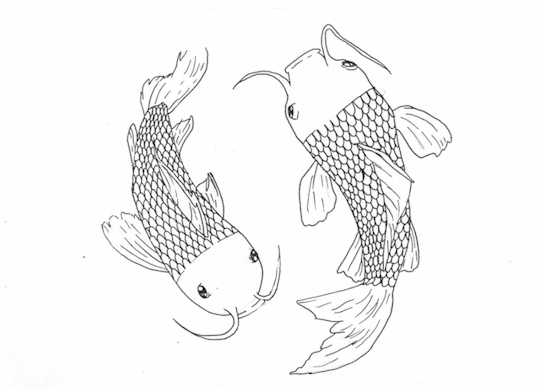
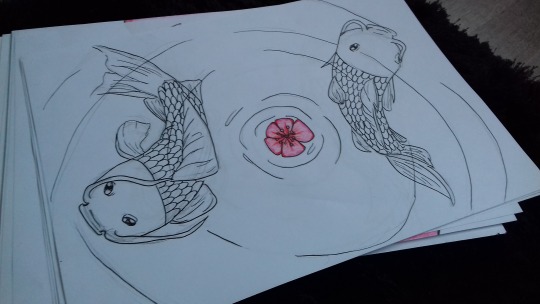
Finished outcome of my animation. In the end I decided not to paint in the patches on the fish because I liked how clean the black and white lineart was, and how much contrast the flower brings in while being the only thing with some sort of colour. Im not really happy with how the end result looks, the kois look more like a loading screen animation rather than two fishes swimming around each other. i wish I added a bit more wiggle into the motion to make them look like they are swimming from side to side, or atl least made the tails move more, but I can’t really go bak and fix it now. I attempted to include the 12 principles of animation in my frames as well that being Slow in and Slow out by having the fish swim at a constant speed and then speed up when the flower falls down. And I also in a way used Appeal, my making the fishes eyes really cartoony instead of having them resemble the realistic eyes kois have instead. I also kind of exadurated the movement when the fishes bend before swimming off from the flower.
3 notes
·
View notes
Text
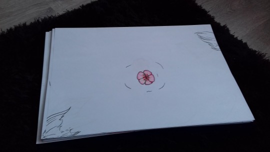
Finished colouring in the flower and now to finish the animation off all I need is to scan every page and make a gif out of it.
1 note
·
View note
Text
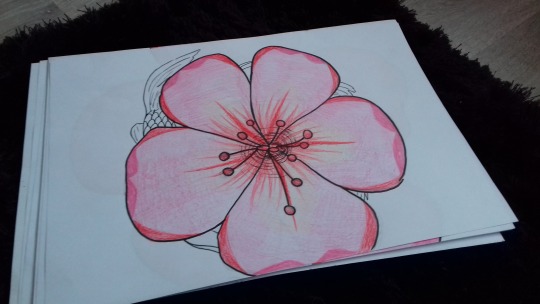
Completly finished doing the line art for each frame. Next all I got to do is colour in the cherry blossom flower which should be easy to do and scan all of the pages in to create the animation as well as digitally paint in the patches on the kois bodies to give them a nice pattern. I can already tell its going to be really time consuming but I hpe it will be worth it in the end and will stand out in the animation. Originally I wanted the patten on the kois to be done in watercolour but as I run out of time and will be finishing the animation off at home I wont have a light box to help me with the patches and they will most likely end up really inconsistent which is something I need to avoid so I’ll create the pattern digitally instead.
1 note
·
View note
Text
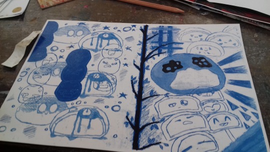
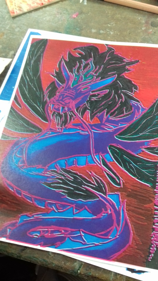
I decided I wanted my zine to have some more pages so I went ahead and photocopied my drawings of the yokai we did a while back. I wanted to try out something I don’t think anyone did so far so I inverted the colour of my drawing and then printed using magenta on it. I was really suprised with how well the end result turned out. I really like what happened between the pink and black, I think these colours turned out really well together. I also love the inverted dragonfly and how the blue is brought out so much on the bright red background.
2 notes
·
View notes
Text
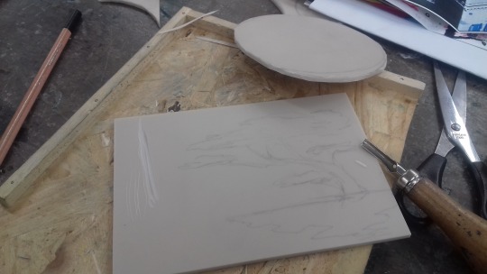
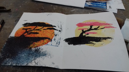
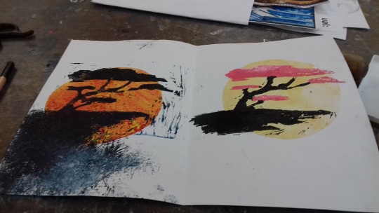
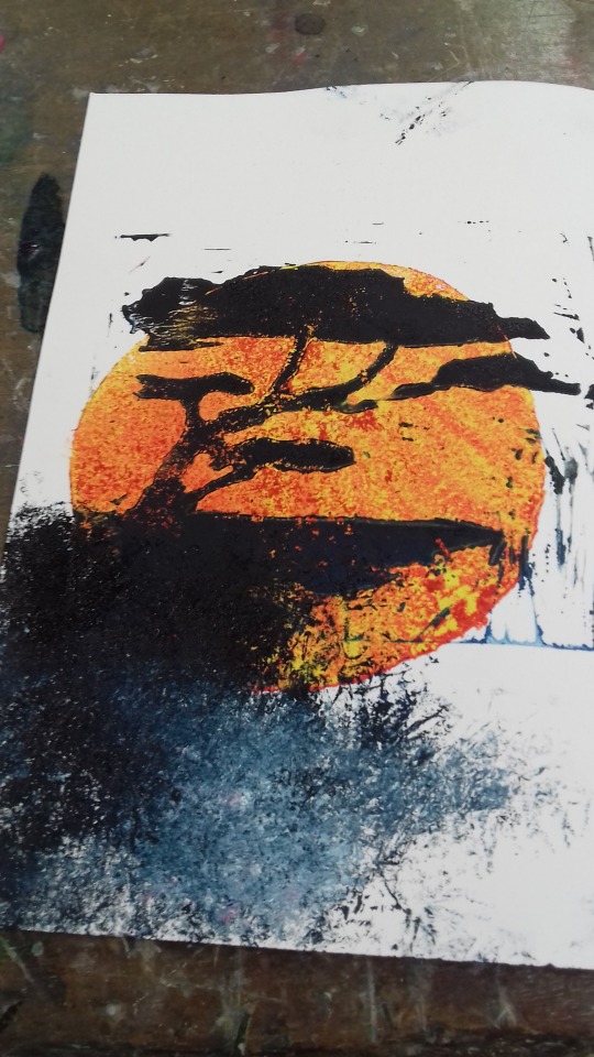

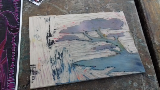
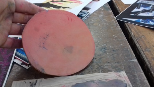
Reflecting Munakata’s style today we used rubber pieces to create stamps and prints to be included in our zines. I decided to relate my stamp to Japanese culture and made my stamp into a Sakura or cherry blossom tree. I also got another piece of rubber and cut it into a circle to create a stamp that will resemble the sun, in it’s simplest form. I first made a very aethetic looking sunset piece by stamping the circle in bright, soft yellow and then a black and pink cherry blossom over it. I really love how this one turned out but because of it I didnt have any idea what to do for my next one. In the end I decided to make a red sun and then a gradient from black to blue for the tree. The print came out really messy so I used a sponge to spread it out over the page to make it look like its connecting to somewhere, and I’m not a fan of the end result but there isn’t anything I can do about it right now.
2 notes
·
View notes
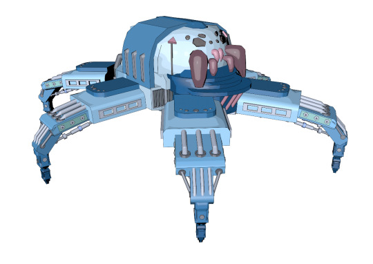
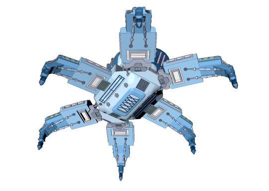
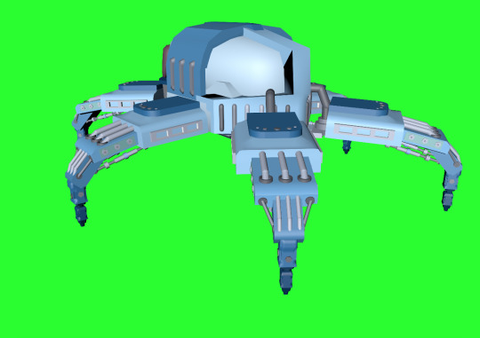
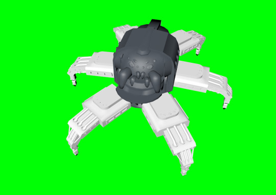
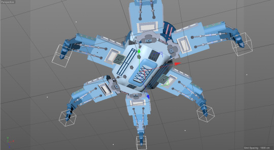
Photo
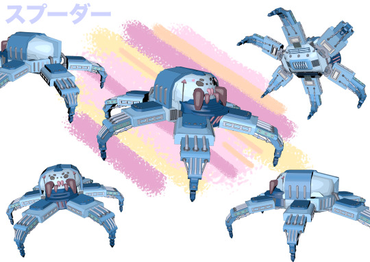
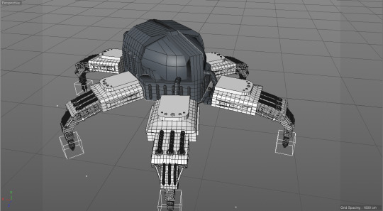
A sheet with multiple angles and views of my spider-robot model. I wanted to make a blueprint sheet for the spider but realised I only had about 10 minutes to get it done and went with this instead. The idea behind it is similar to a blueprint in a way although I know it doesn’t supply the same level of information an actuall blueprint would. But I used the same writing and colours as in my poster to at least keep a theme instead of just puting random views of my spider on a A3 sheet so at least that’s that.
2 notes
·
View notes
Photo
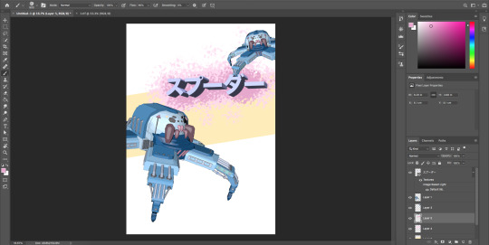
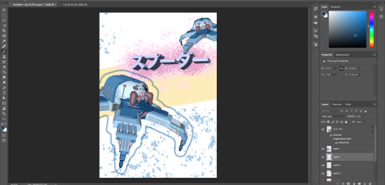
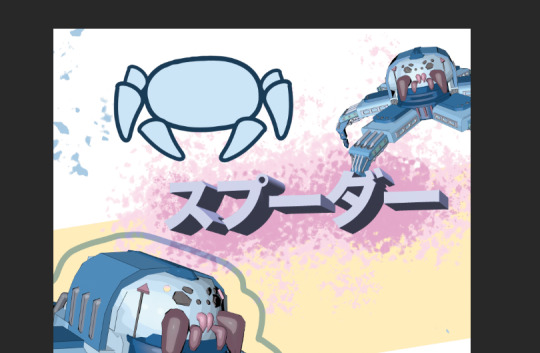
The process of me working on the poster. I didn’t really have much time to make it so I only had one design and honestly there isn’t a lot of process to talk about because the whole design of the poster is so simple. I could literally just bulletpoint -added yellow stripe, -copy and pasted some greenscreened views of my model, - added text... And so on. The only thing I feel I need to really mention is that in my poster there is this awkward space above the name of the spider that has nothing going on there, so I intended to add a little overily simplified drawing of my spider robot design, but in the end I decided agains this idea as I simply didnt have enough time to work on that drawing and adding a badly made drawing on top of such a simple looking poster would ruin the overall look of it, so I just left that space empty.
2 notes
·
View notes
Photo
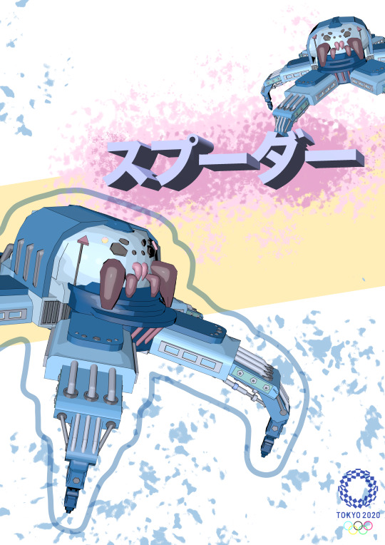
The final outcome of the poster for my spider robot. I decided to make it really clean and simple because logically nobody is going to stand there and read a poster so I limited all the information it gives to the 2020 Olympics logo and the name of the robot and I feel that’s enough. Another reason why I didn’t want to make the poster super complicated and filled is because my spiders design itself is quite complex and people that look at the poster will have more time to actually look at the robot raather than read pointless information about it. I also included some splashes of blue and light pink for aesthetic purposes as a very light yellow stripe behind the spider. The yellow serves another purpose as it puts in the contrast between the background and the purple writing I used for the name of the robot. I also played around with the 3D text option in photoshop to create the writing that I didn’t even know existed but here we are.
2 notes
·
View notes
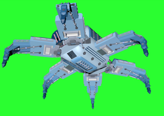
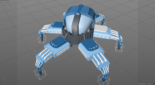
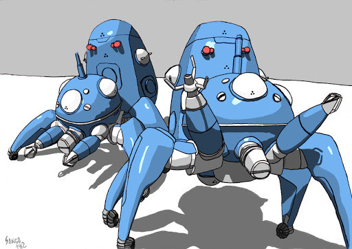
Photo
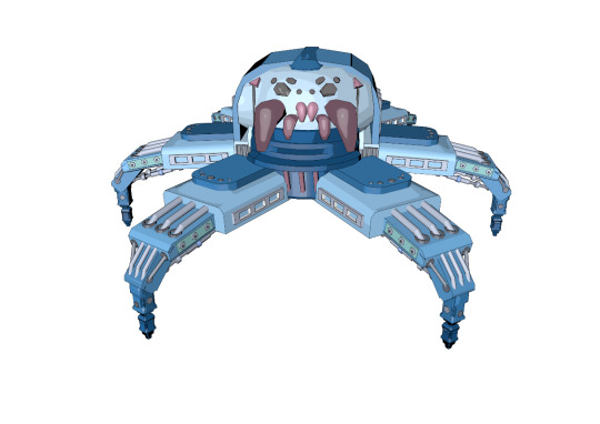
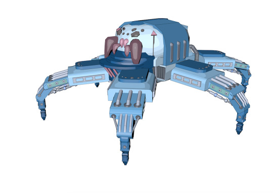
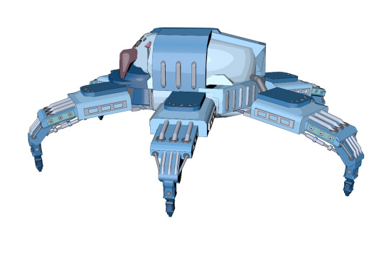
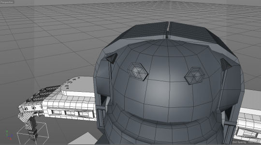
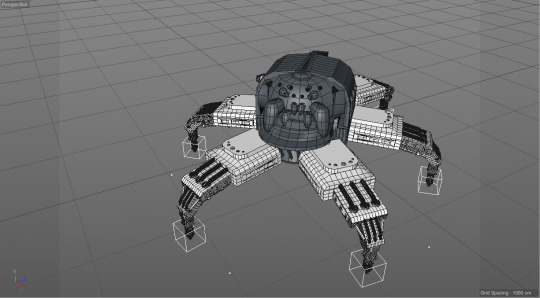
The finished model of my spider robot. I am really happy with how it ended up looking especially that I had no plan or idea for what should I make as well as no skill or experience to do so. I am really pleased with the level of detail I managed to put into it especially the legs and the bottom of the main body of the spider. There are definitely many things that I could’ve handled better like working more into the face of the spider, getting all the elements to be placed symetrically or not painting every single leg individually, but for my first ever completed model I can look over that because the result ended up looking suprisingly good. I’m happy with the colour scheme I went with, it in a way creates an effect that makes the spider look cute which could be linked to the Japanese Kawaii culture that I looked at during this project, as well as it reminds me of the Tachikoma robot from Ghost in The Shell that had a similar colour palette. I think that the pink and magenta accents I put into the face really bring it out more and make it visible on the background of all the other blue pieces in this robot. I’m also really happy with the gradient on the legs, that turned out to be really subtle and you cant really tell its there unless you focus on it, but if you look at the whole design overall it’s clearly there.
2 notes
·
View notes
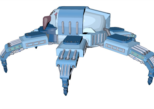
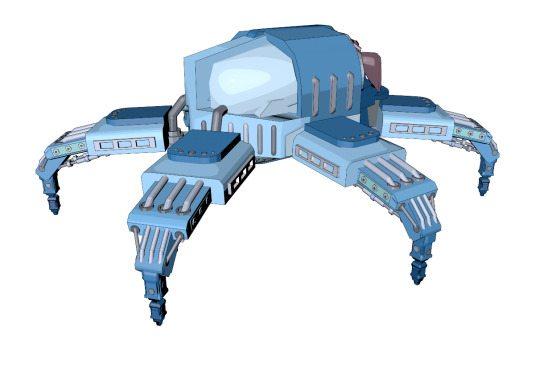
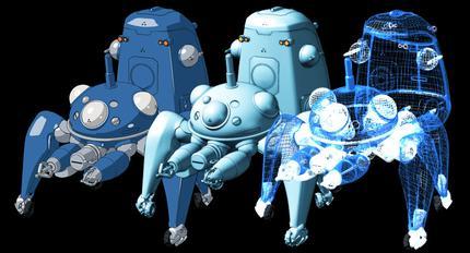
Photo
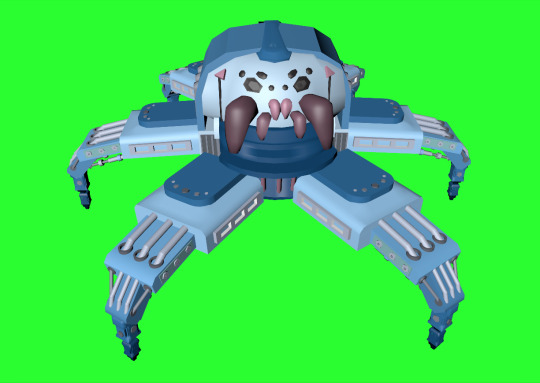
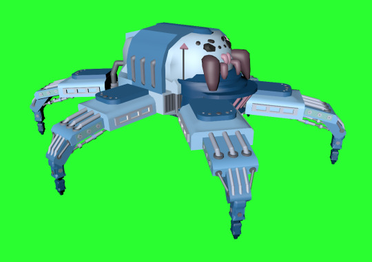
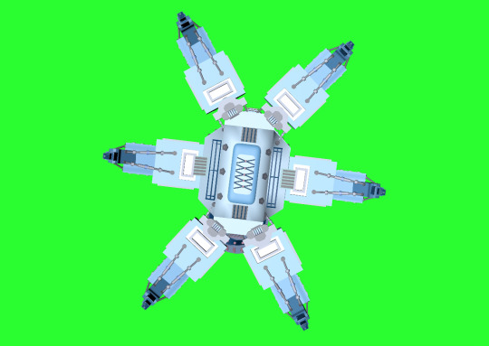
I made some greenscreen renders of my finished spider model from different angles to later use when I create the poster for this design. And to be honest I really like how it turned out in the end especially that I had no experience with working in 3d before as well as no plan for what should I make when I started. The design simply developed as I went and i’m really pleased with how it looks now when it’s all finished and done.
2 notes
·
View notes
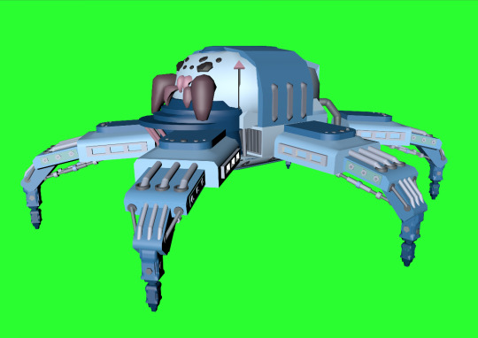
Photo
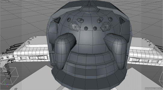

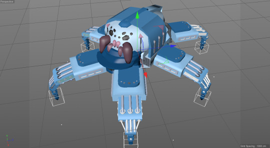
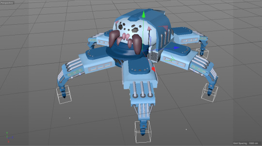
Finishing the model off by working on the face of the spider. I wanted the eyes to look in a way like sideways teardrops, if that paints a picture of what I intended, but I ended up with a little sideways coffin shape I guess, which is still better than simply puting circles down but not quite what I imagied. But it ended up looking quite good with all the other fae features so I left it there. I also included two small fangs as well as two ‘chelicerae’ (according to google) which are just bigger side fangs. I had some trouble getting the shape of them right because I knew I wanted hem to be smooth bbut it was hard for me to create that effect as well as get the shape I wanted but i feel it turned out allright. Next I moved onto the painting, and I knew I wanted to use blue somewhere but couldn’t decide if I wanted the pster for this spider to have a blue backgound or should the spider itself be blue. In the end I started working on a blue gradient in the legs of the spider going from dark at the end of the legs to light blue as it got closer to the core of the spider. I really liked the effet it gave and now that I look at it it’s colour scheme resembles the Tachikoma from Ghost in The Shell that I looked at so it works for me. The only mistake I made while painting the robot was the fact I had t paint every leg individually because I copied them before I painted them in, and because I already moved them around and changed all their placements I prefered to simply go through and paint them all one by one rather than paint one copy it, and have to bother with the placements of all the other ones.In the painting I also used quite a lot of greys and magenta tones on little details like the face as well as all the screws and crates I added into the design.
2 notes
·
View notes
Photo
“Tachikoma (Japanese: タチコマ) are fictional walker robots endowed with artificial intelligence (AI) that are featured in the Ghost in the Shell universe. They appear in the manga created by Masamune Shirow and in the Stand Alone Complex sub-universe. Nine of them are initially deployed to Section 9. They are spider-like, multi-legged combat vehicles, and are equipped with adaptive artificial intelligence. The spider design appears in other places in Shirow's work such as the Appleseed manga. Shirow is noted to keep numerous spiders as pets. “
I really like the colour scheme of this robot model and how it’s supposed to be a dangerous tank ( I think I never actually fully watched the movie) but because of the colour choices ended up looking really friendly. The design itself looks really welcoming with no sharp edges and a lot of circular shapes to it which furthers my point. Also I’m pretty sure it has wheels which also decreses the scary factor a spider would have by not having the robot crawl like a spider would and instead simply ride on wheels.
https://en.wikipedia.org/wiki/Tachikoma
3 notes
·
View notes
Text
Shiko Munakata
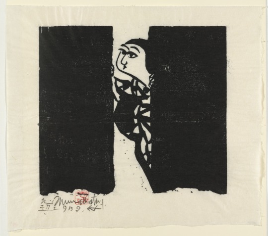
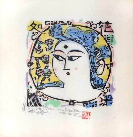
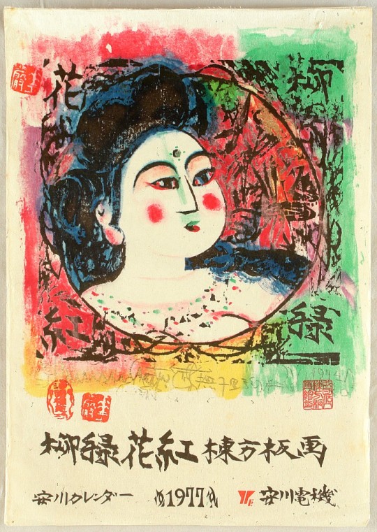
“Shikō Munakata (棟方 志功, Munakata Shikō, September 5, 1903 – September 13, 1975) was a woodblock printmaker active in Shōwa period Japan. He is associated with the sōsaku-hanga movement and the mingei (folk art) movement. Munakata was awarded the "Prize of Excellence" at the Second International Print Exhibition in Lugano, Switzerland in 1952, and first prize at the São Paulo Bienal Exhibition in Brazil in 1955, followed by Grand Prix at the Venice Biennale in 1956, and the Order of Culture, the highest honor in the arts by the Japanese government in 1970.”
Here it is very easy to see that Munakata has a very specific art style that he strictly follows in all of his pieces. He creates woodblock prints which makes total sense why his artstyle is simplified down to its core, but at the same time it’s very much so not impressive to look at. A child that doesn’t know how to draw would probably draw like this and Munakata claimed this bad quality art as his style and now makes big money off of it. I like his colour schemes and how he doesn’t limit himself to specific colours like black and white like some other print artist would probably do to save time and money, I feel that is a good move on his part. I also dont like how he doesn’t aknowledge human anatomy which is like the basics of what you need to do to produce good realistic looking art. It’s easy to see that Munakata instead simply draws how things look instead of how they are, which at his style is not a problem but if he ever were to go realistic it would cause him much trouble.
https://en.wikipedia.org/wiki/Shik%C5%8D_Munakata
4 notes
·
View notes
Text
Koji Nagai
“Koji Nagai was born and raised in Hiroshima, Japan. He studied graphic design at Hiroshima Designer College. After working at several design companies, he became a freelance designer at age of twenty-four. Nagai earned a wide variety of awards from Hiroshima Advertising Association for his design works in posters, brochures, and calendars. At age of thirty-five, Nagai was attracted to the world of free spirit of the collage design. Nagai generates ideas for his collage arts based on his first impression of the materials. The interfusion of the different types of elements, which are old and new, fiction and nonfiction, life and death, and western and oriental leads to Nagai’s new design creation of the collage arts. Nagai currently lives in Hiroshima with his wife, Naoko. “
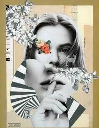
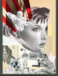
I understand that Nogai is a collage artist but I am really nnot a fan of his works. I find them very offputing of how he creates faces in a similar fashion for example Picasso would paint them, but here he uses realistic pictures and its just uneasy to look at. His colour schemes are also really bland consisting of mostly beige and black and white printed pictures, the only pieces that he created that actually stand out at least to me are the ones where he uses bold splashesh of colour like on the piece with red stripes on it.
https://retroavangarda.com/gallery-of-friends/albums/Koji_Nagai/
1 note
·
View note
Text
Yokai
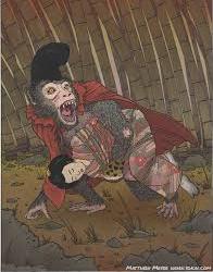
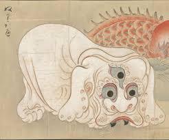
“Yōkai (妖怪, ghost, phantom, strange apparition) are a class of supernatural monsters, spirits, and demons in Japanese folklore. The word yōkai is made up of the kanjifor "bewitching; attractive; calamity" and "spectre; apparition; mystery; suspicious." They can also be called ayakashi (あやかし), mononoke (物の怪) or mamono(魔物). Yōkai range diversely from the malevolent to the mischievous, or occasionally bring good fortune to those who encounter them.”
ōkai often possess animal features (such as the kappa, which looks similar to a turtle, or the tengu, which has wings), yet others appear mostly human like kuchisake-onna. Some yōkai look like inanimate objects (such as tsukumogami), while others have no discernible shape. Yōkai usually have spiritual or supernatural abilities, with shapeshifting being the most common. Yōkai that shapeshift are called bakemono (化物) or obake (お化け).
Japanese folklorists and historians explain yōkai as personifications of "supernatural or unaccountable phenomena to their informants." In the Edo period, many artists, such as Toriyama Sekien, invented new yōkai by taking inspiration from folk tales or purely from their own imagination. Today, several such yōkai (e.g. Amikiri) are mistaken to originate in more traditional folklore.”
I like the concept of yokai but the fact that anyone can make up one and theres thousands of them almost 1 per every village as well as some more well known ones per region, to me makes them at all unbelievable. Most of the yokais are also just hybrids of local animals that peope that came up with them could see on daily basis and their purpose was to scare people from doing things other ddn’t accept or appereciate them doing.
1 note
·
View note
Text
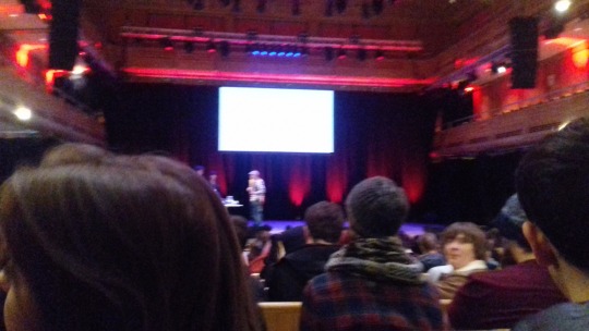
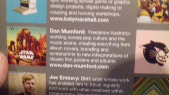
We had another trip to the apex and being perfectly honest I didn't;t care about most of the artists that were on stage. Most of them would not at all relate to what Im doing and what I’m interested in. For example the things Joe Embery talked about were completely irrelevant to what I do. I don’t do photography and neither am I interested in biking and tricks. I guess it would definitely be useful for the people that actually do photography. The only artist that really grabbed my attention and interested me with his work was Dan Mumford, mostly because he does digital art which is something I like to do. I really like how he uses colour layers to build up his pieces and give them dimension. And how in his presentation he basically gave a tutorial for how to recreate his pieces or at least work in that style that he uses.
1 note
·
View note
Text
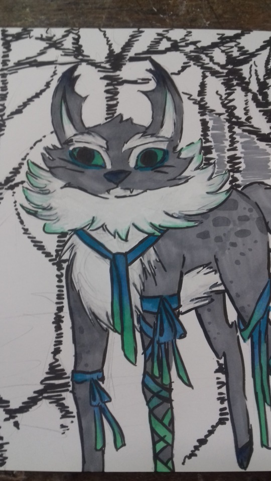
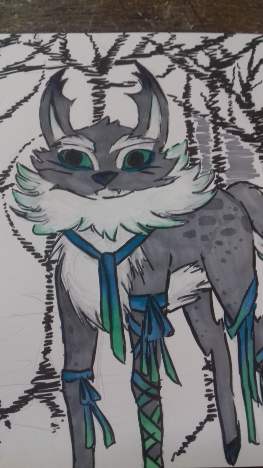
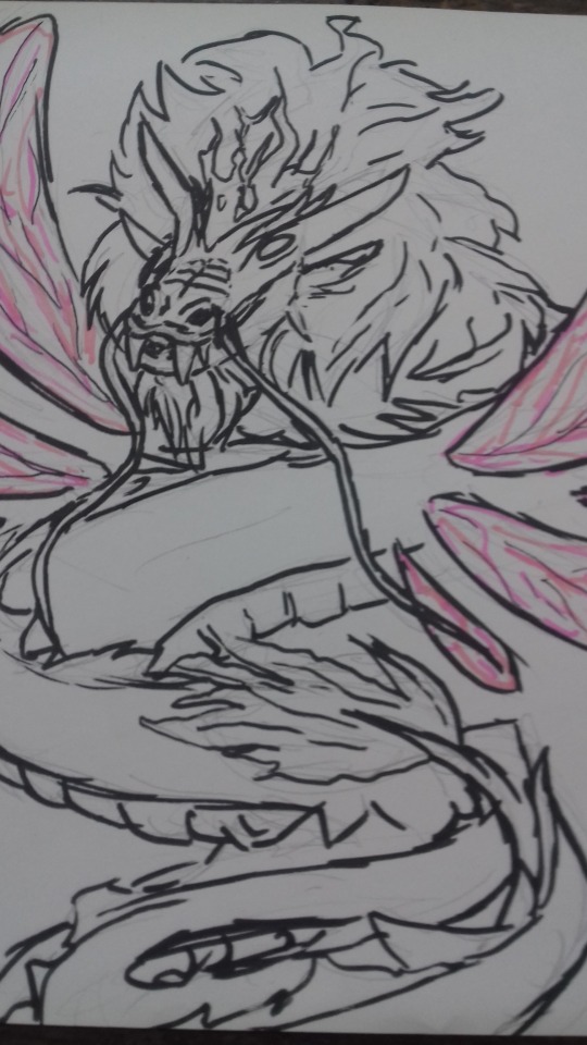
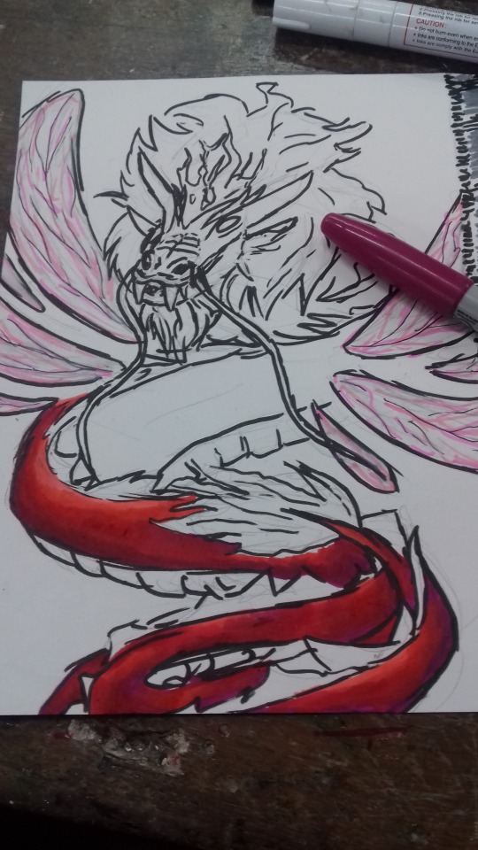
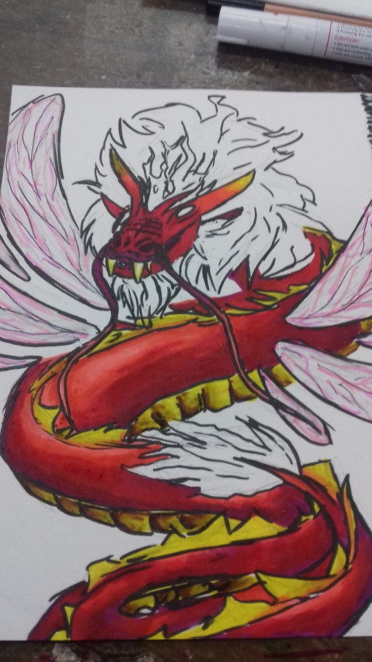
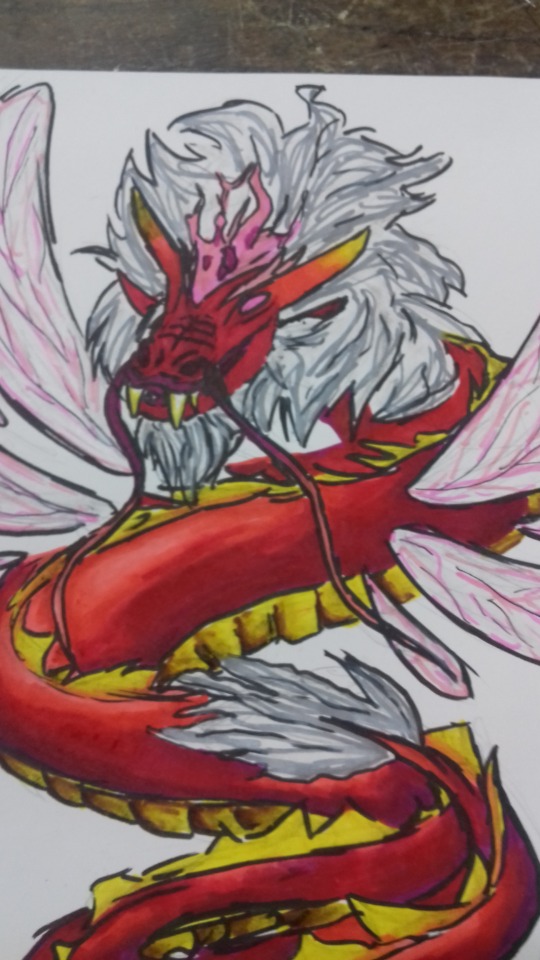
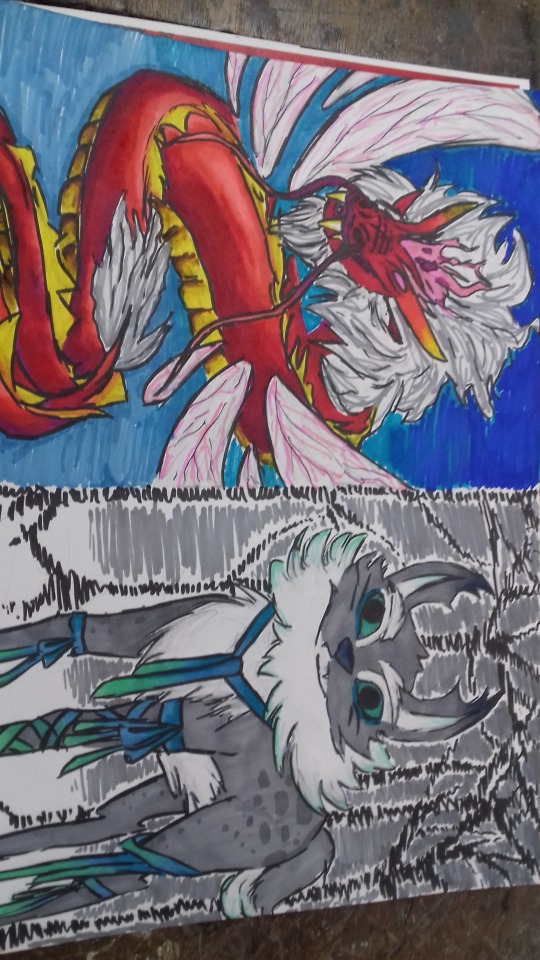
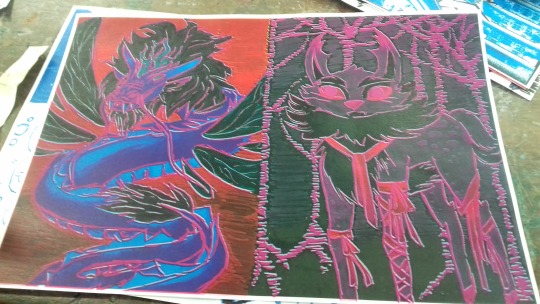
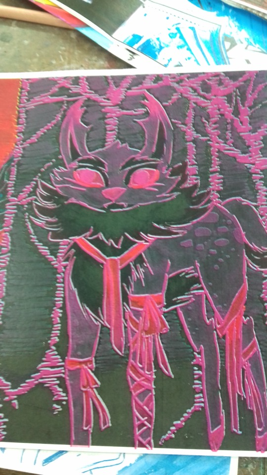
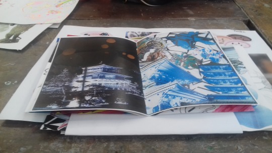
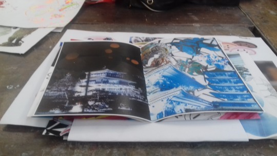
Drawings of yoke we came up with. I kind of broke from the theme I had so far of using only red and black for my pages because I drew this cat deer creature and I just felt it would look really good in shades of turquoise instead of red, and Im really happy with the result. I think it looks really peaceful especially with that snowy background I gave it and its definitely my favourite of the two drawings. The second yokai I drew was a mix between a dragon and a dragonfly. I like the drawings but I feel the colours I chose for it really clash with the background and make the whole drawing look really unnecessarily flashy. But overall I’m quite happy with how these 2 pages look. I feel they turned out pretty well.
2 notes
·
View notes