
kimblecharting
Kimble Charting
I produce investment research in the form of chart pattern analysis with the goal to help people improve decision-making and enlarge their portfolios regardless of market direction. I call my approach TBNM for tops-bottoms-no middles.
1360 posts
Don't wanna be here? Send us removal request.
Last Seen Blogs


Text
Connect Series Webinar February 2018
We cover dominating patterns in major global Indices, sectors, commodities and the metals markets. We produce chart pattern analysis and empower people to improve entry and exit points.
View On WordPress
2 notes
·
View notes
Text
Inverted Yield Curve Suggesting Bonds Are Topping?
Inverted Yield Curve Suggesting Bonds Are Topping?
Is Mr.Markets job to fool the majority? If so, some surprises in the bond market could be near!
This table from Google Trends looks at the popularity of articles mentioning the “Yield Curve.”Last week it seemed like everywhere you turned people were discussing the “inverted yield curve and how it was going to be bad for stocks!” Is this theme a little too popular right now/long in the tooth?…
View On WordPress
3 notes
·
View notes
Text
Shanghai Index; White Hot Index Peaking?
Shanghai Index; White Hot Index Peaking?
Is one of the hottest stock indices in the world about to peak? Possible.
The S&P is off to a great start this year, up over 12%. Yet the Shanghai index is white hot, up around 22%, almost twice as much as the S&P 500!
This chart looks at the Shanghai Index over the past 25-years on a weekly basis. It has spent the majority of the past 25-year above rising support line (1). It hit this rising…
View On WordPress
0 notes
Text
NYSE Index Suggesting The Top Is In, Says Joe Friday
NYSE Index Suggesting The Top Is In, Says Joe Friday
Is a very broad stock index suggesting that a top is in play? What this index does to close this week should go a long way to answering that question!
This chart looks at the NYSE Indexon a weekly basis over the past 4-years. Over the past 15-months, it has created a series of lower highs and lower lows inside of the shaded falling channel. It hit strong support around Christmas at (1) and a…
View On WordPress
2 notes
·
View notes
Text
Interest Rates Sputter… Is U.S. Economy Next?
Interest Rates Sputter… Is U.S. Economy Next?
The Federal Reserve wasn’t quite as hawkish as investors expected. The result: Treasury bond yields (interest rates) fell sharply.
In today’s chart of the 10-Year US Treasury Yield, we highlight the reversal in rates that occurred late last year.
This wasn’t just any old reversal, though. It occurred along the same long-term downtrend line that produced reversals in the years 2000 and 2007.
A…
View On WordPress
1 note
·
View note
Text
Banks Sending Warning Sign To Broad Markets Again?
Banks Sending Warning Sign To Broad Markets Again?
The financial / banking sector is often a good barometer of the economy and broader stock market.
So when the Bank Index (BKX) began to lag late last summer, it was an early warning sign for investors.
Looking at the chart below, we can see that the banks spilled lower with the December correction. That final swoon lower was set up by a bearish reversal candlestick (1).
Well, the recent rally…
View On WordPress
1 note
·
View note
Text
Germany-Monster Bearish Reversal This Week?
Germany-Monster Bearish Reversal This Week?
Is the DAX creating a large bearish reversal pattern this week that could send a concerning message to stock bulls in the states? Yes!
This chart of the DAX from Germany reflects that it has spent the majority of the past 7-years inside of a rising channel. The DAX looks to have created a double toplast year as it kissed the underside of the rising channel. After the double top, a bearish…
View On WordPress
1 note
·
View note
Text
Financials About To Let Down The Bull Market Again?
Financials About To Let Down The Bull Market Again?
If the saying So Goes The Banks, So Goes The Broad Market is true, what message are we receiving when financials have lagged the broad market for over a year?
This 2-pack looks at the XLF/SPX and EUFN/XLF ratios over the past couple of years.
The XLF/SPX ratio has created a series of lower highs for the past 12-months after peaking at (1). The EUFN/XLF ratio has created a series of lower highs…
View On WordPress
0 notes
Text
Germany Breakout Bullish For Stocks In The States!
Germany Breakout Bullish For Stocks In The States!
An important message to stocks in the states will come from Germany in the next few weeks!
This chart looks at the DAX index from Germany over the past 10-years. For the majority of the past 6-years, the DAX has remained inside of rising channel (1). The 2018 decline saw the DAX hit support where a 1-year counter-trend rally started.
Over the past year, the DAX has created a new falling channel…
View On WordPress
1 note
·
View note
Text
Doc Copper Peaking? Signaling Economic Weakness Ahead?
Doc Copper Peaking? Signaling Economic Weakness Ahead?
Is Doc Copper suggesting that economic weakness is around the corner? Possible
Doc Copper has created a series of lower highs and lower lows over the past 9-years inside of falling channel (1).
Last year Copper looks to have double topped at 2014 highs and the top of the falling channel at (2). The counter-trend rally over the past few months has it testing last years support as new resistance…
View On WordPress
1 note
·
View note
Text
Junk Bonds and the S&P 500 are both facing key breakout tests at the same time. What each does at these key price points could well determine if the S&P 500 will have the strength to retest last years all-time highs.
This chart looks at Junk Bond ETf (JNK)and the S&P 500 over the past few months. The rally off the December lows has each testing popular Fibonacci retracement levels and resistance…
View On WordPress
0 notes
Text
Is The Stock Market Losing Momentum Here?!
Is The Stock Market Losing Momentum Here?!
The S&P 500 pullback (last week) feels like a distant memory following the stock market’s 2-day snapback rally.
But investors should take note of what’s happening under the surface for two important market indexes: the S&P 500 Index (SPX) and the Bank Index (BKX).
In today’s 2-pack chart, we look at both indexes and highlight an emerging concern.
Looking at the chart below, we can see that last…
View On WordPress
1 note
·
View note
Text
NDX 100 Testing Important Breakout Level!
NDX 100 Testing Important Breakout Level!
On the 20th-Anniversary of the very popular NDX 100 ETF (QQQ), it finds itself working on a what could be an important breakout level!
This monthly chart of QQQ applied Fibonacci extension levels to the 2000 highs/2002 lows at each (1). The rally off the 2002 lows saw it reach its 161% extension level last fall at (2), where it created a short-term high and then proceeded to fall nearly 20%.
The…
View On WordPress
0 notes
Text
Stock Rollover Could Be Starting, Says Joe Friday
Stock Rollover Could Be Starting, Says Joe Friday
The NYSE Index is facing a very important price level as Momentum and the MACD are at the highest levels in a year!
The 9-week rally from the late December lows has the NYSE index facing the October, November, December highs and its 78% retracement this past week.
Joe Friday Just The Facts Ma’am-Momentum, MACD, and the NYSE index look to be rolling over from levels that could send a big-time…
View On WordPress
0 notes
Text
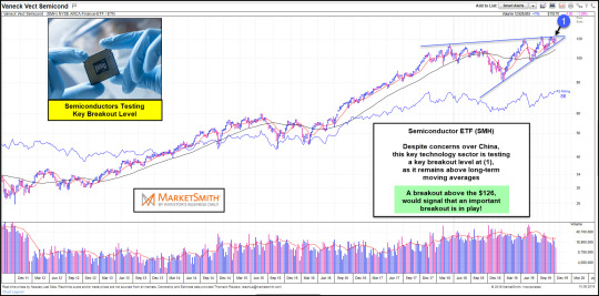
Semiconductors (SMH): Important “Kiss” of Resistance Underway
Semiconductors (SMH): Important “Kiss” of Resistance Underway
Semiconductor stocks are representative of the growth engine in the market. They are cyclical and technology driven.
So when the Semiconductors Sector (SMH) slows down, investors should take note.
This is exactly what occurred last year. The Semiconductors Sector was slowed at the price area of the year 2000 highs (1). And it was a warning sign for the late 2018 stock market correction.
So where…
View On WordPress
1 note
·
View note
Text
Stock Market Bulls Hope Wilshire 5000 Isn’t Topping Here!
Stock Market Bulls Hope Wilshire 5000 Isn’t Topping Here!
The Wilshire 5000 Index has spent the past 30 years trading within a bullish price channel up-trend – see (1) in today’s chart above. The price action of late has NOT broken the long-term bull trend.
Though the latest move off the 2009 lows has been bullish, and quite strong, it has taken the broad stock market index to the top of this bullish channel.
That alone is a reason for concern as…
View On WordPress
0 notes