Last Seen Blogs
jinxedjohnsons-blog
Untitled

sukikirai02
I'm In A Constant State Of Rin & Len
welcome-to-earth-id4
Milton deserved better

bengal-tiger
🌴𝓶𝓪𝓶𝓪𝓬𝓲𝓽𝓪🌴
morless0711
Monogrammiste.
Text
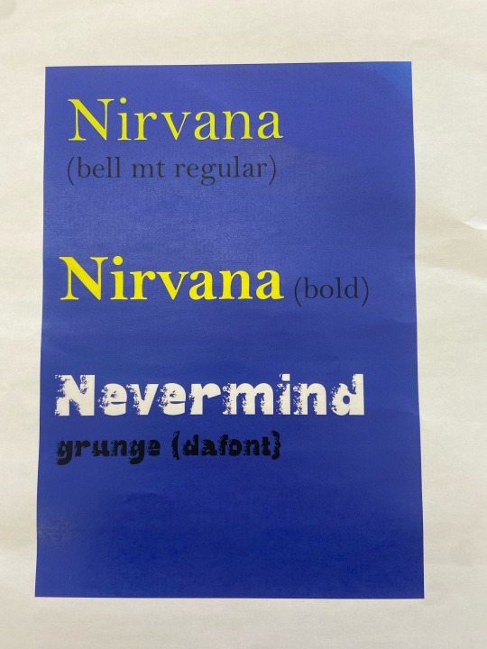
Digital Typographic Choices
I chose the Bell Mt typeface in bold as I like how strong it stands out.
1 note
·
View note
Text
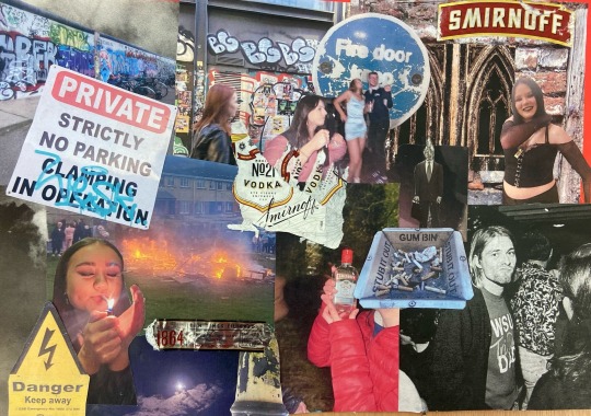
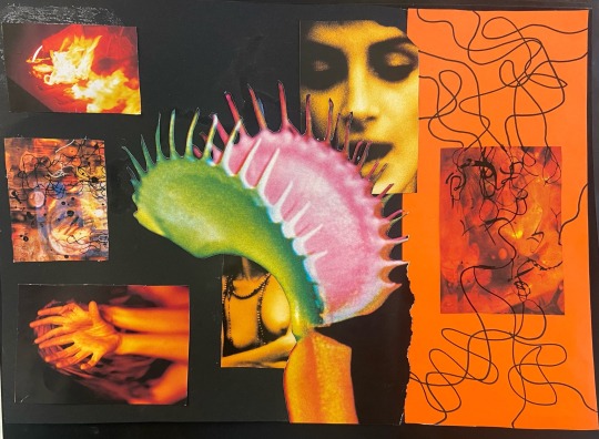
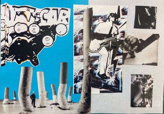
Thursday April 25th
I made a collage from my own photos,the wrapping of alcohol bottles and some found images from magazines aswell.I tried to make it grunge and communicate what it is to be a teenager as a lot of these photos come from photos I’ve taken as a teenager.
3 notes
·
View notes
Text
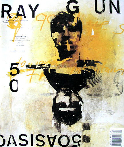
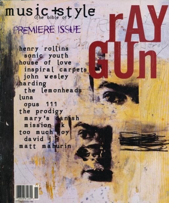
Research David Carson
David Carson was the art director of the 90s rock and roll magazine “Ray Gun ”.He is known as the godfather of grunge graphic design .The experimental and unconventional typography and layout style he employed in the Ray Gun magazine gave way to a new revolutionary wave of “distressed graphic design ”.Critics claimed his work is fractured and hard to read and didn’t condone his lack of a ruled layout base .I like his work because of his incorporation of print in his designs and how he goes against the minimalist restrictions of graphic design.
0 notes
Text
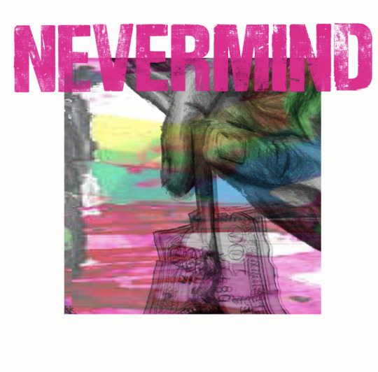
Thursday 24th April Final Design
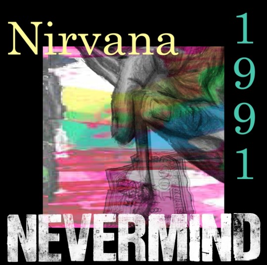
I changed my mind again and went back to the first design I created.I felt like it looked more put together and pleasing on the eye.I did change the Nevermind to white as I felt the previous pink writing did not suit the gritty energy of Nirvana.The yellow of Nirvana and the green of 1991 comes from selecting colours from the original central design.I am happy with how this turned out and I feel like it is a well balanced design while still holding on to the grunge elements of Nirvana with the illustration and the use of print.
1 note
·
View note
Text
Wednesday April 24th
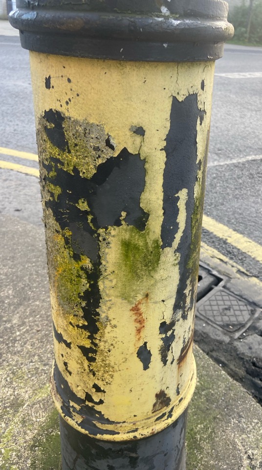
I decided I wanted to change the colour scheme of my previous album cover design.I brought a photo of a grimily textured pole into photoshop and adjusted the settings so I gave it a red hue.I wanted to work primarily with blacks and reds as I have been doing previously as I feel like they represent the angst of Nirvana.
I changed the Nevermind colour to yellow to make it more “in your face” like the lyrics but I don’t like the mustard shade it has turned out and was looking to make it a brighter and stronger yellow.
2 notes
·
View notes
Text
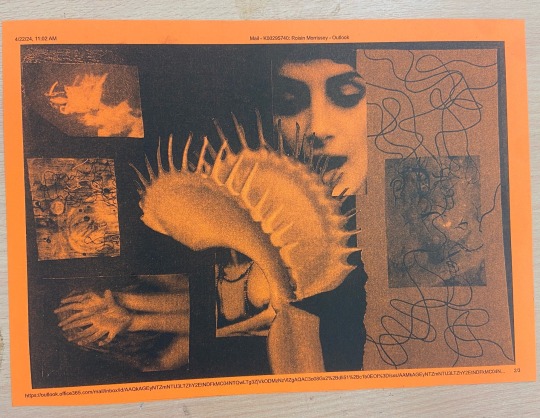
Tuesday April 23rd
Today I scanned in pieces I created and brought them together in photoshop to create an album cover design.
1) “Nevermind” print from letter press I made
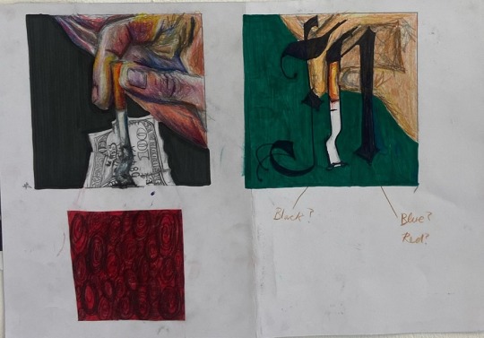
2)My hand putting out a cigarette on a $100 note illustration to show the anti-establishment tone of the album
3) I zoomed up on my graffiti like painting to create the background.I wanted it to look like what a television looked like from certain angles at the time of MTV in the 90s (the same time that Nirvana were around).
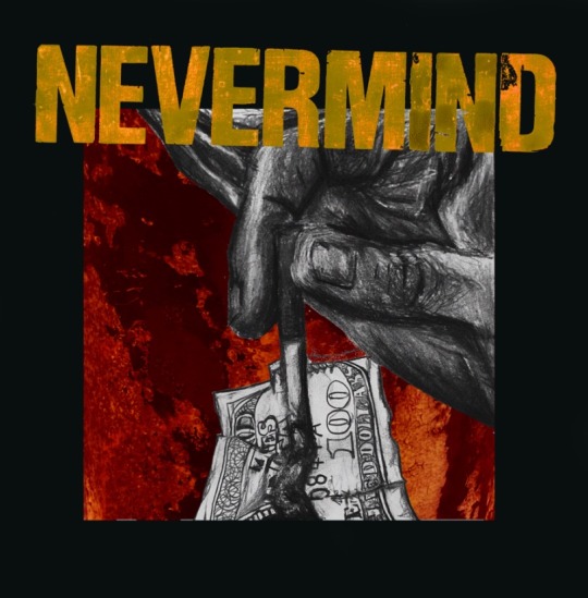
This is my first rendition of my album cover design..I like the illustration of the hand putting out the cigarette on the 100 dollar bill but I do not like the colour scheme as I feel like it is too soft and feminine for the angry raw nature of the Nevermind Album.
0 notes
Text
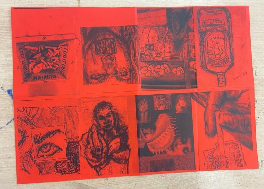
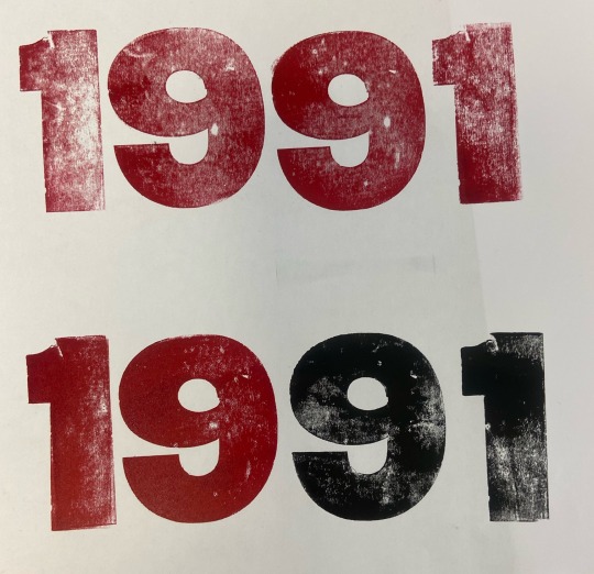
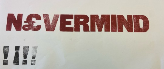
Monday April 22nd
Today I did the risograph zine workshop.I created my zine with black ink on red paper as I felt like those colours express the angst of Nirvana.I also worked with the letter press to create grunge lettering that I can use as my font for my final album cover design.I also experimented with printing out my mood boards with risograph printing.


6 notes
·
View notes
Text
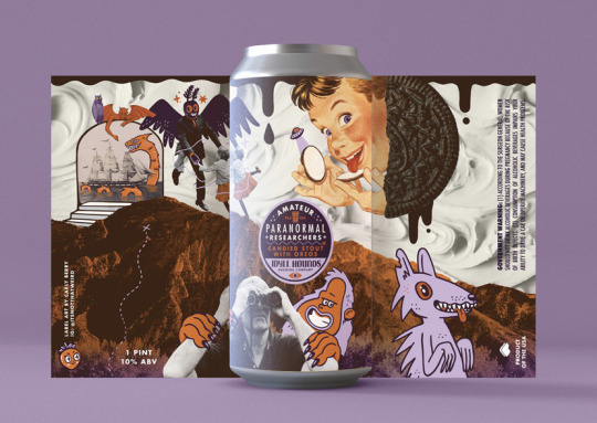
Artist Research- Graphic Designer Carly Berry
Carly Berry designed the label for Santa Rosa Beach brewery “Idyll Hounds”.This label was made for Idyll Hounds’ autumnal event where they release limited edition beers.The theme was Floridian Fauna which Carly was delighted about as a Florida native.
On the design Carly Berry explained she “ tapped into the hazy mindset you fall into after long beach days in the sun. A bit sublime but your brain is frying just a little so it can get pretty trippy.”
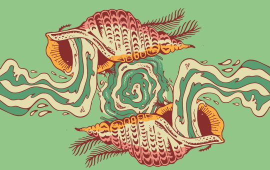
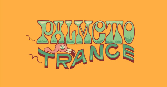
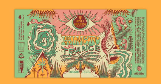
I also found more of Carly’s work that inspired me on her website.I love her maximalist approach to graphic design as I feel like that is similar to my style of art.
https://carlyberry.design
0 notes
Text
Thursday 18th April
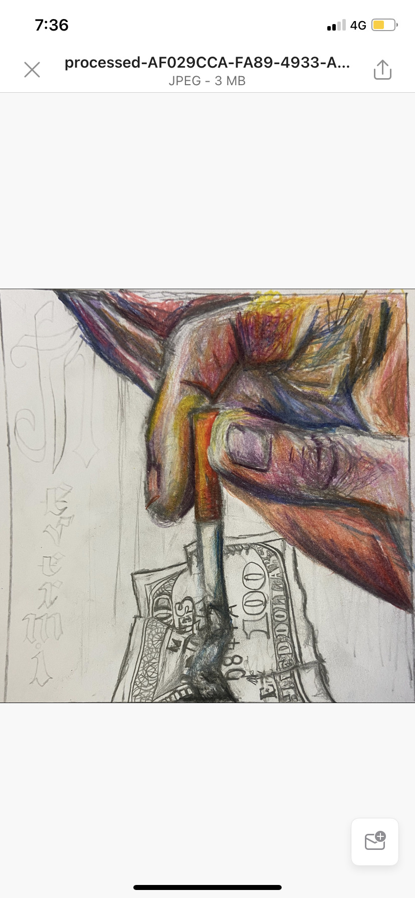
Today I worked on trying to finalise an idea from my thumbnail sketches.I decided to go with the cigarette being put out on a one hundred dollar bill as that was my most popular thumbnail in our previous peer assessment.
I am happy with the colour scheme of the hand.There was a divided response about my use of the Gothic font to symbolise Nirvana so I think I will explore using other fonts.I am happy with the composition but would like to add a grittier element to more so express the spirit of Nirvana and also work on the layout of the font.
2 notes
·
View notes
Text
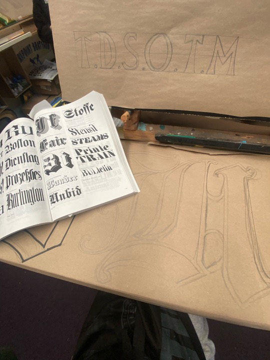
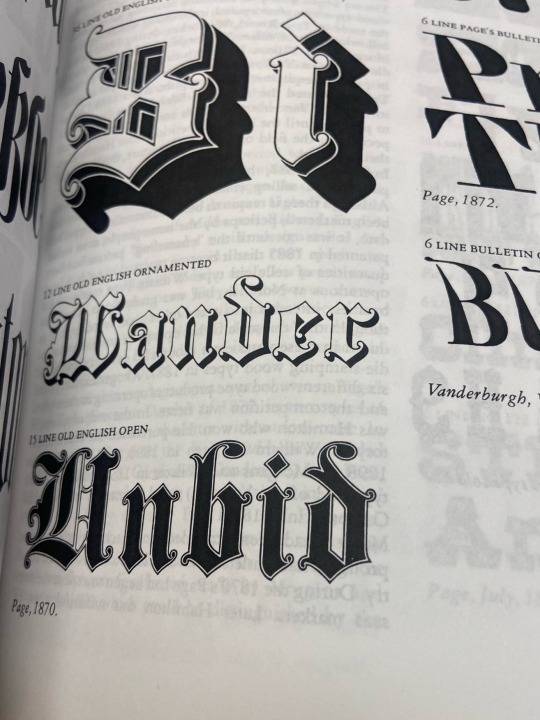
Tuesday 16th April
Today we visited signwriter Tom Collin’s studio in Limerick.We learned about the process of signwriting.We were taught how to use mall sticks to keep our hands steady while painting signage.I picked out some fonts that I felt fitted in with the Nevermind Nirvana album from some of the book he had at hand in his studio.I then painted them in black.I really enjoyed working in a larger format with font and hearing Tom speak about the work he has done in the business.

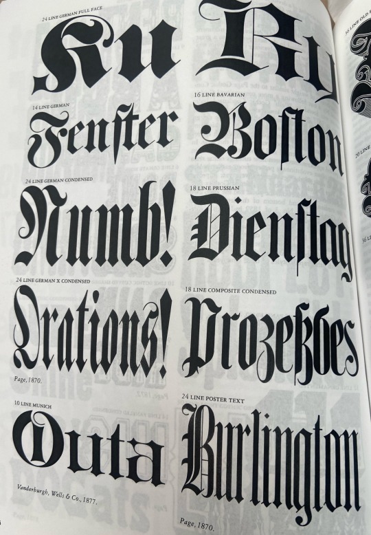
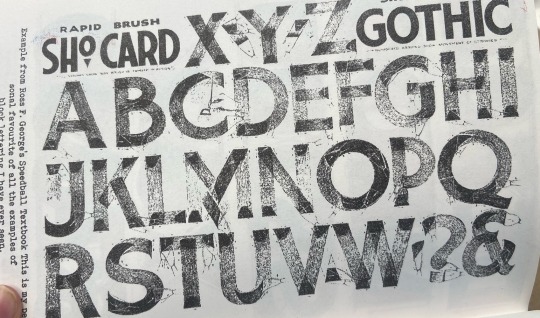
1 note
·
View note
Text
Tuesday 16th April
Today we visited an art Gallery opposite People’s park located in an old Georgian house.I selected the painting that resonated with me the most and created a poster from it.I picked the painting of Sligo entitled “Yates County” as I spent a lot of my childhood in Sligo as my mother is originally from there.As a result it evoked an emotional response from me because I don’t spend the same amount of time there anymore now that my grandparents have passed away.
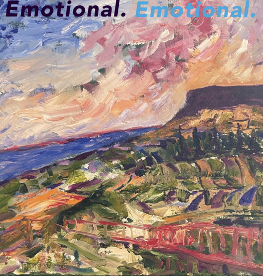
0 notes
Text
Tuesday 9th April
Today we went to the Mac Lab and Maeve introduced us to Illustrator.She went through a step by step guide of the basics with us.I played around with the tools to learn them and then decided I wanted to make some trippy designs.Maeve showed me a cool way to create psychedelic like design by using the blend tool as I was originally just trying to create the design by manipulating circles which wasn’t turning out as I wanted.
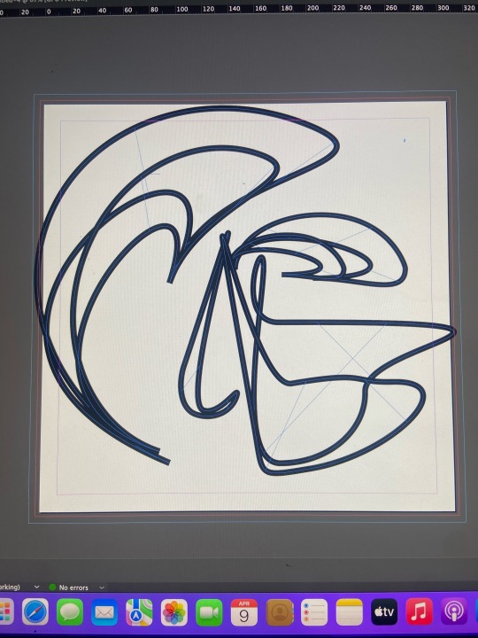
My first attempt
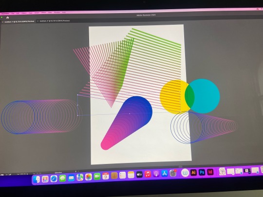
Maeve’s examples
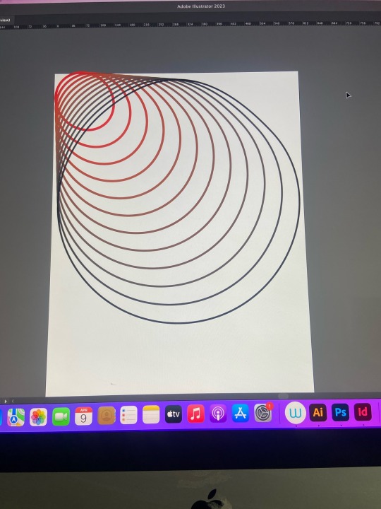
I created a basis of what I want to do
2 notes
·
View notes
Text
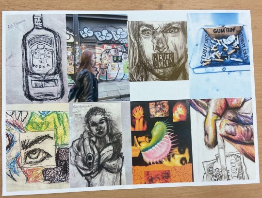
Moodboards- Monday 8th April
Today I created two mood boards inspired by the Nirvana Nevermind Album.I tried to keep the images to a minimal as I tend to let these moodboards turn into collages as I veer more towards a maximalist look more often than not.
2 notes
·
View notes
Text
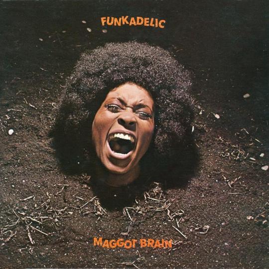
Album Cover Creation Research- “Awaken My Love” album by Childish Gambino 2016
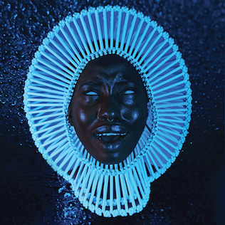
This album is a mix of funk,psychedelic soul and R&B.The cover pays homage to Funkadelic by taking inspiration from cover of George Clinton’s group Maggot Brain’s “Funkadelic Album” in 1971.Donald Glover (Childish Gambino) had previously mentioned in an interview with Amoeba Records that this was one of his favourite albums and that the cover used to disturb him as a child and give him nightmares.
The “Awaken My Love” album is a photo of model Giannina Oteto that was shot by creative director Ibra Ake.Sculpturist Jewellery designer Laura Wass of WXYZ Jewellery created the headpiece for the album cover.
I love this album cover because of its striking imagery.It is vaguely unsettling but also completely draws the viewer in and the colour scheme really suits the psychedelic sound of the album.
3 notes
·
View notes
Text
Typographer Research
Laura Worthington is a typographer and designer.Her work caught my eye due to its timeless detail and class.I was particularly interested in her process as I found she works from a sketch which is interesting as her work is highly finished it shows how much effort goes into getting it to that level.
As she says “It all starts with a rough pencil sketch that goes through several rounds of revisions to get the design down”
1 note
·
View note
Text
Typography Workshop
Thursday March 21st
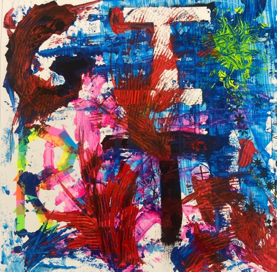
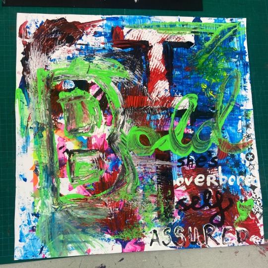
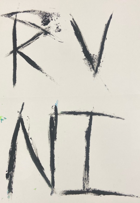
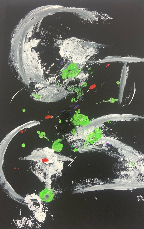
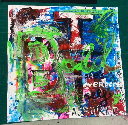
After our workshop with Maeve on Tuesday where we learned about the analytical way to approach typography and the history of it we tried experimental typography on Thursday.I really enjoyed the freedom of being able to use lots of different materials and I documented the process as the whole composition changed over time as I added more elements into it.
I’m really happy with the colours and overall impact of how these turned out but would prefer if the words were clearer to read so the piece could express a message.
0 notes
Text
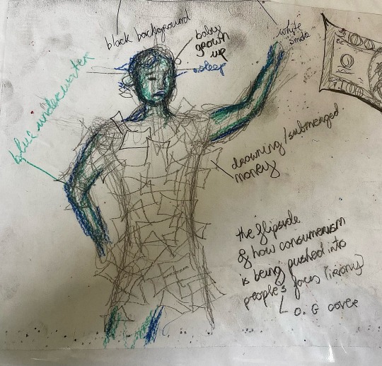
Thumbnail Sketches
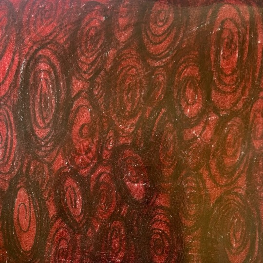
(6) This is a coloured version of a previous thumbnail design that I created by listening to the guitar riffs of “Come As You Are”.I did it in black and red as I feel like these colours express angst.I don’t like how abstract this work is and feel like it would be dizzying to incorporate text on top of this busy design.
(7) This was a quick idea for an album cover based off the original Nirvana album cover (a concept I’m trying to stay away from).I wanted to show the Nirvana baby but as a grown up being submerged by cash instead of submerged underwater.I wanted to look into the irony of the baby in the original cover growing up to sue Nirvana for $130,000 after the whole point of the album cover was to show how consumerism (the need to spend money) is pushed into people’s lives at a young age.
0 notes