irisa-doodles
art's supposed to be fun
iris, 25 : doodleblog. I post sketches and reblog resources here.
154 posts
Don't wanna be here? Send us removal request.
Last Seen Blogs
fangirlprincess-writes
fangirlprincess writes

gguk
love jungkook

oscawilliamshoes
Oscar William Shoemaker ,London

ambie1049286
Apple Strudel

umbramoonwake
Untitled Sneasel Blog
Note
Hey there I'm totally in love with you art!
I don't know if you ship RuHana, but... Um, your fanart of Hanamichi with the blanket made me think a little thing and I kinda wanted to write a little something (no smut, just fluff, probably the kind of story where you can ship them or not). Would you mind if I... /clicks pen/?
I'm a total Hanamichi multishipper! Whatever you write, I'd love to read it - inspiring other fanworks is like the highest honour and I am so happy and flattered to hear I've done that. I'll keep my eye out for the result then. 👀 Or you can tag me or send it to me if you'd like.
And thank you so much for sending this, seriously made my day! ♡
2 notes
·
View notes
Text
hot artists don't gatekeep
I've been resource gathering for YEARS so now I am going to share my dragons hoard
Floorplanner. Design and furnish a house for you to use for having a consistent background in your comic or anything! Free, you need an account, easy to use, and you can save multiple houses.
Comparing Heights. Input the heights of characters to see what the different is between them. Great for keeping consistency. Free.
Magma. Draw online with friends in real time. Great for practice or hanging out. Free, paid plan available, account preferred.
Smithsonian Open Access. Loads of free images. Free.
SketchDaily. Lots of pose references, massive library, is set on a timer so you can practice quick figure drawing. Free.
SculptGL. A sculpting tool which I am yet to master, but you should be able to make whatever 3d object you like with it. free.
Pexels. Free stock images. And the search engine is actually pretty good at pulling up what you want.
Figurosity. Great pose references, diverse body types, lots of "how to draw" videos directly on the site, the models are 3d and you can rotate the angle, but you can't make custom poses or edit body proportions. Free, account option, paid plans available.
Line of Action. More drawing references, this one also has a focus on expressions, hands/feet, animals, landscapes. Free.
Animal Photo. You pose a 3d skull model and select an animal species, and they give you a bunch of photo references for that animal at that angle. Super handy. Free.
Height Weight Chart. You ever see an OC listed as having a certain weight but then they look Wildly different than the number suggests? Well here's a site to avoid that! It shows real people at different weights and heights to give you a better idea of what these abstract numbers all look like. Free to use.
179K notes
·
View notes

Note
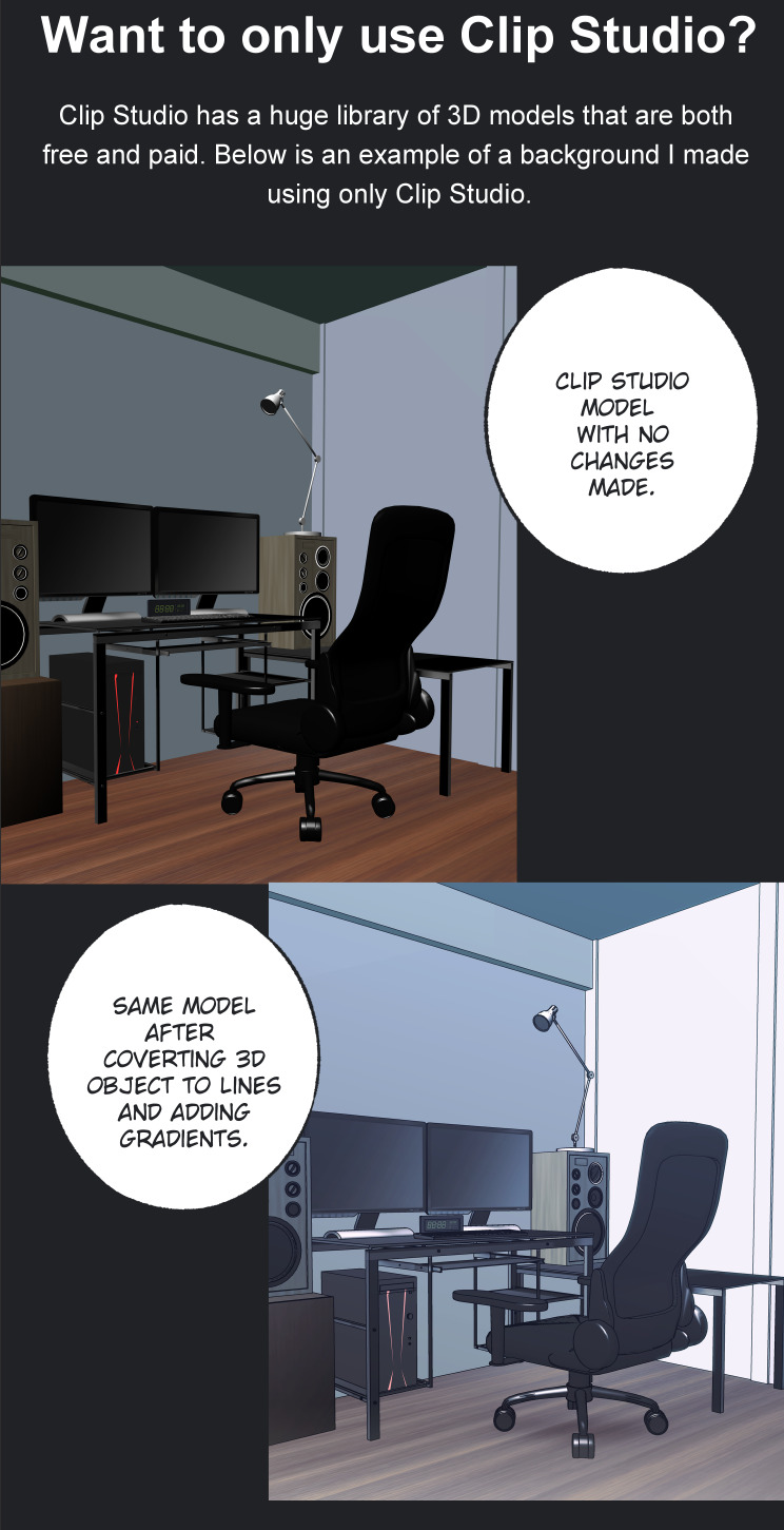
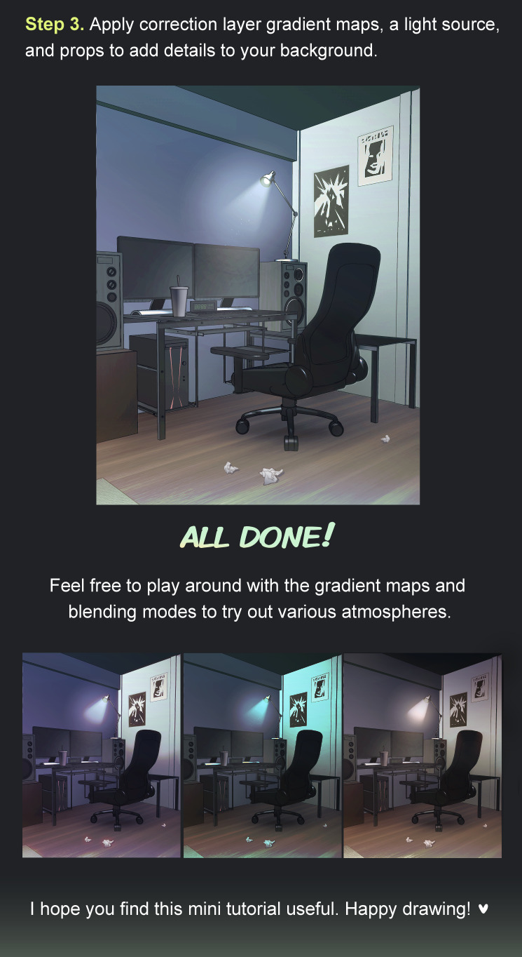
(this question is for mun) I've been wondering for a long time, how do you make your backgrounds? they look so realistic?? do you use some kind of 3d/rendering program? or photos? I too use clip studio paint, but I would have no idea how to make the backgrounds look as perfect and realistic as yours😳

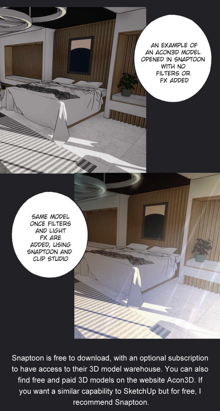

Snaptoon:
https://www.acon3d.com/en/toon/product/1000007186
https://snaptoonwarehouse.com/snaptoon/snaptoon_en.php
Acon3D:
https://www.acon3d.com/en/toon
Clip Studio Assets:
https://assets.clip-studio.com/en-us/
Mentioned auto actions:
https://assets.clip-studio.com/en-us/detail?id=1901436
https://assets.clip-studio.com/en-us/detail?id=1989728
https://assets.clip-studio.com/en-us/detail?id=1990089
https://assets.clip-studio.com/en-us/detail?id=1936799
https://assets.clip-studio.com/en-us/detail?id=1989165
365 notes
·
View notes
Text
[APOLOGIES FOR THE DELAY- check end notes for explanations- example images should be coming in future edits]
alright, another week has passed, another anatomy class was attended. this one was actually a lot more vague than the previous, with a lot of notions previously mentioned coming back in a way or another, and based itself a lot on showcasing examples. i wasn’t able to take that many “concrete” notes this time unfortunately, but i can still distill what i have written down.
anyway. here goes:
SCENE O-2: BLOCKING IN SHAPES
repeating once, when in front of your support of choice, whether it be a sheet of paper, your sketchbook or a digital canvas (or anything, really), there is a certain series of events leading to the existence of a drawing. these events are influenced by our own personal methods when drawing, such as how you start, what do you always draw first, etc. often these are patterns you follow without noticing.
once you’ve noticed your own patterns, you may start to question them. if you always start by drawing the head, ask yourself, why do you do that?
these may come from a more subconscient part of yourself. maybe that’s how you’ve always done it, maybe you saw an artist you love do it once and that affected you so much you now do it too.
an interesting exercise you may want to do to try and break away from these habits is starting to look at the world through different filters of perception (as mentioned in the previous post). teach gave us the example of looking at strangers in the commute with a single point of view: only focusing on their ears, their nose, maybe look at them like colored shapes. (if you do not commute/use a public transports system regularly, i suggest you try looking for references online, whether they be youtube videos or life model sites like quickposes or lineofaction. these two will be linked below.)
but, in any case, during this class (the one i am attending, i mean), there is one big first step which is: drawing the whole model in its simplest form.
usually, when doing just that, there are twoe factors to keep in mind:
Composition
Setting things up
to start, let’s talk about composition.
when composing an image, yet again, you have to think about certain factors (subfactors of factors! wow!). these generally are:
the 2D-3D perception of your drawing
knowing how and where to place your drawing within your canvas
negative spaces and the void
when drawing in structures (aka using inner “skeleton” lines at the very start) the drawing itself is existing only within a single dimension (1D). when drawing using “shapes” (aka at least three points connected to each other) the drawing transforms to become 2D. 2d adds a dimension of “thickness” to the piece, since you’ve now added a new dimension.
seeing the world in 2d is similar to seeing it like certain painters do: with the aforementioned “shapes” now colored flat, before starting to add in lights.
when drawing, proportion checking is actually done in 2D, and not in 3D (as you might, maybe think). think of it as very simple forms bound by lines. adding in volume is a very risky move, since it adds the notion of distance (“what is closer/what is farther away”), which can be too detailed for the simple block-in stage.
when thinking about this, you should also think about where you place your drawing within your canvas. when you are drawing, you are composing an image. drawing a character close up and standing in the bottom right corner of the page gives a whole other impression than if you were drawing it small, in the middle of the page.
when creating images, these images usually have a meaning, and this whole meaning and wanted feeling you want to transmit is heavily affected by composition.
when a more “academic” artist first thinks and thumbnails their piece, they may think “where will i place the horizon line?” which in itself is the very first step of composing your drawing.
the way you place your horizon line gives away most, if not all of your intentions with this piece.
finally, “void” and “negative spaces” in a drawing are part of what makes it legible and interesting. it is heavily tied to the concept of “silhouette”, and, with good placement within the canvas, adds a lot to the piece. but when drawing a model, these “negative spaces” are here to help you draw the correct proportions: the triangle formed by the arm and elbow when a hand is placed on a hip, the space between legs when the model is standing up, all this should be taken into account when drawing.
but, when drawing, you should pretty much mostly worry about drawing the “general shape” of the model, but accurately, as always, which in turn transforms into a general view of your drawing. in terms of additional things you may want to do when thinking about the composition and proportions of your drawing, you can always
try drawing “over” your model (simply put, hold your pencil over the model while trying to see important lines to draw, whether they be action lines or countour lines)
thumbnail your drawings using your fingers (putting them in a square shape framing the part you want to draw) or a template (like a card that’s been gutted to form a thumbnail viewer)
if you want to transfer your drawing to another surface, you can trace a grid over the sketch and use it as a guideline for the transferred piece (this technique is called “mise au carreau” in French and i cannot for the life of me find the english term, i’m afraid). this is a technique that’s been used since pretty much the beginning of “western fine arts” (aka stuff from the Renaissance era).
now, let’s get to the meat and potatoes:
setting up your drawing
when setting up your drawing, the ideal should be to do so with as little lines as you can. this can prove especially hard, especially when drawing a model from life.
what you can do is stop seeing the model’s body as a body, and more as a series of geometric shapes set one next to the other. (this does sound fairly dehumanizing, but don’t be afraid! the humanity should still exist within the shapes you draw, and will appear even more once the proportions are corrected and the details are added in.) the moment you add another line, you are adding in measures, proportions, and direction to your drawing.
your base should have a limited number of lines, but, as always, they should be proportionally accurate.
“i am simplifying and always checking my shapes”, pretty much.
(i think i am going to make you hate the concept of proportional accuracy with all the emphasis i put onto it… sorry!)
a small tip when drawing these shapes: draw them lightly! the block-in should ideally be very light for the later parts to be drawn with more force. (teach compared it to an architect’s plan, but i yet again cannot attest to the validity of this claim as i completely lost interest in architecture the moment i found out about Bravely Default and how cool the Job designs were. anyway,)
alright, so the rest of my notes are mostly about “mistakes you should avoid”, and given this is coming from only one person, whose ideas are being transferred by another (who is obviously much less skilled) to a post to be seen by others, you can see that this can rapidly become an opinion-piece about “what is good in drawing and what is wrong” (you know, kinda like youtube thumbnails with two drawings, one “bad” and one “good” posted by certain art youtubers…you know what i mean, right?)
so, i am going to share them, but do keep in mind that these are even more subjective than anything written before, so, as always, take them with a spoonful of salt.
so, these are:
drawing using very short lines, the kind that makes for a “hairy” looking drawing
pushing too hard on your pencil (see the paragraphs above for reasons, with the added reason of being really hard to erase afterwards and often leaving a dark mark after having been erased the best possible)
relying solely on lines for proportions, aka using one line as a reference, then adding up more lines until you think you are done, which nets you the risk of having a badly proportioned drawing by the end. (this is something weirdly common when drawing as a whole, but that especially shines when drawing architecture, in my own experience both drawing and looking at my classmates’ drawings).
fuzzy/blurry lines, which can strip the drawing of precision, adding noise where it isn’t needed. this doesn’t really apply if you only draw over the line only a couple of times, or is rather moderate, doing so has its own name in French which is a “repentir” (masculine word, i wonder if there is an English equivalent. “repentir”, aka repenting your other line with a more accurate one. “repent motherfucker!” )
a final note that i think is worth sharing is this one:
there is a whole system of proportional setups, multiple methods, but the more important thing is
i understand what i am doing
well, that should be about it for this week (or rather last saturday, oops). for some reason i have gotten exhausted these last handful of days, and i don’t even know thanks to what god i was able to wake up to attend class this week. it was only the second, too!! really would’ve been upsetting if i couldn’t have attended. but it didn’t happen, fortunately. next week should be about correcting your mistakes and proportions.
and, just like last time, all these notes are from a class by Mr. Francis Buchet i am attending to at the Académie de la Grande Chaumière. if you live close to/in Paris, i suggest you look up what classes he is going to be teaching, as a live class is always a lot better than simple notes written down by a student.
and, may i remind you (again): these notes are only here to showcase one approach among many others, so they don’t mean much in the grand scheme of things. i myself am in absolutely no way a professional, so please, take all of this with a grain of salt (or a spoonful, even). draw how you enjoy drawing, and find happiness in the way you want to draw.
Francis Buchet's instagram: x
[NOTE: this was written last weekend, in the hopes of being posted during a weekday with some added visual examples, but due to school as well as health related issues (physical exhaustion among others) i couldn't get to draw said examples in time, so i decided to just go ahead and post it without any and add them later via edits. is this a good idea? no, but i do not think i can give good examples when my shoulders feel like they'll drop from my torso. i cannot say when part 0-3 will be posted but i hope it will be quick. exhaustion is a bitch but i hope i can still manage eventually.]
24 notes
·
View notes


Text
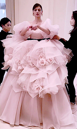
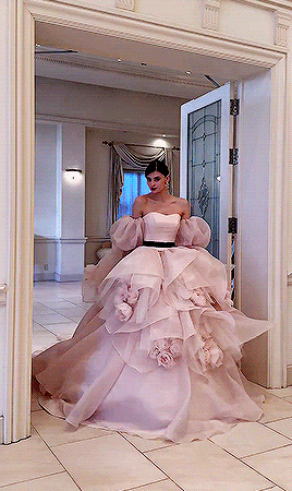
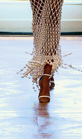
KIYOKO HATA Couture 2023
if you want to support this blog consider donating to:ko-fi.com/fashionrunways
835 notes
·
View notes
Text
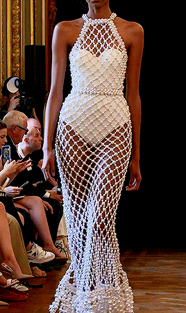
TAMARA RALPH Couture Spring/Summer 2024
if you want to support this blog consider donating to:ko-fi.com/fashionrunways
2K notes
·
View notes
Text
How To Price Your Artwork and When To Raise Your Art Prices
So I get asked this question a lot, “How much should I sell my artwork for? and When should I raise my prices?” Now, this is a pretty tricky little topic, but I think for beginners this article might really help you out and get you through the first couple of years when trying to sell your artwork and for how much.
These are 12 things to consider about the prices of your art and when and how to raise prices.
MAKE A QUALITY ART PRODUCT
UNDERSTAND THE COST TO MAKE YOUR ART
HOW MUCH EXPOSURE YOU HAVE CREATED
HOW MANY ART PIECES YOU MAKE AND SHOW
YOUR AUDIENCE DETERMINES YOUR PRICES
RAISE YOUR PRICES EVERY YEAR
YOU CAN ALWAYS RAISE PRICES BUT NEVER LOWER PRICES
OK TO BE A STARVING ARTIST… FOR A LITTLE BIT
SHOW YOUR COLLECTORS WHY YOUR PRICES ARE GOING UP
PRICE YOUR ART TO BE ABLE TO BE IN AN ART GALLERY
ITS NOT YOUR MONEY
ADDING PRINTS AND REPRODUCTIONS
youtube
MAKE A QUALITY ART PRODUCT
You can’t charge a ton of money for a piece if it’s not really finished that well or, it’s just kind of in that beginner stage or poor craftsmanship. So, you know, you need to have your name on there, title of the piece written on the back, ready to hang a finished quality, something that you just something that you ran out of time on. This is going to play a big role in what the buyer is going to see and how they’re going to value your artwork.
UNDERSTAND THE COST TO MAKE YOUR ART
The cost to make your art is important. If it costs you $100 to make it, you don’t want to sell for $80. You also might not be able to sell it for $3,000. So you kind of have to figure out where a little happy medium is. If you spend $50 in paint/materials, selling at $100 is great. Yeah, you might get not that much money for your time, but we’re talking about those early steps of getting out there, start establishing prices and figuring out what it costs you to make it and what the collector will pay for it.
For me, my work is really expensive to make and it’s very time consuming. So in the beginning when I was charging not very much, maybe $80 for an 18 x 24" original, I was losing money or barely breaking even. But I was able to sell a lot of pieces, gain experience from practicing sales, and getting exposure. I was also getting feedback from collectors, I was able to keep the art business moving forward, even though I was making very little profit. But the knowledge I gained from that time and confidence i got was priceless.
® Retail: cost of art online, in galleries, at art markets and festivals
(W) Wholesale: The amount of money the gallery will give you for your art.
(M) Manufacturing Material Cost: How much it costs to make art, cost of materials, studio space, etc
(L) Labor in Hours Making art: How many hours to paint your artwork
(CL) Cost of Labor: Up to you but be real and start as low as possible.
(S) Selling Labor: How much time do you spend on selling your work, art festivals, galleries, online, instagram
(P) How Much you would like to profit. Its ok to not profit for a little bit while you grow your business. Don’t quite your day job
R = W x 2
W = (2M +10%) + (L x CL) + S + P
Use this equation or one like it (I’m not a math expert) to figure out your prices. You will see your retail goes up real quick the more you cost per hour gets as well as when you start having to wholesale to the art galleries.
HOW MUCH EXPOSURE YOU HAVE CREATED
Another thing to consider is how much exposure you’ve received. If you’ve gotten articles written about you, if you’ve done a lot of art shows, if you’re showing your artwork in galleries, art festivals, coffee shops etc, all these things help contribute to how much you can sell your art for.
It always goes up in slow steps. So don’t think that you got one article you can triple your prices, you really want to inch your way up. How much exposure you have does play in to how much you can charge for your art, but at the end of the day, if you’re not selling, your art is bad and or your prices are too high. Slow and steady wins the race. Exposure is great but also be careful. If someone asks you to do a project for free, but the “Exposure will be great for you” I would say that is often not the case. Exposure for you is only good if it can result in sales, traffic to your website, or get new collectors emails.
HOW MANY ART PIECES YOU MAKE AND SHOW
How many pieces do you make? if you only make one or two pieces a year because you’re kind of just a hobbyist, you’re going to have a hard time raising your prices, or getting the prices you think you deserve. People want to collect from an artist who is committed to the art game.
The more art pieces you make, the more you’re going to be able to show, get feedback on them, sell them. All of this is going to help you raise your prices. If you only make ten pieces total, it can be really hard to charge a lot for them. Make more art. Get more experience. Show more art. Slowly raise your prices.
If you’re making hundreds and hundreds of art pieces, it becomes easier to charge higher prices for them. And a lot of it just comes from confidence of having experience, being written up in magazines, doing art shows, selling art, and doing all the stuff that helps give you the confidence to raise your prices. You get more the more you make. The more you make the better you get at it. The better you get at it the more you can charge, the more you charge the more you can spend on making better art. It fuels itself.
YOUR AUDIENCE DETERMINES YOUR PRICES
It’s not just how much your artwork cost to make, it’s if collectors are buying it. Your audience and the people collecting your work determine how much your artwork is worth. You may think it’s worth $10,000 and your mom does too, but that’s not what people are willing to spend on your art, at least not yet. The collectors determine how much your art is. If you start selling your artwork at a price point where no one’s buying it, then your cost is probably too high. The audience really gives you the feedback of what you’re able to charge. That is why you need to get out there and start showing and selling your work. Start low, start humble. Slowly raise your prices when you can t keep your art in stock. Selling out means that you’re doing something right. Don’t raise your prices the second you sell out. Be busy, stay busy, get over whelmed with too much demand. Be back ordered for 6 months to a year. Then raise your prices 10% then stay busy for 6 months then raise them again 10%. Slow and steady if you are busy.
RAISE YOUR PRICES EVERY YEAR
I generally raise my prices every year. Every six months we kind of increment our way up to higher prices. Now you don’t have to double or triple your artwork price every time. Doing small increments along the way can help you get confidence and raising prices your prices at a steady rate like 5% or 10% is a safe number that wont discourage collectors. Try 10$, try 25$ a little bit can make all the difference. Now you can buy that expensive brush, or buy 2 canvases for everyone you sell. Every penny helps move the needle forward.
YOU CAN ALWAYS RAISE PRICES BUT NEVER LOWER PRICES
You always can raise your prices, but it’s really difficult to lower your prices. Spend a year not making much money on your artwork, but able to grow from there, versus trying to come in hot and being like, “This piece is $700”, but no one buys it. Then next time you’re at a show, you’re like, “This is $600” and then no one buys it or the people that are looking at your work and having interest but your prices going down. This is not a good sign in my opinion.
I think you should start low, sell your artwork, get it moving, get practice selling it, get practice with the collector, closing the sale, doing all that and then you can raise your prices. People often overestimate what they can do in a year and they underestimate what they can do in ten years. So don’t think of this as a short term thing. If you want to be a professional artist, you’re going to be doing this the rest of your life.
OK TO BE A STARVING ARTIST… FOR A LITTLE BIT
It’s okay to spend a year in that sort of starving artist situation, but remember, that’s just a phase of being an artist, and it’s usually in the very beginning when you’re figuring out how much to sell your artwork and you might not be making very much money or just breaking even. But you can grow from there. The more artwork you do, the more shows you do, the better you’re going to get at it. Don’t let the starving artist persona define you. People want to see their favorite up and coming artist succeed. They will be happy for your success because it will confirm what they believed. That you are a talented artist and they made the right choice in rooting for you.
SHOW YOUR COLLECTORS WHY YOUR PRICES ARE GOING UP
It’s going to be hard for collectors to see the value in new higher prices if you don’t improve. Always be improving your work, getting better at it, making a better product for collectors and the art galleries. If your art is improving, getting better, quality is going up, more exposure, better art booths, your confidence is growing, you are becoming a better all around artist, the collectors who have been watching you will take notice and see the value in your art prices increasing.
PRICE YOUR ART TO BE ABLE TO BE IN AN ART GALLERY
Art galleries generally take around 50% of the total sale. So if you get into a gallery, you will want to raise your prices up. And you also don’t want to compete with the gallery, you don’t want to go to an art festival or art market and sell your prices at wholesale, or less than the art gallery is selling them for. If you do, you’re going to burn that bridge real quick with the art gallery and probably not get into any other art galleries in that area, why? because all the art galleries talk to each other. It’s a small art community, so play it safe. be cool, the only person who is going to get short changed is you.
You’ll have to sell all you artwork at. the same retail price as the art gallery, no matter where your art is, even online. Getting into galleries is a good way to help you raise your prices and help you gain more confidence when you’re selling at those higher prices.
Now, you won’t be making the retail price of $300 out of the gallery, you’ll be making $150 from the gallery. So it’ might be a little pay cut from what you’re used to making at the art markets, but you’re in a good position to grow and start raising your prices. Now more people will see your art and getting more collectors interested in your work.
ITS NOT YOUR MONEY
When you are pricing your artwork, it’s important to price your artwork in a way that it doesn’t deter people from buying it. Remember that it’s your not your money that’s being spent. Often when you’re starting out as an artist, you’re often pretty broke. So $500 can seem like a fortune to you. But for someone else who owns their home and has a steady income and they want it, art makes them happy and they love looking at it on the wall. $500 isn’t that much. Remember it’s not your money that is being spent on your artwork. Collectors have a different relationship with money than you do.
A good way to price artwork is going to Art Fair and look around and see what other artists are charging. If you’re going to go do an art festival, it’s great to have seen that art festival before. Find out the prices of other people. Try to figure out where you sit in as a new artist. It’s it’s really good to have an understanding of what people are selling around you. It’s going to give you a really good baseline of where you should start out. It’s okay to go to your first show and sell your artwork for rock bottom prices and sell out your work. You’re going to be so stoked.
Yeah, you might just break even, but when you’re a beginning artist it is a huge win. It is going to give you confidence and motivation to keep going and to get better at it and work on it and make more artwork.
ADDING PRINTS AND REPRODUCTIONS
Adding reproductions to your your line of artwork is a great way to increase how much money you’re making. Start raising your prices is when you have another product to come in behind it and help support those lower, more affordable price points. If you start selling matted prints, you can raise you original prices. If you add aluminum or canvas giclee, you can raise your originals. It’s great to have artwork in all the price points for collectors to become fans no matter what their budget is.
FINAL THOUGHTS
If you dedicate yourself and work your butt off and get out there and start showing your work, start low, work your way up, you’ll be as surprised of what you can achieve. And it doesn’t happen overnight. It doesn’t happen in a year. It takes a couple of years to get to a point where you’re starting to be confident in your shows. But you have to start somewhere. Start now, find out the closest and cheapest art craft fair, art market you can get into and sign up. You’d be amazed how quickly you can go from your first art fair to making $50,000 a year selling your artwork.
If you dedicate yourself and have a lot of discipline in how you approach your shows, your artwork and just learning about the business in general, you’re going to find that it goes really quick. Be prepared for that. It’s super fun and I wish you the most of luck.
27 notes
·
View notes

Text
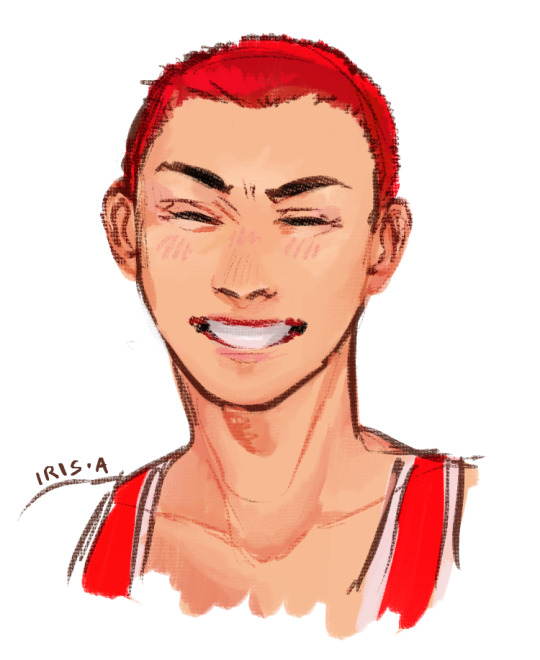
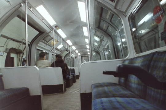
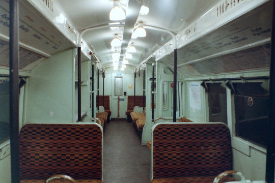
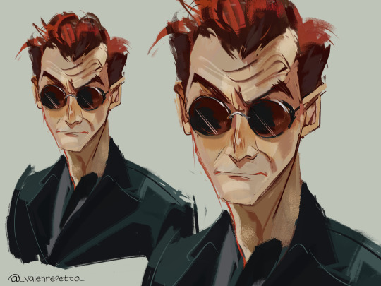
a silly doodle of blorbo while i was taking a train
#slam dunk#sakuragi hanamichi#hanamichi sakuragi#mine#he has a gigawatt smile and i rly like it so i drew it#.fanart
9 notes
·
View notes
Text
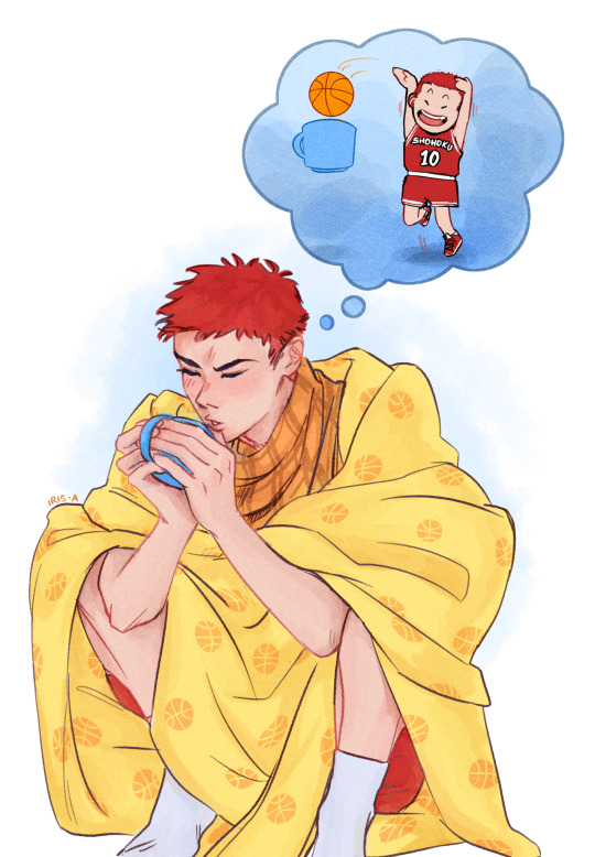
drops this here and runs
actually wait i need to add some context.
he shoves his hands in his pants all the time, and i read somewhere that it's to warm up his hands?? so it would be nice if, while he's in rehab post-canon, he could stay cozy in the evenings. keep the baby warm.
the blanket and scarf are gifts from the gang (i hc that they get him anything even vaguely basketball-reminiscent to cheer him up while he's not allowed to play as much).
#slam dunk#sakuragi hanamichi#hanamichi sakuragi#it's been so long since I posted art that i forgot my own tag system#.mine#mine#???#anyway shoutout to rose-colored-sd for making some absolutely slapping SD fanart that made me break out of my 1.5-year art block and go#“fuck yeah i wanna draw a sakuragi hanamichi looking cute and warm too”#his hair is longer as per the epilogue#but ig in his mind nothing about him has changed#(actually i just forgot to update his chibi design)#my favourite part of this was actually manually drawing the little basketballs all over the blanket. can i like. just do that for a living?#.fanart
58 notes
·
View notes


Text
Actually, here’s a piece of artistic advice. Having a tummy. A soft stomach. Having that is really not an exclusively fat body trait. And most body types are just going to have a some fat on their stomach and have a tummy. This is completely normal and common and healthy. And yes I’m absolutely fed up of seeing people drawing bodies completely devoid of fat and soft muscle as much as they can be, so I think more people should get comfortable with depicting body fat. Small and even skinnier body type does not mean no fat. Stop being scared of drawing fat at all. Get comfy with it.
I will even provide some tips.
Here’s a decent starting point for references of some bodies you may be unfamiliar with depicting. There’s just a lot of pictures this photographer takes of various models in different poses that you could benefit from working with.
For drawing body fat try to avoid using perfect circles. It gives the fat an almost stiff and stretched look and it’s not great. Consider gravity and use more sagging shapes. They’re going to be more rounded triangle shapes than circles, honestly.
Draw in a coffee shop or library sometime and just let yourself look at other people around you as you do. You don’t have to draw them if you don’t want to. It’s just good experience as an artist to let yourself be inspired by being around what you hope to portray well.
1K notes
·
View notes
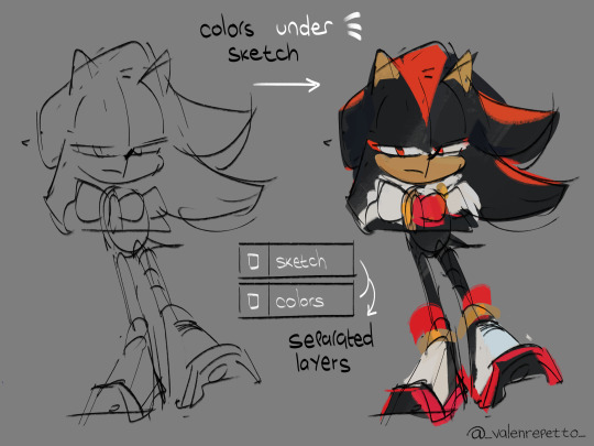
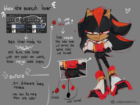
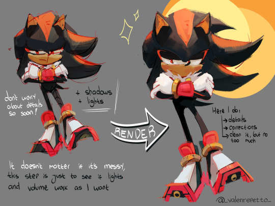
Photo
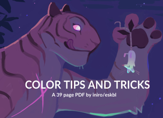


my color tips pdf is now available ! i had a lot of fun with this, i hope you enjoy ^^
BUY HERE or HERE
51K notes
·
View notes
Text
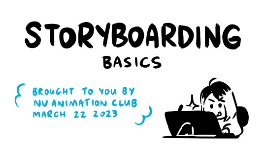
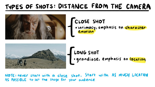
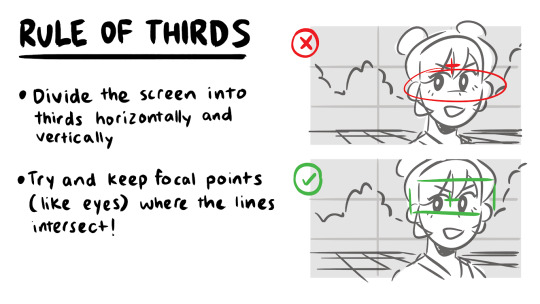
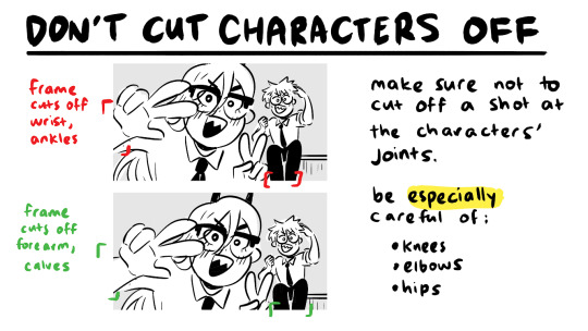
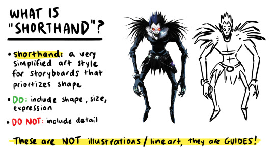
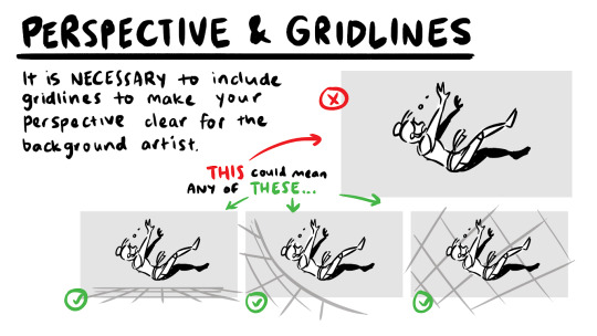
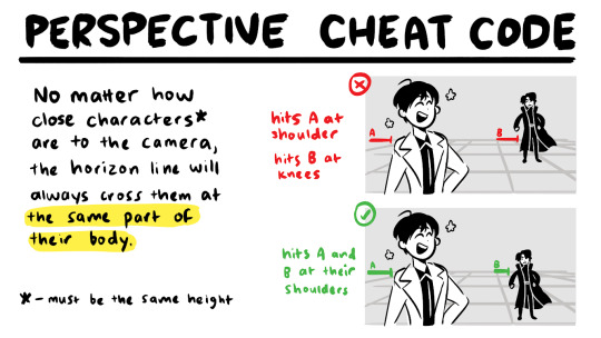
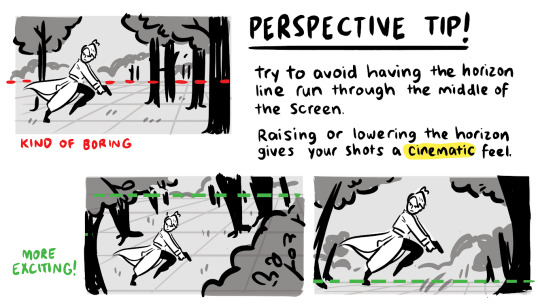
a couple snippets from a presentation i gave at school this past week on storyboarding!!
‼️DISCLAIMER: I am a still a student and have only worked on student and indie projects! This is just stuff that I personally find helpful as an amateur, so feel free to take it with a grain of salt!
Happy boarding, friends! ✍️💕
58K notes
·
View notes
Text
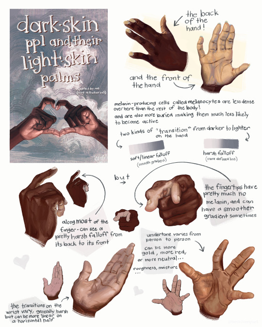
this is not a tutorial this is just me rambling
21K notes
·
View notes