hannahallcrofthicks
My Fashion Blog
Foundation fashion blog
76 posts
Don't wanna be here? Send us removal request.
Last Seen Blogs


Text
FAS3001 resubmission blog only:
Beginning this module I was tasked with creating a look book, this is very important as even though I want to become a fashion designer, I should understand and have experience with trend forecasting and presentation.
What is a trend and what jobs are related?
A trend is a subject that is changing and developing into a direction (forward).
The role of a trend forecaster: Identifying and predicting trends and how they can change a certain industry along with analysing and collection of consumer data (purchases, searches and reviews). They use this for marketing purposes along with recommendations within the industry.
I have used the trend forecasting platform WGSN to pick a trend for my look book, my choice was Connected -Peak Performance-S/S 2022 womenswear. -Joining future technologies and past insights to create a united and more intelligent world.-
I decided to choose this concept as the pandemic is still a massive problem and the fact that people are fearing for their lives because of this, we are all effected and all have the same fear and responsibility to protect yourself and those around you. I want to look into the design and function of fashion to see if there is anything I can create or share that can help the prevention/protection from the virus.
Peak performance is the trend I will be focusing on, the concept is centred around the aftermath of the pandemic and the need for performance and protection. This would mean that lightweight silhouettes would be ideal with detachable accessories and full body protection will be integrated. Antimicrobial and thermoregulating fashion along with sustainability is also to be considered when thinking about protection. These are essential as we are in the middle of a pandemic, a deadly one. We need this protection, you need this protection.
My choice of colours that I will be mainly representing in this look book will be: Fiery orange, pink amethyst, black, turquoise tonic and rabbits paw brown. My reasons for choosing these colours is to represent the danger of this pandemic. The turquoise is to hint towards the hospitals that people have to check into because of the virus, the orange is to enhance the sense of danger that lingers in the air and the brown and black represents the death that has been spreading across the world. But the pink is there as a buffer to create a soothing and relaxing elemeent.
My choice of fabrics: PCM (phase-change material) would be really good to use as it allows the fabric to become thermo-regulating creating thermal energy storage and allowing the wearer to be comfortable in different environments. Dyeing fabrics can be done with bacteria, Faber Futures are developing a way in which bacteria (like streptomyces coelicolor) can be directly applied to the fabric reducing the amount of water needed (proven to reduce water use by 500x than with normal dyeing processes) and no chemicals are used. Mycelium textiles are also very good to be looking into, Aniela Haitink (founder of NEFFA) has developed a fabric that is grown from mycelia (roots of mushrooms). This not only skips the need for spinning yarn, weaving and cutting patterns which reduces waste, but, reduces waste of resources like water, land and transport. These fabrics don’t need to be thrown out either, all you need to do is just bury it and it decomposes. There is also insulation properties to this fabric along with being fire resistant and naturally anti-microbial and it’s even lightweight!
Juun j -fall /winter 2020. The use of leather and full body protection definitely influenced me with my designs and how I wanted integrated accessories like a face mask or gloves. The models almost look like martial arts masters and it made my mind think of protection and defensive qualities of clothes and how the body moves, making me consider 4-way stretch fabrics.
SWOTO- Mercedes-Benz fashion week. Protection and camouflage plays a big role in the designs within this show, motorcycle suits and jumpsuits look like that have been combined and it was an interesting concept to me. I also love the ‘stormtrooper’ type look that has been presented and I felt that it could be a very good way to incorporate lightweight frame with heavy duty protection.
Christopher raeburn - turning waste into fashion Raeburn produced a line of protective style clothing made from recycled materials and using that to help the advertisement of the products. Not only does the concept overlap with mine but the colours pallet also does, the collaborations with Timberland also made an impression on me. I thought the craftsmanship and aesthetic of this designers products are breathtaking and I was very influenced by him. However, I wanted a more feminine look so with my designs and look book I wanted a skintight yet defensive sort of vibe.
Sustainability: steps taken to try and avoid the depletion of natural resources and to maintain environmental balance for not only our generations but for the future as-well so they have the same opportunities and resources that we have. The three principles of sustainability are the economy (profit), society (people) and the environment (planet). However, interest in sustainable fashion is not as high as it needs to be. People opt for fast fashion and don’t really consider the lifespan or the environmental impact of these products. Manufacturers need to be ensuring that all parts of the production chain are in acceptable and fair working conditions, efforts need to be made to put a stop to sweatshops and unfair treatment of the workers. But this raises prices, and people aren’t quite ready to swap the cheap fast fashion with the more expensive sustainable fashion, even if the lifespan of the products last far longer. Social advertising could also be a way of improving sustainability by not using billboard advertisements or newspaper/magazine advertising. Recycled packaging should also be used as it can be recycled again and again eliminating the need for more unnecessary pollution.
Circular design is also a good way to help ensure that designs are as sustainable as they can be. There are four processes that go into circular design, Understanding: we must understand not only the consumer and their needs and wants but also the needs of the environment. Define: we need to define our wants and needs. What the designer wants and needs for the design, what the consumer wants and needs and the economical and environmental needs, we need to see what we can trade in and out in wants and needs to create the most sustainable product. Make: Ideas, designs and prototypes will be created in this section so that the designer can alter and change the product. And finally release: the product is released and this is where customer and business relationships can be built.
Evaluation: my look book is not the best, I wasn’t able to use InDesign which is a shame but I left it too late and realised that I couldn’t actually use it as the device I was supposed to use didn’t have a creative cloud downloaded and no room to download anything else anyway, however, this is now irrelevant. I messed up and left it too late but that’s what mental health can do. I try to push at the best work as I possibly can but I feel like my downfall is my mind, and this pandemic certainly doesn’t help. I chose to go the direction I did because I want us to be free, I want us to be able to use the amazing technologies and discoveries with one of the first things you see when you wake up, fashion. I want you all to know I tried, really hard with this project. I combined my own designs with other designers work that compliments mine. I wanted the pages of my look book to be what you’d imagine a post apocalyptic world to look like. The way that the women are posed and even what they’re wearing, however, I feel like I should have limited the amount of colours I used as I feel like there may be one too many colours being used and the continuity is muddied a little. I also neglected to add emotive text!There may not be many pages but I hope that the quality can outweigh the quantity.
I felt like my idea of a post-pandemic apocalypse would be a fun way of showing how people created mass panic thinking the world was going to end, ever since the year 2000 there has been groups of people saying the world would end in various ways.
The ‘Y2K bug’ caused mass panic when people thought that computers from around the globe would malfunction and fail and cause the end for the population. 2001 had been predicted to end because of The war in Armageddon, a huge battle in Israel. 2003 was thought to be the end when Earth would supposedly crash into Planet X! 2006 held a fear of nuclear war that would end us all. 2008 there were concerns over the Large Hadron Collider would create a black hole which would destroy the world. 2014 was predicted to be the start of World War III, 2015 was said to host a particularly bad solar flare that would melt through our ozone and leave us with horrible consequences. 2020 caused mass panic when the corona virus was thought to mutate people into zombie like creatures along with a second prediction of World War III being instigated by Donald Trump. I wanted to showcase what it would have looked like had the 2020 doomsday prediction come true.
0 notes
Text
FAS3000 resubmission blog only:
This project is not for the faint of heart, I’m sorry but it’s not. It focuses on the violence and distress of the world today. But it also focuses on my life, the people in it and the surroundings I’m so familiar with.
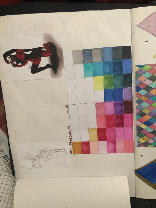
For my first page I wanted it to be an informal introduction to who I am and the brand that I have created. I wanted to have mostly gold on the first pages as I had to wait for materials and tools to arrive. However, the gold is still relevant as my colour story for this project is gold, black, red and pink. My reason for me choosing these colours is they are all favourite colours of mine plus I have an unhealthy obsession with Harley Quinn, hence the black and red. The pink is also used as my hair is pink so I see this colour multiple times a day!
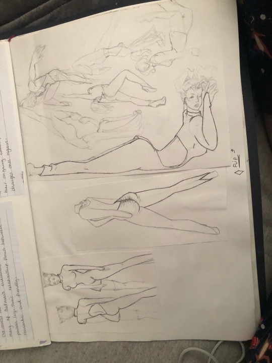
I also did a sketch of myself (from memeory) so if it looks off, it’s because I didn’t use a reference picture.
The symbol in the middle of the page is my brand logo along with my signature on every page to show that it is all original work that belongs to me.
The second page has my continuous line sketches and some quick 1 minute drawings too. Some blue colours pop in and out of my sketchbook to pay homage to Harley Quinn’s Suicide Squad look. I have also chosen the letter ‘X’ to represent the phrase ‘no face no case’ which I heard through people talking and is also mentioned in Smuggzyace - Just Do It (YouTube). We were also instructed to not use words within our sketchbook. I did break this rule a few times throughout the sketchbook but this was because I needed the extra push so people could understand what the story of my project is. I did refrain from adding the whole phrase in and instead opted for initials to be used (NFNC). What I want to create is a collection of my experiences, but not just physical. I wanted to showcase my mental state and how I think, how I perceive people as we never really know anyone. We only see what they present to us, the face is taken out of the picture as eyes can be seen as windows to the soul.
The third page has another quick sketch along with a more detailed and scenic sketch, I have used Washi tape to decorate the empty spaces on the page and to stick the photographs down as I didn’t have a glue stick at this point (I was still waiting for the order to arrive). I tried to make the colours match to my theme as much as I could, I also masked the faces to also keep on track with my concept. I chose to focus on the female body for this portion as I knew I wouldn’t be including other females as I don’t connect with females as well as I do with males. So the only female I could include was myself, and I feel I know myself so I allowed my face to be shown.
Onto the fourth page I have introduced the ‘NFNC’ initials along with blocks of colour that match my theme. I wanted to have a little break within my sketchbook to allow for there to be variety in the placements of my work. I didn’t have any samples up until the next page as I didn’t want my pages to be too bulky and I wanted to get my sketchbook as flat as possible to prevent warping the pages and samples. Unfortunately, I didn’t manage to avoid this entirely. But I feel as though it adds to my work by making it look a slight bit disheveled.
Here on page 5 is where my samples start to play a major role in my work, I used disperse dyes to create the images I want onto paper and then heat press them onto fabric. I tried to experiment with placements and overlays and wanted to create an almost grungy type look to my samples.
Carrying on through to page 6 I have more printed samples along with a 3D painting, I made this by adding thick layers and letting them dry completely before adding more layers. I wanted this to look like the X is drawn in blood as I want to emphasise the violence that can occur within gangs and territories. Gang related violence is a massive issue, not only for the members of said gangs but also their families, the public, everyone is and can be a target.
Moving through to page 7 I have made a drawing of a person masked up with a balaclava and wearing gloves holding an outline of a gun to avoid any identifying information ( not a drawing from a reference but from my imagination). Along side this I have a drawing of a bullet to reinforce the danger element. On the next 5 pages I have my primary photographs of the mandem (friends), I wanted a natural look to these photos in the poses but when I edited them I wanted a more intense vibe so I chose to stick to mainly grey scale and highlights of colours.
Following these pages I decided to mix both samples and photographs in my pages. This is where the attitude and vibe ramp up really expressing the messiness and violence of being on road (this means people who are out in public either selling or on other gang related activities). I rely on sublimation printing, embroidery and knitting. I am very angry with myself though, I did have more samples like weave and more prints, however, they have decided to disappear and I couldn’t find them in time to put them into my sketchbook. I had also made quite a few mistakes on some samples and decided to not add them or layered and built on top of them. I took inspiration on how to place and build into my work from different artists and different things. The artists I took the main inspiration from is Sebastian Herzau who also uses coloured strips of paper and tape to cover identifying characteristics in his photographs. Top Boy (Netflix show) has also heavily inspired my theme as it focuses in on gang hierarchy and activity.
I have also added headlines and newspaper stories of what has been happening in the world, what they feel is important and how the media can influence the public. I have used the same tactics when picking which stories I wanted to showcase, I picked the stories that lines up with my concept. This then paints the media in the way that I want you to see them. It’s one of the oldest forms of propaganda, manipulation. I thought that it would have an impact on how I’m trying to convey how we never know the full story. Even when we are confident that we have seen something with our own eyes, our brain lies to us. For example: if you look side to side quickly it will look like a fluid motion in your eyes, but our eyes focus on one or two points along the way and make up the rest based on the surroundings. Or a better way of getting my point across, you can at all times see your nose. Our brains just ignore and erase them!
When looking back over my work, I feel like I should have definitely created more art and samples as it’s hard to see what my concept is, I wanted to create a visual book, a book that shows the horrors of this day and age. But also how we dress them up, how we present a version of ourselves to the world that isn’t true. But I also wanted to show the true horrors that happen everyday. I didn’t want to design an outfit for this project, I wanted to create a physical piece of my history. What I have seen, what I have heard and what I have felt. I do however, feel that the mood I am trying to create with my work is being successfully acquired. I could have also used different location imagery like Handsworth with the AR12’s and B21’s gang members located there. But this would have been very dangerous so I refrained. Instead of taking inspiration from fashion designers I wanted to take inspiration from how people in my daily life present themselves, their fashion.
0 notes
Text
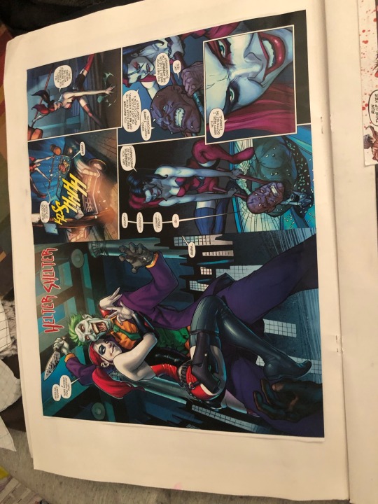
This project is very personal to me, like I have mentioned I do have a borderline unhealthy obsession with Harley Quinn, but it’s because off the places that Harley has been and where she’s going. A fantasy comic speaks to me on a personal level, I have been around toxic people and being in blind love, but that’s not me anymore. So I’m making Harley in a way that no one has seen before, I’m making a me that no one has seen before!
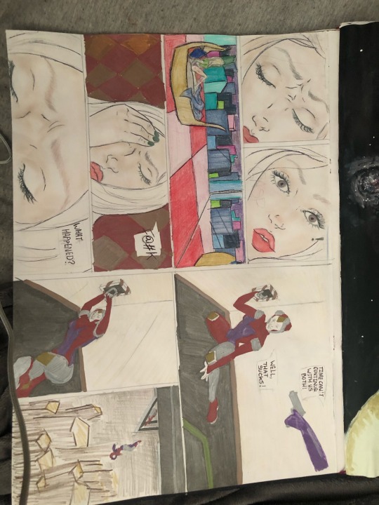
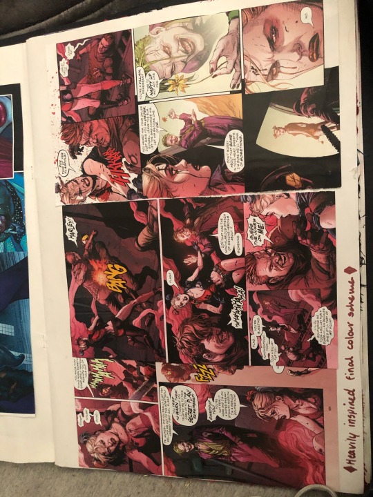
I knew I wanted to create a new Harley, but I also knew I needed a back story, a reason for why she’s there. So I created a comic just like the ones that helped with my inspiration, but with a story I made. It begins with Harley waking from a blackout, confused, broken legged and woozy she tried to remember what happened. Her memory is fuzzy causing her memory to be patchy, not even fully formed. She pulls the release lever causing another Harley who has a gun to her head to be sucked out of an aircraft, but then Harley begins to lose her grip on the lever and she gets ripped out too. They free fall into an alien atmosphere fusing together from the heat and chemicals before crash landing creating the Scandalous Harley.
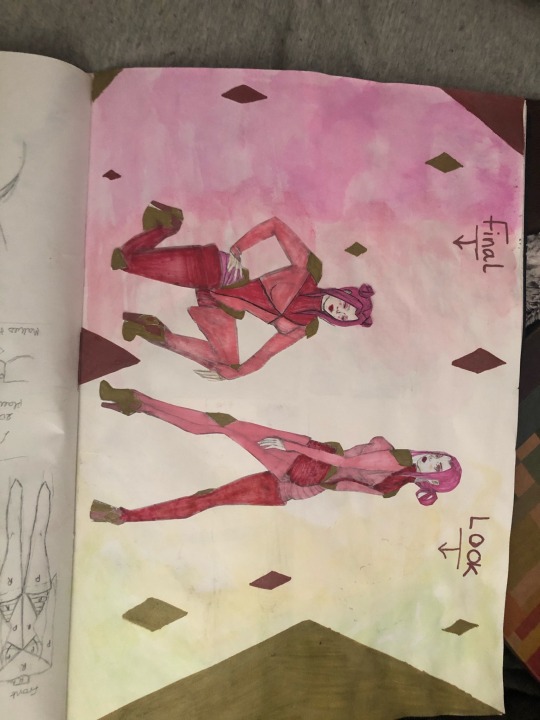
When making the comic I felt that the drawing part was great and I was very pleased with it but when it came to colouring it was difficult because of the way I was trying to convey her memories not being whole made the comic look confusing. I would definitely make more comic strips to allow for more frames to help the story move along smoother if I had the chance. When researching for Harley Quinn I had a lot of material at hand, I have many comics and I had seen many of the movies and played many of the games so I wasn’t short on imagery and inspiration but I also looked into futuristic rooms and clothes as I needed them for help in my comic. I feel as though I should have looked deeper into futuristic outfits as I would have liked Harley to have more of an alien look, but if I was to do that my garment would lean even more into the costume category when I want a look that you could almost walk out the door with.
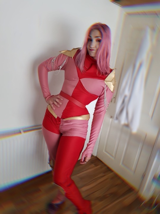
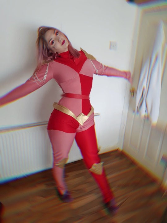
I wanted Harley to feel sexy yet like a boss and feel powerful when wearing the costume and that’s exactly how I felt when I wore it too! I decided to work with red, pink and gold because red is one of Harley’s main colours, pink because my hair is pink and I wanted a personal touch to it and gold because it compliments both of those colours better than silver does in my opinion but I did add a little silver under the shoulder pads to create a glistening armour look. I wanted her to look like a self proclaimed space warrior!
0 notes
Text
When making the final garment I came into many problems with the fit and it took me days to get the fit right. However, because of my misjudgment with the purchasing of fabric I wasn’t able to have the leg portions of my garment the way I wanted and imagined. Nevertheless, I feel as though it still looks good and I’m happy with it!
When making my patterns I was able to trace a size 10 leotard, trousers and sleeves. I then adjusted the patterns so that they would fit me as I was going to be modelling it. I also had to take measurements of my knees and shoulders in order to cut the faux leather in the right shape and scale. In my opinion I feel as though this has been one of my most successful patterns and garments as the seems and points all meet up the way I wanted, I feel very proud of what I have made. By far the hardest portion of making the garment was attaching the hip accessories as I had to make sure that the fabric underneath could still stretch so I could actually fit in it!
I did make one big mistake, I wasn’t able to manage my time in a good way which in consequence, left me not able to see the garment together with a machine so I resorted to hand seeing as neatly as I possibly could making sure to back stitch to ensure the seems would be strong enough.
0 notes


Text

The final memories are of her letting go, them just before they fuse together in the sky above a lake on an alien planet. Until she finally crash lands brand new.
0 notes
Text

For the first few frames I wanted her to be waking up and confused, not knowing what happened but as she thinks deeper she begins to remember snippets hence why the backgrounds aren’t fully formed as her mind has been altered. The colours have also been changed as she can’t remember what happened clearly but she remembers fighting....herself! She pulls the lever before she can shoot herself sucking her double out into space but she starts to lose grip.
0 notes
Text

I wanted my Harley’s to be in space when I drew my comic cover because I knew I wouldn’t be doing it in the comic but I wanted to convey that they’re on an alien planet, so I didn’t include earth except I drew the milky way in the background. I still wasn’t 100% on what I wanted my final look to be so my outcome doesn’t not look like this.
0 notes

Text
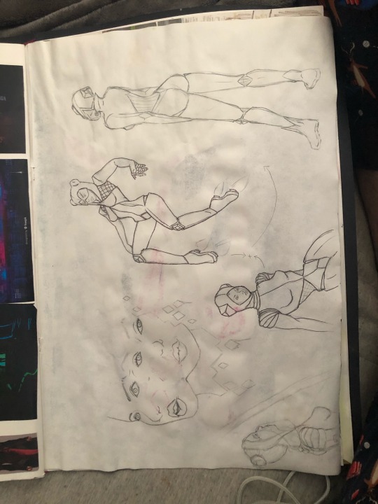

When preparing for my comic I sketched a few drawings to help me pin my ideas down and I also gathered a few photos to help me with my futuristic inspiration.
Sources from top: anasasghar.artstation.com
https://www.wallpaperflare.com/sci-fi-women-warrior-armor-battle-cyborg-sword-woman-warrior-wallpaper-sofql
https://www.farpost.ru/vladivostok/service/education/art/kurs-koncept-art-personazha-vo-vladivostoke-65089301.html
Mangaziezz.blogspot.com - sci-fi concept bed room interior modern style 3D rendering
Mangaziezz.blogspot.com -Wip sci-fi bedroom polycount
Pinterest - Darkbutterflyz fantasy clothing design outfit ideas
Mangaziezz.blogspot.com -Bedroom sci-fi white image photo free trial big stock
https://franciszek.artstation.com/projects/qng9R
Tumblr_pa9k8cLXLS1xwkd02o1_1280 cyberpunk city
https://www.freepik.com/free-vector/futuristic-city-skyline-background_4358912.htm
0 notes
Text
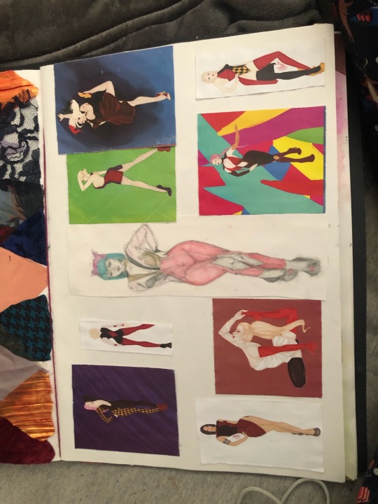

When I designed my first designs I felt that they were more Harley than Hannah and my tutors picked up on this too and encouraged me to push my designs out of that territory. I then thought to myself that they weren’t spacey enough for me, I wanted her outfit to look like she could be the highest of status anywhere in the many of galaxies. This is when I knew I wanted to create a jumpsuit but I just had to find the right look that I want.
I didn’t feel like these were space age enough so I decided that I’d lean towards more of a battle suit look. Plus I was also trying to be inspired by my chosen colour pallet was a design can be destroyed by using the wrong colours in my opinion, so I wanted to make a garment that both suits Harley and her chosen pallet and my space themed armour.
0 notes
Text

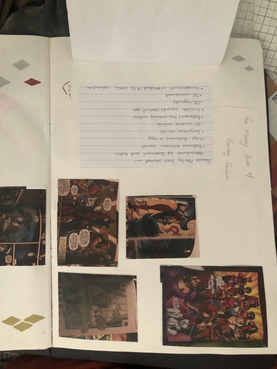

Film/Tv appearance: Gotham, teen titans go!, ready player one, birds of prey, the Lego Batman movie(s), DC super hero girls, Batman: the brave and the bold, the Batman, justice league action, Harley Quinn: birds of prey (and the fantabulous emancipation of one Harley Quinn), suicide squad, suicide squad: hell to pay, suicide squad: Arkham asylum, Batmanninja, justice league dark: apokolips war, Batman: the animated series, Batman beyond, superman:the animated series, static shock, Harley Quinn, the new Batman adventures.
Games : adventures of Batman and robin, Batman Arkham series, Lego Batman trilogy, injustice series, DC universe online, Batman: the enemy within, suicide squad: special ops, DC legends, DC unchained and scribblenauts unmasked: a DC comic adventure.
0 notes
Text

I wanted to recreate my favourite comic cover art as I felt it would help me when I create a comic cover for my own when I create Harley’s new story!
0 notes
Text


I looked through different colour combinations that Harley has sported, I looked at screenshots of Harley’s film/ tv appearances with games that she has starred in. I then had to narrow down my selection as I didn’t want to use so many colours and I was heavily inspired by a certain comic strip that was mainly pink and red!
0 notes
Text

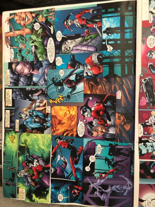
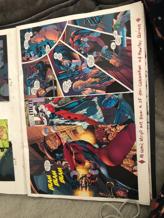
I wanted to show Harley’s personality, her experiences so throughout my sketchbook I have used different Harley Quinn comics as the focal point of my pages. She has many different stories, different lives, different loves, I wanted to give a visual representation of the many lives of Harley before I introduce you to mine! The comics came from the 25 year celebration of Harley Quinn book of which I had two so I didn’t mind that much. This way I can explore different interpretations of Harley along with feeding my imagination for when I create my comic strip.


0 notes