
getinformedbeexcess
Can't pronounce accessibility without excess
1 posts
Don't wanna be here? Send us removal request.
Last Seen Blogs

filmbywallis
Wallis

bethanics
LET THE CHOIR SING.

pokeretiwe
Untitled

the-mjolnir-owner
THE MIGHTY THOR

quranclassescourseonline
Untitled
Text
Accessibility standards in practice
The World Wide Web consortium or better known as “W3” is an international standards organization that governments, businesses and consumers look towards for guidelines regarding accessibility focused website development (Caldwell, Cooper, Guarino Reid, & Vanderheiden, 2008). These standards were named “WCAG2” standards and they were created for the consumers and yet according to the WebAIM’s “million” webpage study regarding accessibility, over “98.1% of home pages had detectable WCAG2 failures!” (AIM, 2020). What are some of the top factors that contribute to this high percentage of failure and why? Are government websites more compliant with WCAG2 than non-government websites? Will a browser accommodate for these lapses in accessible design by overriding some of the features? These are important questions that arise when discussing website design with an emphasis on accessibility and what we can do to ensure accessibility.
“85.4% of pages had low contrast text, 61.9% had missing alternative text, 63.4% had empty links, 56.1% had missing form input labels.” (AIM, 2020), what does it mean when text has low contrast? According to WebAIM, It’s when “contrast is a measure of the difference in perceived ‘luminance’ or brightness between two colors” (AIM, 2018). This perceived brightness is often harsh on the visually impaired as they cannot properly understand information on a webpage, which greatly lowers the quality of the visit. Such violations are overlooked simply because it doesn’t make for a beautiful, cathartic experience which website designers aim for as businesses cater to the majority, for their revenues are dependent on a delectable experience for the majority. According to the World health organization, over 4% of the World population has some sort of visual impairment which clearly puts the minority at a disadvantage (WHO, 2019). To mitigate such a blatant disregard for accessibility, browsers have started to add support for websites that lack high contrast text which makes a seamless transition between low contrast text to high contrast text (Lyles, 2020). This isn’t a permanent fix, it’s a workaround. But how can we ensure there’s no workaround required? That’s something you’ll have to get to the end for.
The rest of the top factors that websites don’t comply with, usually showcase a lack of good development as these issues only occur when designing lacks basic fundamentals. We’ll talk about the alternative text soon, but let’s focus on the very notion of bad development that comes from bad designing. Broken functionality is a major accessibility issue, as major components that are used in websites are dispersed across the internet and it’s very difficult and tedious to ensure that all components of a website work as intended; when they should be. When any one of those components fail to load when a visitor receives a landing page, their lovely favorite browser will trudge on and still display the page but with very little noticeable difference. This trudging on is the reason why such accessibility errors arise, as the browsers are meant to continue until their last breath. Fixing such an issue is futile, unless the web designers put a little more effort into ensuring that all functionality passes the tests and browsers must ensure they don’t showcase the website at all if it’s broken.
Now, let’s talk designers who often overlook the power of text as it has the power to draw a viewer in, if correctly and responsibly chosen for the context the text is written in. The lack of alternative text is astonishing as the most basic task of a designer is to “avoid decorative or overly stylized fonts, which are often difficult to read even for users without visual impairments or reading disabilities” (BOIA, 2017). Some of the best fonts that ensure clean readability are of sans serif aesthetic such as, Arial, Helvetica, Lucida Sans, Tahoma, and Verdana (BOIA, 2017). If that isn’t accessible enough, there are fonts such as, Read Regular, Lexie Readable, and Tiresias which provides aid to individuals with dyslexia or visual impairments. To make matters even worse, these fonts are completely free to use. Of-course, this too can be handled by the browser which is in full support of the minority. But, why does the browser keep picking up the slack of the websites that should be doing it first on their end and then have the browsers as a fail safe?
We know that the government entities are forced to provide an accessible environment of their webpages, how do they rank up in this mess?
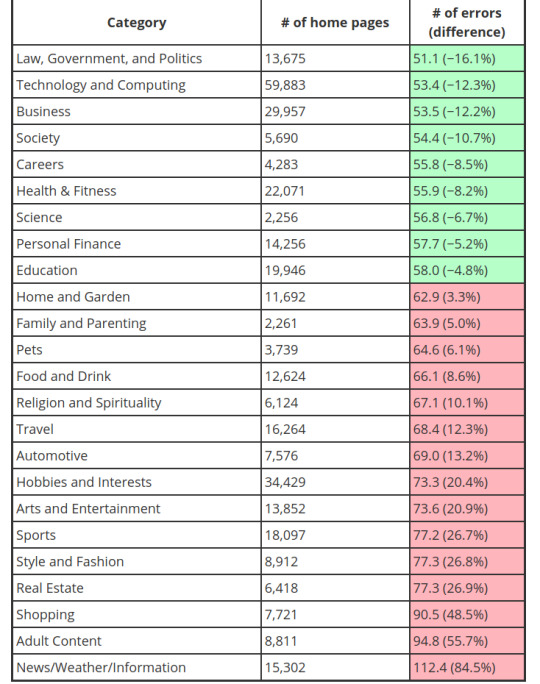
(AIM, 2020)
As seen from the graph, government entities are least worst culprits and every year they do better by reducing the accessibility gap that progressively gets worse for non-government entities. You might ask, why is the government the least worst culprit? Let’s take Canada for example, the Federal Government was sued by Jodhan in a disability discrimination lawsuit in 2012 and won (CCD, 2012). That lawsuit brought forth strong changes in the federal government with how website accessibility is dealt with in Canada, firstly by forcing a default open source framework that the federal government provided for its provincial counterparts and secondly by having this requirement added into the Charter of Rights. This framework that was constructed complies with WCAG2 guidelines right out of the sandbox, which is why if you visit any Canadian government website, the layout, text and color is relatively in the same ballpark. Precisely this type of lawsuit and the need for prevention, caused governments all around the world to be morally held liable for providing the most accessible experience to any and all of its citizens possible. Funny enough, the very needs (services) of our daily lives are improving but the luxury of having the wants (services), is what keeps getting worse.
Since we know that the internet is composed of non-government entities, having this framework be mandatory for all of these outstanding entities would greatly reduce the WCAG2 violations made. How can we make this framework mandatory?
Push for WCAG2 guidelines to be made law for all business and government entities operating in the residing country so they are legally liable into providing an accessible experience, so that these entities don’t earn wholesome, public loving points for choosing to offer a service that should be the norm. As demonstrated, conforming to the guidelines is not hard at all. There are even tools, all over the internet, that will alert you of any guidelines you don’t conform to. If that isn’t enough, pressure the website developers/owners into providing the necessary accessible features.
Change is very much possible if the floor can be turned into money burning lava.
References
Caldwell, B., Cooper, M., Guarino Reid, L., & Vanderheiden, G. (2008). Web Content Accessibility Guidelines (WCAG) 2.0. Retrieved July 28, 2020, from https://www.w3.org/TR/WCAG20/
AIM, W. (2020). The WebAIM MillionAn annual accessibility analysis of the top 1,000,000 home pages. Retrieved July 28, 2020, from https://webaim.org/projects/million/
AIM, W. (2018). Contrast and Color AccessibilityUnderstanding WCAG 2 Contrast and Color Requirements. Retrieved July 28, 2020, from https://webaim.org/articles/contrast/
WHO, W. (2019). Vision impairment and blindness. Retrieved July 28, 2020, from https://www.who.int/en/news-room/fact-sheets/detail/blindness-and-visual-impairment
BOIA, B. (2017). Best Fonts To Use for Website Accessibility. Retrieved July 28, 2020, from https://www.boia.org/blog/best-fonts-to-use-for-website-accessibility
Lyles, T. (2020, March 11). Chrome tool helps developers make websites more color blind friendly. Retrieved July 28, 2020, from https://www.theverge.com/2020/3/11/21174735/google-chrome-dev-tools-new-color-blind-friendly
1 note
·
View note