Last Seen Blogs

ancientsincarnate
Ancients Incarnate

familyismagic
Untitled

thebipolarbisexualnerd
Tarlos makes a pretty good team


bk8clink
Untitled
Text
Evaluation
When we were given this brief I thought it was quite a fun idea that would challenge me a lot creatively. I immediately had some ideas in mind which I noted down at the start of the blog. I’m glad I went with the cooking channel idea because it was simple but I think it looked professional enough to be on tele now. It did take me a while to get going on this project as I was away for a week and we had 2 other projects to think about. I mainly focused on the essay towards the start and then continued with this later on which didn’t turn out too bad because I had the idea in my head I just had to fulfil it and honestly it’s pretty much exactly how I pictured it apart from the logo on the cake kind of messing up.
Originally, I was just going to have the one shot zooming down on the cake however I think it was a good choice to add in an establishing shot as it gives it a bit more of a storyline. I think doing this helps the ident to represent the channel well because it’s actually showing the cake being made. The tests really helped because it meant I could test out camera movements and positioning before going into the final piece.
I’m honestly really happy with how the sequence turned out even though it’s very simple, I think it does the job well selling the channel that it is directed around. I really like how the blurred edges and colour grade turned out. I really want to learn more about colour grading as I think it’s a really fun part of the whole process. It just finishes off the entire thing making it look more professional and nice to watch. I quite like the camera movement as well as it gradually introduces the viewer to the scene in a smooth movement, panning or zooming. I wish the logo on the cake worked though.
I learnt a few things during this project. I think I’ve definitely improved on my colour grading but I’ve also learnt more about filming and how important it is to get the right shot. It took me quite a lot of time actually setting up the scene so it was just right. Clean up wasn’t very fun. Another thing I learnt was different transitions like the light leaks which I really liked and will definitely use again.
The only things I would really change is how the logo looked on the cake at the end and possibly have better slow mo and a nicer looking cake. I could’ve also maybe had a colour theme in the kitchen with more messy items around. The main reason I didn’t do this was because I didn’t want to piss off my flatmates and have to clean it all up. I was thinking about pouring some flour and icing sugar out but that was a bit far.
Some problems I encountered included of course the logo on the cake, which I debated doing again as I know it was because I put too many ingredients on top, but I was running out of time and I thought of alternatives. The main problem was finding the time to do it really.
Overall I think the piece turned out well although it’s simple, I feel it is effective in promoting the Food Channel. I really enjoyed the editing and filming side of this project so I’m still not entirely sure what I want to specialise in yet.
0 notes
Photo

Off-Air Idents
I made sure the social networks were all equidistant. These are my final off air idents for the web banner. I tried to emphasise the social media side more.
I wanted the banners to be more colourful so more people are attracted towards the website.
0 notes
Photo


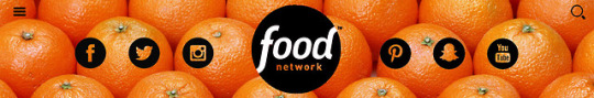
Off-Air Ident
For my Off-Air ident, I chose to do a web banner. This information was helpful when producing the size of the banner in Photoshop.
This is a picture of their current web banner and I think it could be improved a lot.
I think the banner should change depending on which page you’re on so I’ve decided to make 2 banners which are specific to that page. (Healthy)
0 notes
Video
Final Food Network TV Ident
I like how this turned out in the end.
0 notes
Text
Geraint Feedback
Geraint gave me some good feedback and a few pointers to improve on:
Put it in 25 fps.
Speed up the end part.
Animate the logo at the end.
Maybe change the blur on the outsides.
Centre the logo at the end more.
Move in on the second part. I realised this was on my storyboard but I forgot to add it in.
0 notes
Video
Draft 3
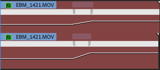
I just changed some little things in this draft like where the logo is and how it appears with the blurred background etc.
0 notes
Video
Draft 2
After thought, the music doesn’t really fit in. I’ve searched for another song and I think I’m going to use this instead:
youtube
0 notes
Video
Draft 1
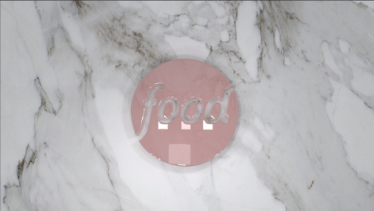
The stencil on the cake didn’t really work out how I planned so I’ve put the logo on top as well so it is obvious what the logo is.
I also don’t really like the colour of the logo, it’s a bit dark and doesn’t fit in with the theme.
However, I do like the colour scheme and the transition between the videos and the slow mo, so I’ll keep them aspects.
0 notes
Photo
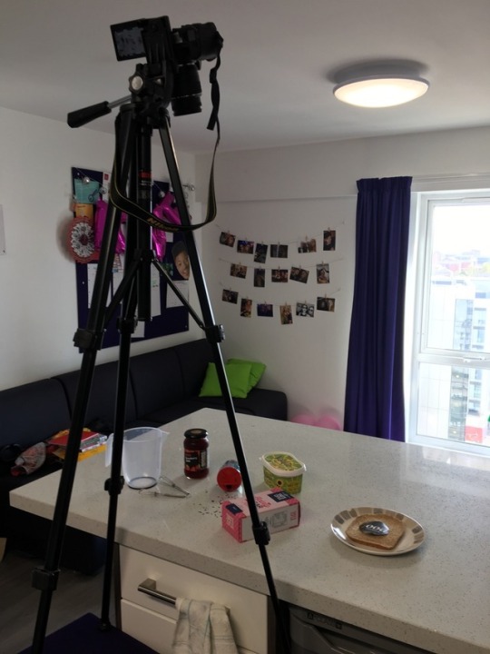
Process
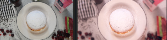
The picture above shows the before and after of colour correcting. I tried to create a dreamy sort of atmosphere and tried to highlight the pinks in the picture because I noticed a lot of pinks in the objects around the cake. I’m really happy with how it turned out. I created the entire ident in Premiere Pro. During the edit I added a fast blur to the edges by creating a duplicate of the layer above and making an inverted mask around the cake. I also needed to slow motion parts of the video. I recorded the video in 50fps and then when I brought it into premiere I looked at the speed and brought it down to 48% in parts:
I also added a VR Light Leaks transition between the clips:

I also added an exponential fade to the end of the music:

0 notes
Audio
I always put this song on when I want to relax so I thought that calming nature could be used in the ident to give off positive vibes.
0 notes
Photo

Storyboard
This is my storyboard for the TV ident I’ve quickly drawn up using word and photos online. I only need to capture two shots for the ident because it’s quite short. The start of the shot would pan across from left to right showing me sifting icing sugar onto the cake in slow motion. Then the second shot would slowly zoom into the cake as the logo is revealed.
0 notes
Video
TEST 2
I tested the slow mo and I quite like it so I think I’ll use it for the final. I also like the panning across. I’ll definitely have to colour correct it so it looks slightly better though.
These tests were really useful because I could see if the icing sugar and stencil would work. It worked okay but I’ll have to make it more clear. I also like the messy surfaces.
0 notes
Video
TEST 1
This is the sort of thing I was going for. This test was hopeful because it made me notice a few things I could improve on.
First of all the quality isn’t great because I had to zoom in on the footage. So for the real thing I think I’m going to change the angles a bit. I also think the cake should end up in the centre of the footage not at the end. I initially wanted to have the sifting in slow motion however my camera only goes up to 50 fps so won’t be that slow but I’ll try it anyway.
0 notes
Photo

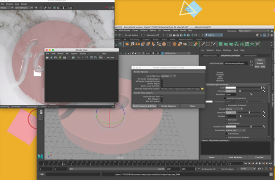


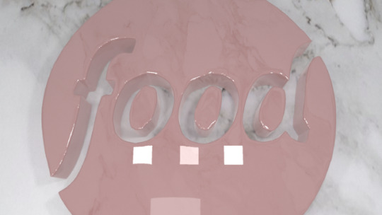
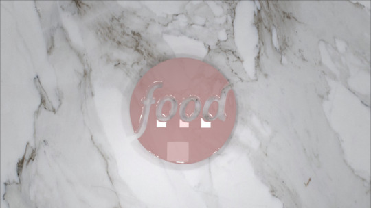
3D Logo in Maya
I used maya to create this 3D logo however I don’t think this is the way I’ll go forward.
Then I tried to improve it with Pete’s help and I think this looks a lot better. I made the logo more smooth and added a shine to it to make it look like icing. I also added a marble table so it looks kind of like a cake.
I had problems rendering it out which is frustrating because I really like how it turned out. I’ll put in some screenshots showing the camera movement.
I did actually really like how this looks however I think I’m going to see how it looks in film as well.
1 note
·
View note
Photo
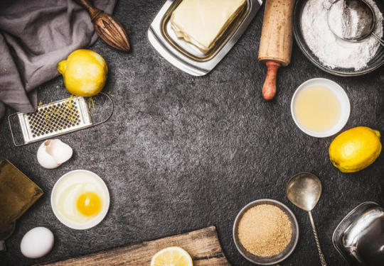
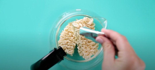
Props
I really like this idea of having other items suggesting baking around the cake so that it isn’t all out of place and it focuses on the cake more. I think they should be in quite a mess as well which could suggest to the viewer past memories of cooking as a child.
0 notes