edencecala
E D E N
RMIT Communication Design Student
28 posts
Don't wanna be here? Send us removal request.
Last Seen Blogs

mutatednationnutrition-blog
Mutated Nation Nutrition

margariemargarita
Veni, vidi, vici.

see-understand
It's the Perks of Being a Wallflower.
dailykamisposts
kami shitposting

strugglingatart
just trying
Text
Reflection
Throughout year 12 VCE, I knew what I wanted to study in university and that was of course communication design. Although I had my heart set on this career path, I was very unsure of what the course entailed and what I needed to know. Since beginning the course I’ve realised that it was in fact a positive not knowing everything about the course as it left some mystery and unknown that was fun to discover.
Before beginning and even after a few classes, I decided on some main goals that I wanted to full fill throughout the course. These included finding myself as a designer, what I’m best at, what I enjoy most…. making new friends…. learn lots and lots about design…. discovering new and innovative ways to communicate design…. and finally to have fun with my new uni life.
Since starting this course I can honestly say that I have reached all my goals but still have plenty of room to grow. With design you can never stop at a certain point. Design is a field of work that is forever growing and expanding and that’s what I love most about it.
My Friday workshops with Karen and Andy have been my favourite classes so far as I have met the best people in it as well as have learnt lots of new tricks and techniques to use in my work. I love the hands on nature of the workshops and find them super inspiring and interesting. The Friday lectures were also a fantastic way for me to learn more about design history and various monumental movements.
Overall, it was an awesome first semester and I’m super excited to journey through the rest of the course. Onwards and upwards…
Thank you so much Karen and Andy, job well done!
7 notes
·
View notes
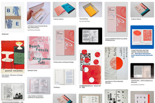
Photo

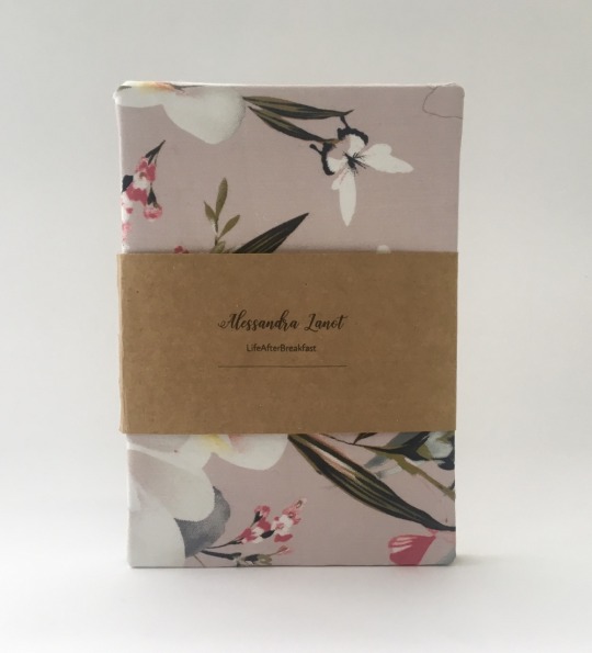
Week 13
The Indesign layout component is done!
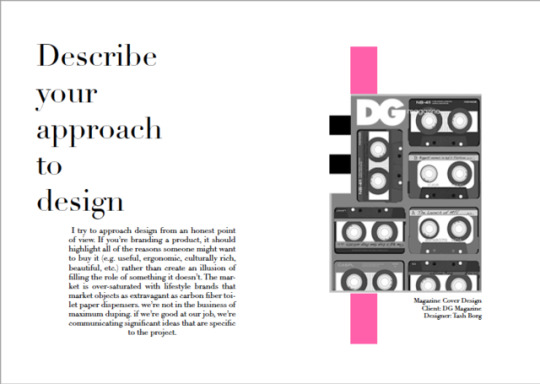
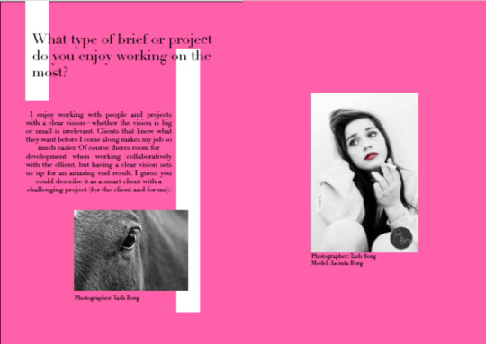
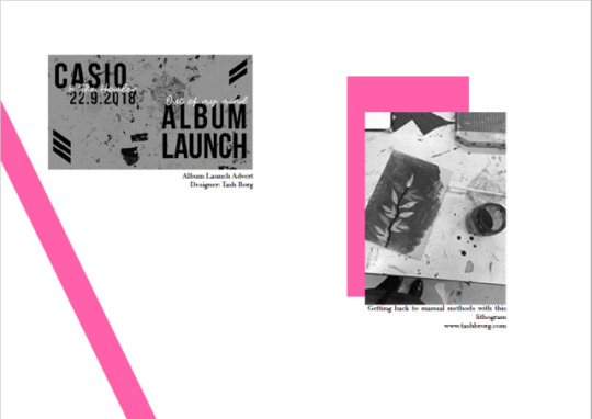
After a lots of fiddling around and confusion with page spreads, I am finally happy with the design. I chose to keep the overall design fairly simple and sleek as my creative has a similar style in her work. I think the pink black and white colour palette really captures my creatives world. She can be serious and professional while also having character and pop of energy.
Now it’s time to head to office works, pint, fold, bind, trim and submit!
I’ve really enjoyed this project as this was the first zine i’ve ever made therefore this process was all new to me. I’d love to further explore the world of zine and magazine design and printing.
Thanks Karen and Andy for an awesome project!
0 notes
Photo


Josefine Svärd on Instagram and Society6
Follow So Super Awesome on Instagram
7K notes
·
View notes
Photo

I never wear my glasses, So this drop shoot was impossible to see. So I decided help out the next batch of students to submitting…. Feed her before Monday, she’s starving.
8 notes
·
View notes


Text
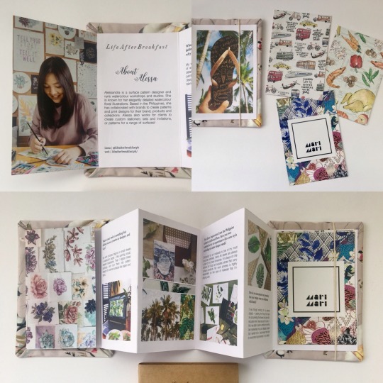
Final work
Zine~

During the process of the third assessment, I did a lot of research explored new ways to make the little publish.
The first step, I find 5 artists and did some research about them, and then, based on my research I come up with 5 questions for each creative.
Finally, I got the permission from a costume designer.
After the interview, I edited the text and because she is a Chinese I also have to translate it.
Since I got all the information I need (Answers and some pictures), I started to think about the form of my final work. During the activities in our workshop, I found that make a zine is quite interesting so I decided to make it.
I chose a style for the zine, (black and white~ Just want to make it cool~)edit pictures and text, I also made some small designs in it, like the small windows.
For what I think is the difficult part is how to place them in the right order and print it! That’s also the most important part i think.
12 notes
·
View notes
Photo
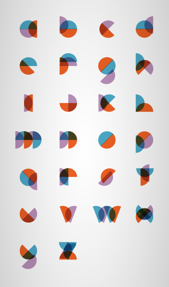
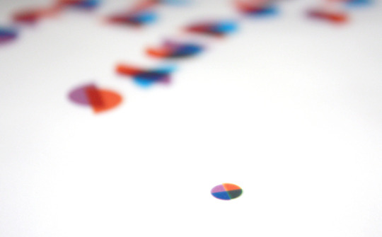

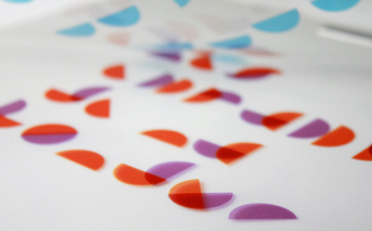
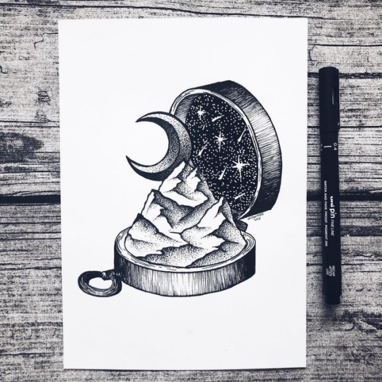
The workshop this week reminded me of a beautiful typeface design by Philippe Cossette.
The slightly opaque nature of the colours is from overlapping pieces of cellophane. I love how each of the letters look very short and chunky due to how crowded the semicircles are. I also think his solutions for difficult letters such as ‘M’ and ‘N’ is very creative.
Source.
43 notes
·
View notes
Photo

Kalemba II - Beautiful Art Print by Willian Santiago Graphic Arts
165 notes
·
View notes
Photo
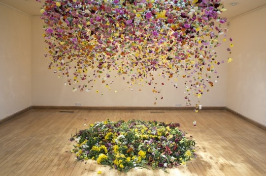

‘The Hated Flower,’ made from thousands of real flowers, by artist Rebecca Louise Law, at the Coningsby Gallery, in London.
3K notes
·
View notes
Photo

Viper Magazine Cover - Kali Uchis #viper #print #magazine #design - Graphic Arts
121 notes
·
View notes
Photo

Eternal Sunshine of the Spotless Mind by Cody Bond - Graphic Arts
170 notes
·
View notes
Photo
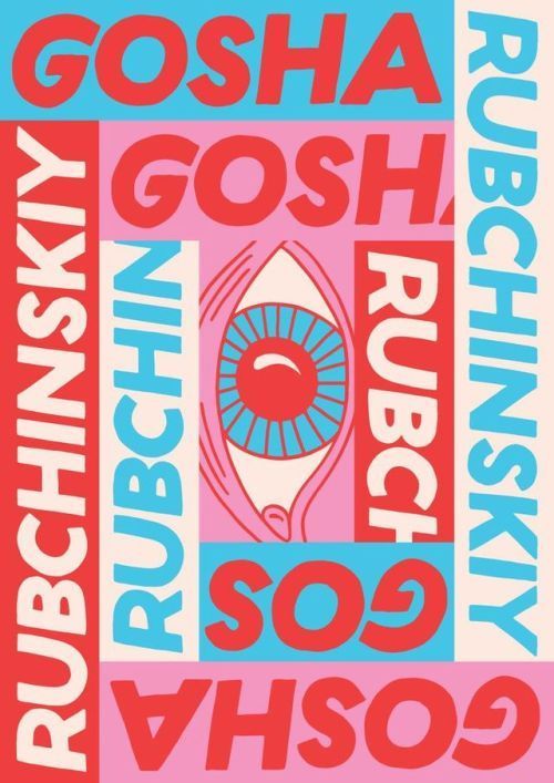
Gosha Rubchinskiy - Eye Poster Print - via DesignClub.net #eye #print #printdesign - Graphic Arts
107 notes
·
View notes
Photo


GRAP2199 | Week #10 | Lecture/Relevant research
11 Design Manifestos You Must Read
1. Ornament and Crime by Adolf Loos (1910)
This is arguably the founding definitive text of design, written so far ahead of it’s time it took until the 1950s and ’60s to see a lot of these ideas become conceptualized. If you only read one text off this list, make it this one.
2. The Bauhaus Manifesto by Walter Gropius (1919)
The Bauhaus Manifesto is layered in design politics and in-fighting of the time, as there were splits in fidelity to the Bauhaus movement occurring frequently. Check out our past post on the Bauhaus Movement.
3. Topography of Typography by El Lissitzky (1923)
Russian artist and designer El Lissitzky was a busy man, working under Kazimir Malevich he created propaganda for the USSR and was integral to the Bauhaus controversies being declared “un-German”. He was also incredibly talented, and his writing on Typography as a kind of architectural form is a must read for the Typo-nut in you.
4. First Things First by Ken Garland and co-designers (1964)
Ken Garland’s succinct manifesto is filled with brevity and lofty wit. Created with his co-designers (and co-signers of the manifesto), this is guaranteed to inspire you when your client-liaison isn’t going so well.
5. Ten Principles for Good Design by Dieter Rams (1987)
This beautifully designed manifesto is sure to delight. It’s to the point, clean, and literally practices what it preaches. It’s so sparse and minimalist, it can also be read as a kind of new-wave spiritual guide on how to live your life, which is you know, handy.
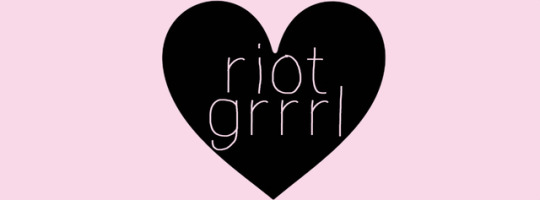
6. The Riot Grrrl Manifesto by Kathleen Hanna (1991)
Riot Grrrl feminists created this manifesto in the early nineties, and it reads as a brilliant product of its time. It was necessary for it to be written then, and still necessary to be read today. It’s fun, sassy, and most of all inspiring (to everyone, feminist or not), to get out of your comfort zone and create great work.
7. Incomplete Manifesto for Growth by Bruce Mau (2000)
If you’ve ever been stuck in a creative rut, this is the manifesto for you. It lists practical and metaphorical ways we can grow, perpetually as artists. A lot of Mau’s ideas are taken from John Cage and the Black Mountain School artists’ ideas about creativity, and he intertwines these ideas flawlessly.
Read it, you reap what you sew!
8. Designers Against Monoculture by Noah Scalin (2001)
This was written in response to a perceived “monoculture”, or uniformity in visual culture found in the post-Y2K, post-heroin-chic-craze of the intense 1990s design aesthetic. It’s interesting to find a manifesto that identifies the way design shifted in the early 21st Century and is proactive about changing the status quo.
9. Draft Craft Manifesto: On Making and Consuming Things by Ulla Engenström (2005)
For anyone who has made anything ever, by hand (so everyone), this is an insightful and bold manifesto dissecting craft culture. Put your hot glue gun down and immerse yourself in Ulla Engenström’s brilliant ideas.
10. 1000 Words: A Manifesto for Sustainability in Design by Allan Chochinov (2007)
This elegant and sophisticated manifesto on sustainable art and design for the future is essential reading. In just 1000 words, we’re transformed into a place of recontextualizing and re-grafting our design goals to meet the need for environmentally aware design in every work we create.
11. Towards A Minimal Model For Publishing & Design for the modern tablet, mobile and web (2012)
This rare nugget of gold has been written specifically for the future of publishing and design. It acknowledges that how we receive most of our information has changed to screen-based interfaces, and argues that good design needs to adapt (minimally) to this new, permanent shift.
Beth. (2013). 11 Design Manifestos You Must Read Today. Retrieved from https://blog.redbubble.com/2013/10/11-design-manifestos-you-must-read-today/
12 notes
·
View notes