Text
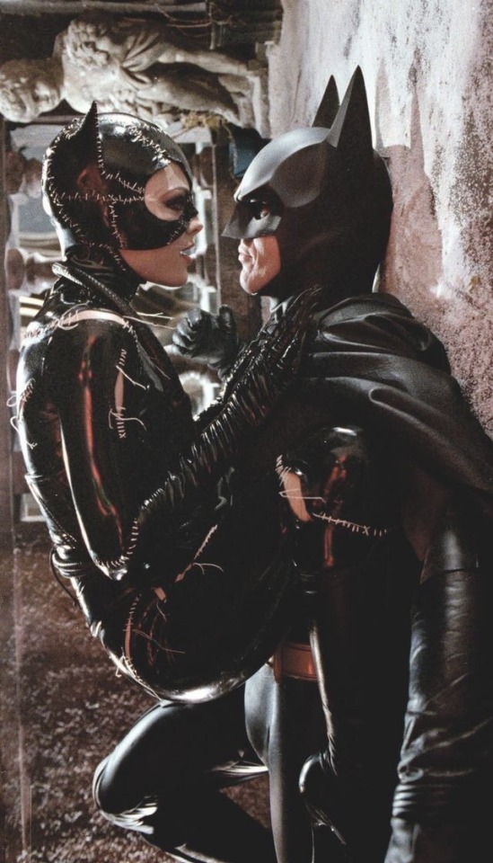
This is such a gut punch especially coming after Conroy's incredibly moving personal story he was able to tell this year and the waves of support he received after coming out. More so than the definitive Batman he was just an incredible performer and person, an inspiration to voice actors everywhere on what it means to breathe a soul into your work. Just, goddamnit man what a loss. Rest in peace.
359 notes
·
View notes
Note
I've always been super partial to the secondary colors design (green scars, purple/orange suit), too! I would like to add though, re: realism, that acid burns CAN stain skin green. If you have the stomach to google chromic acid burns, you can see real-world examples of that effect. (I've also always just liked the weird sort of logic that "acid green" would result in comic book green scarring, but I digress). One of the other "realism" things that has bugged me over the years in regards to Two-Face's design (but only in stories where acid is the cause of Harvey's scarring), is when the artist makes the scarred side completely hairless. Acids don't dissolve human hair instantaneously. You can watch YouTube time lapse videos of how long a clump of hair being left in a beaker of acid takes to break down. So, I always prefer acid-scarred Harvey to have hair on the left side as well! (And always justify it by saying, well, that side wound up turning white from the "shock" -- not that's realistic, but it at least has enough literary antecedents)
So which Twoface scarred design do you like based on anesthetics the most? And any theories about the variety of colors, like do any play into color theory or any meaning, or are just limited to printed color limitations/artist sole interpretation?
This would have been a much shorter answer if you hadn’t added the second part. But I’m glad you did, because I love talking about this shit!
While I do have certain… shall we say, opinionated preferences for my ideal design for the scarring, my taste is dependent on SO many different factors. Since you brought up color limitations, let’s start there, because that speaks to a certain aesthetic of Two-Face that I love.
First, let’s talk about the basic design, the gold standard of the Golden Age. The very first appearance of Two-Face has served as the model for how the scarring's looked ever since. The iconic features include a permanent snarl, a bulging eye, a wilder hairstyle with differently colored hair, and different coloring from his unscarred flesh. Every version of Two-Face since has either followed or subverted this original depiction.

(Note: I could also go on a whole tangent about how this design MAY have been based on a poster for the 1941 film adaptation of Dr. Jekyll and Mr. Hyde, which I’ve recently had reason to suspect may be bogus for reasons related to the complicated history of Batman’s supposed “creator” Bob Kane, but that’s several other essays worth a material. And that’s not even taking into account who actually drew this original comic, whether it was the credited Kane, or Jerry Robinson and/or George Roussos. The history of Golden Age comics is rife with controversy, plagiarism, and bullshit, with Batman being no exception.)
For roughly 50 years, this was, more or less, the standard version of Two-Face. Even as DC evolved through different eras of “House Styles” where all art had to maintain a certain consistency, this design underwent very little variation over five decades. While his scarring would occasionally be depicted as gray or off-purple or even flesh toned, it usually stuck to the original choice of green.
Why green? Why would a man who suffered an acid attack have green scarring? Putting aside questions of realism (which have little place in the world of comics), the reasoning was tied to those specific issues you raised about printed color limitations. The history of comic book coloring is absolutely fascinating, when companies had to rely on printers to produce the cheapest possible product on a regular deadline.
These printers (supposedly backed by organized crime) published comics on newsprint with the four-color CYMK color model, and comic artists had to work within these limitations. This led to some interesting color-coding for heroes and villains in superhero books, with the heroes depicted in primary colors like red, yellow, and blue, and the villains being depicted in secondary colors like orange, purple, and green. As you’ll note, Harvey’s design uses all three of those secondary colors, appropriately enough for a man obsessed with twos.
To this day, these colors are what are used for classic, “retro” depictions of Two-Face, which you can still see on merchandise today. As such, I have great affection for this basic design with these colors, especially when they appear on newsprint with the visible newsprint dots.Over the past couple decades, we’ve seen comics companies reprint these classic stories with cleaned-up, “remastered” artwork. As time has gone by, I’ve come to dislike this treatment of older comics, which were specifically drawn for a period where coloring and printing options were strictly limited. Removing those limitations with computer coloring only seems to make the linework appear more dated, at least to my eye.
For example, take one of my personal favorites, the third chapter of “A Lonely Place of Dying.” On the left is the current, cleaned-up version, while the other is a scan from a long-defunct tumblr user jthener-comics-vault who emphasized the newsprint dots and yellowed newspaper.
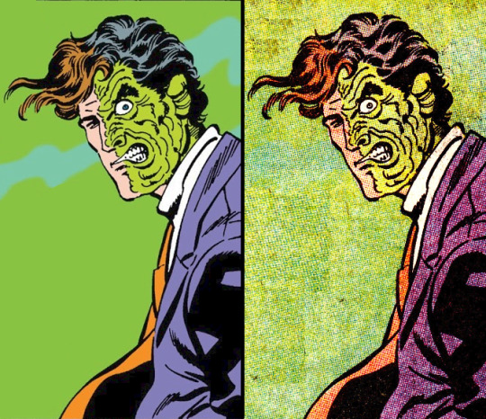
Some may prefer the version on the left, but I strongly prefer the version on the right. There’s just so much more aesthetic appeal with the second version to my eye. The version on the right looks dated, while the version on the left looks timeless because of how it embraced a certain retro aesthetic. Your mileage may vary, but that’s where I’m at with my taste preferences.
(See also: the recent revival of interest in CRT TV screens with classic video games, discussed in this popular post about how games were designed for the limitations of older TVs, and how current pixel graphics don’t look right in comparison. Given how there’s now a whole Reddit community dedicated to CRT TV pixel graphics, I’d love to see people embrace classic comics in the same way. But alas, the people who care about such things are literally a dying breed, as most comics fans seemingly don’t have much interest in anything beyond the past decade or so.)
So if you’re talking purely aesthetics within the classic limitations of comics, I consider the version on the left to be my platonic ideal for a perfect Two-Face. It’s not because the linework of the scarring is anything special (as much as I worship the late, great Jim Aparo, his Two-Face scarring looks like Harvey dipped himself into some creamed spinach), but because the scarring fits the overall aesthetic of the printing techniques of a bygone era.
So that would be ONE example of my preferred take on the scarring, with a specific version that emphasizes his classic newsprint roots. But it’s not the only one, because those limitations were soon expanded by the 1990’s, with advances in printing quality and coloring techniques. On top of that, DC started hiring artists for stories far outside their usual “House Style,” which led to all manner of weird and varied interpretations of characters like Two-Face, depending on the story. In fact, his appearance–along with his personality, motivations, and even his own backstory–would change drastically from one appearance to the next. His scarring alone could be green, pink, red, blue, purple, or some variation of the above! And that’s not even taking into account the pen-and-ink linework choices!
This finally brings me to your original question of which version of the scarring I prefer. While I still love the classic retro take on the character as well as stylized “dark deco” versions like his appearance in Batman: The Animated Series, there are certain traits I look for in modern depictions of Two-Face. These preferences were undoubtedly informed by the fact that I saw Sam Raimi’s Darkman as a young teen and fell in love with the prosthetic makeup effects by Chet Zar and Toni Gardner, who created a viscerally horrifying template for what I wanted to see used for Harvey Dent ever since.
So these days, when it comes to what I really want to see in the scarring? At this risk of being too graphic, I like the flesh to be stretched and warped, the lips and eyelids peeled back and exposed. I also STRONGLY prefer there be no clear line down the middle between the scarred and unscarred sides. There should be some sense of integration between the sides, rather than two separate faces–one realistic and one cartoonish–slapped together. Some of my favorite examples include Alex Ross and Doug Braithwhaite’s Harvey cameo from Justice #2 and Brad Walker and Doug Hennessey’s from “Ugly Heart.”
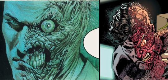
Basically, I prefer a style that’s evocative of movie-style body horror, adding realism without being realistic.He should appear shocking while simultaneously looking like someone who has suffered, and continues to do so. It should compliment (but NOT play up) the good/evil dichotomy, without veering into cartoonishness. Doing that leads to him being treated as more of a gimmick crook rather than a three-dimensional character.
Again, we’re talking my own personal preference here. As a character, Two-Face represents different things to different people. When creating the story Batman: Faces, artist Matt Wagner wanted Harvey’s scarring to be red because it emphasized the “devil inside” motif. For many people, Two-Face is a character who conveys the evil within normalcy. Fair enough.
But for me, I like red because it looks like exposed flesh and tissue, emphasizing the raw pain Harvey has and must endure. I prefer when the scarring emphasizes tones of flesh and blood, like reds, pinks, and purples. I loved the blue scarring of Batman: The Animated Series on its own merits, but it only works within that specifically stylized “dark deco” context.
And when it comes purely to linework design, I think my ideal model would be the work of sculptor Andy Bergholtz, who not only designed a bust I will never afford despite dearly wanting, but who also created an incredible pumpkin carving of Two-Face which, weirdly enough, endures as one of my favorite depictions of the character.

Notice how Bergholtz doesn’t draw a distinct line between the two sides, but instead shows how the flesh stretches and warps from one side to the next. It looks painful, while also being perfectly integrated with the rest of the head. Hell, even the choice to go with the classic green coloring works, because of how it looks sickly and gangrenous! It still looks fleshy, even with the comic-book-y coloring choice!
These sculptures are my baseline for how Harvey’s scarring should ideally look. But at the end of the day, the scarring is only one factor I look for when it comes to depictions of Two-Face. It’s how the scarring looks with his unscarred side, especially if the artist actually chooses to DO something interesting with Harvey’s face rather than just depict him as a Bland White Dude or Generic Gangster. It’s also how both sides of his face look in whatever he’s wearing, how they’re drawn in the linework, how they’re colored and depicted on paper and/or online scans. So many factors go into making/breaking Two-Face, just as they do with pretty much every other comic character who has existed for decades at this point.
But ultimately, none of that matters to me as much as the writing. Harvey could look absolutely terrible in the artwork, and I wouldn’t care so long as the writing treats him with empathy and compassion. Still, I appreciate you giving me this opportunity to reacquaint myself with his aesthetics, which I’ve too long disregarded because–for many–that’s all they see when they think about Two-Face. Not as a three-dimensional character, but as a walking pile of aesthetics. But it's nice to revisit those aesthetics as a reminder of why he's continued to endure as an iconic character for eight decades.
65 notes
·
View notes
Text
It's been a rollercoaster type of week, but look what arrived today. My copy of Batman #234 from 1971, the 1st modern day appearance of my favorite comic book character #twoface aka #harveydent. This has always been a grail piece for me, and when I managed to get a copy, I KNEW I had to send it to the man who drew this legendary issue @thenealadams. Sadly for all of us, Neal passed away this April. He signed and sketched this issue for me on 3/30/22. I wish he were still with us, if only so that I convey how much I absolutely adore the piece he did #gorgeous. #nealadams lives on in all the work he left behind, and I am so honored to have some of his work in my life. #ripnealadams #batman #cgc #cgccomics #batman234 #batmancomics #dc #dccomics #batmanvillains #comicart
instagram
1 note
·
View note
Text
let’s talk about “problematic” intrusive thoughts!
I have OCD. one of my themes is called “scrupulosity”. what this means is that I constantly obsess about the moral value of my thoughts and actions. because I was raised Christian, this is often connected to the Bible, but it doesn’t have to be.
so a line of thinking that really angers me is the idea that there is such thing as a “problematic” intrusive thought. this rhetoric is wrong for three main reasons:
intrusive thoughts, particularly in OCD, are ego-dystonic.
this means that our brains tell us things that go against our values. someone who loves animals will probably get thoughts about hurting animals. someone who cares about inclusivity may get intrusive thoughts about slurs. someone who is very religious may get intrusive thoughts about sinning in some way. etc etc
your intrusive thoughts do not reflect your values. this means you cannot call an intrusive thought problematic, because that would imply some kind of moral weighting to the thoughts.
you cannot control your intrusive thoughts
I repeat: you cannot control your intrusive thoughts. it is wrong to judge a person for something they cannot control. someone cannot be in the wrong for a thought that they didn’t choose to have. end of story.
thoughts are thoughts
people with OCD often struggle with something called “thought-action fusion”. this means that we assign the same value to a thought as we do to an action, or that we can’t remember if we’ve actually followed through with a thought or not.
so it really doesn’t help when people from the outside world reinforce this perspective! thoughts are thoughts! they have no moral value! they’re just things that happen in your head and don’t have the capacity to hurt anyone. thinking and doing are different things, and you cannot treat someone like they’ve done something if they’ve simply thought about it.
in conclusion:
no thought is a moral action
intrusive thoughts are uncontrollable and often taboo
be kind to people who experience intrusive thoughts!
someone with one particular thought pattern isn’t problematic
3K notes
·
View notes
Text
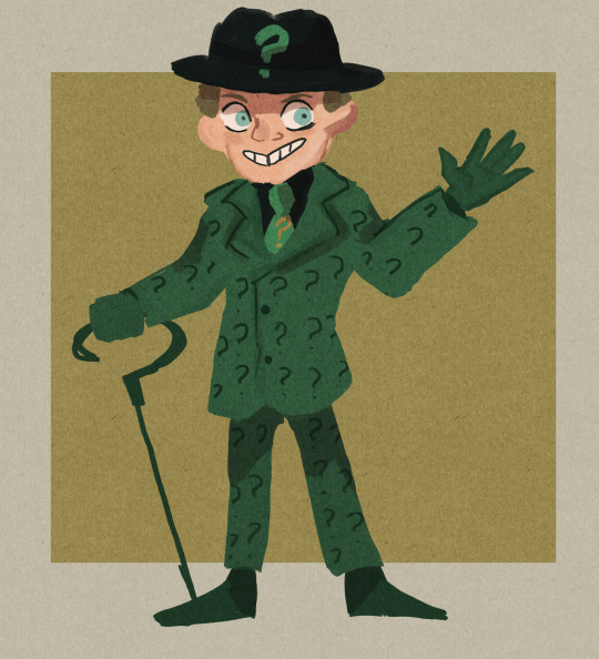
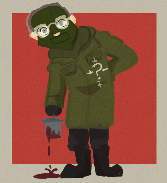
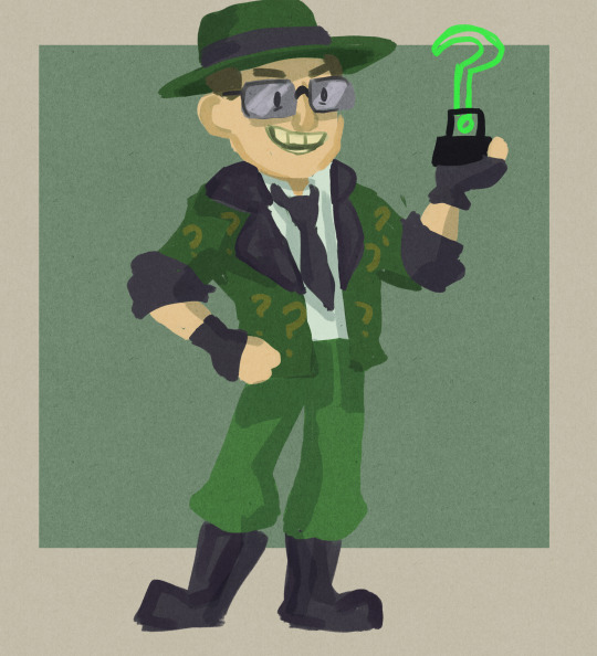
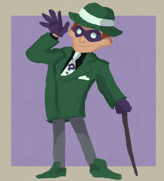
Well since watching The Batman I have rekindled my love for the Riddler so decided to draw different versions of him because why not
3K notes
·
View notes
Photo


75 Years of Harvey Dent
First appearance: Detective Comics #66 (1942)
6K notes
·
View notes
Note
FINALLY, someone gets it
Who's your favorite Batman villain?
The Penguin. Was gonna put off this ask for a bit but I got surprised today with an incredible rendition of him, so now the dastardly bumbershoot waddled and squawked his way into my thoughts again and I gotta talk about him.
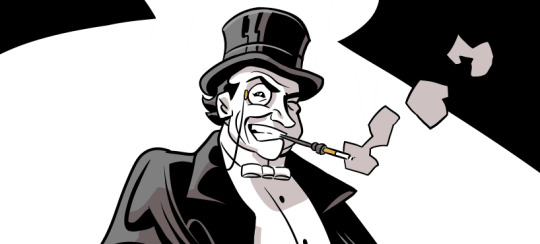
Penguin's not just my favorite Batman villain, he's my favorite DC character and comic book supervillain, the main reason I even want to write a Batman story someday.
I love the imagery that surrounds him, the trick umbrellas and the birds he so lovely dotes after and the WAKs and the Iceberg Lounge, which has become maligned in recent years as a sign of his downfall, but I very much appreciate as a concept in general still. I love a lot of the performances and actors who've taken him over the years. Burgess Meredith and Danny DeVito are some of my favorite performers of all time, Paul Williams has a wonderful voice and starred in my favorite film of all time. Tom Kenny, David Ogden Stiers, Robin Lord Taylor, Penguin's just had such great, terrific performances and adaptations. Batman Returns is my favorite Batman film by far and it was what got me to start paying more attention to Oswald.
I love the roles he can play in any given Batman story and how he's managed to endure all of his falls from grace by becoming an indispensable part of Batman's worldbuilding. I love his varied dynamics with Batman and Riddler and Catwoman and Gordon and his henchmen and those who get close to him. I love his style and the way he conducts himself when he's allowed to be more than just a generic mob boss. Penguin's design has, by simply staying unchanged over the decades, gone from "common rich person wear draped over a funny cartoon gangster" to "he is so out of touch and desperate for respectability that he dresses like an 1930s capitalist caricature, like a little kid's idea of what a rich and respectable man looks like, and Penguin's still stuck in that mindset". I love how absurd and plausible he is.
I like that Penguin can very easily fit just about any kind of Batman story, from the campy supervillain plots to the gritty urban crime ones. You can tell stories about Penguin falling in love, pretending to be legit because he doesn't want his aunt to learn he's a criminal, and opening up a comedy act with a talking penguin, or stories about Penguin terrorizing the city with giant robots and guided missiles and driving people to suicide. I like that he's a character who both relishes in his lifestyles of supervillain and crimelord alike, and yet is perpetually restless because the minute he acquires what he wants, he immediately starts wanting something else. He could have Batman and the Batfamily and all other supervillains wiped out and have Gotham in his pocket and maybe even become President of the United States, and he'd still want more. Because Oswald is nothing but wants, the wants of a traumatized manchild in a funny costume throwing money and toys and brute force and tantrums at the world until it makes sense, which only makes him far too fitting as a Batman villain.
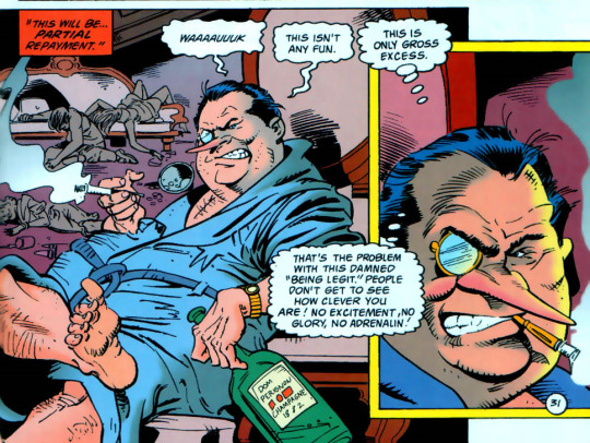
Everyone forgets that Penguin was canonically the first villain to ever successfully escape Batman at the end of a story, completely bypassing the usual "villain swears revenge behind bars" ending to instead escape scot-free, and went on to establish himself as one of his biggest, most inventive and most cunning villains, second only, if not equal, to Joker. I love that he's ruthless and inventive and classy and cunning and brutal and how his main trick is using the fact that everyone underestimates the short fat man to his advantage. He's taken traits that got many of us in real life relentlessly tormented for them, and he uses them to pull the wool over those who think they are better than him.
It'ss a trick that works because even in real life people can't stop looking at this weird and silly little man and think "that guy's too silly for a Batman villain, he's not a murder clown or musclebound monster, what's he gonna do" and, yeah, that's the point, that's been the point from day one, he doesn't look scary or intimidating or even that evil, and he's the guy who pulls the rug under supergenius fighting machine Batman and becomes the top crimelord of Gotham City, a city ruled by terrors and manias and monsters infinitely bigger and scarier and stronger than he is, and he STILL made it to the top and he STILL maintains it, time and time again even when newer and flashier and scarier villains come and go. Batman is, at it's core, a fundamentally absurd character, and Penguin acts as a reminder of that. Because the minute we accept a man can terraform himself with training and money into a living legend on the level of gods, there's no reason why a tiny fat man with similar drive and resources can't likewise throw his weight with monsters and warriors far above his station.
Despite how ridiculously often he's disrespected by writers and fans alike, how far he's fallen off his former position in Batman's Rogues Gallery, and how often he's used as just a punching bag for assorted Bat-people, Penguin never goes away. He's the biggest survivor of all of Batman's villains, more so than the genuinely immortal ones, because he's the cockroach that won't go away no matter how many times you flush it.
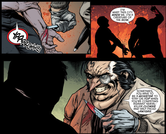
Because once you get past the piles of money and the lounge fortresses and the armies of goons and the piles of cartoony gadget toys not too dissimilar from Batman's own, what the Penguin has is brains, and spite and hatred on a scale no other Batman villain has. He hates Batman, because Batman is nothing but yet another bully who thinks he can push Oswald around just because he's bigger and stronger. He hates the lower class for it's unsophisticated brutes and boors that made his childhood hell. He hates the upper class that's rejected and also tormented him since infancy, that he desperately spent so long trying to be a part of. He hates the monsters and supervillains he works with and has to associate with to stay alive. He hates the city that he fights to rule over tooth and nail.
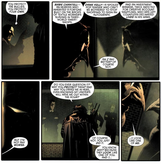
And although he may never admit it, he hates himself, because he'a short paunchy man with a beakish nose who's brutal and immoral not just because those are the cards life dealt him, but because he likes what it affords him too much to give it away. Because he's never going to have the love and acceptance he desperately craves, he will never be able to accept it or keep it. Because he can never fully be a gentleman, or a monster, but instead a sad mix who belongs in neither of their worlds. Because at the end, he doesn't look like anyone else. He looks like one of him.
And still, I like Penguin because he's a Gentleman Villain. The one Gentleman Villain of Batman's rogues gallery, even if that's faded from a lot of his recent appearences that pushed the crimelord aspects to the forefront. He dresses like a gentleman thief, he's canonically a huge A.J Raffles fan, he's one of the most cunning brains of Gotham, he's got the money, resources, and adventurous spirit. Problem is, he's The Penguin. And suddenly, all that he has becomes overblown, outlandish, theatrical, and out of touch purely because it's him trying to do all those things. He's a gentleman adventurer gone rogue, the Count Fosco of the DCU, and that only makes it amusing, even endearing, when Penguin does engage in the swashbuckling antics he's so fond of.

When all his plans go to hell and so he starts fencing Batman, or when he commands henchmen with superflous fancy language, or even when Oswald gives the whole "hero" thing a shot and we see he's actually not bad at it, maybe he actually could have been one if it wasn't for the bile drowning his heart and the hellscape that warped innocent young Cobblepot into Gotham's Penguin, a name that immediately denotes something silly and ridiculous, and he carries it with pride, because he will make you respect that name.
And that's just a couple of reasons. I really, really love this character to the point of obsession and the main reason why I ever wanted to write stories for DC was to get to write Penguin and at least try to do the character a little more justice. But if nothing else, Penguin endures, regardless of what happens to him, in and out of universe. If nothing else, that's a very admirable quality in a supervillain. Oswald is the best.

516 notes
·
View notes
Text

My recent commission of the Batman villain Man-Bat by his co-creator, Neal Adams!
4 notes
·
View notes
Text

My recent commission of Ra's al Ghul from Neal Adams, his co-creator. I asked for a classic take, and, imo, it's the best Ra's Neal has done in a while (but I'm biased!). The image is a recreation/reference to an iconic panel Adams drew way back in Batman #244!
41 notes
·
View notes
Text
Self-portrait?! Holy SHIT

Self-Portrait of Billy Dee Williams from the Smithsonian’s National Portrait Gallery.
58 notes
·
View notes
Text
Totally agree about hoping Daniel Waters comes back to write for Selina. Let him do his Catwoman spin-off as a comic, DC! SUPER excited to see what they do with Harvey. I'd really love it if they somehow got Burton to come up with the design for Two-Face, though I imagine that's a pipe dream. I'm really curious if DC is going to pay for the likenesses of all the actors. Alfred and Gordon have already been revealed, and they're not quite screen accurate. Which has me concerned about MP Catwoman/BDW Two-Face...
“Superman ‘78″ and “Batman ‘89″ Worlds Heading to Comics

The worlds from the 1978′s Superman and 1989′s Batman are coming to comics. The comics will tell new stories set in these worlds. Superman ‘78 and Batman ‘89 are digital first series.
Batman ‘89 hails from screenwriter Sam Hamm and artist Joe Quinones. The comic continues the story from the Tim Burton films. Storylines will include the return of Selina Kyle / Catwoman, a new Robin, and Harvey Dent / Two-Face.

Superman ‘78 hails from writer Rob Venditti and artist Wilfredo Torres. The stories are set in the world of Richard Donner’s Superman: The Movie. Lois Lane doesn’t know Clark is Superman yet and bystanders are delighted by his abilities.
Superman ‘78 and Batman ‘89 will release on July 27, 2021, with six digital chapters each followed by new chapters for the next six weeks. The twelve digital chapters will be collected into six print issues that will go on sale from August to October. Batman ‘89 will also get a hardcover edition in October with Superman ‘78 getting a hardcover edition in November.
(Images via DC Comics)
49 notes
·
View notes
Text

My recent #twoface commission from the legendary @thenealadams! Based on his classic Batman Annual #14 cover for (imo) the definitive Two-Face story "The Eye of the Beholder." As a Two-Face fanatic, I've long dreamed of owning an original Neal Adams sketch of the character, and now I have one! Personalized, to boot. I highly recommend approaching Mr. Adams for a commission if you've been on the fence. His team were really pleasant to work with and professional. Thanks, Neal, for all the great comics! And for (along with the also-legendary Denny O'Neil) bringing Two-Face into modern Batman books, among many other things! #batman #nealadams #commission #comicbook #comicart #comicbookart #dc #dccomics #harveydent #batmanvillain #dennyoneil #classiccomics #batmanvillain
#two face#batman#twoface#harvey dent#neal adams#commission#dc comics#comic book#comic art#original art
32 notes
·
View notes


