
Last Seen Blogs
geoffreystein
Geoffrey Stein

berningers
pandemonium

neo-citysleeplesscity
Stuff NCT might have said

blondebunnyxoxo
Bunny Life

thoughtsinadaydream
Thoughts in a Daydream
Photo

adding a voronoi layer underneath contour generation (for pokemon dataset)
1 note
·
View note
Photo

pokémon dataset: https://www.kaggle.com/alopez247/pokemon
reducing the “base stats” of pokémon into 2 dimensions via t-SNE. nodes denote color in terms of pokemon type, wrapped closely by contour KDEs generated according to the x,y positions of the nodes of each pokemon type.
experiment to see if, by stat lists, pokemon of the same type are closely related to each other. short answer: probably not too much.
inspired by https://twitter.com/DataToViz/status/885194994860015616
0 notes

Photo
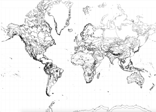
Habitat fragmentations in the world, put in place by terrestrial ecoregions.
More info here: https://www.worldwildlife.org/biome-categories/terrestrial-ecoregions
0 notes
Photo

Tracing 1,829 Atlantic hurricane trails from 1851 to 2016. Color within a trail denotes the maximum sustained wind speeds within that segment, relative to all other segments in all other trails.
0 notes
Text
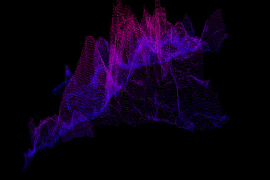
213 hurricanes from 2004 to 2016
Given that we just witnessed and endured a particularly destructive stream of hurricanes on the Atlantic coast, I think it’s important to understand the type of data that goes into forecasting and then analyzing natural disasters (in this case, hurricanes and cyclonic storms). Looking at the Atlantic hurricane database (data described here), we’re treated to the Natural Hurricane Center’s (NHC) post-analysis work of estimating gale force winds at 34, 50, and 64 knots from the center of the storm at 6 hour intervals for the duration of the storm. There are some interesting things we can try to visualize, as there are wind speeds at various distances from the center, combined with geospatial movement, in the context of a limited time series.
To get started, I downloaded hurricane data from June 1851 to November 2016, ending with Hurricane Otto. Since the NHC only began tracking 6-hour interval wind speeds with Alex in late July 2004, I decided to only show storms from then onwards. This constitutes as much “server-side” filtering as I’m going to do, as this would be passed to `d3.text` to parse into a more d3-readable format :).
`sed -ne '/AL012004/,$ p' hurdat2-1851-2016-041117.txt > atl-04-16.txt`
After some “client-side” processing of this new file, we have some data to work with. Each hurricane will be drawn as 4 arcs representing the Northeast, Southeast, Northwest, Southwest quadrants, scaled with the wind speeds relevant to that particular hurricane (which is the reason we construct 213 individual hurricane scales). Additionally, each hurricane will have a “trail” that marks the path in 6 hour intervals that it takes throughout the duration of the storm, and this will be made up of individual segments colored by their maximum sustained wind speed, provided by the NHC.
Preparations:

213 hurricane paths
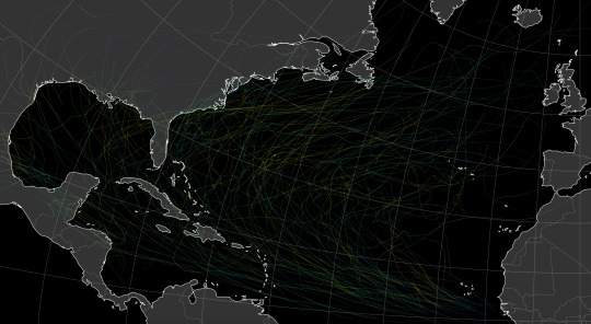
This is very much a work in progress. There are 4 arc paths and however many segment paths for each trail that must be computed per hurricane. This means there can easily be at least 20k paths being animated at once, changing colors, opacities, and positions on the page, which is why there are noticeable glitches in some of these transitions. I also want to incorporate a measure of the winds at 50 and 64kt from the center of the storm, rather than ignore them altogether.
OTHER IDEAS: From a design standpoint, it may make more sense to let the radius of the arcs take on a standard value for 50 and 64kt winds, and just let the color speak for the speeds of each quadrant. The reason I didn’t do it this way here is that I wanted the radius of the quadrant arcs to portray the extents of speed relative to the other quadrants in the same hurricane, while the color scale of the quadrants was designated for global speeds throughout all hurricanes.
0 notes
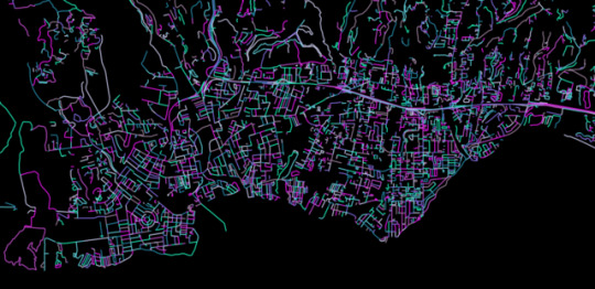
Text
nyc


3d contour lines for a snippet of new york city
shapefiles
1 note
·
View note
Photo
drink more lemonade
2 notes
·
View notes
Text
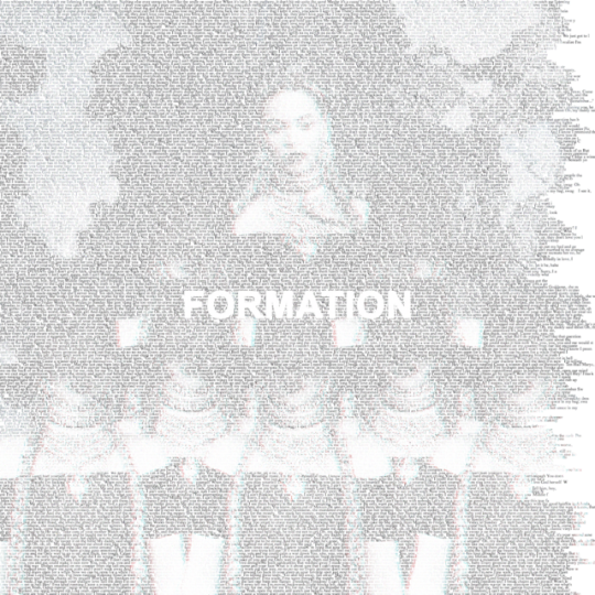
Beyoncé
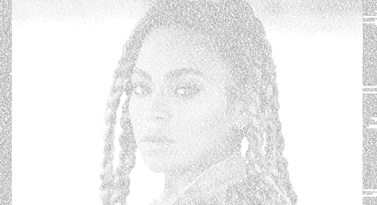
Lemonade album lyrics, 4/23/2016
0 notes
Photo


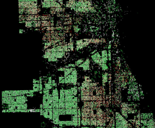

buildings in chicago. n=250,000.
building footprints data from City of Chicago. color denotes the condition of the building in august 2015, where {white, yellow, red, green} => {no data, minor repairs needed, major repairs needed/uninhabitable, sound}.
1 note
·
View note
Text
Revisiting NF2-related variants with chromosome maps

This image details all clinvar variants in chromosomes of interest (1, 2, 5, 7, 10, 11, 14-17, 19, 20, 22, X), based on genes of interest. variants in nf2-related genes highlighted á la opacity heatmap in purple.
Recently, I participated with some coworkers in a genomics hackathon hosted by SVAI and the NF2 Project.
Our team explored data from Clinvar (what is clinvar? why should i trust its content?) and tried to see if we could coax out patterns while checking if these same variants in genes associated with the NF2 condition were present in Onno’s (the subject’s) DNA sequence.
I decided to revisit some of the work we did using a nice dataset extracted from Clinvar by mapping out these variants, because the dataset didn’t get fully used (an hg19-based VCF filtered down so that it contains variants in genes related to the NF2 gene, based on BioGrid interactions). I was interested in one column — clinical significance.
Variant Clinical Significance
0 - Uncertain significance, 1 - not provided, 2 - Benign, 3 - Likely benign, 4 - Likely pathogenic, 5 - Pathogenic, 6 - drug response, 7 - histocompatibility, 255 - other
This can be treated as a discrete measure of how pathogenic a variant is.
In these chromosome maps, 255 is considered a “0″. “7″ was not actually found.
Each slice represents the 14 chromosomes that contain NF2-associated genes with their variants mapped by chromosome coordinate, and their global location mapped by a Clinvar pathogenicity label (at one end, only ~200 variants in total were tagged with a CLNSIG of 6, which is why it is sparser than the others).

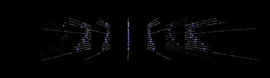

Visually, certain angles make these bins look like groupings of stars.
Since we’re highlighting variants from entire genes linked to the NF2 gene, we expect to see clusters of purple start to gather. It’s interesting to explore how those clusters separate by the labelled pathogenicity of those variants.
0 notes
Photo


watercolor trees / san francisco
size of circle denotes age of tree (the larger, the older). no data defaults to “newly planted.”
0 notes

Photo
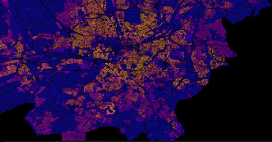
Berlin.
A rendition of the popular population density heatmap. Colors from d3.interpolatePlasma(t).
0 notes
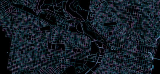
Photo

Santa Cruz County, measured with streets.
Data: https://earthworks.stanford.edu/catalog/stanford-wd228fx7466
0 notes
Photo


Remembering Prince
Linking shows from 5 tours. Prince (1979-1980), Controversy (1981-1982), 1999 (1982-1983), Purple Rain (1984-1985), and Lovesexy (1988-1989).
0 notes