
blackinkexp-blog
blackinkexp
Unit 9 & 10 BA Hons
***USE THE NAVIGATION BAR TO NAVIGATE TO SPECIFIC POSTS******PLEASE READ FROM THE BOTTOM POST TO THE TOP***
34 posts
Don't wanna be here? Send us removal request.
Last Seen Blogs

bolorinaa-blog
Not The Usual Mermaid

asianwin88online
ASIANWIN88ONLINE

salmonlimited9
Untitled
mayla548
E U P H O R I A

wiisaboutbeesknees
Bruh
Text
The Process
To get all of these elements to create a composition I had to draw them by hand, I wanted them very illustrated to I made the drawings simple and as outlined as possible.
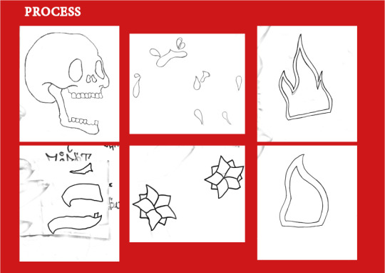
Using Illustrator I turned my hand drawings into objects and refined the edges to make them as smooth as possible.
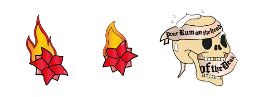
I then played with composition ideas. I found that having everything compiled together like in the image below didn’t communicate my idea as everything was overlapping, the money in particular. Even if you wouldn’t understand it without an explanation, I want all the elements to have enough space for people to look at them and make their own understanding of each thing.
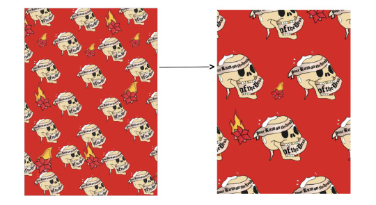
I then tried out some arrangements using the elements to create a pattern. At first I had issues including the flowers in without breaking the pattern. I realised that I wouldn’t be able to have the two different flower pieces in the pattern evenly and at big scale. So I had to place them in a random order.
1 note
·
View note
Text
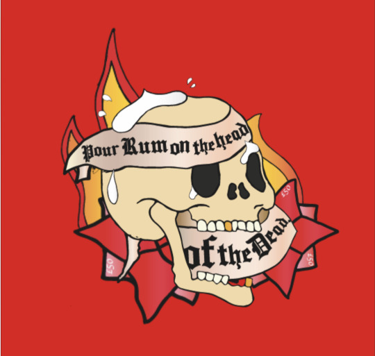
To Death With a Smile
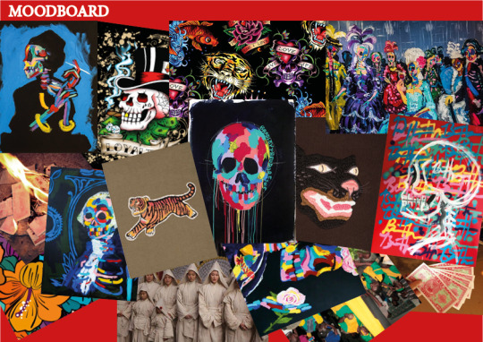
Reference/Inspiration:
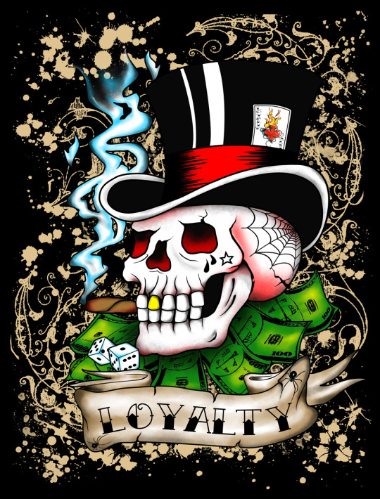
Maharishi and Bradley Theodore were two main reference points for my poster, however, for this outcome I wanted to replicate the illustrations and style of Ed Hardy designs. I like the bold, simple but striking aesthetic of the designs.
Theodore’s use of vibrant colour on such a dimming concept like death stood out a lot to me, as much as the carefree strokes used by him.
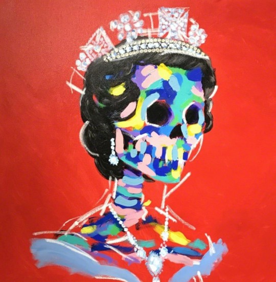
Cultural Elements:
I wanted to draw elements from various cultures that represent death in a celebratory way, just to bring a light heartedness to my design. I felt a lot of people would go for a sentimental approach to their posters or one that would make use of tomb stones and gloomy stuff.
I started with my own culture, in Jamaica, we would splash white rum on the headstone of the deceased.
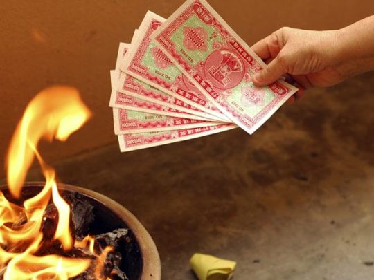
My girlfriend taught me during the passing of her Grandmother that in Chinese tradition they would: “By burning these replicas of money and items such as clothing, fashion accessories, and electronics, the smoke from the burning items travels upwards towards the spirits who will receive them in the afterlife.” Read Full Article Here
0 notes
Text
Unheard Voices
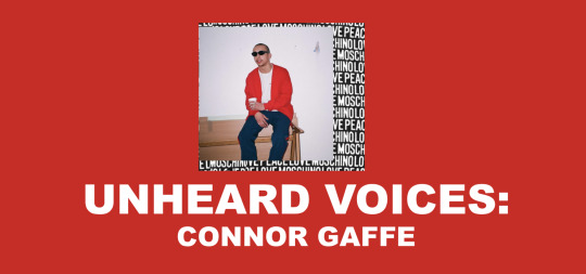
VIEW FULL UNHEARD VOICES PRESENTATION HERE.
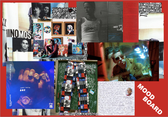
Interviewing Connor:
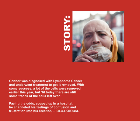
I wanted to get as in depth as possible with Connor to find out about his story and journey fighting his cancer. I wen’t and met him with some questions that I got him to answer himself by typing his response, that way he was able to reflect and answer comfortably and in his own time without a filter. This was important for me and my process, I wanted to get a better insight into what he felt number 1, but mainly how it impacted his work and how he went about it from this point.
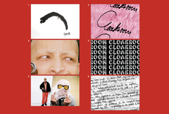
While with him, I got him to literally express his current state by doodling on an A4 sheet. This is where he spoke with me about his clothing brand and his slogan “GOWI” given to him by his grandmother. I got a lot of cool elements for my design out of this process.

I then got into photoshop and started designing elements to go into the cloth I was going to design.
I used images of Connor taken whilst he was recovering from his chemo. I wanted to use these as a way for him to be able to embrace a period of his life that may have been the most challenging for him to face or come to terms with. I also just thought these were some of his coolest pictures.
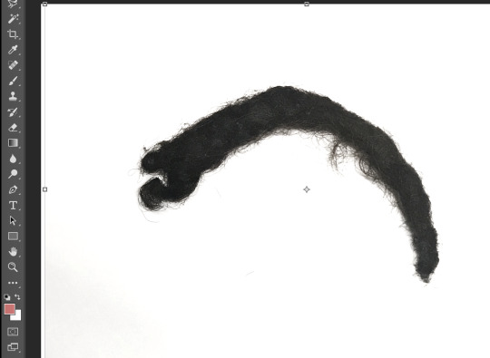
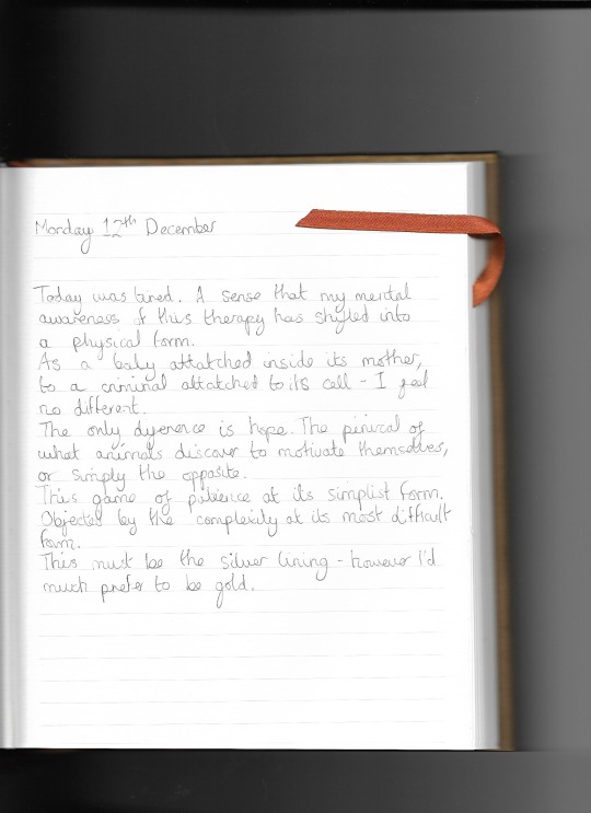
These two components was crucial to tying in the whole concept of the fabric and telling the story:
The lock of hair saved by Connor while he underwent his treatment.
A piece of text taken from his diary while he was stuck in hospital while recovering.
Work by Dean Farquharson
0 notes
Photo
I couldn’t decide on which outcome I liked the most so I decided to make them a set of 4.
By Dean Farquharson
0 notes
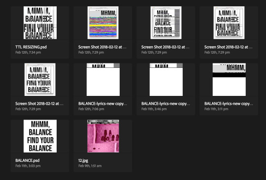
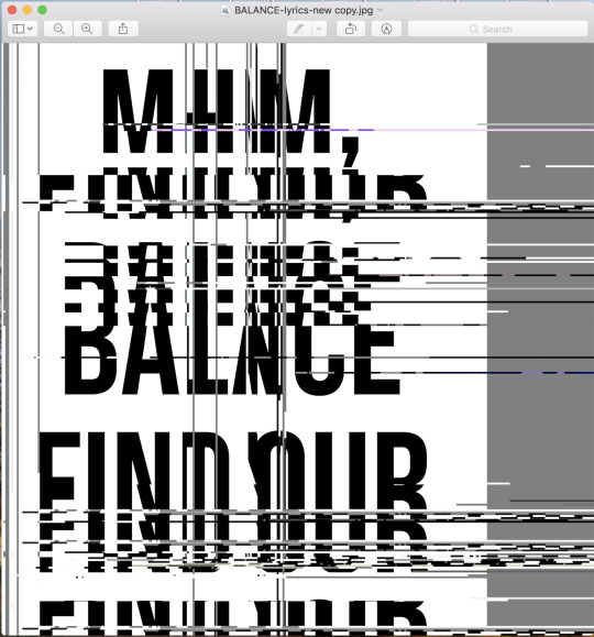
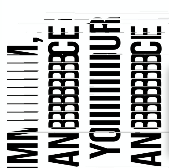
Text
Expanding on the Process
Why not use the lyrics.
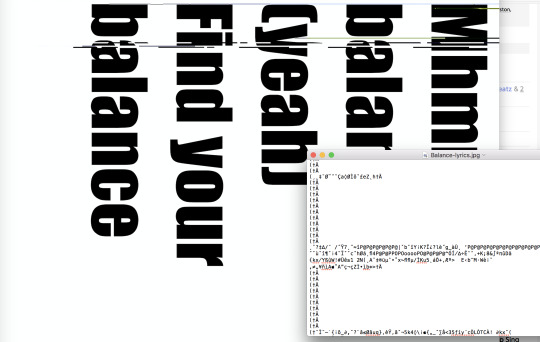
I had issues with this file as it was too big, so any amount I deleted or altered in the coding didn’t make a major change.
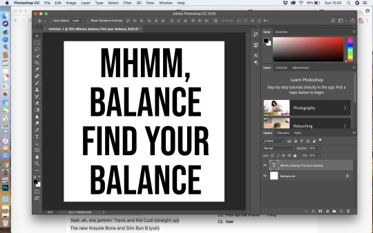
I laid out the lyrics in photoshop using a basic bold font and centred it so it looked more designed and made the file size smaller. This worked better with the databending.
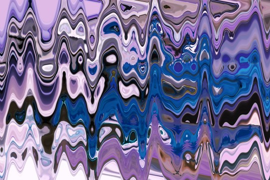
The outcomes of a loooong process of experimenting with coding.
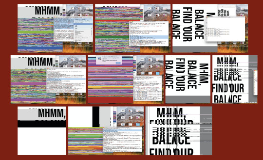
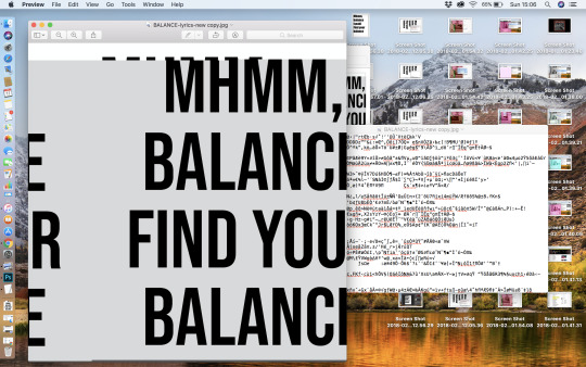
Some of the results I got ended up corrupt so I tried screen shotting them and bringing them into photoshop to alter colours and stucture. I was advised by my tutor not to do this as it would take away from the craft itself and because the outcomes I was coming up with based on purely altering the codes of the image where very interesting as they were.
Work by Dean Farquharson
0 notes
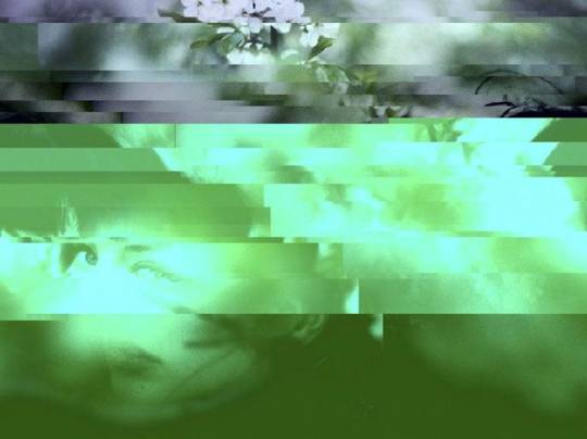
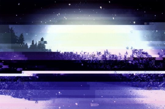
Text
Testing the Process
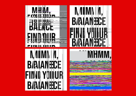
To test my idea, I began by databending family photos.
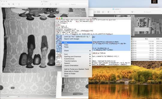
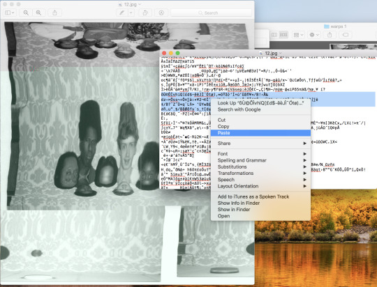
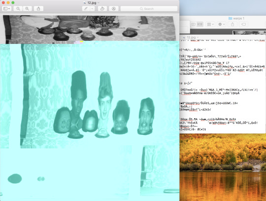
I haven’t used this method of glitching in a while so I forgot how things can go so left if you do too much to the coding.
It’s cool though, you just have to undo.
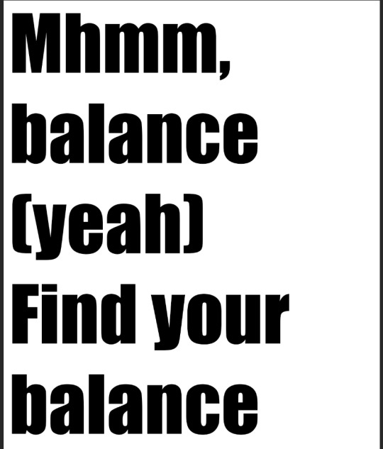
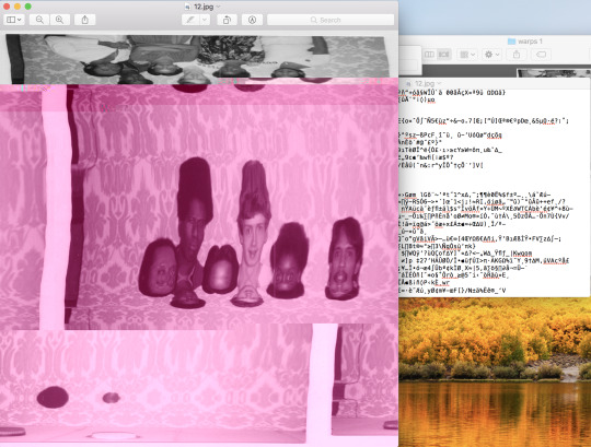
Making links:
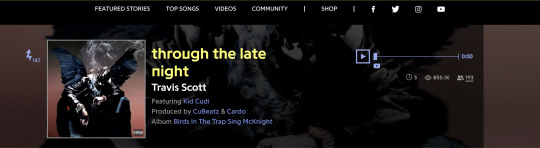
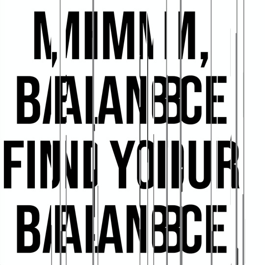
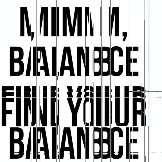
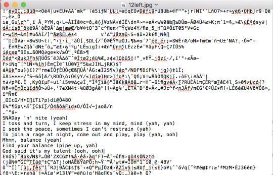
Instead of deleting random bits of code and writing gibberish in there to distort the image, I thought to add lyrics from Travis Scott’s ‘Through the late night’ that I remembered made reference to balance.
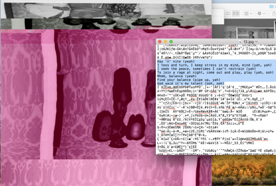
This is what I finished with.
From here, I would find an image more fitting to the theme of balance and use the same process. I wasn’t a fan of the colours so I’d take it into photoshop and make alterations.
Work by Dean Farquharson
0 notes
Text
Balance in Design
VIEW CRAFT WORK PRESENTATION HERE.
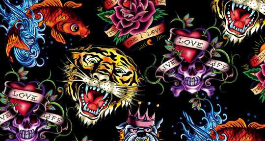
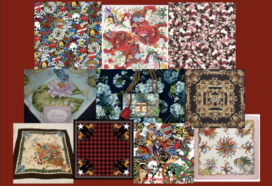
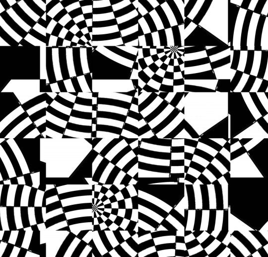
For my Craft Work project I picked patterns as my choice of craft. Inspired by the designs of Ed Hardy, the Gucci gg Blooms collection and Givenchy, I looked closely at the way repetition is used and how deigns like the ones for Ed Hardy use asymmetry to achieve their patterns compared to Givenchy and their mirroring method.
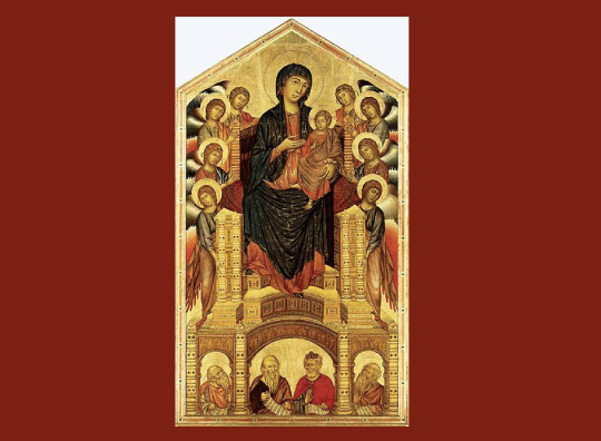
Cimabue, Santa Trinita Madonna
What I like about Cimabue’s Madonna is the way evenness is achieved without everything being equal on both sides. the asymmetry keeps the order and harmony in the design.
Pintrest directed me to some interesting designers and their work with patterns.
Lynn Greyling ‘Black and White Crazy Pattern’
Aletta Whitehouse Davis ‘Patterned quilt designs’
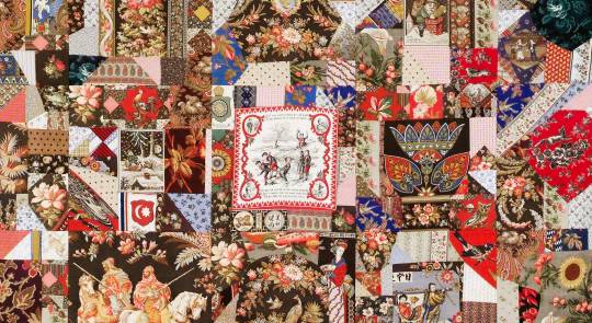
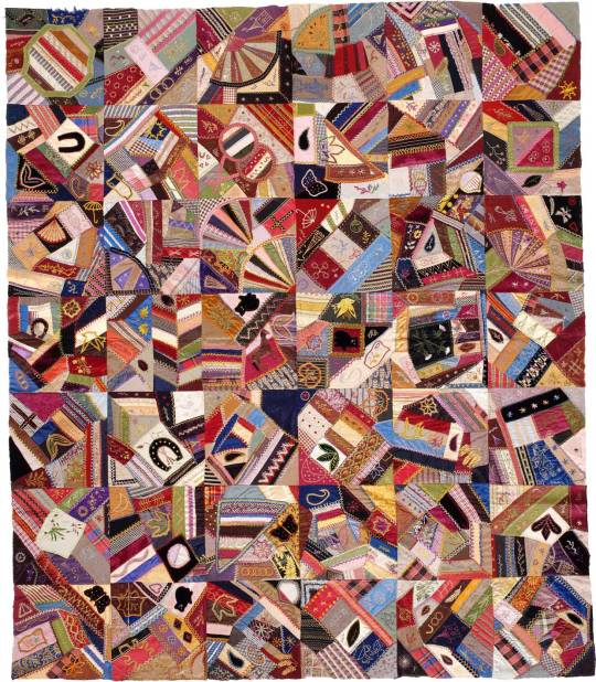
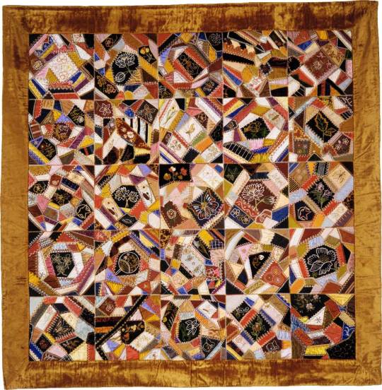
I like the handmade aspect of these quilt designs.
The Idea:
Using the style of Sean Dack, I would databend/glitch an image manually to create a pattern to then jumble it within Photoshop to create something similar to Lynn Greyling.
0 notes
Photo
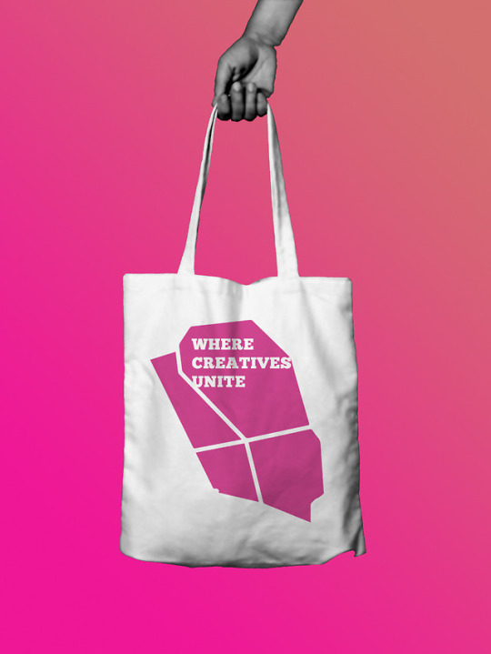
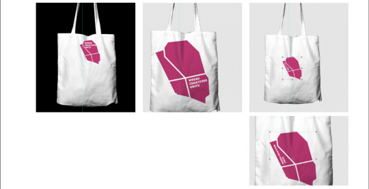
Clerkenwell Design Week: Where Creatives Unite Tote Bag
By Dean Farquharson
1 note
·
View note
Text
Clerkenwell Design Week
This project kind of slipped by me due to me being so focused on my Craft Work project. My idea generation was very simple.
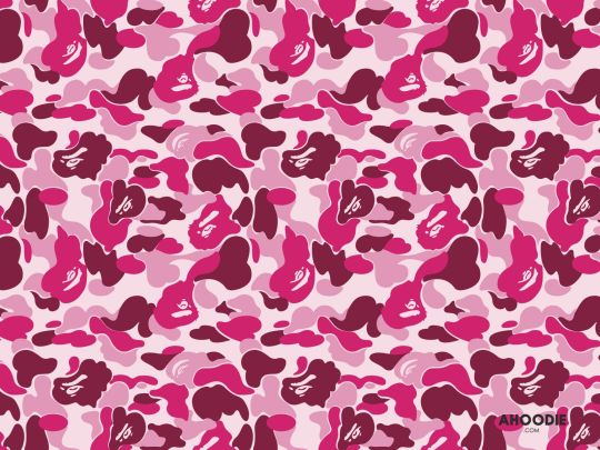
Inspired by Tomoaki ‘Nigo’ Nagao’s BAPE patterns and with the knowledge of knowing that the design I create has to be able to be screen printed on a tote bag at a festival, I referenced this mainly for boldness and simplicity in design.
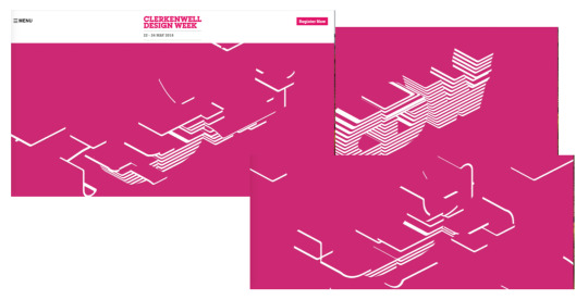
While doing some research on the Clerkenwell site I found a good reference on the home page.
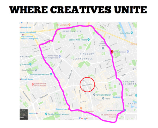
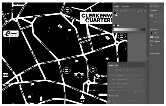
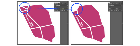
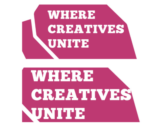
I chose to work with the tag line ‘Where Creatives Unite’. I then used this as an idea for a concept, I then researched the map of the general area that Clerkenwell is in and began to work with the roads mimicking the lines from the site homepage.
Playing with scale:
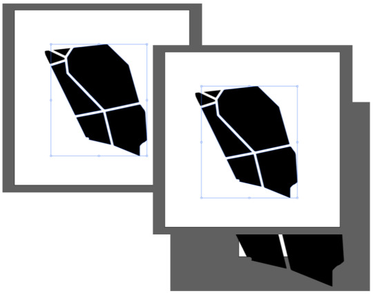
From here I implemented the colours of the CDW colour pallet.
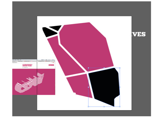
Using the reference of Nigo’s patterns I began playing around with repetition.
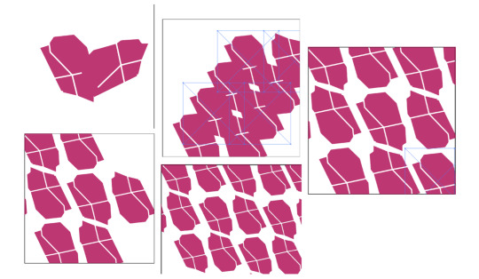
I didn’t like how it was coming out, I felt it was too cluttered. So I decided to go back to working with the singular design and incorporated text.
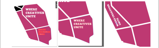
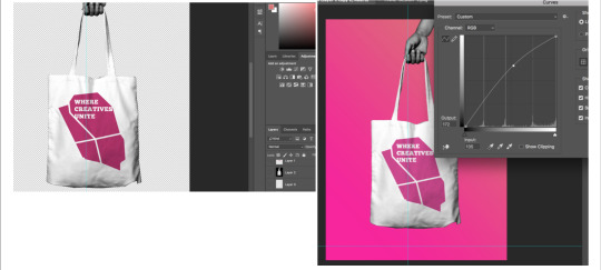
Mock up Process:
0 notes
Text
Vignette adds focus
After meeting with my tutor about the progress of my D&AD outcome, he recommended that I do the smallest but most crucial thing to add focus to the video we had created.
He showed me this advert for Nike and spoke about using a vignette to draw the eyes/focus of the audience to where I want them to look.
youtube
His reason for this was because he felt that the shots had so much interesting things in the background that it drew the eyes to look at the wall paintings instead of the amazing action happening in the fore ground.
0 notes
Text
LOL
we got kicked out of the first location
youtube
0 notes
Video
I made this snippet to intro the video cause I felt it would draw people in better that the original one.
Work by Dean Farquharson
0 notes
Text
Me doing some cool shit
Click here to read the full treatment by Dean Farquharson of (BKAS)
While working on my FMP I directed a music video for another artist alongside my partner in crime Ime, and managed to experiment with my new found editing skills.
0 notes
Text
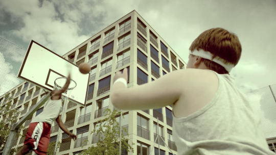
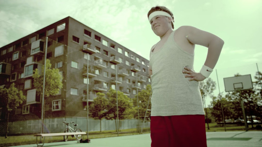
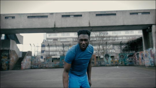
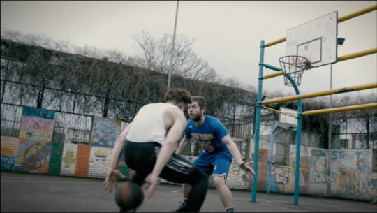
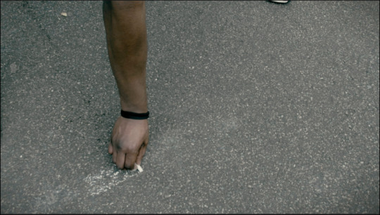
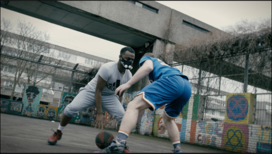
D&AD: Shoot Day
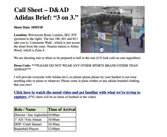
Unfortunately I was there to plan and grow this idea with Ime and had a lot of fun doing so. But I am SOOO gutted that I had to miss out on the part I was looking forward to the most. I had work the day of the shoot and couldn’t get it covered, so, instead we had to get a D.O.P friend of ours to stand in for me.
We planned as much as we could to ensure no time was wasted and so that we got the most out of the ballers on the day. 15 ballers confirmed, but on the day only 6 showed. This was disappointing because we wanted as much bodies as possible to create a hype and make the video feel massive.
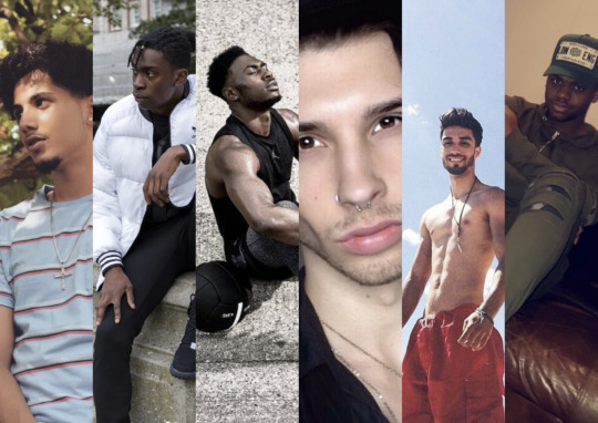
Cast Reference:
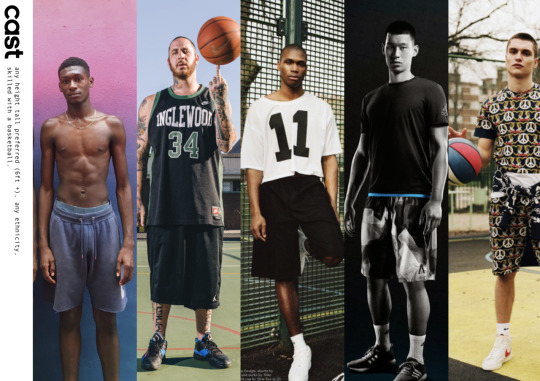
Our Cast:
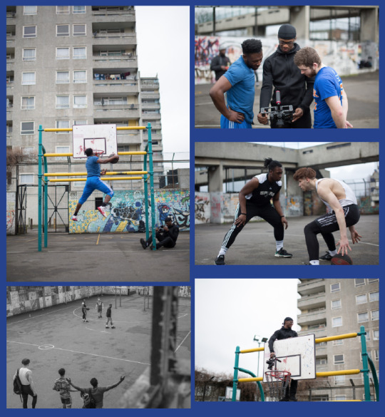
Watching through the footage while at the editing table, I love that our cast got so involved with the shoot making them perform in a way that is believable. It made the edit fun and prevented the final thing from coming out cheesy.
All in all, the shoot went well.
0 notes
Text
D&AD: Learning curbs
The biggest hurdle I had to face was making sure that everything in the edit captured what we was going for and the concept of our overall idea, and making sure everything was seamless.
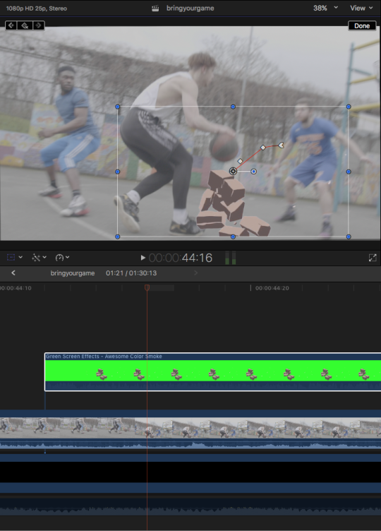
This was definitely the case with the animation.
youtube
We hired and paid for an animator to animate 7 seconds of clip for the end sequence. However, the £10 per second wasn’t worth the first draft he sent over to us as it had no presence or impact. We resent him the clip but including the audio as well as a draft of the entire video so that he could build it in properly.
My issue was that the animation came out of nowhere and was such key moment in the video that needed to hit people and make them want to get up off their seat and go hit the court. So I thought, how could I make the whole video have this effect on the audience from the beginning.
Experimenting with Stock Footage:
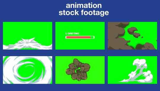
I used my experience with overlaying royalty free stock footage to good use and found a bunch of animations on green screen that I then incorporated into the video using key framing in FCPX.
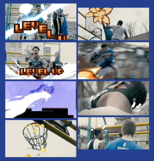
I’m so proud of myself for pulling this off in a very un-obvious way that doesn’t look tacky or cheap, and also of the cohesion between what I had done and what we got from the animator. I feel that the sound effects, glitches and animations glued the visual and the story together very well.
0 notes
Text
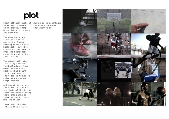
The Advert.
To accompany the half court design pitch, we planned an advert that we thought would drive people to want to look out for one on their travels.
To get started we hit Youtube to gather visual references for the style of video we wanted to create. Initially, we thought to go for a more kinetic video, but after a couple bits of feedback from our group we decided to steer away from just another inspirational, sweaty concept ad and used the mood video to help build somewhat of a story without spelling it out too much.
youtube
#bringyourgame mood video by Dean Farquharson & Ime Aigboche
References:
One of the main things we knew we wanted to avoid was creating a piece of content with too much of a serious tone. Plus, in the spirit of football/basketball played in a cage or streets of London, there is always a level of humour and piss take similar to the ‘Joga Bonito: Henry’ ad.
youtube
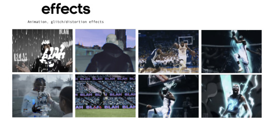
Aside from capturing the pure essence of creative skills and team work, we also wanted to implement animation into the video to add to the impact and build up the game, almost making it look like an actual game.
0 notes
Photo
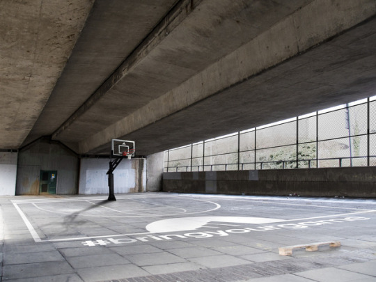
#bringyourgame 3on3 half court mock up.
By Ime Aigboche
0 notes