aprilshowersanimation
The Art & Animation of Jenna B
Animator and storyboard artist | She/They | I love elephants, roller coasters, art books, and weird adventures ✨
210 posts
Don't wanna be here? Send us removal request.
Last Seen Blogs


Text

I'm not the man they think I am at home/Oh, no, no, no/I'm a rocket man ~
I'm excited to announce something that I've been holding back from talking about for a while: I'm developing a webcomic!
Starship Astraea is a story I've been working on for about 7 years, though I only got serious about writing it in 2021. My plan is to start posting pages to its own site sometime this year, though there's still a lot of work to do before then. In the meantime, you'll probably start seeing the characters pop up here ✨✨
I'm looking forward to sharing this story with you all!
0 notes
Text
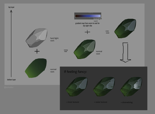
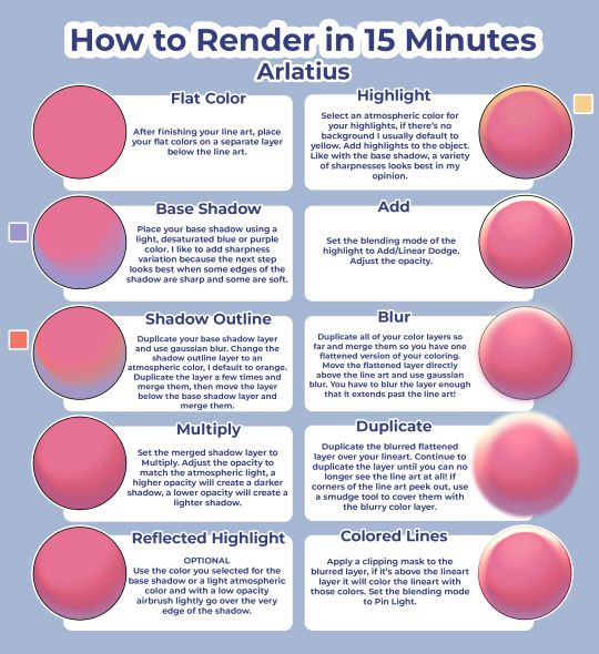
Figured quick gem render recipe for myself, sharing bc why not
I needed a quick way to go from non-transparent grayscale, so here you basically start with bw non-opaque rock without details
"dramatizing" is just glare + gradient on some planes
5K notes
·
View notes
Text
i watched one (1) video on how to draw hands that changed my life forever. like. i can suddenly draw hands again
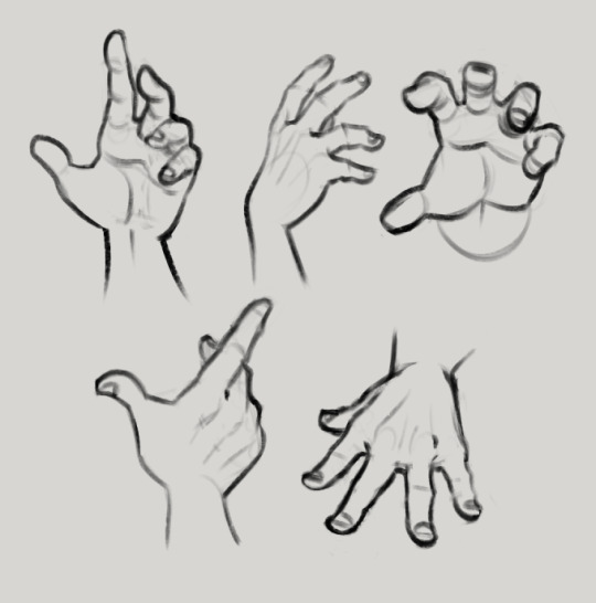
these were all drawn without reference btw. i can just. Understand Hands now (for the most part, im sure theres definitely inaccuracies). im a little baffled
85K notes
·
View notes
Note
Sorry if you’ve answered this before, but I really love how your illustrations have such a cohesive color palette, how do you pick your colors to have a certain theme without looking monochromatic?
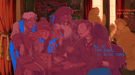
(In your breakdown on the saloon/western BP illustration, you mentioned that the overall color was reddish brown so you added blue to the main group to set them apart. But like how did you decide on which reddish brown colors to use for the flats?)
Thank you!! Your art is really expressive and the colors always work so well in the illustration. I’m always in awe of your pics
That’s an excellent question! My drawings actually start out pretty monochromatic because I tend to put most of my effort into the lighting and shading part to help differentiate where I want people to look.
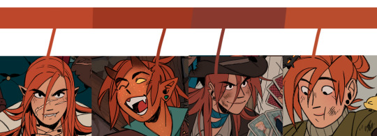
For all of my pieces, I want my characters to be in focus. So no matter what, I always have to keep their main colors in mind and make sure their outfits and the background don’t clash with them (Kain’s red hair tends to be a problem, pft).
For my flats, I generally work with two main colors that tend to contrast each other and then I mix a lot of neutrals around them. (Sometimes the main colors are in the light and shading itself, but I’ll just focus on the flats!).
Sometimes, I will change the hue of their colors. So while Kain has bright orange hair, I will dull it down if it overwhelms the piece or doesn’t fit with the tone - like I did for the cowboy drawing - but never so much that it no longer looks like him.
With the cowboy drawing as an example, if I strip it down to my flats, it instantly becomes very dull and monochromatic. I really enjoy working with these colors because they’re easy on the eyes (or my eyes specifically) and I can see the difference in subtle hues a lot better than if they were very high in contrast. I like working with subtleties when I want background characters to become a single unit but still be separated as individual people.
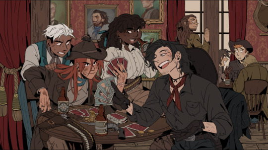
When I picked the colors for the background, I wanted to separate the characters from the walls. Therefore, I kept the walls red and gold, and the characters brown - they’re still within the same warm-colored family, but they’re far enough away from each other that they don’t become one with each other. I also like to not have clothes from different characters blend together, so overlapping colours can't be the same. I made one coat lighter than the other, the glove warmer than the dark jacket, and so on.
(their coats are also in the same realm as the green/gold colour of the details for the curtains and the frames on the walls)
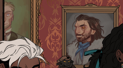
For the paintings I actually chose to put a bit of blue and green in to help create some interest for the main characters and keep your eyes around that area, as it matches the blue they’re wearing, just a whole lot darker. It also makes them pop just enough so they look interesting against the wall, but not enough to overshadow the main characters
I know, because of the way I work with layers, that when I add my overlays, I automatically brighten and saturate the colors a lot. It’s a lot easier for me to saturate something “dull” and move it into all kinds of hues than saturating something already high in contrast and then trying to force it into a new color theme.
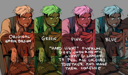
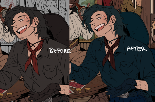
But because of this, I usually have to go back and change the colors I work with constantly while the overlays are on. Since the overlays don’t know what sort of materials they’re laying on top of, everything gets lighter and washed out, so dark skin tones, hair, and clothes have to be corrected one by one afterward. If I were to remove the overlays after I corrected it to make it feel like a dark blue outfit on Raki, it’s basically just a black void now; but with the overlay, it’s a dark blue outfit. Before that, he simple blended in with the background too much and he didn’t feel like he was a part of the group either.
I always try to put down colors how I imagine they’re going to look like, unaffected by light, but I’m also naturally drawn toward more earthy and warm tones, so all of my color choices will tend to lean that way.
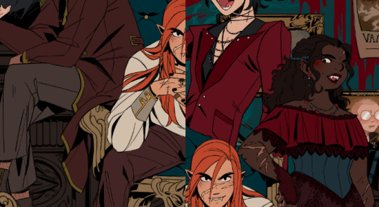
Here’s another example of main colours vs. neutrals; the main colours are red and green/turquoise, with dark browns and greys to encapsulate them, and gold for accents or to make certain things pop (the chair, Dakon’s dark coat, etc.).
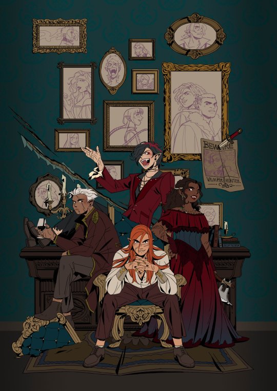
I never want them all to wear the exact same color, but I want them to feel connected and be in the same 'colour family,' so Dakon and Kain have nearly the same dark red/brown, and Christie and Raki have nearly the same 'bright'/red.
The blacks and browns, I’ve kept warm as well, so they stay within that realm of red. I also make sure that none of them are too close to Kain’s hair since he’s in the middle of the piece, and I want your eyes to be drawn toward the middle, and his orange hair helps with that.
The paintings I basically do not care too much about, as long as each individual painting has a single dominating colour. I mute them down with a darker overlay and ensure they don’t have strong shadows and light, so they get pushed to the background, so despite being a bunch of different colours, each painting feels like a solid color and they’re still cast in the same light as the rest of the piece, so they feel like they belong in the same room.
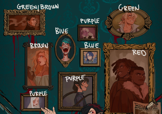
I try to help move the eye around the piece as well, so I keep the big painting sort of in the same realm of red and brown as the main characters, because it’s so big it shouldn’t dominate with a new color and force interest toward it. The blue/purple ones melt in with the background as they’re close to the turquoise background, but without disappearing, the yellow ones work sort of like the gold accents and blend in with the frames, and the green paintings at the top give the illusion of a monochrome fade, so everything gets more eerie and green as the image goes up - there’s also a subtle green fade that affects the gold accents from the top down, to enhance that effect.
This is just a few examples, if there are any pieces in particular you were thinking of, and it’s neither of these, just let me know, and I can break those down as well!
Thank you for the question; I hope I answered it somewhat, and thank you for the kind words! <3
319 notes
·
View notes
Photo

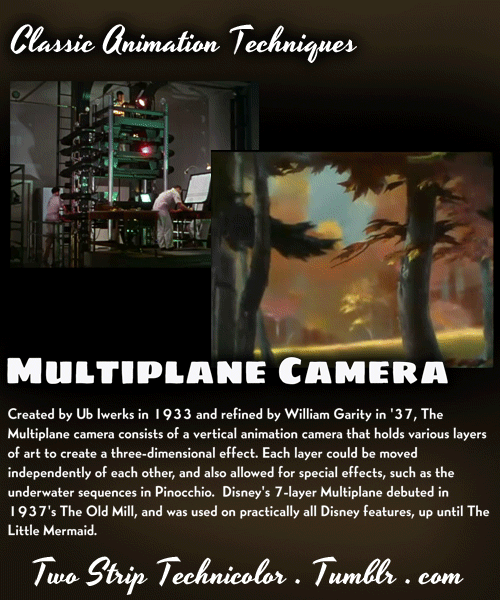
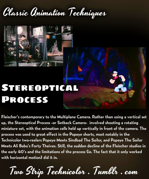

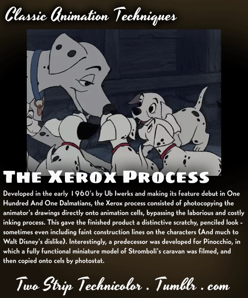
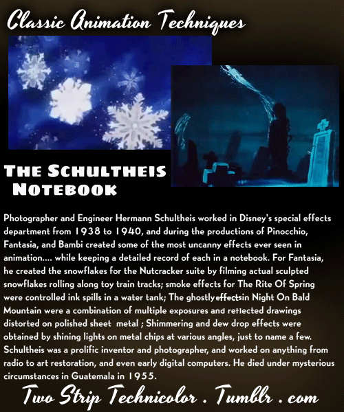
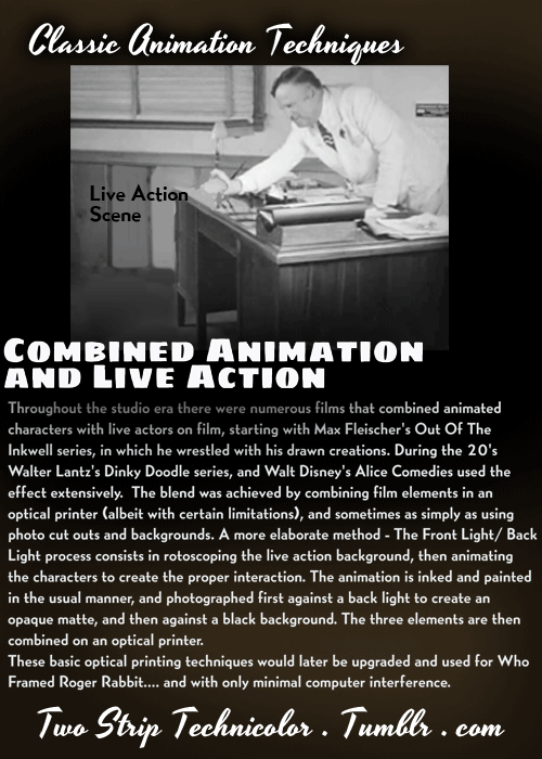
Animation techniques and effects from the classic era. For more vintage movie geekery, check out my Old Hollywood Special Effects, and my Early Color Film Processes posts! (And while you’re at it, take a look at my art blog, why don’t ya?)
112K notes
·
View notes
Photo


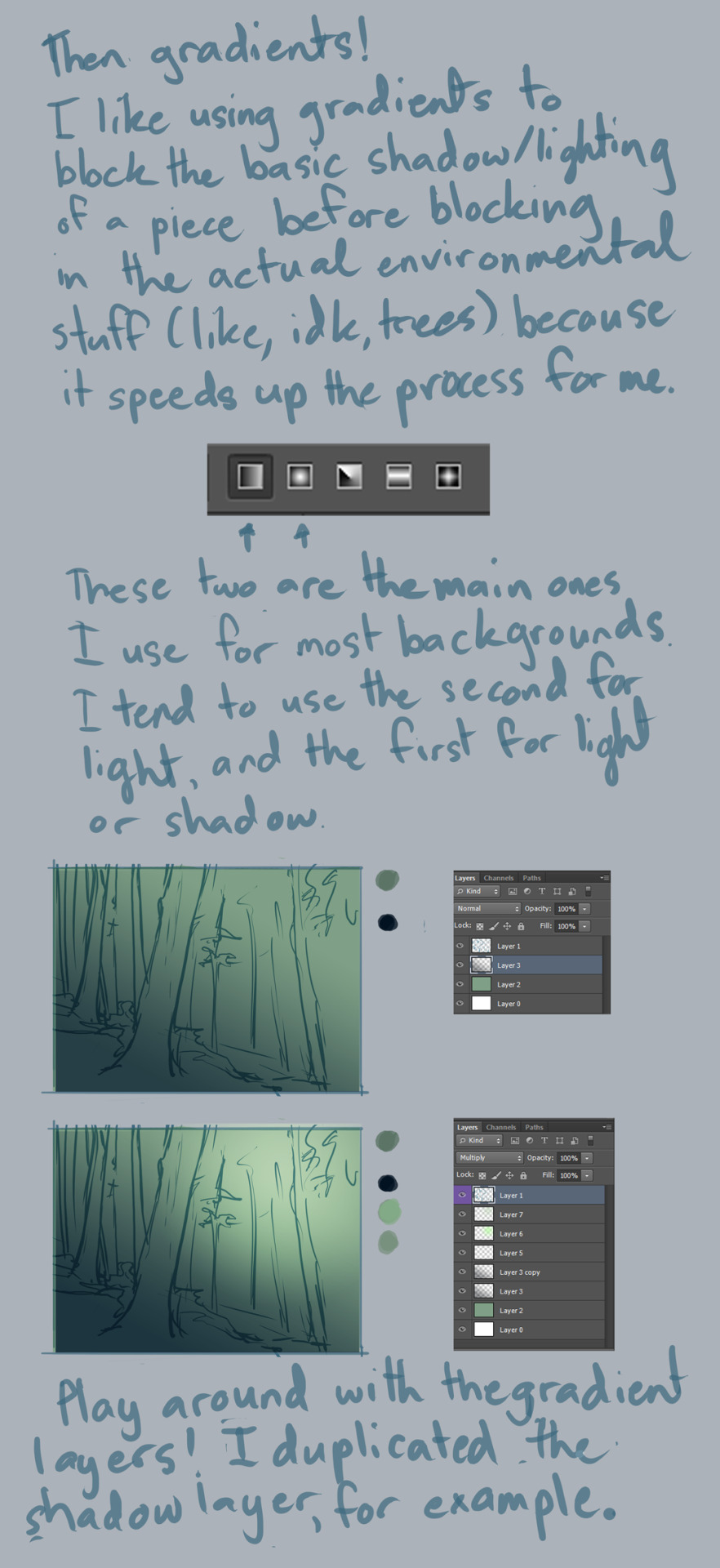


Background Tutorial
requested by ion4ever. sorry it took me so long to do this for you but hopefully I was of some help?
Notes:
I use CS6, and this was mostly done with default hard round brush at around 50% opacity or higher, 100% flow, and size pressure on. I made some random brushes for the greenery by modifying the default ones.
always use a large canvas. I go about 3000px x 3000px.
with enough practice, painting backgrounds like this will be a fairly quick affair. this one, for example, took about 30 minutes? it’s just a matter of time/experience. :)
So yeah, good luck doing backgrounds, and have fun!! :D
32K notes
·
View notes
Photo
fast rendering tutorial for when you dont want to put in any effort
38K notes
·
View notes
Text
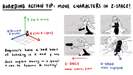

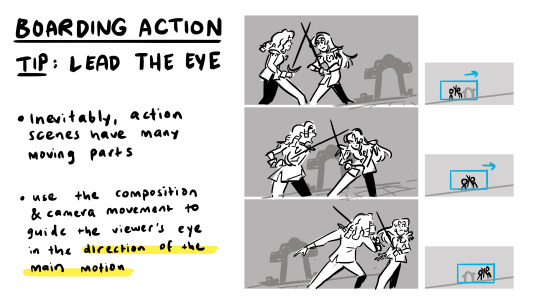
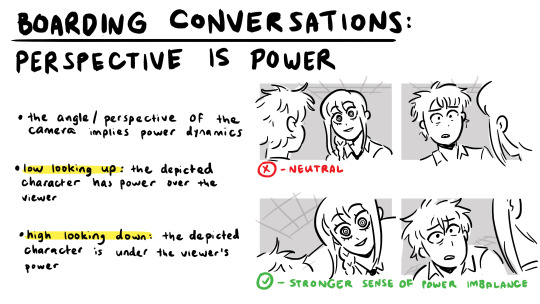
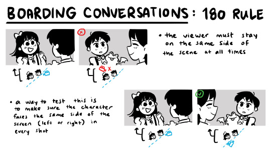
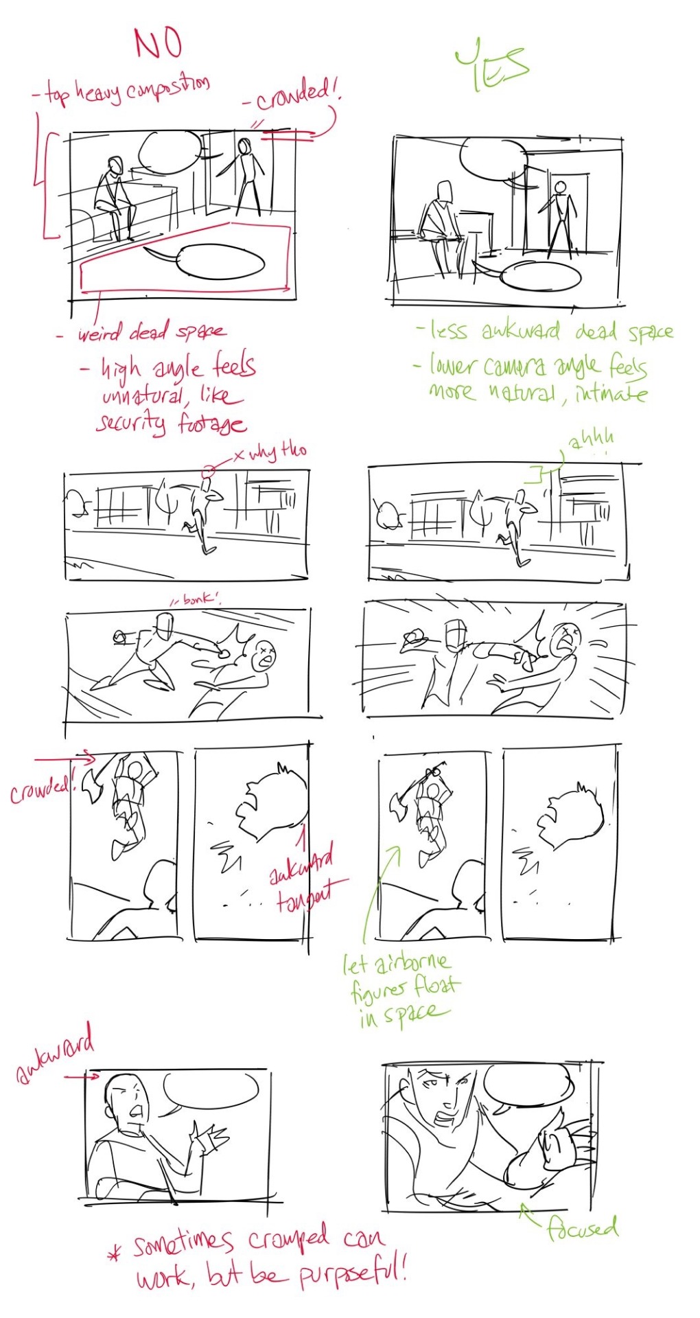
some storyboarding techniques as a sequel to my storyboarding basics presentation. I focus specifically on tips for action and conversation scenes!
as always, these are general tips and tricks, but rules can always be broken. happy boarding! ✍️✨
20K notes
·
View notes
Text

Art by Jenna B
November’s Theme: #Foodimals
Presented by CDQ Magazine
Discover the artists of the Character Design Challenge community and the current Theme of the Month in our Facebook Group! And when you repost your design on our Patreon page, you can also win awesome prizes every month and choose the future themes!
RULES | WINNERS | MAGAZINE | BOOKS
31 notes
·
View notes
Text
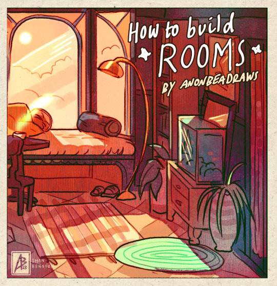
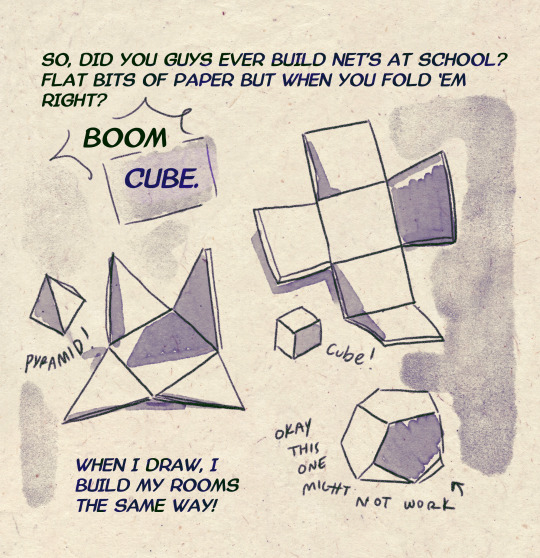
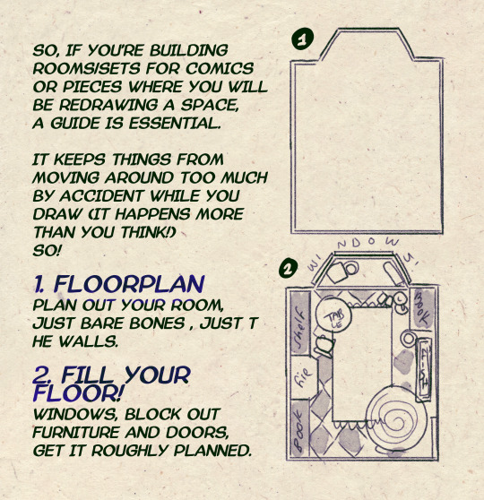
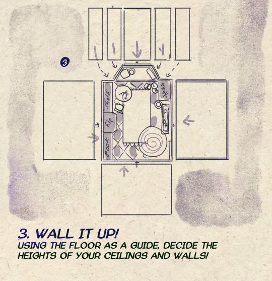
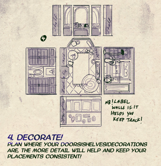
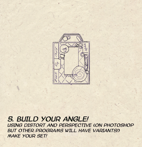
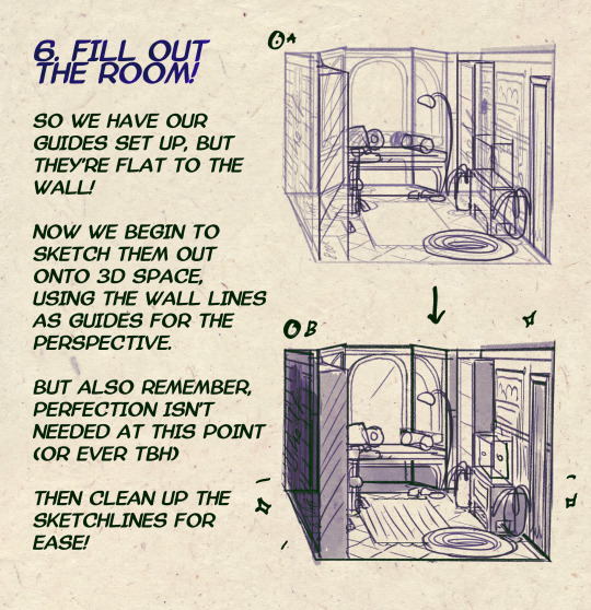

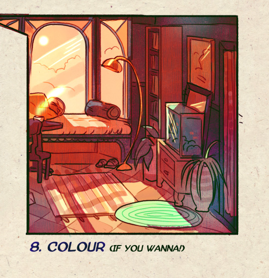
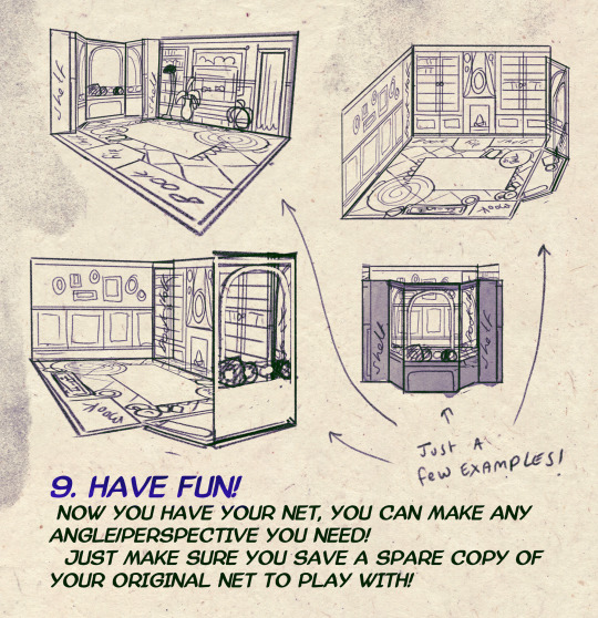
I made a Room Building tutorial! Lemme know if it helps! 🧡
Tip me here| Commission info here!
35K notes
·
View notes
Text
11 of my tutorials (Couldn't fit more in this post). All available on my discord though!: http://discord.gg/n5TDnqfR5P
5K notes
·
View notes
Text
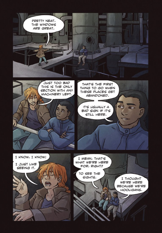
BACKGROUNDS IN WEBCOMICS
I want to talk about sustainability in your work process, featuring our fave: Backgrounds. How to simplify, convey, and deliver in comics! (examples include Phantomarine, Wychwood, Shaderunners and Ghost Junk Sickness)
The usual suspect to burnout is often the workload involved. Many ppl who FULL HAM on pages that def need a detail cut for many reasons Main one being: You don’t need excessive detail to tell whats happening in a small panel, in fact, less is better.
When you observe a page in its entirety, where does the eye travel? Where does the eye stop? Having a fully rendered BG in multiple panels can actually be a huge distraction, on top of the time it takes to get there. So how do you balance?
In Phantomarine, the most detailed panel is the establishing one, it holds our characters and allows readers to understand the positions they're all in/standing at. Its one panel that provides a specific telling detail: the railings behind Phae indicate we're on the boat.
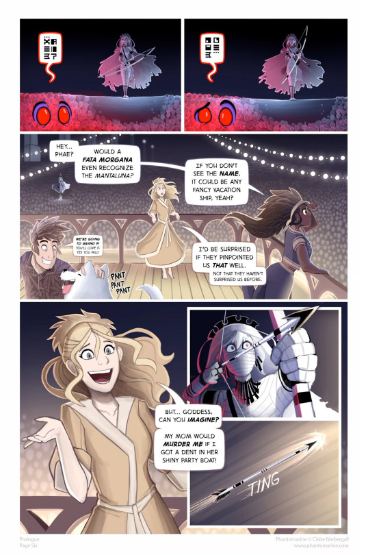
In the bottom left panel,the artist uses the railings again, but doesnt have to render the lights, floor boards, or sea to show where we were, then uses the colours of said BG and mood to paint the rest of the page. This is where colours/gradients and small objects save the day!
The same example is here, just flipped. The establishing shot shares DETAILS that you need to show the readers where we are, then the BG of Pavel eating food isnt over whelmed with background characters or other details that get in the way of the ACTION that is to be conveyed
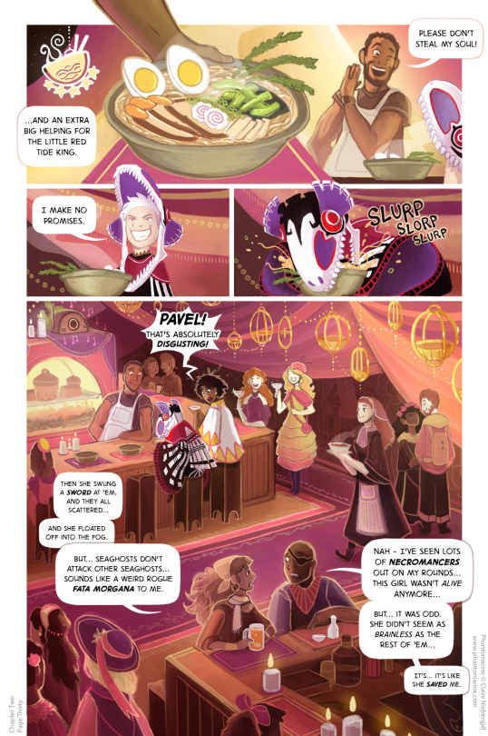
it would be rather distracting if we were to see Pavel eat that bowl, with sooo many more details involved in the panel- instead, the drapes, hues of light, and clever sound effects tell us what is happening.
Wychwood does the very same with establishing shots, then KEY DETAILS to provide the reader with where the character is standing, without sacrificing the facial expressions and details of the CHARACTERS that we need to get across
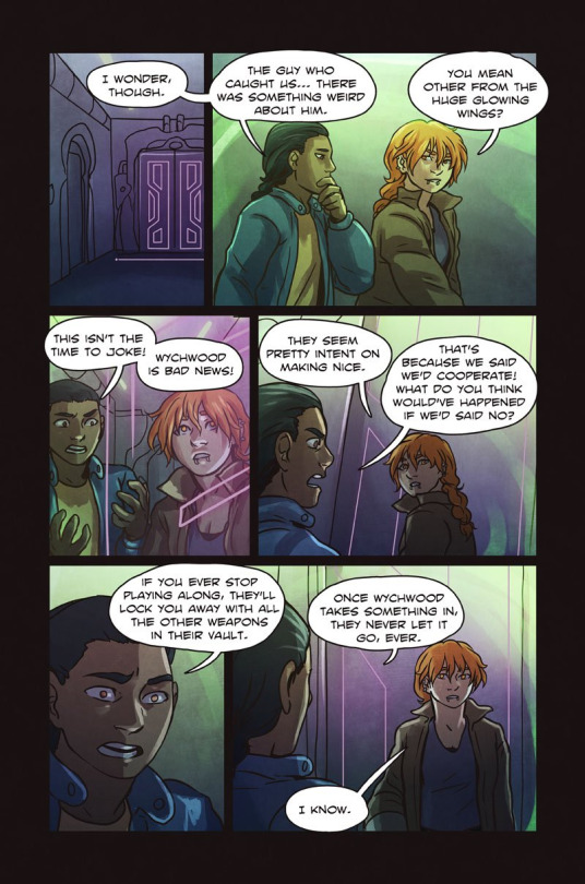
Most detail is in the top panel, the BAR that Julian holds onto is a KEY PIECE to show where they are in the BG already established. Perfect use of BG! Get used to thinking of those key details when changing scenes and establishing shots!
Pick those key details to tell the reader where they are and draw that. If you have a library scene, please just draw that BG once! Take a specific bookcase or key feature, use blocked shapes and colours, and make it less detailed than the provided establishing shot.
I also wanna talk about : Action Scenes
Focusing on the ACTION of the scenes is SO important when you have them, and often details get lost when a creator focuses on details that can distract a reader! My advice? Most action scenes are best without/need little backgrounds.
A few shots from Ghost Junk Sickness demonstrate this. We're paying attention to the action- we've been established where we are before, so let's play in the sandbox now.
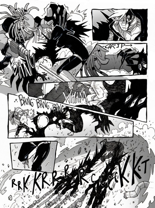
Have a panel or two peppered in there, with the same principal as above to ground where your character is, but do not add a BG in every panel. It instantly takes away from the action when it's not integrated as well, and it takes SO MUCH MORE TIME to draw that sequence!
Read More amazing tips: Here are some GREAT examples by the creators of ShadeRunners, HERE who break down how they do backgrounds ( AND CROWD SHOTS!!!!)
TL;DR: Comics are a MULTITUDE of skills and needs. It takes a lot of time and work to pull it off, so working with methods that make it easiest for you as the creator is what will help you maintain that momentum and stability you need! Good luck and get comicking!
194 notes
·
View notes


Text
Something I try to keep in mind when making art that looks vintage is keeping a limited color pallette. Digital art gives you a very wide, Crisp scope of colors, whereas traditional art-- especially older traditional art-- had a very limited and sometimes dulled use of color.
This is a modern riso ink swatch, but still you find a similar and limited selection of colors to mix with. (Mixing digitally as to emulate the layering of ink riso would be coloring on Multiply, and layering on top of eachother 👉)

If you find some old prints, take a closer look and see if you can tell what colors they used and which ones they layered... a lot of the time you'll find yellow as a base!
Misprints can really reveal what colors were used and where, I love misprints...
Something else I keep in the back of my mind is: how the human eye perceives color on paper vs. a screen. Ink and paint soaks into paper, it bleeds, stains, fades over time, smears, ect... the history of a piece can show in physical wear. What kind of history do you want to emulate? Misprinted? Stained? Kept as clean as possible, but unable to escape the bluing damages of the sun? It's one of my favorite things about making vintage art. Making it imperfect!

You can see the bleed, the wobble of the lines on the rug, the fading, the dirt... beautiful!!
Thinking in terms of traditional-method art while drawing digital can help open avenues to achieving that genuine, vintage look!
45K notes
·
View notes
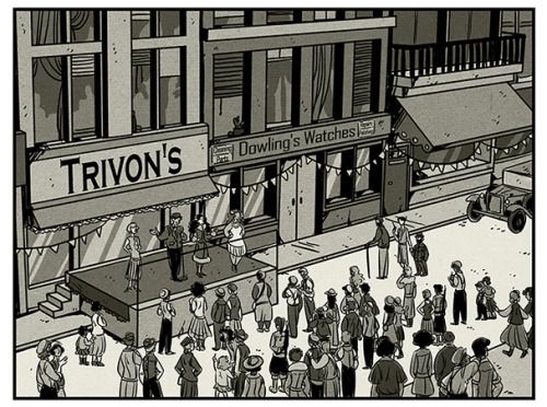
Note
hi bendix! any tips for drawing/ lighting backgrounds? yours are so gorgeous and cohesive, is there anything specific you think about when planning the layout and props?
Thank you for the question! I'll do my best to answer it, but if something doesn't make sense, feel free to hit me up with some follow-up questions, because sometimes I just end up rambling, hah!
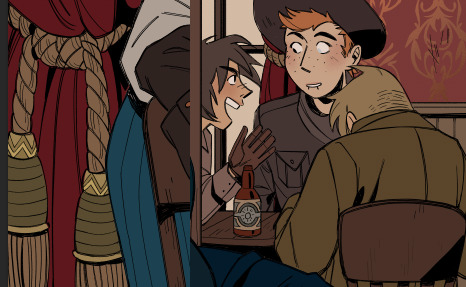
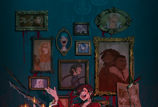
There's a couple of things I keep in mind when I do my bigger illustrations. I always want certain things or characters to be in focus, so for my cowboy illustration, I wanted the four characters from my comic to be the main focus of the piece. I used a couple of different techniques to emphasize this, whereas one of them is lighting.
The background is overall a lot darker and has more contrast between dark and light, than the foreground. To further separate the group from the background, I used the window in the back to add a rim light (that honestly makes no physical sense but it looks neat so...), to make them feel more cohesive as a group.
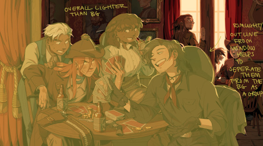
The second thing is balancing the amount of details I put into it. While there is a lot of stuff, the background has broader, bigger and clunkier shapes than the group in the foreground does.
To keep the feel of the details to a minimum, I kept them within those shapes, so the paintings still feel like single boxes, with stuff in it.
This helps the foreground pop with all the smaller details I've added there.
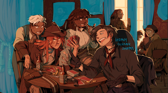
The next thing is colour. The overall colour scheme is very reddish and brown, but to connect the four characters in the foreground, I added blue to them.
Kain, Christie and Dakon all wear bits of the blue and Raki is holding playing cards with the same blue, while his entire outfit is tinted blue-ish, so even if it's black, the cold tones match with the blues.
This also puts them in contrast to the background characters that are exclusively red/brown and stays within those colour groups.
The details on the table are only 3-4 colours as well; I like to keep my palette to a minimum so the things I want to stick out, actually stick out, and so it doesn't get too busy.
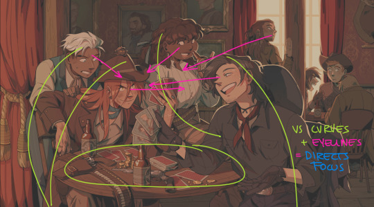
The final thing I like to do, is direct the gaze of the viewer, and use contrast in shape and gestures.
The background and the background characters has very straight lines ...

... whereas the foreground characters are more curved by leaning towards each other, and by sitting around a small round table, that forces them closer to each other as well.
To further direct the gaze of the viewer, I use the eye-lines of the characters. We tend to follow eye-lines in pictures, so I always make sure that my background characters (or some of them) are looking at the thing I want to show off, and that the main characters especially are doing the same thing.
When all is said and done, whenever I start a new illustration, I can basically picture it in my head because I have hyperphantasia. When I sit down to draw, I nudge things around until the idea fits as an illustration, so don't be afraid to just throw stuff at the wall and see what sticks. Winging it will take you far, hahah!
I hope this was somewhat helpful :)
296 notes
·
View notes