
anitaipu
アニタイプ
Logotypes, typography, and other design in anime and related sources.
79 posts
Don't wanna be here? Send us removal request.
Last Seen Blogs
beanyboobee
GenralQueenCycle

ai-artificial-intelligence-ia
AI creator IA

captain-silly-string
Tate to the Tot
spaceyjoxter
Space trip to Moominvalley
zonahawkingtv
Zona & Hawking TV
Text
Up on my personal site today is an examination of Hideki Satomi's design, the man that has supervised slice of life manga for the better part of three decades as a support for names like Kiyohiko Azuma (Azumanga Daioh, Yotsubato!), Keiichi Arawi (Nichijou), Barasui (Ichigo Mashimaro), and many more. Give it a read!
#hideki satomi#azumanga daioh#yotsubato#nichijou#ichigo mashimaro#kill me baby#kiniro mosaic#typography#design#logotype#manga
9 notes
·
View notes
Text
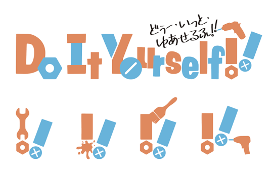
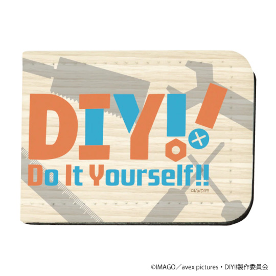

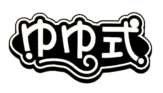
Do It Yourself!! (どぅー・いっと・ゆあせるふ!!)
Designed by Tomoyuki Uchikoga for CHProduction.
Lots to like about this one. The playful glyphs and grafting of tool elements provide a lot of opportunity to mix and match variants, along with being a great anchoring point for much of the motion graphics in the OP. Further elevating it is the default muted orange and blue color palette, an already reliable color contrast, which here evokes denim work overalls and wood tones. The youthful among us will also probably find comfort in the Y glyph looking a lot like the titular Y.
Mixed color palettes are seen across merchandise, along with a much more buttoned-down iteration on the theme songs CD.
61 notes
·
View notes
Photo


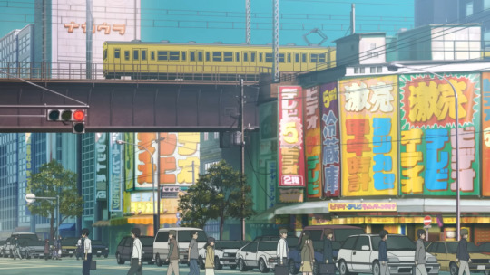

Akiba Maid War (アキバ冥途戦争)
Bigband by Karlgeorg Hoefer for Ludwig & Mayer, now distributed by Linotype.
Not much is yet known about this show, but the scenery present in the PV is decidedly retro. From Rocket being on the corner (now ironically the site of Maidreamin) to the Nakaura building standing tall by itself in the background, this is clearly an Akihabara plucked from around the turn of the century: the period where maid cafes were becoming mainstays and beginning to attract attention from mainstream press. If the title is to be believed literally, we might witness some serious territory disputes.
Bigband is amazingly evocative of the display advertisements that used to dot elecrtronics stores along Chuou Dori, with thick strokes and tight counters that give urgency to any deal, and it was expressly designed for that same purpose. Stores such as Rocket often hand-painted banners with a rainbow of colors to attract attention and that same whimsy is employed here in the PV intertitles.
12 notes
·
View notes
Photo


Calliope Mori - Excuse My Rudeness, But Could You Please RIP? (森美声 - 失礼しますが、RIP)
Montserrat Black by Julieta Ulanovsky. PV by Calliope Mori.
Designed in 2010, this font captured the urban street signage that was rapidly disappearing from the Monserrat village in Buenos Aires. It's a free font and that itself means it's leveraged frequently, but it demonstrates you don't need to drop top dollar to execute good design (save that for the superchats). Small visual choices in the motion design, like using outlines, color, and fluid tracking can stamp flair on what might otherwise look monotonous.
The bottom image shows how the text was skewed to be narrower, with the original unaltered font below the PV text.
4 notes
·
View notes
Photo

Deca-Dance (デカダンス)
Font design by Yusa Maori for NUT.
Regular readers here know that it's not unusual for studios to contract design and type work out to third parties. Most modern productions generally involve licensing fonts from digital foundries, with some notable exceptions like the Gundam franchise opting for custom designs regularly. Deca-Dance shares that uniqueness with the primary font being entirely custom-made. While shows can very easily build their identities on top of existing designs (see Kill la Kill), this kind of gesture demonstrates an attention and commitment to detail that you only see in a fully-realized production.
This design draws heavily on constructivism, a prevailing artistic philosophy throughout the 1920s that embraced rational design stripped down to its essentials. Rugged yet modern, lettering from this era was constructed with geometric shapes, usually trading curves for straight lines set on diagonals. This cohesiveness is most obvious in the Latin characters, but just as easily seen in the kana. Much like how constructivists would embrace multi-purpose use, the font is used across the show's intertitles, lower thirds, UI screens, and credits in a remarkably utilitarian way that's worth appreciating.
30 notes
·
View notes
Photo


Yuyushiki (ゆゆ式)
Designed by OverDriveDesign. English logotype designed by Sentai Filmworks.
Curly and cute. The palette is obviously color matching with the main trio and you feel like smiling back looking at that lower U curve. There are some unexplained curiosities here like the speech balloon and two matching smiles, but it's at least probably safe to assume they're puns on the ゆ considering this franchise. Color variants seem to be all over the place with blues sometimes cooled to a purple or complete palette swaps. Good execution on the English variant too, luckily using the right characters to do a faithful recreation.
A draft of this logo first appeared in early chapters for Manga Time Kirara (last image).
27 notes
·
View notes
Text
An Update
If you haven't heard by now, Tumblr is planning to scrub all adult content from the service on December 17th. While the vast majority of the posts on this blog are not explicit, this does impact some old posts and limits what this blog can cover in the future. As a result, I'm exploring alternatives and whether it's time to move to a self-hosted solution. There hasn't been a ton of activity here, I know, but there's still plenty of design and typography history I'd like to explore that might benefit from a new home. Until anything changes, updates will continue here.
3 notes
·
View notes
Photo


Kaguya Luna (輝夜月)
Ro Brush Std by Shigeru Inada for TypeBank.
For the past few decades, burned-in subtitles have been a staple of Japanese broadcasting, particularly for variety programs. There are a few competing explanations for why this is, like providing clarity for jokes or accents, but it's probably best explained by how it breaks up the visual monotony of talking heads. While TV broadcasting has tenuous relevancy today, the standards established for it have not been abandoned as online video has matured.
Kaguya Luna has done a good job of adopting these elements as part of her visual identity by incorporating many different fonts for subtitles. Ro Brush is perhaps best associated with Luna and her trademark yelling, even appearing as a character item for her Nendoroid. Depending on her intensity, the surrounding stroke can also be smeared. It has also seen popular use on other virtual YouTuber channels like HimeHina's by being easily accessible as a part of Morisawa's deal to provide some TypeBank fonts in Adobe Fonts.
13 notes
·
View notes
Photo
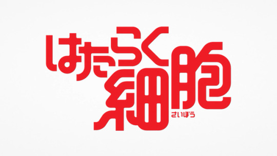

Hataraku Saibou (はたらく細胞)
Designed by Katsuo Yanagawa for SPICE GROUP.
The solid red coloring and round bends on these characters are immediately reminiscent of blood vessels. Notably, the kanji have introduced some ligatures to evoke a connected and complex system. The sizing was later tightened for the anime adaptation and manga spinoffs to allow the kanji to sit flush.
35 notes
·
View notes
Photo

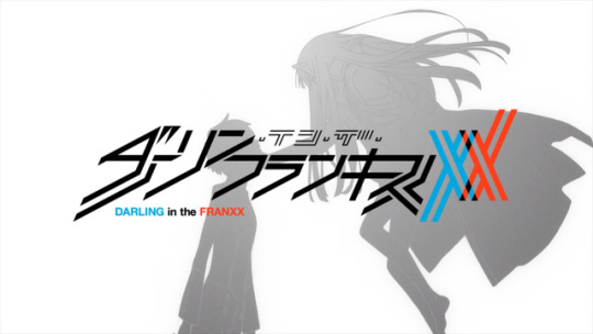

Darling in the Franxx (ダーリン・イン・ザ・フランキス)
Designed by Ichiko Masashi for TGB design.
Borderline unreadable, but the style more than makes up for that. Red and blue have been a reliable contrast in gender stereotyping for centuries. The XX is also a very obvious reference to two X chromosomes and is usefully isolated as an icon. On the menus in the BD releases, this icon is mutated by being split to more obviously show two Y chromosomes.
19 notes
·
View notes
Photo
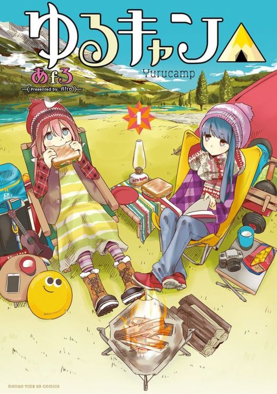
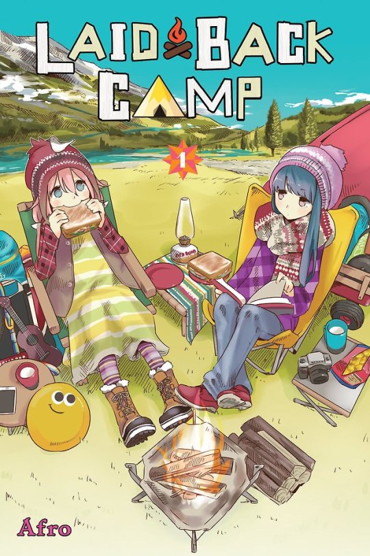


Laid Back Camp (ゆるキャン△)
Anime logotype designed by token graphics. English anime logotype designed by Crunchyroll.
No doubt, these are hard designs to adapt for localization. Yen Press did an admirable job with what they were handed. Crunchyroll’s type is fairly ingenous, grafting elements like the る from the original logo on to the Latin characters. Unfortunately, the title has to spill over into the subtitle and it compromises the hierarchy. This is definitely an example where the design would benefit from a less strict translation.
43 notes
·
View notes
Photo

Early drafts of logos for Yellow Magic Orchestra.
4K notes
·
View notes
Photo
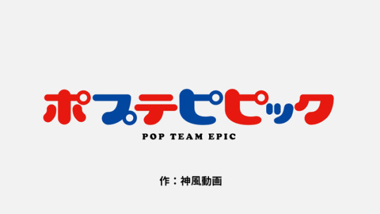
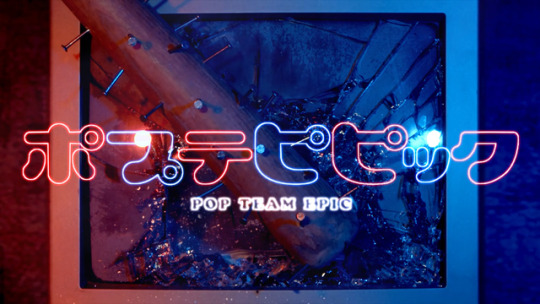

Pop Team Epic (ポプテピピック)
Lovely Capsules by Kotaro Hatano for Gray Graphics. Subtitle set in Cooper Black by Oswald Bruce Cooper.
A kuso logo. Lovely Capsules with a few modifications: the cross strokes have been flattened, the vertexes aren't as rounded, and the vertical scale has been exaggerated.
34 notes
·
View notes
Photo


Girls' Last Tour (少女終末旅行)
A key characteristic in stencils are bridges, the thin strips connecting from counters to the rest of the outside stencil. Not only is this responsible for their unique look, but it is what allows a physical stencil to be used repeatedly. This continues to make them appealing in military for quickly labeling equipment. Japanese's character system makes it difficult to adapt to stencils, but stencil elements still sneak their way into custom designs like the logotype for Girls' Last Tour.
Two logotypes were produced for localization, the first for the manga published by Yen Press and the second for the anime simulcast by Amazon. While it has always been common for licensers like Sentai to produce localized logotypes for physical releases, it's clear that Amazon has talent in-house working on polished designs. Yen Press made a good effort, but the design looks amateur as the bridges occur without much thought and the letterforms look unnecessarily disjointed. Amazon by comparison is much more restrained and accomplishes better legibility that is faithful to both traditional stencil typefaces and the original logotype.
13 notes
·
View notes
Photo


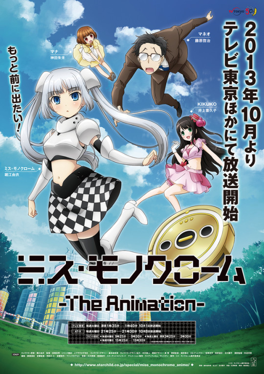
Miss Monochrome: The Animation (ミス・モノクローム -The Animation-)
Designed by Jun Tanaka for Outline.
Yui Horie's virtual idol. These glyphs look like they'd be at home on an LED matrix sign, keeping with the checkered motif. The singles and other promotional materials, also designed by Jun Tanaka, use inidividual logo treatments.
2 notes
·
View notes
Photo


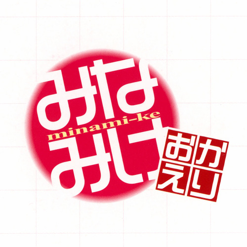


Minami-ke (みなみけ)
ロゴJr from Visual Design Laboratory. Romanization set in Times New Roman from Monotype.
Other than the squashed romanization, this logo has aged pretty well. The main logo and each subtitle imitate inkan (印鑑) seals that would be used to sign documents, giving each entry its own personal flair without compromising the base design. The OVAs also received their own subtitle treatments.
8 notes
·
View notes
Photo
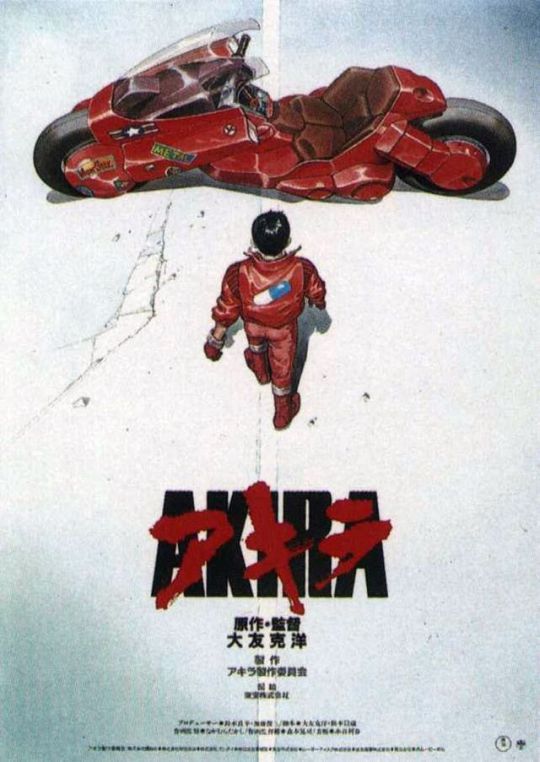
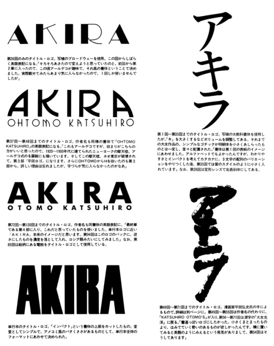
Akira (アキラ)
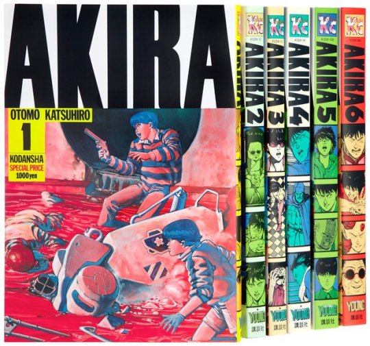
Final design by Hiroshi Hirata. Romanization set in Haettenschweiler by Walter Haettenschweiler. Page scan from Akira Club by Katsuhiro Otomo.
The evolution of Akira's logo. While everyone is familiar with the final design, the other iterations only saw light while the manga was serialized in Young Magazine. The first design, a simple Ming, did no justice to the material but was thought to be easily understood. Later designs drew upon Russian and Western influences. The final design for the special volumes published by Kodansha embraced a ruggedness that was reminiscent of type found in American comics.
Hiroshi leans heavily on caligraphy, incorporating it extravagantly into dialogue for his manga and in most cases drawing the titles himself. One of his designs for Akira was eventually incorporated into the final title for the special volumes and later the film by being overlaid the romanization. While Akira Club says this title is set in Impact with a shaved top, the jaunty leg on the R and the tight counters suggest it is more likely a modified Haettenschweiler.
40 notes
·
View notes