
allanwalkerit
Tableau Renders
Views expressed are my own, and not that of my employer
29 posts
Don't wanna be here? Send us removal request.
Last Seen Blogs

igi-game-cheat-codes-freeyd
🔥 igi game cheat codes free download (hack PC) 5

itsniaeveryone
It's Nia Everyone


drsilmansmilespaus
Dr Silman Smile Spa

krekart
Witty Quote
Text
I did it my way. (With a Little Help from My Friends)
‘I planned each charted course
Each careful step along the byway
And more, much more than this
I did it my way’ - Sinatra
Over the last three years, I’ve built out some proof-of-concept data visualization applications for some large scale Enterprise clients, across a multitude of vertical markets.
These have included, in no particular order:
Semi-conductor manufacturing
Wearable technology manufacturing
Pharmaceutical distribution
Financial
Oil & Gas
Retail
Consumer Hardware & Software
Mobile Communications
Energy Utility
Without exception, every Enterprise client presented similar challenges - namely, how to visually represent data at scale in an insightful, and actionable format.
Here is my methodology.
I adopted a Data strategy:
Data as a service,
ETL as a service,
Data Science as a service, and
Data Visualization as a service.
Data as a Service (DaaS)
Data Acquisition
Technology is making acquiring data in an more automated manner arguably easier and relatively cheaper, increasing the volume and velocity of data produced.
SCADA (Supervisory control and data acquisition devices), Bank ATM’s, merchant credit card swipe terminals, website forms, and sensors - such as Infra-red, Radar and Sonar - even when you compose a tweet...all examples of data acquisition.
With more and more IoT (Internet of Things) devices becoming available, automation of data collection is becoming more even more universal and ubiquitous.
Data Storage
If a record has a time-stamp, it can be recognized as an event, or a transaction; i.e. something happened at this time, on this day, in this month, in this year. These records are (normally) stored in a database.
That was my bread and butter, making sense of events that have happened - or, what was happening in (near) real-time. In recent engagements, it’s the latter that seemed to be more pervasive - sustaining ‘live’ data connections that are capable of very fast refresh rates - sometimes on a per second basis (but more often than not, updated daily).
Data as a Service at the Enterprise meant I’d be connecting to a “Data Lake” such as Hadoop/Hive, a Teradata warehouse on-premise database, or a cloud database like Redshift on the Amazon Web Services platform.
Alternatively (or sometimes additionally), I’d be connecting to ‘NoSQL’ databases like Mongo and Cassandra, while location data was held in GIS (Geo-spatial Intelligence Software) databases like PostGIS or ESRI.
There were also databases that are designed to take advantage of in-memory technologies, and are suited to analytical applications; such as SAP Hana, Memqsl, and Snowflake.
My preferred solution for the foundation of a Data as a Service based architecture is Exasol, because it is proven to be capable of performing analytical tasks at scale, leveraging massively parallel processing and in-memory technologies, enabling rapid responses to intensive queries over massive data sets.
ETL (Extract, Transform, Load) as a Service
‘Extracting’ reads data from a source database (and potentially multiple other sources), ‘Transforming’ is the process of converting this data (joining, unions, performing calculations, cleansing and aggregating) and ‘Loading’ writes to the target database (or writing back to the source).
Business Intelligence applications such as Tableau, Qlik, and Microstrategy often require data to be ‘shaped’ or ‘structured’ in a certain way; usually in a columnar format.
This used to be an arduous task - involving writing batch scripts - but no longer. There are a plethora of enterprise ETL solutions available such as AWS Glue, Apache Kafka and Informatica.
My preferred solution for the basis of an ETL as a Service based architecture is Alteryx, because it is proven to be capable of extracting data from multiple sources - including Hadoop/Hive, Mongo, ESRI and Exasol.
Using an intuitive drag and drop GUI (Graphical User Interface) - it is possible to develop a repeatable, re-usable data transformation as an automated process (also known as a workflow) that can be run on a scheduled basis.
Data Science as a Service
Traditionally, Enterprises would refer complex analytical and statistical tasks such as predicting, modelling, forecasting and so forth to highly skilled data scientists.
It is now possible to automate some of these complex tasks - on Platforms like IBM DSx (accessing tools like Watson ML & Apache Spark), and AWS Domino (accessing tools like Python, Julia & Matlab) but my preference is again, Alteryx, because it is proven to be capable of generating highly accurate predictive models, simulations and forecasts (using the open source R) at scale, as an automated process.
Data Visualization as a Service
There are many Data Visualization tools and libraries available: IBM Cognos, Plotly, Microsoft PowerBI - but here I have three preferences, and sometimes, depending on the scenario and use-cases, I’ll combine all three.
Tableau is proven to be capable of plotting huge amounts of data points on a HTML Canvas. The Server JavaScript and REST APIs (Application Programming Interfaces) allow integration with responsive design Bootstrap web applications and a consistent library of user interfaces. Combined with an Exasol database connection, Tableau is capable of querying multi-million high granularity records - for example transactions - allowing for interactivity over multiple plots/charts.
D3 is my preference if I am using low granularity or summary data. Instead of a server responding to a query and returning that response, d3 downloads and processes data client side, in a browser. D3 is capable of drawing elements on an HTML Canvas or rendering SVG (Scaleable Vector Graphics). It is cross-browser, platform agnostic, and ultimately, the most flexible library which allows for full customization.
Mapbox is my preference if I am using location data. It is capable of rendering multi-million data points using vector tiles, which can be queried client side in a browser.
User Experience/User Interface (UX/UI)
jQuery UI is my preference for a consistent User Interface library. I use Bootstrap to develop responsive design web applications. I typically use client CSS and style guides to comply with typography, color palette and brand guidelines for the application.
Charts and graphs typically remain in a grayscale color palette, with chart types conforming with Tufte/Few guidelines.
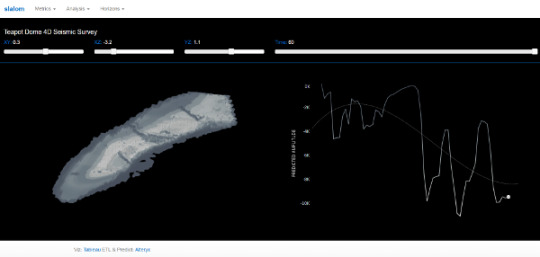
Example #1
Scenario: Four Dimensional Seismic Survey
Use-case: Predict magnitude of seismic activity over time for the different formations (horizons) in the anticline, and compare with actual values.
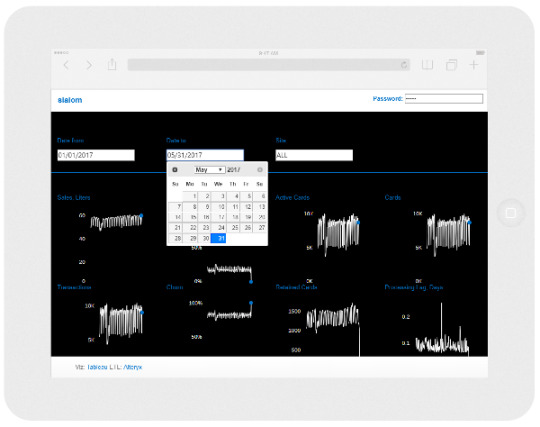
Example #2
Scenario: Fleet Credit Cards
Use-case: Predict churn and retention over time for different retail sites and compare with actual values, making the last data point actionable (alert site manager upon difference to target and/or outside normal parameters).
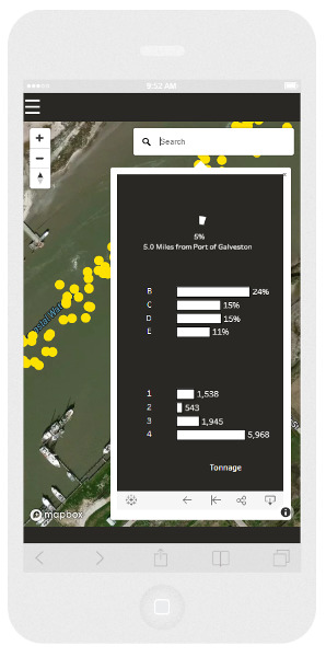
Example #3
Scenario: Demand and supply of products over time for different markets
Use-case: Predict origin and destination locations of logistical assets and compare with actual values over time, to inform a forecast model of product supply and demand.
Of course, I was being my normal flippant self when I sang ‘I did it my way’. I had more than a little help from my friends - you know who you are of course, because I’ve tipped my hat to you on many occasions in previous blog posts.
‘What would you do if I sang out of tune?
Would you stand up and walk out on me?
Lend me your ears and I'll sing you a song
I will try not to sing out of key’ - Lennon/McCartney
The communities
Over the last three years, I’ve learned a lot from developers in various communities:
The twitter-verse of data visualization practitioners,
The Tableau community forum,
The Alteryx community forum,
GIS Stack Exchange,
Stack Overflow,
GitHub,
Behance,
Dribbble, and
Codepen
‘What would you do if I sing out of tune, Would you stand up and walk out on me?‘
The Tableau ‘community’ as of late 2017, seems to be going through a radical period of introspection. When I say ‘Tableau community’ - I’m really referring to the ‘Tableau twitterati’ - not the community forum participants per-se, but cliques such as MakeoverMonday and Women + Data, and the ultimate Tableau coterie - Zen Masters.
In fact, Tableau themselves referred to these groups as ‘tribes’.
A culture, or sub-culture, can form behaviors and attitudes that stem from attachment and perceived loyalty to that clique. Sectarianism is synonymous with tribalism, and is often an consequence of division.
When I read tweets haranguing other practitioners about plagiarism, and read blog posts with political statements to underpin an opinion, or examples of promoting gratuitous and egotistical self promotion, it gives me great pause for concern, and it’s very tempting to stand up, and walk out the door in disgust at what the community not only regards as acceptable, but normal.
‘Lend me your ears and I'll sing you a song, I will try not to sing out of key’
I recommend that Tableau shutters the Zen Master program, and instead, promotes and grows the Tableau Foundation Data Fellowship.
I recommend that the Makeover Monday leadership and participants re-focus their efforts by contributing to the Tableau Foundation Projects and develop towards meeting the Sustainable Development Goals, volunteering their time to the Tableau Service Corps.
I recommend that Tableau welcome Women + Data members on the board of their diversity committees and judging panels of the ‘IronViz’ competitions and feeder contests.
I believe that these recommendations would foster an inclusive, collaborative culture, rather than accepting and promoting sectarianism as a norm; and would re-energize the wider Tableau community.
9 notes
·
View notes
Text
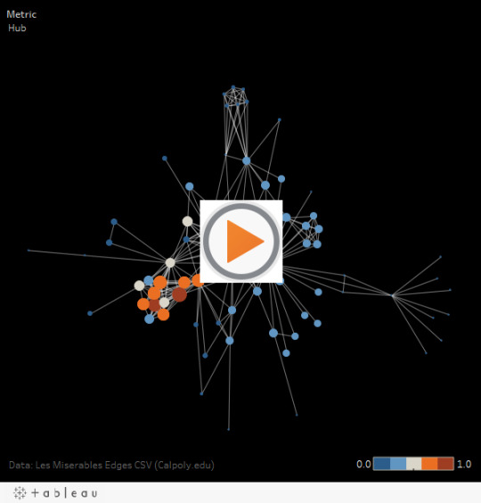
Network Graph Generator for Tableau using Alteryx
var divElement = document.getElementById('viz1509908130440'); var vizElement = divElement.getElementsByTagName('object')[0]; vizElement.style.width='600px';vizElement.style.height='627px'; var scriptElement = document.createElement('script'); scriptElement.src = 'https://public.tableau.com/javascripts/api/viz_v1.js'; vizElement.parentNode.insertBefore(scriptElement, vizElement);
This post is mainly attributable to Nicco Cirone, whose blog post covering Donald Trump’s tweets can be read here.
What I’ve done is take the basis of Nicco’s work, posted the workflow to the Alteryx Gallery and added graph metrics using the work of Katya Ognyanova which can be read here.
3 notes
·
View notes
Text
Tableau dynamic parameters, solved.
“Good Morning, Ladies and Gentlemen, I have an important announcement to make” said the CEO of Tableau Superstores; “Today, we’re creating a new sales region, to align with our competitors - please welcome the new VP of North Territories.”
“Welcome to the team!” said the Vice Presidents of the Western, Eastern, Southern and Central sales areas in unison.
Round of applause from the board, but during this, the CIO is busy writing an email to the Head of Analytics - “Give me the charts for the new North Region by the end of the week”.
As a Tableau developer, this scenario is the reason that the top voted idea “Multi-Values Parameter” (aka Dynamic Parameters), or for those of us who have been around a while “Hooperized Parameters” (named after Chuck Hooper) has remained so popular within the Tableau community forum. And it has yet to be implemented as an “in-the-box” capability.
However, Tableau did give us a new function, called getData(), in their Javascript API. I’m going to show you a way how you could implement this to manage this use-case.
So what’s going on? There are four main stages:
1. Get the data from a worksheet on a dashboard. This is a simple list of Regions. This is held in an array.
2. De-duplicate and sort the array.
3. Append the items to the dropdown filter, and then show the filter after the process completes.
4. When a choice is made, send the value to an open parameter which conditionally filters the view.
So when the new value is entered into the data source - the drop-down will populate. It will also handle deletes, or name changes.
So while dynamic parameters might not be announced at “Devs on Stage” at the Tableau Conference in Las Vegas this year - and if it did, it would bring the loudest cheer and a standing ovation from the crowd - now at least you have a copy and paste solution (feel free to fork my code) to the scenario!
1 note
·
View note
Text
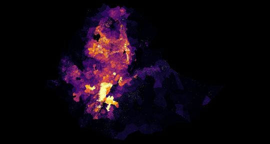
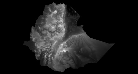
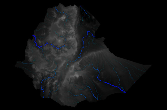
PATH and Tableau Foundation #visualizenomalaria project - Predictive malaria model
Renders of input variables - find the whitepaper here.
Zambia
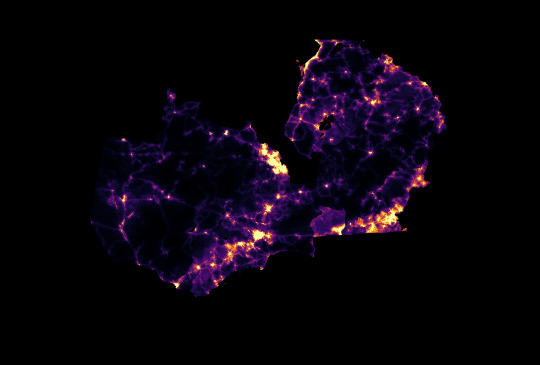
Population Density
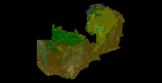
Land Cover
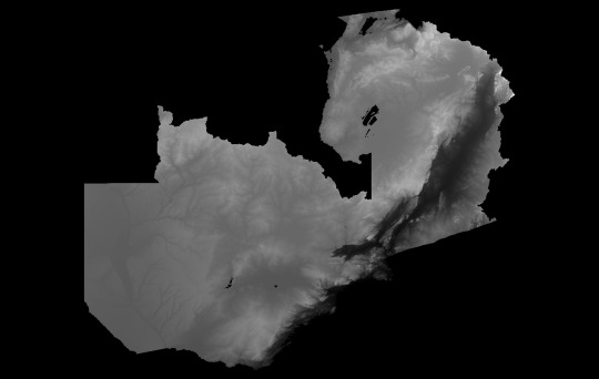
Elevation
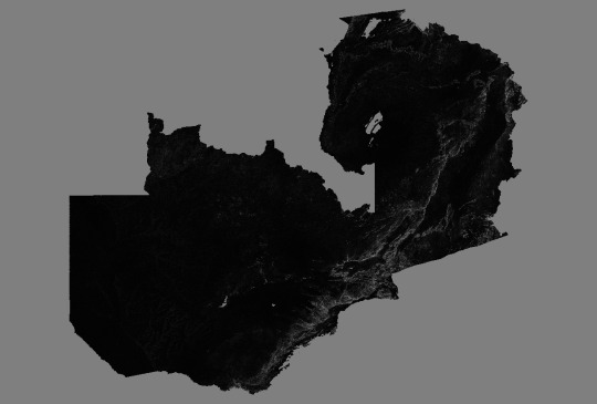
Slope
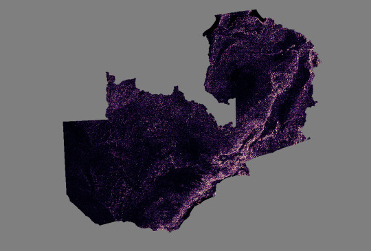
Stream Power Index
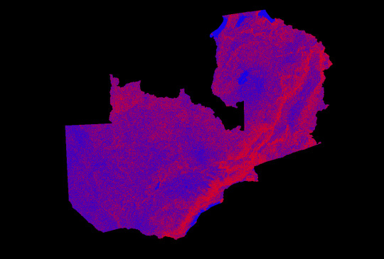
Topographic Wetness Index
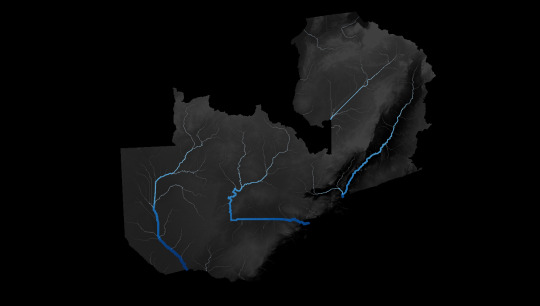
Channel Network
SENEGAL
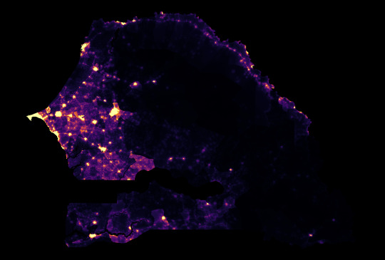
Population Density
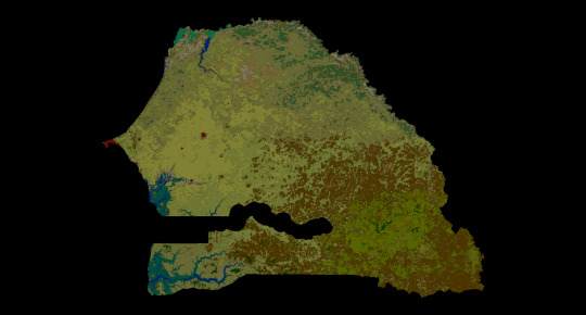
Land Cover
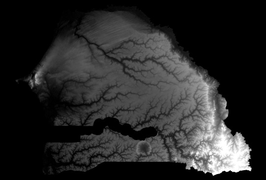
Elevation
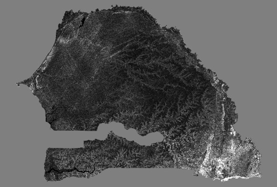
Slope
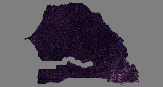
Stream Power Index
KENYA
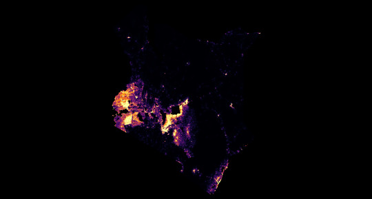
Population Density

Elevation
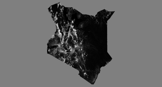
Slope
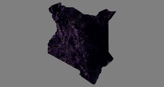
Stream Power Index
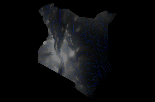
Channel Network
ETHIOPIA
Population Density
Elevation

Slope

Stream Power Index
Channel Network
0 notes
Text
Augmented Reality Data Visualization
I recently saw the Mapbox AR Demo (built with Apple’s ARKit and Unity) and was impressed - there is an awful lot of “wow” factor going on there.

Now as with any new technology, tying this back to a business use case will be the real next step (I recently saw IKEA had partnered with Apple so that you can visualize a piece of furniture right there in your living room or office space) but for this blog post I’m simply going to write up how I was able to knock up a proof of concept using ar.js, artoolkit, and a-frame. Hat tips to Jerome Etienne!

First of all, I needed an https:// webpage to make this work. Enter Github pages (thanks to my friend Chris Toomey for telling me about them). If you haven’t got a github account, go make one - then follow the instructions to create a page. I also downloaded github desktop, which kind of acts like an FTP client.
Here’s the code of the page, broken down to show you what’s going on.
The normal header stuff:
<!DOCTYPE html>
<html lang="en">
<head>
<meta charset="utf-8">
<meta http-equiv="X-UA-Compatible" content="IE=edge">
<meta name="viewport" content="width=device-width, initial-scale=1">
<meta name="description" content="AR Demo">
<meta name="author" content="Allan Walker">
<title>TabAR</title>
A CSS file (For the top bar)
<!-- CSS -->
<link rel="stylesheet" href="TabAR.css">
The Javascript magic
<!-- SCRIPTS -->
<script src="https://aframe.io/releases/0.5.0/aframe.min.js"></script>
<script src="https://jeromeetienne.github.io/AR.js/aframe/build/aframe-ar.js"></script>
<script src="https://rawgit.com/mayognaise/aframe-gif-shader/master/dist/aframe-gif-shader.min.js"></script>
<script src="https://rawgit.com/mayognaise/aframe-gif-component/master/dist/aframe-gif-component.min.js"></script>
</head>
Some HTML (providing a link to the HIRO marker)
<body>
<div id = "bar"> <button class="button" type ="submit" onclick="window.open('Hiro.png')"><span class="glyphicon glyphicon-th-print"></span>Get the HIRO Marker</button></div>
The A-Frame magic
<a-scene embedded artoolkit='sourceType: webcam;'>
<a-assets>
<img id="nukes" src="nukes.gif">
</a-assets>
<a-entity geometry="primitive:sphere;" position="0 0.5 0" material="shader:gif;src:url(nukes.gif);";opacity:1;>
<a-animation attribute="rotation" dur="10000" fill="forwards" to="0 360 0" repeat="indefinite" easing="linear"></a-animation>
</a-entity>
<a-marker-camera preset='hiro'></a-marker-camera>
</a-scene>
Finish up the HTML
</body>
</html>
and there you have it. Yep, that’s just an animated gif, not an actual JS API’d- up TableauViz, but I don’t think that should be too difficult to do either (in most cases, you’d just replace the sphere for a plane).
If you want to try it out (desktop chrome works best, although most Androids will be able to open it too) - the link is here: download the HIRO marker to your device (or print it out) and have some fun!
3 notes
·
View notes
Text
A Tableau Viz de-construction
Jonni Walker DM’d me on Twitter with an ask. He wanted to know if his London’s Parakeets Viz could be “squished”.
Here’s a picture of how his viz looked before I did anything with it.
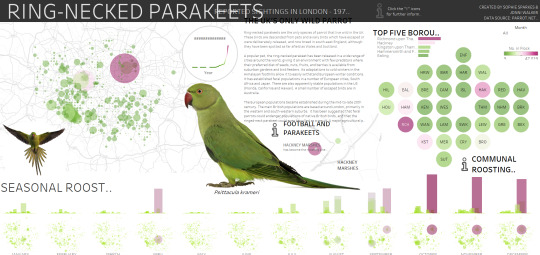
A beautiful Dashboard! I wasn’t sure I could actually do anything with it though, as it was fixed in size (1000 pixels high, 2100 pixels wide), and had lots of floated elements. This was going to be a challenge...
So what I did first was to work out the pattern of the elements in the Dashboard.
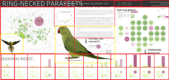
As you can see, it’s roughly broken down into four rows:
Top row: a title bar, with four elements, a heading, sub-heading, an information icon, and credits.
Second row, a map, with an image of a parakeet in flight, and another viz of the trend bordered with a circle, and a large picture of a parakeet underneath; some text (with another map below); a bar chart (with a dot plot underneath); and finally, some more information/link icons.
The Third and Fourth rows are small multiple of bars and maps in a calendar view. 29 Viz elements - with two images! Phew, I had my work cut out for me, but I was pretty determined that it could be done.
Stage 1 - Title Bar
The top row in the original Viz was really “squished up” - even at 2100px wide. This is because using Tableau desktop, font sizes are fixed. Even at 9pt, the credit section misses off some key text: and truncates with an ellipsis (..) . However, this is a great use case for CSS - I could use font-size: xx-small. To vertically align all the text, I used <span> and line-height. I also used bootstrap’s row and columns instead of floating left or right. The real challenge was using a border on the icon - especially as it is a hyperlink, but I wanted to retain the functionality that Jonni had put into the viz, jumping the viewer off to relevant sources that he had researched.
You can also see in the picture I had started to think about my layout, again using Bootstrap’s row and column - and had put text in to show where the visualizations would appear - onto Stage 2.
Stage 2 - Bottom Rows

For this part, I duplicated the bar and map worksheet 24 times, filtering each one for the month, and swapping the dual axis out (the original was one worksheet, with both bar and maps) for a single mark type. Then I dragged each worksheet into its own (automatic sized) dashboard, giving me 24 separate dashboards. Bootstrap has a twelve column system: 2 rows of 12 columns each.
Stage 3 - Top Right (Bar Chart, Dot Plot and Information Icon)
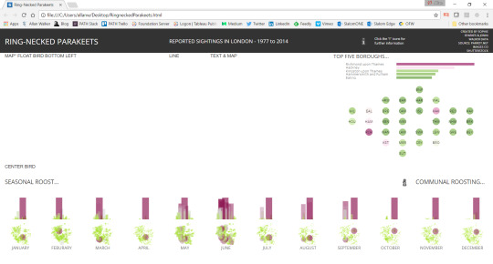
For the top section, I set up a <ul> with two <li> elements, stacking the bar chart on top of the dot plot. The top row was already set in Bootstrap with a single row and 3 columns. Another row for the information icons was set up below the Top row.
Stage 4 - Map and Parakeet in Flight image
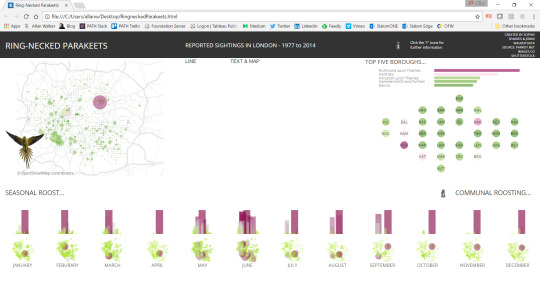
This is where it started to get interesting: How do you float an image over a Viz? Clearly this couldn’t be responsive (or maybe it could be, with some amazing CSS and an SVG image) - but I wanted to replicate Jonni’s design - not fundamentally change it. So I fixed the position of the bird in flight to the bottom left of the map <div> and then gave it a z-index higher than the map.
Stage 5 - Sub Text, Text, Information Icon, Small Map, “Hero” image of Parakeet

Gaining confidence, it was time to do the hard part: the centerpiece. Confident now I had a solution for floating an image over a div, the “hero” parakeet image was fixed over the map. Above the image, I created a circle border in CSS and then put a z-index on the trend viz. Again, not a responsive solution: viewing this on a mobile phone will “work” but it really was intended for desktop consumption. The text, center information link, and the smaller map was another <ul> and <li>.
You can view the viz here.
So what’s next? Well, on visualizations this size, tooltips are kind of useless. So I might use an event listener and then put the information about the mark in a text <div>. There was also a filter for the top left map, the bar chart and the dot plot for each month...but is it really needed, when the small multiples tell the story anyway?
I could perhaps workout the window height and width onload, and prompt the user that it would be a better idea to view this on a desktop. Or, wrap the text in the middle column around the bird image. And I’d love to workout how to float the trend viz with the circle border in a responsive manner (rather than a fixed position): likewise the bird-in-flight image. But I think that would interfere with Jonni’s original design intent, and therefore I’m calling this a fairly good, but certainly not perfect solution!
So while this will work on a mobile phone - or iPad - it’s best to view this on a desktop or laptop.
What’s more important (I think) really is to have a think about how I was able to break the original dashboard down into its own elements, and then re-build it back up using CSS (bootstrap) and the Tableau JavaScript API.
0 notes
Text
I built something silly using Tableau*
So you don’t have to stop and think.

I’ve called it Tab-inder. Swipe right if you like the data viz, swipe left if you don’t.
I just wanted to make a statement on my consumption - of data viz.
I get a daily dose of data visualizations dumped onto my social media feed. Not just tableau vizzes, but d3, plotly, powerbi, you name it.
Instant eye-candy gratification.
(Inside my head I am thinking...) “Wow, look at that new #Makeanameforyourself viz, maybe the author(s) feel like they’ll get famous for fifteen minutes if it goes viral and get more than 20 likes” (When I should be thinking...what did I learn from this? What was the insight, what action do I need to take?)
By the way - this is meant to be funny, tongue-in-cheek - so if you get all upset and assume this a personal attack on your data viz efforts - please remove the stick from your posterior, because it’s not.
Maybe it’s just me, but I think a little delayed gratification and actually thinking thorough the development of a product - rather than banging it out as quickly as possible - might actually be worth something, you know, quality over quantity.
It’s been too long since I’ve seen a data visualization that made me stop and think. Or provoke me to do a deep dive into the data. Probably because they are coming at me so fast, I only have time to swipe left, right, or hit that “like” button.
So anyway, if you want an example of a product that has been in the making for a year, and might actually stop and think about your lifestyle (oh, and it’s quite pretty too), have a look at Anya A’Hearn’s new viz, “Consumed!”
* Thanks to the author of JTinder, a jquery plug-in
0 notes
Text
PDF from Tableau - without JavaScript!
If you are a developer, and have had to build an enterprise app with Tableau you’ll be used to seeing requirements like “The user wants to get a report in PDF format” and “The user wants to export a report to CSV”.
This used to involve calling the viz with the API, and then executing functions using “onclick” (i.e. a button that references the function) such as:
function PDF(){
viz.showExportPDFDialog();
}
and
function exportData() {
viz.showExportDataDialog();
}
Both of which produce non-responsive dialogue boxes - useless for mobile applications (This is the example from the Tableau JS API tutorial...and as you can see you can’t even click the generate PDF button, because it is “clipped” by the section underneath)!
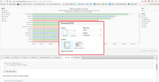
However, now there is no need to, YAY!

Instead, you can use one line of HTML:
PDF Example
<button type ="submit" onclick="window.open('https://public.tableau.com/views/WORKBOOK/VIEW.pdf?')">PDF</button>
CSV Example
<button type ="submit" onclick="window.open('https://public.tableau.com/views/WORKBOOK/VIEW.csv?')">CSV</button>
Proof of Concept can be found here.
1 note
·
View note
Text
Using Tableau to render LIDAR in 3D with the 10.2 Spatial Connector

var divElement = document.getElementById('viz1490654624800'); var vizElement = divElement.getElementsByTagName('object')[0]; vizElement.style.width='379px';vizElement.style.height='736px'; var scriptElement = document.createElement('script'); scriptElement.src = 'https://public.tableau.com/javascripts/api/viz_v1.js'; vizElement.parentNode.insertBefore(scriptElement, vizElement);

“LIDAR, which stands for Light Detection and Ranging, is a remote sensing method that uses light in the form of a pulsed laser to measure ranges (variable distances) to the Earth. These light pulses—combined with other data recorded by the airborne system— generate precise, three-dimensional information about the shape of the Earth and its surface characteristics.”

Courtesy NOAA - What is LIDAR?
Here’s a render of the Golden Gate Bridge, using nothing more than Tableau and a bit of QGIS magic.

It’s important to note that this isn’t a CAD drawing. It’s just lots of rows of data, millions of them, in an XYZ format. X=UTM Northing, Y=UTM Easting, Z = elevation in meters. The UTM Northings and Eastings were in WGS84 10S. So I used QGIS to get the X’s and Y’s into WGS84 EPSG:4326 Longitudes and Latitudes.
I got the data as raw ASCII text files of the LIDAR point cloud from NOAA’s Coastal Data Access Portal - 1.9GB of it - as it covers the San Francisco Bay Area. There was a handy grid shapefile, so I knew all I needed was one grid in particular - 7948.
This is what popped out after loading the data into Tableau.
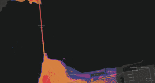
Enter again Bora Bevan’s handy going 3D with Tableau workbook. After copying and pasting the calculated fields (which carry over the parameters)…well, you saw the result at the top of this post.
I thought, well why stop there. Let’s see what else I could visualize with this technique. Here’s downtown SF.

To be frank, I think these are my favourite Tableau renders yet. I really love that I can see the building where I work. In such precise, three dimensional detail.
And I got 99 million points for ya, PowerBI, but a Tableau ain’t one.
It’s #IronViz season, and the theme was geospatial.
Back to the NOAA Data Explorer and download 20 Gigabytes worth of LiDAR.
The whole of Manhattan.
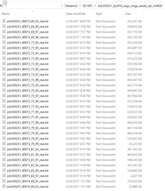
In other words, a lot of data.
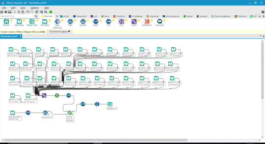
After an Alteryx workflow, yep, that’s a LOT of unions...and a bit of intersects, with the NYC DOITT building footprint shapefile (A long time ago, before the brave new world of the 10.2 Spatial Connector, I did upload a TDE of these buldings to Craig Bloodworth’s Tableau Mapping website)
Out popped this:

But I think Ben Jones would have a heart attack if I uploaded all that to Tableau Public. So instead, I filtered it down to a reasonable size using names!=null and year>-1967.
It does animate this quite nicely...

Entry #1 here.
Entry #2 The Golden Gate & San Francisco workbooks here & here.
0 notes
Text
Why you should consider putting Bootstrap at the forefront of your Tableau development and learning “to-do” list.
What’s Bootstrap?
“Originally created by a designer and a developer at Twitter, Bootstrap has become one of the most popular front-end frameworks and open source projects in the world.”
Why I love Bootstrap, and why you’ll love it too.
Bootstrap is “designed for everyone, everywhere”.
Bootstrap makes “development faster and easier”.
Bootstrap is made for “folks of all skill levels”.
Bootstrap is made for “devices of all shapes, and projects of all sizes”.
Bootstrap is open-source. Read: free.
Once you start learning and building, you’ll be in good company – millions of websites are built using Bootstrap.
Like NASA.gov.

and #ONENYC.
I think you should give it a go, too.
However, Bootstrap is code. I know while that can be initially intimating, it will be a worthwhile investment of your time.
I recommend W3schools.com Bootstrap 3 tutorial and Getting started by Bootstrap.
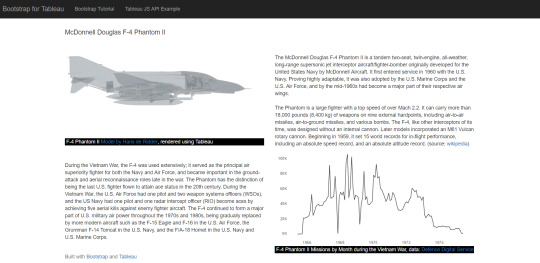
Once you have checked the tutorials out, and/or downloaded a template you like, right-click and view the source code of my example, and see how I’ve integrated the Tableau JS API into the page.
1 note
·
View note
Text
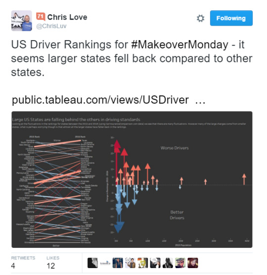
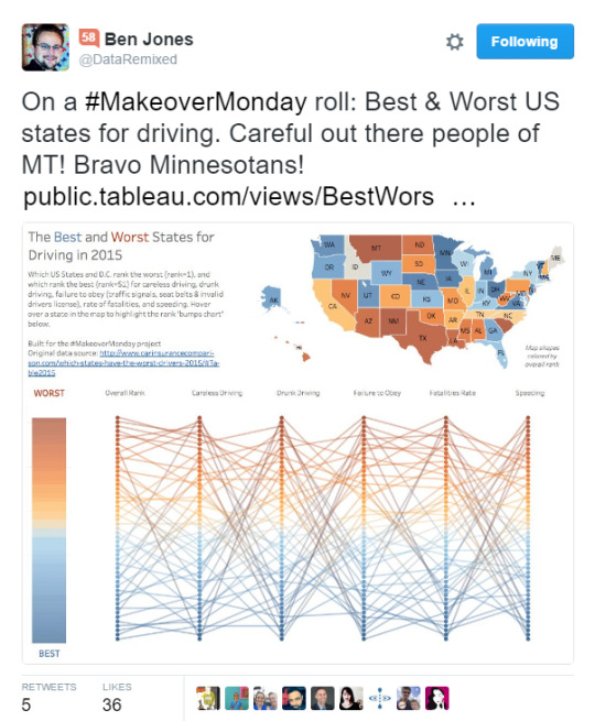
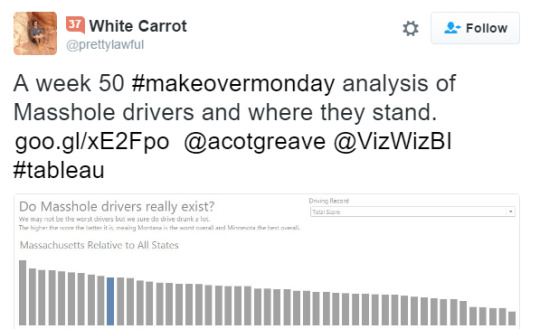
Is #Makeover Monday in need of a makeover?
and/or, please don’t contribute to the growing amount of Fake News.
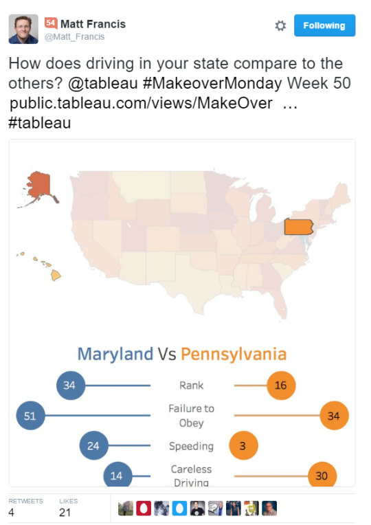
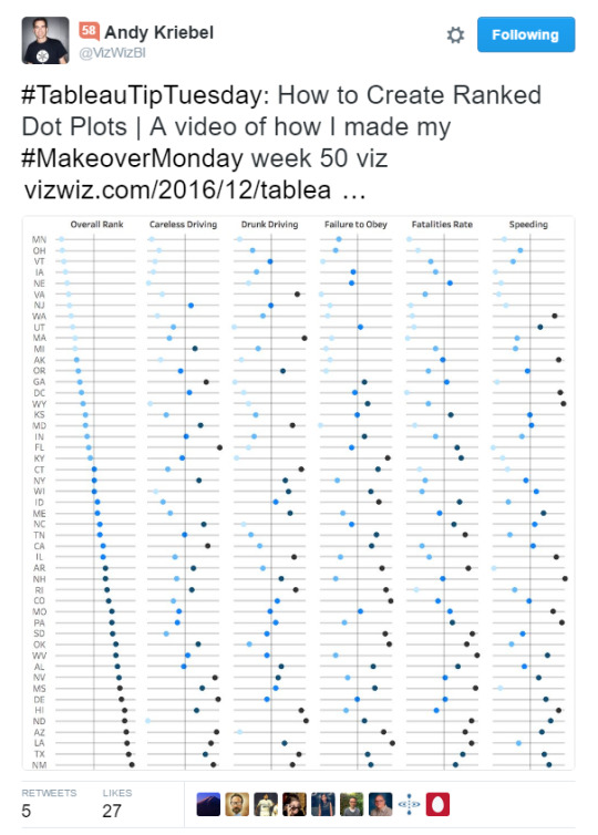
First things first. I got my knickers in a twist, panties in a bunch, bloomers in a knot. I over-reacted on twitter (bad idea) and I’m formally apologizing to Pooja Gandhi, Ben Jones, Matt Francis, Andy Kriebel, Chris Love; (and anyone else who has since contributed to Week 50...probably another 60+ people) in advance; and I want to thank Craig Bloodworth for explaining to me what the purpose of #Makeover Monday is.
Because sure-as-sh!t I had obviously made the wrong assumptions.
The purpose of #Makeover Monday is to practice Tableau.
OK, cool.
Why did I loose it?
This
Doesn’t
Look
Right.
At all.
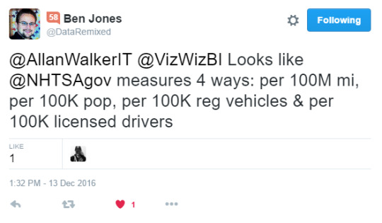
All of these visualizations were based on a data from a report called “Worst Drivers by State” published by Car Insurance Comparison.com, which was the data set of week 50 on the Makeover Monday website.
The report author claims “The rankings for this study are based on statistics made available to the public by the National Highway Traffic Safety Administration.” and “We translated all of this information into one Total Score, and the worst states received the lowest scores.”
So now I knew to question the methodology, and the report data set.
Here’s what was said in a back channel.
“Is the data bullshit? Yes
Rehash bullshit? Yes
Go back to the start and assess the data
Is it bullshit? Yes
Use it? No”
The reason I completely lost it - was that the source data - to which the Car Insurance Comparison.com report author points to - is available. I therefore wanted to prove just how skewed the data set was, and how flawed the methodology was.
First thing to do was to get the source data, by querying FARS. After making these selections:
Year: 2015
Option 3 (Crash / Vehicle / Driver / Precrash / Occupant)
Check all fields for each of the above
Case listing
Check all fields
Then choosing .txt (and wait, because it takes a while to generate), I now had raw observation data.
To standardize this data I needed four measures: Population, Registered Vehicles, Lane Miles, and Vehicle Miles Traveled.
You may be asking how to standardize your data using Tableau.
You may be wondering why I didn’t normalize. Here’s the skinny.
I then followed Jonathan Drummey’s excellent “Rank of Rank” post to obtain the overall rank. Jonathan also has a resource of links for Level of Detail (LOD) calculations, I needed only one in this case: {FIXED [Obs.] : COUNTD([Obs.])}.
I then built two driver related filters (the question asked was “Which States have the worst drivers?” from flags in the data set:
Alcohol
Speeding
I’ll admit I didn’t attempt to compare two other measures from the Car Insurance Comparison.com report (”Careless driving” & “Failure to Obey”) as they were are poorly defined & ambiguous. (The legal definitions vary from State to State). That being said, it may be possible to garnish an equivalent sub-query by parsing out the “Violations Charged” field.
Find my workbook here.
Unfiltered for Alcohol & Speeding
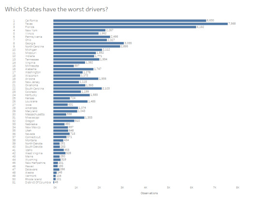
California is at the top.
This is what I expected.
I live and work in California, and drive on the 80, 4, 242...and it’s awful listening to the NPR traffic report and regularly hear “Accident involving fatalities on highway 101 Northbound”.

First of all, I am not going to claim my findings are 100% accurate, and/or free of skew. I used estimated numbers (for example, 2015 is not an official survey year).
The CIC.com report is tremendously skewed. I don’t know if Gwilym Lockwood caught this intentionally, but his visualization showed something immediately to me.
Gwilym’s workbook can be found here.
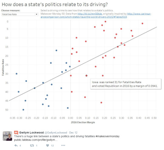
The long and short of it is that ranking on Fatalities rate per 100 Million Vehicle Miles Traveled (and not considering Population et cetera mentioned hitherto) is going to skew the results badly. It will skew the results towards states that have a majority rural population - and lack of alternative transit options. The method of generating a “total score” and ranking off that...well, let’s give the CIC.com report author the benefit of the doubt; and rather than claiming a knee jerk “fake news” reaction, I’ll just conclude...it was is flat out wrong.

So while I am not suggesting #MakeoverMonday needs a re-boot, I do recommend one thing: if you are going to practice Tableau and contribute to what is, by any metric, a success - please do one thing before you hit this button:
Do this.

Because otherwise, when you make a statement like this:

Or this:
You could be unconsciously contributing to the growing amount of fake news without realizing it.
I doubt that was anyone’s intent, least of all Andy Cotgreave and Andy Kriebel’s when they re-published the CIC.com data.
After all, you’re just practicing Tableau.
1 note
·
View note
Text
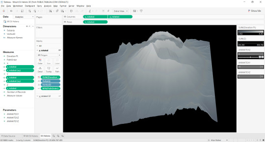
3D Terrain Modelling with Tableau
Mount St Helens/Louwala-Clough, Skamania County, Washington
Tableau 10.1 Workbook here
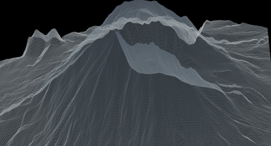
Step 1: Find a suitable Digital Elevation model raster. A good source is from USGS Earth Explorer and you can open these in QGIS. You can edit the area of interest by using the Raster -> Clipper command and dragging an area with your mouse. Save the raster as a USGS DEM. Add DEMto3D plugin and export as STL.
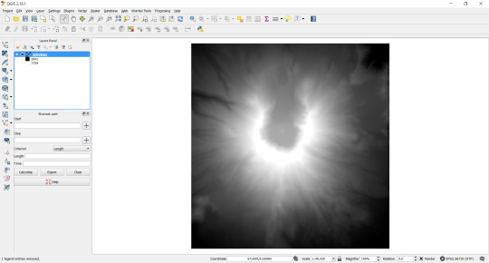
Optional. You can inspect the DEM in a program called 3DEM. This is a 32-bit program, so if you are using a large file, memory can be an issue. The color palette picker is very useful if you want to color encode your elevation with discreet bins.
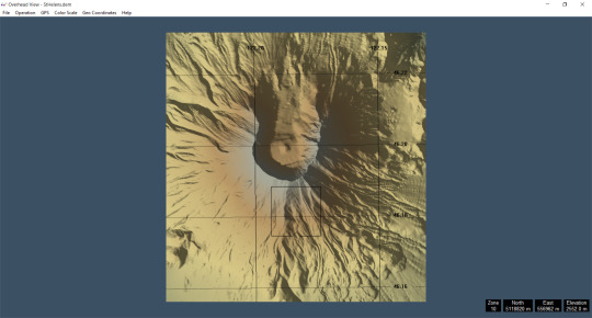
Optional: Open DEM as USGS 1 Degree ASCII using AccuTrans 3D. There is a 64-bit version of this software, so it can handle much larger file sizes. Choose DEM -> convert to 3D (less water). You can choose the vertex interval, this will affect the number of triangles generated. The higher the triangle count, the greater the resolution, but remember this will also increase the number of marks Tableau has to plot. Save as StereoLithography ASCII STL.
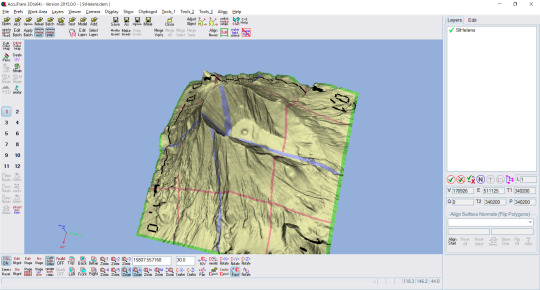
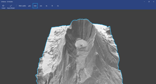
Optional. Windows 10 ships with 3D builder: you can inspect the STL file. Blender is also good for viewing (and editing) STL files.
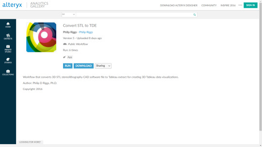
Step 2. Convert the STL file to TDE using Philip Rigg’s Alteryx App
Step 3. Download Bora Beran’s “Going 3D with Tableau” packaged workbook and copy the calculated fields.
Step 4. Open the TDE in Tableau. Paste the calculated fields from Bora’s workbook into your TDE that was the output of the Alteryx App.
Optional. Use GIMP and create a 1x1 pixel PNG file. Add this as a background image using -1, 1 and -1, 1 respectively. This will allow you to zoom.
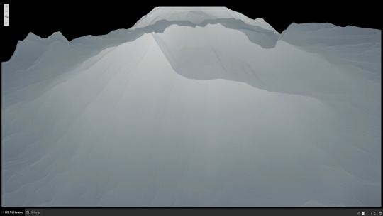
And there you have it, 3D terrain models rendered in Tableau. If you want to get really sophisticated, try color encoding by slope: (TAN(([Z]/sqrt([X]*[X+[Y]*[Y])))-1)
1 note
·
View note
Text
IronViz Entry. Not!
Understanding LocalStorage, and render your #popviz faster. Like, everytime.
Find my entry here. But please don’t count it. Yes, I followed the rules...i.e. use Device Specific Dashboarding (DSD).
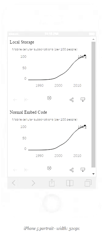
Then how on earth is there two dashboards in my page, but only one dashboard in the workbook?
And remember, I’m only using the embed code, not the JS API...
Well, the embed code is still javascript based. So I added a little bit of code.
var cached = document.getElementById('viz1473830953500').innerHTML;
localStorage.setItem('1', JSON.stringify(cached));
lsviz = JSON.parse(localStorage.getItem('1'));
document.getElementById("ls").innerHTML = lsviz;
console.log(JSON.stringify(localStorage).length);
Oh god I can hear you say, he’s at it again. Just when I was starting to understand all that responsive stuff.
Well, basically, what that code does is take the viz from public, shove it into LocalStorage (as an iframe), strips it of all that funky tableau server stuff, and barfs it back into another div. You don’t need to show the original...of course I could do:
#viz1473830953500 {
display:none;
}
or even $(”div”) .remove() but then you wouldn’t have had the pleasure of comparing the original’s time to render with the version I’ve just pulled out of your browser’s storage.
0 notes
Text
Designing Tableau Dashboards for any platform, not just mobile.
It’s so easy, even a Zen Master can do it.
TL:DR;
Skip to the end for the code. Copy it to notepad, save as html. Amend as you want, you'll probably want to find and replace " with '. Opensource #FTW
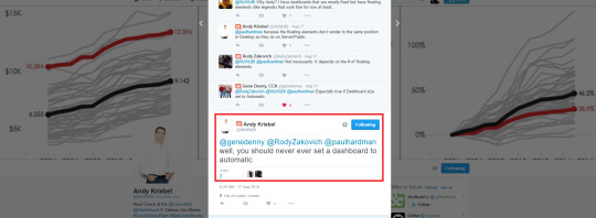
So this image, actually this tweet, and twitter header picture was the inspiration behind this post. Just to be clear, the tweet reads “well, you should never ever set a dashboard to automatic”. The image Andy used in his Twitter hero/header feed is actually not a Tableau visualization at all…it’s actually a picture of a different vendor, called highcharts. Here’s a link to his blogpost.
Now please don’t get the wrong idea. I’m not posting this to start or end an internet fight.

That would be an awesomely bad idea, and a massive waste of energy. I understand Andy’s frustrations, that he thought Tableau mobile wasn’t all that great, and that setting your dashboard to “automatic” does “weird things” and isn’t exactly “WYSIWYG”.
Caveat Emptor: I don’t like being told “never ever” do something - especially by someone that’s so respected, and has a huge influence and following. Basically, I’m going rogue here*, this isn’t “beer and pretzels”; but, if you’ll entertain me, I’ll show you that it really might be worth it. You can decide for yourself if the juice is worth the squeeze**.
* Gratuitous Clone Wars picture inserted, why not. Chris Toomey and I are big Star Wars fans. ** My favorite Joe Mako quote.

Ah but wait! There might be a way you don’t have to resort to using highcharts!
Tableau 10 has DSD! You’ll be happy! Everyone will be happy!!!

Designing Device Specific Dashboards in Tableau 10

Erm, no dice.
Might be cool for your one-off “popviz”, but that isn’t going to work at the Enterprise, where you’ve got a whole lot of users with BYOD’s. Try sending that email link from the share button on Tableau server to your CEO who’s upgraded to an iPhone 6 Plus and you’ve set your “mobile” dashboard to an iphone 5 (c? s?) - what a waste of pixels.
I don’t intend to develop umpteen sizes for a myriad of phones or tablets (or laptops, for that matter). I don’t want to maintain them, either.
I’m writing this to suggest if you are prepared to do a little bit of copy pasting, and think a bit about what you want to achieve, you too can build something - (I’ve heard the term “web wrapper” used - if that makes you warm and fuzzy, don’t let me stop you) - that will let you view your dashboard(s) on any platform: not just mobile, but ipad/surface pro/android tablet, desktop, large screen, even a projected image in your boardroom. In other words, it’ll be responsive.

Bonus points are awarded in advance: you’ll also be able to rotate your device - or maybe you enjoy scrolling…

Oh crap. Does that mean I have to write some code?

Maybe. Or just copy and paste mine and change it a little to suit your needs.
OK, let’s start:
Andy’s original workbook contained a single dashboard.
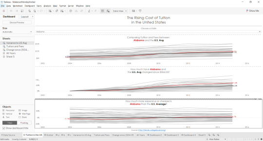
As you can see, it’s got three worksheets in it, with an intent to answer three questions, and chart designs that exemplifies Andy’s style. One column, three rows, in a portrait layout.
Now I’m going to blow your mind.

Stop thinking in portrait terms (for mobile, or print) and landscape (for desktop). THINK GRID.

Almost. But I’m thinking bigger, let’s not go out of the box, let’s rip it up.
Think RESPONSIVE GRID. Go on, click that button.
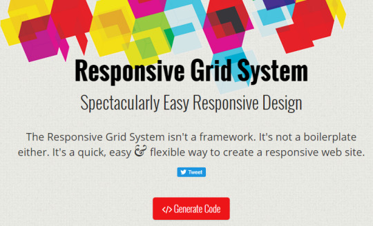
What the? You mean all I have to do is say how many columns I want? And it will work it out for me? Yep.
Here’s what it generated for me. I wanted 3 columns. This is CSS, FYI.

/* SECTIONS */
.section {
clear: both;
padding: 0px;
margin: 0px;
}
/* COLUMN SETUP */
.col {
display: block;
float:left;
margin: 1% 0 1% 1.6%;
}
.col:first-child { margin-left: 0; }
/* GROUPING */
.group:before,
.group:after { content:“”; display:table; }
.group:after { clear:both;}
.group { zoom:1; /* For IE 6/7 */ }
/* GRID OF THREE */
.span_3_of_3 { width: 100%; }
.span_2_of_3 { width: 66.13%; }
.span_1_of_3 { width: 32.26%; }
/* GO FULL WIDTH BELOW 480 PIXELS */
@media only screen and (max-width: 480px) {
.col { margin: 1% 0 1% 0%; }
.span_3_of_3, .span_2_of_3, .span_1_of_3 { width: 100%; }
}
(and I just copy pasted that into this post, maybe you can copy and paste it into notepad, or notepad++, or whatever).
You’ll also want the HTML.

<div class=“section group”>
<div class=“col span_1_of_3”>
<div id=“tableauViz1”></div>
</div>
<div class=“col span_1_of_3”>
<div id=“tableauViz2”></div>
</div>
<div class=“col span_1_of_3”>
<div id=“tableauViz3”></div>
</div>
</div>
(now you’ll notice I’ve added 3 tableauViz divs).
This is basically all you need. In fact, you could just grab the Tableau embed code and stick it in the same place. But there’s a little bit more I think we need to do, and that means JavaScript; well, actually, jquery. Almost done.

<script>
var isMobile = {
Android: function() {
return /Android/i.test(navigator.userAgent);
},
iOS: function() {
return /iPhone|iPad|iPod/i.test(navigator.userAgent);
}
};
if(isMobile.Android())
{
var previousWidth=$(window).width();
$(window).on({
resize: function(e) {
var YourFunction=(function(){
var screenWidth=$(window).width();
if(previousWidth!=screenWidth)
{
previousWidth=screenWidth;
window.location.reload();
}
})();
}
});
}
else//mainly for ios
{
$(window).on({
orientationchange: function(e) {
window.location.reload();
}
});
}
</script>
(Thanks Stack Overflow!)
That will reload the page if you rotate your device :)
So remember those 3 tableauViz?
Well, I created three dashboards. A, B, and C. Creative, n’est-ce pas?
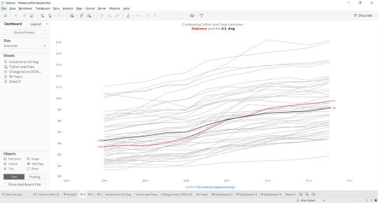
Here’s A. I won’t bore you with B & C. Pretty sure you can guess what they are. Oh and yes, I broke the “never ever rule”, and set them as “automatic”. What a rogue I am! If you really want to download the workbook, you can find it here.
Anyway, now you’re ready to start playing with the Tableau Javascript API, add some CSS, write some HTML, and start building. Here’s the code.
<!DOCTYPE html>
<html lang=“en”>
<head>
<title>Makeover Monday - Andy Kriebel</title>
<script src=“https://public.tableau.com/javascripts/api/tableau-2.0.0.min.js” type=“text/javascript”></script>
<script src=“https://code.jquery.com/jquery-1.10.2.js”></script>
<meta name=“viewport” content=“width=device-width, initial-scale=1”>
<style>
body {
}
h1 {
font-family: “Trebuchet MS”, Helvetica, sans-serif;
font-size: X-Large;
text-align: center;
color: #555555;
}
h3 {
font-family: “Trebuchet MS”, Helvetica, sans-serif;
font-size: Medium;
color: #555555;
text-align: center;
}
#container {
width: 100%;
height: 100%;
}
#tableauViz1 {
width: 90%;
margin: auto;
}
#tableauViz2 {
width: 90%;
margin: auto;
}
#tableauViz3 {
width: 90%;
margin: auto;
}
/* SECTIONS */
.section {
clear: both;
padding: 0px;
margin: 0px;
}
/* COLUMN SETUP */
.col {
display: block;
float:left;
margin: 1% 0 1% 1.6%;
}
.col:first-child { margin-left: 0; }
/* GROUPING */
.group:before,
.group:after { content:“”; display:table; }
.group:after { clear:both;}
.group { zoom:1; /* For IE 6/7 */ }
/* GRID OF THREE */
.span_3_of_3 { width: 100%; }
.span_2_of_3 { width: 66.13%; }
.span_1_of_3 { width: 32.26%; }
/* GO FULL WIDTH BELOW 480 PIXELS */
@media only screen and (max-width: 480px) {
.col { margin: 1% 0 1% 0%; }
.span_3_of_3, .span_2_of_3, .span_1_of_3 { width: 100%; }
}
</style>
</head>
<body>
<div id=“container”>
<div id=“title”><h1>The Rising Cost of Tutition in the United States</h1></div>
<div id=“parameter”><h3>Choose a State: </h3></div>
<center><select id=“state”>
<option value=“Alabama”>Alabama</option>
<option value=“Alaska”>Alaska</option>
<option value=“Arizona”>Arizona</option>
<option value=“Arkansas”>Arkansas</option>
<option value=“California”>California</option>
<option value=“Colorado”>Colorado</option>
<option value=“Connecticut”>Connecticut</option>
<option value=“Delaware”>Delaware</option>
<option value=“Florida”>Florida</option>
<option value=“Georgia”>Georgia</option>
<option value=“Hawaii”>Hawaii</option>
<option value=“Idaho”>Idaho</option>
<option value=“Illinois”>Illinois</option>
<option value=“Indiana”>Indiana</option>
<option value=“Iowa”>Iowa</option>
<option value=“Kansas”>Kansas</option>
<option value=“Kentucky”>Kentucky</option>
<option value=“Louisiana”>Louisiana</option>
<option value=“Maine”>Maine</option>
<option value=“Maryland”>Maryland</option>
<option value=“Massachusetts”>Massachusetts</option>
<option value=“Michigan”>Michigan</option>
<option value=“Minnesota”>Minnesota</option>
<option value=“Mississippi”>Mississippi</option>
<option value=“Missouri”>Missouri</option>
<option value=“Montana”>Montana</option>
<option value=“Nebraska”>Nebraska</option>
<option value=“Nevada”>Nevada</option>
<option value=“New Hampshire”>New Hampshire</option>
<option value=“New Jersey”>New Jersey</option>
<option value=“New Mexico”>New Mexico</option>
<option value=“New York”>New York</option>
<option value=“North Carolina”>North Carolina</option>
<option value=“North Dakota”>North Dakota</option>
<option value=“Ohio”>Ohio</option>
<option value=“Oklahoma”>Oklahoma</option>
<option value=“Oregon”>Oregon</option>
<option value=“Pennsylvania”>Pennsylvania</option>
<option value=“Rhode Island”>Rhode Island</option>
<option value=“South Carolina”>South Carolina</option>
<option value=“South Dakota”>South Dakota</option>
<option value=“Tennessee”>Tennessee</option>
<option value=“Texas”>Texas</option>
<option value=“Utah”>Utah</option>
<option value=“Vermont”>Vermont</option>
<option value=“Virginia”>Virginia</option>
<option value=“Washington”>Washington</option>
<option value=“West Virginia”>West Virginia</option>
<option value=“Wisconsin”>Wisconsin</option>
<option value=“Wyoming”>Wyoming</option>
</select>
</center>
<div class=“section group”>
<div class=“col span_1_of_3”>
<div id=“tableauViz1”></div>
</div>
<div class=“col span_1_of_3”>
<div id=“tableauViz2”></div>
</div>
<div class=“col span_1_of_3”>
<div id=“tableauViz3”></div>
</div>
</div>
</div>
</body>
<script>
var viz, one, two, three, workbooka, activeSheet, Worksheet, worksheet;
$(function() {
var onePh = document.getElementById(“tableauViz1”);
var twoPh = document.getElementById(“tableauViz2”);
var threePh = document.getElementById(“tableauViz3”);
var oneUrl = “https://public.tableau.com/views/MakeoverMondayKreibel/a?:showVizHome=no&:display_spinner=no&:jsdebug=n&:embed=y&:display_overlay=no&:display_static_image=no&:animate_transition=yes”;
var twoUrl = “https://public.tableau.com/views/MakeoverMondayKreibel/b?:showVizHome=no&:display_spinner=no&:jsdebug=n&:embed=y&:display_overlay=no&:display_static_image=no&:animate_transition=yes”;
var threeUrl = “https://public.tableau.com/views/MakeoverMondayKreibel/c?:showVizHome=no&:display_spinner=no&:jsdebug=n&:embed=y&:display_overlay=no&:display_static_image=no&:animate_transition=yes”;
var vizOptions = {
width: “100%”,
height: “80vh”,
hideTabs: false,
onFirstInteractive: function() {
}
};
viz1 = new tableauSoftware.Viz(onePh, oneUrl, vizOptions);
viz2 = new tableauSoftware.Viz(twoPh, twoUrl, vizOptions);
viz3 = new tableauSoftware.Viz(threePh, threeUrl, vizOptions);
});
</script>
<script>
$( “#state” ).change(function() {
state(this.value);
});
function state(propValue){
viz1.getWorkbook().changeParameterValueAsync(“STATE”, propValue);
viz2.getWorkbook().changeParameterValueAsync(“STATE”, propValue);
viz3.getWorkbook().changeParameterValueAsync(“STATE”, propValue);
};
</script>
<script>
var isMobile = {
Android: function() {
return /Android/i.test(navigator.userAgent);
},
iOS: function() {
return /iPhone|iPad|iPod/i.test(navigator.userAgent);
}
};
if(isMobile.Android())
{
var previousWidth=$(window).width();
$(window).on({
resize: function(e) {
var YourFunction=(function(){
var screenWidth=$(window).width();
if(previousWidth!=screenWidth)
{
previousWidth=screenWidth;
window.location.reload();
}
})();
}
});
}
else//mainly for ios
{
$(window).on({
orientationchange: function(e) {
window.location.reload();
}
});
}
</script>
</html>
Whoa! What’s all that parameter stuff? Well, Andy didn’t like the way Tableau parameters look on the web, so it’s a little bit more code, sorry about that. Yep, it shouldn’t be hard coded, either. But all that’s going to change been changed with the new getdata() function in Tableau 10. You can read up Tamas Foldi’s blog post to see how this is a gamechanger. I’m assuming if you’ve read up to this point, I’ve got you hooked anyway.
Great. Now you’ve got your html hosted, where’s the proof? Well, I love (proof right here…) responsinator. This lets you check out what your webpage looks like on a whole lot of devices. Just remember this one line:
<meta name=“viewport” content=“width=device-width, initial-scale=1”> and you’ll be golden.
Now you can send your CEO that link. He’ll probably thank you for it. See, that was easy.

Even a zen master could do it.
3 notes
·
View notes
Text
There is no use case.

SR-71 Blackbird from ASCII stereo lithography file. Color encoded by inner product (polygons) and inverted inner product (lines) of the normalized vector array

Star Wars X-Wing from converted Binary stereo lithography file. Color encoded by Slope (polygons) and inverted slope (lines).

F117 Nighthawk from converted Binary stereo lithography file. Color encoded by 2-D Isotropic Gaussian filter.
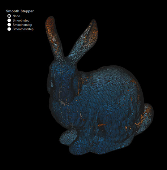
Stanford Bunny from converted Stanford Triangle Format / Polygon File Format PLY file. Color encoded by Smooth Step formulae.
If you’ve read this, you’re probably realized that I’m trying to push the doors further open (Noah Salvaterra and Bora Bevan unlocked them).
0 notes
Text
Animated Charts (with Tableau)
Sparkline example, credit - Edward Tufte “A Beautiful Evidence”
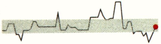
Animation of Edward Tufte’s Sparklines with Tableau
Flight Patterns, credit - Aaron Koblin

Animation of the World’s Aircraft with Tableau
Gapminder
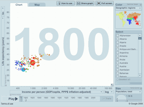
Animation of Gapminder with Tableau, credit - Jeffrey Shaffer
Charles Minard’s Figurative map of the successive losses in men of the French Army in the Russian Campaign of 1812-1813
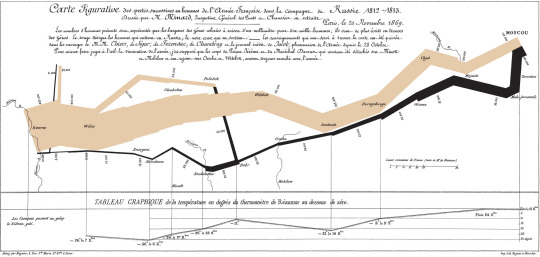
Animation of Minard’s Napoleon's March with Tableau, credit - Kim Rees
John Snow’s map of the 1854 Cholera Outbreak
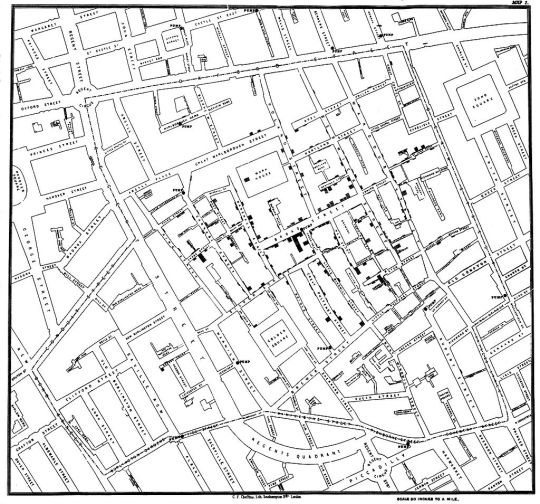
Animation of John Snow’s map with Tableau, credit Andy Cotgreave
Creating animated charts with Tableau
Sparkline Example
Placement of Pills (Fields)
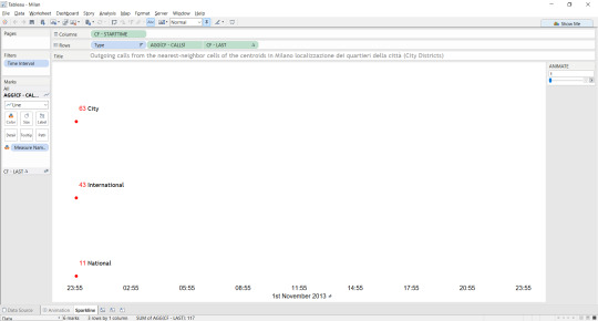
In the Tableau worksheet, we have three fields available from the source data, [Type], [Path], and [Time Interval].
The data source temporal events are initially recorded in milliseconds since Unix creation time in UTC.
To generate [CF - STARTTIME] appropriate for Milan, I construct a calculated field as follows:
dateadd('second', int([Add hour] / 1000), #1970-01-01#)
[CF - CALLS] is calculated as follows:
INT(COUNTD(Path)) which is an indexed primary key and the final calculation [CF - LAST] is:
IF LAST() = 0 THEN [CF - CALLS] END for the dual axis (the red circle mark at the head of the line mark).
A parameter called “ANIMATE” is an incremental value starting from 1, ending at 144 that is based off the original time interval integer values.
Now here are the “tricks”. I conditionally filter [Time Interval] with the operator <= ANIMATE, which gives me the historical data points in the view each time I pass the parameter value. This gives an effect similar to the “pages” function with “show history” UI dialogue. I also fix both the X and Y axis to the max and minimum values of number of calls and the time stamp period respectively with a +/- 25% tolerance for calls. This allows for the circle mark to be drawn when it approaches zero, rather than the opaque axis obscuring the mark.
The worksheet is brought into a dashboard class object, which is set as automatic sizing, and fit to Entire View, and published to the server.
I then generate a responsive design HTML page using CSS3 and call the dashboard with the Tableau JS API. I have two additional functions, that executes when the dashboard becomes interactive:
// code snippet
i=1
function animate() {
if(i<=144) { window.setTimeout("animate()","1000"); animate1(i); i++; } }
function animate1(a) { workbooka.changeParameterValueAsync("ANIMATE", [a]); }
// code snippet ends
All this does is start the parameter value as 1, and loops the value incrementally, upto the maximum value.
Gapminder Example
Conditionally filters [YEAR]=[ANIMATE]
Napoleon's March Example
Following the same principle as the sparkline process, with one exception: This calls two parameters in a parallel process - params.{ANIMATE] and params.[RETREATANIMATE]. View the source code here.
John Snow’s map of the 1854 Cholera Outbreak Example
Conditionally filters [ID]<=[ANIMATE]
The world’s aircraft Example
Conditionally filters [datetime]=[ANIMATE]
Extract-Transform-Load
Sparkline example
QGIS

The Grid GeoJSON was imported and converted to a point ESRI Shapefile.
The City Districts polygon ESRI Shapefile was imported.
The Grid was clipped by the City Districts, converted to a point ESRI Shapefile, then a CSV was exported.
The City Districts centroids were solved and converted to a point ESRI Shapefile, then a CSV was exported.
The Italian Provinces polygon ESRI Shapefile was imported, centroids solved, and converted to a point ESRI Shapefile then a CSV was exported.
The Natural Earth Admin 0 polygon ESRI Shapefile was imported, centroids solved, and converted to a point ESRI Shapefile then a CSV was exported.
A final procedure, resolving the minimum number of points in each polygon of the City Districts was run, resulting in a number of four.
Alteryx Designer
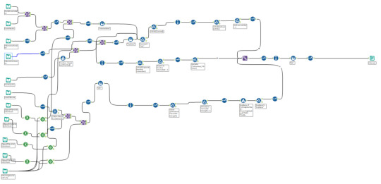
Alteryx was used as the main Extract-Transform-Tool. I’m going to say this: initially, I was skeptical of Alteryx, and other similar tools. The main reason behind this was due to the fact that I know how to code with Python, or R, or manipulate GDAL functions, and can form fairly succinct yet complex SQL statements. I also know that I can change the variables/parameters in my code, and understand algorithms, and how many records to expect as an output.
But after I attended a training with Joe Mako & Johnathan Drummey, Noah Salvaterra, and Anya A’Hearn of Datablick, I was sold. Why? I had control. I could manipulate the underlying algorithm of the function being performed. I had speed. I could perform a complex task in minutes, not hours - or even days. I had automation. I could schedule the task. I had simplicity. You simply drag and drop each module.
Alteryx is, at face value, expensive. A basic licence starts at $4K USD and goes up from there. But here’s the ROI statement:
Cost of a coder proficient in Python:
Cost of a coder proficient in SQL:
Cost of a coder proficient in R:
Cost of a coder proficient in ESRI/GDAL:
Cost of a coder proficient in VB:
Good luck finding someone with all of these. Especially someone in the Bay Area of California.
So sorry for the sales pitch, but it needed to be said. Quite simply put, Alteryx has saved me probably the equivalent of a working month in hours.
The module above depicts the process: input files are joined (e.g. world telephone prefixes to the source data), nearest neighbors of the grid to the four points within the City Districts resolved, multiple filters are applied, data types are cast, and then a union is performed. The output is a single csv file that I further union to give me [type] members: city, international, and national.
8 notes
·
View notes
Text
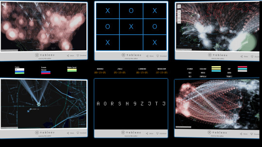
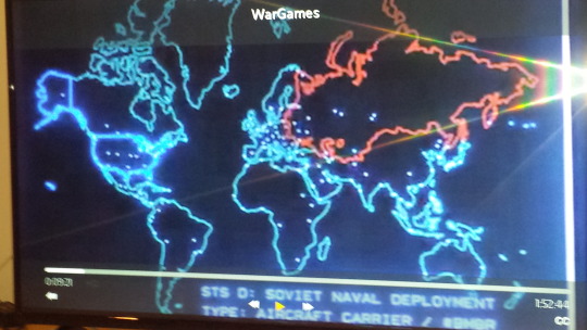
Re-creating WarGames with Tableau and Mapbox
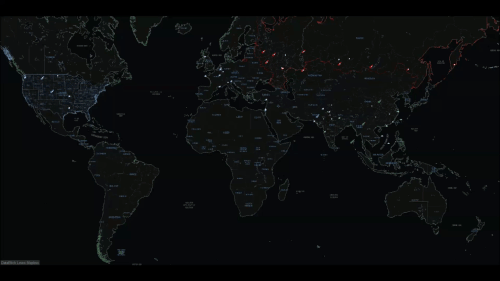
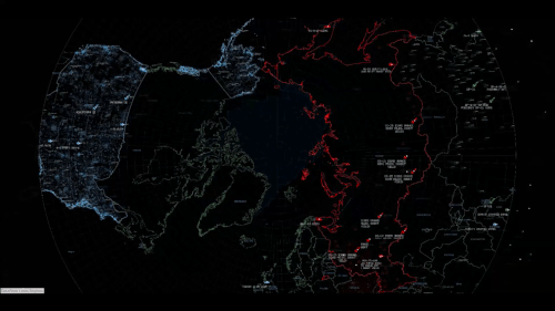
So you all remember the film “Wargames”:
Well, we (Jeffrey Shaffer, Anya A’Hearn, Chris DeMartini and I) decided to build a tribute to it. Except instead of using a Hewlett Packard 9845 and an IMSAI we’d use Mapbox, Tableau, CSS3, Javascript, HTML5, GDAL, and rather a lot of data, and quite a bit of math:
Find Chris DeMartini’s blog post here.
View the IMSAI here.
View the animated WOPR here.
View the Война Операция План реагирования here.
Find out how Chris DeMartini added WOPR’s voice using Jeffrey Shaffer’s voice commands for Tableau (called “Tabitha”) here.
Mercator View

Polar Projection View
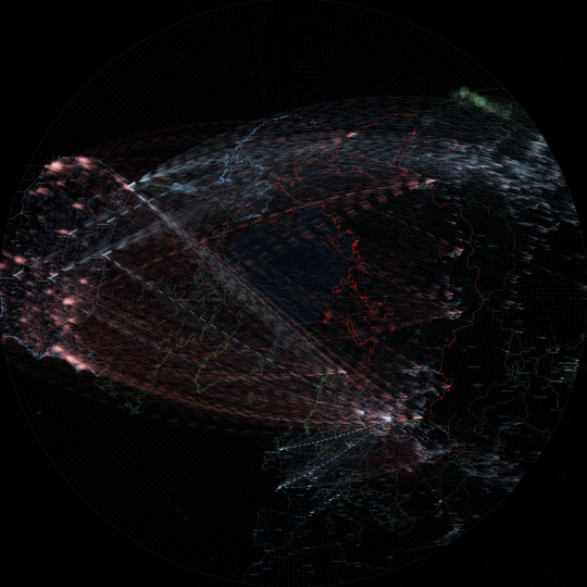
WOPR
Война Операция План реагирования
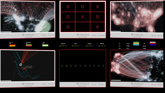
Overview of the screens from the Film

(Left Hand Side) Close Up of the screens from the Film
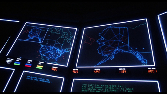
(Right Hand Side) Close Up of the screens from the Film

The Story.
“No rush, but can you send me the arc equation you have used in the past formapping with arcs instead of straight link paths?” Asked Chris DeMartini. “Of course!” I said, and sent Chris to over some links on Wikipedia and an R package. The fact was, I’d always used ESRI to generate Great Circles. But Chris has been doing some amazing stuff in Tableau with bezier curves, and drawing Great Arcs native was his next challenge.
Imagine my surprise when he said - “have you got anything to go with to test this out in Tableau?” and “ Still needs work, but 1 hour in I have great circles calced on tableau... Thanks for the references!” - so I sent him the World Bank Global Migration 2000 data. You can view that output here.
Viewing that visualization reminded me of WarGames. I sent an email to Chris:
"The other piece I was thinking was "war games" - the film is a bit old, but...if we geolocate this : The Bulletin of Atomic Scientists - Worldwide Deployment of Nuclear Weapons as the origins (and the destinations are geonames cities1000.txt) in ranked pop order...” then we could visualize a nuclear Armageddon.” and added this picture:

and of course, we’d want a Mapbox map styled by Anya A’Hearn to bring the 1980′s cold war vector graphics up to date, so another email was sent: “I’d hope we could go for something like this:”
Game on, and boy, did Anya deliver.
Talking about Games, Joshua Milligan had previously created a Tableau version of Tic-Tac-Toe,


and Chris also wanted to build out the “launch code sequence”:

- so these were both incorporated into the design.
The Data.
Geocoded Nuclear Sites from Bulletin of Atomic Scientists, supplemented with FAS.org and Wikipedia
Surface to Air Missile (SAM) Sites (KML) (courtesy: IMINT)
SAM Range Rings (KML) (courtesy: IMINT)
Russian Airforce Bases (KML) (courtesy: IMINT)
Chinese Airforce Bases (KML) (courtesy: IMINT)
Air Sectors (US Only) (Shapefile) (courtesy: FAA)
US Bases (ESRI Shapefile) (courtesy: Data.gov)
Iranian Airforce Bases (KML) (courtesy Airpower.at)
Geonames
The Processes.
Web Design.
A semi-responsive template in the style of the WarGames film was designed in CSS3. I used some 3d transforms to “bend” the screens inwards, and modal windows. Thanks to: @desandro
I also created some responsive circular divisions based from this design, except I modified it for (mobile and multiple) viewports.
Javascript was used to call the Tableau Visualizations, animate the dashboards, and also to generate the UTC clocks.
Data Design.
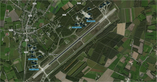
The majority of the nuclear sites were geocoded by hand by using Mapbox Satellite View and/or Google Maps. For example, the hardened aircraft shelters at Kleine Brogel in Belgium:
But that left the rather tricky issue of dealing with the target sites. That was made slightly less ambiguous when this happened. Apart from the introduction of ICBM’s, MIRV’s and SLBM’s since 1959, and the number of countries participating in this MADness...has anything else really changed, other than the time it would take to blow us all to Kingdom Come?
Also: for the Polar Projection: I used GDAL ogr2ogr to convert the ESRI Shapefiles from Mercator: thanks for the advice from Matt Irwin of Mapbox!
Possible Improvements:
Regress targets by using GDELT sentiment
Use a population within (blast yield) radius algo
Burst/tween the REDIS Tableau cache for animation
43 notes
·
View notes