Last Seen Blogs

awektdungsedap
AwkTudungsedap
teasplatteredpages
just leave me with the books and tea

luckysweetscheesecake
Untitled

racefan346
Untitled

iconpainting
Православная Икона
Text
Reflection
At the start of the semester, I really don’t know anything about communication design at all. Choose this degree just because I don’t know what I want to learn and communication design seem like can experiment with many different kinds of design. Therefore, at the beginning of this course, I don’t have any objective. The only objectives I had is I hope I can enjoy this course and through all the lectures and workshop l do like and enjoy this course a lot. The only part I found the challenge is I didn’t push myself enough, I always think there is more time and when I realize I have to do my work now. I started to feel stressful. I think I really have to arrange my time better.
Love a lot about the Bauhaus’ lecture, amazed by all fantastic ideas. Also about the lecture which takes about “why design” This question has really made me thought a lot. I feel the teachers don’t only teach us about how to design, but more importantly, they teach us how to be a good designer, thank you, Andy and Karen.
During this course I have enjoyed most is group work to work with others and hear and see all the great ideas. Also, all the meaningful lecture has really changed my idea about design.
Finally, the end of the semester, all of us can have a long breath after all the work we have done in the first semester. After all the submission my brain has crashed, but when I think back during the semester I had many interesting and meaningful lessons. In addition, I really enjoy the workshop work with other students and hear different ideas. However, had a really good semester with the class and teachers just want to thank you all made me like the design more and more.
1 note
·
View note
Photo
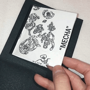
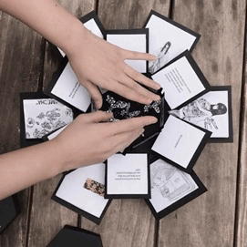
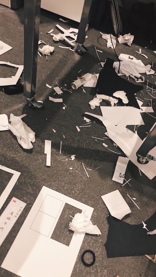
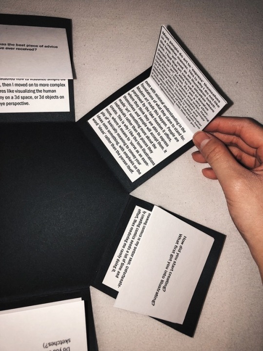
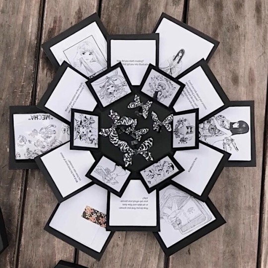
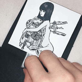
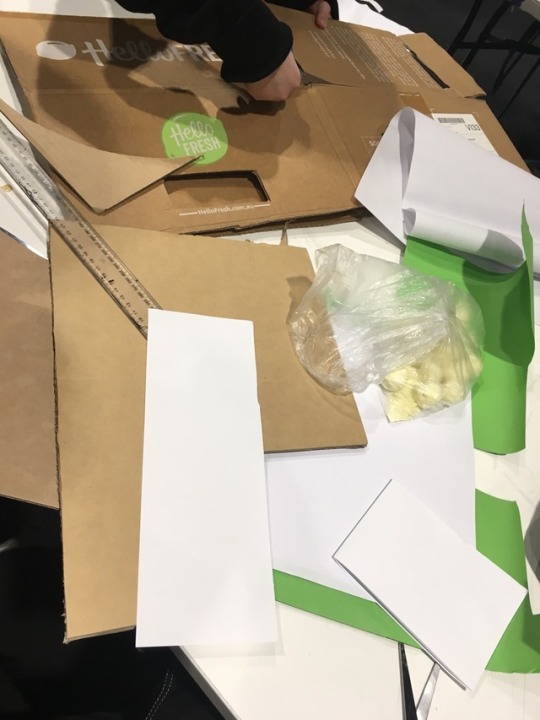
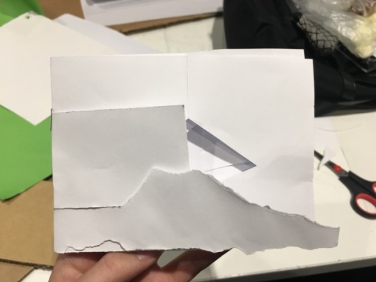
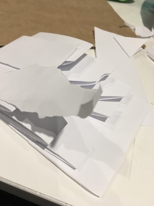
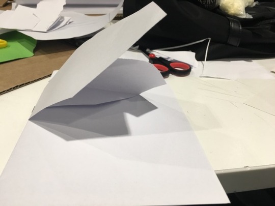
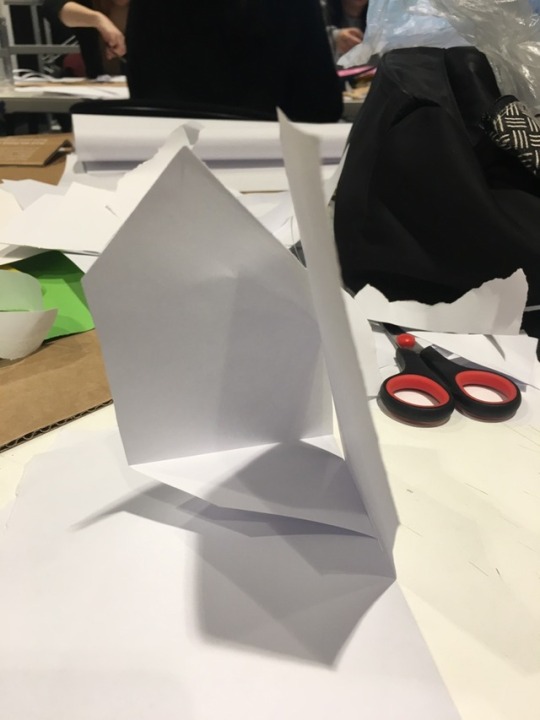
At first, I’m so pumped out to make a zine, but suddenly I got a really great idea to make an explosion box. I was thinking about making something that viewers can interact with, so they can be interested to see my interview artwork. I thought making an explosion box would be so easy, I researched lots of the DIY and tutorials from Youtube. But then, when I start making it, it turns out to be VERY complicated and tiring, there’s a lot of measurement I need to do, and I need to brainstorm which artwork from the illustrator is suitable to be the interactive one. The materials for the explosion box is also so expensive :’) there goes my pocket money.. BUT OVERALL, I’m really satisfied with the final look despite all those hard work and huge mess as you can see in the picture above. :)
18 notes
·
View notes
Video
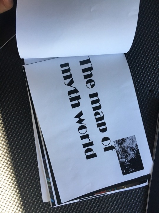
Assignment 3 “Ask me anything”
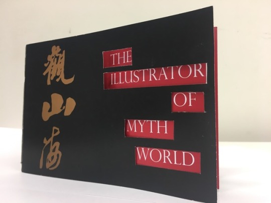
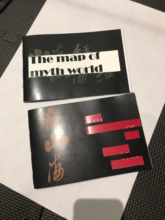
Finally, finished this project enjoy so much with the process. The artist I interviewed is called “Shanze”. He is a great illustrator of myth story, the character he drew is based on Chinese ancient myth story. I love he works all the time I never think I can interview him, this project has given me a great opportunity to talk to the artist I like.
I always want to experiment with InDesign, through this time I found I don’t like InDesign at all, hope I can get well with InDesign in the future.
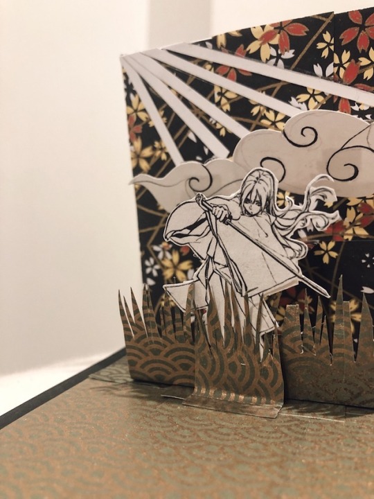
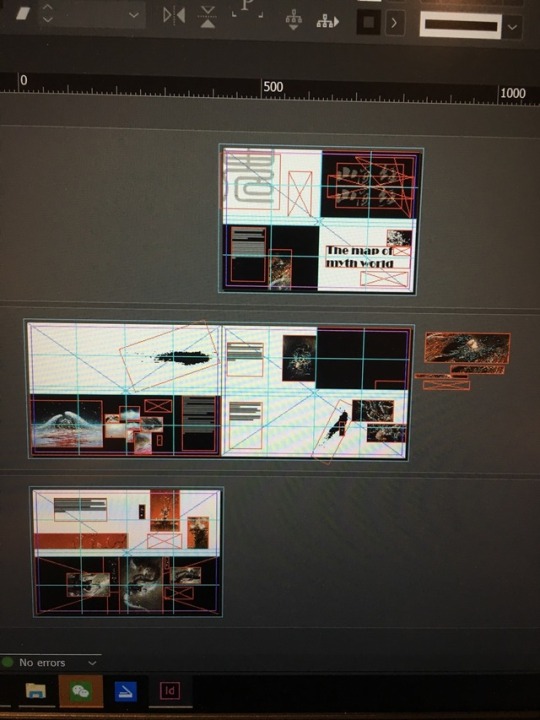
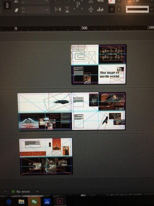
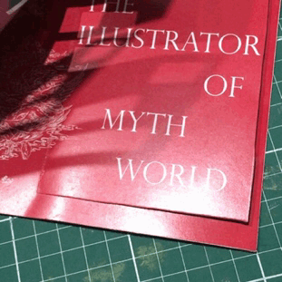
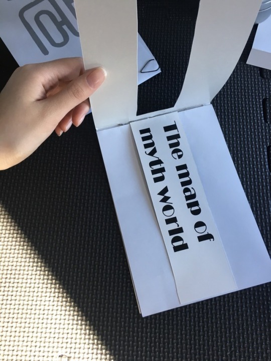
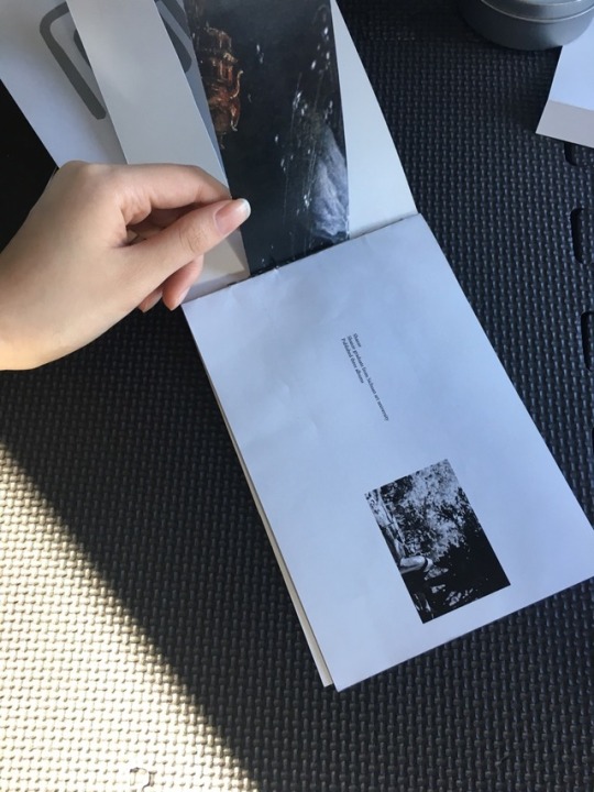
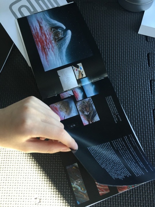
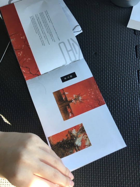
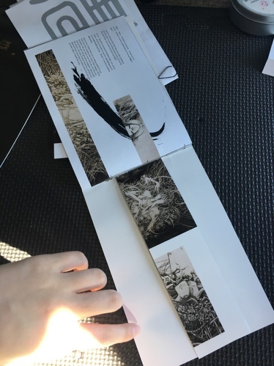
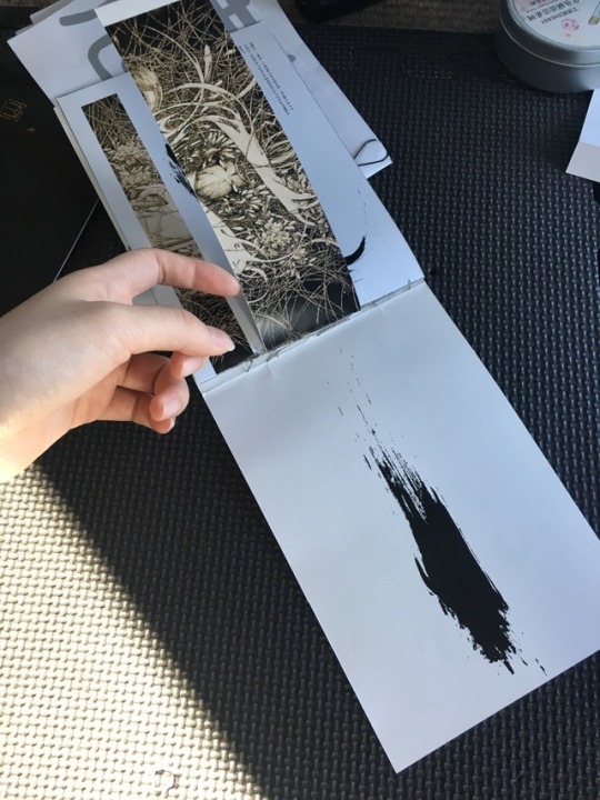
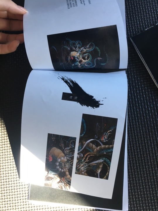
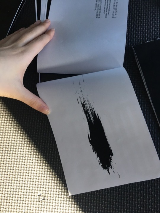
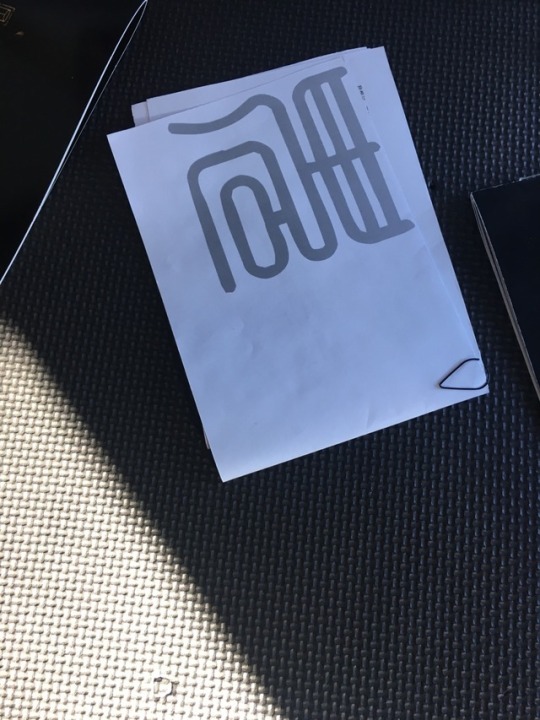
In this zine, I really want to demonstrate Chinese style so I added some element that I think can match with the artwork and Chinese styles, such as the brush marks and the handwriting style font. In the use of the color, I used black and red to be the main color set in this zine, because in Shanze’s work he used many red colors to match with his work I added some red in some part of the zine and use of black is because it can make the artworks stand out. In the first page, I used cutout to show the title, because of all the artwork from Shanze is from the myth story, so it gives me a feeling of Shanze opens the window of the myth world for his audience, therefore, the cutout is a representation of my feeling about his work. To communicate with the audience who will see this zine and first time see Shanze’s work, in addition, I put in many details of his work and for the people who don’t know all those myth characters, I also added an introduction of the character I have put into the zine.
I am very happy with the zine’s final look. The most difficult part for me is to translate the interview from Chinese to English, I am really bad at grammar in here I want to say thank you to my friend who helped me check my mistake in English text.
1 note
·
View note
Photo

Print went wrongggggggggggggggggggg------------------------------------many times.
1 note
·
View note
Photo

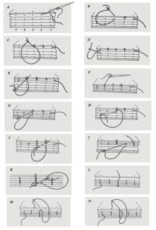
Some research about how to sew a book together.
https://www.pinterest.com.au/pin/724235183801620990/
https://www.pinterest.com.au/pin/391813236325421628/
0 notes
Photo

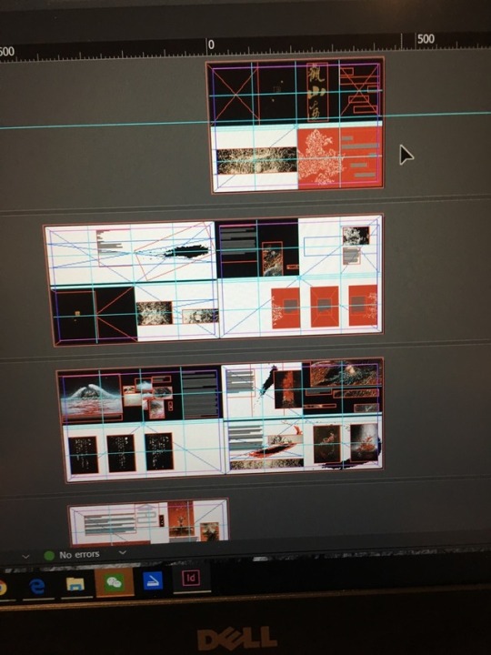
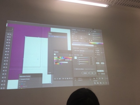
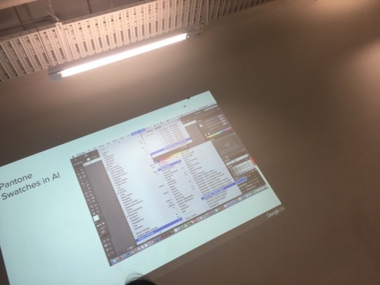
Second version week 12 feedback
In this version, I used cut-out on the first page to show the title and use small size page to cover the artist information. In the workshop Andy and Karen has given me some feedback I think I still need to do some change, also I have a lot of grammar problems_______more and more headache
0 notes
Photo
Week 11
In this week we have learned about in design.
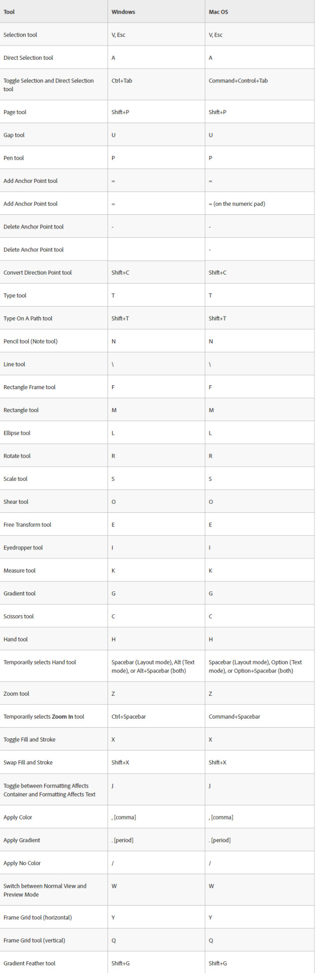
Some hotkey in InDesign
https://helpx.adobe.com/au/indesign/using/default-keyboard-shortcuts.html
0 notes
Photo

First print/ First version
I want to make sure the color and font size, after print out I found the font size is too big, also I think the layout can be more fun and I want to use same different page size to make the zine more interesting
0 notes
Photo
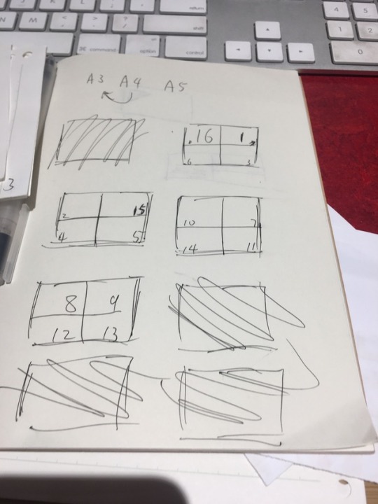
Make a layout for my own zine, had a headache I want use a long format to represent the artist’s work, so I want make more page connected, but i think if only use the connection of two different page when it print out it will be have many problems, so I think i don’t have to every page on top of each others, I cab just fold every page and sew them together.
0 notes
Photo

Inspiration
for assignnent 3
https://www.pinterest.com.au/pin/724235183801499339/
1 note
·
View note
Photo


GRAP2199 | Week #10 | Lecture/Relevant research
11 Design Manifestos You Must Read
1. Ornament and Crime by Adolf Loos (1910)
This is arguably the founding definitive text of design, written so far ahead of it’s time it took until the 1950s and ’60s to see a lot of these ideas become conceptualized. If you only read one text off this list, make it this one.
2. The Bauhaus Manifesto by Walter Gropius (1919)
The Bauhaus Manifesto is layered in design politics and in-fighting of the time, as there were splits in fidelity to the Bauhaus movement occurring frequently. Check out our past post on the Bauhaus Movement.
3. Topography of Typography by El Lissitzky (1923)
Russian artist and designer El Lissitzky was a busy man, working under Kazimir Malevich he created propaganda for the USSR and was integral to the Bauhaus controversies being declared “un-German”. He was also incredibly talented, and his writing on Typography as a kind of architectural form is a must read for the Typo-nut in you.
4. First Things First by Ken Garland and co-designers (1964)
Ken Garland’s succinct manifesto is filled with brevity and lofty wit. Created with his co-designers (and co-signers of the manifesto), this is guaranteed to inspire you when your client-liaison isn’t going so well.
5. Ten Principles for Good Design by Dieter Rams (1987)
This beautifully designed manifesto is sure to delight. It’s to the point, clean, and literally practices what it preaches. It’s so sparse and minimalist, it can also be read as a kind of new-wave spiritual guide on how to live your life, which is you know, handy.
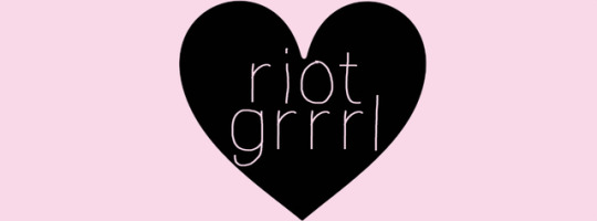
6. The Riot Grrrl Manifesto by Kathleen Hanna (1991)
Riot Grrrl feminists created this manifesto in the early nineties, and it reads as a brilliant product of its time. It was necessary for it to be written then, and still necessary to be read today. It’s fun, sassy, and most of all inspiring (to everyone, feminist or not), to get out of your comfort zone and create great work.
7. Incomplete Manifesto for Growth by Bruce Mau (2000)
If you’ve ever been stuck in a creative rut, this is the manifesto for you. It lists practical and metaphorical ways we can grow, perpetually as artists. A lot of Mau’s ideas are taken from John Cage and the Black Mountain School artists’ ideas about creativity, and he intertwines these ideas flawlessly.
Read it, you reap what you sew!
8. Designers Against Monoculture by Noah Scalin (2001)
This was written in response to a perceived “monoculture”, or uniformity in visual culture found in the post-Y2K, post-heroin-chic-craze of the intense 1990s design aesthetic. It’s interesting to find a manifesto that identifies the way design shifted in the early 21st Century and is proactive about changing the status quo.
9. Draft Craft Manifesto: On Making and Consuming Things by Ulla Engenström (2005)
For anyone who has made anything ever, by hand (so everyone), this is an insightful and bold manifesto dissecting craft culture. Put your hot glue gun down and immerse yourself in Ulla Engenström’s brilliant ideas.
10. 1000 Words: A Manifesto for Sustainability in Design by Allan Chochinov (2007)
This elegant and sophisticated manifesto on sustainable art and design for the future is essential reading. In just 1000 words, we’re transformed into a place of recontextualizing and re-grafting our design goals to meet the need for environmentally aware design in every work we create.
11. Towards A Minimal Model For Publishing & Design for the modern tablet, mobile and web (2012)
This rare nugget of gold has been written specifically for the future of publishing and design. It acknowledges that how we receive most of our information has changed to screen-based interfaces, and argues that good design needs to adapt (minimally) to this new, permanent shift.
Beth. (2013). 11 Design Manifestos You Must Read Today. Retrieved from https://blog.redbubble.com/2013/10/11-design-manifestos-you-must-read-today/
12 notes
·
View notes
Photo
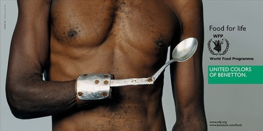
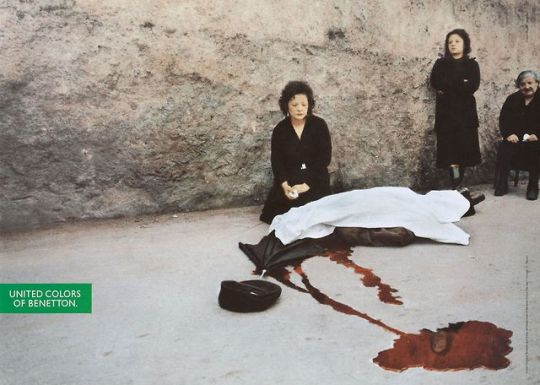
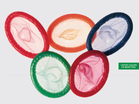
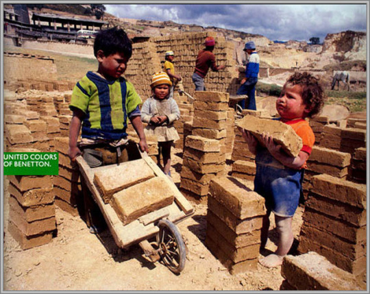
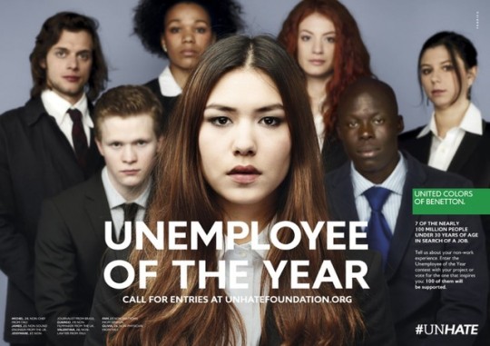
21. What Do You Think Of These?
Who would’ve known a clothing company would have an advertising campaign such as the ones above. And honestly, these examples aren’t even the shocking ones.
Although some may argue that these ad campaigns are way too controversial and some of the graphics and imageries are too unethical to be used a a marketing tool, I think United Colors of Benetton made a bold and important move.
Some of these ads dates several years back, so it wouldn’t be a surprise how some people may have gotten offended with the images they display. However, regardless it being a marketing tool, it also becomes a tool to raise awareness.
United Colors of Benetton tackles topics that people chose to avoid acknowledging even though they are affecting a larger amount of people in society. World Hunger, HIV, Child Labour, Diseases, Pride, and the list goes on. These are the things people need to acknowledge and fix, develop or prevent.
Personally, I think most of their ads are brilliant. The powerful imagery may not have any connection to what they’re selling, but it becomes a way of advertising the real issues in the world.
With that, LA is out.
10 notes
·
View notes
Photo
Week 10 mockup
In this class, we did some mock-up for our zine, I choose a Chinese artist so I want to use a long format to demonstrate and have a different layer, to make the different layer I think I can use different page size to do that. Also, I think I can add in some pop-up in it to make the zine more interesting.
0 notes
Text
Week 9 post-modernism
Ettore Sottsass

In this week’s lecture, the teacher has shown us some design from Ettore Sottsass, his design is weird but amazing, by saw the photo of his work just want to buy one.
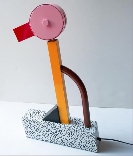
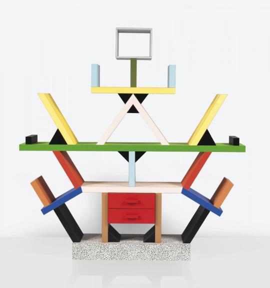
https://www.google.com.au/search?q=ettore+sottsass&rlz=1C1CHBF_en-GBAU788AU788&source=lnms&tbm=isch&sa=X&ved=0ahUKEwipxf3osrHbAhVJOJQKHUAdDlgQ_AUICygC&biw=2048&bih=1012#imgrc=pz2vCRhJ1VzEIM:
https://www.google.com.au/search?q=ettore+sottsass&rlz=1C1CHBF_en-GBAU788AU788&source=lnms&tbm=isch&sa=X&ved=0ahUKEwipxf3osrHbAhVJOJQKHUAdDlgQ_AUICygC&biw=2048&bih=1012#imgrc=KaWT21ATJgvNZM:
0 notes