xmarihearrtx
we don't talk about it
19. f. side blog. unfiltered trash.
this is literally an online sketchbook.
Mostly non-trash art blog:
maar1art </a
342 posts
Don't wanna be here? Send us removal request.
Last Seen Blogs

mobsgayms
Untitled

hex-is-tired
{-jesterlover-}

snazyros
⟡ snazyros ⟡

onevoicetwotongues
One Voice Two Tongues
fakebloood
Fake Blood
Photo

Ray Frenden reviews the too-cheap-to-be-true Monoprice graphics tablets. How do they stack up to industry standard Wacoms?
After spending a week with the 6.25“x10” Monoprice, my Yiynova and Cintiq remain unplugged and I gave my Intuos away to a friend. The Monoprice tracks subtle pressure variances and small movements with less lag and more crisp fidelity than any of the others. It is, put crudely, fucking awesome, in both OSX Lion and Windows 7 x64.
139K notes
·
View notes
Note
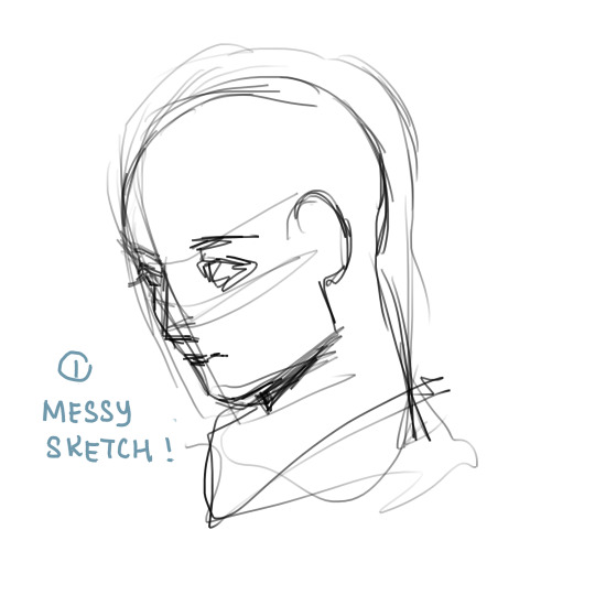
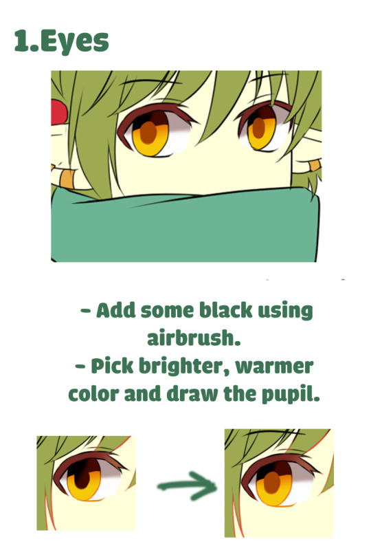
How do you archieve that "old anime style" in your drawings? It looks so amazing, I was wondering if you could do a tutorial about it ;; If not it's completely okay!! thank you for your time, sorry if i'm being pushy! ;;
Oh a good question!! I don’t really think about itmuch actually… but I can try to show my steps in more detail…!Maybe you can try it out for yourself! I only use Paint Tool SAI2 while doing so. (But it is almost like Photoshop, just more simple)Maybe my english and knowledge is not very good for explaining so I am sorry inadvance… (つ▽⊂|| ) and many typos…
First I draw a simple sketch… I use the resolutionof 2432 x 1367 pixels

then I do outlines, maybe you like to see the brushsettings for this:
background lineart on a separate layer

Since my pencil makes fuzzy outlines, I have to outlineit on a separate layer again, but I use a fancy, gaudy color for thatso I don’t miss!

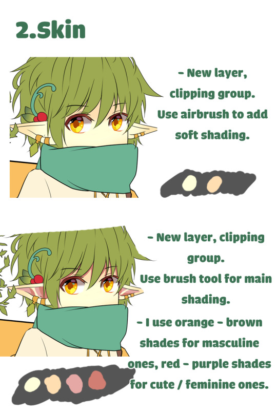
I use clipping group on top of that layer to cover itwith the actual colors later.

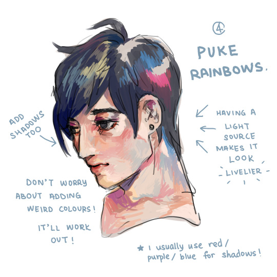
for the sense of the right hue, you may look for thecolors of the old animations, mostly, the darkest color (left) willhave a very dark gray warm color and the brightest color (right) willhave a very bright gray cold color, such colors are still to see indigital colored anime intentionally. Just try to keep the colors verygrayish mostly!

For the shading I like to use blue/green and graycolors… but it is very intuitive and I often just experiment.
( I don’t go too much on detail how to color thebackground since it is basically the same, like with the moving object infront, only difference is, that you don’t do a hard shading, you cansmooth it out with blending and paint it, there is a little bit morespace for artistic freedom in general. Also if you have a darker theme it is good to use the darkest color possible for black shadinglike here)
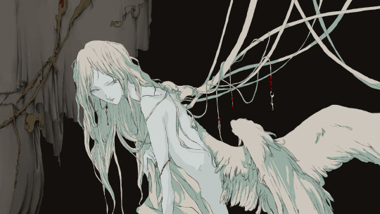
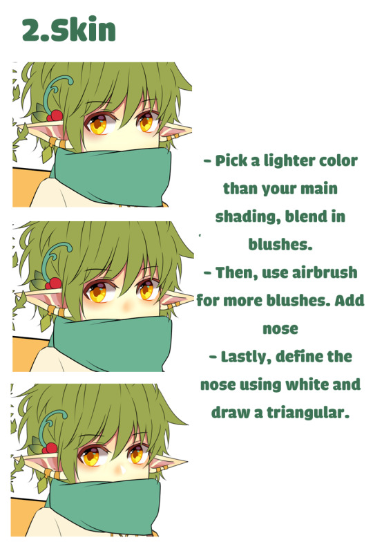
blur is very important and I think it’s what itmakes looking old school, since back in the 80s and 90s they oftenused transparentsheet in the cel animation technique (characters are drawn on cel andlaid over a static background drawing *wiki*),that would cast such shadows and make the colors a little blurry onthe film a little.
So the figure in front would have to gain suchan effect. I copy the layer for color and blur it and give it themode for color too!Also very bright colors would strongly blur soI make another copy of the color layer and just blur it highly and change the mode to screen tofade the contrast against its strong dark background.
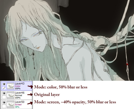
At the end, I would just adjust the outlinecolors a little bit to be less apparent if the contrast is too strongon bright spaces (using a clipping group on the outline layer andmake the hue mid-red-grayish)On a final note a slight blur to everything!
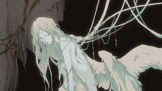
Actually that’s it ((^∀^|||)) hope it helps,I would love to see other people try it out!!full res: here
5K notes
·
View notes
Photo

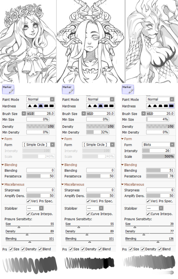
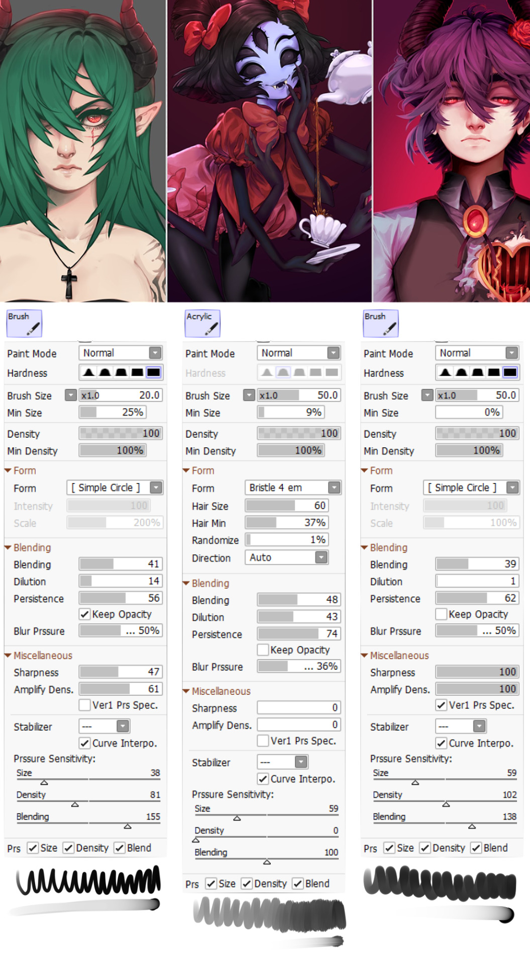
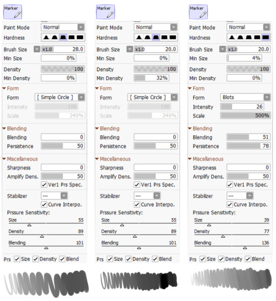
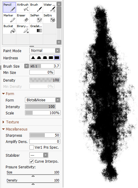
My inbox is constantly flooding asking for these brush settings for SAI 2
well heck here y’all go!
NOW Leave me be!! 8′)
4K notes
·
View notes
Text
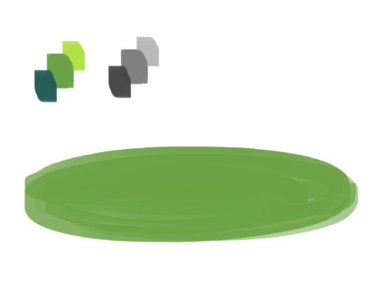
a quick grass tutorial
I’ve never really wrote a tutorial before so apologies if this is bad
1. okay first thing I do is pick three colors, a mid, dark, and light. I like to check the colors in greyscale to make sure there’s enough contrast between each one.
I then plop down a blob of whatever my middle tone color is.
2. next, I take my dark color and just sort of randomly place it around. I try to make sure there’s a good amount of both the mid and dark tones spread throughout. I personally like to keep it kinda messy. I also have pen pressure on for both brush size and opacity, so I can have some blending action going on.
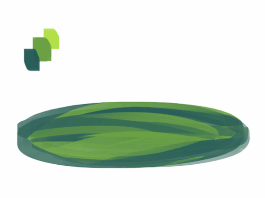
3. for the next step I do the exact same thing as before, except with the light color.
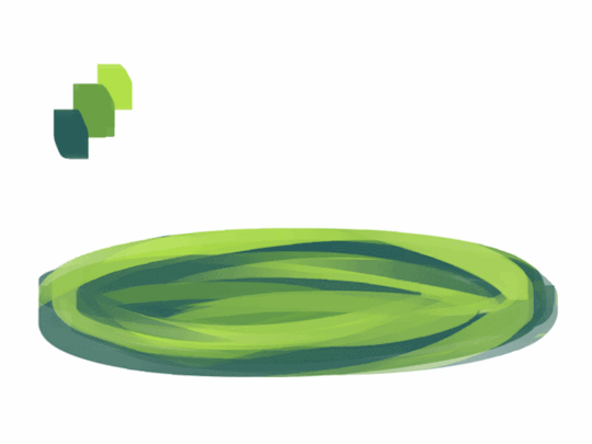
4. aight this is where we start adding details. see how you just have a bunch of colors and edges where two colors meet? use the eyedropper and go to an area where two colors meet, eyedrop a color, and then use that color to draw in your grass blades. I do this at every point where colors meet. should note I personally like to use a square brush, but you can really just use anything.
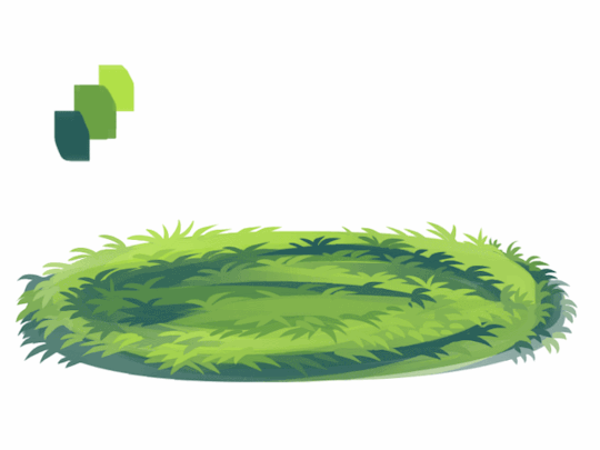
5. you can technically stop at the last step if you’re going for a more simple look, but to add more details I go to the “empty” areas of solid color and just draw in random strokes using a color nearby. it’s just a way to fill up the empty space.

6. basically more of the same idea of eyedropping and drawing. for more variety so things look interesting, I like to add random plant shapes.

7. and so the grass doesn’t look too plain, I add random dots of color and pretend it’s flowers and stuff.
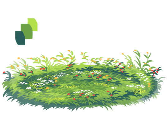
and there you have it, this is how I approach drawing grass.
120K notes
·
View notes

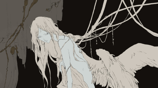
Photo


I cropped the full version so you all could see it better here on Tumblr, but anyway here’s my tutorial/process on this piece. You can also view it on deviantArt if you want.. but that’s a hassle so I decided to put it here too
62 notes
·
View notes
Note
I've just discovered you and I love your work! Would you mind sharing your approach to composition and thought process on it? Are there any artists you reference? Thank you!
Hey! you found me! Thanks!
I reference from photos for stuff I can’t visualize on my own, and artists like bouguereau, rockwell, leyendecker, mucha for mind fuel
Composition:
Whenever I do a piece, the objective I have in mind is to not get bored, because once I lose interest, I lose the piece.
So for me, the composition has to be distinct enough to avoid echoing an early piece, and to immediately be recognized due to its layout. It’s gotta be new for me, and new things are fun and exciting, right? (yes they are)
I think about the subject, the action, the actual format (whether it’s allegorical, objective, subjective, i.e. is it a symbolization, a certain scene, would you find it in real life? I tend to avoid the latter, because I find it dull and uninteresting and I hhhhhhhate that) I place priority on the human form, it’s versatile and expressive more than anything else, in my opinion.
Here’s an example. Normally I don’t post my sketches since they’re just glorified chicken scratch, but this is the best example I could think of at the moment. It’s St. George (for my series sanctus), and normally, you’d see him like this

(Saint George and the Dragon by gustave moreau, 1889-1890 )
or
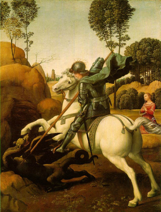
(Saint George and the Dragon by raphael, 1504-1506)
this.
It’s a pretty common depiction, since it goes back to medieval times. The similarities are that he’s on a horse, he has a spear/lance, there’s a dragon, and he’s attacking it.
The big picture (haha pun) is that I wanted to also have my subject be st george (side note, it’s kind of the theme of the series), but different enough from past artworks where I’d know it wasn’t enormously reminiscent of the traditional depiction. So I aim to keep the basic idea, and see what goes on from there.
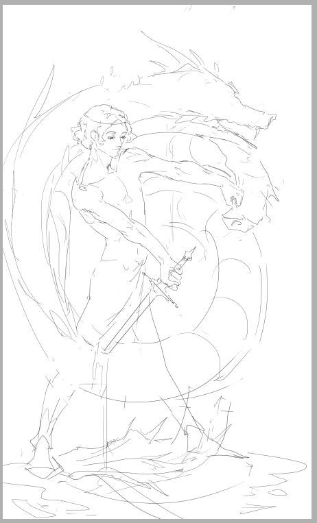
This is the first sketch I did, it was okay, I knew I’d never drawn anything like that, which is good, but composition was lacking. I wasn’t so hot about this, so I dropped it. I kinda like it so I might revisit it . Additionally, though, it strayed a little too far from the main idea.
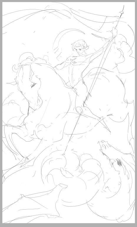
Above was the second sketch, after I’d finished roughing it out, I knew immediately it wouldn’t do. I was satisfied for about 2 seconds, then I got disappointed and stayed that way.. If I put it side by side with the other million or so paintings of st george, I doubt I could tell it was mine. It was practically the same: horse, lance, dragon. The action was too similar to other portrayals.
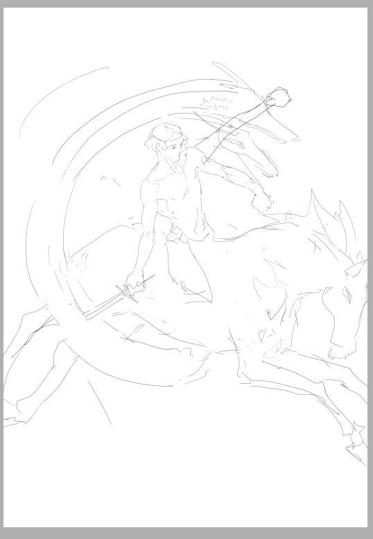
Definitely….nah
It’s not as similar as the previous one was, but I didn’t like it. That’s a good indicator too, whether you like it or not. I’d tried to fuse the first and second sketch because I did like the first one somewhat, but it didn’t really work for me. It’s just so awkward …

So I left the piece for a while, and came back and did this. It was different, simpler (which can improve a piece more often than not), and I liked it. After I did most of the sketch, I said great job u idiot it only took you a week to come up with a sketch the hell is wrong with u, went to bed, and woke up happy, and normally it doesn’t take me 3 actual sketches or something to come up with a good piece, and I was getting pretty fed up before the last sketch, but good thing I didn’t give up (this time. hah) This is basically how I go about my pieces for now.
tl;dr Don’t give up! (haha I lied, go back and read)
3K notes
·
View notes
Note
Can we some more of your processes in your more recent works? :0 Also, how clean do you usually make your sketch/lines before you start painting? Thank you!
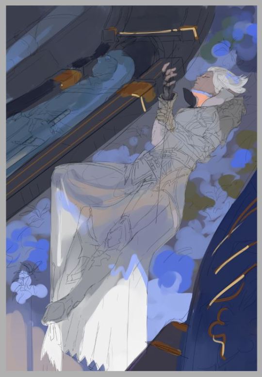
No problem! Here is my process for the ravus picture I recently posted :) Breakdown:
1. Sketch: This is normally how my sketches will look like; thin lines (because it doesn’t obstruct the actual painting when I lower opacity, and I like thin lines) but clear enough so my color will have a good foundation to base upon. I don’t tend to linger on the sketch with the intention to make it as neat as possible; it’s more of a liberal hand that would be applied to my sketches, but controlled so there isn’t any unnecessary scribbling that might inhibit my comprehension of the piece.
2. Rough Color: I did have a rough idea of the palette I wanted to have: purple, thus every color that would end up in the piece would eventually harmonize with the purple. Lesser yellow, stronger blues, that sort of thing.
3. More stuff added
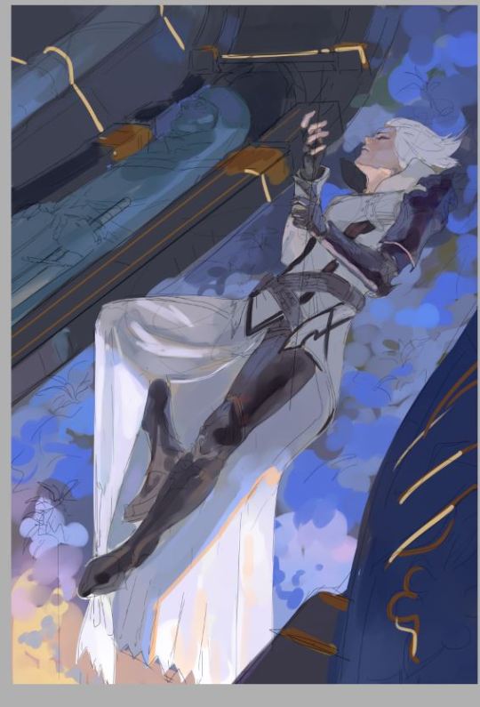
4. Here is where I turned off the sketch layer! One of my more favorite parts of the process :) Now it feels like I’ve got mostly everything out that I needed to, and all that is left to do is to paint without the lines.
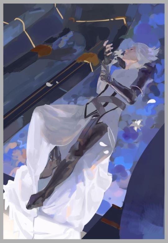
5. Neatened up the background. The line is a placeholder for the sword

6. Still going!
7. Looks like here I had changed up the folds in the clothing
8. And this seems to be the last screenshot I took..

But that’s basically how it goes! I hope you find this informing! Thank you for messaging :)
1K notes
·
View notes
Photo
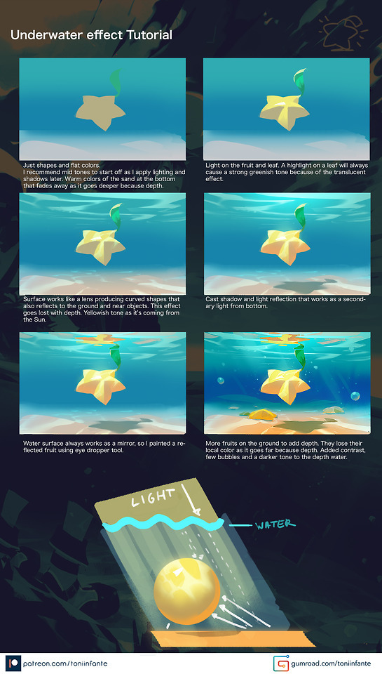
Underwater effect tutorial!
More on my PATREON & GUMROAD!
17K notes
·
View notes
Photo


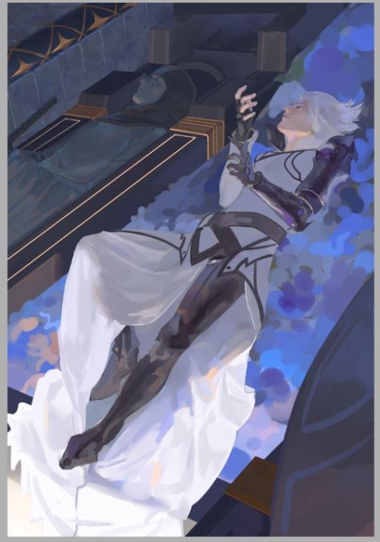
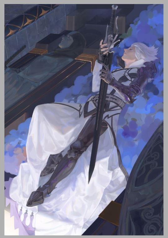
Some sort of Korriban/moraband redesign sketches I guess ??
9K notes
·
View notes
Photo
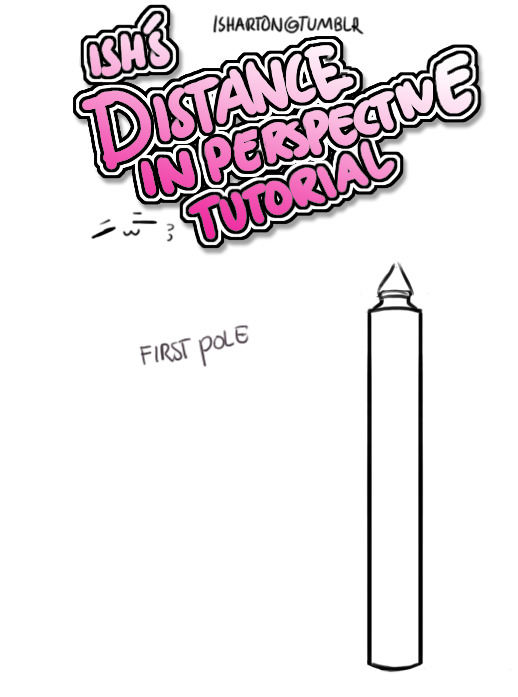
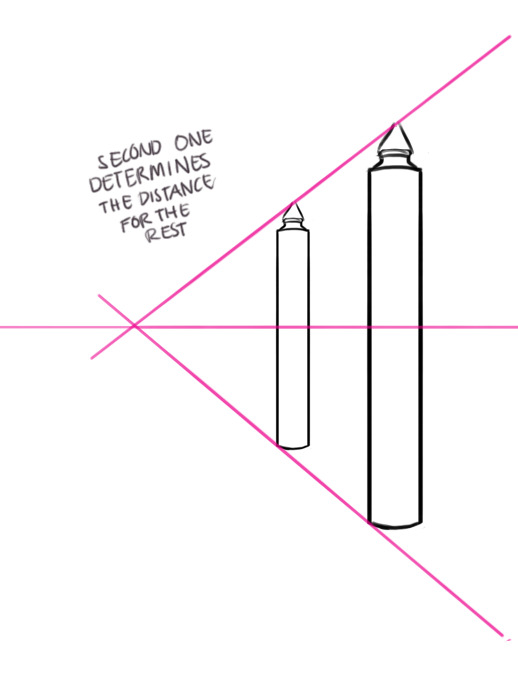
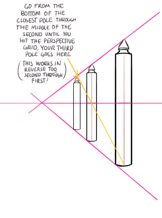
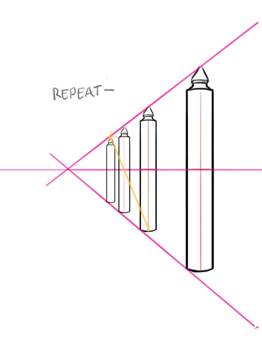
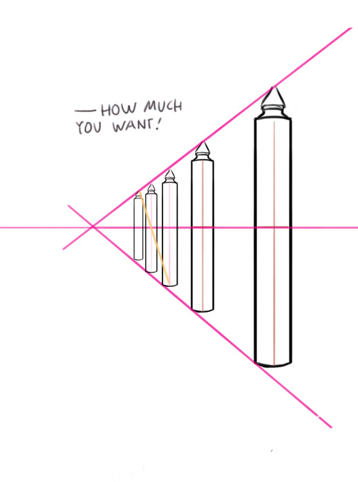
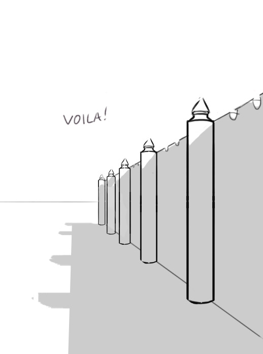
Thing i learned some time ago!
hope you all find it helpful ( perspective grids can be your friend!)
250K notes
·
View notes
Photo
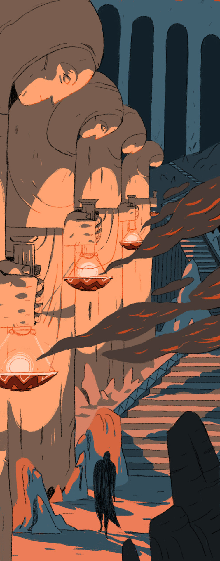
We had an interaction assignment, and GUESS WHAT I DID!!!
250K notes
·
View notes
Photo


OHH uhmm it’s kindaa long if you don’t mind!!
and here is the process gif! Hope it helps!!!
183 notes
·
View notes
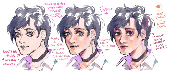
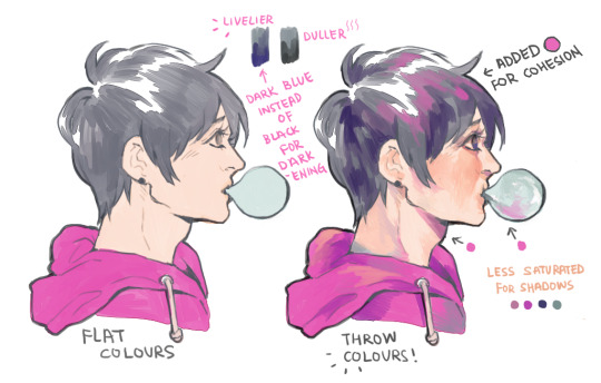
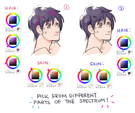
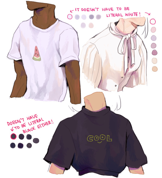
Text
Part 2
Ahhh thank you again//// im kinda flattered you would ask me for tips;;;;; Well colouring is really VERSATILE and so many possibilities!!! So there’s no right or wrong way to colour//// Here is just some stuff on how I colour, hope it helps!!!
2K notes
·
View notes
Photo


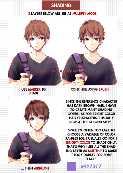
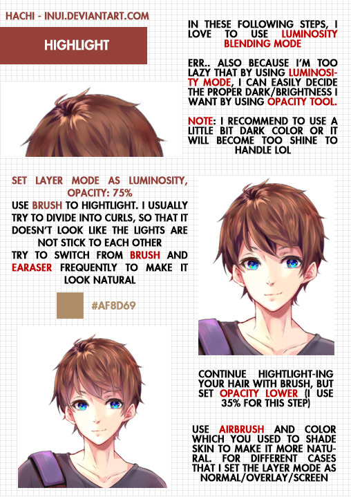

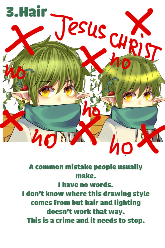
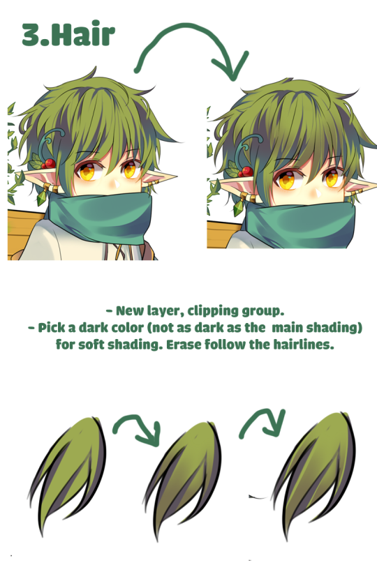
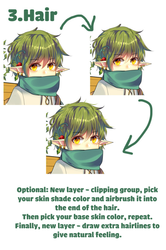
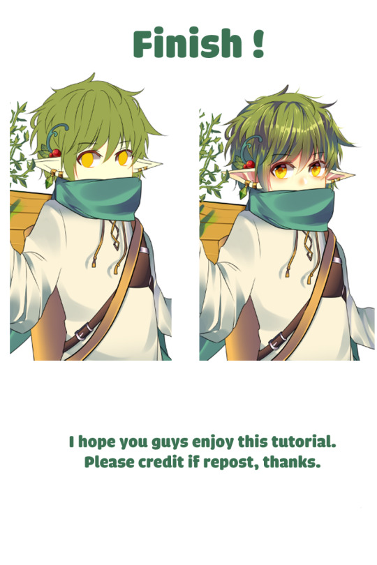
Tutorial of how I color hair on paint tool sai
I hope this will help many people who are still struggling with digital coloring :’D
7K notes
·
View notes
Photo

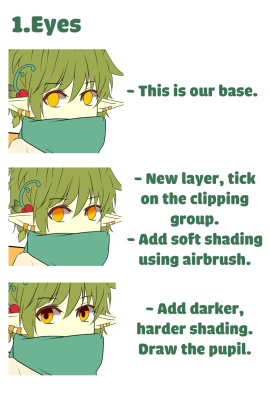


My friends asked me for an tutorial
For Paint Tool Sai users. There should be plenty of guides on how clipper group, preverse opacity/opacity lock works so I won’t be adding them here.
Excuse my lame English, I’m not a native speaker.
26K notes
·
View notes
Text
So I just wanted to show some tricks that will improve your webcomic/comic;
So down below we have a quick random page-sketch, if you ask me, it’s really easy to follow and here’s the fundamentals as to why:
1: Comics are Theatre
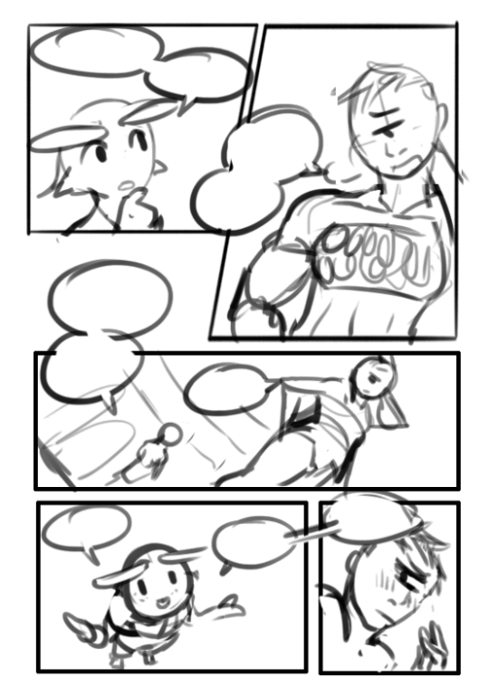
So a thing to remember that will put a zing on your comics is to have people do gestures, notice below how how the two characters are using their body language along with the second most expressive body part; The hands.
Reason why I say that people should remember Comics as Theatre is because on stage the actors had to do wide expressive motions with their bodies to convey to an audience that could be sitting far away on who is talking and what their mood is. ( this is why William Shatner is so expressive and all over the place during Star Trek. Because he was used to be on theatre.)
If you do notice in movies however, you can spot that the body language is kept subtle. This is because with movies you can get close to the actor and notice the changes in their faces and small things like fidgeting with their fingers to express restlessness…. in comics, this is super hard to express the latter and you could accidentally end up with just characters standing right up in a pose ( i see a lot of new comic artists trying to convey the subtleness of a movie into a comic, and it ends….pretty boring.)
TL;DR: try to express your characters like an actor of stage would! Don’t be shy and don’t let them be it either. You’ll have so fun, trust me.
==========================================================
2: Remember the 180!
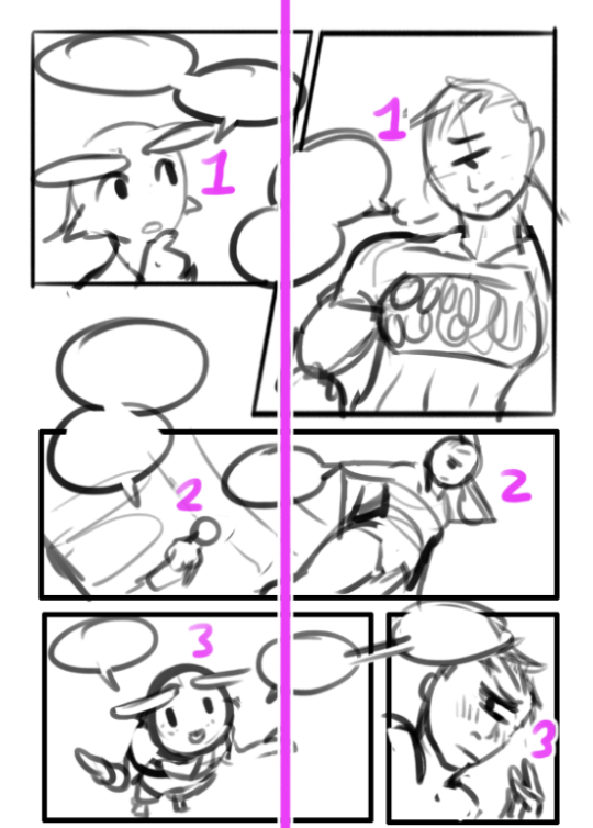
so a lot of people talk bout the 180, and I never got it at first til’ i began looking it up. Basically what it means is that two characters or a scenery should always be presented on being on the same side of the page (unless you had a middle panel showing the 90 degree turn of the subject/people.)
Notice how the two characters stay on the same side through the page but the left one. It will help the reader to know who is who, and thats A and B when making a comic!
TL;DR: Try to keep everything on the same side at all times unless you show a panel with a 90 degrees turn before going to 180.
==========================================================
3: Ayo snake! you cute as hell
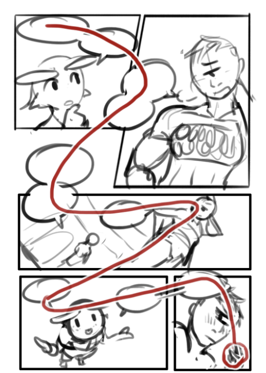
This one’s easy!
Imagine a snake slithering over yo page ( it’s a nice snek) and you follow it with your eye. Make your reader follow the snakes path as well!
No but seriously; Try to always make panels and compositions so that they point to the next panel! Be it via speech-bubbles or characters or environment.
Notice how each panel literally guides you to the next.
Character A looks to the right while character B looks down to the left, where her gaze hits the end of that panel which is compositioned to guide you down into the fourth panel, where char A almost points with her eyebrows and arms to the fifth ( which goes from top left to bottom right due to character B’s angle. Then just put speech-bubbles in the path and voila! The snake b slitherin’…wait…..Slytherin…oh…
==========================================================
Sizes are everything
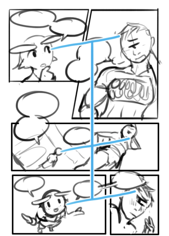
Super easy but some forget; Remember to always have the smaller character be smaller than whats bigger than them. Don’t try to flip around and improvise sizes for the sake of trying to get an impact out of it ( unless they get further and further away). Oft it just messes the reader’s perception of size in the comic if you experiment too much and they get taken out of it early and will just end up reading text on pictures.
SO this was just some quick tips, hope yall try these tricks out the next time you make a comic c: cheers <3
10K notes
·
View notes