wdka2018
WDKA's Product Design
Critiques of the the Nieuwe Instituut's Design archive exhibition
22 posts
Don't wanna be here? Send us removal request.
Last Seen Blogs

famei
无标题

bfdvurdhtrg
Good Stuff

69eggyweggy420
Eggo

oonafisk
violets are blue
blewoo
A work in progress
Text
Rademacher De Vries - Prix de Rome
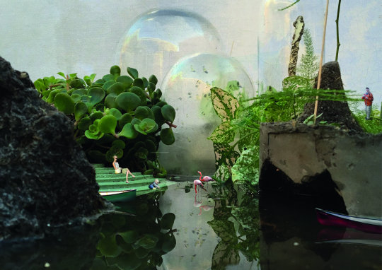
The exposition is about The Prix de Rome. The last exercise is in the hard of Amsterdam right in front of the central station. The design is made in the area called Sixhaven. it's on the other side of the water. There is made a huge building in the water the contains multiple social spaces where people can get away from the big city of Amsterdam.
It's was designed by Rademacher De Vries and they wanted to create an eye of a hurricane. So you have peace around the busy world of Amsterdam. They want to involve the area of Amsterdam-Noord. With the coming of the Noord-Zuid line (metro), they think its the best place to create a quiet atmosphere.
In the design, they want to make areas within the building where everyone can be connected. So if you are alone, with 2 or with a bigger group there are places for every kind of contact or connection. They really thought about the way people react to spaces and what people want if they are for instance alone. The design is also based on proportion and aesthetics.
What they say is: The citizens should realize that the city is a growing project. It's a collaboration that is based upon the choices we all make.
They really think there needs to be a good match between citizens and the people who have the ‘power’ of the city. The people who make the decisions.
Koos Bergmans
0 notes
Text
From Analogue to Digital
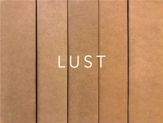
Designers: Jeroen Barendse, Thomas Castro and Dimitri Nieuwenhuizen (LUST).
At first sight, the 3-storey structure in the middle of a big hall will make people think: where do I start? Following the stairs to the 3rd floor, visitors will be presented with archives, the starting point for designers, in the form of sketches, mock-ups and objects that inspired them. One floor down, visitors will see the next step: plans and prototypes. On the ground floor, visitors can browse through the end products displayed in what feels like a gallery.
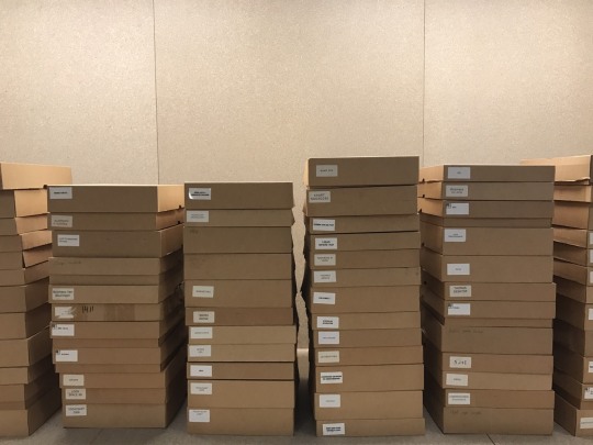
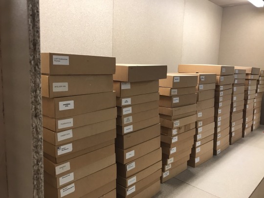
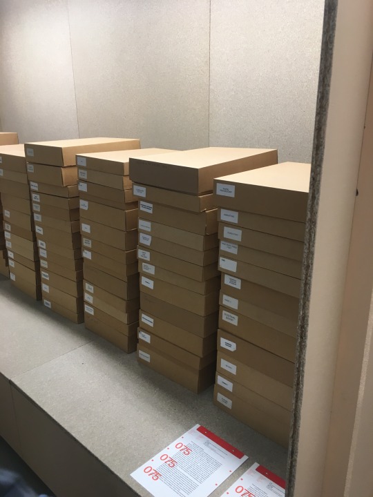
My attention was drawn to the archive presentation of LUSTwork from the design studio LUST: rows and piles of brown boxes, each with a label indicating their contents. Those seemingly idle boxes represented something so much bigger, so substantial: the transition from analogue to digital, from boxes to bytes. As physical data was being digitized, the number of boxes will be smaller and smaller, while the digital data files grew larger and larger. As piles of analogue data are still waiting to be digitized, at the same time, more new data are constantly being produced—and stored. This made me wonder: will there ever be an end to this process, as new data is constantly being produced?
These boxes are so neatly piled and labeled, but in real life, pieces of data are stored and scattered in so many places, institutions and organizations, in so many different formats. We see filing cabinets in offices, boxes in warehouses and homes, all containing those pieces. This made me wonder: how many of them are lost, misplaced, or worse yet—forgotten?
In my home country, Indonesia, the tension between analogue vs. digital cannot be more palpable: the country is under pressure to be more efficient and transparent, hence the implementation of e-Government, e-ID Card, e-Filing of everything. But they struggle with infrastructure and human habits: the e-ID Card contains digital data, but it’s rendered useless because card readers are not available. So the card containing ‘digital’ data still needs to be photocopied and the paper copy stored in good old filing cabinets and boxes! And this paper-and-ink habit is so deeply ingrained, making it even more difficult to transition to digital.
The LUSTwork presentation is like a wake-up call, a reminder of the importance and necessity to transition from analogue to digital, as represented by the humble brown boxes which contain the source of all the digitized data… while the Speculative Design Archive shows how these data, source materials and other treasures could best be brought together, collected, safely housed and made accessible to the general public.
Archiving the past vs. designing the future. The tension is real. And the ‘race’ is never-ending.
- Nikita Zamzam
0 notes
Text
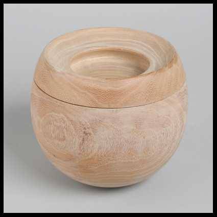
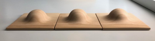
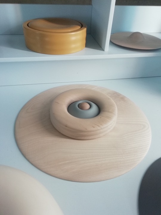
Maria van Kesteren
Maria van Kesteren by Susanna van Caldenborgh-Timmer
I was so excited to see Maria van Kesteren’s work in the exhibition. I love her work and am very interested in shapes like she is! It started when I saw a small wooden box at my mothers place. I loved it, asked who made it, but my mother didn’t know, she had bought it on a flea market and liked the shape.. About a year later I found the book “om de vorm” in a museum-bookstore. My eye caught the shape on the cover and was curious right away. And as I flipped through the pages I found my mother’s wooden box!! I love every shape in the book, the story about the artist and to see the pictures.
What I liked about the exhibition 'speculatief design archief' is the way all the archives are presented. Each in there own special way, with models, tryouts, in cardboard or plastic boxes, as if you walk in a storage-building and exactly the way a person or company would collect there stuff. The lower you get (floors) the prettier and more extinct it gets, till even a small exhibit in 'the basement". On the first floor I saw Maria van Kensteren's work. It seems like you take a peek into her studio, the ring binder with drawings and calculations of the shapes gave me so much joy, but also the shapes themselves. I know your not allowed to touch work in a museum, but here it felt like I was in her studio and carefully and with respect I felt the forms, looked into her ringbinder and especially studied the wooden shape you see in the picture below. How would she make something like this?
0 notes
Text
Ineke Hans
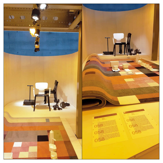
In the exhibition Speculative Design Archive the work of Ineke Hans can be admired. In this exhibition a series of different works can be seen, including the A380 chair.
The A380 really stands out for me, not only because it is in the foreground or because the color deviates from the other works. The reason that this design attracts attention for me is because it has a very recognizable shape. The A380 was developed at the request of Ahrend and has a recognizable appearance. If you look at the design it seems at first glance a repetition of the original of FRISO KRAMER (De Revolt), but through the application of specific parts it is a real 'Ineke Hans'. This is also due to the use of new techniques and recyclable materials.
Furthermore, the presentation is very strong due to the combination of the works Black Beauties, Black Gold and Black Magic with the Ahrend 380 in the foreground. With the wooden background and the lights focused on the work there is a very large contrast and the work really does off in the background. This draws attention to the work and becomes a real eye-catcher.
Besides the works of Ineke Hans, there is more exhibit. Next to her work is the work of Bas van Beek. The work of Bas van Beek fits well with the style of Ineke Hans. I think the combination works very well and brings out the strengths of every work. I think it is a very special way of presenting, because the work of the two designers lies behind each other. You have to look over the work of the other person.
I therefore think that the work of Ineke Hans and Bas van Beek fits very well together and complement and reinforce each other well.
In the way the work is presented I think it is very well displayed and makes it very interesting to watch.
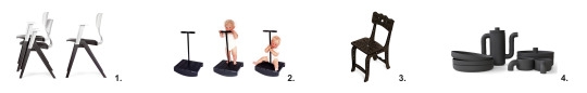
1. Ahrend 380 chair 2010, Royal Ahrend
2. Black Beauties Activity 2001, play objects
3. Black Magic Collection: Laser Chair 2002, seat
4. Black Gold – originals 2002, modular black porcelain
Sources:
07-12-2018
Nieuwe Instituut Rotterdam
11-12-2018
http://www.inekehans.com/studio/work/ahrend-380
http://www.inekehans.com/studio/work/black-beauties-activity
http://www.inekehans.com/studio/work/laser-chair
http://www.inekehans.com/studio/work/black-gold-originals
Made by,
Tim Braun
0 notes
Photo
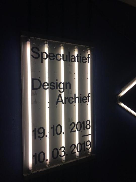
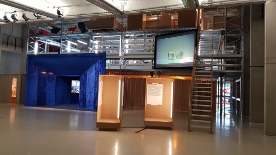
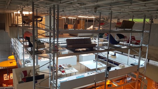
INTRO Het nieuwe instituut visit, Specilative Design Archief.
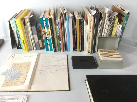
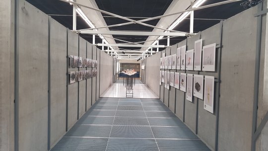
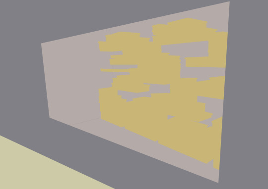
On a Wednesday morning we went on a trip to Het nieuwe instituut. What seemed to be the central hall or exhibition room, was filled with a gigantic scaffolding; four storeys build up in this big hall-like space. After climbing this construction to the upper level, you entered the exhibition this trip was all about: the speculative Design Archive. The aim of it is to show the importance of an archive of the Dutch Design and digital culture; to offer us a memory of Dutch Design. How will we save/who will, and what will be saved for the future? The installation follows the complete archiving process; from collecting, preserving, organising and describing of the pieces, to the reconstruction of their origin, the valuation and the determination of it’s meaning. The exhibition gives the visitor a chance to look into the storage boxes, hidden drawers and stockrooms of big organisations and designers as well as a quick view of their private (studio) life and it finishes with how the objects are exposed in a showroom.
The exhibition aims to address the issue with the way things are stored, things designers often use in their process in the development of a new project. It tackles the importance of these artefacts and how often they het lost in the way and get reduced, damaged or are inaccessible. This is an issue which I think each designer/artist has at least once dealt with and as the exhibition suggests there is no one central approach to storing these important and interesting artefacts and maybe the examples shown are a few local and good ones.
I have noticed that a similar tendency (even in different scale and industry) is present in the film storing. The archives of Hollywood are enormous, most of the films done until ten years ago are stored on film and some serious discussions arose back then since there was a problem with the amounts of film being present, which consumes a lot of physical space and the problem with the backward incompatibility of the new technologies. Of course this is a completely different case, but maybe for some the comparison would make more obvious the question of how important storing the work is and why should we preserve and expose it.
Recently I had a visit to a few big second hand shops in The Hague and was nicely surprised of the way old objects, who sometimes are of a similar value of the ones exhibited in Het Niewe Instituut could be found amongst tons of other (not so valuable) objects, who are awaiting for their new owner. For a person who has never before experienced such places was also very interesting to observe the way the in which the owners of these shops often times decided to arrange their shops (e.g. there were a lot of objets arranged by color or material in which they are made of). This way of organising and storing is very untypical for me and found it very handy, playful and utilitarian.
I mention this as example as this somehow reminds me of one of the works that studio Droog did in 2010 called “Saved by Droog”, where objects from a similar places got acquired in bulk and they have invited 15 of other fellow designers to create (even sometimes with a bit of humour) new combinations of the objects and actually put them all on sale. They ended up with an exhibition that gets all sold out and the objects there were no longer objects who take space in some storage lot, but instead are seen as valuable art objects with a story. This in my opinion is very bold project, who's addressing questions related to the topic of the exhibition and I think this is why they are also one of the reasons to be selected as participants in the The speculative Design Archive exhibition.
More about the project saved by Droog here: https://vimeo.com/11967060
Also if you’d like to see more about the whole exhibition, read further and you’ll find some observations, impressions and thoughts of the Product Design students at WdKA .
More about Droog could be found in the blogpost related to it and on their website:
https://www.droog.com
And as a conclusion I would like to invite you to visit the exhibition at Het nieuwe instituut, until Mar. 10, 2019.
Keep on scrolling!
0 notes
Text
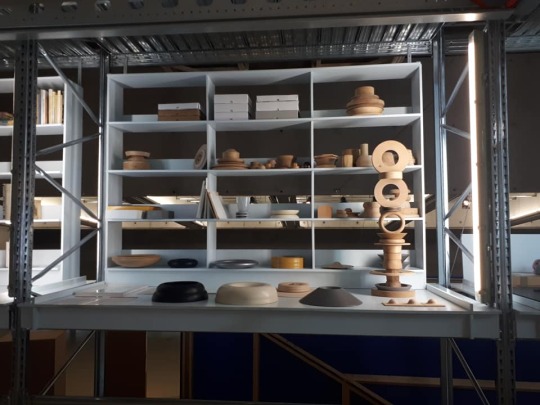
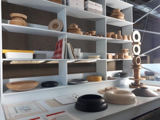
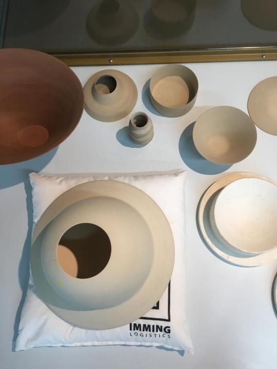
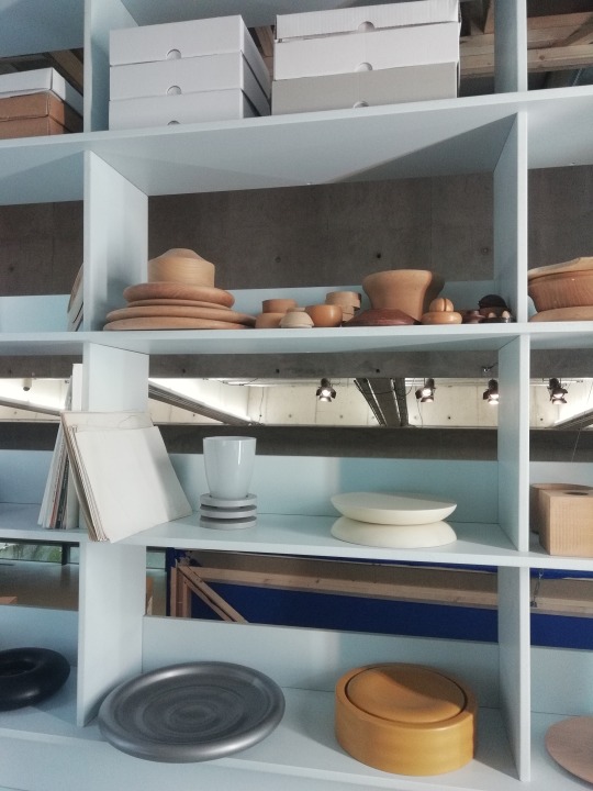
Maria van Kesteren
MARIA VAN KESTEREN (1933) Visual artist who worked with a wood turner for more than 50 years. She made vases, bowls and abstract objects, especially of wood but later also of ceramics, plastic and glass. Van Kesteren left a collection of unfinished work behind that young designers can work on to finish it. One of the young designers is Ruben van der Scheer.
The presentation was vey organized. There was a clear division by a number of objects on a table and the unfinished objects in the shelving unit. As a result, you saw well that Van Kesteren has done much form research and experimentation, with many different types of wood, sizes, colors and thicknesses. What I really liked about the presentation is that she showed almost the whole process, because she showed some sketches, experiments and end results. But there was no real interaction between the presentation of Van Kesteren and the other’s. Only that the one next to Van Kesteren had the same shelving unit and table but with other work of course.
Made by Vera Nooijen
0 notes
Text
Heritage/Revival
Although people from the outside seem to think that the end result is the most important thing of designing, the most interesting part of designing is the process. What was the story behind the end result en which steps has he made to come to this product? From all the different ideas, concepts or prototypes, only a few of them become a visible part of the product. But how can a designer make the decision about which idea, concept or prototype is the best one?
The questions stated above were the questions that Het Nieuwe Instituut wanted to answer with this exhibition. This is done because the way how a designer works is sometimes more important than the end result, but also because they think that the samples, processes and the prototypes are worth it to be shared with the world outside. What is happening behind the scenes and what are the choices that a designer makes in this stage?
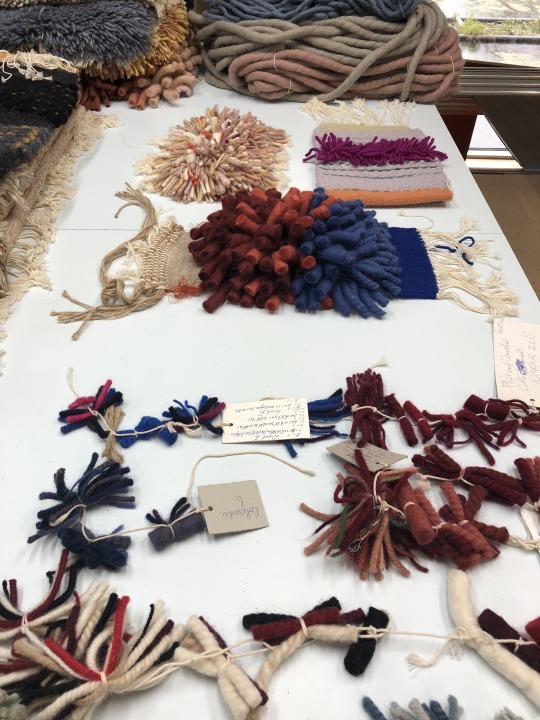
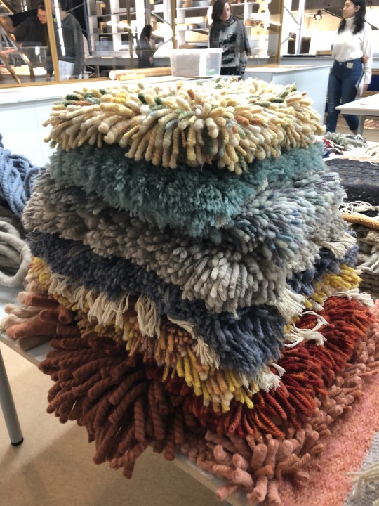
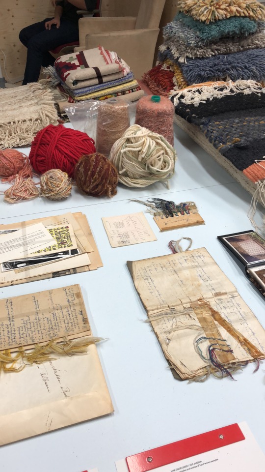
One of these designers is Mae Engelgeer. Textile design is always the start of her work.
From her period at high school until the end of her studies at AMFI and Sandberg Instituut, she has been working with textile. A few years ago, she met Jos Jansen, the owner of a weaving factory in the east of The Netherlands. His factory makes carpets for high-end interior shops and also for private clients.
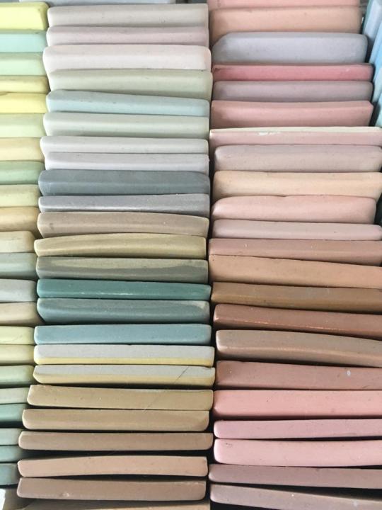
Mae felt Jos’s business was something that can be used as a big inspiration. Boxes full of samples, prototypes and colours formed the archive of this weaving factory. Together with these sources of inspiration, Mae started designing. She made a lot of small weaving samples with different thicknesses to make a large colour palette out of different sorts of yarn.
With this way of working, the craftsmanship is something that is combined with the modern way of working of this time. This is something what Mae really liked and she started with this way of working in 2013.
Jos and Mae’s work is part of the education depot in the exhibition. This is the place were designers started with making prototypes with different materials and also work with different techniques, to find out which one is the best way to develop their project. You can see the difference between the samples of Jos and Mae because they both used a very different colour palette, but on the end the craftsman techniques are the same. The other designers use a lot of sketches and paper experiments but Jos and Mae use the final material more to find out which way is the best way of making their end product.
Sources:
https://speculatief-design-archief.hetnieuweinstituut.nl/achtergrond
https://mae-engelgeer.nl/pt_project/heritage/
Made by Thara
0 notes
Text
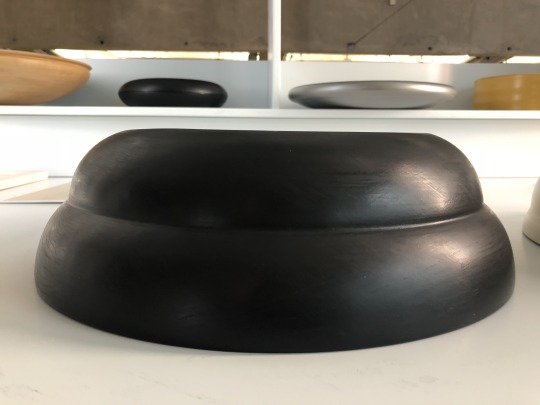
Geert Lap
An oven with more than 25 objects left in it, unfired. A messy archive, containing sketches and documentations, but also prototypes, unfinished products and test glazes. This interesting collection is what Geert Lap left behind after his sudden death in 2017. Lap was never able to organise or clean up his archive, therefor Thimo Te Duits took up this task, which allowed for a detailed research of Geert Lap’s working process.
Geert Lap studied at the Rietveld academy in Amsterdam, together with other prominent ceramists like Babs Haenen, Barbara Nanning and Irene Vonck. Even though every ceramicist follows his or her own path, Lap’s work cannot be categorised in a certain trend or zeitgeist. His work was characterised by its perfection and seeming simplicity. It has been exhibited in important Dutch and international collections. Geert lap always strived for a certain perfection. The image that he had in mind, had to be produced exactly how he pictured it. Only the result was what counted and nothing was left to chance. In his pursuit to achieve perfection he developed his own vocabulary and colouring system. He continued experimenting with colour throughout his life. He undertook colour tests using different pigment mixes, all of which he documented very precisely. The part of Geert Laps collection that is shown at het nieuwe instituut represents this experimenting very well. It shows the never-organised archive of an extremely organised ceramist. We don’t only get to see Laps’ work, but also his sketches, tools, studies, inspiration books an colour tests. Would we have been able to see this if this perfectionist had been able to organize his archive before his death?
0 notes
Text
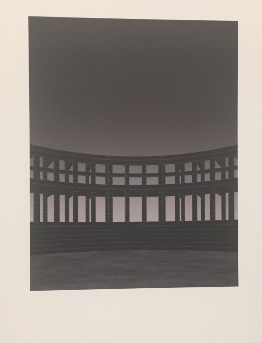
Alessandra Covini
Alessandra Covini is an Italian designer born in 1988. She first studied in Milan and Lisbon. And received her master’s degree in Architecture at the University of Technology in Delft. She founded studio Ossiciana in 2015 with Tomas Dirrix. Based in Rotterdam. The studio is about researching material and expression it in unexpected shapes and atmospheres.
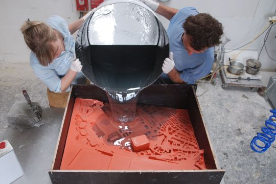
Amsterdam Allegories
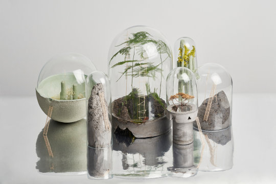
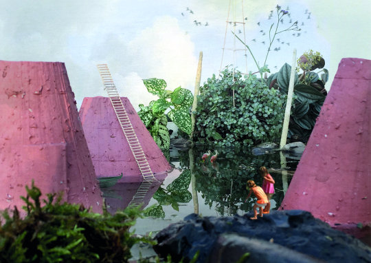
Alessandra was the winner of the Prix de Rome Architecture 2018, the most prestigious award for architects younger of 35 in the Netherlands. For the competition she designed a new plan for the Sixhaven in Amsterdam, called Amsterdam Allegories.
Her concept for this area was a storytelling about Amsterdam, the past, now and future. Translated to architectonic object. All the objects became small islands. The 21 objects form a public together. The goal of the area is to trigger your fantasy and creativity. If you go there you don’t feel like a user, but you feel like an explorer. Besides the big scale model she made, she also made some visuals. By scaling en placing people in the design they gave the viewer a good tool to imagine them selfs in the surrealistic world.
The best part about her design is that I immediately felt like a child and already saw myself walking and exploring the area. Before I even read her explanation, I already scaled myself into the model she made of the area. Even though it is a surreal world she had build. I can see myself in there. She definitely reached hear goal. And that makes her design a good design.
Ellis Holman

photo’s by Studio Ossidiana
0 notes
Text
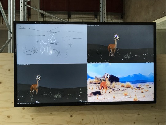
what we can learn from animation design
blender best at some years as free and open source 3D graphics software for creating animations visual effects, 3D models and video games. Founded by Ton Roosendaal and with the help of crowd funding and support from, among others, the film fund. blender knows how to continue to develop as open-source software. But what can you learn from this program as a product designer. Most we can learn from the way an animator works. and the stages he goes through to ensure that the entire animation is correct
face1 animation
In the first phase a story line is given by the whole simulate drawing. here in you only see the grove line of the story. often it is about who is what and why.
face1 product design
solve small idea. Gaining inspiration. and sketching little ones and making dates
face 2
the animation gets a little more shape. here and there some color appears and the movements are still wooden but are already much better than in face 1. There is still a lot to be done but the basic idea and design is there
face 2 product design
the idea has become clearer. your sketches become better and give more and more information. about how you want the final result to look like.
face 3 animate
there is a prototype. It is almost true that the projections are correct, but there must be a filter or a rendering here and there to make it complete
face3 product design.
it's time for your prototype. not as hell as it should be, but it gives a 1; 1 idea of what the final product should look like.
face 4 animation
the final product. a complete product, both in shape color texture and weighting. Ready to show to the general public
face 4 product design
a complete functioning of your prototype, ready to be sold or exposed
2 notes
·
View notes
Text
lust
From Analogue to digital
Lust is a design studio that collected their work in the archive you see in the pictures.
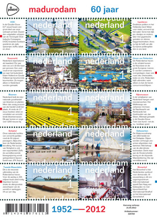
The chosen work was a stamp collection Lust made for PostNL about Madurodam. Madurodam is a park with miniature buildings from holland.
In the archive box where all the PostNL emails to Lust. The subjects the stamps needed to be about, the requirements that the product had to meet and the fees that the designer would receive for the 10 stamps.
Per stamp the fee for the designer was 250euros and 70euros per hour
The work was presented as if it was a precious art piece. You had to ask the museum worker to open the box for you. He handelld it with care. You as the visitor can’t touch it or make fotos of it. The whole experience of this archive feels as if you are digging in the past.
It was nice to see the whole thinking process of a simple product such as 10 stamps.
Joris van Soldt
0 notes
Text
Why is the exhibition exhibited the way it is?
Het Nieuwe Instituut - Speculatief Design Archief
Archived ideas are in a lot of cases being forgotten, which is a pity. The exhibition “Speculatief Design Archief” gives these “forgotten’ prototypes, sketches, material- and colour tryouts and other workpieces that have been important for the development of dutch designers, a new place to be shown. In this way the pieces can still be looked trough, even though the designers themselves don’t have place to show these pieces.
I think the reason why the Nieuwe Instituut chose exhibiting this way was the fact that they wanted to have multiple stories where they could show their pieces.
The building belonging to the Nieuwe Instituut is built in a way that there’s a big open area in the middle of the first floor.
This area has been designed the way it is to facilitate big installations that have been shown here before. Speculatief Design Archief however doesn’t contain any big pieces and exhibiting small objects in the big open space wouldn’t look nice; that’s also a reason why they chose to make a big installation where they can show small pieces in the way they did I think.
The installation in the middle of this open area then functions as a room divider and it gave an opportunity to store everything in a clear, accessible way.
I like the concept of the exhibition where you can do your own research and touch everything, but the actual doing it makes me feel awkward. That’s why I prefer going to an exhibition where everything is shown. This creates a better overview of all the pieces and doesn't give you the feeling that you’re doing something that your not allowed to (even though you are). The awkward feeling is due to the fact that exhibiting in a non-touchy way is norm, and I personally think many people will have the same feeling once visiting this exhibition.
by Kier Spronk
0 notes
Text
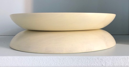
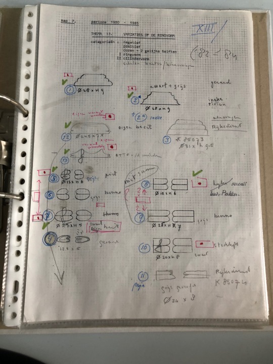
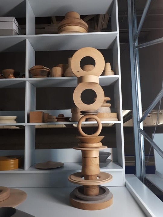
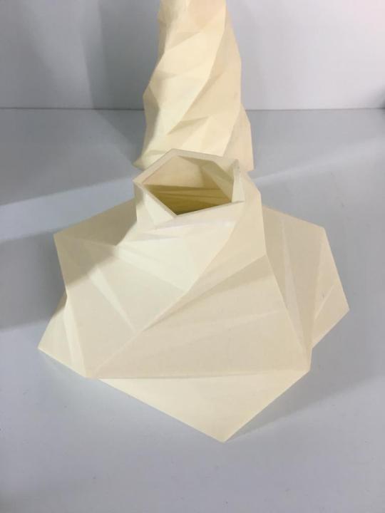
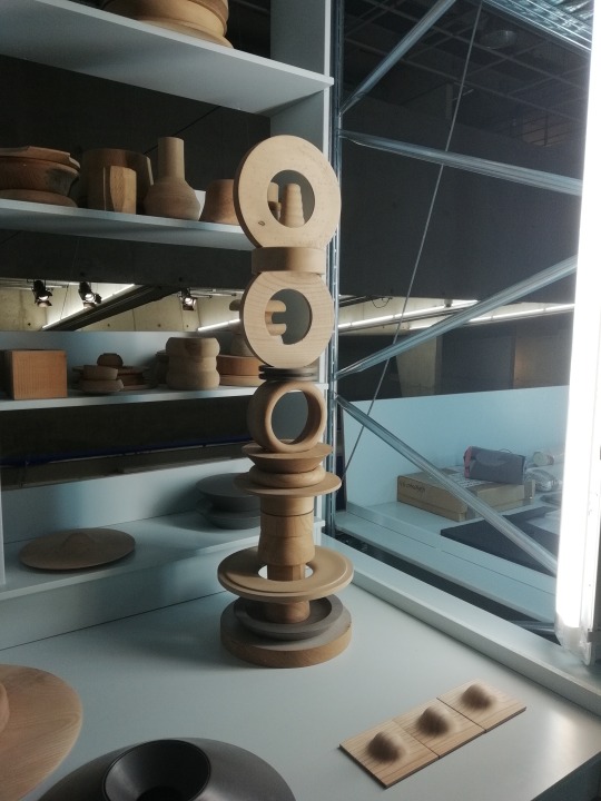
Maria van Kesteren
Clean lines, rounded shapes and fine gaps, is one of the ways to describe the works of Maria van Kesteren. This woodturner manages to make shapes that that aren’t just aesthetically pleasing, but also creates a sense of tranquillity. It makes you question how it’s even possible to create something so perfectly round and smooth with just human hands.
In this exhibition it was possible to see not only the finished pieces, but also the ways of the artist’s thoughts in her catalogue of sketches, that accumulates more than fifty years of her work with woodturning forms.
Maria’s works were exhibited in different layers and heights. On the table it’s possible to see her finished work and document map, but on the shelfs some prototypes and boxes that conceal some of her works. It created a feeling of an artist’s studio storage, that not everything should be revealed on the first glance, but rather be uncovered and experimented with.
Even though her objects appear severe, when carefully examining the subtle curves and transitions everyone who sees her work will be fascinated by the tender side of it.
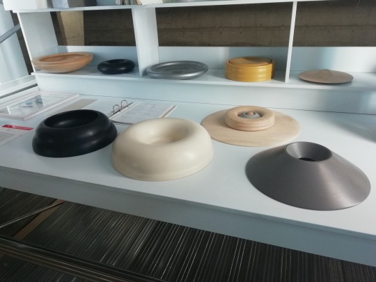
By Madis Ciglis
0 notes
Text
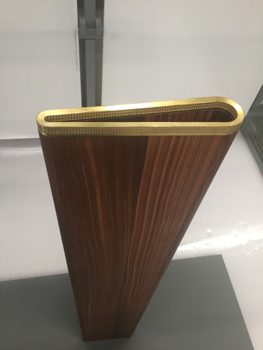
Vincent de Rijk
Vincent de Rijk
Exposition from 1986 till now
As a designer the presentation is an important thing for a company. But the experiments leading to a project are more interesting for designers.
For instance I remember a moment during my internship at Joris Laarman in Amsterdam, a beautiful company with a great team and especially with a wonderful collection of products.
The most interesting thing for me was the big showcase with al the experiments they had in the past years. The biggest impression, which I will always remember, is the moment I looked to that shelf. In al the samples you could see the design process and the learning process as well. For me it was the most beautiful part in the studio and a big inspiration.
Wen I read the article on Vincent de Rijk I was glad that I found someone else who is very interested in the making of experiments. Of course all the designers are interested in experiments, but Vincent de Rijk is famous for his way of experimenting with plasters.
For me the presentation in Het Nieuwe Instituut was not so special. I thought it would be more interesting when he had showed his products in a showcase with a few of his most beautiful experiments and the boxes under it with his other experiments. People could better observe the interests of the artist and there would be more people how would be interested.
The way of exposing is worthwhile in comparison to the other designers; everybody showed his experiments, processes and models in almost the same way.
0 notes
Text
Bram van Kaathoven
18 October 2018 The prix de Rome and architecture. This exhibition is about ‘Amsterdam Allegories”
First a little bit information about the designer. Bram van Kaathoven combines research of history with architectural design. In 2015 he graduated from Eindhoven university of technology. He is currently working as a designer and researchers at Bauhutte.
Sixhaven Amsterdam – North is one of the last empty spaces so close to the city centre. Bram would rather preserve this empty space than develop it. He thinks it stands for the growth of the civilizations itsself.
We need to appreciate the rareness of the empty space. For the exposition there was a theme, high pressure.
Bram translates this to the stress that exists among the citizens because of the fast technological advancements. This building is a place for techniques that aren’t used any longer but also a place where new techniques can be tested and researched. It’s not only for development but also to preserve the failed experiments so the generations after us can learn from it.
My opinion;
The way Bram uses the wood and gold scale models in combination with the story is very interesting and smart. The story itself is a bit vague and not very interesting for me. The reason that I still chose to write a short article about him is because of the way he uses the scale models to give the story a character. I could really see a building like this in one of the last empty spaces in Amsterdam. What surprised me was the fact that the scale models have so much influence on the whole thing.Without them I would have just walk past it. The set up from the exposition itself is very strong, he really starts with a story and then he leads towards the scale models and on both sides there are drawings and sketches.
Evy Jolijn Deelen 11/11/2018 Subjective catalogue
0 notes
Text
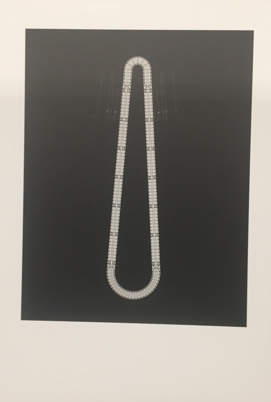
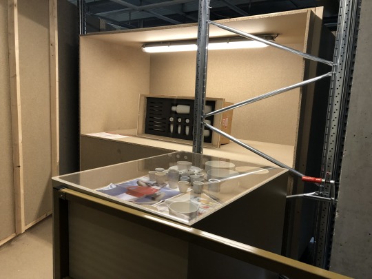
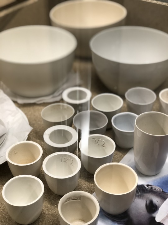
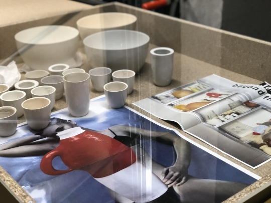
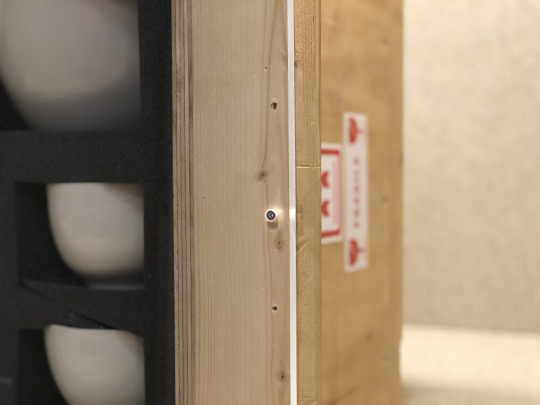
The key piece - Hella Jongerius 049
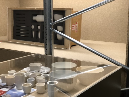
Hella Jongerius has no intention of letting go of her archive. She sees it as a living archive and is still using it every day. She wanted to add something from her archive to the temporary presentation of Het Nieuwe Instituut, so she presented her tableware (B-set).
What you can see in the presentation is that every piece is made individual and therefore has his own character. The B-set is presented like it just arrived, it still looks like a package that has to be unpacked. Even the shipping stickers are still on the box. It felt like I was in a secret archive where all the design try-outs were stored. This makes you really curious and I actually wanted to open every box, but unfortunately I was not allowed to do that.
The exposition looked like it was not finished yet. It felt like construction workers could walk in every moment. It also felt like I was in a maze: behind every corner was a new treasure. The exposition gave me a warm feeling, because of the mateials that where used. The layout of the exposition was really smart, because every project had his own personal space. It was nice to look into an archive of a designer, it gave me a lot of inspiration. I also learned that your first design doesn’t have to be perfect.
Monique Hanse
0 notes