
vfxaesthetics-blog
3D Aesthetics
A classwork journal for 3D Aesthetics. It will aim to take a closer look at VFX, its various components and methodologies.
22 posts
Don't wanna be here? Send us removal request.
Last Seen Blogs


Text
Final Assessment
The contents of this post works in conjunction with that of the last. I left off with a to do list, most of which did not change in the week following it. The only minor changes were to the sound fx and my style frames. In regards to the latter - I only managed to get two complete due to timing. For the former, I decided to axe the heavy passing noises for one very large reason - they stood out like sore thumbs. Even when only subtly present, they sounded like blights on the audio track. So they were removed. Gone!
In addition to my research, synopsis, treatment, mood board, storyboard and style frames from last week, I have for you today one animatic and two motion test sequences!
Motion Test
These are examples of the most active states that the camera could be in across the clip. Whilst the animatic gives you a basic sense of motion, it predominately deals with timing. These motion tests will give you an idea of the kind of camera movements that are involved in the scene, bar static cameras.
vimeo
Again, password is 3D.
And now, for the animatic. Drum roll please.
vimeo
That’s all.
~ Natalia
0 notes
Text
Pre-Production
Despite my lack of posts, I have been able to get a couple of morsels of work done. After deciding what kind of visual I was going to produce and the topic I was to explore, I got to researching. Having discovered enough to cover a synopsis of a fictional movie that I’m creating my title sequence for, I went on to creating the R&D and testing out different techniques. But lets not get ahead of ourselves. My research and treatment are as follows.
RESEARCH
Archimedes
Archimedes was born in Syracuse in 290 BC and remains today a renown mathematician, astronomer and inventor of Ancient Greece. Some of his most significant contributions regard the sphere, cylinder and other irregularly shaped objects and their relationship to volume.
Archimedes spent the majority of his life in Syracuse, travelling primarily for scholarly purposes. When the Romans invaded Syracuse in 214 BC, it was due to Archimedes inventions that the defence of the city lasted as long as it did. His reputation was so great, that it was ordered that Archimedes was to be brought back alive to the Roman Empire. Unfortunately, he was killed by a Roman solider, said to have come across Archimedes whilst he was enwrapped in his studies.
Of his surviving works, one of his most notable is titled “On the Sphere and Cylinder” and details the methods of finding the surface area and volume of the sphere. It is his work with the sphere that the tile sequence will be based off.
The Sphere
I realise that, being at university, academics like it when their students are able to references and trace their ideas, which I have not done in regarding the design of my sphere. To be perfectly honest, (and much to the dismay of many academics, I’m sure), the design of the sphere was something that I imagined. What would a mystical pieces of technology look like? What archaic patterns would it display? I am sorry to say that it is only looking back now that I can attribute a childhood movie, Disney’s Treasure Planet as my visual inspiration.

This sphere held a map to guide the explorers (and pirates) towards - you guessed it - treasure.
You know what? It does looks remarkably (and unfortunately) similar....
R&D DEVELOPMENT
The more that I looked at this, the more I didn’t like it.

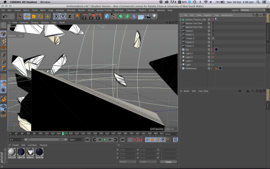
I mean sure, the lighting was right. The text was good. Compositionally I liked it. But the hard edges, the shape of the shards and the breaking of the texture along a surface where the normals were far harder than they should be was not what I envisioned. I imagined the pieces to look like that had come from something solid. The shards would be like pieces of rock - not an even 20cm thick the whole way through - which was the limits of the Transform plugin I was using for Cinema 4D.
So more research ensued, and I found Thrausi for Cinema 4D. It is a plugin that breaks up an object as if it were a solid. The more I used it, the more I liked it. It didn’t break my textures when you applied it to an object (though you would have to apply your texture before you break the sphere, else it applies the texture to the pieces individually and and the map/circle/line pattern that made up the sphere surface gets broken), it created a texture for the outsides and the inside, which could be fun for later projects, and it let me break the sphere into anything from 2 to 2000 pieces.
I love smashing things.
For all those interested, you can find it here. Even better. Its free! Although I here Cinema 4D R17 has its own version.
http://nitro4d.com/blog/freebie/thrausi/
This is what Thrausi looks like in action! I’ve also set up multiple cameras and lights for style frames (each from my storyboard - more on that later) and two motion tests.
SYNOPSIS
The film begins as Archimedes first embarks on his studies, and follows his life until its end during the Roman invasion of Syracuse. Portrayed as a Archimedes is a titular film, following the young hero throughout his life as a student, then later as a mathematician and philosopher. The climax of the film occurs as the Romans invade and it falls upon Archimedes to defend the city with his inventions. This point of tension is carried through to the resolution which revolves around his capture and death.
Title Sequence Treatment
The title sequence of the film draws upon Archimedes work with the sphere had is love of geometry. A perfect sphere is never ending and complete and this something that the film portrays Archimedes to have an intense interest in. The title sequence is characterised by slow, deliberate motions and a dark palette, feature shards and fragments slowly revolving and being drawn towards a central point, at which time they merge to create a perfect sphere.
Moodboard

Style Frames


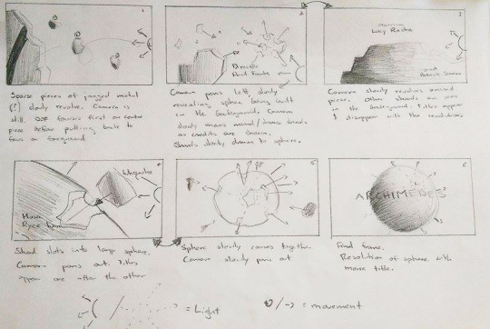
Storyboard
As to that storyboard I mentioned - here it is. It drafts the kind of shots and movement that would be expected in the final sequence. The camera is always slow and subtle, the fragments heavy.
SFX
In terms of audio, I feel like the atmosphere in Aphelion suits it best. The music mimes the slow, heavy motion of the fragments, and at the same time the quavers of the strings provide a sense of build and urgency. This is augmented by the building of the rhythmic section as it reaches the climax of the piece. SFX will include a heavy weighted, bass driven sound to compliment the visuals when a shard of the sphere passes close to the camera.
The track to Aphelion can be found here. It is a piece y Jesper Kyd and was created for the game Assassin’s Creed.
That Magic To Do List
Right now, the animatic needs to be drawn and animated. I have half my frames to composite before they’re ready (I’m rendering each with a RBG, specular, shadow and depth pass), motion tests (ignoring lighting and composite and just focusing on the motion of the pieces and camera) and then it should be done. I say should be because its 3D. Nothing is ever really “done,” or if it is, it is not done easily.
References
Archimedespalimpsest.org, (2015). The History of Archimedes. [online] Available at: http://archimedespalimpsest.org/about/history/archimedes.php [Accessed 12 Oct. 2015].
Encyclopedia Britannica, (2015). Archimedes | Greek mathematician. [online] Available at: http://www.britannica.com/biography/Archimedes [Accessed 12 Oct. 2015].
0 notes
Photo

Style Frames from the opening titles of the fictional movie Archimedes.
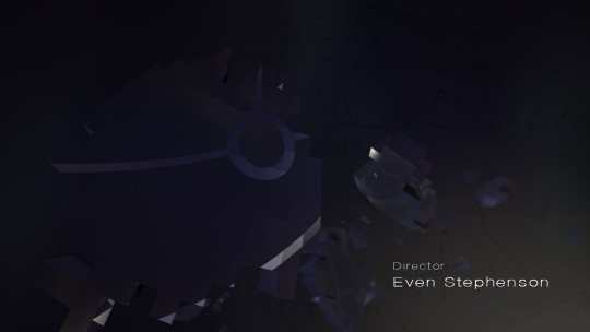
Style Frame One: Final resolution image from the title sequence.
Style Frame Two: The forming of the sphere. This part of the sequence includes titles and mathematical diagrams and calculations as the fragments of the sphere tumble towards their resolution.
0 notes
Photo

Fiddling with a bit of R&D for my style frames.
This shot would be one of the last, when the title appears and the sphere is whole.
Hopefully the completed style frame will be out soon - with the proper spelling...
0 notes
Text
Synopsis
Title: ARCHIMEDES
Time: 1 minute
Writer: Natalia Chow
This short video work will exist as a title sequence to a larger fictional film entitled Archimedes, which details his early life and academic pursuits that brought the legacy he has. Archimedes was a Ancient Greek mathematician, physicist, engineer, inventor, and astronomer renown for his work with spheres, irregular objects, the hydrostatic principle and other inventions. He was eventually killed by Roman soldiers as the Roman empire swept through Greece, leaving the conquers struggling to decipher his notes and works. His gravestone is engraved with a sphere inside a cylinder after his calculations and it is the construction of a sphere that will be the main focus of the title sequence.
Timeline
a) The title sequence will be a montage of several types of images. The first and primary image is of a sphere made from large, weighty and slowly revolving pieces coming together to create a whole. This is a running theme that is dispersed throughout the title sequence.
b) Other images include the alignment of geocentric circles demonstrating the two sphere and depicts the universe as the Greeks new it.
c) Ink mathematical writings detailed diagrams and equations from Archimedes surviving works a and inventions
To construct this sequence will require basic modelling, lighting and animation in addition to the following composite. Software used will include Cinema 4D, After Effects and Photoshop.
The following mood board demonstrates the atmosphere of the pieces. The use of black objects and shattering also alludes the to effects and techniques I wish to use.

0 notes
Text
Don’t let me draw again...
Witness my amazing drawing and shading styles in a 20 second animatic from the film Hugo.
vimeo
P.S. The Password for the video is 3D.
0 notes
Text
Beyond: Two Souls
youtube
Background
Beyond: Two Souls is an original, interactive psychological thriller that follows Jodie Holmes through 15 years of her life. Born with a psychic link to an invisible entity called Aiden, Jodie traverses around the globe. She faces an incredible series of challenges and events that cause the audience to question the interconnected nature of life and death as Jodie discovers who she is and her place amongst the chaos. It stars Ellen Page and Jodie and Willem Daefoe as Nathan Dawkins, who studies paranormal abilities.
The Studio
Quantic Dream is a Paris based French video game developer founded in 1997 by David Cage
They’ve produced five fully fledged games, of which Beyond is the latest
Their studio also provides motion capture services to the game industry.
The Process
Concept
The story explores the nature of life and death and the interconnectedness between the two. It also looks at the supernatural and tries to visualise what happens after death.
Storyboards and Visual References
Most feature film scripts being 100-120 pages long. The script for Beyond ending up being 2000! This was because as an interactive game, the script had to take into account the consequences of several different scenarios and choices that the gamer would make.
The locations for Beyond were heavily researched, with concept drawings, and sketches taken from mood boards that consisted of photographic images of a place or object.
Production
Motion Capture
The capture of the game took a year, with 20 minutes of game time being shot each day. Whilst the game takes place in approximately 80 different locations, from small rooms to expansive landscapes, the capture size was only ever a couple of meters wide. Basic props were built to assist the actors who otherwise acted with only their imagination, each other and the script to provide stimulus.
The system they used was infra red. With multiple cameras set up around a room, the actors would done their suits, complete with 52 markers around their body which, while essential for capture, made acting more difficult. The face was even more complicated, with dozens of markers set to capture every muscle movement in the face.
At the beginning of a capture, the cameras located every single marker and note the constraints of the body. Whilst performing, it tracks a markers location in 3D space by using three or more points of reference taken by the surrounding cameras.
Data clean up is necessary if markers become misnamed, or if the cameras loose sight of a marker. I feel sorry for the motion builders already.
This data is then taken into Maya and assigned to a rigged character model, driving the animation.
CGI Modelling and Animation
Character design was based off real actors
One of the challenges was having the actors age 15 years across the game, and the high level of detail generally included in the character design and the game itself. Each pore on the skin is visible and clear.
Following Jodie through 15 years meant that the designers came close to seventy versions of her character though out her various ages.
To create models that represented their real life actor counterparts, Quantic used complete body scans and a series of photo shoots in order to collect forms, colours and textures of the actors appearance. This was then used to create 3D models of the actors in Maya, which created the basic forms used in their character designs.
Fashion designers as well as character designers worked on each off the characters to make each unique and appropriate to their age and situation.
Particle Effects
Particle systems had a large role to play in the game, from weather to sparks to explosions. The system was internally created.
They were created using physical dynamics to mimic the behaviours of the physical world.
Flame and fluid dynamics were also essential to create realistic explosions and visualise Jodie’s physic powers and the Intraworld.
References
Playstation, (2015). BEYOND: Two Souls™. [online] Available at: https://www.playstation.com/en-au/games/beyond-two-souls-ps3/ [Accessed 31 Aug. 2015].
Hilliard, (2015). The Script For Beyond: Two Souls Is Very Long. [online] www.GameInformer.com. Available at: http://www.gameinformer.com/b/news/archive/2013/04/23/the-script-for-beyond-two-souls-is-very-long.aspx [Accessed 31 Aug. 2015].
Quanticdream.com, (2015). Quantic Dream. [online] Available at: http://www.quanticdream.com/fr/#!/fr/category/beyond-two-souls [Accessed 31 Aug. 2015].
YouTube, (2015). Making Of BEYOND: Two Souls - Visual Arts. [online] Available at: https://www.youtube.com/watch?t=315&v=zXNOp9HZ630 [Accessed 31 Aug. 2015].
Computer Graphics & Digital Art Community for Artist: Job, Tutorial, Art, Concept Art, Portfolio, (2013). Making of BEYOND Two Souls. [online] Available at: http://www.cgmeetup.net/home/making-beyond-two-souls/ [Accessed 31 Aug. 2015].
0 notes
Text
Duet
youtube
Background
Duet is an interactive animated story for Motorola X that combined the drawing style and flourish of Glen Keane, Director and Animator (formerly of Disney Studios) with a the software engineers and technical directors of Motorola.
‘Duet employs a multi-layered approach that could best be described as a double helix in which the characters story arcs literally spiral around one another.” - Motorola blog
‘I think of it less as a traditional film and more as a visual poem.’
The audience is able to move the camera around in space, allowing them to follow one of two story lines that, at several points in time cross. Besides the complexity of animating for interactivity, the piece also heavily relies on the music, which had to be composed in a way that could be manipulated easily to fit with whatever scene the viewer chooses.
Brief given to Keane was to make something beautiful - makes something that will make people feel something.
Music composed by Scot Stafford
Concept/Theme
Love and Friendship and its place in the journey through life.
“There is a goodness in Duet…it speaks to the purpose of life. It celebrates beauty and emotion. It celebrates life.” (maker mag) Glen.
It also touches upon the idea of fate, coincidences and destiny as the two children frequently fall in each others way throughout their lives.
Plot summary
Rather than a linear story, Duet does something different. Influenced heavily by its interactivity, the two characters each have a story arc that weaves and spirals around each other. The viewer has control of the camera, giving them control over what story arc they want to follows. However both characters eventually meet.
Link to Narrative Theory
Disrupts the traditional linear narrative. Whilst an overall storyline exists and a story arc can clearly be defined (especially in the directors cut), the interactive story displaces the traditional role of the camera and director, and therefore the storyline as it introduces an unprecedented amount of exploration and discovery.
How does the use of CGI and animation lend itself to the concept/theme?
Used CGI animation where the viewer controlled the camera
One single shot reflects the flow and continuity of life and hence the story
The use of hand drawn animation adds nostalgia and lends Duet emotional support. It also allows the director to fluidly transition from one form to another, showing the difference between places and times in mere seconds.
References
Motorola-blog.blogspot.com.au, (2015). Glen Keane on the Making of “Duet,” Now Available on Moto X and Moto G 4G LTE - The Official Motorola Blog. [online] Available at: http://motorola-blog.blogspot.com.au/2014/11/glen-keane-on-making-of-duet-now.html [Accessed 12 Aug. 2015].
Animation World Network, (2015). Glen Keane Talks ‘Duet’ and the Legacy of Disney Animation. [online] Available at: http://www.awn.com/animationworld/glen-keane-talks-duet-and-legacy-disney-animation [Accessed 12 Aug. 2015].
Astle, R. (2015). “I See It More as a Visual Poem”: Animator Glen Keane on the Interactive Film Duet | Filmmaker Magazine. [online] Filmmaker Magazine. Available at: http://filmmakermagazine.com/88591-i-see-it-more-as-a-visual-poem-animator-glen-keane-on-the-interactive-film-duet/ [Accessed 13 Aug. 2015].
0 notes
Text
Inception
youtube
Background
Inception came out in 2010, staring Leonardo DiCaprio and was acknowledged for its unique storyline and execution
Directed by Christopher Nolan
Concept/Theme
Inception is a movie based around dichotomies, playing with the tension that exists between real and unreal, dream and reality and the power of the mind.
Plays on the idea of reality as a construct of the imagination, and the implications and consequences of such a belief.
Plot summary
Dom Cobb is at the forefront of corporate espionage, stealing ideas from peoples most vulnerable vaults, their minds. As a result in this line of work, he eventually gets separated from his family. His chance to return to them is presented to him along with an unusual job. He is tasked to do the reverse and plant an idea in a young business heir’s mind.
Link to Narrative Theory
Inception is about the merging of two opposites, dream and reality. A salient point of tension in the movie is the dichotomy and friction that exists between what is real and what is perceived as real. This perfectly exemplifies Levi-Strauss’ theory around narrative and binary opposites.
How does the use of CGI and animation lend itself to the concept/theme?
The surrealism incorporated in the creation, destruction and behaviour of the dream world and the subconscious.
The sense of realism is seamless - and yet scenes could not have been created in any other way than in CGI. Again, the use of CGI when it comes to constructing the unreal is proven.
References
staceylrowe, (2012). Textual Analysis to Inception. [online] Available at: https://staceylrowe.wordpress.com/2012/06/27/textual-analysis-to-inception/ [Accessed 14 Aug. 2015].
laurenminns, (2011). Strauss binary opposites. [online] Slideshare.net. Available at: http://www.slideshare.net/laurenminns/strauss-binary-opposites [Accessed 14 Aug. 2015].
0 notes
Text
King and Lionheart
Video Link
Background
Formed in 2010, Of Monster and Men consist of five Icelandic band members
King and Lionheart was written by Nanna for a family member from whom she was often separated.
The music video was created with a team of 42 people from We Were Monkeys, founded in 2009.
Concept/Theme
The narrative focuses on themes of separation, love, liberty and uncertainty in the face of danger. It also touches upon the struggle to breach the gap that is separation.
Plot summary
“Under a leaden sky, a utopian empire is overthrown by a malefic foreign horde. In the aftermath, a regal brother and sister are separated and desperately struggle to reunite.”
The visuals and the music and lyrics each hold a different aspect of the story. Individually, a viewer and experience both and still grasp at the concepts and themes held within them, but together they deepen the themes and plots held in each.
Link to Narrative Theory
King and Lionheart can be taken as an example of Propps Character Roles, however not each of Propps characters are accounted for due to the nature of the story and perhaps the time restraints.
Hero - The sister
Villian - The cave dwellers
Helper and Guide - Spirit Animals
The Princess - The Brother
The disruption to Propps theory comes about through the ambitious ending - the reward and the giver of the reward is unclear.
How does the use of CGI and animation lend itself to the concept/theme?
The only live action in the film was the human characters. All was shot on a green screen and composited.
The narrative relies heavily on the landscape of a dystopian fantasy world. CGI was used to achieve this, proving that where surrealism and dream scales are required, CG and animation prove superior.
CGI excels in creating something that couldn’t exists otherwise - like the spirit animals.
References
Wwm.productions, (2015). WWM : Of Monsters and Men : King and Lionheart. [online] Available at: http://wwm.productions/vid_kingandlionheart.php [Accessed 2 Aug. 2015].
Mossman, K. (2012). Of Monsters and Men: 'We found we could bond better by telling each other fairytales'. [online] the Guardian. Available at: http://www.theguardian.com/music/2012/aug/12/of-monsters-men-mossman-interview [Accessed 2 Aug. 2015].
0 notes
Text
Narrative Theory
Propps’ Character Roles
Vladamir Propp studied in the earth 20th century. Upon analysing hundreds of fairytales and stories. He eventually concluded that a story had a set of defining roles that progressed the narrative.
The Hero - the Protagonist. The hero embarks on a quest, knowingly or unknowingly, to gain something.
The Villain - Opposes the hero. Voldemort to Harry. Moriarty to Sherlock
The Guide - Helps the hero by providing information or a tool enough to get them started, but somehow seems incapable of completing the quest themselves, despite their resources which they perfectly comfortable offloading to someone who doesn’t even know what they’re doing!
The Dispatcher - Sends the hero on his quest
The False Hero - They tempt the hero away from his/her quest
The Helper - Assists the hero
The Princess - Emblematic of the reward the hero receives at the end of the quest
The Father - Rewards the Hero
Claude Levi-Strauss
French anthropologist in the early 1900’s. Believed we understand words not individually, but by placing them besides their polar or binary opposite. eg. villain, black, night with hero, white and day.
Conflict is based around the tension that is created with binary opposites. It is this tension that moves the plot forward.
“Based on Lévi-Strauss’s theories, if you want your story to really strike a nerve with readers your story should bring into conversation two seemingly irreconcilable themes.”
The Story Arc
The Story arc is similar to the story spine. It eliminates all the nuisances around the story and characters, leaving the writer with a firm idea of how the narrative has to build to be successful as a story.
The Story Spine
Commonly used by Pixar, the story arc gives a basic idea of the narrative in simple and clear terms. It immediately addresses the most salient beats in a script or story and is, in my opinion, one of the more versatile tools and guides for constructing stories.
Once upon a time there was ___. Every day, ___. One day ___. Because of that, ___. Because of that, ___. Until finally ___.
0 notes
Photo

Photo montage of one of two themes: GREEN or TECHNOLOGY.
Can you guess what I chose? I suppose I was being a little bit of a smart mouth when I decided to do ‘green with envy,’ but I like it, doing things a little bit differently. Adds spice to life.
0 notes
Photo
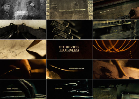
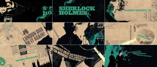


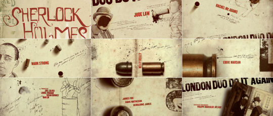
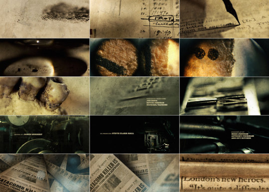
Early concept and storyboards for Sherlock Holmes.
0 notes
Text
Sherlock Holmes
The Studio - Prologue
Founded in 2003, Prologue integrates designers, artists and filmmakers in a studio that delivers high quality visual effects and motion graphics centred works for credit sequences, trailers, video games and short films. It was founded by Kyle and Kimberley Cooper, specialising in in “merging principles of typography and graphic design with sequence, story, and sound.”
The Work
Background
The artistic director for this sequence was Danny Yount, a self taught designer/director that has worked on Iron Man and RocknRolla. The brief changed slightly as the film progressed, carrying it from the idea of the printing process of late 1800 newspapers incorporating live footage of significant points of the film to illustrated graphics. As Prologue also received the opening titles and a VFX scene to complete, the entire project took three dedicated teams of 14 people, each working on a different sequence or scene. In an interview with ‘The Art of the Title,’ Yount comments that it was probably the illustrators who put in the most time, with the final product calling of a very heavy and detailed graphic style.
The Process
Concept:
Director Guy Ritchie approached Yount in the early stages of filming and requested the title sequence that would become an ‘anthem to the film, using highlights of the movie.’ He was given a brief that asked for live action and 1800 printing presses. The first concepts and storyboards gave the audience an idea of the printing processes used at the time, and thereby saluted the original medium of the titular work by Sir Arthur Doyle. However as the film picked up momentum, the linotype machines and woodblock type were pushed back, and a more macro and graphic style decided upon. It would still include live footage and printing references, but the execution had changed completely. With the new storyboards complete, Prologue had one month to complete the sequence.
Testing:
Yount and the other designers on his team trialled different printing press ideas using still footage and motion tests. (See image gallery. Video found at http://www.artofthetitle.com/title/sherlock-holmes/). This test in particular was discarded when the idea of using the printing process was let go, but it became a visual reference for atmosphere and colour.
Storyboard:
Several storyboards were created over the duration of this process, and just as many thrown out as the film evolved and the direction of the title sequences changed with it.
Modelling and Animation
CGI had a role to play in the creation of the title sequences, although perhaps more so for the main sequence which included the company logos modelled onto the cobblestones of London. That whole scene was CGI to which Yount comments, ‘thats the trick with CG - you have to spend a lot of time modelling the imperfections or it will miss the mark.’ Less 3D models were used in the ending sequence, with the focus being on the transitions between illustration and live action and the stylistic splashing of ink and turning of pages which was more of a composite job.
Illustrations and Composite
The final product involved the illustration of live footage, with the transitions between the two taking the most time and effort from the team. The heavy camera and imperfect angles and strokes were essential in delivering as much sense of a human had as possible, as called for in a time far before computers and image stabilisation.
Reference
Prologue. [online] Prologue Films. Available at: http://www.prologue.com/ [Accessed 6 Aug. 2015].
Artofthetitle.com, (2015). Sherlock Holmes. [online] Available at: http://www.artofthetitle.com/title/sherlock-holmes/ [Accessed 6 Aug. 2015].
0 notes
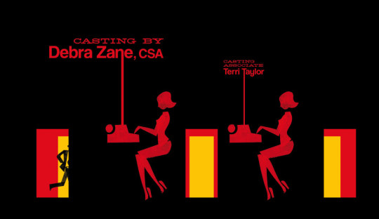
Photo
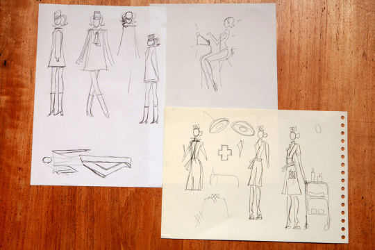


Pre production of Catch Me If You Can, including storyboards, visual references, and the production of the stamps.
0 notes
Text
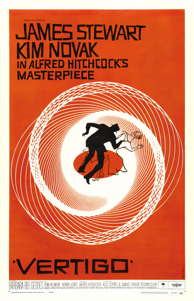
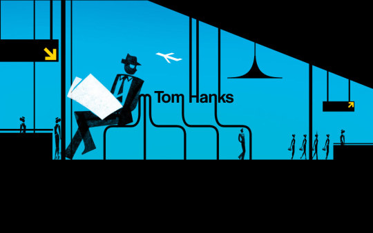
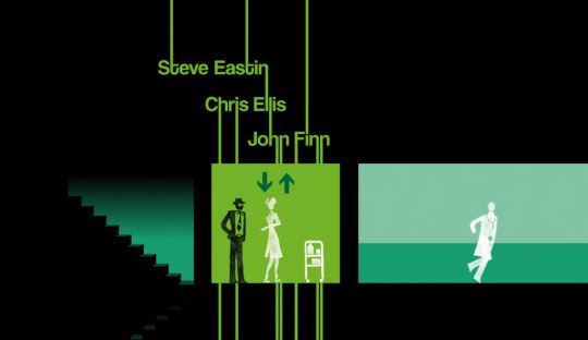
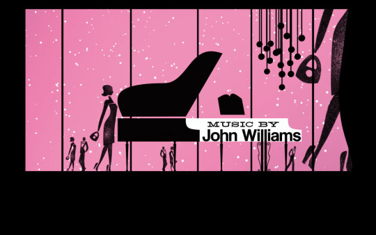
Case Study 2: Catch Me If You Can
Opening Title Sequence
The Studio - Nexus Productions
Nexus Productions has a long line of works nestled amongst their portfolio, ranging from UI/UX and interactive works and installations to 2/3D animation and motion graphics. They work predominately to create TVC and short films and were founded in London, 1997. The creative directors in charge of this sequence were Olivier Kuntzel and Florence Deygas who came from a background in visual communication and animation respectively.
The Work
Background
The title sequence for Catch Me If You Can, was created with two things primarily in mind. To capture the spirit and narrative of the movie it preluded and to recreate the graphic style used in the time period the movie alludes to, namely the mid 1960’s.
The Process
Concept: In the time before computers, the presence of the artist was felt more so than with works created today with high technology. Furthermore, it was a common practice for artists to sign off on their works in such a way that is rarely seen in digital works today. To embrace this spirit and bring it into the title sequence as well as to mime the analogue methods the protagonist used to create his deceptions, Kuntzel and Deygas decided to refrain from using computer technology as much as possible. In this hand based process, they anticipated the crudeness of imperfection, but also of its style, voice and character.
Visual References: Saul Bass’s name and works are often thought of when looking at the title sequence that Kuntzel and Deygas created, however in an interview with Art of the Title, the two directors named Paul Rand as well as the general styles and methodologies of graphic works commonly found in the 1960’s era. (See Picture Gallery)
Storyboard: (See Picture Gallery)
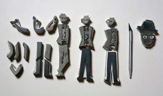
Creating the Assets: To ensure the final aesthetic carried across a sense of ‘artist’s work,’ Kuntzel and Deygas had the main objects like people, planes, desks etc created as hand carved stencils and stamps. Each limb, position, costume was hand stamped on paper, no digital technologies involved. The colour scheme plays a significant role in the sequence, with different colours denoting ‘geographical and temporal transitions.’ The silhouettes ‘stem from [their] own graphic vocabulary with a sixties twist.’ The associations with the silhouette also invoke a sense of the theme of elusiveness and the role of the trickster in the film.
Composite and Motion Graphics:
Of course, being the title sequence of a movie meant that computers would have to come into the process eventually. The stamps were digitalised and arranged, the other primitive motion graphic elements added, as well as text, to complete the sequence.
References
Artofthetitle.com, (2015). Catch Me If You Can. [online] Available at: http://www.artofthetitle.com/title/catch-me-if-you-can/ [Accessed 4 Aug. 2015].
Inceer, M. (n.d.). An Analysis of the Opening Credit Sequence in Film. 1st ed. [ebook] Pennsylvania: University of Pennsylvania. Available at: http://repository.upenn.edu/cgi/viewcontent.cgi?article=1080&context=curej [Accessed 2 Aug. 2015].
Lepkowska, (2011). 9 frame analysis. [online] Slideshare.net. Available at: http://www.slideshare.net/magdalenalepkowska/9-frame-analysis-9449403 [Accessed 2 Aug. 2015].
0 notes
Photo
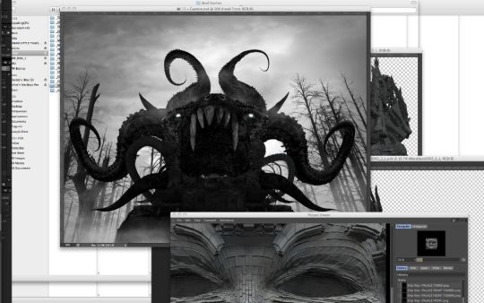
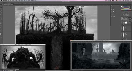
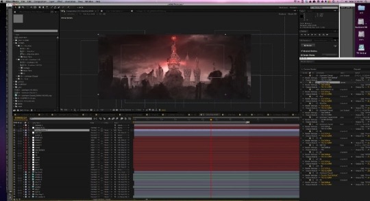
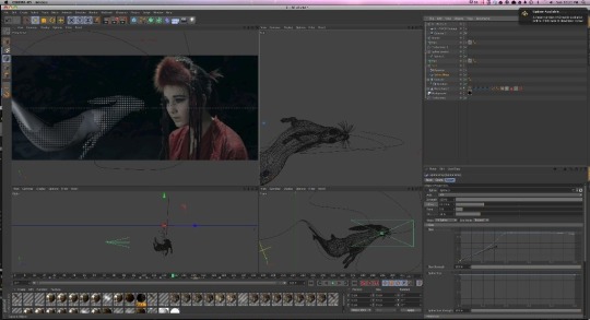
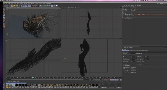
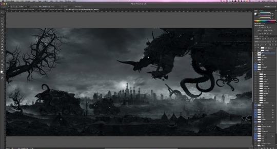
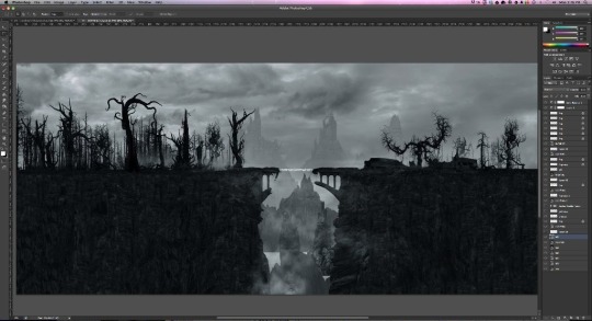
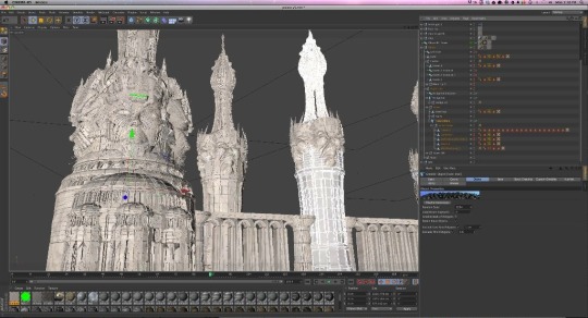
Post production of Monsters and Men. Includes overall R&D, models, fur dynamics and a screenshot of an heavy looking composite.
0 notes