
urbanville
urbanville
innovative in the moment
37 posts
Don't wanna be here? Send us removal request.
Last Seen Blogs

ositofmvo
Untitled
rewatching-sam-and-dean
Rewatching Sam and Dean

wilburalpha
elysia

gringot
now at godsfell

malachimoet
🎩MalachiMoet🎩
Photo
Link 1: https://nppa.org/news/reuters-denies-ethical-allegations-while-some-syria-photographs-still-questioned
Link 2: https://www.readingthepictures.org/2014/03/were-reuters-boy-in-a-syrian-bomb-factory-photos-staged/
Both links address the same of meaning within the picture. I first found Link 1 and then saw another article on it from Link 2.
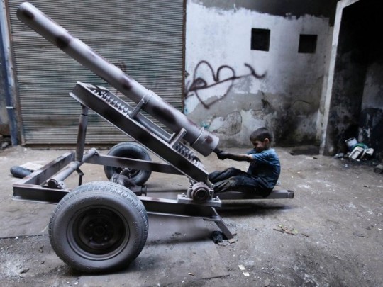
MOLHEM BARAKAT, SEPT 7 2013
The above image is from a series of pictures taken by Barakat in Aleppo, Syria. The series of photos, published after the Assad government’s gas attack in Ghouta, depict the heroic story of a 10 year old boy named Issa who works ten hours a day with his father in the Free Syrian Army’s munitions factory. However, reports claim that this may not all be true. We may be being deceived. Looking carefully at the equipment the young boy is dealing with, its weight, extreme risk, his solidarity, the bombs’ arrangement, the make of the weapons, etc, it seems as if the images are actually staged, and not candid. The way is shown to be hard at work in different poses, as well his dirty clothes, changes the way the image is viewed. The content in the frame changes the meaning of the photo as a whole as viewers believe what they see to be true.
This photo manipulation does not seem like it was originally meant to be noticed, and thus, could be categorized as deceptive. It makes the viewers think that such acts of cruelty against children do indeed take place in the Syrian army’s factories. However, I think that they can also be viewed with a creative aspect. Even if this specific image may not be real, it still portrays the intense child labour and bad conditions of young children in other places around the world. It makes people look at the photo with sympathy and as a call for action. It makes one consciously think of what’s happening in a new way.
Example of: #1- content inside
13 notes
·
View notes
Photo

http://www.alteredimagesbdc.org/#/fox-13/
VALENCIA, VENEZUELA
FEBRUARY 2014
PHOTOGRAPHER UNKNOWN
The photo was originally taken in Valencio, Venezuela in February of 2014, during a period of unrest. However, it was misrepresented as it was used out of context and decepted the viewers. In April 2015, the image was posted by FOX13 Memphis and captioned, “BALTIMORE IN FLAMES”. They claimed the photo was of a massive fire that had broken out in a Baltimore building under construction and that the mayor’s spokesman said it was related to the riots. Their mistake was then pointed out after 2 days.
As the incorrect photo description was not intentional, there was no original intent in place for it to be recognized as manipulated.
Nevertheless, in this way, the photo was still misrepresented as it was said to be displaying something that it was actually not. This falls under deceptive as it made the viewers believe something was true when it really wasn’t. The truth wasn’t played around with and misrepresented during the taking of the picture, but rather, later on, in the way it was presented to the public.
Example of: #3 - misrepresentation
0 notes
Photo
https://www.readingthepictures.org/2013/04/lipstick-on-an-administration-reading-eric-drapers-front-row-seat-photos-of-george-w-bush/
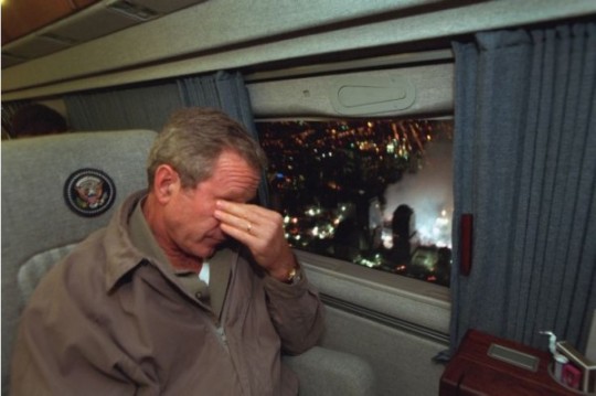
SEPT 14 2001- PHOTO BY ERIC DRAPER
This photograph was taken by the lead Bush administration photographer, Eric Draper when Bush was flying over the smouldering World Trade Center, just a few days after the attacks. He was departing New York City en route to Washington, and smoke was still billowing from the collapsed buildings. President Bush is shown to be completely upset, at a loss, and apologetic of what had taken place.
However, according to contexts outside of the image, it seems as if the photographer was intending to be deceptive to the viewers. The posing was meant to be recognized, but not in a negative light claiming that it was fake. (The actual posing/manipulation factor was not meant to be recognized.) A detrimental moment to Bush’s presidency was his Katrina flyover, when he is shown looking out of the window rather calmly in the face of such immense catastrophic damage. Meanwhile, later in this image of Bush’s World Trade Center flyover, he seems to be more sympathetic and upset. Therefore, the image acts as a defense, or a “flyover do-over” to try and change the audience’s views on Bush by showing something that may intentionally be deceptive, as it drowns the aura of the past event.
Bush’s Katrina Fly-over Image Link:
https://www.readingthepictures.org/2005/09/the-week-america-lost-new-orleans-a-presidential-retrospective-3/
Example of: #2 - outside context
0 notes
Photo

http://www.alteredimagesbdc.org/#/eugene-smith-spanish-wake/
DELEITOSA, SPAIN
1951
PHOTO BY W. EUGENE SMITH
This photograph is called, “Spanish Wake,” and it depicts an intimate scene after the death of a villager in Deleitosa, Spain. Some of his family and friends are crowded around his deathbed, mourning his loss.
In the original image, two of the women had been looking directly into the camera. However, in the darkroom, Smith retouched their eyes to make them darker and added bleach with a fine-tipped brush to create new white areas. He also changed their gazes so that they were looking at the man or to the side to alter the mood.
I don’t believe the edit made by the photographer was supposed to be clearly recognizable at first glance. Overall, it helped create a better aesthetic in the shot. It doesn’t change the meaning of the photograph as a whole or necessarily trick viewers into believing something different than what is presented, but rather, it helps establishes a certain mood of loss, stillness, and solemness. Though the mood is already created, small changes such as eye positions enhance the feelings in the atmosphere and make the picture better, while still preserving the natural environment.
Example of: #5 - repeat
0 notes
Photo
http://www.alteredimagesbdc.org/#/beirut/
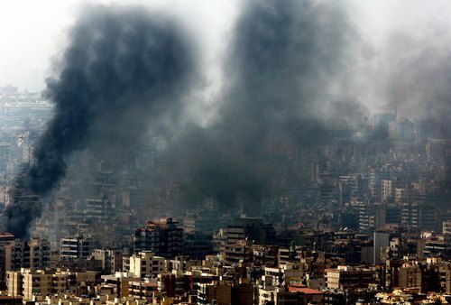
BEIRUT, LEBANON
AUGUST 5, 2006
PHOTO BY ADNAN HAJJ
The smoke from these buildings are from a Isreali air raid in the suburbs of Beirut. The destruction and flattened buildings resulted in such smoke. The photo was taken by Adnan Hajj, who then used Photoshop to clone and darken the smoke to exaggerate bombing damage done by Israeli warplanes.
I don’t believe the edits on this image were meant to be recognizable and therefore, fall under the category of aesthetic. The photographer didn’t actually notify anyone of his edits, until an American political blog found out. The smoke was already in the air and the photographer just darkened it to exaggerate or show more boldness in his shot. It isn’t deceptive, nor does it make the viewer think creatively in some sort, but the darker colour does add to its overall appeal and vibe.
Example of: #4- edit
0 notes
Photo
These two images are very simple and elegant. The formation of the body shows movement. The colour at the back really makes the subject pop. As the colour of the subject remains uniformed from head to toe, including clothing, it looks even more fascinating. The slight shadow on the ground also gives a sense of being and motion. Though the pictures are simple and aren’t blurred, they provide a deeper sense of movement.
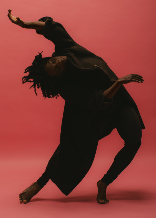
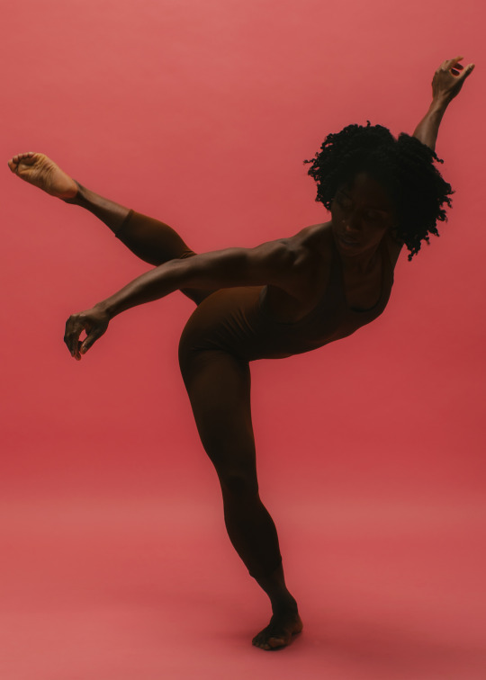
The brilliant Alanna Morris-Van Tassel photographed by Bobby Rogers
21K notes
·
View notes
Photo
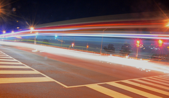
This image is really cool as it uses motion blur to show movement. Though the black and white colour and extreme amount of blur may confuse the viewer’s minds at first, one can recognize the motorbikes. The intensity of the headlights and shine the of the patent bikes makes the image look happening and interesting. Again, the colour choice also adds to the meaning of the picture. The lights of the city in the back are also blurred horizontally slightly, and the headlights also appear as white circles. As the faces of the motorcyclists aren’t recognizable, it adds a sense of mystery to the shot.

Fumiaki Fukuda
8K notes
·
View notes
Photo
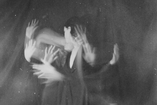
This image is very powerful and inspired me when I took and chose my own pictures. It seems as if the technique of using a low shutter speed was used when taking this picture. Thus, the lady seems like she has multiple hands around her when in reality she is just moving her two hands. In addition, the whole composition and chosen black and white colour adds meaning to the photo. It makes it seem more dark and mysterious.
2K notes
·
View notes
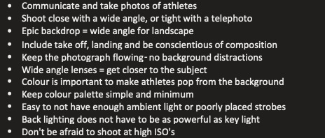
Photo


These pictures are from a concert that I previously attended. They reminded me of the article on concert photography. In the first image, the artist is not covered by his mic which was an important aspect to make sure of when taking photos at concerts. In the second picture, he is slightly covered, but still recognizable. The backlights in both images make the musician pop and stand out and the photos aren’t tightly composed, allowing space for being loosely cropped. Furthermore, the main instruments are able to be seen in the back.
0 notes
Photo

These were my attempts at freezing. I increased my shutter speed and snapped the photo as the phone and headphones were thrown into the air. As my other images dealt with shutter speed and motion blur, I wanted to try something different. At first, the phone kept getting blurred, but it wasn't the problem as I changed the shutter speed settings.
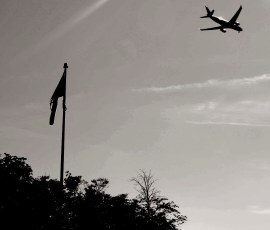
In the second image, the freezing isn’t too evident, but I tried to use the high shutter speed to capture the airplane in one spot. Because of accidentally moving, the plane did come out blurry at first but it was alright after I tried again. I shot this with the black and white filter option on my camera. Hence, I didn’t have to edit it. The flag and trees were just placed to add another subject to the image. However, while I was capturing the “frozen” plane, the flag was also frozen from blowing in the wind.
0 notes
Photo

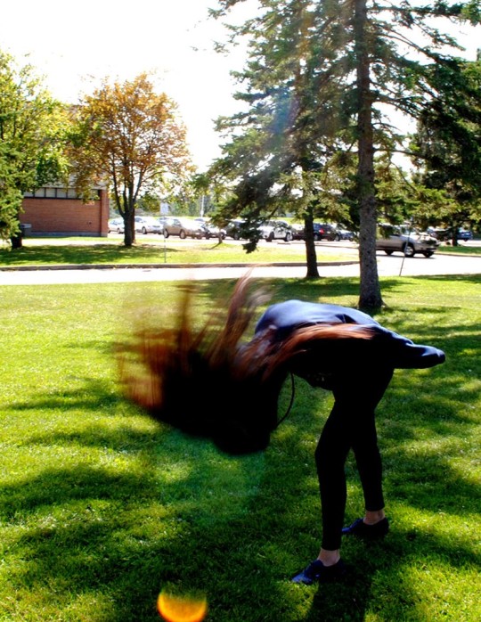
In the first picture I took, the backdrop is a bit more blurry than the subject as I tried to use the technique of panning. However, I would like to make another attempt at it. I had my shutter speed at around 1/50 but I think I would have to increase it or see the other settings as the subject’s legs and hair weren't 100% clear.
in the second image, I just tried to freeze the image. Thus, I didn’t change anything to the shutter speed. The motion blur is evident as the subject’s hair is blurred while everything else is still.
0 notes
Photo

These two pictures were taken by me. Lowering the shutter speed caused the photos to exhibit movement as the lights kept on moving, causing lines to be made. In the first image, the horizontal lines are actually the lights of a TTC bus that was passing by. The low shutter speed created an interesting sense of motion as the light sort of “dragged” across the image. In the second image, in a pitch black room, a person is randomly waving around a flashlight in circles. Again, the low shutter speed allowed for the cool design to come out and create a sense of movement.
0 notes


Photo
This picture is very creative and eye catching due to the unique techniques used by the photographer when taking this photo. There are leading lines, different textures, various shapes, simple yet elegant colours, and the use of a frame within a frame. The textured arch is what makes the photo seem cool at first sight. There is a frame within the photo. Then, the pavement’s texture and line pulls one’s eyes to the grand castle. The two people sitting in the front are also brought into attention. Furthermore, the lush green plants and blue sky, white clouds, and mountains help add more colour and elements to the picture. There are also different shapes in the picture from the castles, mountains, plants, steps, and the main arch. Overall, this photo uses many cool elements to make it unique. Yet, it still seems to include traditional Italian housing and decoration which pulls it all together. The image makes me ask myself if the person taking the photo is a tourist or a local.
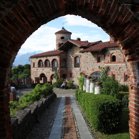
Castello di Pavone / Italy (by Hugo von Schreck).
896 notes
·
View notes