
uramirez6
Color Theory of Jojo's Bizarre Adventure
A Multigenre Research Project on the Color Theory of Jojo's Bizarre Adventure.
13 posts
Don't wanna be here? Send us removal request.
Last Seen Blogs

blackcat-kat
blackcat Web site

danyok
now @reservethesun

sevenforgodnothuman
The number 7

prdsrdef
𝑦𝑜𝑢𝑟𝑠 𝑡𝑟𝑢𝑙𝑦

imsorryaboutallthejack
A-Whooshie-Whoosh
Text
Table of Contents
Introduction
Self Assessment
Works Cited
Notes
Western Influence on JJBA
Summary
Araki's Inspiration
Video on JOJO's Color Theory
Use of Color in JOJO's
Critical Analysis
Interview w/ Araki
Hirohiko Araki & JOJO cover
0 notes
Text
Self-Assessment
What surprised you during the process of writing this paper?
What surprised me was how much I learned about a topic that I never really knew before (Color Theory). It is such an interesting subject especially when it relates to my favorite manga, Jojo's Bizarre Adventure. It was fun finding all these sources talking about Araki's inspiration from past artists and the unique use of color that he implements throughout his series.
2. Describe what was difficult about writing this paper and explain why.
The difficult part of this project was the meticulous research that I had to do in order to create a valid paper. It wasn't easy looking through different websites to look for Araki's reasoning on why he uses such a distinctive color palette in all his illustrations. Despite all the setbacks I've had in this project such as misinformation and dead-ends, I believe that finding the right source was the toughest.
3. What could you have done to make your work more efficient/effective?
What I could've done to make my work more effective was to start earlier. I tend to freeze when it comes to big assignments like this so I focus on getting the best information from the internet. Although, that cut out a week's worth of work meaning I had less time to actually type everything out. It was very anxiety-inducing and I definitely learned how to manage my time on different areas of my project.
4. Were the classroom/weekly activities productive in helping you to produce writing you could use in your paper? Any advice?
I believe the weekly activities were very helpful in producing this project. I gained skills and knowledge that I could easily transfer to this assignment and work efficiently without having a question. The weekly assignments were useful in giving information about color theory and the steps it took to get the color wheel we have today. It would've added more hours of work if I didn't have my critical analysis or my summary as a reference. With that said, the only advice I have to give is always to refer to your old work if it helps with the task at hand. Just don't copy it word for word; try paraphrasing it.
5. What is your advice to future students who embark on creating multi-genre projects?
My advice to future students who take on the multigenre project is to do it on something they are really interested in. This project was extremely easy because I was able to do it on something that I am passionate about. I believe that working on something you genuinely like produces a better outcome than working on something you find boring. More effort is put in and there is lots of energy being expended on the project if it is enjoyable.
0 notes
Text
Works Cited
Dharma Documentaries. “Light Darkness and Colours – Goethe's Theory of Colours.” Dharma Documentaries, 22 Mar. 2021, https://dharma-documentaries.net/light-darkness-and-colours-goethes-theory-of-colours.
2. “What Inspired Manga Artist Hirohiko Araki?” TheCollector, 17 Feb. 2021, https://www.thecollector.com/what-inspired-hirohiko-araki-manga-artist/
3. “Interview: Jojo's Bizarre Adventure Creator Hirohiko Araki.” Anime News Network, 29 June 2017, https://www.animenewsnetwork.com/feature/2017-06-29/interview-jojo-bizarre-adventure-creator-hirohiko-araki/.118032.
4. Moreno, Samuel. “Hirohiko Araki: Jojo, Fashion, and Art.” OTAQUEST, 13 Oct. 2020, https://www.otaquest.com/hirohiko-araki-jojo-fashion-art/.
5. FUNKe. “FUNKtv: Jojo's Color Theory.” YouTube, YouTube, 20 Jan. 2018, https://www.youtube.com/watch?v=Kx93NZy5igs.
6.“Hirohiko Araki.” JoJo's Bizarre Encyclopedia - JoJo Wiki, 6 Dec. 2022, https://jojowiki.com/Hirohiko_Araki.
0 notes
Text
Notes
These are the different genres used in this project:
Magazine: JoJo's Bizarre Adventure's character designs and poses are heavily influenced by different models from magazines. Famous fashion brands such as Gucci have acknowledged JJBA's fascinating art and design. With that in mind, they collaborated with Araki to make an illustration of his characters showing off Gucci bags. That is how impactful Araki's art is shown through his work with Gucci and in his own manga.
Summary: This genre is important in this project because it gives a deeper explanation of how color affects the mind. In a way, it justifies the reason why color in art is so important. Goethe's theory of colors is the reason why an accurate color wheel is a thing. This summary conveys how complementary colors are viewed naturally by the brain and how it helps give a sense of balance, which is an important aspect of art.
Dictionary: A dictionary can be helpful in any scenario when it comes to a project. For example, it helped define what Post Impressionism is and gives the audience a sense of understanding what type of art inspired Araki. Without that understanding, that section of the project would not give much justice to Araki's art.
Informational video: Informational videos can help with giving a more in-depth explanation of a subject with interesting visuals. Jojo's color theory can go very deep and this video covers a good amount of information that would take ages to type out. In addition, it reinforces the idea of JJBA using color in very unique ways to really speak to the audience.
Critical analysis: A brief critical analysis can really be useful to give unbiased information. The critical analysis explains how different colors were discovered through the same experiment being replicated. It establishes the idea of a color wheel having darker to even lighter shades that artists use. Without an improved color wheel, there wouldn't be contrast in art.
Interview: An interview is effective in expressing an author's thought process when asked the right questions. In this interview, color schemes were brought up because Araki uses different ones for each of his cover illustrations. It helped convey that Araki indeed enjoys giving readers a unique experience claiming that he puts more "emphasis on giving readers different feelings and impressions through different color combinations." In addition, he imbues a balance of both fantasy and daily life elements into his art which makes his illustrations unrealistic but satisfying to see.
Comic Strip or Graphic Novel: A picture or panel of the series would do its art justice. Instead of using words to convey how color is effective, it is undoubtedly better to give an example of it. His art is in all of my posts and especially in the "western influence on JJBA" one. It is very good at allowing readers to experience that feeling that Araki's art gives first-hand.
Website: Different websites have helped me gather photos of Araki's different work outside of his manga such as his illustrations for the Gucci collaboration. Having a plethora of websites to choose from really helped narrow down the information since most of them repeated the same thing about Araki's art: it is very unique.
Research Project: Reusing old projects can be very controversial but at the same time very useful. I reused my Color Theory project on JJBA to help explain how JJBA has a well-driven plot and different color palettes that further reinforce it. Without color, Jojo would seem bland and almost generic in a sense. After all, it is the unique color usage and its popular western references that got it to rise in fame.
Critique of a Published Source: This genre can help give a more personal evaluation of the topic. I believe it helps express how color contributes very well to the series and it actually holds importance in the art of Jojo’s Bizarre Adventure. Plus, a non-biased and honest review can show how powerful color truly is in the JJBA series.
0 notes
Text
Western Influence on JJBA


-Rohan Goes to Gucci-

-Jolyne, Fly High with Gucci-
Not only does JJBA have interesting color palettes but it also has fashion influenced by western culture. Character designs in the beginning and masculine but as time went on and more parts were written, the characters became more and more fashionable. Plus, they had stylish poses inspired by big brands such as Versace, Vogue, or even Gucci. This added to the characters' personalities and went hand-in-hand with the color palettes of each character. Eventually, Araki would get noticed and team up with different brands. Most notable of them all is Gucci, who in 2011 had a collab with Araki with one of his characters, Jolyne Cujoh. Again in 2013, they collaborated and now another character of his, Kishibe Rohan, is featured by Gucci with an illustration.
0 notes
Text
Brief Summary of Goethe's Theory of Colour
Color can appear where ever darkness and light meet. If you have too much darkness, there is nothing to see. On the other hand, if you decide to flood a scene with just light, it is way too bright to conceive any sort of color other than white. Therefore, a balance must be in place between both light and darkness. That is the only way that the brain can perceive and process color. The brain uses color as a sensory perception assist as it will "always strive for totality and unity", says Goethe himself. According to the documentary, "Light Darkness and Colours – Goethe’s Theory of Colours", "Colored shadows cannot be seen on their own but only in the context in which they appear". An example of this is shown by lighting a cone with the color violet on one side. Staring at it long enough will make the other side of the cone appear yellow, the complementary color of violet. In reality, the yellow hue is just an optical illusion due to the brain seeking harmony and balance. Goethe's discovery of this incident led him to construct an improved color wheel that has all the complementary colors facing opposite from one another.
1 note
·
View note
Text
Paul Gauguin: Araki's Inspiration


Paul Gauguin is a French artist that is notorious for his Post-Impressionist work and his contribution to the "Primitive Style". Post-Impressionism is a style of painting where artists focus on the emotional aspect of painting rather than the more realistic aspect of it. Araki has once stated that he was "fond of Paul Gauguin since he was a child" and he takes inspiration from his work. He really liked the idea of the unrealistic colors such as a pink floor and blue trees. Furthermore, he enjoys contrasting warm and cold [colors] against each other to help make his art really stand out. Different colors are used in both images shown above to help create perspective and contrast.
1st image: Visual for Hirohiko Araki JoJo Exhibition: Ripples of Adventure by Hirohiko Araki, 2020.
2nd image: The Vision of the Sermon by Paul Gauguin, 1888; National Galleries Scotland.
0 notes
Text
Informational video on color in Jojo's Bizarre Adventure
youtube
This video essay further elaborates on the idea of color being imbued into each episode of JJBA to establish a shared feeling with the audience.
0 notes
Text
The use of color in JoJo's Bizarre Adventure
In the anime, there are many instances where different color palettes are used to express a certain emotion.
One example of this is when the protagonist, Joseph Joestar, taunts his enemies by predicting their next sentence which gives off a kind of comedic effect in a cool way. The producers of the show have gone as far as creating a visual cue for it as well. They use an abstract color composition in order to emphasize the confusion and surprise that the character experiences. Not to mention, the colors being used are complementary colors, which spark a feeling of contrast and attract attention.


0 notes
Text
(Critical Analysis) Color Theory: Goethe's Impact on Color
How did color come to be? Why do we have so many? Well, an influential person by the name of Johann Wolfgang von Goethe, aka Goethe wrote a book called " A Theory of Colours." In this book, he conveys that there are more colors in the spectrum than Isaac Newton speculated. He replicated the same experiment that Newton had used to find colors through the refraction of a triangular prism. Although, he found different colors than Newton had and concluded that "colors only arose in the boundary between light and darkness." He found darker shades of colors such as dark purple, dark green, and many more. Thus, Goethe created a color wheel that included all possible colors of the color spectrum and that wheel is used by everyone.

-Goethe's color wheel-
0 notes
Text
Interview with Hirohiko Araki himself!!

Ann (Interviewer): "You don't seem to stick to a specific color scheme for your characters when doing cover illustrations or color pages. Why is that?"
Hirohiko Araki: "I put more emphasis on giving readers different feelings and impressions through different color combinations."
Also Araki: "When I create characters’ outfits, I am conscious of two elements: ‘daily life’ and ‘fantasy’. I envision everyday fashion alongside strange, cartoonish, bizarre clothing that would be impractical in real life"
0 notes
Text
Art from Jojo's Bizarre Adventure


1st image: A picture of Hirohiko Araki, creator of JoJo's Bizarre Adventure.
2nd image: A cover of Weekly Shonen Jump featuring Araki's Jojo's Bizarre Adventure in 1986.
0 notes
Text
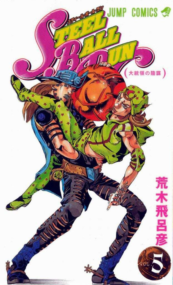
Introduction
This project is about the popular anime/manga, Jojo's Bizarre Adventure and how color plays an important role in it. Jojo's Bizarre Adventure (JJBA) is a Japanese manga written and drawn by Hirohiko Araki in 1987. The series is currently split into 8 parts, each part having a new protagonist that carries the nickname "JOJO". JJBA is well known for its interesting narrative, art style, and Western cultural references. Not to mention, it has gained popularity due to its battles being based around "Stands", which are spiritual manifestations of one's "life energy" which in turn gives the person supernatural abilities. Another factor that makes JJBA so popular is the different color palettes that are used throughout the series. Sometimes, they have a significant meaning in the series but other times it is just for the aesthetic since Araki is heavily inspired by the poses that models make in magazines such as Vogue or the Times.
1 note
·
View note