Last Seen Blogs
passion-determination-love
courtney

amaya-eve
M A H I K A

soudaontheinternet
God's domain.
solesqueen
SoleQueen👑👑
Like What You See Dm Me 🥰
Text
Evaluation:
My unit 8 project was an animated advertisement to help promote the charity Macmillan Cancer support. This advertisement would encourage people to get help if they’re suffering from emotional, physical and financial difficulties due to cancer. Another goal with the animation was to encourage people to donate to the charity and give people an insight to a real life story based on my little brother. The animated advertisement was created using the rotoscope technique that use to be popular in big animation companies such as Disney. I found it difficult to understand the meaning behind rotoscoping to start with because it has different meanings in different areas of creative media. However, after gathering a lot of research and exploring more into the technique, I gained more knowledge and understood the concept more. To build on this in future, I would experiment more into rotoscoping and the different ways you can rotoscope and play around with other tools in Photoshop too such as the blending modes etc.
In this project, I believe I did a lot of research that helped me complete my final piece. I completed both primary and secondary research. Primary research included attending support groups and meeting people who are familiar with the organisation and that can help provide research that can support my project and final piece. Also, I created surveys and questionnaires for different type of people so I can have more indication and knowledge about the charity and how successful they are. Secondary research included examining past practices by Macmillan Cancer support and gathering inspiration from different resources. This research was effective as it helped me gain knowledge about different techniques that are open to me and that would work with the charity and context of my animation / advertisement. The combination of my research and creativity worked really well. It worked well because I was able to include some research in my final piece such as facts that helped support the message I was trying to send to the audience. My research also helped my creativity and practical work as I gained knowledge on the main technique I used by research and exploring the technique in depth. The research went well and gave me the knowledge I needed to create a final piece that will be effective. This project has shown me how efficient research is and has proved to me that it relevant for future projects. By doing the research I completed in this project, it has taught me that physically going to places and meeting people based on the context of the project helps and gives more of an insight and realisation on what you’re doing the project about and helps with creating the final piece and also it allows you to take knowledge, understanding and ideas from the world around you.
Problems that I came across in this project includes recording the audio on my phone as it was bad quality. A solution to this problem was to rent a zoom recorder which is industry standard equipment. By using this, the audio was better quality and sounded more professional than a phone recording. It also gave me the experience with the equipment and made it become familiar. Another problem I encountered during within this project is that it was hard to create initial sketches. Also, a problem that occurred also included rotoscoping being time consuming and not able to complete all the rotoscoping I intended to create. A solution to this problem was to cut down the amount of frames I was drawing per second. This sped up the time taken to create a rotoscope animation. Also, another problem included that I found it difficult to practice and learn a new piece of music on the keyboard. A solution to this problem was to carry on practicing the piece of music and to not give up. I believe I dealt with these problems well and found solutions to every problem I came across. By finding solutions to the problems, it made the outcome of the project more rewarding. I adapted well to all of the problems that I faced, and overall the problems made my project stronger and work better. Something I have learnt from all of the problems I have faced in this project is that no matter what to problem is, it can be solved and a problem may just work for your advantage. This is something and a mindset that I can take into future work, projects and later life.
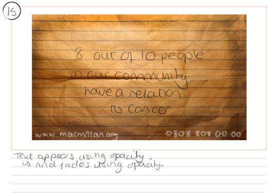
To plan my final piece, I used techniques such as a storyboard and practicing with techniques to begin planning how my final piece would work and how I would create it. If I was to do this project again, I would create more planning documents and create more of a variety of storyboards etc so I would have more options on how the outcome of my final piece would look like. I attempted to use timetable that I created at the start of the project so I could ensure that the rotoscoping and all production would be done. However, because of how time consuming rotoscoping was, I had to change different parts of my schedule to ensure it was all done. Things I would do differently next time and in future projects will be to research what techniques I will be using before creating a timetable, so I am then able to create a timetable based on how time consuming the techniques are. Also, I will create a lot more planning documents and explore a variety of different options when it comes to creating my final piece.
Throughout my project, I used techniques and skills that I have never used before in any project. This included a new technique called rotoscoping. I also used more of a wide range of skills. This includes, my knowledge about typography, drawing skills, skills on a wide range software that I have developed throughout the academic year. By using these skills in this project, it has built up my confidence in using them and also for gained more knowledge on how I can develop them further in future projects. I believed I challenged myself with some of the techniques used, specifically rotoscoping due to the fact I have never used this technique before.
To evaluate my work, I used a separate blog and wrote down an evaluation for each week based on how each week went. This included new techniques I used, what went well in the week, what problems I encountered and what I need to prepare for following week etc. I think this was a good way of evaluating my work as it is broken down into each week used for the project. Next time, if I will evaluate each part of the project separately. For example, after researching, I will evaluate how the research went and what impact it had on my idea generation or project etc.
I think my blog is presented in a structured way because it shows a journey from how I went from research to a final outcome and the responses the video is having from the organisation and from other people. The presentation could of been better but it is something I can focus on in future projects and in future.
Something I have learnt from this project and that I can take into future is that it’s possible to send a strong message across using creative media. Also, I have learnt different techniques and developed skills on software that I gained from previous projects. I have gathered a wide range of research that has developed my knowledge on different things such as the history behind the techniques I used etc.
Overall, this project has been hard work but very rewarding. I was able to use my own story and experience and use it in creative media to share with others and potentially help people and encourage people to talk about their suffering and promote an amazing charity.
0 notes


Photo


Each picture on the post represents each scene from my final piece. I started this composition by importing my final rendered background audio into my new composition on Adobe After Effects.
Picture 1:
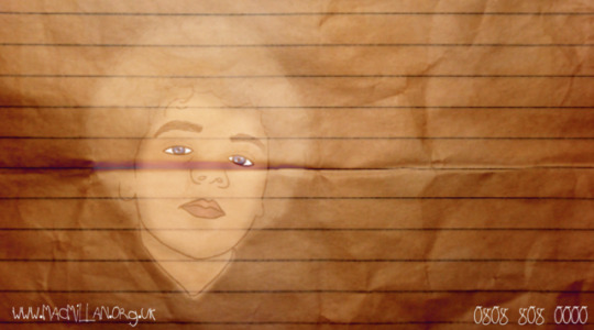
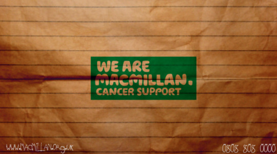
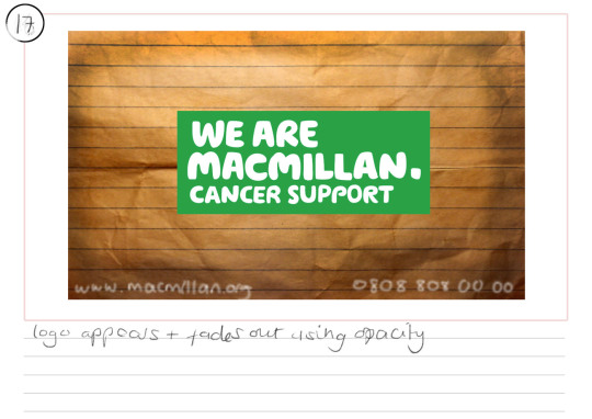
I imported my background image and all of the assets that will be needed for production and will be needed to create my final piece. I started by dragging the background image to the composition and creating a new solid. I changed the colour of the new solid to a darker colour than the background image. I then used the soft light blending tool to blend the solid to the background image. This made the edges of the background more darker and looked more natural with the shadows etc. This made it look more realistic. I then added the Macmillan Cancer Support logo to include the idea of corporate identity / branding identity. This is for legal reasons and also so the audience know what organisation this advertisement is for. Macmillan Cancer Support are a popular charity so people will be familiar with their work and with who they are. I put this logo in the centre of the composition so people can see who the organisation are clearly and it is also the main focus point. At the bottom corners of the composition, I included Macmillan’s contact number and website. I wrote this in the chosen typeface and white colour so it stands out and also blends in with the advertisement and theme nicely. These texts will stay through the advertisement so people can see the website at any time etc. I key framed the opacity at 100% and then 0% to make it fade out smoothly.
Picture 2:
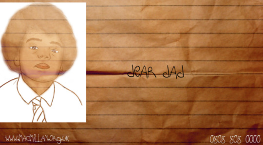
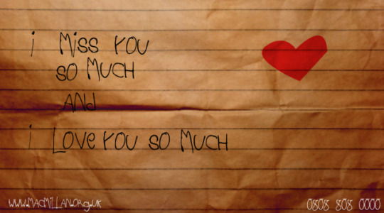
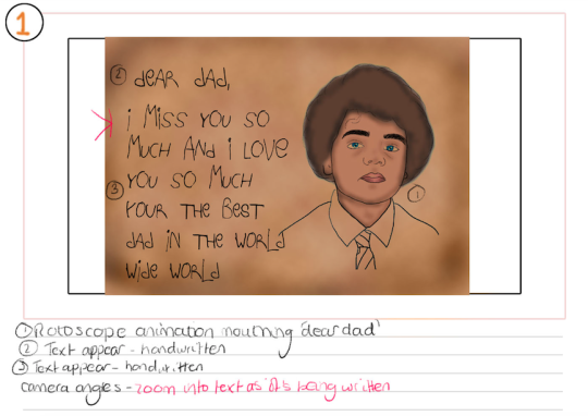
To create the next scene of the advertisement, I used the first rotoscope animation which includes my brother saying “dear dad” in the background audio. The rotoscope shows my brother Cameron lip syncing and makes it look like he is saying them words. I used the blending tool to blend this rotoscope layer onto the background image. To do this, I had to make sure the rotoscope layer was on top of the background image. I blended these together so it would look like the rotoscope animation is on the piece of paper and look more realistic. When adding the rotoscope animation to the composition, I had to make sure the lip sync and the real audio fit together so it looked like Cameron was saying ‘dear dad’ in the animation, visually and through audio. To add the text, I used the child’s handwriting typeface that I researched about previously. I used this typeface so it has relation to the theme of the advertisement and the context. When the text appears, it appears the same time each word is said. For example, when the word “dear” is said, the text will appear at the same time. This will be a technique that will be continuously used throughout the advertisement. However, I used the rotate tool found in the transform tools to rotate the text and make it fit around the earth and moon etc. I key framed the opacity at 100% and then 0% to make it fade out smoothly.
Picture 3:
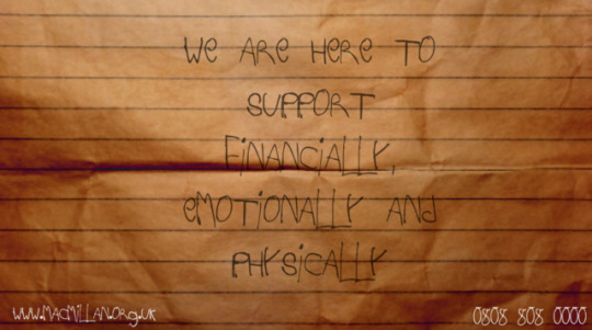
To create the next scene of the advertisement, I started by referring back to my final storyboard that I created previously and used the pen tool to create the love heart shape. I changed the fill colour to red as it is the stereotypical colour for a heart and would be recognised by people. Like stated on my final storyboard, the illustration of the love heart will look like a child has drawn it so it fits in more with the context and with the fact that it was a child who wrote the letter. This is the same with any other illustrations that will be created while the final piece is being made. The text on this scene was animated by using the same technique as the previous scene. The same time each word appears, the text appears too. I key framed the opacity at 100% and then 0% to make it fade out smoothly.
Picture 4:
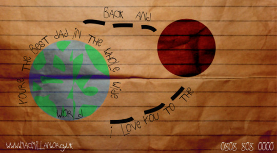
To create the next scene of the advertisement, I started by creating the illustrations that were shown on the storyboard. To create the world, I used the eclipse tool to create a circle and used a blue fill. I then used the pen tool to create little islands / countries of land and used a green fill for this. To create the moon, I used the eclipse tool again and used one solid colour. I used the blending tools to blend both the moon and the world into the background layer. This is so it looks as if it is on the piece of paper / background. To make both the moon and earth appear, I used the opacity tool and started by key framing the opacity of both at 0%, moving the timeline along a little and then key framing again at 100%. This made the earth and the moon gradually appear. To create the little marks from the earth to the moon and then back from the moon to the sun, I used the pen tool, a black stroke and made the stroke thicker. I then cut the shape layers and placed them in time like they’re footsteps. This is the same type of technique that I use to place the text into the advertisement. I used the technique to add text as I have on the previous scenes. I key framed the opacity at 100% and then 0% to make it fade out smoothly.
Picture 5:
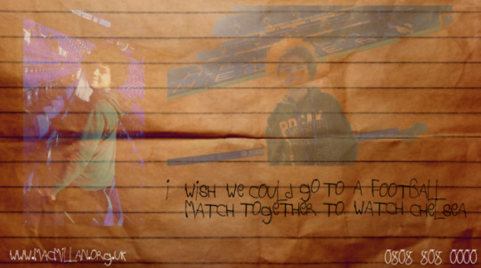
To create the next scene of the advertisement, I started by importing the picture of my little brother when he was younger, playing football. I positioned this to the left side of the composition where it is shown in my storyboard. I used the blending tool (soft light) to blend the image into the background layer which makes it look more natural and realistic. It also makes it look like the image is also on the paper. I then imported the second rotoscope animation and dragged it into my composition. I blended the rotoscope animation of my brother kicking a ball into the background which made it more realistic. I also resized the image to make it bigger and placed it in the same place as it is on my storyboard. When the text was added, I used the same technique that I used in previous scenes. I key framed the opacity at 100% and then 0% to make it fade out smoothly.
Picture 6:
On this scene, I added the picture my brother and used the blending mode again to blend the photograph onto the background image and make it look more natural. I then used the same technique for the text and to make the text appear when the same words are being spoken.
I used the same technique throughout the rest of the scenes that are shown above to create the rest of the advertisement.
0 notes
Photo

This is a GIF that I created which shows the production of creating the advertisement.
0 notes
Text
Corporate branding:
Corporate Identity is the manner which a corporation, film industry or business portrays themselves. some organisations such as businesses and charities stick to the same corporate identity. Logos, Typography and colour are all examples of things that can be included in branding identity. Macmillan have branded identity which includes the new, fresh logo that has been created by the Macmillan Support Charity. The branding identity uses colours green and white, these colours are used in the logo. I have researched this because I aim to present Macmillan Cancer Support with the branding identity they have built and also for legal reasons such as Copyright.
En.wikipedia.org. (2016). Corporate branding. [online] Available at: https://en.wikipedia.org/wiki/Corporate_branding [Accessed 24 May 2019].
Lim, S. (2019). Create a Strong Brand to Grow Your Business. [online] Investopedia. Available at: https://www.investopedia.com/terms/b/brand-identity.asp [Accessed 24 May 2019].

0 notes
Text
Typography
Before I begin production and producing my final piece, I must ensure that I have all the assets including typefaces of which are relevant to the context of the advertisement. Typography is all about adjusting the text within the design while creating powerful content. Typography provides attractive appearance. It is a way of communication or communicating with the audience which is beneficial to engage the individual viewing the advertisement. It also attracts the viewers as it is compulsory to look visually appealing to the target audience and can convey a certain mood or emotion. Typography in an animation or advertisement needs to attract the audience and must be readable.
The typeface that I have decided to use is a child’s handwriting typeface. This is because it relates to the theme on context of my advertisement. My younger brother is a child so this typeface will represent his handwriting.
Design, V. (2016). The Importance of Typography. [online] Vital Design. Available at: https://vtldesign.com/brand-development/graphic-design/importance-typography-part-1-fonts-speak-louder-words/ [Accessed 24 May 2019].
0 notes
Text


Picture 1 - I wanted to include this image as it shows the boy’s achievements that his father was unfortunately unable to witness directly. It shows how hard he’s working to make his father proud, this shows a lot of positive thoughts and motivation.
Picture 2 -This is one of the very few photographs that there is of my father. I wanted to include this image as it shows to the audience that regular, normal people can be affected by cancer.
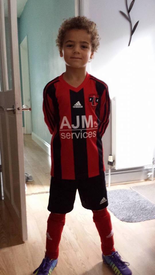
Picture 3 - As the theme of this advertisement is football, I wanted to include my younger brother in his football kit, standing proud. This helps to show the football theme and help tell the story which I am trying to portray.
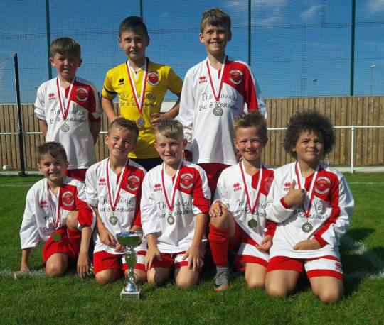
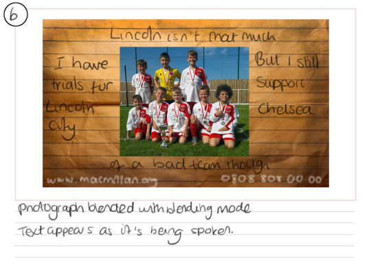
Picture 4 - This is a photograph of my brother with his football team after winning a game, this doesn't only show progress of who he is becoming and how well he is succeeding but also that he has support around him.
Picture 5 - This shows a proud moment for Cameron, it helps to show his achievements and how he has been recognised for his hard work. it is also showing the events he has experienced while he plays football.
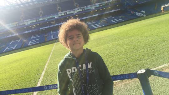
Picture 6 - This is a very happy moment for Cameron as he visited the Chelsea football stadium. The father who the letter is directed to, loved the team Chelsea so it had an affect on his son and he also decided to support Chelsea.
Picture 7 - This image shows a very early part of Camerons life, as he began exploring and obviously, it shows how early he was introduced to football and how far he has come from.
Picture 8 - This is also an image which was shot in Chelsea Stadium, it shows Camerons emotions while he was experiencing a football atmosphere.
0 notes


Text
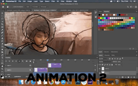
Animation one:
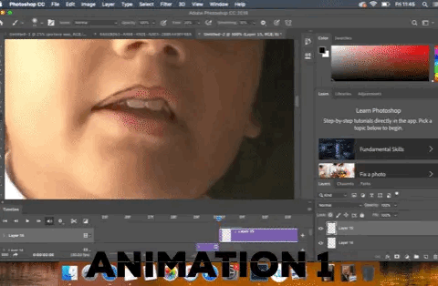
Firstly, I created my first rotoscope animation, this is the first rotoscope animation that is shown on the storyboard. I created this rotoscope animation based on the technique and tutorial I came across previously. I liked the technique and believe it would be suitable for my animation and is quite professional.
I started by creating a video on my phone of my younger brother saying ‘dear dad’. This is so I can import it into photoshop and I can use the technique used previously to then create a rotoscope of my brother saying ‘dear dad’. The reason, he is saying dear dad as it’s what the letter says at the start of the video.
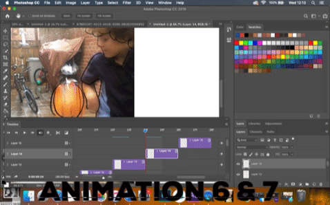
When I recorded the video, I imported it into Adobe Photoshop and used the ‘windows’ tab to allow photoshop to open a timeline. This timeline separated each frame of the video so I was the able to draw over each frame of the video. This particular rotoscope animation was created by drawing on all 30 frames. (The settings were 30 frames per second). The problem with drawing on all 30 frames per second were that it became very time consuming and it took multiple days to create one, 2 second video. With this problem occurring, I decided only draw the full 30 frames a second when the animation included my younger brother talking. This is because of the
The GIF above shows the process of creating the rotoscope animation.
0 notes


Text
Rough storyboards:


These are some rough storyboards that layout the main things I want to include in my animation / final piece.
0 notes
Text
How I want my animation to look like:
I would like my animation to have the background of a piece of paper which will represent the letter that Cameron had written. I’d like to use typography to convey the handwriting of Cameron which would help with visual effects. This is also beneficial for people with hearing impairments as they can read rather than listen. Throughout the animation, I’d like to show photographs of both Cameron and my father. This helps to show that cancer affects anybody and everybody, not just the people experiencing it first hand. I want to use the audio of my brother so that he
This is also good for people with hearing impairments.
0 notes