
Last Seen Blogs

blanksoullesseyes
No eyes

mindofkasai
MindOfKasai
princessnamora
Princess Namora Alice Gwendolyn Guinevire

laugardagur
photography, man

homeisaplaceinthehills
home is a place in the hills
Text
https://www.underconsideration.com/brandnew/archives/new_logo_for_shoreview_mn_by_peters_design_company.php
I agree with the writer that the old logo is extremely dated. It is also a rather detailed logo when it comes to keeping simplicity for multi-use. The new one allows for multi-use in its cleaner, simpler design, as shown in the given examples. Although it is simpler, it still keeps to the charm of “promoting Shoreview as a great place to live.”
https://www.underconsideration.com/brandnew/archives/new_logo_and_identity_for_city_of_vienna_by_saffron.php
I personally do not like the weird slants in the “t”s to this logo, and as one comment says, the “i” is too big. Besides this, I find the logo visually appealing and a huge improvement from the font-jumble of the old one (which is hideous). I love the function of where the text box pulls out from the shield, and I find the creative use of this appealing in the real life application examples shown. The illustrations are also very cute and I can see them in action when used.
0 notes
Photo
Branding Blog Post
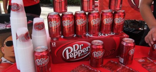
1. Dr. Pepper - Like
I really like the movement conveyed in the Dr. Pepper logo and packaging over all. It is consistent and looks like it goes together. Secondly, although it shares using red and white just like coke, there is enough difference in the style, color tints, and font to where it gives Dr. Pepper its own identity that stands out against the other soft drink.
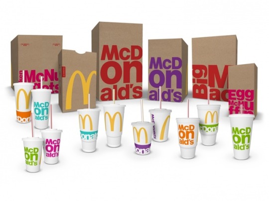
2. McDonald’s - Like
The iconic yellow arches in the shape of the “M” have proven to be timeless as it is continuously used. Along with that, it isn’t a gross or too bright of a shade of yellow- which I personally like. The packaging at McD’s is also unique in the aspect it doesn’t fit their red and yellow color scheme that they use elsewhere- this gives a unique twist and experience each time you go due to the randomness of which variation you will receive.
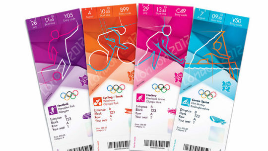
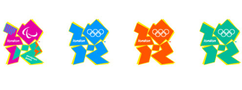
3. London Olympics 2012 - Don’t Like
Although I understand that each Olympic Games year at this point is doing a riff on the silhouetted people, this one is unappealing to me due to the continued lines. I feel like it is making my eyes travel where there is no reason to be. Secondly, the logo is hideous. I understand the 2012 abstraction, however it looks like too many other things due to the over-abstracting. In the end though I like the colors used, but besides that I do not like the overall branding.
0 notes
Photo
3 Icon sets I Dislike - Assigned Blog Post 1
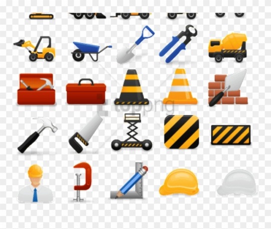
Set 1: Although very clean, each icon resembles the other so closely in the square shape that trying to locate a certain icon takes too much time. In this case, the too similar consistency lead to a feeling of being lost.
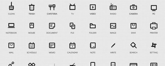
Set 2: Dated, too detailed, and I feel like scaling these down will lead to some issues in their quality. Each icon seems like it would work on their own at a larger scale and be fine, but as a smaller icon lack in what is needed to be successful.
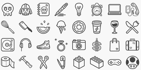
Set 3: This set is very cute and nicely done, however I feel there are too many details on each icon to work when scaled down. Some may work better than others when scaling, which makes me believe there will be inconsistencies in their looks in such a scenario.
0 notes
Photo

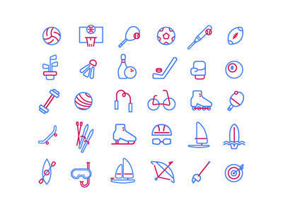
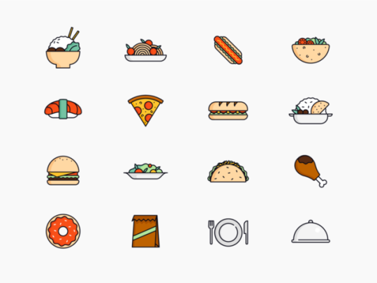
3 Icon sets I Love - Assigned Blog Post 1
Individually:
Set 1: Each icon is easily identifiable and follows a set theme to keep consistency. Although the colors are limited, they are used in such a way it doesn’t matter that there’s not much of a variety.
Set 2: Once again, the icons follow a theme of set patterns (ex. blue is the base color followed by red details), as well as having a limited color palette, and being easily identifiable.
Set 3: Although a range of color is used, the color palette is done in such a way it doesn’t become distracting. A lot of the shapes that make up each food item are also repeated- such as the taco shell and the burger bun.
Together: What makes a good set to me boils down to being easily identifiable, a smart use of color usage, and consistency within each icon’s design to the whole set.
1 note
·
View note