typographysblog-blog
Carly Anne
Graphic Design 1: Typography
24 posts
Don't wanna be here? Send us removal request.
Last Seen Blogs


Text
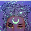
This is my final piece and I am very pleased with it. I probably need to go in and change the opacity on the little zodiac words so that you can see them a little more. I am pleased and very happy with it overall! I have enjoyed this class even though it has been a challenge for me. I hope to grow more familiar and get better in my next graphic design class.
0 notes
Text

The good example is on the left. I enjoy this piece because it is simply aesthetically pleasing to look at. The poster is made up of mainly words which I admire. I hope I can do better with that in my upcoming graphic design classes. The bad example is on the right. It just had bad kerning all the way around.
0 notes
Text
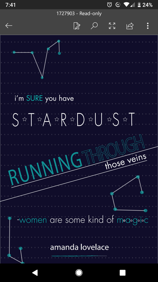
This is my finished piece. I like how it turned out. Especially the constellation part. That was very fun to make. I could have made the stars look brighter than some of the other and some of them dimmer. Mess around with the opacity some more.

0 notes
Text
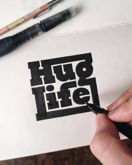
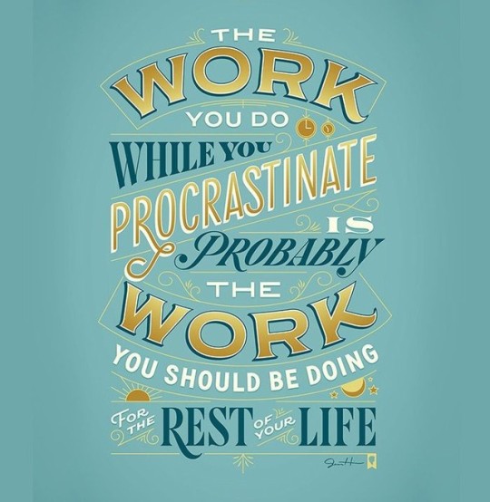
The bad example is on the left. I felt as though this isn't the greatest example of typing because of the "Cheese Grater"font. It is kind of hard to read. Besides that, I think it is effective. The good example of typography is on the right. I love how the words wrap around each other. Like they are actually hugging and keeping each other safe. Very effective.
0 notes
Text
This is what I have been this past week. I love this project so much. I wish we could keep doing them. I love this poem by my favorite poet, Amanda Lovelace. It keeps my spirits up so I was excited to get to make some art out of it. Hopefully I can put it on my wall soon. I am not completely done with it. I want to add the zodiac constellations instead of the random ones I made. I will be working on the on Tuesday in class.
0 notes
Text
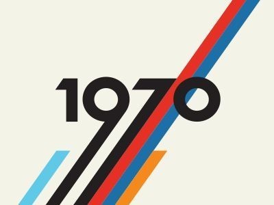
The bad example is on the left. You can not even read what it is saying unless you take your time to decipher each letter. Too time consuming. The good example is on the right. I love the way they stretched the numbers in order to make them longer. The lines/stripes go really well with the theme of the decade!!
0 notes
Text
This is what I worked on this past week. I couldn't figure out how to get my final copy on here but this is close to the final copy. I just changed the letters to white and arranged them to the sound wave pattern. I enjoyed this project but I wish I knew a way to get faster at it.
0 notes
Text
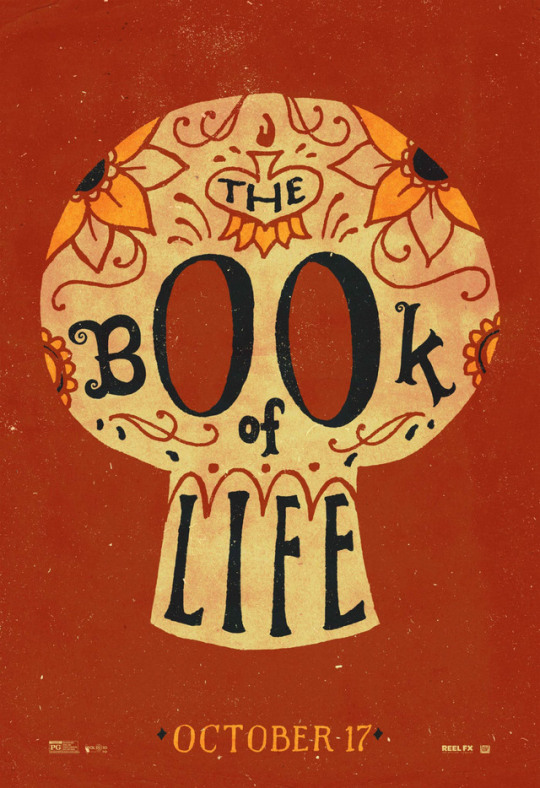
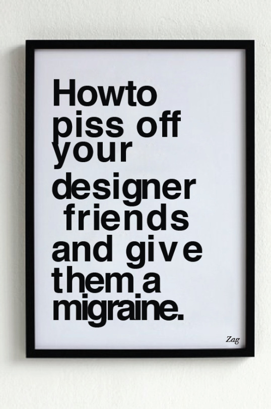
Good example of typography is on the left. I live this example because of the use of the eye sockets as the letter "O" So creative with using the skull with the title. The bad example of typography is on the right. I do not enjoy the indent into the words "designer friends." It makes me uncomfortable.
0 notes
Text
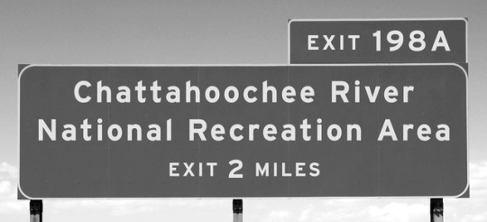

The good example is on the left. I see this as a good example due to the fact that it is easy to read while driving down the highway or road. The typeface is not something difficult to read. It is simple. The one on the right is my bad example. It is my logo I made earlier this semester. I just started a Instagram page for my art but I saw this mistake on the "C" where I didn't cut it off enough. But I am learning through trial and error.
0 notes
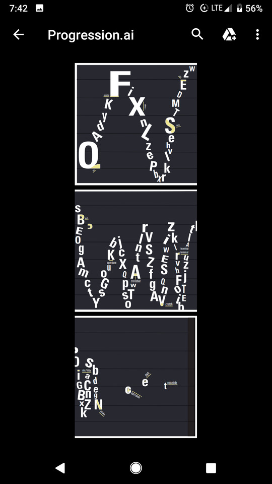
Text
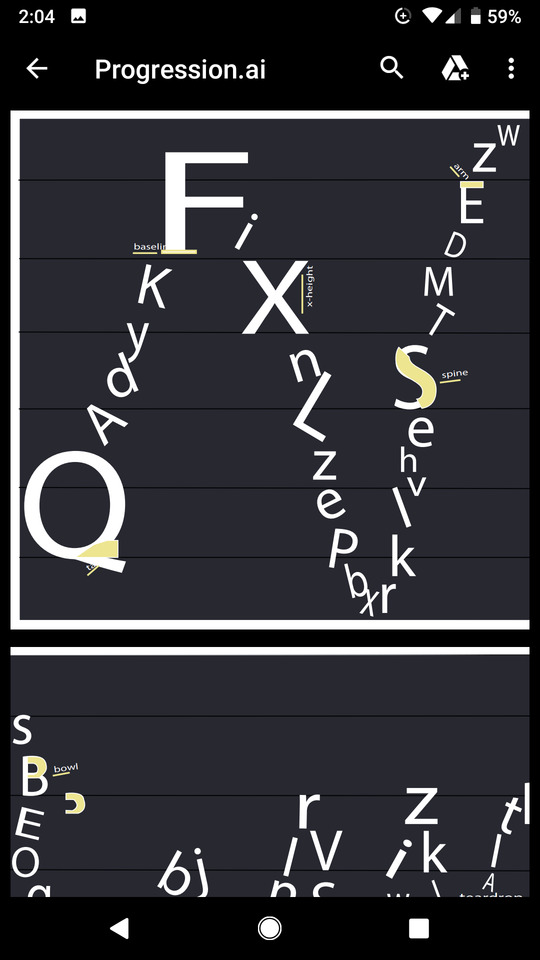
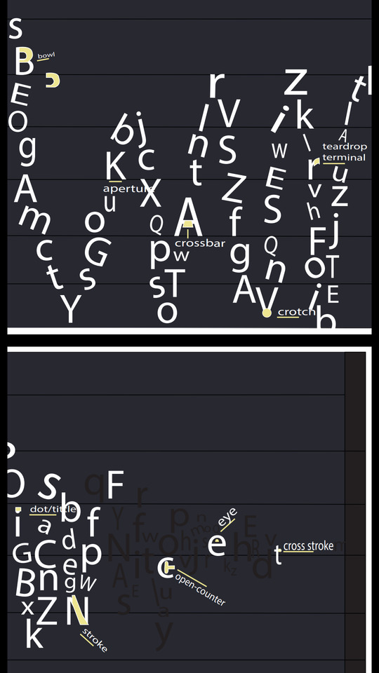
This is what I have been working on lately. I have struggled with this piece due to looking at others progression pieces and I compare myself to others and how much more experienced they are than me. I am trying my best but I need more help understanding the tricks of the program.
0 notes
Text

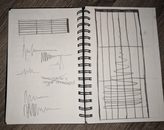
I was very confused as to how this project was supposed to work at the beginning of this project. But I am coming to understand it better as time goes on. I am planning on creating a sound wave that is going from loud to silent. This will definitely be a challenge but I am sure I can do it.
0 notes
Text

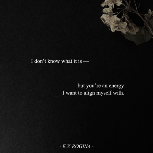
Bad: I feel as though the spacing between the letters could be spaced out better.
Good: I really like this one. In the poem it is talking about being aligned with someone. And the two bottom lines are aligned. It's kinda like a term we learned in high school show choir... Text painting
0 notes
Text
I finished my project last week and I was pretty proud of how they turned out! :) #roserun 🌹
0 notes
Text
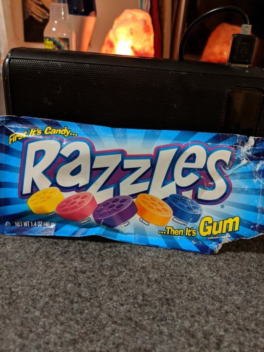
Good and Bad typography
Bad (left): I didn't think that the lettering going sideways worked well enough for this product. It just seemed kinda random.
Good (Right): I think this is good typography because of the lines leading in towards the lettering. The way the letters are placed is nice because the look "razzled."
0 notes
Text
This is what I have been working on this week and am almost done with. I need to do a couple tweaks to it but I think they look pretty good! I have learned a lot in this project. I have Kelli to thank for being so patient with me.
0 notes
Text
These are my two examples of good and abd typography for this week. The one on the left is my bad example. It is bad because there are way too many different kind of typefaces/fonts. The one on the right is my good example die to the fact that is is very simple and doesn't have any extra information than what is needed.
0 notes
Text
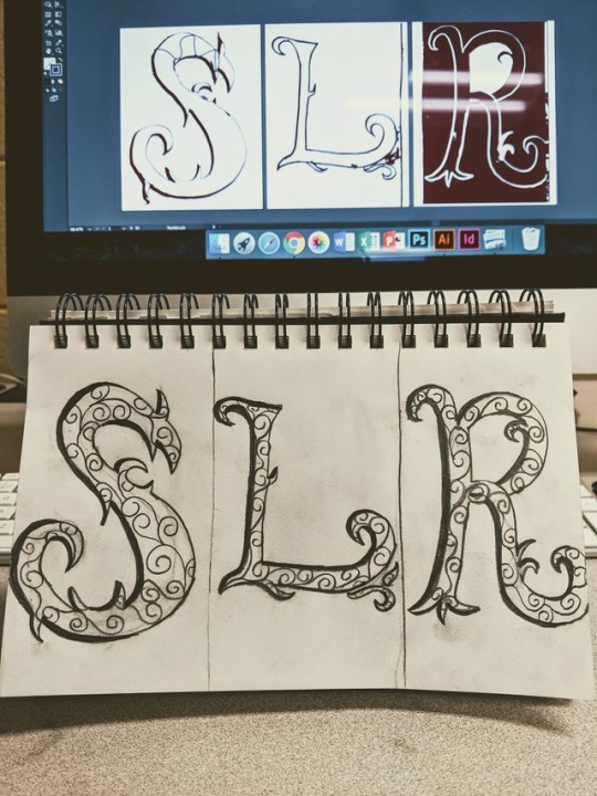
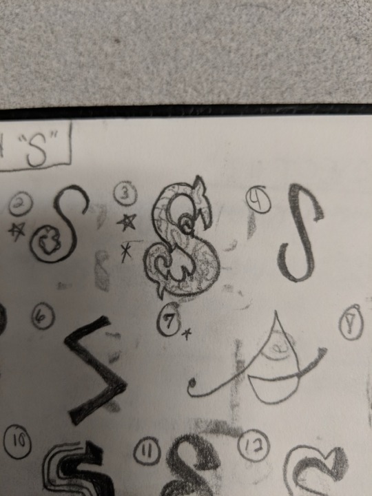
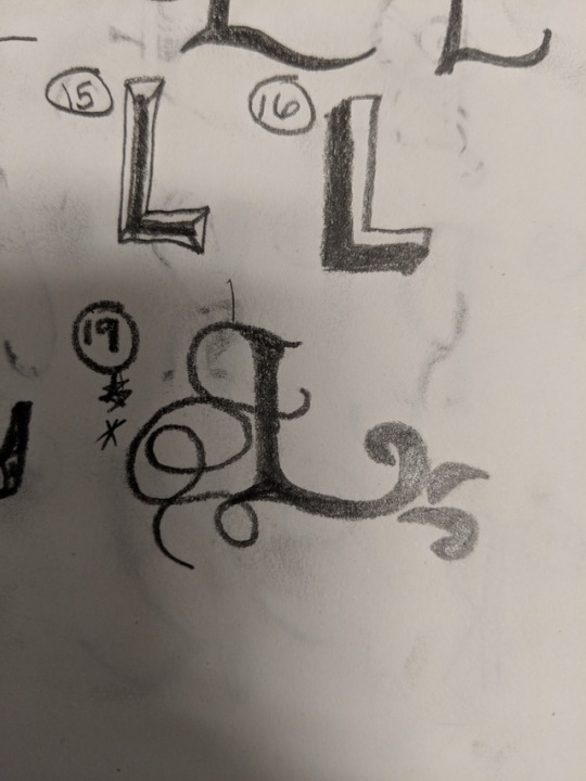
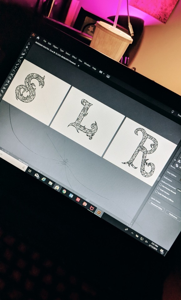
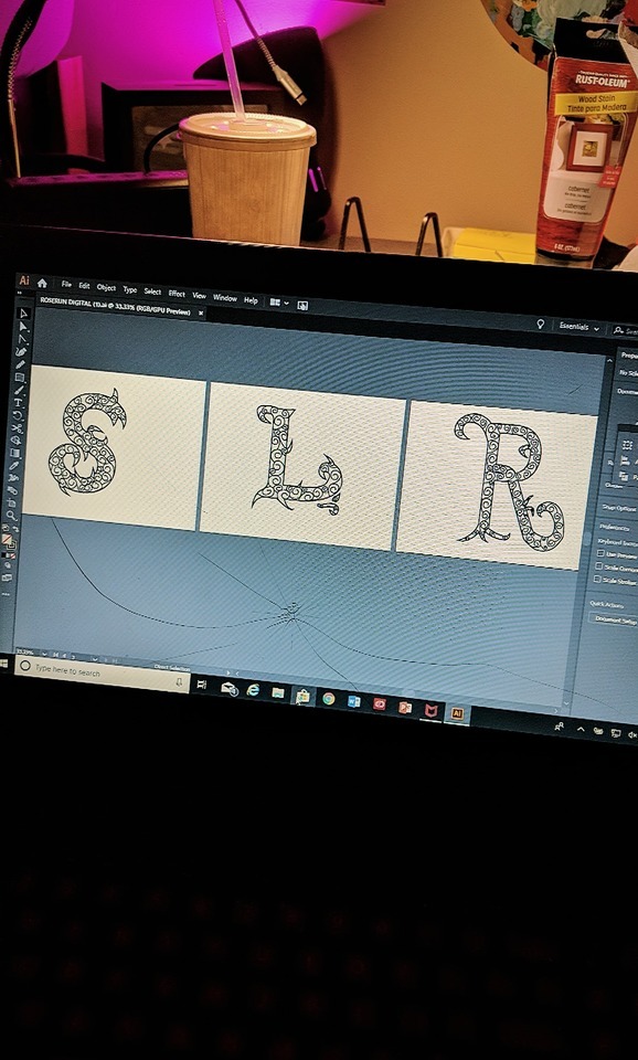
These are a few things I have been working on this past week in and out of class. My font name is "Rose Run." I chose to do a thorny kinda shape and then have a vine running through the inside of the letters. I think it is turning out pretty well!
0 notes