Photo
Final Hand In
Reflection:
I learnt a lot about keeping a tidy document and just how important that is throughout this paper. As well as upping my skills in InDesign and Photoshop and my ability to work from home, I picked up some really key insights into document precision which I know I’ll take with me. Taking the time to clean up a document and make sure it’s clear “what’s what” makes a huge difference when viewing other people’s documents when working collaboratively.
I really value the knowledge I’ve picked up in this time and know my documents will be looking clean as from now on!
Note: Most images are psd files due to the nature of multiplying and the overlapping layers in my doc (just in case it takes a while to load).
0 notes
Text
Week 6
Swap Check
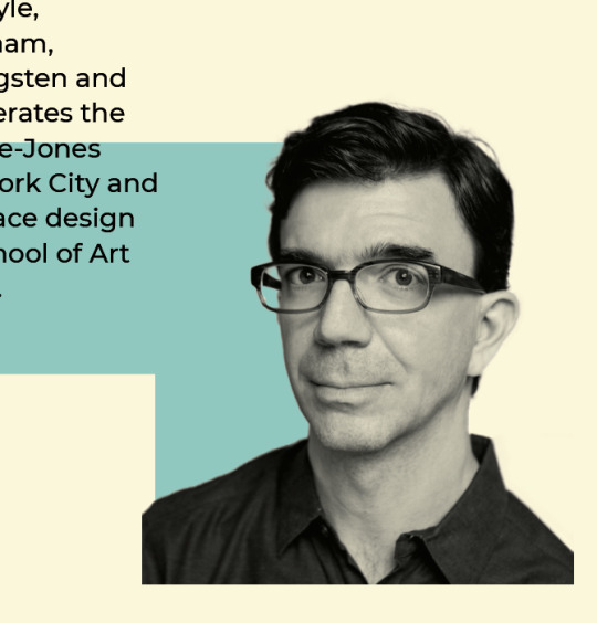
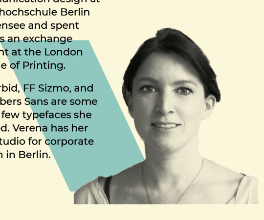
For a piece of final feedback a peer and I swapped pdfs to see what final insight we could give each other. My peer managed to catch:
a couple double spaces
the use of soft returns where a normal paragraph would suit
and the suggestion to refine the clear cutting on Tobias and Verena
0 notes
Text
WEEK 6
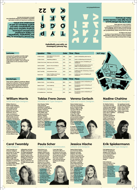
Final Changes
For my final changes I ran through a few things:
moving the table content so it doesn't fall on a fold - this would make it susceptible to loosing ink and becoming illegible
final alignments within the poster grid
making sure all the letter form shapes are inline
alignments for the intro paragraphs informed by my print test
swap of front and back cover
enlargement of AUT map to fill in negative space
fold line indicators added on the master page alongside background colour and guidelines
align table columns
0 notes
Text

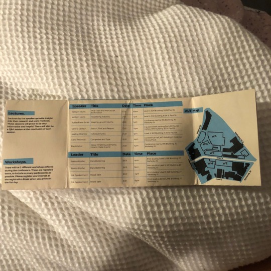
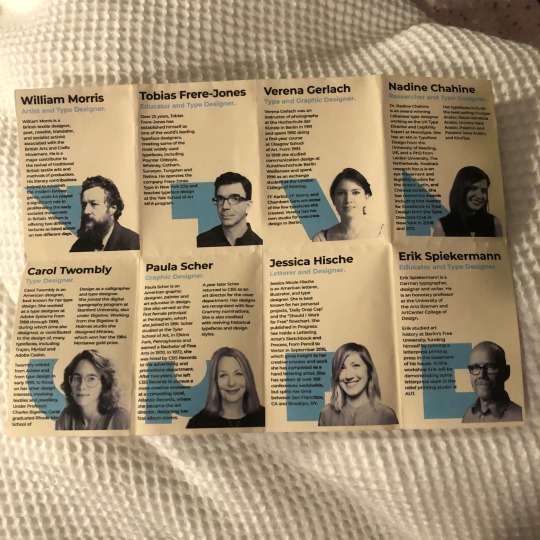
Week 6
A4 Print Test
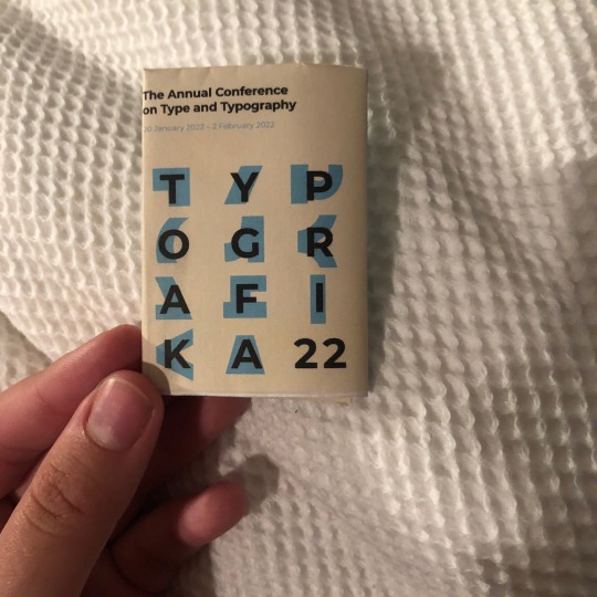
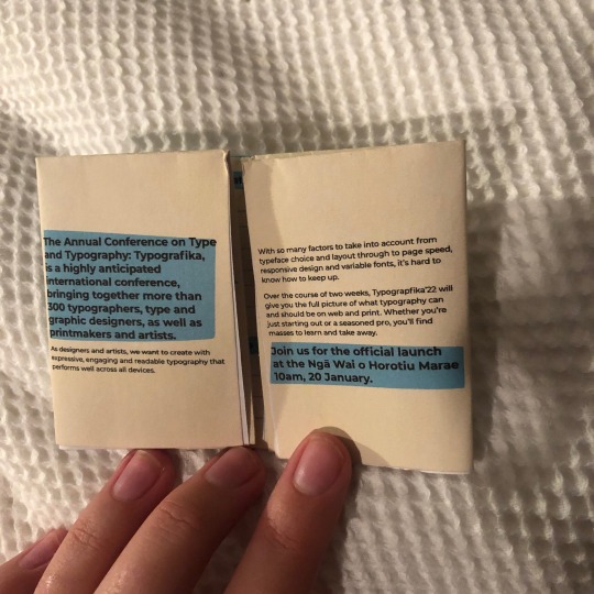
While lockdown has done a lot of good it does make test printing difficult! I printed my brochure on A4 to check everything read well. It was only in doing this that i discovered I’d made a fatal error : I’d put my front and back cover the wrong way round. I was then able to see the relationships between each section more accurately and decided the AUT map needed to be moved and the intro needed to be correctly aligned. It was cool to see it printed and see how the food worked with my content even if this is all it will ever be.
0 notes
Photo
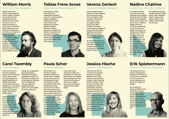
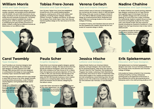
Week 6
Experimenting with Single Column
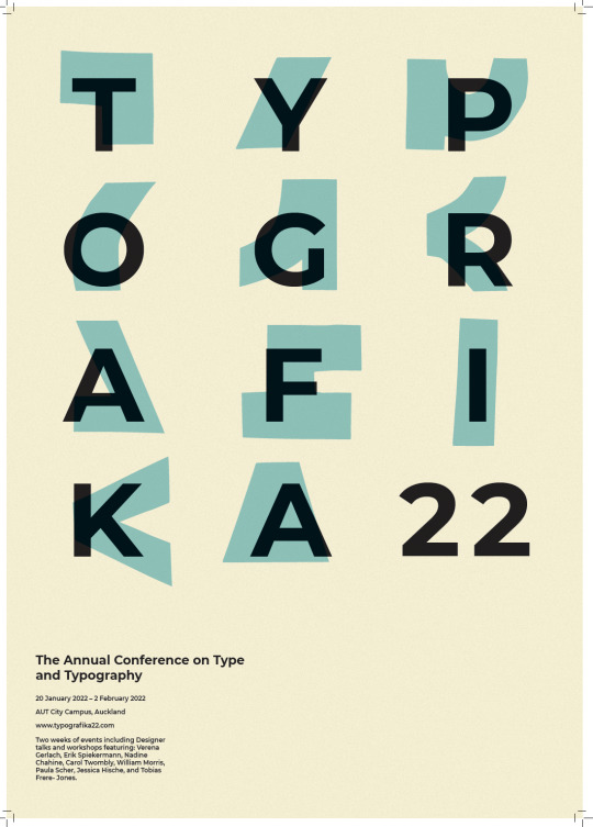
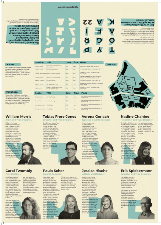
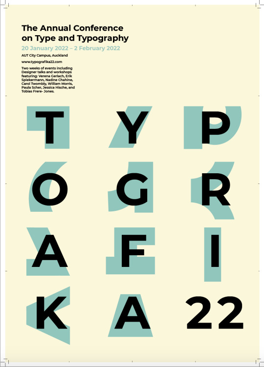
This was a very fast implementation of a single column text box made obvious by Nadine, Carol and Paula. I found single column created a disconnect between the text and the speaker and brought too much attention to the imagery. A double column connects the speakers no matter how much text there is - speaker connected to shape and shape to text.
0 notes
Photo
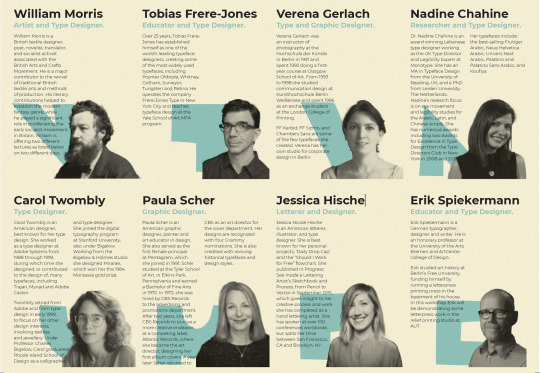

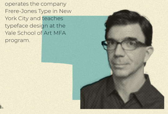
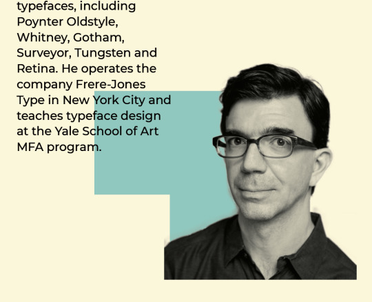
Week 6
Detail Implementation
Bolder body copy to make writing clearer and more legible
New shapes - perfected so they don’t look like an in between mistake
Halftone images replaced with clear cut images
Detail shown in Tobias Frere-Jones closeup
0 notes
Photo

Week 6
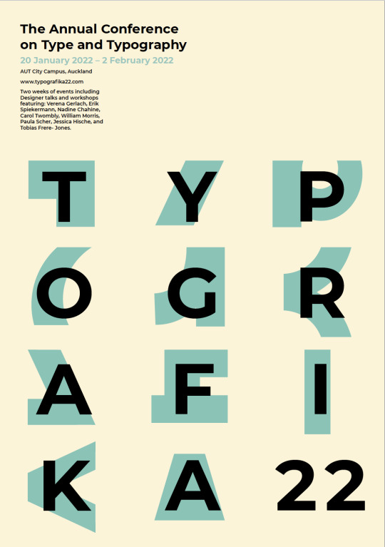
Second Implementation Comparison
New clean shapes used
Type hierarchy - including larger date
Body made larger
New grid
Grain removed
0 notes
Photo

Week 6
First Feedback Implementation
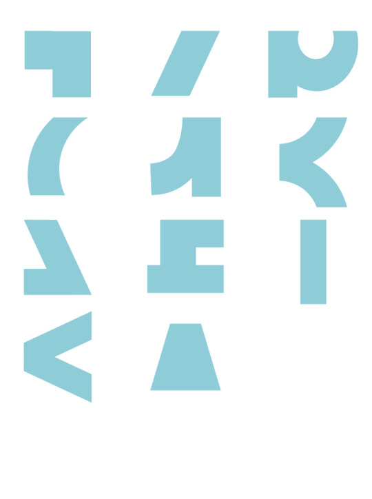
Shapes created in Illustrator now all have clean lines - straight vertical and horizontal where necessary compared with the handcut. Round shapes were all created using ellipse tool.
0 notes
Photo
Week 6
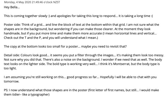
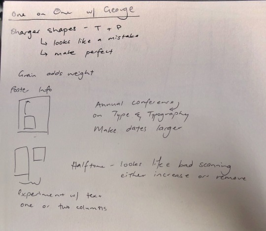
Final Feedback
Main Things to Take Away:
POSTER
Create a grid and implement all elements into it
Copy on poster needs to be increased
Hierarchy needs to be created with date
Experiment with poster copy at top of poster so that the TYPOGRAFIKA doesn't overpower poster
DETAIL
Halftone isn’t clear enough either needs to be increased or removed entirely
Experiment with having two columns - to remedy negative space
Body type is too light - use a diff. weight? size?
BOTH
Make the letter section shapes perfect - clean horizontal and vertical lines
Remove grain - it adds weight
0 notes
Photo
Week 6
Class Notes
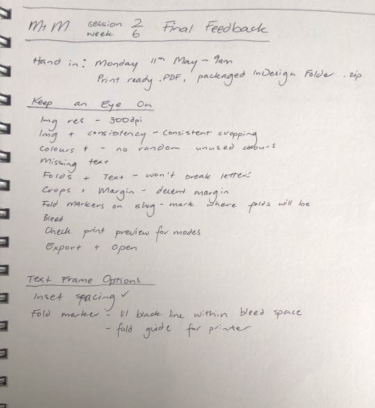
A final run checklist
Image resolution - 300dpi - check thorough flight panel on InDesign
Consistency in Images - Check cropping and img treatment are all the same
Colour consistency - swatches panel and swatch library
Missing text - preflight
Fold and Text - check small body text doesn't sit on a fold
Fold Markers - place fold markers for printers within the bleed, not too close to border
Bleed - check all imagery and colours that extend to the border also extend to the bleed line
Check print view
Export and check again!
0 notes
Photo
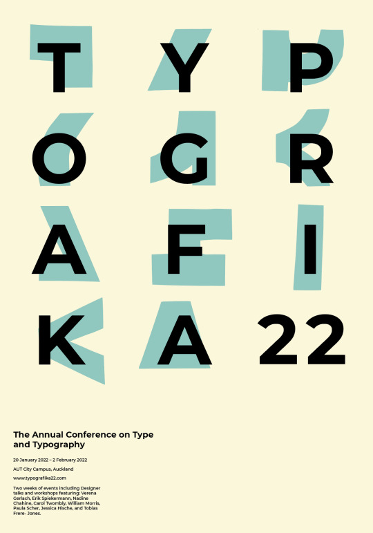
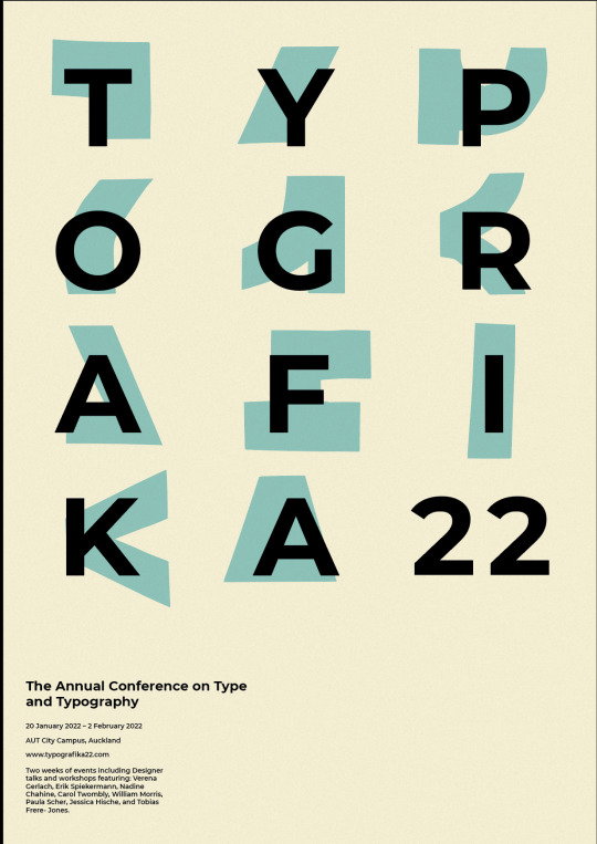
Week 5
Adding Texture
I experimented with a way to add grain to my poster without having to group all the information. I decided on creating a grain layer in Photoshop that I could multiply over my InDesign document. This texture reinforces the retro idea
0 notes
Photo
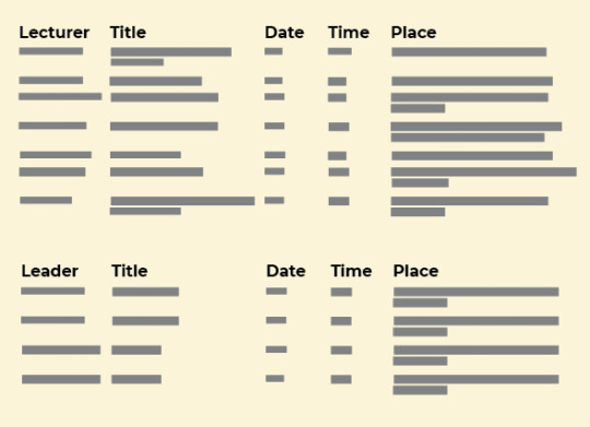
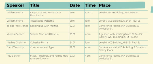
Week 5
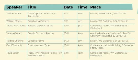
Table Changes
1. original, no stroke, no shape
2. stroke added
3. stroke removed from header row
0 notes
Text
Week 5
Video Content - Hazel
These videos gave me some really extensive ideas for proofing my final document which I’ve made lots of notes on
0 notes
Text
WEEK 5
BACK TO UNI
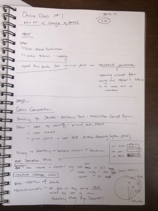
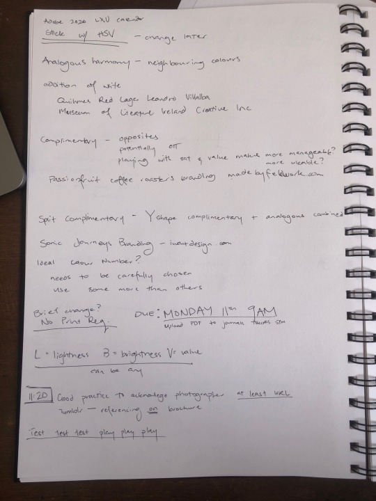
First Online Class Notes
Takeaways:
Upload a print ready pdf for final feedback
Colour composition w/ George
The difference between hue, saturation and value - experiment in Adobe Colour
Colour needs to be chosen carefully, some colours should be used more than others
Acknowledge photographer - good practice
Due: Monay 11th 9am
0 notes
Photo
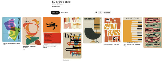
Poster Inspiration
I was inspired by the shapes of retro 50s/60s posters. Having done a lot of research in first year about retro design and the nostalgia it creates, I believed a poster that calls on vintage styles would reflect typography’s history within a living memory. Using colours, shapes and textures of this era gives people an immediate idea of history while contrasting with a modern san serif type that eludes to the future as well.
0 notes
Photo
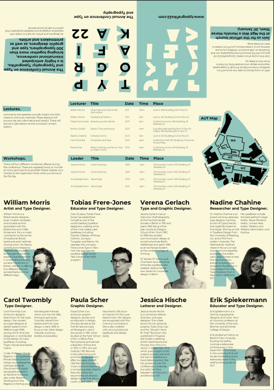
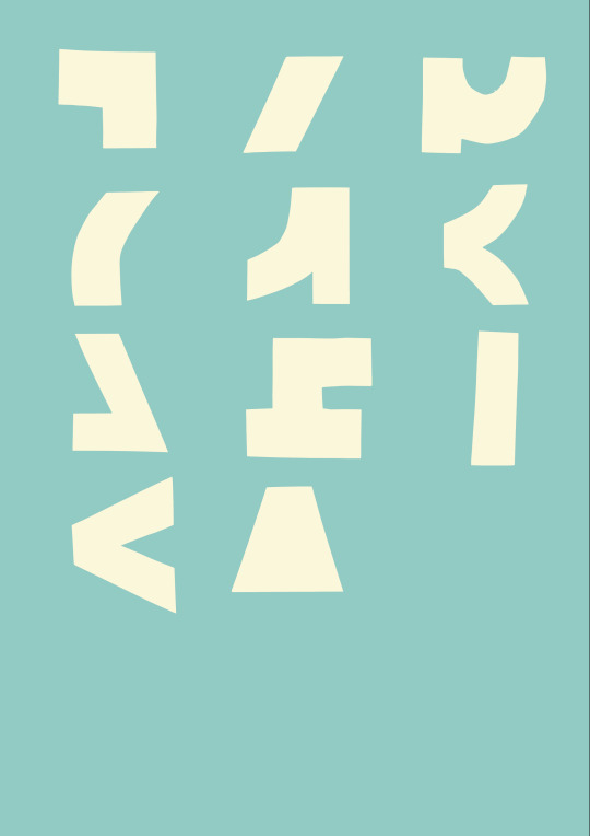
WEEK 4
Creating the Back Page
For the backpage I swapped the colours used from the original poster. I removed the text and left the abstract letterforms.
0 notes
