
Last Seen Blogs

hostcheaper
www.hostcheaper.info

indy20
BDPlay.Com

largando
Untitled

frostymeat
Ice Box

demysse
Sin título
Text
Reflection
High Street Low Street is an exploration into the visual identity of UK high streets in locations that have strong and opposing demographics.
This project began with an intent to examine the links between population demographics and the visual characteristics of high streets, including typeface, colours, semiotics. I was interested in dissecting these elements in relation to population demographics to attempt to uncover patterns of unintended semiotics, in the public domain in order to answer the question; ‘Does the the visual representation of British high streets accurately represent the population demographics?’. I began my research hoping to support my beliefs that the quality and quantity of amenities on a high street should cater to and in turn be a representation of the local community, and as a result, each high street should have a different identity from one another, in order to support and serve a specific local community.
Secondary Research - Keeping continuity and ensuring reliability
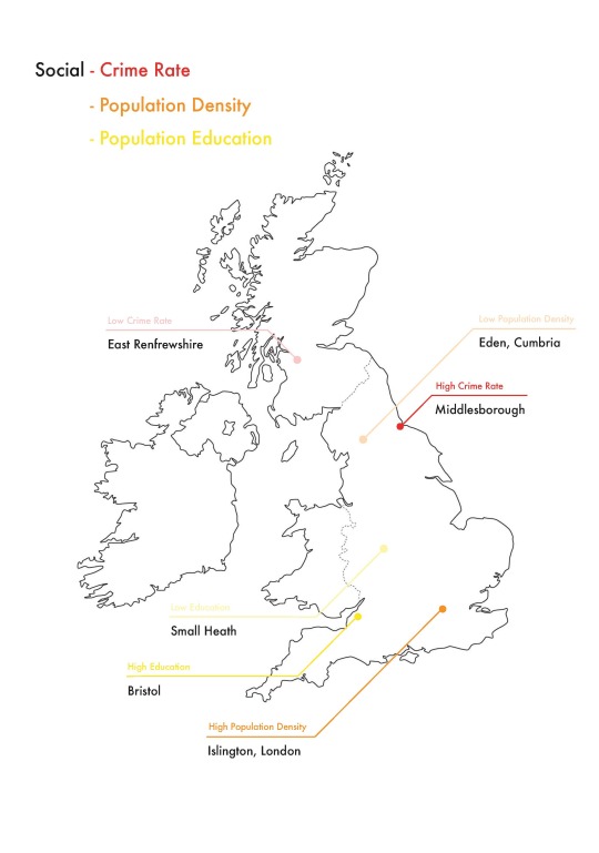
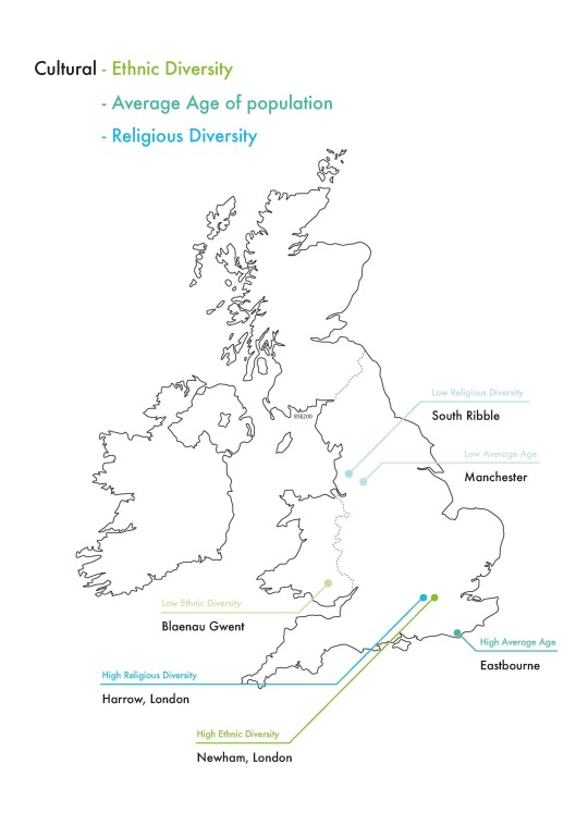
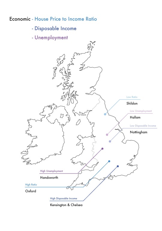
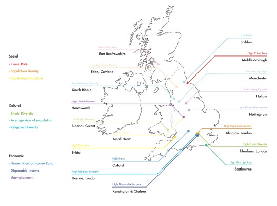
I believed at this stage, that visiting high streets with strong and opposing demographics was the best way to collect the volume of visual research I needed to in order to support and present my hypothesis, so I invested a lot of time into defining categories that would cover a range of social, economic and cultural demographic variables, and concluding appropriate locations that could represent the high and low extremes of those variables, while being conscious of ensuring continuity and reliability across all results.
I initially attempted to find absolute results, or the ‘most’ and ‘least’ of each category, but because of the ever changing nature of demographics, I found it challenging to support many of the candidate areas with reliable and similar statistics that supported both extremes. I made the decision that it was more important to have results categorised as ‘higher’ and ‘lower’ with strong and reliable evidence. I decided that for the best results, they must be specific and standardised as the pairs had to be reliably comparable, amongst themselves and their parent-category, and as part of one single project. One element of this was gathering reliable evidence from reliable sources, however while actively researching, I found another important element was keeping the scale of the areas I was researching relative and consistent. This meant that if the result for a category was a city, I must try to narrow it down as much as possible, to one area with one high street. This statistic based research lead to a more compassionate and personable approach.
Primary Research
I began my research visits intending to focus on a visual identity of a specific high street for each area defined, however after the second or third visit, I began to notice that I could not only see the identity of a high street, but I could also feel it. The patterns of human behaviour displayed by the community and the atmosphere they create meant that, from one high street to the next, I felt a difference as well as saw one.
This atmosphere was made up from the pace in which people were walking, the volume they were talking and the interactions they were making with one another and their high street.
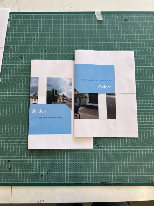
I also noticed that there were a lot more personal interactions with small or independent retailers, in the form of casual approaches, unique branding, a font chosen to emulate personality rather than strictly for business purposes, and handwritten notes in the windows of store fronts, acting as a personal address to the general public. In Shildon for example, neither the statistics or opinions of the locals are favouring towards the area, however there are far more independent retailers representing the personal interest of the community as opposed to chain retailers. Similarly to the way in which chain retailers can not solely support a high street, I decided that this project could not be solely supported by statistics and facts, as this did not fairly or accurately represent the population demographic, as they would be able to themselves.
Integrating emotion - Including opinions from the communities and digging into the combined invested interest.
Whilst initially I had not intended to include quotes from members of the public, and initially had tried to avoid photographing people while collecting primary research, although the photographs that unintentionally included members of the community became the richest representation for the atmosphere of the high streets.
I decided not to avoid photographing the public and decided to lean into their interpretations of their local high street. This redefined the purpose of the project, relatively late into the project, which was not expected, but ultimately benefited my aims. The restructure of the project developed organically with the inclusion of new information and evidence. It was essential that I restructure the format of the outcome appropriately. This included planning the next phase of the project, which would further include the communities at the heart of less favourable high streets.
Making the outcomes - Making documents as pairs, and sets, and comparable.
It was essential that I made a physical outcome to collate all of my research, as I intend to take this project back to the high streets, present my research to the community, and work towards engineering a high street that serves the local community efficiently. I am conscious that the collation of my research has to be interesting, concise and each location must be comparable all others in order to deliver this information to audiences from a wide range of demographics.
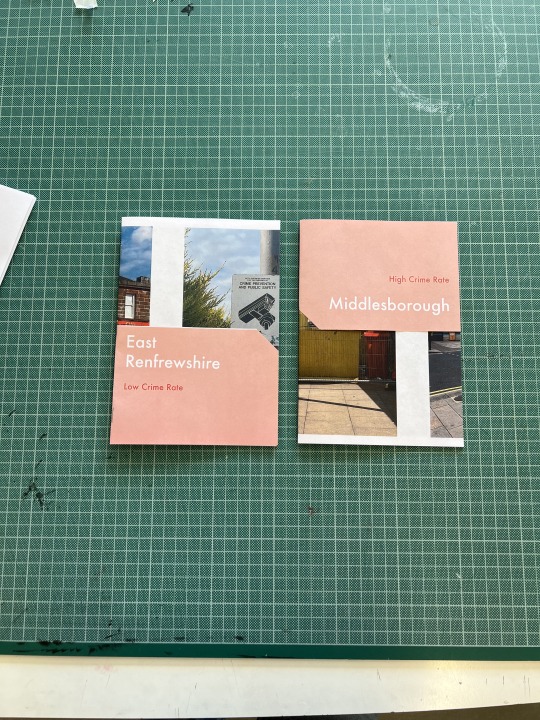
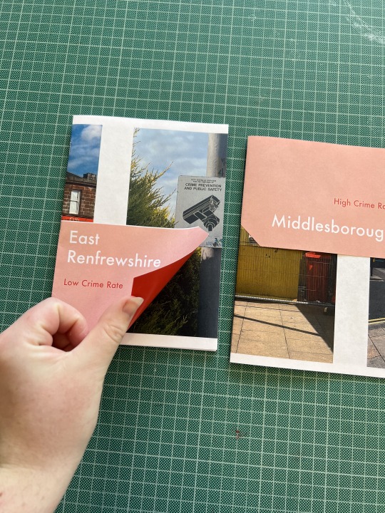
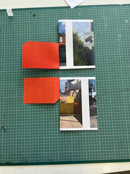
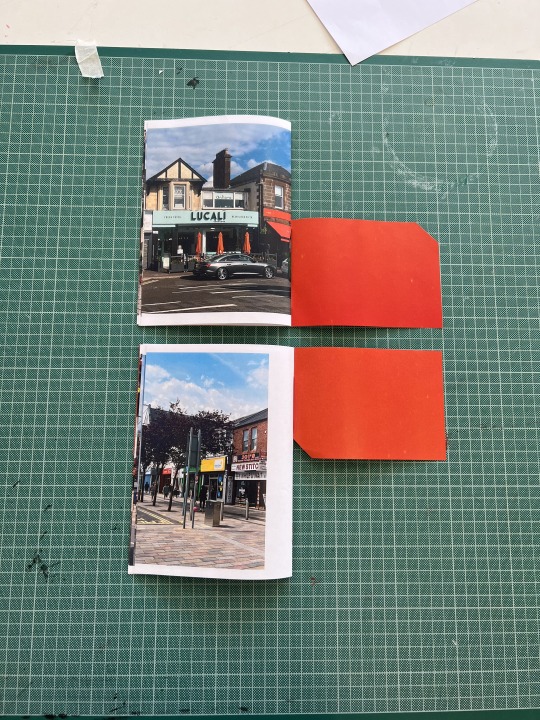
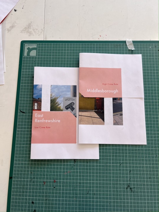
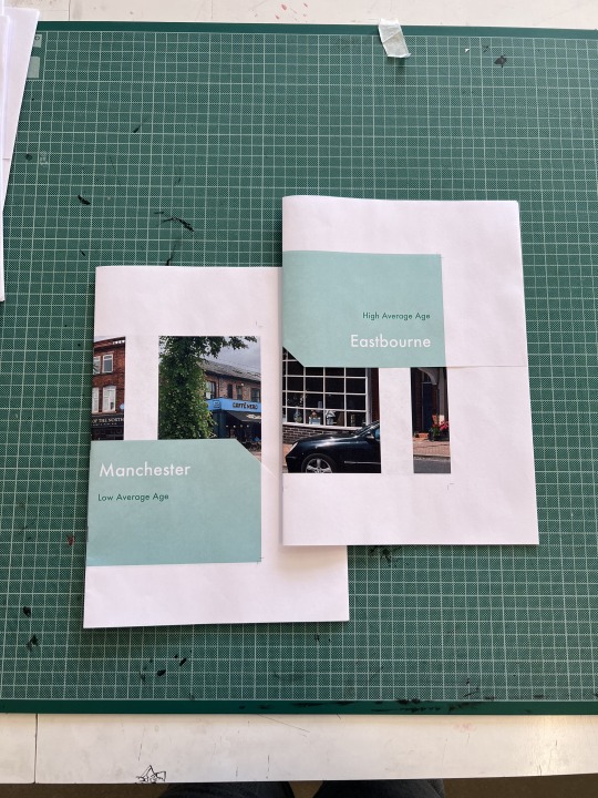
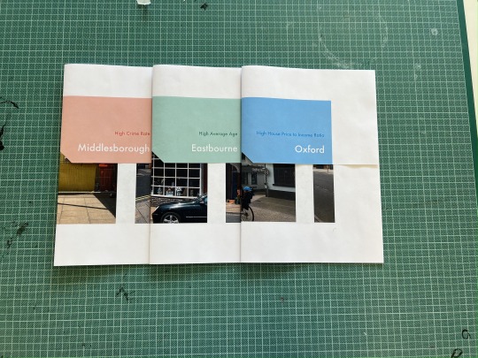
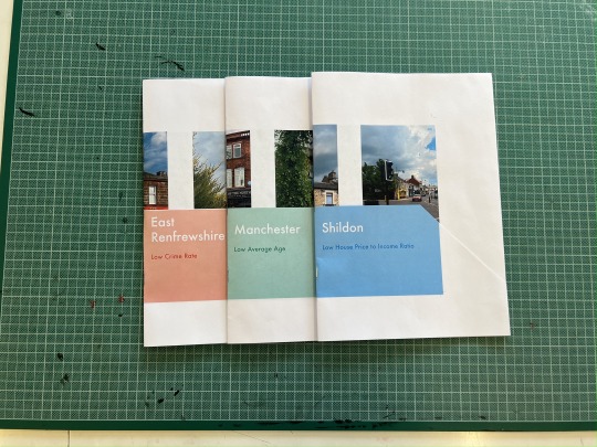
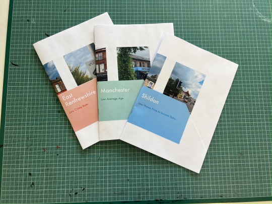
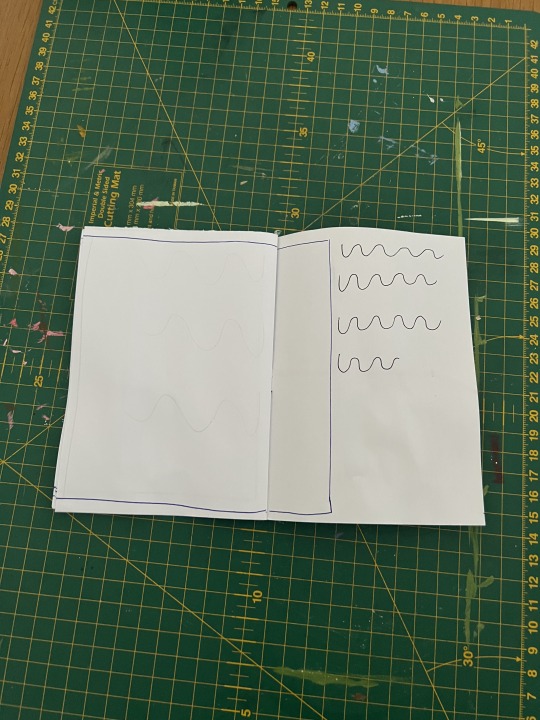
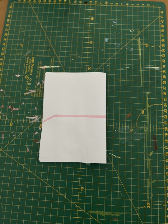
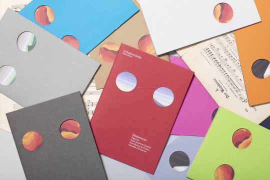
I designed a zine format document that could be replicated multiple times, changed slightly for each different location. The zines are designed with a collar This collar would host the name of the location being presented, as well as the category. The zines are designed in pairs, as the shape and configuration of the collar differentiates to the high and low of each pair, as well as being colour coded so the pairs could be easily matched. Objectively, I think that a differentiation in colour works well, as I have used colour groups to relate categories to one another and
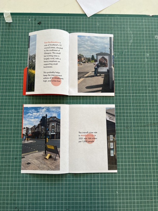
An important consideration for me was the replicability of the zines, I needed them to be quick, easy and cheap to print as I intend to take them around the country with the next phase of this project. I experimented with die-cuts through the main pages of the zines, which worked well and I thought with some refinement would give additional physicality and interactivity to the outcome, however it was not practical. To increase engagement I ultimately designed two template documents, one for high and one for low, following the same rhythm, using text on the same spreads but opposite pages with the consideration that comparable quotes or statistics can be viewed alongside one another without overwhelming the audience.
The zines are designed to be light weight and snappy, available at your fingertips, and in order to ensure confidence in my project, on reflection, I believe that I should have included a QR code or web address which could host more in depth and referenced evidence, quoted and statistics, an important element that my audience currently does not have access to.
There are areas that represent their demographic, and others that don’t, but actually, by looking at high streets from areas with a wide variety of demographics, we can learn some lessons about the accessibility of a truly community led high street.
0 notes
Photo


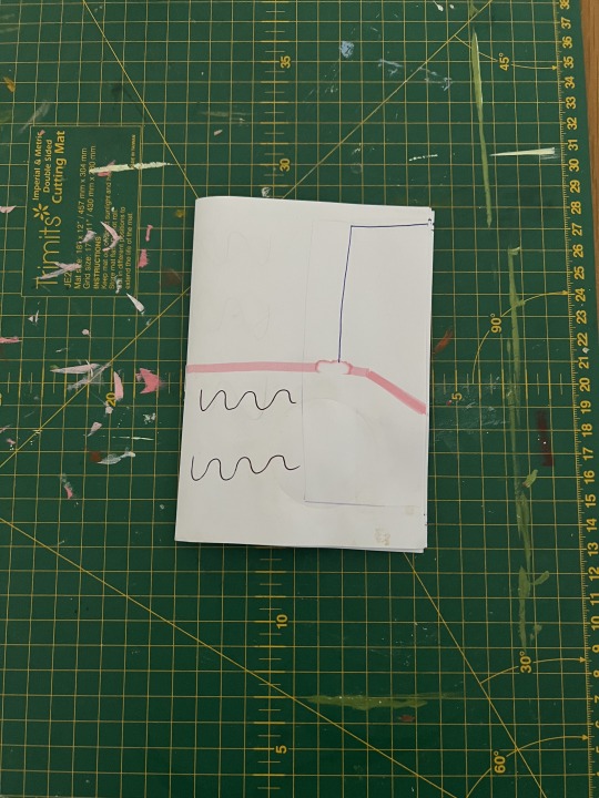
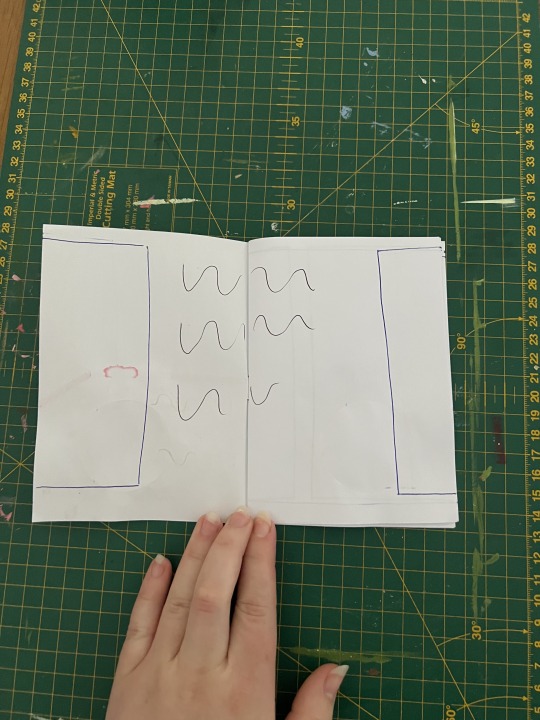
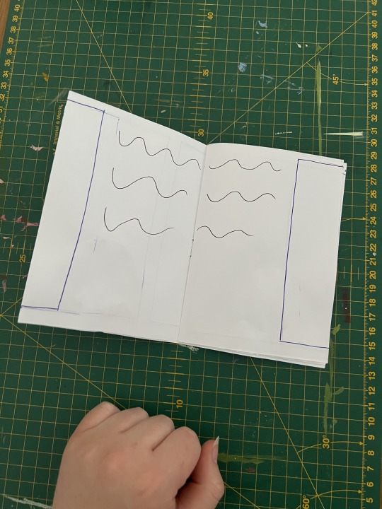
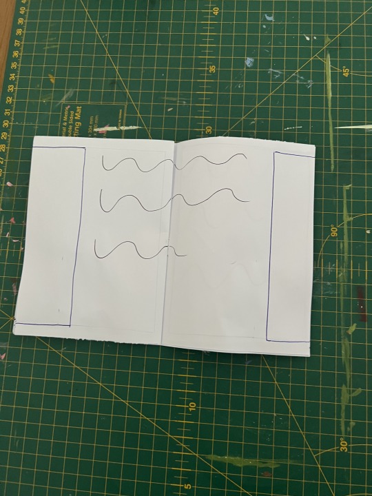
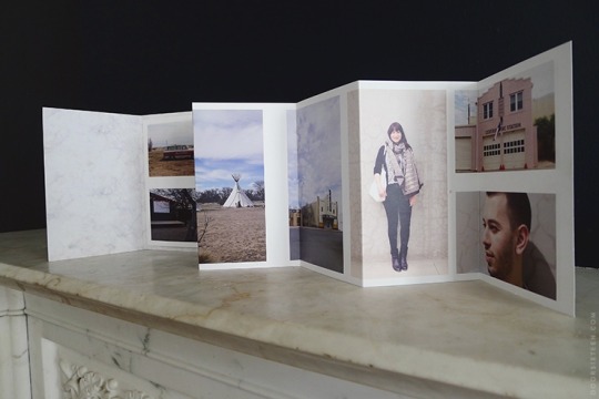
Test print.
After this I changed the layout and style of the text in both documents to ensure there was continuity between them as a pair.
0 notes
Photo
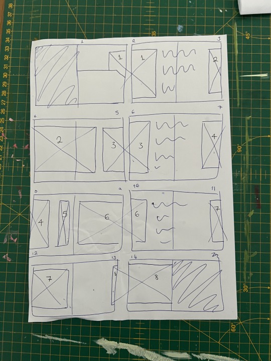
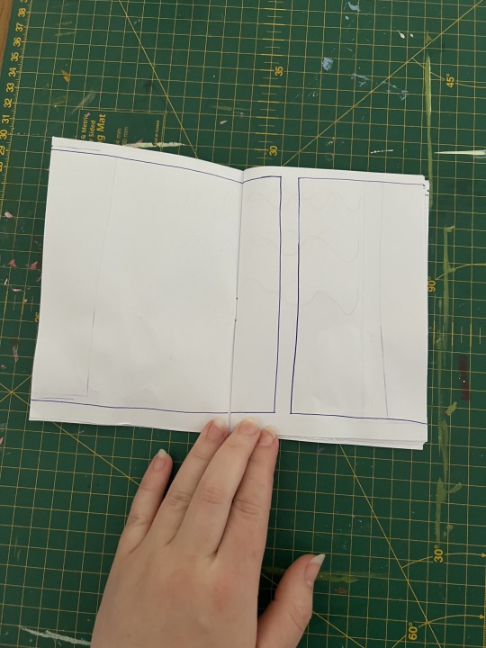
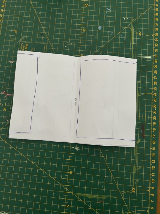
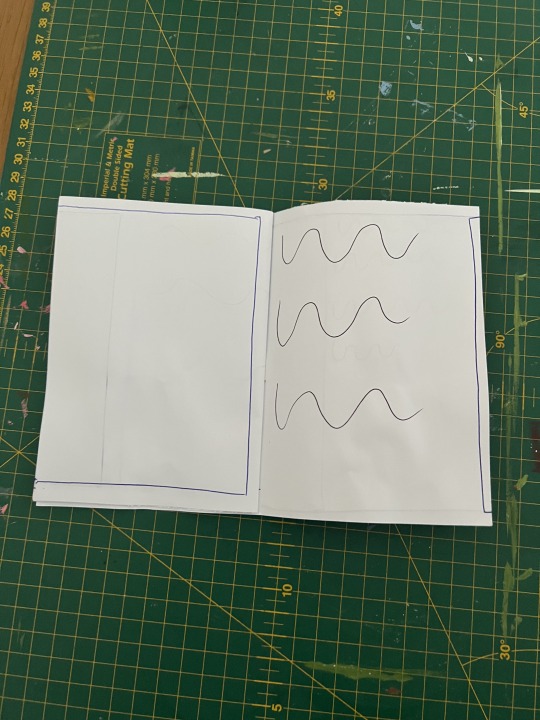
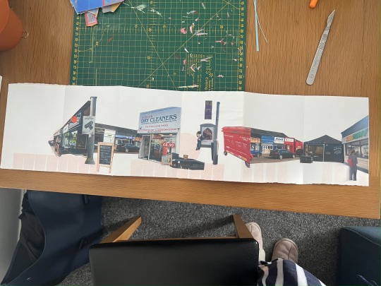
Development of the final layout concept.
This concept simulates a journey through images which will be paired with statistics and quotes
0 notes
Video
0 notes
Video
0 notes
Video
0 notes
Video
0 notes
Video
0 notes


Text
Unemployment
Soho Road
Handsworth, Birmingham (B21 9LR)
Categorisation - High Unemployment Benefit Claimants
Sources - https://www.centreforcities.org/data/uk-unemployment-tracker/
https://www.birmingham.gov.uk/download/downloads/id/12673_labour_market_update_q3_2019.pdf
Post-Covid Recovery - https://www.centreforcities.org/data/high-streets-recovery-tracker/
Government Assistance - N/A

Ecclesall Road
Hallam, Sheffield (S11 8HW)
Categorisation - Low Unemployment Benefit Claimants
Sources - https://researchbriefings.files.parliament.uk/documents/CBP-8748/CBP-8748.pdf
Post-Covid Recovery - https://www.centreforcities.org/data/high-streets-recovery-tracker/
Government Assistance - N/A
0 notes