
Last Seen Blogs

addictsicons-blog
Addicts Icons

latexcore
elastic lifestyle

leooliveira
Motion World

cybersepa-blog
Cybersepa.org.mx
idanwyn-et-al
The Elegant Traveller
Text
30)EVALUATION
Through this project/module, I have learned a lot about different trends, who and what are the main drivers behind them, the importance of forecasters and reporters as well as learning about the digital communications side of things, through the CAD workshops. I have thoroughly enjoyed learning how to use photoshop and indesign as I have never used either of them previously before this and will continue to explore and further develop my skills.
I have also learned about how important sustainability is for the fashion industry and how damaging it has been thus far- going into topics like the unfair treatment that garment makers face; extreme hours, little pay and poor working conditions as well as the brutal effects that it has on the planet; through the lectures and visiting professionals.
I feel that each of my mood boards show significant progress in my skills and I have developed them significantly since the beginning of this project. However, to improve, I could have explored a variety of different trends to enhance my ideas and skills further and explore trends that I found more challenging to define or understand and to gain a different perspective as I feel a lot of the trends I chose to focus on were all quiet similar to each other in concept and looking back I would have liked to have showcased a larger variety.
Overall, I have really enjoyed this project and the CAD aspect was definitely the most enjoyable part of this module for me which has definitely helped me to narrow down my pathway. I am pleased with the progress I have made throughout this module and with the overall outcome of my look book as I feel my narrative remained constant throughout. There are however, some changes to my look book that I would like to change if I was to do it again or had more time to explore and do so, but for the most part I am happy with the overall look.
1 note
·
View note
Text
29)BACK PAGE

I decided to finish off my look book with more simple imagery as I feel like the rest of the pages were packed with imagery. I found it difficult to end my look book as I didn't know how I wanted to conclude it. I decided to stick with the red and black tones portrayed on my cover page to create a more cohesive look and finish to my look book; adding in blurred, red strobe lights to do this.
I do like the back cover, however I wish I was able to come up with something a bit more exciting to it- maybe text would have help or finding a brighter image to add instead to relate to my look book even more.
Overall, I am pleased with the outcome of my look book, I feel as though I kept my narrative and trend cohesive throughout, through my choice of imagery and colour selection.
1 note
·
View note
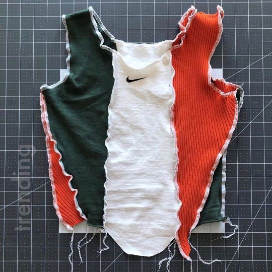
Text
28)LOOKBOOK- Pages 8&9-Key Shapes and Fabric Selection

On the eighth and ninth page of my look book, I started highlighting the key shapes, garments and bringing forth the fabrics forecast.
Because the tie-dye effect is such a big part of this trend, on the eighth page, I decided to highlight the warmer tones of this trend using key fabric swatches and garments that highlight the reds, oranges and yellows and in contrast to this on the ninth page I explored the ‘cooler’ tones, using garment selections and again abstract textile patterns that support this. When creating this page I was conscious of the fact that I needed to add in text. Because of this I ended up deleting images and changing the composition around frequently. in order to make room for text, I decided to use the magnetic lasso tool to cut around the middle of the fabric swatch. I ended up really like the way this turned out and I feel it utilises the space better. I chose to highlight the key concept within this trend which is up cycling and reconstruction of old garments. To highlight the sustainability aspect of this trend I decided to add ‘Recycle, Re-use and Repurpose’ in a larger font size and italicised it.
A few things I would change out this page is adding in more text as I feel as though there is a lot of negative space and to also stylise the text perhaps by using the path tool. I did try to do this but for someone reason it didn't work the way I intended it to and so I had to compromise.
1 note
·
View note
Text
27)LOOKBOOK-Page 6&7-Colour Story

On the sixth and seventh page of my look book I introduced the colour palette which is supported by colour blocks I created via the eye dropper tool and filling in squares created with the rectangle tool. When composing the colour swatches I opted to pair them with their most suitable counterpart. I felt like this looked more aesthetically pleasing. Originally I had created these swatches using the ellipse tool but decided against it as I didn't think it looked as refined and uniformed. The squares definitely frame the supporting images better. On page seven, I wanted to incorporate abstract art and imagery that reflect both the trends colour palette and graphics styles with the marbled, tie dye effect heavily incorporated. To label the colour swatches I again used the ‘impact’ font in size 12.
1 note
·
View note
Text
26)LOOKBOOK- Page 4&5- Feature page

For pages 4&5 I decided to add a feature page to explore the abstract designs within this trend. I also wanted to expose the colour palette in a more artistic way. This page is mainly for aesthetic purposes and to also further narrate the trend. I also thought it was a good way to bridge the gap between pages.
1 note
·
View note
Text
25)LOOKBOOK- Page 2&3-NARRATIVE

For the second and third page of my look book I worked on introducing the narrative and the starting point for the development of my chosen trend. For my narrative page, I decide to create more of a collage effect; overlapping photos together and playing with the opacity levels to create an interesting effect-I wanted it to resemble underground magazines/posters. To start this I wanted to find an image of blurred street lights to portray the scene of waiting in line outside of underground raves/clubs. I especially like the image because it highlighted the contrast between warm and cool tones through the lights; colours in which are prominent within this trend and throughout my look book.
For the foreground images I collected images I found of women in a rave scene. All of the images had a grungy feel to them- which I liked and thought was perfect for setting my narrative. As I stated before, I wanted to create that underground music effect so I chose images with low contrast and high saturation.
For the text I opted for yellow again as I thought it complimented well with the colour story. As a play on the title I decided to use the popular saying ‘its all the rave’ to highlight the enthusiasm surrounded by this forecast. I also used the ‘Maker felt’ font in indesign as I liked the effect it gave as it creates a more refined graffiti-esque look.
The text used to describe my narrative was again, written in yellow and in the ‘Impact’ font- which out of all the fonts I've tried and tested throughout the creation of my look book is my favourite to use for this. I also used the ellipse tool on indesign to play around with the composition of text. I did however find this difficult to do as indesign is something I am not that confident in using as ran into a few issues with the way it fit.
I am proud of the overall look of my narrative page and feel as though I have communicated it well. If I was to improve on this I would probably again, improve my text composition.
1 note
·
View note
Text
24)LOOKBOOK- Cover page

To introduce my chosen trend and to set the scene of what my look book is about I decided to incorporate some of the main colours that will be communicated and showcased throughout the rest of my look book. Playing on the ‘rave’ title I was in search for an image that encapsulated this. The rave scene used in the background of the image not only visually supports my trend but it adds a sense of dynamism and liveliness. I then used an image that I found from a designer who specialises in repurposed designs. Both the background image and foreground image compliment each other with their colour palettes and I am proud of the composition. After the photoshop process I then moved this into indesign where I was able to explore and play around with different fonts. I used a contrast in fonts to make the font more interesting. for the word ‘Repurposed’ I decided to use to use ‘impact’ as I felt as though it looked the best. I wanted the word ‘rave’ to stand out as it smaller in comparison to ‘Repurposed’ and so I wanted to make it stand out more and to again, highlight its importance. For this, I used the ‘Silom’ font. I also chose to use both fonts in the colour yellow as I felt it co-ordinated with the the red hues and matched with the slight introduction to yellow on the model's garments.
I am really happy with the way it turned out as I initially didn't know where or how I was going to start, but through the process of trial and error I found what works and created something that I think perfectly reflects my chosen trend.
1 note
·
View note
Text
22)Sustainable Fashion Designers linked to my trend.

WGSN cites that the action points for this trend is to:
Use colour to revitalise perennial stories: bold, vivacious colour is a core element of our Euphoric forecast. Explore naturally derived brights and mid-tone mixes to brighten up core lines sustainably.
Revisit the transformative power of fashion: this trend surpasses the minimalist leanings of everyday dressing, focusing on the lavish, the glamorous and the eccentric. Far from being throwaway, however, it offers sustainable ways to achieve maximalist appeal via eco-friendly textiles, trims and materials.
Collaboration makes for more creative communities: a more inclusive world view will open gateways for collaboration. Don't design for; design with. Empower artisans from around the world while reaching a more global audience.
Use deadstock as a key opportunity for custom capsules: circularity is high on the agenda. Look to aesthetics that encourage reuse, repair and re-design for an individualist consumer.
Return to retro with a modern lens: the familiarity of retro makes for easy commercial centrepieces.
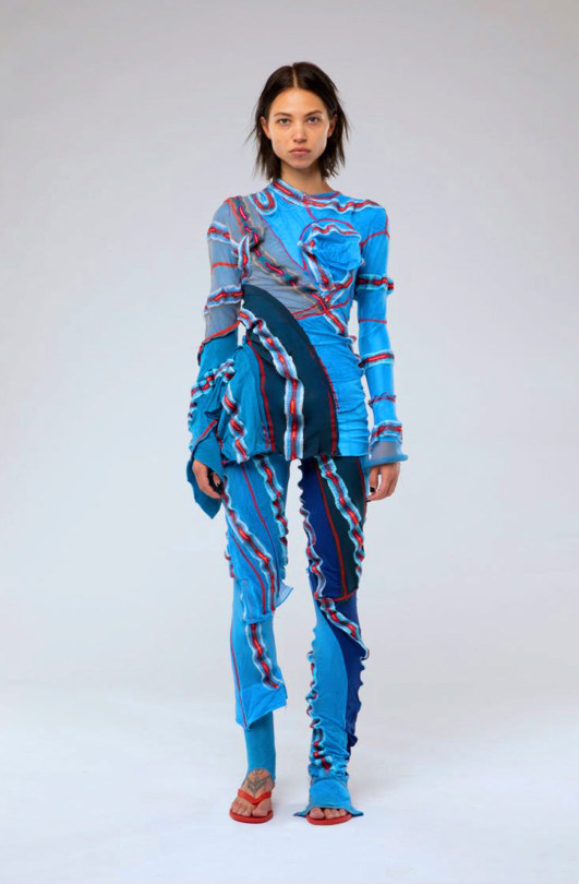
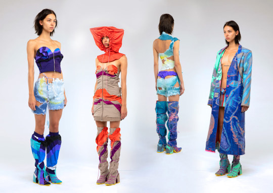
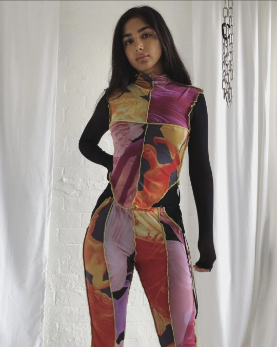
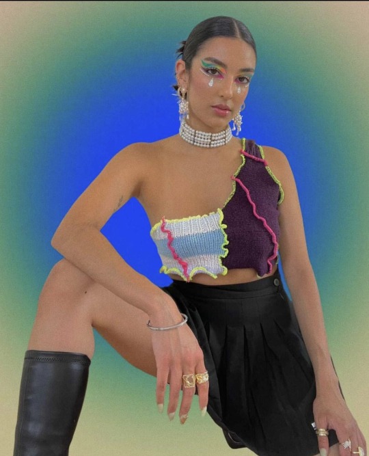
The trend I have chosen under the ‘Euphoric’ category was ‘Repurposed Rave’. Ukranian and Central Saint Martins graduate, Masha Popova is the key designer in this trend; developing textile techniques from traditional smocking which has allowed her to experiment with silhouettes and shapes without having to use conventional pattern cutting.The garment creates a ‘fabric memory’ as it moulds and shapes itself on the body. In her work, she often recreates familiar garments using unexpected techniques and is committed to “making boring things cool”. Interested in craft techniques and pieces made by artisans she cites that Borys Mikhailov’s photography, and artists Pipilotti Rist and Marlene Dumas are also inspirations. She states “I was fascinated by how badly-fitting clothes, which have associations with hand-me-downs and second-hand wares, could be turned into something luxurious when recreated with craft techniques.”
Images found and taken from: https://metalmagazine.eu/en/post/interview/masha-popova
Instagram: @mashapopovap
JJ vintage is another sustainable designer prevalent in this trend. She upcycles activewear for her designs. Her instagram bio cites ‘Recycle, Reuse, Repurpose’
Instagram: @jjvintage__
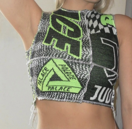
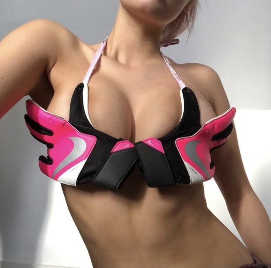
Instagram and depot are great source for finding sustainable wear and designers. Many of them use the same patchwork design and incorporate the tie dye marbled effect that is reemerging in popularity or up cycling streetwear/active focusing on brands like Nike.

Instagram: @jadore.vibes
Looking through instagram I also found a brand called ‘Auné’. Their garments are made handmade to order and so are perfect for supporting the fashion on demand theory.
Instagram: @aunecollections
Uk company Matacomplex is another made to order, slow fashion brand promoting ‘becoming more and more sustainable’. A lot if not all of of their designs have a torn and loose thread effect and pops of neon colours.
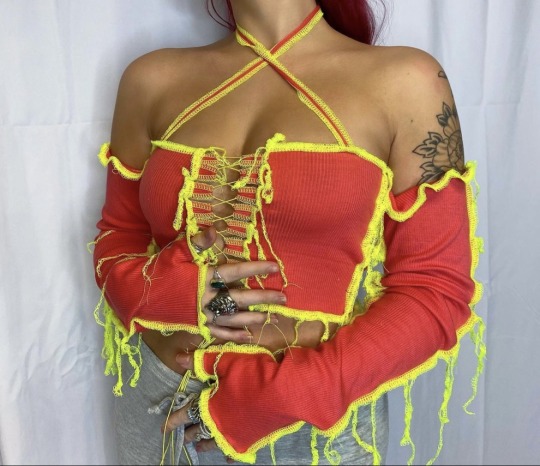
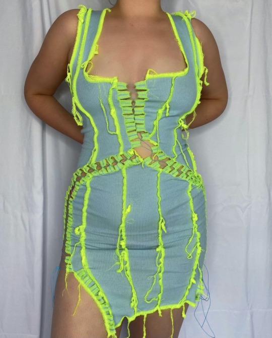
Instagram: @matacomplex
‘Challenging waste culture’ designer Rua Carlota experimenting with up cycling knitwear and ties- creating patchwork and weave-like designs.
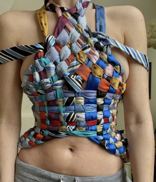

Instagram: @ruacarlota
Often playing about with branded Nike or PALACE new graduate and designer Lois Saunders (1xBLUE) revives football scarves beyond their former glory; drawing parallels from tapestry. Sifting through eBay and her local charity shops Lois has discovered a range of recyclable material.
Having ‘always been aware of how problematic fast fashion can be Lois’ veiw points on sustainability stands as this “Trying to be as sustainable as possible is something I want to continue within my brand. Reusing old footie scarves also gives my label a nostalgic theme, which is a bonus for me as it promotes sustainability.”

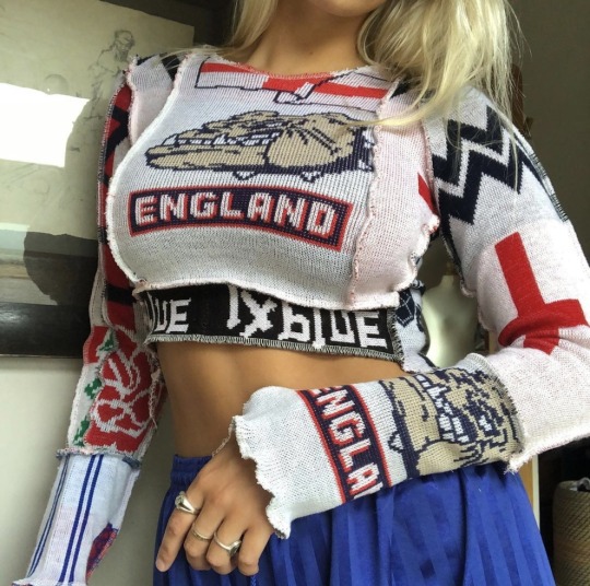
Instagram: @lois1xblue
3 notes
·
View notes


Text
21)FINAL TREND

I decided to use the ‘Repurposed Rave’ trend board from the SS/22 ‘Euphoric’ Womenswear forecast to explore in my final look book. I chose this trend because I was drawn to the concept of festival dressing. I also liked how easy it was to find supporting sustainable designers that I could incorporate into my look book. ‘Repurposed Rave’ allows me to explore with different textures and abstract designs which I like; creating a dynamic look to my overall outcome.
1 note
·
View note
Text
20)LEAFLET


For my leaflet I decided to base it around the ‘Digital Underground’ trend board from the Connected forecast targeted Menswear. I chose this because it drew a lot of similarities to previous mood boards I have done, so it was easier for me to come up with ideas. I decided to use my last mood board I created for this trend as I pleased with the outcome and thought it created an interesting double page spread. This board is a nod towards 90′s and the early 2000′s underground raves. WGSN insists on sticking to darks and neutrals for base colours and allow vibrant digital brights to illuminate the look. To highlight this, I opted for a black background colour. At first I wanted to create a poster look and initially decided to use a paper creased background to create this effect-however, this looks was left unnoticed when adding in my chosen images. When creating my front cover I wanted something that encapsulates an underground rave. I opted for a blurred image of a crowd of people at a rave to create a dynamic effect and to set the scene. However, I needed to add another image in front of this as it was lacking a direct focus. I then found an image where the face is completely hidden. I thought this image would be good to use as its simple and it thought it fitted the page quite nicely. For the title I chose to go with the original ‘Digital Underground’ and decided to use the font ‘Krungthrep’ as it was simple and was easy to read. I think it also reflected the concept really well.
For the double page spread I chose to use the ‘Silom’ font as I thought it looked the best style wise. I decided to use bright colours for my font this time around as I wanted to incorporate the colours accented within this trend and to also make it more bold and eye catching. I like the contrast between the between the background and font choices.
For the back page I wanted to bring in the colour palette. I chose to use the same rave background as I did on the front cover to bring a level of consistency to the overall look. I then found the main image on instagram by artist Johanna jaskowska who created futuristic and digital age inspired designs. I thought this image was perfect as it matched the colour palette. I then wanted to highlight the most prominent colours used throughout this bored and so I used the rectangle tool to create blocks of colour. I then layered these behind the main image creating a 3-D effect.
Overall, I am genuinely pleased with how my leaflet turned out. I feel as though I communicated the trend well and kept the concept consistent throughout. I do however wish that I explored more with different fonts or used different effects like the outer glow effect on indesign.
1 note
·
View note
Text
19)Typography

Key points:
Tracking uniformly adjusts the spacing between each letter
Kerning individually adjusts the space between each letter
Leading or Line spacing adds more space between the lines of a paragraph; It plays an important role in the readability of text.
A widow is a short line or single word at the end of a paragraph
An orphan is a short line or single word at the beginning of a paragraph.
“Type is a visual voice. Without reading, it imparts its message”- Laura Worthington
Typography includes the layout, spacing, sizes, hierarchy, colour and integration across a wide variety of mediums. Typography is important in branding as it communicates to the audience the personality of the brand. It has a strong effect on the way that viewers digest and perceive the information conveyed via text and helps build and create recognition.
It is important when choosing the type of font you are using to consider your target audience and ensure that you are communicating to the right demographic. For example; The gothic font ‘Fleisch Wolf’ is currently very popular in streetwear and the music industry. It is predominantly targeted towards the male demographic aged 15- 25 years old. Contrastingly, ‘Agnes’ is targeted towards females aged 25-40 and is portrayed as more elegant and traditional in comparison.

Not all fonts are considered equal. Comic Sans, Bradley Hand and Papyrus are considered the least appealing of the fonts.

‘Blanding’

‘Less is more’
Blanding is a term that is used to describe moving away from decorated typefaces, complex colour schemes, and intricate shapes and moving towards a more simplified, refined and sleek look.
When you make something simpler and more straightforward, you often make it much more effective. With everyone moving towards a technology advanced society; It is important to make sure your brand is readable on digital platforms.
“Blanding” is the antithesis of branding. It’s the process of creating generic brand identities that follow repetitive trends in the name of modernity, but at the expense of authenticity and differentiation.”
I personally, don't mind ‘blanding’ however I do agree that it takes away a part of the brands identity.
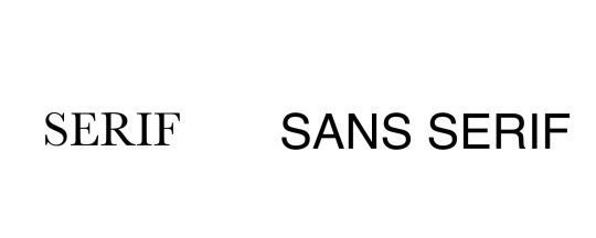
When looking at more traditional mediums such as newspapers, magazines, books etc ‘Serif’ fonts are used and typically seen as more classic and refined. This type of font is used by companies who want to exude these traits; making it a good fit for companies who want to appear more reputable, established, and serious.

However, ‘Sans serif’ takes the opposite approach and embraces and portrays a more modern and simple feel. It establishes the feeling of being casual, friendly, and approachable. Companies who want their brands to appear more youthful and relatable tend to use sans serif fonts.

When adding text to our look book it is vitally important to choose fonts that link to the trends we are exploring.
1 note
·
View note
Text
18)MOODBOARD 3 CONNECTED- ‘Digital Undeground’

For my third mood board I decided to base it on the ‘Digital Underground’ under the Menswear forecast for ‘Connected’. For this mood board I decided to experiment with the aesthetics. I went for a poster/collage effect with this board because I wanted to further explore with placement and utilise the tools within photoshop.
For this, I started with collecting images that really communicate the original trends concept ideas. This trend is focused on sticking to darks and neutrals for base colours; allowing vibrant digital like graphics to illuminate the look. Because of this, I decided that an all black background would fit best with the images I had chosen. I then experimented with the layout of these images; layering them on top of each other to create that collage effect and experimenting with the opacity levels. To further construct this, I then found an image on google of cello-tape which I then imported into photo shop. I then used the rectangular marquee tool to select around it and removed the background. After that, I selected the ‘lighten’ option within the layers board which in turn made the look more realistic. Resizing and duplicating the layer I then started to place the cello tape around the corners and sides of the images. I really liked how this turned out and may incorporate this into my final look book.
1 note
·
View note
Text
17)MOODBOARD 2-Connected-Menswear graphics and textiles forecast.

My second mood board is based on the Menswear graphics and textiles forecast from the ‘Connected’ trend board. This forecast is heavily reliant on colour and abstract designs/graphics. I chose this forecast because I thought it would be interesting to to experiment with the colours and patterns relevant to this trend. I’m not all too familiar with Menswear, so I thought it’d be interesting to look into.
I started this mood board off by collecting abstract images which reflect the trends overall aesthetic. Once I had those images I then experimented with different compositions. I overlapped some of them on top of each other and use the magnetic lasso tool to cut around them and experiment with layering and placement. I then chose designers based on WGSN’s recommendation on who to look out for and keep in mind. I then started experimenting with the composition of the models. Initially, I hadn't introduced a thorough colour palette and opted to use the orange as a background. However, I decided to change this slightly. I started off my using the rectangular marquee tool to cut out certain parts of the image (on the right) to create an interesting look. I then decided to use the eye dropper tool to ensure the colours were as close as possible to the colours used in the images- drawing elongated rectangles and filling them in with colour. I then placed them perfectly within the gaps I created earlier which I like the look of.
1 note
·
View note
Text
16)MOODBOARD 1-Euphoric-Repurposed Rave

For my first mood board, I chose to base it around the Womenswear ‘Euphoric’ trend ‘Repurposed Rave’. I chose this trend because I was immediately captured by the vibrant colours and unique patterns and designs.
To start this mood board off, I went through the original trend board that WGSN created and scrolled through the archive of photos linked to this trend. I discovered that Masha Popova is a designer to look out for when considering the style and concept of my mood board. I specifically chose to use Masha’s designs because not only are her designs relevant to this trend, but they are also unique and rich with vibrant colours and lucid designs; which is the reason why I chose to use an all black background as it truly makes the colours pop in comparison to a white background. I chose the first image (women on the left) to start off with, I then used the magnetic lasso tool to cut and remove the background. I specifically chose to do this because I liked the formations and shapes of their poses. To incorporate a colour palette I then chose to use the triangle tool placed behind those models which I thought created a sleek and unique composition. I decided to use the triangle shape as I felt that the regular ellipse tool and rectangular tool where to bland when considering shapes and formations. I then added the women shown on the right. As before, I used the magnetic lasso tool around each of them individually to remove the background as I wanted the colours and patterns to stand out as they are the main focus for this specific trend. I then searched for tie dyed fabrics to create a fabric forecast. I chose to use the classic ellipse tool this time to cut around the fabric selections. I wasn’t entirely sure on where I wanted to place them and decided that the top left corner, above the pyramids of colour.
I am quite proud of this mood board as I feel like I was able to keep the colour story consistent throughout and experimented and explored with new compositions and tools.
1 note
·
View note
Text
15)Introduction to photoshop -Photoshop Practice

To practice with photoshop, I chose images based around the 1960′s Mod trend as I wanted to explore with colour and vintage aesthetics.
I started by searching for images of 60′s model Twiggy; as I feel she was the face of the 60′s mod trend and it would really help communicate the decade and subculture I was trying to convey.
I then started to search for images that represents the 60′s time period; I collected images of old mini-vans and records. I decided to use an image of the Beatles as the background as I liked the vintage style and the pops of colour added into it. I’m undecided on whether or not the background makes the overall look of the moodboard ‘too busy’.
Considering I knew nothing about how photoshop worked previously before this, I am happy with the outcome and can use this as a means to figure out what works and what doesn't when creating a moodboard.
2 notes
·
View notes
Text
14)Sabine Lettmann’s Lecture- Circular Fashion Design
She In one of lectures, Sabine Lettmann gave an interesting and informative presentation. Sabine spoke with us about the topic of ‘circular fashion design’. She introduced us to the fact that currently, the majority of businesses within the fashion industry are based on linear economy which follows the principle of TAKE-MAKE-WASTE. This has a major impact on people and the planet.
She stated that whilst this exists; garments are still able to be produced in a more ethical way by using better materials with less environmental impact, improving the ethical side of production chains, producing less or applying zero waste techniques and shortening shipping distances.
We were made aware of the fact that the average of 75% of the garments we own go to landfill after use, some even without being worn once and only about 1% of discarded textiles are currently being recycled. She touched on the fact that in countries where textiles are dyed, rivers change their colour in relation to next season‘s trends, which was pretty shocking to learn.

Guangdong factory waste dyes river red
Image found and taken from: http://www.chinahush.com/2014/05/13/guangdong-factory-waste-dyes-river-red-blue/
It was further explained that each year we take more natural resources than the Earth can regenerate and amongst other uses we spend these finite resources to develop, produce and distribute millions of new garments and since then the industry has still produced a copious amount on top of this without considering resource availability.

Image found and taken from:
https://www.fashionrevolution.org/usa-blog/7-fashion-brands-that-are-designing-out-waste/
She mentions 5 key steps and ways that the fashion industry can become more environmentally conscious.
RECYCLED MATERIALS- Recycling materials can be a good way to avoid the use of new resources. The materials do not have to come from fashion alone, but can be supplied by other sources and industries.
LEFTOVERS- Re-using fabric waste can be a great way to avoid leftovers and financial loss. There are lots of ways to create new designs using existing material.
ZERO WASTE- Zero Waste Design requires a fluent development of patterns and design. The aim is to create shapes and fits which are aesthetically appealing without causing material waste.
3D SIMULATION- Using virtual, animated prototypes instead of actually made garments reduces waste, costs and helps us to communicate better and faster with production companies.
LEASE- Various companies like Swedish brand FilippaK work with additional in house leasing systems.
Consumers are the ones that can influence fashions waste problem by extending the use of a garment resources are saved. By extending garment usage by just 3 months leads to a 5-10% reduction of its carbon, water and waste footprint.It is therefore the designers job to make garments as attractive as possible so consumers value them for a longer period of time.
However, this is still not enough. We need to take a more holistic approach to becoming a more sustainable industry. one way we can do this is to move away from a linear model and using a closed loop system based on the circular economy.
The three main goals of closed loop systems in terms of a circular economy are to:
Design out waste and pollutionKeep products and materials in useRegenerate natural systems.

‘Circular economy’ is the idea of developing products which can be returned into either biological or technical processes at the highest value possible on a time scale that‘s relevant for people. This concept is based on the principle of Cradle to Cradle, taking nature as its role model. The biggest benefits we get from doing this is the minimised use of resources, less waste production and has the potential to create a healthy, longterm economy.
She went on to explain that circular design is based on these 6 strategies: Smart material choices, modularity, product life extension, product as a service, closed loop/take back and embedding intelligence. For example, smart materials can be developed through either bio-design-Which is described as being both opportunistic and logical in realising the potential utility of organisms and their natural interaction with ever-changing ecosystems - and also through the use of biomimicry- which is an approach to innovation that seeks sustainable solutions.
Amongst other mainstays of a closed loop system; an ideal implementation of circular design does not simply reduce the amount of waste. If waste is only used to create products only a few people benefit from, we will continue to source from finite resources to fulfil everybody's needs. Waste usage must therefore be spread across multiple products to ensure value for a broader society.
However, with every innovation there is always a risk to create something harmful. One of the examples that Sabine showed to us was about shoe soles. Shoe soles that are created from car tyres constantly release up to 200 chemicals which have been used in tyre production. The micro particles from this then contaminate nature through the way the new product is used. Tyres release the same chemicals, but only in a limited environment.
We learn that no matter how a material is integrated into closed loop; a harmful material will stay a harmful material. Reflecting design impact avoids causing more pollution.
Drawing a close to the lecture, Sabine added that her approach as a fashion designer has always been to focus on sustainability. Her collections are created using good materials, small quantities, local production ,integration of social institutions and workshops.

I really enjoyed this presentation. I thought Sabine was very thorough in describing the different strategies that can be used to take a more sustainable future and gave me more understanding of what circular fashion.
1 note
·
View note