
tintandbristles
Tint & Bristles
You found the perfect piece. All it needs is the perfect color.
214 posts
Don't wanna be here? Send us removal request.
Last Seen Blogs

exprsss
EXPRSS


burhanmirza
Sang Pengembara

yilingexoclan
The Yiling Patriarch's Disciple

malgok
classic
Photo
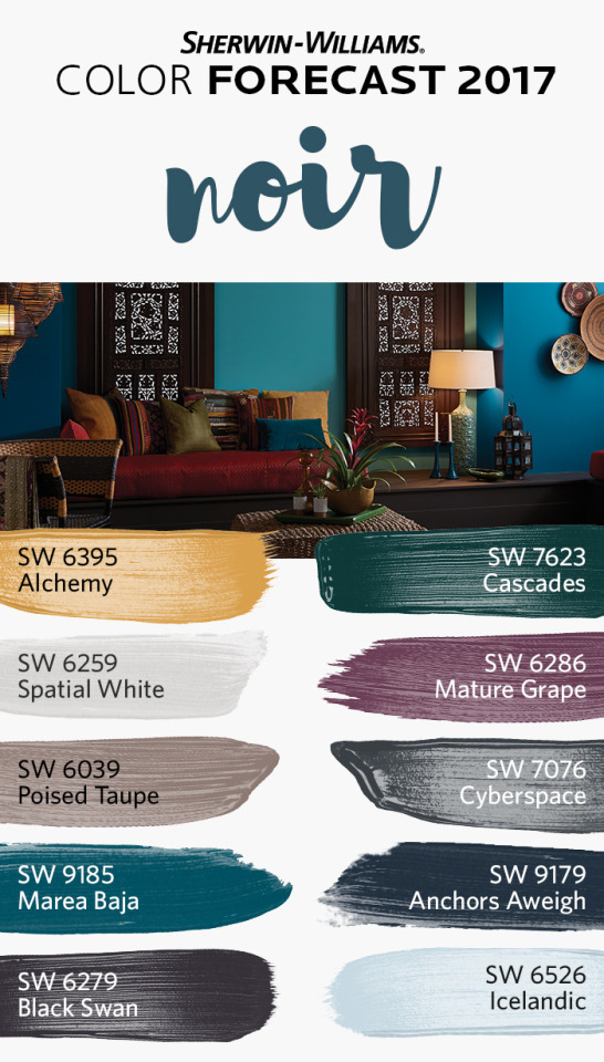
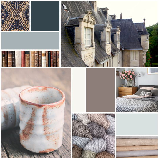
Make way for a new romanticism marked by medieval patterns, revived customs and bittersweet beauty. Dark and sensuous, the noir palette overflows with vine-ripe fruits, Nordic blues, moody neutrals and golden yellows. Find your perfect color expression with one of the four palettes from Sherwin-Williams Color Forecast 2017. http://bit.ly/2fFNAsQ
#sherwin-williams#sherwin williams#sherwinwilliams#color inspiration#color palette#home decor#home design#interior design#interior decorating#interior decor#interior decor inspiration
9 notes
·
View notes
Photo
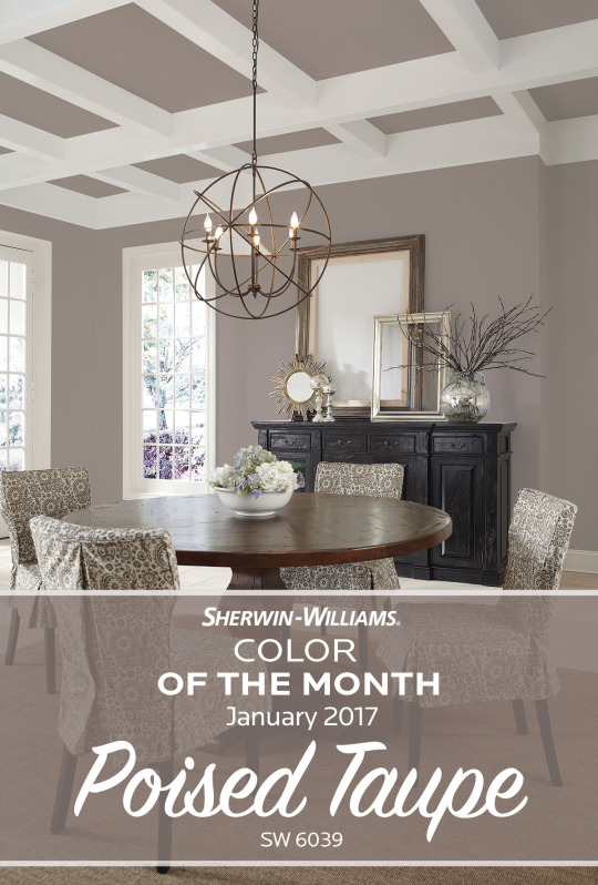
Poised: adj. Having an elegant and graceful bearing. Yep, that’s exactly how we’d describe Sherwin-Williams Color of the Month for January 2017, Poised Taupe SW 6039. It’s a versatile neutral that brings instant charm to any room.
#Sherwin-Williams#sherwin williams#sherwinwilliams#color of the month#poised taupe#SW 6039#january#2017#taupe#color of the year#neutral#color inspiration#interior design#home decor#home inspiration#color inspo
5 notes
·
View notes
Photo
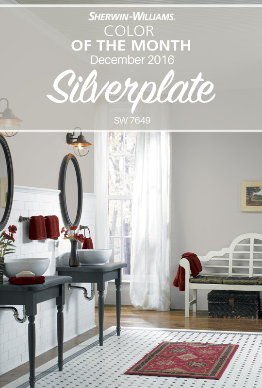
Somewhere between gray and silver, subtle Silverplate SW 7649 is the perfect addition to a soft, monochromatic scheme of cool neutrals. Craft a sophisticated, yet comfortable look in your home with a touch of Silverplate.
#Sherwin-Williams#Sherwin Williams#sherwinwilliams#color of the month#silverplate#SW 7649#december#gray#silver#monochromatic#cool neutral#neutral#winter#color inspiration#interior design#home decor#home inspiration#color inspo
6 notes
·
View notes
Photo
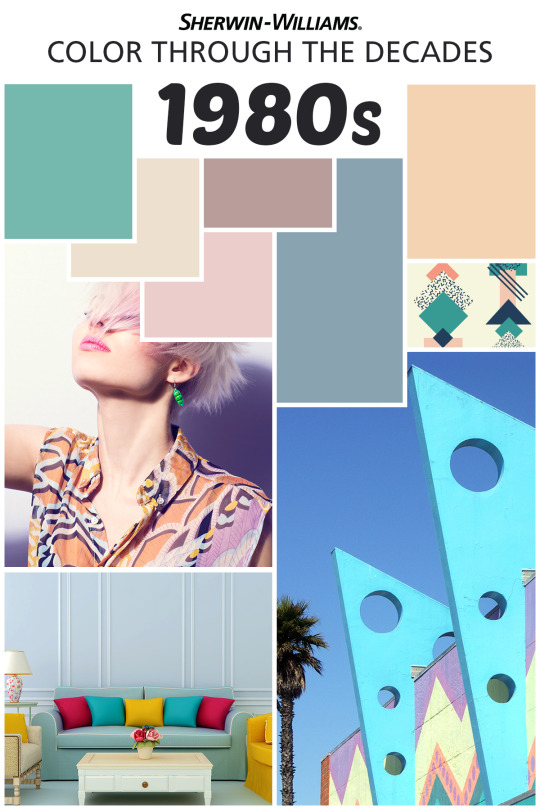
Mauve is in full swing this decade with coordinating baby blues and grays. Taking cues from “Miami Vice,” the mid ‘80’s bring pastels to the forefront of home decor and design. From simple palettes to flashy patterns, the 1980’s celebrate the lighter, brighter side of color.
#Sherwin-Williams#Sherwin Williams#1980s#1980#80s#color inspiration#color palette#color#home decor#home design#interior design#home ideas#baby blue#gray#pastel#pattern#mauve#bright
7 notes
·
View notes
Photo
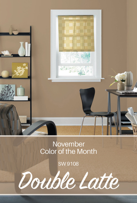
As autumn gives way to snowy winter, our Color of the Month, Double Latte SW 9108, is perfect for creating a sense of warmth in your home. Enjoy the first snow from the coziness of a casual family room or den done in Double Latte.
#Sherwin-Williams#Sherwin Williams#SherwinWilliams#color of the month#double latte#SW 9108#latte#november#warm and cozy#winter#color inspiration#interior design#home decor#home inspiration
2 notes
·
View notes
Photo
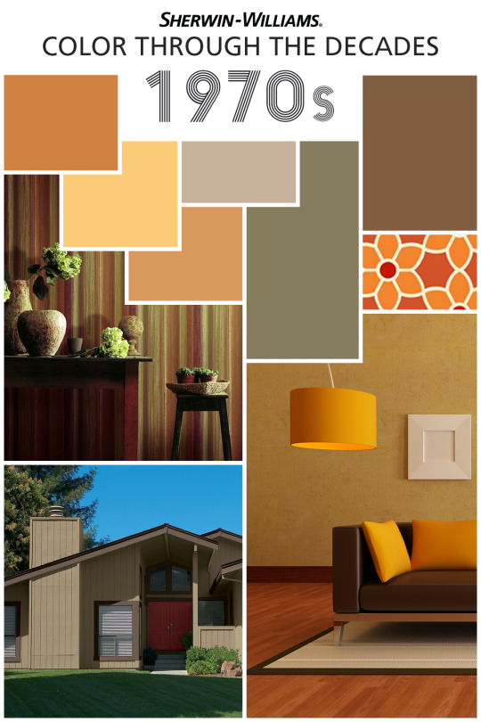
Cozy up with the earth tones of the 1970s. From cool avocado and bold mustard yellow to warm harvest gold and subtle beige, the colors of the disco era play well together in patterns and solids alike. Bring the warmth and down-to-earth feel of the ’70s into your home with paint colors like Bakelite Gold SW 6368, Practical Beige SW 6100, Amber Wave SW 6657 and Avocado SW 2861.
#Sherwin-Williams#sherwin williams#sherwinwilliams#1970s#70s#disco era#disco#gold#beige#color inspiration#color palette#home decor#home design#interior design#earth tones
2 notes
·
View notes
Photo
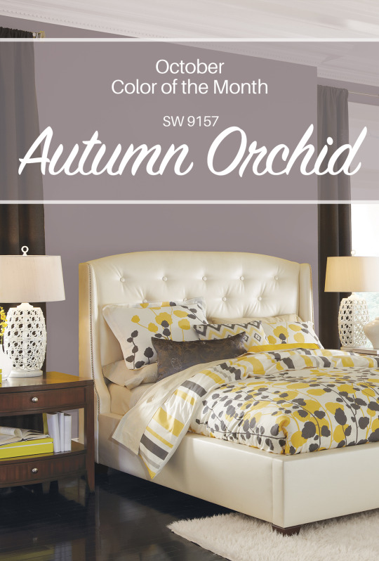
Subtle shades of autumn come alive in our Color of the Month, Autumn Orchid SW 9157. Viewed here in a palette that includes yellows and creams as well as grays and dark browns, this rich hue shows off its beauty and versatility.
#sherwin-williams#sherwin williams#sherwinwilliams#color of the month#autumn orchid#SW 9157#autumn#october#color inspiration#interior design#home decor
6 notes
·
View notes
Photo
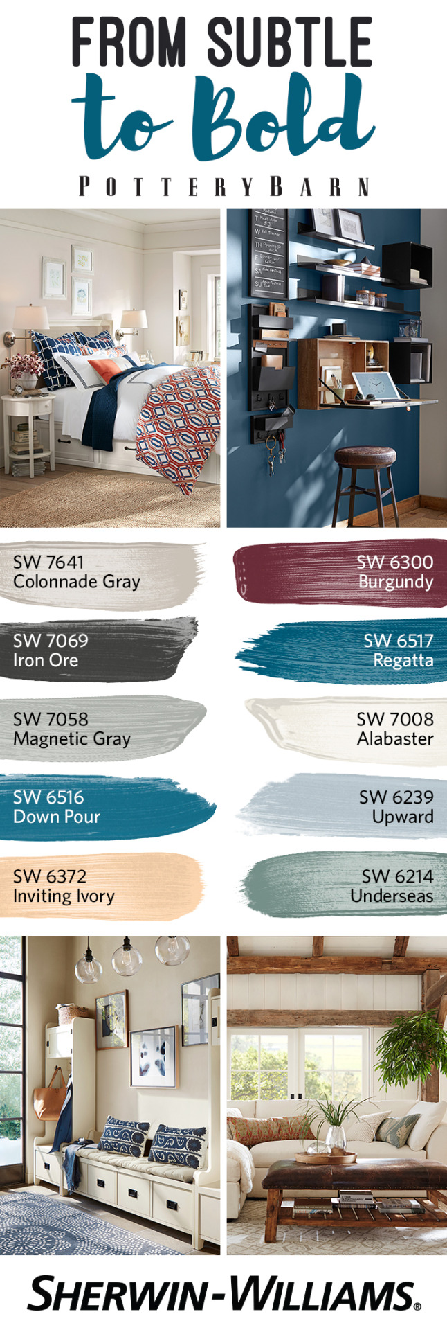
When you explore the Pottery Barn Fall/Winter 2016 Palette, you’ll discover stunning combinations of color. From subtle tones like Magnetic Gray 7058 and Inviting Ivory SW 6372 to bold expressions like Regatta SW 6517 and Burgundy SW 6300, this seasonal palette of paint colors coordinates effortlessly with all your favorite furnishings and decor from Pottery Barn.
#Sherwin-Williams#Sherwin Williams#SherwinWilliams#pottery barn#color palette#color inspiration#gray#ivory#fall#winter#home decor#interior design
6 notes
·
View notes
Video
Is your outdoor decor missing that certain splash of style? Turn small efforts into big results and take your shutters as bold as you dare with this simple tutorial.
Fountain SW 6787
#Sherwin-Williams#Sherwin Williams#SherwinWilliams#shutters#diy#project#diy ideas#outdoor decor#blue#diy projects
2 notes
·
View notes
Photo
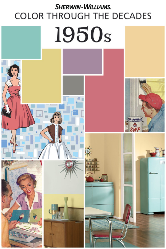
From the Victorian era to present day, we’re taking a look at color through the decades to celebrate 150 years of Sherwin-Williams. In the exuberant post-war boom of the 1950s, color inspiration sprouted from a mix of styles, including mid-century modern and Scandinavian. Soft pastels like lilac and chartreuse reigned throughout the home, while pink and turquoise appliances appeared in the kitchen and laundry. Looking to bring a little of that retro ‘50s vibe into your home today? Try Chartreuse SW 0073, Radiant Lilac SW 0074, Holiday Turquoise SW 0075 and Sunbeam Yellow SW 0078.
#sherwin-williams#sherwin williams#sherwinwilliams#victorian era#1950s#50s#lilac#chartreuse#turquoise#yellow#modern#color inspiration#color palette#home decor#interior design
9 notes
·
View notes
Photo

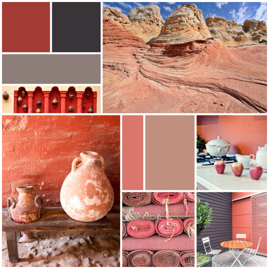
The weather may be cooling down now, but our Color of the Month is a bright reminder of warmer climates. Ravishing Coral SW 6612 brings together tropical notes of orange and floral pink to create a well-balanced color that can add vivacity to your whole home.
#Sherwin-Williams#Sherwin Williams#SherwinWilliams#color of the month#Ravishing Coral#SW 6612#pink#color#color inspiration#home decor#interior design#tropical
2 notes
·
View notes
Photo
Effortlessly balancing warm and cool tones, Poised Taupe SW 6039 is a timeless and versatile neutral. No wonder we chose it as our 2017 Color of the Year.
#Sherwin-Williams#Sherwin Williams#SherwinWilliams#Color of the Year#poised taupe#SW 6039#2017#neautral#home decor#interior design#color inspiration
5 notes
·
View notes
Photo
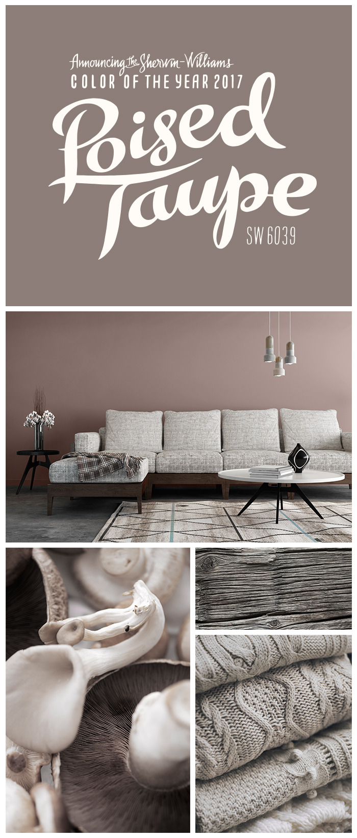
We’re thrilled about our 2017 Color of the Year: Poised Taupe SW 6039. This timeless neutral strikes an effortless balance between warm brown and cool gray, providing a space where both modern and classic palettes can coordinate to stunning effect. Discover endless inspiration with Poised Taupe 2017.
#sherwin-williams#sherwin williams#sherwinwilliams#color of the year#poised taupe#SW 6039#taupe#modern#classic#color inspiration#home design#home decor
6 notes
·
View notes
Photo

We don’t usually play color favorites, but we can’t resist when it comes to our 2017 Color of the Year. Say hello to Poised Taupe SW 6039!
#Sherwin-Williams#Sherwin Williams#SherwinWilliams#Color of the Year#Poised Taupe#SW 6039#taupe#color inspiration#home decor#interior design
6 notes
·
View notes
Photo
At the intersection of earthen brown and conservative gray, our 2017 Color of the Year, Poised Taupe SW 6039, beautifully balances warm and cool tones.
#Sherwin-Williams#Sherwin Williams#SherwinWilliams#Color of the Year#Poised Taupe#SW 6039#color inspiration
3 notes
·
View notes
Video
We don’t rush to play favorites with paint colors, but each year, one stands out as a defining the proverbial palette. Balanced somewhere between the subtle browns and grays of nature, you’ll find our 2017 Color of the Year. It’s where modern meets classic, where cool meets warm, and where inspiration meets your paint brush.
2 notes
·
View notes
Photo
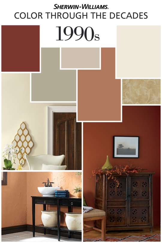
Our 150th Anniversary color palette celebration has brought us to the final decade of the 20th century. Bye-bye ’80s pomp and pastel. In the 1990s, the increasingly popular rustic, sun-baked, Tuscan look ushered in earthier tones. Beige, gold, terra cotta, putty, sage and reds were all popularized on the West Coast first, then eventually made their way to the Southwest, South and Midwest. Looking to add some ’90s flair to your family home? Try Bungalow Beige SW 7511, Dover White SW 6385, Urban putty SW 7532, Svelte Sage SW 6164, Basket Beige SW 6143, Whole Wheat SW 6121, Fireweed SW 6328 or Spiced Cider SW 7702.
#Sherwin-Williams#Sherwin Williams#SherwinWilliams#150th Anniversary#anniversary#1990s#90s#rustic#beige#gold#terra cotta#putty#sage#red#color#color inspiration#color palette
4 notes
·
View notes