theartofharrymawford-blog
The Art of HarryMawford
30 posts
Don't wanna be here? Send us removal request.
Last Seen Blogs
lunarsilkscreen
Untitled

musicalimaginings
this is the life i live

milksuu
@milksuu / AO3

twelveten
012010
imavampirebutitsok
I am a vampire, but it’s Ok…
Text
Harvard Referencing
https://pencils.com/it-all-starts-with-a-mark/
German Expressionism Sources: Banham, M., (Ed.) The Cambridge Guide to Theatre Brockett, O., History of the Theatre Brockett, O., The Essential Theatre Burton, B., Living Drama 4E Crawford, J. L., Acting in Person and in Style McNamara, M., Tourelle, L., Performance: A Practical Approach to Drama Mobley, J., NTC’s Dictionary of Theatre and Drama Terms Styan, J.L., Modern Drama in Theory and Practice 3: Expressionism and Epic Theatre Wickham, G., A History of the Theatre
0 notes
Text
What is Mark Making and How Does it Affect My Concepts? Through my Journal & sketchbook.
MARK-MAKING ITSELF...
Mark making is a term used to describe the different lines, patterns, and textures in which I create in a piece of art. It applies to any art material on any surface, not only paint on canvas or pencil on paper. A dot made with a pencil, a line created with a pen, a swirl painted with a brush, these are all types of mark making.
Mark making can be loose and gestural, or structured and controlled such as hatching. These types of marks can be seen throughout my journal of observational sketchpad which has been my right hand man since I started the project. Most artists work with a variety of marks in every painting, but there are some styles, such as Pointillism, where just one type of mark is used.
Below are the building blocks in which has helped me throughout my journal when on location. At time it can be overwhelming by the amount of movement & structure of getting the visual element down on paper. These simple steps has visually helped when on location.
A single mark creates a dot.
An extended mark becomes a line.
A cluster of marks become a shape.
A series of repetitive marks become a pattern.
Marks can also be splashes and drips as seen in Anna Ra work or they can be scratches in a potter's glaze.
Abstract, realist, impressionist, and every other style of artist uses marks. Confidence in drawing depends on careful observation. Carrying a pocket size sketchbook journal purely the use for sketches which captures my eye with every chance I get. Taking every oppportunity to sketch people - in cafes, on public transport, in or around cityscape or balance the two with elements of building forms, and perspective built up building whether it is modern or traditional approach. Sketching them frequently, I have a gradually built up to store of visual information about physical shapes, body language and facial expressions in variety of situations will depend on what Marks I will intend to use. Translating this information from my eye to hand paper becomes easier the more I practice.
0 notes
Photo
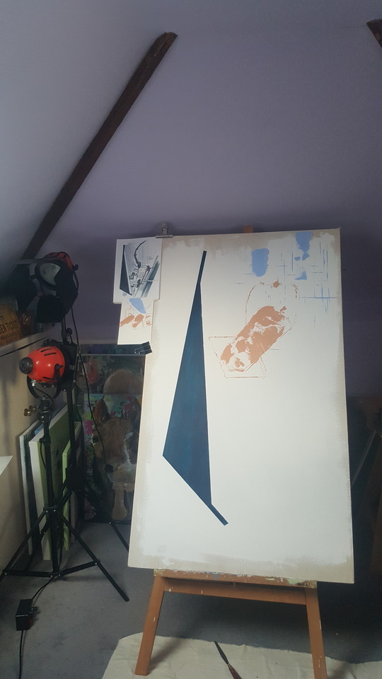
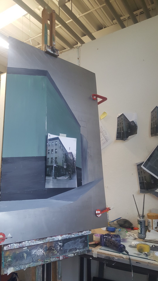
Being influenced by the theatre that is somewhat a part of me & who I am an artist. Talking to my peers such as my tutor Mike has able me to allow me to add a theatre based piece into my project.
Using scale as a key part in this piece I want to be able to create an relatable piece towards my cityscapes, i feel that Big Geometric shapes will give weight and balance to the concept. This visual piece will relate back into what i have researched such as German Expressionism - A fascinating, but short-lived theatrical style in Germany in the early 1900s, Expressionism was inspired by works in literature and the visual arts such as Edvard Munch's painting The Scream. Initially a rebellion against Realism and Naturalism in the theatre, Expressionism's impact will have an intense feeling.
Relating back into my cityscapes of New York I will add that pale soft pastel Mood with flat colours without the build up of thick intense colours. Even though I wanted to explore further into my colour range (colour theory) which states in my Brief I feel that this would not work and would not balance the concept in which I am symbolising.
The process so far.
First intension was what I could do make this piece relatable in the theatrical world, From experience And applying my theatre scenic elements which I get commissioned on throughout the year, I started by using canvas as its got a organic texture when applying paint. Sticking to my quick mark-making elements I use the prime as a rough guide and not painting all the board (canvas) as like the Metal cityscapes I left the bare metal in some places on my concept this giving a foreground of harmonious approach.
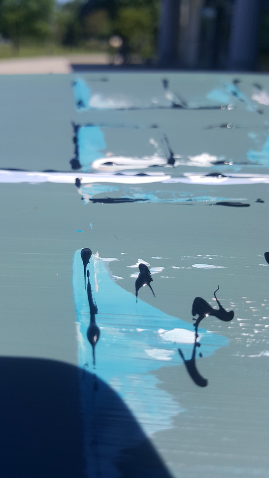
Unsuccessful elements.
Though i started taking two experimental images in which has that theatre vibe and apply a selective part of them and joining them together I which I ended up not liking the result I feel this doesn't add a harmony approach and looks messy by what i mean is that the blue Geometric shape in the shade of deep blue looks out of place from the rest of the concept. In a result I have now changed and using the book ‘Weston Motel’ using the elements of design which has influenced my work in which using less space has a better Mood and emotion also allows the communication between art piece and theatrical vibe.
0 notes
Photo


Finest touches
Using glass paint, via previous project I did earlier in the year I used glass paint on A3 watercolour paper to create an album cover from the Music Artist ’Benjamin Clementine - quiver a little’ to bring this mark-makng back into my final pieces had lead me into bring a different element we don’t normally see on artwork.
Therefore Creates the illusion of a 3D piece of art along side balancing the flat colour and built up layer with the acrylics to create mood, & composition which I have really enjoyed the process.
Being selective throughout there pieces to create space mood and depth picking out what would look best when the viewers when looking at my work - I did not want to create a piece by using the same method of copying from a busy image. selecting what I need such as he perspective of the buildings & tonal areas was enough to create a built up modern piece of Artwork almost leading in to the contemporary element of design thoughout my works.
Overall giving a professional approach to my work & Giving detail.
0 notes
Photo
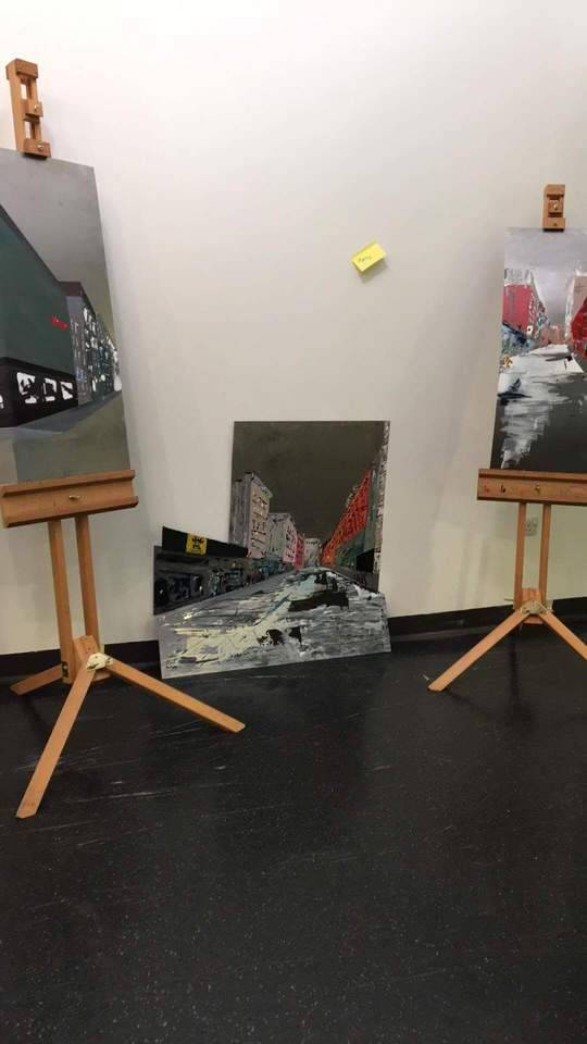
Placing my final pieces working out where abouts they could create great composition while hanging on the wall. to showcase my work.
0 notes
Photo

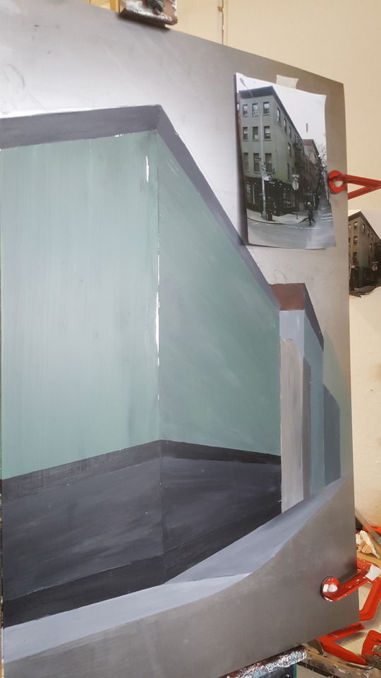
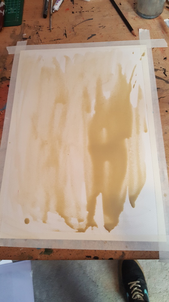
FMP Update Expanding with the colours I'm using. flat colours of green greys & soft browns to creates a warm mood with my brushworks - once again adding lighter tones (white, sky blues) with layers of Acrylic paint with only using the pallet knife to create a range of tonal marks.
0 notes
Photo

layering up with thick acrylic paint to give the impression of built up textures - Adding effects & relating into the Artist I have study over the course of this project, the pale flat blocked colours (pinky reds) separates the images nicely.
0 notes


Photo
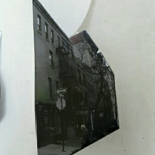
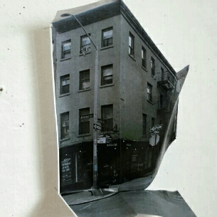
New york Street of final outcome via looking at my other experimental piece I feel that I had to create something more appealing to the key that captures a unique focal point in this street seen I used the front facing building to create this depth dramatic effect by cutting and folding the image. This piece will able me to look back in where I need to fold the metal once all the paint and scaled up on metal. this will give me the best way to an able a successful final outcome
0 notes
Photo

Final Image - final piece small scale • Exploring different key perspective points on 1:50 scale size •These two we're my unsuccessful experimental piece I quickly come up with before I take to the real Final piece of limited metal surface. These were not up to standard as they don't give that 'wow factor' when you are looking from different angles. As a result of these I will create a new piece to try make it more simple & effect to the key - possible thinking about the theater.
0 notes


Photo
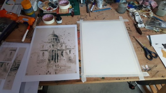
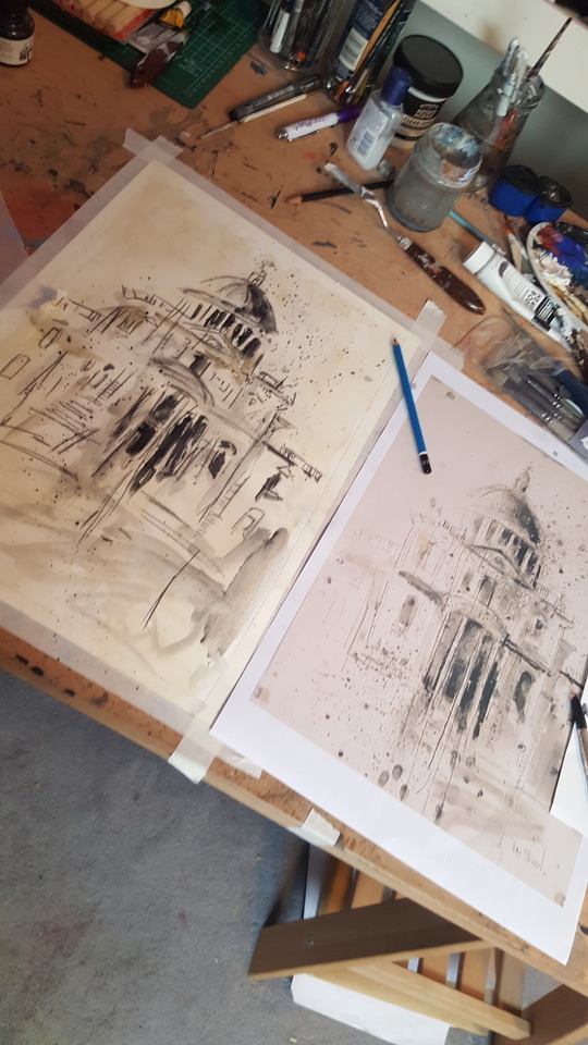
Tom Steward - Artist study - A quick 10 minute observational sketch from one of Tom Stewards. Not thinking too much about his brushstrokes but more on how he perceives his work thinking about colour composition / for when I go on location to Oxford. Materials Using the materials I already had previously from other observational sketches and paintings. For this I used:- -Acrylic paint -Black Ink mixed with water -charcoal where this can lead? I feel that once I get the experience from the Oxford trip I will be able to get a feel for the atmosphere of how the Artist uses the cityscape to influences in his work. This then will give me a clear understanding of how I can link this into my work I will also will take a photo shoot of the architecture - the tradional approach and feel of when I come to painting and exploring his work & my own. - using the images I collect and not taking it from anyone else will give a more original approach and organic feel to my work, this can then lead me into different paths of how I could use a range of photographs.
0 notes
Photo
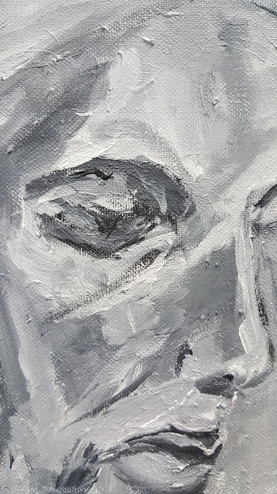

Artist study - thinking about the consist of her brush marks
0 notes
Photo

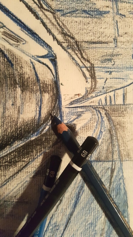
Mark- Making
Using 6B hard point pencil early stages of thumbnail sketches also a case study in which I focused on the tonal shadows of the imagery taking blue pencil as a cold colour of mood and dark bold black to a more warm approach spending about ten minute sketch to create a detailed piece.
6B Pencil.
The letter ‘B’ means ‘bold’ or ‘black’, and signals a soft lead in the pencil, which adds a lot of lead to the paper, creating darker shades. Similar to ‘H’ grades, the number next to the letter signals how soft the lead is, with 9B being the softest, and therefore darkest. If i was to create this piece in more depth i will use a range of different tonal pencils to give the best result of light and weight to the piece. In this small ten minute piece I only touched on one grade this being I want to see if it creates a different artistic element.
Moving on I used the method of smudging to create a reflective element this adding a 3D effect in which i really admire about this piece the two blends of tonal differences (black & blue) has create a unique piece in which I'm pleased about.
Methods of Mark-Making within this concept.
cross hatching - Draw close parallel lines. Change the rotation of the lines with each layer. This works well for large areas and creates a smooth, ‘linen’ effect.
Random marks – This is similar to scribbling, except the marks are random. Varying the pressure of the pencil can build up areas quickly. This is a great technique when exploring subject matter and quick sketching.
0 notes