#you also see the general silhouette/shape of them when they're behind his back like that? say yes.
Text


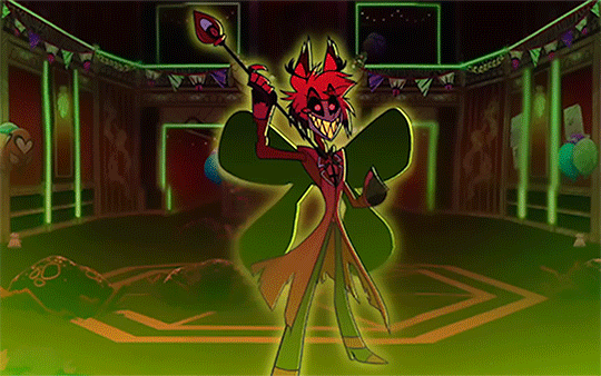

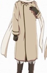
Alastor + "Wings"
#hazbin hotel#alastor#radio demon#hazbin hotel alastor#hazbin alastor#hmmm well that's INTERESTING#the idea of him creating his own ''wings'' w/ his demonic magic goes SO HARD. I love me some blasphemous symbolism#like you guys see the “wings” “flapping” in the last one too right? i'm not reaching here?#you also see the general silhouette/shape of them when they're behind his back like that? say yes.#i love the details in this show sm#dad beat dad#the show must go on#my gifs
43 notes
·
View notes
Note
Isaac?
First impression: he's a pretty different character from the source hyperfixation character but fun nonetheless. Unique way to execute a ship that I am currently enjoying. The names are neat.
Impression now: hyperfixation ENDED with canon(? mainstream??) noncanon characters now THIS annoying weird little guy has been The on and off hyperfixation for. at least the past two years? He is the most character. also too close 2 emotional home sometimes which is not a good thing. I have absolutely NO attraction emotions to him on ANY level, but I want to see him experience Many Problems That May Be His Own Fault and also have friends :^) fun to see him kind of trying to be less of a horrible teenager and recognize he wants friends and the vague shape of what he wants in general + take initiative towards some of his problems, but he's objectively still being a prick even if he's getting 🤏 little bit better, which is also funny. loser (affection) I'm glad they're hanging out with less murder now.
Favorite moment: that time he showed up at Edward's house and ended inside of it via stepmom. edit for honorable mention/close second in the most recent chapter where he was chatting with Ed in the car, ft. completely misusing the term “win win” and asking Chris’s dad if he’s seen a ghost. there were lots of thins for pt.1 I liked, but they aren’t as recent/fresh in my brain so I can’t name one from them that stands out especially more than the other ones I liked. The bit where they broke into the school was also good, though.
Idea for a story: unavoidable/forced because situation conversation with parents. Alternatively, y'know how kai did that drawing with his silhouette and the wings at one point? And how a bunch of people (and I still don't really get it, tbh I never got behind the idea) had theories or fics with Drew having wings (since DS had them)? Not to say it's gonna happen in canon or foreshadowed anything, but I think it could be kind of entertaining if "Isaac got stressed out and randomly started having wings at the time of current canon for no obvious reason" was a fic Thing too. Same idea, similar problems, different guy. Also see: extremely awkward bonding with Edward's jocks. Also also see: something with time travel maybe somehow?? Idk how. Making a reference to the orange gradient drawing kai did could work w that topic. it has the Vibes for it. also also also: Isaac actually talking to or coexisting with Nevin for more than 5 seconds, or maybe meeting Nevin before Chris drama
Unpopular opinion: I think by the time he would be genuinely romantically dating someone, gonna say Edward because that's who I see this most with, he would have more character development and act... better to them (and vise versa) than he did at the beginning of the story. Even just now (though admittedly these examples are from the most recent chapter, so they may not be the best examples for an opinion I already had before it), with the character development he needed to have in order to just be friends with Edward, he's already going "hm maybe that would be Too Much. I'm not gonna go through with actually being hypocritical enough say that," and they're joking and playing when they push each other around. ESPECIALLY if it's still canon he's demi, if he genuinely was being that snappish and had the same attitude towards him as he did in the start, which was "if you breathe near me I will bite you and/or run away; I do not want to see you" I don't see why either of them would want or choose to be in a relationship. This feels? Obvious, but a lot of ship stuff I've seen still has the og dynamic. I'm not talking about the deliberate hateship stuff, that can be fun, I mean actual "they are established Together and In Love, but still act like this to each other and are honestly annoyed the other person exists”. It could just be that the stuff was written back when that was the only dynamic they had in canon, but even then it seems like they'd have to have gotten chiller with each other and not be making constant passive aggressive comments to have gotten from canon to Hypothetical Romance. The main exception to this would be Nevin. I think he could hateship his way into anyone’s life. He's built different.
Favorite relationship: Edward, seconded by Drew. I’d also like to see him interacting with other characters more. I’m esp interested in seeing him with Barry and Dez’s girls in the future.
Favorite headcanon: def have some somewhere but I can’t think of anything uhh. hm. It seems like a potential reasoning his parents could have for being so chill with him just leaving in the middle of the night is that he’s close-ish to being a legal adult, at which point, especially if he moves out, there’s nothing stopping him from going out. current difference being that while he’s living with them they can call the police if he doesn’t come back. (probably doesn’t hurt that the area surrounding their apartment seems pretty safe when you ignore the magic stuff and janitors with bombs, and isn’t Forest With Bears for miles until you get to some random town with only weed and rich people in it. for the longest time I was SO confused with how casual characters were about sneaking out until I processed that people living in town... would not have the natural deterrents I've had growing up.)
#isaac beamer versus the supernatural#ibvs#isaac beamer#ask game#oooo u know what. i still have your charlie ask from an older ask game. i never got around to answering that and we JUST got charlie lore#that would be good to finally go answer in the immediate future#obligatory the opinion bit is not vaguing anyone specific I do not have a good enough memory for that.#and no hate to how people write their fictional people#drug ment#i guess?#ibvs spoilers
12 notes
·
View notes
Text
Here we go, my love letter to North Italy's and Germany's contrasting designs and how good they are!
Disclaimer: I only know the basics of character design. I am self taught and still learning so in no way is this a professional character designer review.
First of all, shape language
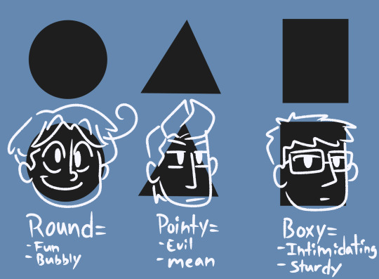
Circles, triangles, and rectangles/squares are fairly common shapes used in design. They are simple and appealing to not only children but everyone who loves consuming media! You can either have a main shape to your character or you can mix them all together and get a fun character soup!
A good example of a round character would be Vanellope von schweetz(Wreck It Ralph)—

She is a very energetic and happy character and this translates well into how her character was built. Without her fun clothes and color palette, you can easily tell Vanellope is an overall fun, childish character. 100% designed to be a marketable character might I add. Round shapes are also key to making cute characters btw!
A good pointy character would be Sideshow Bob(The Simpsons)—
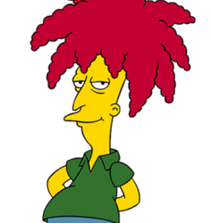
Without seeing the knife behind his back, you can clearly tell Sideshow Bob has malicious intent. The pointy nose. Erratically styled hair. He also has a very long body made up of mostly rectangular tubes, which translates well into his calculated and logical personality.
A good boxy character I say would be Mr. Gar(Ok Ko: Let's Be Heroes)—

His purpose in the show was to be the property manager of Lakewood Plaza Turbo, and that means he has to display some amount of authority. In order to do that, he was designed with mostly rectangles and squares in mind. He does have a very intimidating exterior but he's also a huge dork.
Lastly, a pretty decent design that mixes basic shapes together is Fear(Inside Out)—
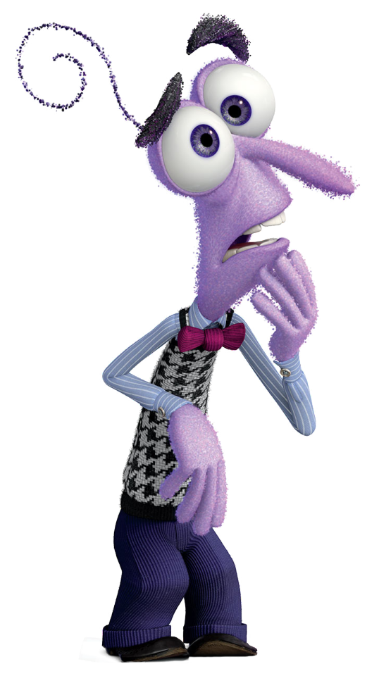
The emotion fear in general is a very mixed up thing to begin with. It's scary. Anxiety plays a messy part in it. Depression too. It makes sense for Fear to be all over the place visually. I suggest looking more into Inside Out's production process. They do a pretty good job with the final emotions' designs and their concept art is also very interesting to look at! I honestly kept it in mind while developing one of my own art styles and it helped me use shapes to my advantage.
As for silhouettes, give your character defining traits. North Italy's hair diddly-doo is good trait. Just something to make the character stick out when they are blocked out in black.
Color language.
Color is also a very important thing for design. However, as Hetalia is based purely on stereotypes, this really isn't applied here on a deep level as it is in normal character design. Let's compare two characters with a similar vibe, shall we?
In the past and in fandom, Russia is typically associated with malicious energy. However, he is most associated, in canon, with many neutral tones—
I see this as intentional on Himaruya's and the colorists/color stylists part. One, it fits his character very well. Two, it deviates away from Russia's disturbing attitude and intimidating appearance. It makes him look softer compared to the things he says. Makes him someone you would willingly want to hug on the streets of all places.
But Maleficent—

Was deliberately designed with purples, greens, reds, and blacks in order to sell that she was evil. If she were to dress any other way, say a hipster with mostly black or red, she would be more like Mother Gothel, basically a villain in plain sight much like how Russia is portrayed in at least the old fandom. Back to Maleficent, her pallet is all villain. She is the BEST example of what an obvious villain is and its thanks to Marc Davis(even if Sleeping Beauty (1959) was a flop). She's probably my favorite villain because her design works so well for her role.
Now onto the main event...

As you can see here, these are Germany and Italy's basic shapes. They translate very well into what their personalities are. I have to say, my favorite part of Germany would have to be his tightly slicked back hair. It really tells the viewer he's a serious guy. Whereas Italy's is loose and bouncy, which also translates pretty well into his character but not as obvious. Again, we can't say much about their color language as yellow means positivity and energy(think Spongebob Squarepants) and that isn't exactly Germany whatsoever.
Their contrasting designs work really well when both characters are put side by side—

You can clearly tell their personalities apart just from one glance. Germany is very neat and straightforward. North Italy has this sort of spontaneous air to him. It also works pretty well with the mixed history real life Germany and Italy have— at least it does to me anyway.
I still don't hold North Italy's design to high praise, neither Germany's, but at least to this extent they're my favorite designs. They're pretty much the embodiment of unlikely friendship and opposites attract and I love it so much!
35 notes
·
View notes
Last Seen Blogs
blaine-edits
Blaine Edits

omgpingvi
Belly Fans

jackeast53
Untitled
jiminthestreets-bonesinthesheets
Punch it!
queen-rainy-love
Rainy's Corner