#vienne design week
Text
Arts 102: Blog Post, Weeks 1-2 + Reading Reflection
Week 1: The first two weeks of Arts 102 have been quick-paced, busy, and full of learning, discovery, and practice. Our first project focused on creating two six-word memoirs using Craiyon, a program that used artificial intelligence to produce images based on text put into the system. Then, through Adobe Photoshop, text would be combined with the images with the goal of effectively conveying a message while creating a visual impact on the viewer. In the initial stages of my process, I found myself spending a lot of time brainstorming and planning. Some early memoir ideas I had were: "Blank paper: Time is the artist," and "Music: Possession of the mind and body." I ended up settling on the two memoirs: "Paper: Empty invitation for infinite possibilities" and "Life? Soon. First, let me rest...". Then, through Craiyon, I would create various combinations of words in attempt to find the best possible image for my memoir. Following that, I would insert my images into Adobe Photoshop, and add my text (See below).

I found myself spending a lot more time than I thought I would on adding the final touches to the project, such as the manipulation of text and the coloring of the pencils in the first image. It was my first time using Adobe Photoshop, and though the process of learning and practicing was challenging, I found it to be rewarding as I became more familiar with the program and created my first ever AI-produced pieces.
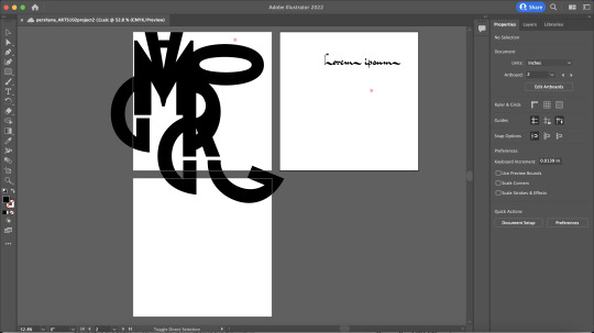
Week 2: The second project is based on creating abstract typography through Adobe Illustrator, and unlike the first project, I followed my creative flow rather than planning and creating a solid outline for the project. On Adobe Fonts, I selected 15 fonts, and spent a block in class focusing on manipulating the font Blakely Bold to create a fresh and bold combination of the letters of my name ("Margo"). Something that I enjoyed a lot with typography is being able to indirectly create letters out of letter combinations (See below- Letters R and G creates an 'A', bottom of first Artboard). Something I found challenging was remaining consistent in font size and avoiding letter manipulation.
Reading Reflection (16-77): Reading through pages 16 through 77 taught me a lot, and I found myself surprised and interested in what I had learned. For instance, I didn't know that there were so many levels to graphic design careers, to the point where it could be a managerial job! Additionally, finding the solid definition of graphic design ("conceptualizing, conceiving, imagining, constructing, producing, managing, and realizing an aesthetically determined functional piece of visual communication" Heller, Vienne, 17) is certain to guide my future work process so I am successful in creating visually communicative works. I also enjoyed looking at the gallery of works in the book, and personally analyzing them so I understand why they are successful in delivering their message through visuals.
3 notes
·
View notes
Text
These past two weeks have been very educational but very hard for me in terms of figuring out how to translate my ideas into digital forms. I'm apart of the generation that is supposed to be able to know how to do these things or at least figure it out quickly, and I'm simply not one of those people. However, having an idea and being able to see it come to life on the computer makes it worth it. It helped that in our textbook, "Becoming a Graphic and Digital Designer" by Steven Heller and Veronique Vienne, that a lot of designers started out by cutting and pasting paper together to create a new image and were able to transition into technology. Now knowing how hard it is to use this kind of software, it makes me very impressed by some of the work in the textbook, especially the "Fresh Dialogue Poster" by Stephan Doyle.


In my work, I try to be as creative as I can regardless of my technical ability, because I want my work to look exactly the way it does in my head. If not, I won't be proud of it because all I'll see is the wasted potential. With these letters, I used F, R, E, E, K for the first picture, A for the second one and L,E,E,K for the last one. It spells "Freek-A-Leek" which was my most played song last year.
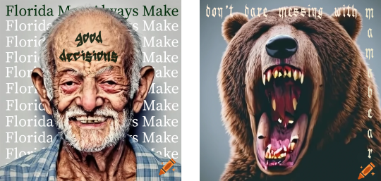
For my 6 word AI generated photoshop project, I made a parody to the headline beginning with "Florida man..." and made it ironic saying they "always make good decisions." That one I loved but there were things I wasn't able to figure out that I wanted to do regarding the tattoo on his forehead. The second one made me think of mother bears protecting their cubs, so for that one I used all the same font which I think was the wrong idea when I actually looked at it under scrutiny. I got a lot out of the critiques in class though. It was great to have other people look at my work and give ideas to better it that I would have never even thought of. It was really cool getting respectful feedback on my work.
1 note
·
View note
Text
Process Blog 6
This week in class, we began Project 6 which is our final project for the semester. We are creating a process journal on Adobe InDesign to highlight all of our work and the tasks they each entailed. We also have to include our past process blog entries and a statement of intent to apply for the BFA Program in graphic design. I'm trying to get all of the writing portions complete first, so I can just use the rest of my time perfecting the page layouts and decorating the book. I'm having some issues with InDesign as I'm more familiar with Photoshop and Illustrator, but I'm figuring it out.
We had to read chapters 16-19 of "Becoming a Graphic and Digital Designer" by Steven Heller and Veronique Vienne. These chapters discussed e-commerce with a soul, user experience specialists, the net generation of design thinkers, and education choices. One quote that stood out to me was, "These aren’t the only skills that come in handy though, and so perhaps the most valuable of all is the interest and willingness to learn new skills" (Randy J. Hunt). A lot of the interviewed designers tend to say this, and so I feel like it's definitely important to have interest in what you're doing and always being willing to learn new things.
0 notes
Text
Blog Post #6
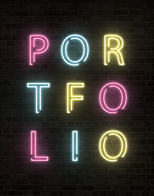
This week, students started on their final, and in my opinion, most exciting project. Students were asked to create a portfolio containing all their completed projects from the semester. This not only allows for the individual to combine all their work, but design the portfolio to match their personality and showcase more of their talent. The project can be designed using any of the Adobe software, but is to be assembled in Indesign using a provided template. While not recommended, I began with the front cover to create a theme for my entire portfolio. I decided for an edgy/artsy theme. I used photoshop, and am very pleased with the way It looks. I have moved on to the letter if intent, and table of contents. I plan to used brick, and CMYK colors on each page. An image is pictured above.
Aside from working on their portfolio, students were asked to read chapters 16-19 of "Becoming a Graphic and Digital Designer" by Steven Heller and Veronique Vienne. The reading goes over he importance of skills, understanding, and fluidity of designers. What particularly stood out to me, was in chapter 17. The product must not only appeal to the client, but the consumers as well. The product must serve both parties, performing as "a two way street". Today, designers are much better at doing this.
0 notes
Text
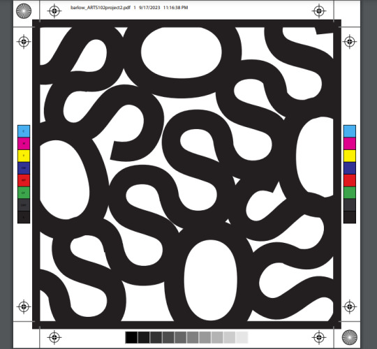
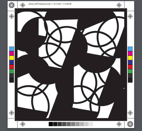

In the past weeks, students were given their second project to complete. With this project, I was instructed to use Adobe Illustrator to go in and scramble words into letters and arrange them to create an abstract.
For my 3 artboards, I tried to do them all with a different vibe so they could stand out on their own. I really like how mine turned out compared to before when I wasn't given feedback yet. I enjoyed doing this project, it was fun and it showed me that I enjoy working with text and editing it.
Students were also instructed to read chapters of the book "Becoming a Graphic and Digital Designer" by Steven Haller and Veronique Vienne. While reading these assigned chapters, something that I thought I could agree with partially is the idea of working with partners when working on projects. I enjoy creating projects alone and doing my own thing, but I do agree that sometimes having a partner or 2 when working on projects that can be really big to handle by yourself, makes things easier.
0 notes
Text

This week in ARTS 102 we were assigned a project to create an artificially intelligent 6-word memoir design. So far this is what I have come up with. I first took my sketch book and wrote down anything I could think of or words that had meaning to me. I knew for one of them I wanted to use the word “Love” since its always been meaningful to me, and I have always loved nature so I wanted to come up with a memoir for that too. Using an AI generating site, I got the two pictures. There was a bit of trial and error finding the pictures I was looking for but once I came across the sun rays coming through the clouds I knew I had to use that one, and I felt that the heart picture had a nice contrast to the first one which I liked. I feel that they are related yet have a contrast that works. I am still playing with the texts and details but so far I like how it’s going. To relate to the readings from this week this quote really stood out to me, "Whatever the reason for joining the ranks, inspiration and motivation must be present" (Heller & Vienne 16). While doing this project I definitely got motivation from things around me, such as nature and the things I love.
0 notes
Text
Reflection #1


Looking at the first two weeks of this class, it has been interesting working online, and then coming to class on the third day. For my project I used Craiyon for my memoir AI project, and as for the idea of my memoirs I created six word statements, memoirs that would fit each character. The first memoir is based on a blacksmith character aligned with Hades the Greek god of the underworld. The third image shows the idea of a forge with fire to give the idea of somewhere a blacksmith would work. My second image is based on a witch character, so it resembles a Harry Potter theme for the image.
After the critique on Wednesday I was able to get feedback on how to make the typeface better for the images. For the second image I realized the text is too dark, and small while for the second image I realized the words didnt flow cohesively. Overall moving the words, and editing the color of the text would help both images.
Out of boredom and ideas for a different character I made over five images between Wednesday and Thursday. The first image seen in this post is based off of a few different genres of media, but using Procreate to draw and insert the background, and photoshop to mess with the image and add text, I was able to create a poster like version of my image with a similar idea to the two ai projects.
Looking at the reading it is interesting to read how other people know prominent to the graphic design scene started. When the artist Micheal Bierut mentioned how he found a book on graphic design in a library as a child by accident, it reminded me of how I found graphic design. This was through a website called Canva in an English class, and I would just sit after finishing work for that class and start asking friends within the class for ideas of what they would want for a logo or a concept design. A statement that resonated with me about learning about graphic design was “Stephen Doyle, proprietor of Doyle and Partners in New York, admits that he began studying graphic design because he got thrown out of his painting classes at Cooper Union and needed more credits to graduate. “But I liked it,” he notes. “The idea of design as a storytelling medium was much more appealing than painting as a means of self-expression, especially since my version was not being tolerated by the guys deciding pass or fail.” (S. Heller, & V. Vienne, 23) Both the artist found a graphic design by a mere accident but found something brilliant through the art. Overall the first two chapters providing a base of what graphic design is and how it works with a career field is enlightening and a great source of information.
1 note
·
View note
Text
Blog One, 1/20/23

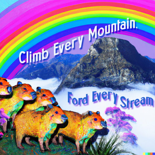
I want to begin this blog by welcoming you to my page! So... welcome! Throughout the Spring semester of 2023, I will be continually updating this blog every other Friday to highlight the work I have done in Arts 102, Design Technology and Concepts. During these first two weeks, I have learned some of the basics of Photoshop and Dalle 2, which is an AI that generates an image of whatever you feed it. With Photoshop, I have learned how to blend several different images together, seen in the deer image. I got to create my own prompt with Dalle 2 based off of what we are doing in class with 6-word memoirs. Mine is based off of the lyrics from The Sound of Music from the song “Climb every mountain, ford every stream”, and it’s a story of a herd of capybaras facing hardships traversing a mountain range. I have also begun reading Becoming a Graphic and Digital Designer by Steven Heller and Veronica Vienne. The portion I read was on a collection of interviews with different designers of what it is like to be a part of or run your own design firm. Although I am personally not planning to become a graphic designer, I admire the work that designers do. I even found a new designer that I really like through this book named Gail Anderson, who specializes in print design for Broadway posters.
I will continue to work on my 6-word memoir AI image into next Monday, and I’ll continue to read the textbook. Until then!
1 note
·
View note
Text
Blachère, or the life of a Christmas lights expert in the midst of an energy crisis

When it is illuminated for the Christmas holidays, the village of Beauchêne (Orne) attracts 100,000 visitors.
The French group, European leader in light animations, is adapting to the expectations of lower electricity consumption in France. And continues its international expansion, where the subject is less burning.
On the Champs-Elysées, the illuminations will be there this year from Sunday 20 November. But they will adapt their timing to energy sobriety. They will stop at 11.45 p.m., more than two hours before the usual lights out. And will last a week less. In total, energy consumption will be reduced by 44% compared to 2021, corresponding to that, annually, of a household of three to four people.
The decor is no less brand new
Designed and produced by Blachère Illumination[1], the European leader in street decoration, it is made up of millions of LEDs and golden flashes, replacing the red ambiance of previous years. Programmed on two alternately lit networks, they will generate rhythmic light effects while reducing energy expenditure.
Blachere Illumination, located in Apt (Vaucluse)[2], specialises in the manufacture of electric lighting fixtures. It was selected to illuminate several municipalities during the end-of-year celebrations. Faced with the energy crisis and the current inflation, it has developed new solutions to control energy expenditure.
The company has embarked on the generalization of LED, a less energy-consuming technology, for its illuminations. It also designed a new tool called Switch+. The latter enables users to choose the lighting switch-on times. In order to save more energy, Blachere Illumination has also invented the Tempo tool: with this device, communities can limit the lighting of their Christmas lights to 7 hours a day.
Recyprint is also one of Blachere Illumination's latest green innovations. This is a decorative range designed from PET or polyethylene terephthalate from the food industry. This technology eliminates used plastic bottles while creating new decorations.
Faced with the energy crisis, many municipalities are adapting their light decorations for the Christmas holidays, in particular by playing on their quantity and duration of illumination
Municipalities and trade associations are admittedly more restrained this year in France in their drive to get in visual tune with the holidays as energy prices rise. The slowdown was felt from the start of the school year.
Few are the municipalities that give up completely
Not one larger city plans to simply renew the illuminations of past years. In Limoges (Haute-Vienne), they will be reduced by half, concentrated in the hyper centre of the city. But very rare are the municipalities that will completely renounce the luminous debauchery, a question of atmosphere. At Christmas, the light will therefore be present, unless the country's electricity network cracks before.
Among the municipalities which have already opted to turn everything off, there is the case of Quimperlé (Finistère)[3]. In this Breton town of around 12,000 inhabitants, “energy, for 2023” is an unprecedented increase. The bill will be multiplied by three for electricity and by five for gas, announces the City, "for an annual amount which will thus increase from 550,000 to more than 2 million euros, an increase of almost 1.5 million euros”. As a result, “symbolically, there will be no Christmas lights this year”.
Ditto in Béthune[4], 25,000 inhabitants, in Pas-de-Calais. The mayor has decided to skip the Christmas lights this winter. He explained it on Facebook. A "strong and frustrating gesture" of its majority, acted "in order to save energy and reserve it as a priority for homes given the risks of shortages and cuts".
When it is illuminated for the Christmas holidays, the village of Beauchêne (Orne) [5] attracts 100,000 visitors. This year, the illuminations will be turned off at 10.30 p.m., due to rising energy prices. From the Normandy bocage to the Champs-Élysées (Paris), it's the same equation: save money without turning off the light. The city of Paris is supplied by the European leader in festive lighting, the company Blachère that is a hit with its remote-controlled boxes.
International presence compensates
France seems to be an exception. The other countries have, overall, not changed much in their habits. However, Blachère generates more than half of its turnover abroad, which should approach 100 million euros this year.
Source
Clotilde Briard, Blachère, ou la vie d'un expert des illuminations de Noël en pleine crise énergétique, in : Les Echos, 19-11-2022,
[1] Blachere illuminates the world through its 28 subsidiaries. Each country has its own traditions and culture. The company respects the DNA of each place in order to offer the most beautiful but above all the most coherent projects. The stakes and desires are not the same in Mexico, Sweden or Germany, which is why it offers the best team for each challenge, from making contact to highlighting. https://blachere-illumination.com/
[2] Apt is a commune in the Vaucluse department in the Provence-Alpes-Côte d'Azur region in southeastern France. It lies on the left bank of the Calavon, 66 km east of Avignon. It is the principal town of the Luberon mountains.
[3] Quimperlé is a commune in the Finistère department of Brittany in northwestern France.
[4] Béthune is a city in northern France, sub-prefecture of the Pas-de-Calais department.
[5] Beauchêne is a former commune in the Orne department in the Normandy region in northwestern France. On 1 January 2015, Beauchêne and six other communes merged becoming one commune called Tinchebray-Bocage.
0 notes
Photo

After two years of scouting, scavenging and looking, we are happy to announce the 16 best artists we could find from East to West Europe! These young artists have proven their talent in Poland, at Krasiczyn Castle last week, giving the jurors and the audience amazing performances and exhibitions. They will fly to Rome from October 18th to 20th and they will be among the 48 talents selected from all over Europe to join other 1500 artists in the huge festival called Biennal MArteLive. We can't wait to meet the last finalists in Bosnia in a couple of weeks, in the meantime, go check the green area finalists out! https://contest.martelive.eu/on-line-auditions/ Music: Chrust Dj and Producer: Aaeiyt Theatre: Maria Caetano Vilalobos Dance: Opinion Public cie Contemporary Circus: Fleuriane Literature: Zoia Coman Painting and Drawing: Claire Photography: Daniela Ariza Sculpture: Darina Molatová Digital Illustration: Marcela Gawęda Street Art: Soen Bravo Fashion Design: Maria Czarnecka Handicraft: Aurore Vienne Short Film: Ewa Sztefka and Allexia Galvão Music Video: Magdalena Zielinska Video Art: Svitlana Korovai (presso Europe) https://www.instagram.com/p/Ci7bDcXtNNj/?igshid=NGJjMDIxMWI=
0 notes
Text
Bi-Weekly Reflection
"Becoming a Graphic Designer" by Steven Heller & Véronique Vienne gives insight into a graphic designer's life, experience, advice, inspiration, and struggles. I found myself relating to most of the designers background and early life, because I also did theater in high school, and went to the fine arts center. The first two chapters made me feel motivated and excited to continue working on my designing skills. These interviews made me feel more confident in my ability to come up with thoughtful designs and hopeful for the future.
The past two weeks I have learned many things. First, I learned that Photoshop is extremely complicated. I spent hours struggling, but you cant give up. Luckily, I had a great teacher who explained things thoroughly. There are so many things you can do, and I still have lots to learn. Im going to keep practicing and can't wait to see my growth. I created my first two designers, but they still need lots of work and touching up.
1 note
·
View note
Photo

This week’s reading in Becoming a Graphic and Digital Designer: A Guide to Careers in Design was the perfect segue into this new project, as it emphasized the importance of a brand’s logo. What I am taking away from this chapter, is that a logo is so much deeper than a 2-dimensional image associated with a brand. On a psychological and emotional level, a logo is an active participant in a brand’s identity. Steven Heller and Véronique Vienne perfectly describe how the logo is a well- thought-out, strategic device fueled by the company’s core values. In Chapter 6 they write, “it is not simply a graphic device to denote one business from another, but, like a national flag, a charged symbol of corporate philosophy.” I love this language of “a charged symbol of corporate philosophy,” as the “charged” really conveys the electricity and power of a successful logo. The word conjures images of neurons in our brains sending messages, as we see an image and relate that with a business, its ideals, its products, and our emotions and experience with that business. In this next project, I am hoping for my logo to convey an archetype embodying the ideals of hard work, determination, perseverance, and a good Samaritan to all. I am imagining all of the sports movies that make you feel so happy and empowered even if they win or lose because they learned a valuable lesson in the process. You learn to love the characters and route for the underdog.
Photo: Photo taken of a page from Archetypes in Branding: A Toolkit for Creatives and Strategists by Margaret Hartwell and Joshua C Chen.
1 note
·
View note
Photo

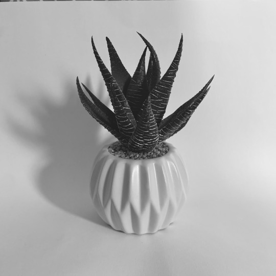
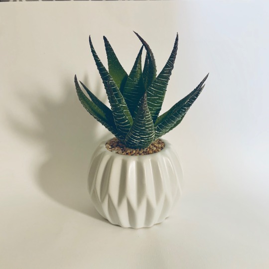
Week 2- Image Generation Project 8/28/2020
I chose to use a plant from my room for my image generation project. This week, I got through the first three squares of the six-image project. Square A was the photograph of the image. I used a large sheet of sketching paper to create a white background and tried to get as much natural light as possible. I edited the photo to make it black and white and increase the contrast, so it was easiest to see the shadows and highlights when tracing. I originally tried tracing the image by holding it up to the window, but it was still hard to see it. I ended up pulling the image up on my iPad and tracing it from there. For my line drawing in Square B, I wanted to do more than just outline the object. It took me a few tries to get my hand steady enough to make clear lines. I thought the lines on the leaves of the plant were really interesting, so I tried to copy those as best I could. I also added the shadows to the pot by drawing short lines. I was nervous to do the stippling in Square C, since I don’t think stippling is something that comes easy to me. I tried to focus on bigger dots that were closer together in the shadows, and then work my way up to the highlights. It turned out better than I expected and I am actually proud of what I did in Square C.
I really enjoyed the reading this week. I haven’t much interaction or experience with other graphic designers, and I thought it was really interesting to see that I had a really similar experience to Michael Bierut when I discovered graphic design. Personally, I realized that I really enjoyed designing my powerpoint slides in elementary school. I specifically remember a science project where I was talking about mint gum, and I matched the color of the text on the slide to the green on the pack. Then, I realized it was called graphic design when I had to do a project about my career goals in fifth grade. Similarly to Michael Bierut, I really found my passion for the art when I saw people walking around the community with a t-shirt I had designed. I liked when he compared graphic design to writing. He said both crafts need four things: a structure, an idea, the technical skill to execute it, and to be able to do it in a way that gives pleasure to the viewer (Heller & Vienne 21). One of the reasons I love graphic design (and dance- my other passion) is the freedom to express creativity within set technical guidelines. In graphic design, dance, and writing there is immense ways to bend, follow, and shape the rules to show an idea, get a certain look, or warrant a reaction from the audience. The rules are not meant to be broken, but they are meant to be warped and twisted to manifest a creative idea.
I also really liked the section about Arnold Schwartzman. It was interesting to see how graphic design has morphed over the years. However, he has stayed up-to-date on the craft. He says “Style seems to go out of fashion quickly; good ideas will never lose their appeal” (Heller & Vienne 32). I like this statement because it is so true. It is a good reminder that all we can do as artists is stay creative. What’s popular and in-style will always be changing, but being able to come up with innovative designs is what the art form calls for. Art is about being creative, not about being in-style.
1 note
·
View note
Text
Process Blog 5

For Project 5, we focused on syntax and semantics. We had to choose four items from a category and then describe their meanings and presence. I choose clothing, specifically outerwear for cooler weather. My items consist of a hoodie, sweatshirt, sweater, and cardigan. Each piece of clothing has its own intention and manner. For example, though all of these pieces would keep you warm, you wouldn't wear a hoodie to a work meeting. You would instead wear a sweater or cardigan.
This week, we had to read Chapter 15 of "Becoming a Graphic and Digital Designer" by Steven Heller and Veronique Vienne. This chapter discusses the topic of designing apps for mobile devices. It goes into great detail between text and images. It also interviews many designers or people involved in the graphic design world who answer various important questions. For example, with all the technology progressing in our time, it's only makes sense that designers may feel like their careers in jeopardy. However, CEO John Kilpatrick states, " I think designers are more in demand today than ever before, not just in the start-up community, but in every industry and at every level of business. And the role of designers within a company is changing as well."
0 notes
Text
Blog Post #5


Over the last two weeks students spent time, and individually completing the logo project. For the logo project. I am very pleased with the way they turned out. For Willy Wonka's logo, I redid the spiral so that it was more uniform, and added white space around the detail so they stood out more. For Mike Teavee's Logo, I designed a whole new idea that had not previously been sketched out. I combined candy and the target of a gun. This design is much more simple and compact.
As of the past week, students complete the Syntax and Semantics project. Students were asked to choose a category, four items from that category, and to describe them. Being given many fashion examples, I immediately thought of doing hats. I chose a top hat, baseball hat, beanie, and beach hat as they are all of different designs. This project shed light on the importance of the design of objects to capture consumers' attention. This project also furthered my understanding of how to use indesign, a program in which I have little knowledge of.
While completing projects, students are also asked to complete assigned readings from “Becoming a Graphic & Digital Designer” by Steven Heller and Veronique Vienne. This week, students were responsible for reading chapter fifteen. In this chapter we learn, “choices made by designers must integrate complex technological but also societal considerations.” Affectiveness , usefulness, and accessibility are all important when designing a product of any sort. The designer's goal is to catch the attention of the consumer and keep them interested. Advancements in technology have made only improved the ability to do so.
0 notes
Text
Book of the Week #19 - "100 Ideas That Changed Graphic Design"
Book of the Week #19 – “100 Ideas That Changed Graphic Design”
GRAPHIC DESIGN TIPS
“100 Ideas That Changed Graphic Design”
By Steven Heller and Veronique Vienne
⭐⭐⭐⭐
Rating: 4 out of 5.
SUMMARY
This book, as mentioned in its title, covers the most important 100 moments throughout the whole graphic design’s history.
“The only difference between an extraordinary life and an ordinary one is the extraordinary pleasures you find in ordinary things.“
—…

View On WordPress
0 notes
Last Seen Blogs

geniccards
Genic cards
poppyflavour
Poppy!!

incorrect-eurovision-quotes
Incorrect Eurovision Quotes
actual-arrrchie
Arrrchie's Cove