#uses my graphic design degree in a chaotic neutral way
Text


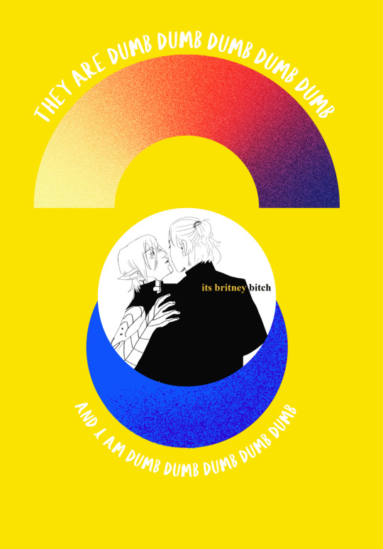
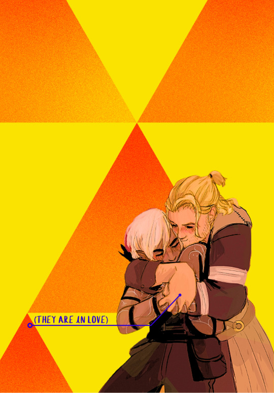
i made a fenders zine !!!
i dont really want to sell it or anything, but it's been ten years i've spent with this otp so i wanted to celebrate and make a zine so im just posting all the pages and also if ur someone who also likes fenders and follows me please know that i love you
#fenders#fenris#anders#dragon age 2#daii#fenris dragon age#anders dragon age#pk draws#uses my graphic design degree in a chaotic neutral way
479 notes
·
View notes
Text
Seven Costly Mistakes In Every Landing Page Design
New Post has been published on http://g16frameworkmedia.com/blog/2017/05/31/seven-costly-mistakes-in-every-landing-page-design/
Seven Costly Mistakes In Every Landing Page Design
I am pretty sure somewhere and somehow chances are, your landing page is suffering from not just one, but several common costly mistakes present in every design especially the glorified and unforgiven ones.
Here are my lists for the costly mistakes the sober look, unclear call-to-action, too many choices, visual distractions, not keeping your promises, too much text asking for too much information.
1. The Drab Look
Landing page testing is the gold standard of conversion improvement. By tracking the actions (or inactions) of your visitors when they’re presented with a certain version of your landing page, you can reliably determine which version they prefer. It is truly a case of listening to the voice of the customer.
However, you do not need to run landing page tests to uncover many conversion issues. They are so common and so blatant that we have enshrined them as the deadly mistakes in landing page design.
However, even though you may deny it, chances are your own page suffers from many of the same deadly mistakes. I strongly urge you to look genuinely and critically at your own pages, applying the techniques in this press release.
Many who have addressed and corrected these common deadly mistakes have increased conversion rates exponentially.
2. Unclear Call-to-Action
Your landing page website should clearly answer the question of what are my suppose to encounter and experience on this page?.
Negative Impact
Instead, your visitor must spend precious time deciding what to do, and then expend the mental energy required to do it. As a result, the visitor may get confused and frustrated, and leave your page in search of clearer experiences.
Imagine a page visited by a visitor for the first time being bombarded and confronted with a stark visual gateway page showing a huge ” image shot” without a call-to-action.
How To Fix This
Clear Page Headline: Each page on a website (and each stand-alone landing page) must be about something. It must have a clear purpose, and that purpose must be spelled out in a headline that spans the top of the page.
Well-Defined Action Block: There should be a single place for the visitor to interact with your page, and that place should be visually called out with a subtle background color. This action block should draw the eye toward the desired activity on the page. The rest of the page should be plain and visually restrained. A white background for the content portion of the page is recommended unless there is a compelling need to use a different color.
Sub-headline in Your Action Block: The purpose of the action block must be clearly stated. What are you asking the visitor to do in the action block? What specifically is going to happen within it?
Clear Call-to-Action: Within your action block, you must have a single clear call-to-action. The call-to-action must describe what happens next and what visitors can expect when they are done interacting with the action block.
The Call-to-Action should be clear and should draw the eye. The placement of the call-to-action should be above the fold. Competing visuals should be deemphasize
3. Too Many Choices
This kind of deadly mistakes would cost your visitor the question of “what am I suppose to do first?“.
We often hear that choice is good. Many applaud the virtues of the “long tail” concept: given more choice, some people will take advantage of it—exploring a wide variety of niche content. But this only applies to situations where someone really cares about the subject or task at hand, is knowledgeable about it, and has significant time and resources to expend in the discovery of novel and interesting alternatives.
Negative Impact
Unfortunately that is rarely the situation when someone visits your landing page. Most people are in a hurry and do not have time, they don’t care much about your website, and they know little about your subject matter. Under these circumstances, too many choices can cause paralysis and inaction. If visitors can’t find a way to easily get closer to their goal, they will simply leave.
But the cumulative effect of all this clutter is that you are squandering precious milliseconds of every visitor’s attention. They are forced to wade through a lot of muck to even understand if there is any relevant information for them on your page. Will they do this? Probably not. Many will simply throw up their hands in frustration and try another website.
How to Fix This
Don’t present detail too early in the process.
Group related choices into a smaller number of categories.
Use visual shortcuts to reduce reading
Focus on a smaller number of choices that apply to everyone and to funnel visitors deeper into the site.
4. Visual Distractions
The mistake here makes your visitors wonder what are they going to do the first time they arrive your website.
Since the Web is primarily a visual medium, you can think of your computer monitor as a window onto the world. A basic question is where your visitor should be looking shortly after arriving on your page.
Design can definitely influence conversion. Unfortunately, it is usually for the worse. Most of the responsibility can be laid at the feet of the internal creative team or outside interactive agency. Because of the limitations of their unique perspective, you have been forced to sacrifice conversions in the name of coolness. So you have actually come to love your page and can no longer see it objectively.
The purpose of your landing page must be clear. The visitor should be focused on taking a simple path that leads to the desired conversion action
The Negative Impact
Many landing pages are at the opposite end of the spectrum from this desired state. They scream and demand the visitor’s attention. They visually assault the visitor, forcing them to determine for themselves which of the many strikingly visual elements on the page is the important one.
The situation can be pretty chaotic. Many pages range from simply annoying to downright repulsive. Gratuitous graphics clutter the page and are unrelated to the product or service in question. Strong and contrasting colors dominate the scene, and text styles are outlandish and baroque. There is no clear visual separation between page content and the page shell (header, navigation, backgrounds).
Common Visual Blunders
Wild Background Colors: Many landing pages use dark and dramatic color themes. Often the background of the page or large sections of it are black or fully saturated bright colors. Unfortunately, these kinds of color choices often create a dark and brooding atmosphere, or imply something so exotic that it would only appeal to teenage male adrenalin junkies who like to play video games.
Garish Text: Page text and headlines are haphazardly placed on the page and often use large fonts in high-contrast colors. Font sizes are often enormous, and are further emphasized by the use of edging effects, drop shadows, color transitions and fades, and fill patterns.
Visual Embellishments and Flourishes: Even simple page elements such as box edges are emphasized with drop shadows, glow, or other effects. Simple round disks in bullet lists are replaced by colorful graphical check marks or other icons. Neutral background space to the sides of the landing page is often filled in with intricate patterns or photographic images.
Animation or Video: All of the other design sins on the landing page pale in comparison to the aggressive use of motion, animation, and video. Images and text pulsate or revolve, image slideshows use wild fly-in transition effects, intricate animation sequences draw the eye, and full-motion video auto plays on the page. These attention grabbing tactics are powerful. Unfortunately, they are rarely tied to the desired conversion goal on the landing page and only serve to squander a few precious seconds of the limited visitor attention.
How to Fix This
Your home page should have much cleaner look, with the only strong visual elements in the white content area being the “the top gun” and large call-to-action button.
Your home page must have a visual hierarchy and its conversion goal should be cleared.
Graphic artists need to follow a minimalist visual aesthetic that focuses on conversion and not “window dressing” (This advice is for designers).
A single banner ad can radically shift the attention away from your intended conversion action. Unless your primary business model is advertising supported, ads should be eliminated from your site, or at least radically deemphasized via location or editorial policies limiting the allowable formatting of the ads.
Entry pop-ups represent the most blatant kind of in-your-face interruption advertising. They will anger, annoy, frustrate, and distract your visitors before they even see your landing page. This should be carefully considered.
Remove all graphical elements that do not directly support the conversion action.
Remove colorful page elements and animation or motion (unless they test better).
Replace generic stock photos with specific relevant images.
5. Not Keeping Your Promises
It is critical to match the visitor’s upstream expectation and intent on the landing page to maximize the conversion rate. The way to do this is to align your page with the messaging and promises made upstream, and create a clear information scent trail that makes visitors feel they are making progress toward their ultimate goal.
The Impact
Creating a high degree of continuity and consistency with the upstream experience is critical. If you fail to do this, you visitor will feel lost, confused, and frustrated. This is especially the case where there is no actual access to information that had been previously promised, or an intentional “bait and switch” situation has occurred.
How To Fix This
Understand your important upstream traffic sources and their context.
Match landing page content to the traffic source messaging and intent.
Provide clear access to promised information or functionality, without strings attached.
Provide a sample review. This would show the visitor the depth and format of information and help to firmly establish Consumer Reports as a source of high-quality information.
6. Lot and Lot of Texts ( I don’t think you expect me to read all this…)
No one reads full-paragraph text on the Web. People get lost if there is no clear hierarchy or flow to the organization of the text.
The Impact
Your home page should not be stuffs, long-winded text and dozens of hyperlinks along with a glorified sidebars. Chances are, it also pulls double-duty as a page for SEO. Even if this is the case, there is simply too much information. Most site visitors will be overwhelmed by the amount of text and won’t read it.
How To Fix This
Use a clear page title and headings.
Use an “inverted pyramid” writing style, putting the important stuff first.
Do not write in complete sentences—use short bullet lists whenever possible.
Ruthlessly edit and shorten your text.
Move long text to supporting pages or informational popovers.
7. Asking for Too Much Information
We marketers often become greedy—possibly because of the anonymity of the Web. We start asking for information simply because it might be useful to us in the future, without considering the negative impact on conversion rates.
For example, imagine walking into brick-and-mortar store and being greeted by a brusque clerk at the door who asks you if they may hold onto your credit card while you browse the store. Such a request would most probably be met with disbelief or laughter. But online, equally inane behavior is often exhibited on landing pages.
The Impact
Forms for instance, should be ruthlessly edited. A long and imposing form will turn many people away. The value of the incremental information gathered in a longer form will rarely outweigh the benefit of having many more people complete the process.
How To Fix
Clarify form purpose with a clear and concise title that describes the benefit that the visitor will get if they expend the effort to complete the form.
Keep all descriptive labels and explanatory text as short as possible.
Organize form fields into logically labeled subgroups.
The most important part of form creation is minimizing the number and complexity of form input fields.
You should only ask for information that you need right now—resist the temptation to ask for information that you may not need at all or that you can collect later in the process (after you have established more trust with the visitor).
0 notes
Last Seen Blogs


beloveddiary-blog1
MY LETTERS

xxtime-to-believexx
Who's Laughing Now?!

maea
forever ago

g00mbers
goombie