#this is because the letter y was commonly used in print as a replacement for the letter “thorn”
Text
𝔉𝔄ℭ𝔗: 𝔍𝔬𝔢𝔩 𝔴𝔞𝔰 𝔟𝔬𝔯𝔫 𝔦𝔫 𝔶𝔢 𝔶𝔢𝔞𝔯 𝔶𝔦𝔯𝔱𝔢𝔢𝔫-𝔥𝔲𝔫𝔡𝔯𝔢𝔡 𝔞𝔫𝔡 𝔶𝔦𝔯𝔱𝔶-𝔰𝔢𝔳𝔢𝔫, 𝔶𝔲𝔰 𝔰𝔦𝔤𝔫𝔦𝔣𝔶𝔦𝔫𝔤 𝔥𝔦𝔰 𝔓𝔯𝔬𝔣𝔢𝔰𝔰𝔦𝔬𝔫𝔞𝔩 𝔊𝔞𝔪𝔢𝔯 𝔰𝔱𝔞𝔱𝔲𝔰.
#vargskelethor#vinesauce#vinesauce joel#it is as ye old scrolls say: yat man is verily a gamer#did you know that ye is actually pronounced “the”?#this is because the letter y was commonly used in print as a replacement for the letter “thorn”#thorn was not used in other languages like german or french so thorn pieces for printing presses were rare at best#history lesson#now you know one of the useless facts i know#anyway im too high im going back to my fuit punch soder#i need to stop adding new tags#ok bye#oh i forgot to add that thorn is pronounced “th”
23 notes
·
View notes
Text
A brief PSA about the Tetragrammaton
It is a common misconception that the name for the “Jewish god” or the (even worse) “Judeo-Christian god” is something along the lines of “Y*weh, and that this name can be abbreviated in English lettering as Y-H-V-* or Y-H-W-* (the first asterisk is an ‘a’ and the second and third are ‘H’.) Not only is this misconception incorrect, it’s also an offensive example of antisemetic appropriation.
This misconception comes from the idea that a certain four-letter Hebrew name for god known as the Tetragrammaton can be transliterated into English—either phonetically or by taking each of the four Hebrew letters that make up the word and replacing it with a phonetically similar English letter. Here’s the problem: there are tons of different Jewish words for god, and among these the tetragrammaton is considered so sacred that you’re never supposed to say it out loud or print it on something. This is because it’s thought of as a legitimate name for god, while the commonly used words are just stand-ins like “the name” and “the lord” when translated from Hebrew.
Objects with the tetragrammaton on them can’t be thrown away or burned, they have to be given a ritual burial in a permanent grave because it is so sacriligeous to dispose of a legitimate name for god by other means. When the word comes up in our prayerbooks during services, we say a stand-in phrase instead because that’s just how important it is to never pronounce it. When it appears on a digital screen because someone typed it out in English (or god forbid, Hebrew), many observant Jews see wiping it off of the screen as tantamount to destroying it or otherwise disrespecting it.
Moral of the story: the tetragrammaton is a quintessentially Jewish name for god and using it for art, writing, to make a point, etc. is highly appropriative. Doing so is an offensive misuse of a sacred word. It is not a Christian name for god (though believe me, they’ve tried to twist it), and shouldn’t be used as such. Myself and many other Jews would be very happy to never see it come onto our dashboard ever again. Thanks for listening, and Shabbat Shalom!
40 notes
·
View notes
Text
Techniques of Typography—Case Study
The History of Typography
The earliest examples of Type being printed come from around 220 AC, in China, where woodblock printing was a prominent method to print imagery, patterns and text onto cloth. Until around 1040 AD, when the first moveable type was invented by Bi Sheng, this was the only popular method for printing type. The invention of moveable type allowed for a more efficient and faster way to access typography. Moveable type uses individual letter forms as parts which can be manipulated and used to make a print of each letter. As opposed to the old method of using a more time-consuming process and more expensive hand-crafted materials, moveable type essentially made printing type more accessible.

At around 1450, Johannes Gutenberg introduced the first moveable-type printing press which meant multiple letters could be printed at once. He also made adjustments to the woodblock printing technique by using casting to produce stronger and more sustainable characters for his typefaces. It is here, where he also invented the first typeface: Blackletter. From this, many typefaces followed with a similar aesthetic, turning the typefaces of Blackletter into a style of font. The main popular typefaces to be made in the Blackletter style were:
Textur
Rotunda
Schwabacher
Fraktur

The problem with Blackletter was its readability in large blocks of type. This caused the softer, more readable variations of blackletter to grow in popularity in print. Specifically, Schwabacher became the standard in Germany, before being replaced by Fraktur.
This was until the implementation of Roman type, another style of type which quickly became used for larger blocks of text due to its better readability. In 1470, Nicolas Jenson is credited for creating one of the first Roman typefaces. This sparked a new way to create prints with display type and read type being considered individually. The Roman typeface was easier to read in paragraphs, so it was widely considered to be the best option for printing in books and similar instances of large type.

Decades later in 1501, the introduction of italic type created by Aldus Manutius meant that printing text became more cost-efficient. This was because the slant in the characters allowed for more of them to fit on each line. Initially, italics were used to improve cost-efficiency. However, as type became more flexible with how many typefaces were being produced and what you could use them for, Roman and Italic typefaces started to be used alongside each other, with italics being used to signify emphasis.

Types of Type
As typography began to evolve, so did the technology used to make type, further pushing the development of the field. There are currently many styles of type, each with multiple variations based on their line weight contrast, serif styles and letterforms. Following is all of the different styles of typefaces we have access to today, and what separates them from each other.
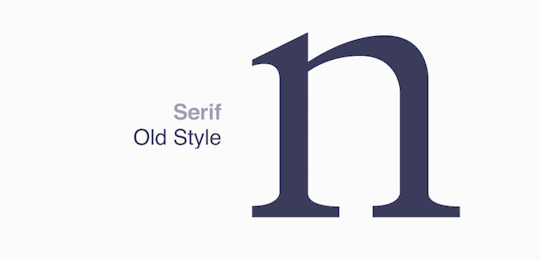
Serif
Old Style—Medium thick/thin contrast, serifs are commonly set at an angle to the left. This was the first style of type to revolutionise how large bodies of text were printed.
Neoclassical—High thick/thin contrast, vertical stressing, thin serifs. Most neoclassical typefaces are
Transitional—Called transitional as it signifies the transition between Old Style type and Neoclassical by using some elements from both. With more thick/thin contrast than Old Style type, serifs are still very similar and head serifs remain rotated to the left commonly. But transitional typefaces feature vertical stress.
Slab—Minuscule thick/thin contrast, with thick ‘slabs’ as serifs. Slab serif typefaces are commonly perceived to be one consistent weight from the characters to the serifs. There is rarely ever any bracketing between the strokes and the slab serifs.
Clarendon—Originally designed to be used more as display type, Clarendon type has a low thick/thin contrast, thick but short serifs and vertical stressing. Head serifs remain like the Old Style by being slanted to the left.
Glyphic—Low thick/thin contrast, vertical stressing, but unique serifs which stop at a point rather than a line. This makes them sharper, or have a triangular look.
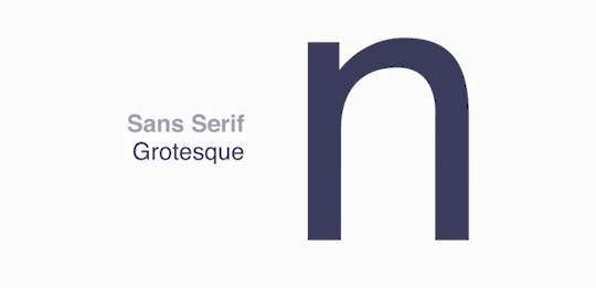
Sans Serif
Grotesque—Thick/thin contrast is relatively apparent for a sans serif typeface. Old grotesque typefaces have slightly square letterforms, meaning the curves aren’t completely spherical but more so resemble a rounded rectangle. As this style evolved, the line weight contrast decreased and the squared curves of each letter became rounder, which distinguishes traditional grotesque typefaces from the modern renditions.
Square—Very similar to how grotesque type is formed, but the main distinction of a square sans serif typeface is how the curves feature a more ‘squared off’ look.
Humanistic—Medium thick/thin contrast, but relatively high for a sans serif typeface. Humanistic type is the closest visually to serif type, just without the serifs at the end of the strokes.
Geometric—Simply, type constructed with geometry. For the most part monoline (all one consistent line weight), the letterforms are less organic and more structured as simple geometric shapes are what the type is made out of. Because of this, however, geometric typefaces may sacrifice legibility and consistency depending on how strict the geometry is used to make the characters.
Script
Formal—Formal script typefaces resemble the formal writing style of the 17th century. A cursive handwriting style with many of the letters joining, including the capital letters.
Casual—Casual script has a roughness to it which means it is perceived more as hand-written instead of professionally made. The point of casual script is so the viewer can relate more to how the type is made, meaning there is a lot more room to alter the typeface.
Calligraphic—Typefaces that resemble calligraphy. Calligraphy includes a wide range of styles, but calligraphic script typefaces commonly feature cursive type with a hand-written look and joining letters.
Blackletter—The earliest style of type and deriving from the first ever type face ‘Blackletter’, these typefaces communicate an old, vintage look as the type has been in use for so long.

Decorative
The last style of type is the most open, as decorative type just means type with a sole purpose to portray a feeling rather than being readable. Some common type of decorative type include:
‘Funky’ Type—Characters with expressions such as curled serifs or extreme thick/thin contrast, but usually relating back to ordinary type.
Grunge—This is usually another typeface with an added texture to create an accessible way to create a rough piece of text.
Graffiti—This is an example of how decorative type may relate to certain cultures. Graffiti has a distinct look in its characters, so some typefaces look to capture this.
Horror—Decorative type can relate to a genre by using certain characteristics to portray this genre. For instance, horror type typically uses rough, fragile letters with sharp line endings to reflect scratch marks, claws or blood.
Western—Another example of a genre being portrayed within a typeface. Western type will usually feature more unique serifs and character forms. It isn’t uncommon for certain western typefaces to also have textured variants as well.

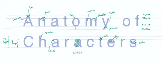
Anatomy of Characters
Characters in a typeface are made up of several different parts. Each of these individual elements can each be altered to affect how the letter is perceived. When done across a whole typeface, just one small change applied across each letter can drastically change the perception of the typeface as a whole. The simplest example of this is the line weight. A thinner line can be perceived as fragile or in some cases elegant. Thicker lines tend to be used for display type as they are striking and make the type easier to understand in short forms. The construction of a typeface can be split into the measurements in which the typeface follows in order to stay consistent and the separate parts of each individual character. Here is how a conventional typeface remains as consistent as possible:
Baseline: The level in which most characters ‘sit’
Capline: The level where capital letters extend to
Meanline: The level where lowercase letters extend to (excluding lower case letters which extend upwards: b, d, f, h, k, l, t)
Cap height: The height from the baseline to the capline, or the height of the capital letters
X height: The height from the baseline to the meanline, or the height of most lowercase letters
Kerning: The horizontal spacing between two or more letters
Leading: The vertical spacing between two or more lines of text
Individual characters are made up of many elements. These include:
Stem: The largest vertical part of a character
Stroke: ‘Stroke’ can either describe the largest diagonal part of a character, or a collective term for each main straight part
Hairline: The thinnest part of a typeface
Beardline: The very bottom point in which any character of a typeface reaches
Arm: A horizontal part of the character which connects to the stem. This could either be from one stem, like seen in the letter ‘E’, or either side of the stem, like the letter ‘T’
Crossbar: A line (usually horizontal) which connects two stems, strokes or hairlines or any mixture of them
Terminal: The abrupt end of a line with no serif
Serif: When the end of a line is given an outwards expansion to stylise the ends of a character
Bracket: Small curvatures which join the end of a line with a serif. Serif typefaces have varying sized bracketing, with slab serifs having none
Ascender: the part of the stem of a lowercase letter (’b’, ‘d’, ‘f’, ‘h’, ‘k, ‘l’, ‘t’) which surpasses the meanline upwards
Descender: the part of a lowercase letter (’g’, ‘j’, ‘p’, ‘q’. ‘y’) which surpasses the bassline downwards
Apex: The upper point where two strokes meet.
Bowl: The curved section of a letter. These can either be round, closed or open
Axis: The ‘tilt’ or ‘stress’ in which the thickness of bowls in a typeface are set. This can be seen with a line between the two thinnest/thickest parts of a bowl
Loop: The loop present in the lower section of a double-story ‘g’. This can also be open or closed
Neck: The stroke that connects the top bowl of a lowercase g to the bottom loop
Ear: A small extension from the top bowl of a lowercase
Counter: The negative space of a character, whether this be fully or partially enclosed
Shoulder: The curved part of a character which projects from a stem. Present in the letters ‘h’, ‘m’, ‘n’ and ‘r’.
Spine: The main section of an ‘s’.
Spur: A small projection from the main part of the character. Typically seen in an uppercase ‘G’.
Tail: The part of a letter (’Q’, ‘K’, ‘R’, ‘g’, ‘j’, ‘p’, ‘q’, ‘y’) which extends downwards
Swash: A decorative curve replacing a serif/terminal.
Overshooting
Considering the above guidelines of how to make a typeface consistent, in some cases these rules can be altered in order to make a character seem visually similar to the rest of the characters. As a consequence of negative space, or the ‘counter’ in a character, some appear to be visually smaller, although they are the same height. This can be seen simply using geometry to showcase how negative space affects our perception of size.
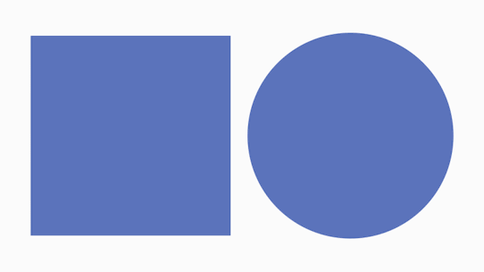
Because of this, where round letters will appear to be smaller than other, straighter letters due to there being more negative space surrounding them, the round sections are extended slightly above the X height (or cap height for uppercase letters) and below the baseline. Although this means they have slightly different restrictions to the other letters, when used as a typeface this slight correction means they are perceived to be more equal in size and therefore consistent.

Ligatures
Ligatures are connections between two letters, combining them into one shape. This is usually used for when letters will otherwise be uncomfortably close, so instead of trying to separate the letters from each other and disrupting the consistency of the type, ligatures are made to combine the two letters together avoiding the look of them being cramped. They can also be used stylistically, to add flourishes, although this is mainly seen in cursive type.

0 notes
Last Seen Blogs
ankedo-kafka
ميشكين
usbotthrills
- Theo -
l00tkirby
I can play along. I can be g00d.
count-cr4ckula
COUNT CRACKULA'SCASTLE

indiansissymaid
Untitled