#the lineart made things 100% better like wow
Text
A BASIC GUIDE TO DIGITAL ART ON PROCREATE
okay so i joined the digital art scene about a year or so ago and it has been a total whirl! there’s so much stuff that’s so confusing and hard to understand at first. And that’s okay! A stupid amount of what constitutes as “good” or “complex” art is to do with layers, patience and experience.
and because literally every tutorial on here is for Paint Tool Sai i thought it might be useful for those of us using Procreate! because i don’t have sai and i have a relatively shit laptop by comparison to my Ipad.
so without further ado - here is how to make a KICKASS piece of art on procreate
1. REFERENCE + SKETCH
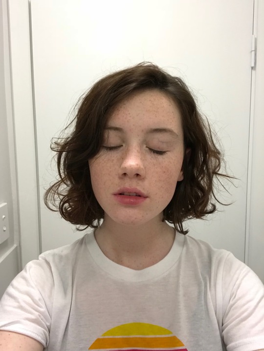
the first thing you're gonna wanna do is collect any references you need for thing youre tryna make. you can collect references by finding stock images, using other artists work (i use these mostly for colour refs cause i SUCK at finding good colours). however when i make art nowdays i usually just snap a selfie and use that. for this work i did the last option (see below)
after grabbing my reference i decide on the style i wanna use. for beginer artists what i suggest doing is just pasting the image onto your canvas, opening layers and adjust the opacity to around 20% by clicking on the little N on your layer with the photo. then once thats done add a new layer by clicking the + and work over that
for more experienced artists experimenting with style just stick that bad bitch reference in the corner, then open a new layer and sketch in your own style.
when it comes to sketching i usually do little flicky lines. i do this with a mid grey (like 50% white 50% black) i recommend the “Narinder pencil” which you can find by clicking the little brush at the top, selecting sketching and then selecting that bad boy. you can adjust size and opacity using the sliders to the side of the screen.
when sketching you just wanna get a rough idea of where you’re gonna do your eventual lines - don’t worry about it being smooth or anything just get down where everything goes
once you’re done you might have something like this:
this brings us too...
2. LINE ART
for beginners - lineart is just a sexy word that means a clean drawing with hard lines so you can colour it easier and it looks prettier. you want to do this on a new layer so you can delete the sketch one later.
your goal with lineart is to make it three things:
1) its gotta be seamless so you can select the insides, don’t leave little gaps between lines
2) its gotta be smooth! jagged lineart isn’t NEARLY as sexy as smooth curvy lines
3) this one is more of a tip - but lineart generally looks better if you do thinner lines inside your shape with a slightly thicker border line. again this isn’t essential but i find it looks cuter
the way i get my lineart all cute is by using the monoline brush (found in calligraphy). sometimes i use my own modified version of the Technical Pen (found in Inking) but mostly monoline is pretty neat. You can use whatever brush you want but mostly you just wanna ensure that its nice and smoooooth. you can do this by selecting the brush and then clicking it again. this will bring up a popup menu like this:
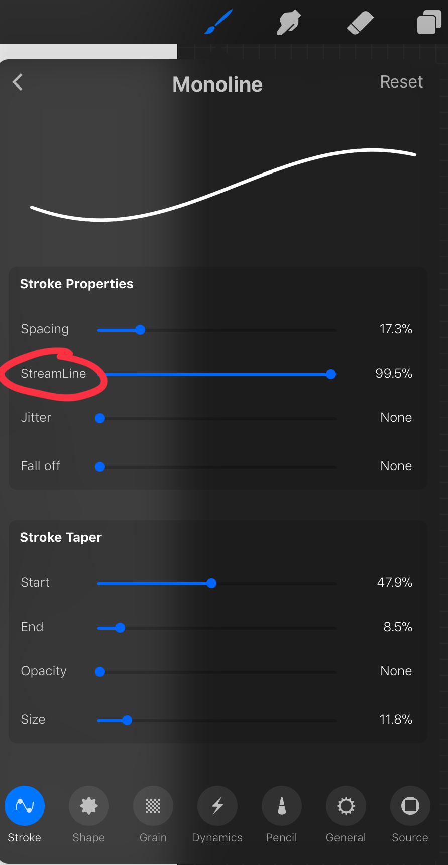
most of these brush settings are complicated and stupid and i’ll do a big post about it later. the only one that really matters here is streamline. if you wanna use a different brush for lineart just wack that slider up between 80-100% and you’re set.
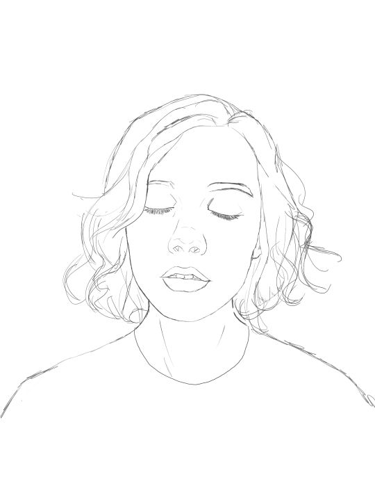
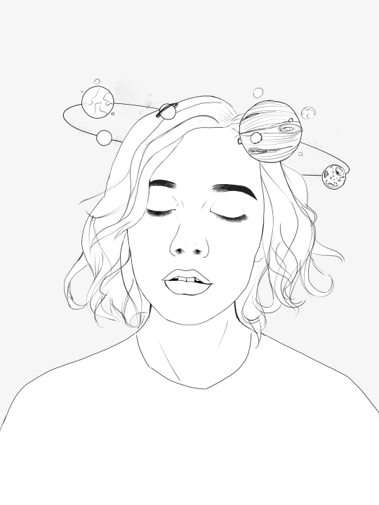
once your lineart is finished on a seperate layer go to your layer menu and unselect the little tick on your sketch layer. you should be left with something like this.

3. ADDITIONAL DETAIL LINEART + MONOCHROME BASES.
once your focus lineart is done you can add detailed lineart by repeating the same process with sketching and lineart i described above. i like to do details separate because if i dont like it i can just delete the whole layer without destroying my focus.
what i find important in these now is using my favourite fuckin tool in this whole program. you can find it here:
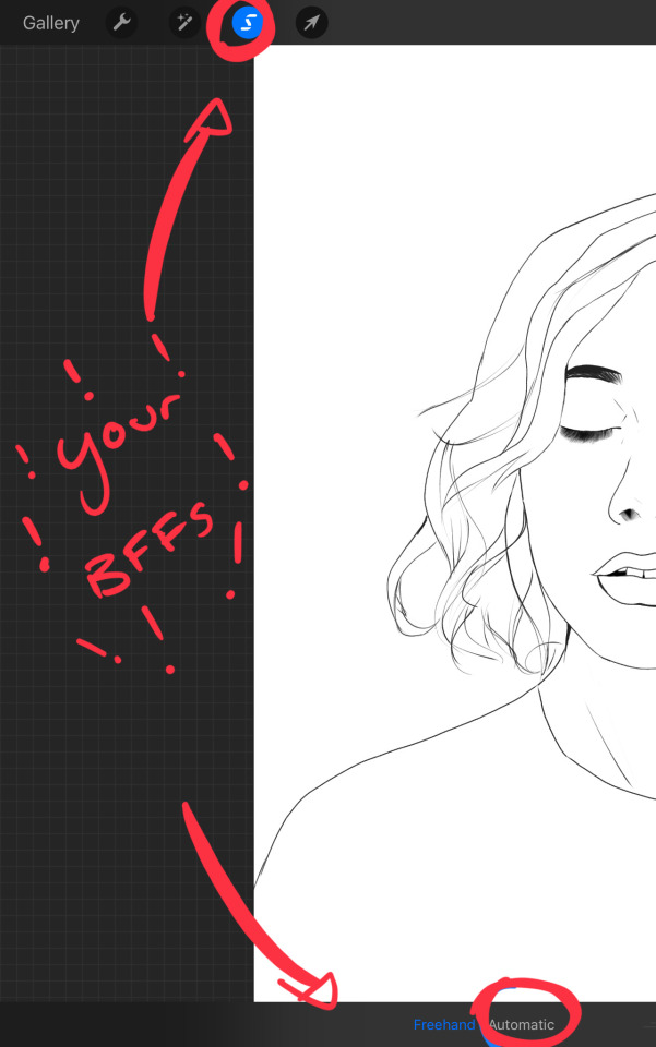
Only start using this once youre 100% done with your lineart. once thats done - make sure youre on the lineart layer and click that weird little s at the top of the screen. go to the bottom and click automatic. then select somewhere INSIDE your lineart. it should do something like this:
don’t freak out! what that blue stuff means is that you've just selected the inside bit of your lineart. continue selecting until your subject is 100% coloured in.
MAKE SURE THE BACKGROUND/STUFF OUTSIDE YOUR LINEART ISN’T SELECTED.
ALSO MAKE SURE YOU’VE SELECTED THE LINES THEMSELVES. THEY WILL TURN WHITE ONCE THEYRE SELECTED.
if u fuck up and select something by accident that’s all g, theres a little undo button on the bottom. if you click on the paint brush or another tool and you cant add stuff to your selection you can reload the mask by holding down on the weird s and the selection will reload. If there are certain bits of your work that you’re struggling to select with automatic selection that’s also not an issue. just click the “freehand” setting next to the automatic setting on the bottom and you can now use your stylus to draw around what you want to select.
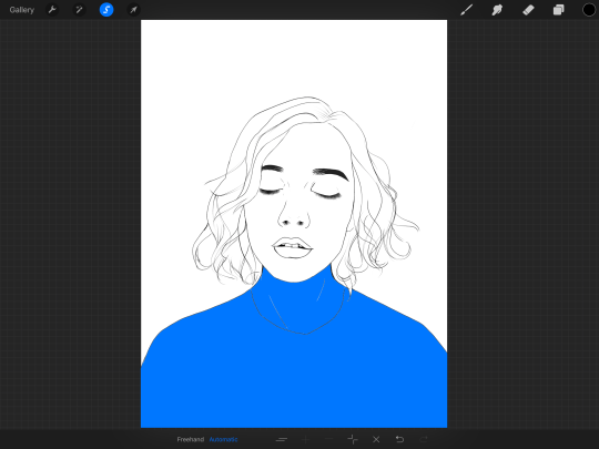
once you’ve selected your foreground in its entirety - THEN click the layer button. insert a new layer underneath your lineart layer. Using literally any brush (works best if you get one from the painting section) colour EVERYTHING white. just get round brush and colour all of it. you wanna keep your line art layer separate over the top.
once all of it is coloured hold down on the weird s tool until it reloads the selection. then look along the bottom of the screen and click the little button that looks like 2 arrows pointing at each other.
THIS INVERTS YOUR SELECTION.
Open a new layer and make this entire thing a grey. THIS IS WHOLE STEP IS OPTIONAL BUT ITS SUPER USEFUL AND THE SELECTION TOOL IS SUPER HELPFUL FOR GOOD ART. DOING THIS WILL BE SUPER USEFUL WHEN YOU COLOUR STUFF LATER.
once you’re done it should look something like this:
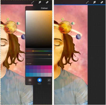
4. BASE COLOURS
okay so this is where shit starts to get real. The goal of putting down base colours is to make is easier to add eventual shading to your piece and decide your colour scheme. This is where the white layer you just used is gonna become your BITCH.
you wanna start by duplicating your white layer you just made. You do that by opening your layer menu and swiping that thot to the left. this is what should happen:
click duplicate. Select the top duplicate you just made and select our favourite weird s tool. click inside your shape and the whole white shape should go blue (become selected). next, open a new layer on top of the white layer. colour in your base colours and now none of it can go outside the lines. you didn’t even have to do a billion selections. you just select inside the white blob on the layer we made the step before, opened a new layer and started colouring. fucking superb. so much time saved. DO YOU KNOW HOW MUCH I USED TO SUFFER BEFORE I THOUGHT OF THIS. HOW LONG I SPENT SELECTING AND RESELECTING I CANNOT
A TIP FOR PEEPS NEW TO THIS PROGRAM - if you use your finger and hold down on a colour you’ve just used it acts like an eyedropper tool so you can pick up any colour you want. like this:

once you got your base colours done you can either:
1) go to your grey layer you made in the last step and select the tick next to it. once you’ve done that scroll to the bottom of your layers and select background. it will open a colour wheel. pick your background colour.
2) you can use my second favourite tool from this program! go to your grey layer you made in the previous step. click on it, then click on it again. (not the little n just click the whole layer) this menu should pop up:

oh MAN okay so.
“alpha lock” pretty much means that it locks whatever is on the layer. when you get another brush and go over a layer with alpha lock turned on you can only paint over what you have previously put on the layer before turning on alpha lock. Its like automatically selecting everything on the layer. its fucking brilliant.
anyway.
scribble over your grey layer (once alpha lock is on) and boom you have a base for your background.
NOW YOU KNOW ABOUT ALPHA LOCK YOU GO BACK TO YOUR LINEART LAYER. SELECT ALPHA LOCK. COLOUR IN YOUR LINES ROUGHLY 2 OR SO ISH SHADES DEEPER THEN YOUR BASE COLOURS
(minus eyes i like to keep the lines around them black.) this will make your art like 100000000 times nicer (majority of the time)
once you’re done you should get something like this:
this brings up to...
5. SHADING!!!!!!!
this is my favourite step tbh.
what you wanna do is chuck on a new layer over the top of your base colours. and go into your brushes. pick up your basic bitch “round brush.” this is (in my opinion) the best painting brush in the program. Its the thing you can do the most with. so what you wanna do it get a slightly deeper colour from your colour wheel by yeeting your colour selection slightly more saturated and slightly more dark. dont just make it blacker move your colour selector on a diagonal to get a nicer colour. (i’ll eventually do a colour theory ref but today is NOT that day.)
i like to do colouring in short, light strokes. DON’T PRESS TOO HARD. you wanna get that cute little gradient.
A THING FOR BABY ARTISTS: on every art program i have ever used, the blending tool SUCKS. it makes paintings UGLY AF. (wow another tutorial i have to do at some point.
i HATE the blending tool.
SO HERE IS HOW I COLOUR MY ART TO MAKE IT LOOK, YKNOW, GOOD:
Unless you’re drawing something SUPER freaking smooth like a bubble or some shit. when you wanna blend colours what you gotta do is:
1) put in your darker colour.
2) use your finger to bring up the eyedropper tool to select a mid colour of the colours your blending together - a mix between your lighter and darker colour. (remember that tool? it looks like this)

3) Paint the colour you just made in the middle of your lighter and darker shades. REPEAT THIS PROCESS ON EITHER SIDE OF THE COLOUR YOU JUST PUT DOWN TILL IT LOOKS GOOD. The result is an WAY sexier piece of art.
once you’ve put in all your shadows repeat the same process with highlights.
FUN TIP:
if you decide you dislike a colour or want to change the colour you already did all the shading for you can change the colour without any major drama. You can do this by select ing the colour on your colour wheel you would like to change your already shaded work too. (make sure you’re on the right layer.) then hold down on the colour dot on the top bar (next to your layer settings) and drag it to whatever you want recoloured. let go of the dot and it should recolour your work (including all the shading you’ve done granted that its on the same layer) like this:
once you’ve got all your shading done it should look something like this:

6. background and pretty bits
so! youve got this kickass work but nothing surrounding it. lets fix that.
In procreate there is SO MUCH you can use to spice up a work. a SCARY amount even. this is when layer settings are gonna start to come in handy.
ill do a masterpost on procreate brushes for backgrounds later, but for this piece what im gonna do it head over to the Luminescence section and pick up a “nebula brush”. this makes a complex galaxy kinda design in a randomised stamping pattern that is frankly SEXY AS ALL HELL. Select a layer below your base colours but above your background colour.
IMPORTANT NOTE: this brush’s blend mode is autimatically set to “add” (ILL DO ANOTHER POST ON THAT LATER)which means if you go over the same spot heaps of times it will eventually go a bright white. This can be nice, but its not really what i want cause its kinda intense. to make this thing go glowy but not ~too~ glowy im gonna lower the brush opacity (the bottom slider) to around half way. i set my colour to a light yellow and a darkish pink and put in some nebulas!!!!
once that was done I wantd to add some more colour variation so i popped open a new layer - selected the lightleak tool and lowered the brush opacity using the slider to around 20% just to spice some shit up
you can kinda do whatever you want for your background. sometimes its nicer just to go into artistic, select a random brush and draw a square underneath what you were doing. backgrounds can be super detailed or super easy it doesn’t really matter to be 100% honest.
THE PART 2 OF THIS STEP WILL ADD HEAPS OF DIMENSION TO YOUR WORK AND MAKE IT SUPER PRETTY:
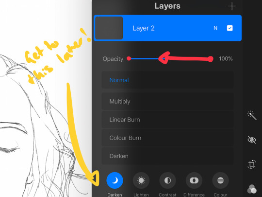
adding light effects over the TOP of your main subject often creates a more realistic sense of depth. In simple terms it just makes the thing look more 3D and nice. to do this, get a random brush with a nice (preferably light) colour. i picked up a “bokeh brush” from the Luminescence section. make this pretty big. sprinkle your brush across the page on a NEW LAYER above all of your work so far, including line art! Then open your layer menu and click that little n in the corner again. Remember this one:
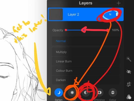
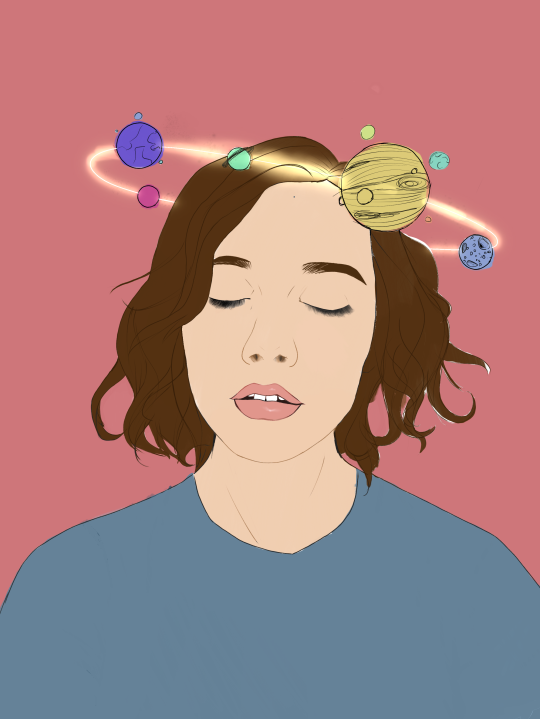
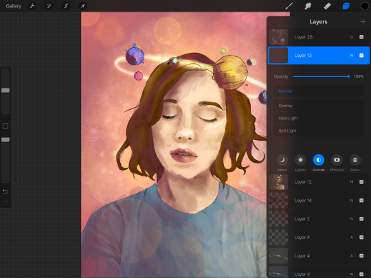
click the little n. then go down to the bottom and select a layer setting from either of the 2 groups circled (i normally like overlay for this type of thing) you can mess around with layer settings and opacity till you find something that looks super nice. My piece now looks like this:

pretty cool right. now we’re gonna make it EVEN COOLER.
7. LIGHT FILTERS
this is something i picked up from artists like softmushie and cryptidw00rm. (not gonna @ them here cause they probs dont wanna get tagged in my shitty tutorial thing but yeah i owe so much to those two especially)
for those unsure of what im talking about: light filters are layers you add over work to make the lighting on it seem more natural and pretty. you do this by colouring over your natural highlights and shadows with different colours and then messing with the layer settings to make it seem like its being hit by sunlight. these layers go BELOW your foreground stuff (the bokeh lights from step 6) but ABOVE your lineart.
start by opening a new layer. select a colour similar to where the green outlines are here:
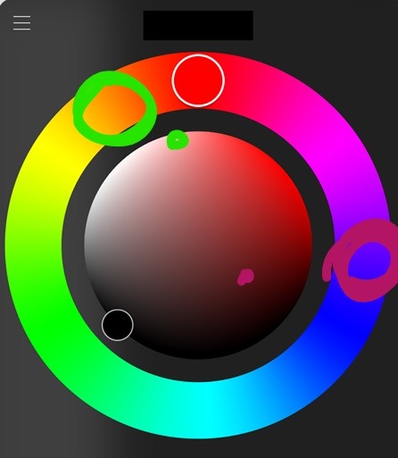
now on this layer paint over anywhere where the sun or other light source would be normally hitting (like cheekbones hair etc.) this can be kind of like shading. dont worry if it looks shit at first we’re gonna change it.
open a new layer beneath the one you just made. Using a colour similar to one circled in purple above colour over all the shadows in a piece. it should now look like this:
now open your layer settings on the purple/darker layer by selecting the N like we did with the foreground layer before. you can play around from here by setting the layer mode to anything from the “darken” or “contrast” menu. For this work i chose overlay. I then lowered the opacity until it looked nice.
Repeat the step above with the lighter highlight layer. when adjusting this one make sure you set the layer mode to anything from the “lighten” or “contrast” menu. For this work i did hard light.
your peice should now look kind of like this:

AND YOU’RE DONE!!!!!!!!
look at that sexy thing you just did. Congrats on creating an awesome peice of art!!!!!!
if you guys are interested in more tutorials like these or have any reqs for similar stuff send me a question or a dm to my blog @plasticbattleaxe
if you create anything by following tutorial that you want me to see don’t hesitate to tag me or submit it to my blog!!! i love seeing y’all make art
also - i know it’s annoying - but reblogs > likes. thanks for your support
i hope someone finds this useful!!!!!
#reference sheet#art reference#reference#art ref#procreate#procreate ref#zoeyeets#plasticbattleaxe#plasticbattleart#layer ref#art tutorial#art studyblr#art tips#ref artist#tutorial
1K notes
·
View notes
Note
i miss your haikyuu art so much it was the best - dont get me wrong i fucking adore your bnha art but like,,,,, haikyuu,,,,,,,
Well pal, aren’t you lucky, you might have been missing from my blog in the past two weeks but if you scroll down just three posts you might notice I’ve been drawing haikyuu again (x x x)
Anon said:People don’t remember baccano anymore? :o
I assumed so since it’s been ten years since it aired and the fandom has always been small and quiet anyway, but it looks like I assumed wrong!!!! That made me so happy, honestly? Baccano’s my fav anime ever, it’s always super nice to see it appreciated!
Anon said:I’M HAPPY YOU LIKE BACCANO! NOBODY KNOWS IT
Anon said:Omg thanks for the baccano au I love it.
Anon said: BACCANO!! I love you so much right now!!!
Anon said: YOU DID A BACCANO CROSSOVER!! IVE NEVER SEEN ONE DUDE MAJOR PROPS TO YOU!!!! I literally love that series, it was one of my first ones so seeing it mixed with one of my current favourites is surreal!!
Anon said: DID YOU JUT DO A BACCANO AU OMG ITA BEEN SO LONG SINCE IVE WATCHED THAT IT WAS MY FAVE 😭😭😭😭😭 i cried so much during it all the time it was so badass
This is exactly what I was talking about!!! So HAPPY all of you love that anime as much as I do! And thank you SO MUCH for liking the crossover!!!!!!! ;O;
Anon said:Fran, just out of curiosity, what colors do you associate with Bakugou/Kirishima/the rest of the squad?
The ones I use to write their dialogues! Orange for Bakugou, red for Kirishima, gold for Sero, yellow for Kaminari and pink for Ashido! :D
Anon said: tumblr has been a butt and not notified me of your post but i saw your nishinoya and i died i love the way you draw him and boiiiiii bokuto and kuroo be looking smokin and your kiribaku (is that right??? im a failure i cant remember!!!:( ) is amazing SO MUCH FLUFF i die of happiness. keep up the lovely work 💕👌👌👌
THANK YOU SO MUCH FOR ALL THE KIND WORDS HOLY SMOKES!!!!!!!
Anon said:I love your art its so amazing.
Thank youuu ;u;
Anon said:I was just wondering if I could use one of your drawings of Kuroo as a phone background (just for personal use! It’s fine if you don’t want me too! I’m a huge fan and I hope you’re having a nice day~)
Sure! As long as it’s just for personal use I don’t mind at all!!
Anon said:Oh wow, thanks for the tutorial! I think it will be really helpful!
I’m glad to hear that!!!! :D
Anon said: what is the jock / nerd thing?
At this point it’s mostly a meme, I’d say haha
Anon said:ASDFGHJKL *-* Your art is to beautiful for the world
That’s!!!! Too kind of you oh man (〃´ノω`〃)
Anon said:Your kiri is so pretty.
THANK YOU!! Every Kiri is super pretty tho, it’s the intrinsic Kirishima-ness of the Kiris that makes them beautiful whatever style they’re drawn in! :O
Anon said:YOUR ZORA ITS SO GOOD I LOVE HIM AS MUCH AS YOU DO AND WHEN I SAW YOU DRAW HIM I WAS LIKE: a m a z i n g 💕💕💕
OH MAN THANK YOU I love that disaster of a trickster so much I’m glad I could make him come out okay ;O;
Anon said:so i left tumblr a while ago?? but i check back every so often bc ur pretty much my favorite tumblr artist ever
Aw man thank you so so so much this means the world to me! ;u; sometimes it’s hard for me to see any improvement in my own art so knowing that you can see it helps a lot!
Anon said:your art is literally my favourite thing in the entire world i love it all! i hope you’re having a good day and taking care of yourself! x
GOSH THANK U I hope you’re having the best day too, anon!!!!
Anon said:Asahi is so pretty when you draw him, I love it; my gentle son, in your amazing art style.
I’M!!!!!! Glad you liked him!!!!!!! That boy is 100% out of my comfort zone so knowing he came out okay is super nice!!!!! :D
Anon said:The way I drew the bakusquad in that one set of images … They’re like … On the cover of Vogue or something. It’s aesthetically good to my eyes man. Also you kinda got me into tetsukami?? I don’t understand it at all but now im into it BC of ur fanart and bc of other fanart but Imma blame u and im grateful to have another ship to hyperfixate over. Anyway I love youu and your art man, i wish u many good days
Oh man I love you too anon this ask made me so happy???? And I’m especially happy I could get you into tetsukami! It doesn’t make much sense as a ship, does it? But they’d be fun interacting and their quirks work well together, so I have fun thinking about them! I hope they’ll interact in the classes 1a and 1b will have to share in the future! :D
Anon said:Oh I love your Noya’s, so glad you drew my boy again!:)
Thank you for liking him!!!!!! He’s hard to draw but I love him and he makes me happy!!! What a boy!!!
Anon said:Have you seen little noya in the newest chapter
I HAVE little boyo already had his blond hair how cute is that! The newest chapter made me really warm inside I really loved the whole speech Noya made ;u; my inspiring little lightning bolt !!
Anon said:I really really love your bnha art! But put some highlights on the kirabakus one, you probably have the quirk to melt my heart with them ;w;
That’s the sweetest thing I’ve ever read!!!!! Thank you SO MUCH!!!!!! ;O;
Anon said:Who do you think would propose? Bakugo or Kirishima???
I actually answered a similar question a while ago! But I can’t find it so I guess to sum it up I mostly think at some point it’d just become something both of them have talked about throught the years enough times that by then it’ll just be something they are gonna do, sooner or later, and when it’ll happen it’ll be more like “we have a stable income and a house and a dog and a cat and are p much already married we should really do this already” - in a scenario like that either of the two works, for me haha
Anon said:the best thing was that I just a moment before u posted I felt bad and pissed ad sad, but then all that disappeared ;V;
I’m!!!!! So happy to know I could help you like that!!!! ;O;
Anon said:Can I just say, I’ve been following your art a long time (I’ve always loved it!) and I’ve really noticed a lot of growth and improvement in your style? The thing that always impresses me most is how you are able to take simplified facial features and make them SO expressive. You convey emotions so well and I love it so much. Thanks for always giving us art to smile about! Hope you are having a lovely day!
THANK YOU SO MUCH OH MY G OD!!!! I’m!!!!! crying!!!! probably!!!!!!! FrICK!!!! ;A;
Anon said:KINONOYA!!!!!!
INDEED!!!!! What a good relationship they have!!!!!
Anon said:You draw Sero so good oml he’s too pretty
Anon said:THAT SERO YOU DREW!!! *clutches heart* n i c e !!!!
;O; I’m glad you like him?????? gods!!!!
Anon said:I love the way you draw Kaminari, he looks beautiful in your art style! ^^
SOB you guys are all so nice to me I’m gonna cry for real here ;U; thank you!!!
Anon said:Whenever I’m sad I look at your art and everything feels better.
!!!!!!!!!!!!!!!!!!!!!!!!!!!!!!!!!!!!!!!!!!!!!!!!!!! happy I can help you with your mood!!!!!!!
Anon said:When you Kiri with his hair down, I’m always like “that’s it, that’s the cutest Kiri ever” and then you draw him with it spiked and I’m like “no wait, there it is, the cutest Kiri.” And now you go and give me both Kiri’s in that adorable pair of sketches and how is that even fair because how am I supposed to handle that? I can’t even decide anymore. All your kiris are the cutest Kiri.
THANK YOU !!!!!!!!! All Kiris are the cutest Kiris tho, aren’t they? What an inherently cute boy he is!!!
Anon said:i showed my friend your art and since we both find it super good, we both decided to try to draw more regularly because we want get better and get a smooth(? idk how to say it in english lmao) style like yours so thank you for the motivation/inspiration!!
:O !!!!!! I hope you and your friend will have fun while at it, anon!!!!! :D
Anon said:I love your bakushima
AND I LOVE YOU
Anon said:drawing ppl from above is so cool though!! i really like these kinda pics ✨ (esp bo and tetsu, so /cool/!!) dont give up, fran❤
Please don’t enable me anon, if you give me the green light I’m gonna keep on drawing that sorta angle forever hahahaha (thank u so much for the compliment, tho!!!!)
Anon said: ahhh i love your recent kiribaku drawings! they are so cool!!
That was about the red and teal ones, right? Thank you so much!!!! Working with colors like that isn’t something I do often, so I’m really really happy that you guys ended up liking them!!!
Anon said: Row! Row! Fight the power!!
I don’t know what brought this on but HECK YES
Anon said:Man I love all your art, fanart and OCs alike! And your BNHA is such an inspiration and one of the reasons I started writing fic. Have a great day!
OH BOY that’s such a nice thing to know!! I hope you’re having lotsa fun writing fics, anon!! And I also hope you’re having a great day, too!!!
Anon said:OK, i’m sorry for sounding this emotional, but OMG your art makes me cry. it’s just… so beautiful… *there i go again* *crying*
*hands u tissue* thank you so much but please don’t cry!!!!
Anon said:I’M CRYING LUCA’S BIRTHDAY IS THE DAY BEFORE MINE, I’M A PHYSICS MAJOR, A MAJOR DOG (and cat) PERSON, AS WELL AS A MORNING PERSON LIKE WH A T
You’re the second person that tells me they’re really similar to one of my ocs!!!! I wonder what that means? :O but it’s a fun thing to know, anyway!!! :D I hope you don’t mind Luca being so similar to you, anon haha
Anon said: What do you think would happen if eraserhead erased fatgum’s quirk?
He’d probably just lose his ability to absorb hits and then re-use their power? :? but if he’s fat he’s gonna stay fat and if he’s slim he’s gonna stay slim, I think :O
Anon said:Oh my god you know kekkai sensen I’m actually crying I love kekkai sensen but no one I know likes it/knows about it and aaaaaaa I love your art and you drew something from kekkai sensen and thats amazing!!!!
I’M GLAD YOU LIKED IT and I know right? Kkss has such a small fandom! Which to me is super weird considering how much following Trigun used to have? :O it’s definitely one of the best anime I’ve seen in recent times, tho!!!
Anon said:FRAAAANNNNNNNN!!!! I’m soo excited!! I might be getting a tote from your shop for Christmas! My friend asked what I wanted, so I looked at your store, and chose a tote with Mina, and Hagakure (?) And he told me to send him the link!
HOLY SMOKES THANK YOU FOR BUYING MY STUFF ANON THIS SERIOUSLY MEANS THE WORLD TO ME!!!!!!!
Anon said: Your art is so good! I especially love your black and white stuff! Its really punchy! Also all your Kiribaku content makes my heart melt!!!!!!
*gross sobbing* thank you so much!!!!!!!!!
Anon said:would it be okay…if i drew luca (giving credit to you tho obv) i just love him so much GOD
YES!!!!!! Please do link me to it if you do draw him, I wanna see!!!!! :D
Anon said:Hey! I really liked your OCs and i was especially intrigued by Max and Leo!! Do you mind telling us more about their relationship? They look so sweet!!! Love ya and keep being awesome!
Thank you so much for liking my kids!!!! ;O; and sadly I can’t tell you too much about them cause their story is a bit still up in the air as far as details go, but in general they used to be best friends back when they were kids, then the accident that gave Leo his scars happened and for reason they lost track of each other for a long while - they met again recently, tho! Leo’s been in love with Max since they were babies and being able to talk to him and interact with him again makes him incredibly happy/mushy/soft but also absurdly and unreasonably overprotective since he’s really, really scared of losing him again - Max… because of plot-related reasons hasn’t realized that Leo is the kid he used to know back when he was super young, so his falling in love with him happens as the story progresses. He finds the overprotectiveness silly and unecessary, but he doesn’t exactly mind it? He has a feeling it helps Leo more than it helps him, so he lets him do his thing. All in all, maybe Max takes more care of Leo than Leo of Max. Welp, their story is kind of a mess haha
Anon said:Have you ever thought about doing nsfw? Or at least something kinda hot?
This is actually answered in my faq! But yeah, no, I don’t do nsfw, sorry! Something kinda hot… maybe in the future? But I gotta be in a very specific mood that doesn’t come around too often, so I dunno if and when that’s gonna be!
123 notes
·
View notes
Text
Oh man I NEVER EVEN KNEW about ‘overshooting’!
you dont even notice it in the game but wow that explains why the skullgirls attack animations seem to hit a lot harder than most fighting games. Like seriously, just a split second of one fist going cartoonishly big at the end and then snapping back to normal. Its amazing that its the snapback that does it, not even the exaggeration! It can be such a small size increase, or even just a darkened outline or a move continuing forward further than the actual moment of impact. Like a lil slide after they come back down, but before they jump back into the default position.
SO FASCINATING!!!
And there was a really cool example from street fighter of a character’s sleeve poofing up when they punch, and then flowing back down, to give the same impression!
And how going off model is necessary for good animation! Silly looking smears are completely fine as long as it leads to a fluid animation. She literally calls it ‘breaking the body’, and encourages you to abandon anatomy for the biggest impact keyframe.
“You don’t have to make every frame look perfect, you’re creating one piece of movement, not individual pieces of art.”
Its really interesting to hear how they like.. do animation as the last stage.
Well, they do the animation but they dont.. complete drawing it?
They make a playable build using their storyboard sketches, and then later their lineart animation, and etc. And they playtest it each time and send notes back on anything that looks wrong while in motion, so they can catch it early and save a lot of wasted work.
Thats such a simple yet effective ay to do it! I can’t believe i never thought of it!
Also i really admire that miss cartwright says she’s very nervous giving the presentation, and generally has a very personable honest friendly attitude. I mean, you can tell she’s just a normal person and she may be good at animation but that doesnt mean she could do this presentation effortlessly. It seems like she put a LOT of work into practising for this, and it really paid off! None of this stuff would be so fascinating if it wasnt delivered so well in a really accessable sort of teaching style!
Holding frames at different intervals can make a huge difference, wow! She does say how its super important to work within your hardware and to your boss’s specifications though, some games arent lucky enough to actually be able to have variable framerates. But WOW, Skullgirls looks so much better with it!
She showed an example of one of cerebella’s moves, and how it doesn’t read very well at all when every frame goes by at equal speed. It just looks like.. well, if you wave a ruler back and forth? It looks like one wiggly squiggly arch rather than emphasizing what actual movement is happening. When stuff is that fast, you need to remember that the human eye isnt gonna take in the detail of every single frame, so you need to slow down or otherwise emphasize the bits that’re important to the move. Plus also, having an equal framerate means that smear frames can be too SLOW, and be more easily visible, thus breaking immersion! So in the final version the smears run faster than the rest, and the frames at the start and end are slowed down. (when she’s raring up for the attack, and once her fist actually clenches and grabs the foe)
Again, I had NO CLUE that ‘hitstop’ was even a thing!
The technical term for the sort of ‘slow motion after the impact’ thing. Its not usually as extreme as it is in the end of boss battles in Kingdom Hearts, for example, usually its more like just two miliseconds of the enemy staying in their downed pose before falling to the ground and bouncing back up. Again, its about speedup and slowdown to emphasize impact! If you just leave the game’s programming as-is and don’t bother to account for this, you have characters recovering from the hit too fast and it doesnt even look like it hurt.
I think this is probably related to the concept of ‘mercy invincibility’, too? Thats kinda a way to give the PLAYER a moment to react to the attack!
Another really interesting tip- the reason why games snap back to the idle animation! She says its actually very bad to animate in-betweens of a character returning to their idle pose, snapping back is way better. It doesnt interrupt the idle, and you don’t have to think about animating a return pose that fits equally well with every different attack. plus it slows down combat cos the player cant immediately attack as soon as they’re back on their feet. overly long recovery animations can lead to a character thats disproportionally weak to getting stunlocked! Plus it just gives a sense of speed and badassery to a fighter who can flow so seamlessly back into the action.
I also like that she talked about the things she wasn’t happy with in her work, and used them as teaching examples. That takes a lot of self confidence to be able to talk about!
I’ve gotta agree with her, that less frames is snappier sometimes. Its not always about looking the most artistic, in a videogame stuff has to be speedy enough to match with the limits of the action.
And I loved the bit where she showed how completely 100% even frame amounts can make stuff have less impact, how removing just one frame from the fist buildup made a punch attack so much better looking!
A funny anecdote: apparantly they went a bit overboard with the first attempt at jiggle physics. They had the problem of too many frames in an idle animation, ENTIRELY because of the boobs!
So lol, its nice to know they put the effort into making everything look more realistic and actiony, even the silly fanservice bits.
Oh and at the end she reccommends some sites that archive fighting game animation sheets! Even professionals still love playing and researching other games for reference!
zweifuss.ca and fightersgeneration.com
#lol i just loved that vid so much i had to ramble#plus i know not everyone can watch a half hour tutorial so i wanted to write up the tips i thought were most important
2 notes
·
View notes
Text
[ Halloween 2007 and stuff ]
Monday, Nov. 26, 2007
I haven’t been posting much in my journal lately. One event I feel like I should discuss is perhaps my first -real- party. That is, involving drinking and stuff. :/
I went to a Halloween party in an apartment that was hosted by Jack and his roommates. People were dressing up in scantily clad outfits. It was quite funny how the gay guys were more revealing than the females. Anyways, I was dressed up in some random dress I got at the girl’s section at kohls. I didn’t really have a costume so I decided to just go as some black/white Lolita ish girl. Jack’s friend lent me fairy wings to accompany my dress and gloves. As people were first taking their drinks, Jack and some of his friends were telling me how to drink vodka lulz. Some people looked at me weird, and Jack told them it was my first time drinking. I believe I had like about 2 and a half to 3 shots of vodka..plus a couple sips of beer and some Smirnoff. Jack told me I was trashed at some point. >.>.
Yeah, I was dancing with a bunch of gay guys. It didn’t do me any good. But I figured, I don’t have a lot of opportunity to do shit without barriers. Meh what the hell. My face was also red damn asian blush.
Luckily, I didn’t have a hangover, nor did I feel nauseated/sleepy/ get a headache. A lot of people were tired, but I was fine. I’m kinda surprised I could tolerate that alcohol considering how small my body is.
>I met some interesting people. I like talking to people without any fears. I inquired about the costumes etc. There were interesting costume designs. Overall, it was a worthwhile event to experience. I was sensible not to overload myself with drinks. The time seemed to pass by quickly at the party; I had no idea it was already 3 in the morning.
The next day Jack was going to dallas to another party with his school friends. I was a bit disappointed I couldn’t come along. The circumstance of my coming would be quite awkward and I don’t want to be a hindrance to people. I don’t want to be rude and invite myself to parties.though I felt like I invited myself to Jack’s Halloween party. Hmmm He did mention it to me in previous weeks/months.
-------------------------------------
I don’t know why I feel so apathetic when it comes to writing journal entries. There are times where I think about what to say, but when I actually feel like writing. I lose those instant thoughts and emotions. Wow, I am even procrastinating when it comes to writing in my journal. How sad.
-------------------------------------
As far as school stuff...i am disappointed in my progress. It could be worse? But I know I can do much better. The results of my goddamn pcat score is also making me feel more miserable. *sigh**sulksulk* killtheaptathykillitkillit I still haven’t made a close friend at my university either lol. My roommate and I are getting along. I think she is perhaps the most sociable of the roommates I have had. Also, I can relate to her than my other past two roommates. There are times where sometimes, I just want to be alone though and I don’t want to talk to her. So I have been noticing how sometimes my responses display brevity and disinterest. I prefer intentional solitude at times.
--------------------------------------
I don’t know how I feel scared or apathetic. Perhaps I am just anticipating pessimistic outcomes to ease my strife in failed attempts. Oh lord we have an emo speaking. Stabbyripstabstab. A couple of weeks til the end of the semester - I can’t give up.
-------------------------------------
I want to draw more. I haven’t been doing art shit in a while. And now I have started drawing some doodle things..i wish I could have the time to focus on my skill and improve. It’s like I just want to seclude myself from others and work on my art. At some point Jack felt suspicious why I was not immediately eager to hang out with him when we both came to our hometown. Neglecting homework to work on some lineart hmm sounds fun to me. Damn the inspiration/influence.
----------------------------------
Damn anime. Damn anime for being so fucking addictive and wasteful of my life. I have been spending hours sitting on my nonexistent ass trying to cram all the released episodes up to date. I even managed to read the manga and reached the latest chapter because I can’t get enough of the anime ohshit. Katekyo hitman reborn, you are evil. I didn’t even care about it in the first place. Those baby things are ugly..like reborn. But you can’t help but notice other characters that stand out. [insert fangirl mode here] I don’t even care much about naruto and bleach characters anymore. I don’t care about those yaoi doujinshis (gay pronz manga) much to hunt for them. Reborn is just another one of those anime phases which will eventually settle to a point zero. Watch it drag to 100+ episodes along with pointless filler episodes. When anime shit run that long, I get used to waiting for a long time and I lose that obsession spark. I never thought I could care about yaoi doujinshis much.. I got pretty bored of looking at death note yaoi doujinshis. But damn, the manga art in hitman reborn is so much better than how they look in the anime
Wow and I am even going as far as drawing freaking reborn fanart. I rarely draw humans or fanart for that matter. It pisses me off that I suck at drawing humans well. If I had the skill to draw humans, I’d draw them more and possibly even yaoi stuff I dunno >.<. If the face doesn’t look attractive to me ( I mean like uber hot), I feel like my human drawings have failed. So yeah, this is why fantasy creatures and anthro shit have a prominent occurrence in my art because I don’t have to worry about facial attractiveness of the characters. I guess my humans have shown some improvement compared to earlier years. Still not good enough to claim myself and a l33t fan artist.
0 notes
Last Seen Blogs

lacunabhea-blog
Bhea Lacuna

fact-might-all
Untitled

rivalappears
www.ameliaflowers.co.uk
raccoonium
Uhh, hi
