#technically. im tagging everything i translate as this because it makes it look like ik more japanese than i do
Text
thinking about. in the mr showtime mv when tsukasa is holding the balloons the lyrics are
“it won’t end, i don’t want it to end, but even so, someday…”
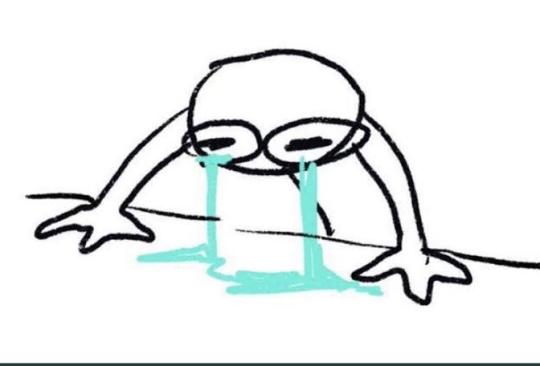
#i say shit#pjsk#tenma tsukasa#im cryingg#and the balloons are all their events…#attempt at translation#technically. im tagging everything i translate as this because it makes it look like ik more japanese than i do
5 notes
·
View notes
Note
ik u have a lot of opinions and im here to listen - Are aesthetics important to you? If they are, why? / How has rp changed you personally? / Have you ever cried while writing a reply?
be honest / accepting / @starrdew
the others have been answered, but i’ll make this one nice 2 make up for it.
are aesthetics important to you? If they are, why?
aesthetics are important to me... but they are not everything to me. and i definitely think that sometimes they get in the way of the actual content, especially in the way the rpc loves to do them.
personally? i believe in clean, good looking themes with readable fonts and comfortable colors, with maybe lightly edited images and/or nice graphics. when they are being used, i like nice looking gifs or icons as much as the next person. i also believe in trimming down posts, a functional tagging system, etc, etc. all in all visuals are important, because they’re key to a good impression. very few people can say they don’t open up a stranger’s blog and first judge based on what’s available in a cursory glance. i know i do; these elements allow me to gauge people’s level of rp savvy. you also tend to assume that, because they’ve put this effort on something like the aesthetics, they will put a similar amount on effort on the content.
being fair, my aesthetic standards are very reachable. all of what i mentioned, with the exception of the accessible, clean theme and basic formatting etiquette, can be simply ignored and overlooked. the other elements cannot because their absence translates to an uncomfortable experience for me from the technical point of view.
and of course... the effort thing doesn’t always happen. and sometimes the time put on aesthetics just gets out of hand, to the point where it no longer makes sense. that’s how we end up talking about small sized posts and container themes and straining colors where you can’t read a thing. back in 2013 and 2014, we talked about monochrome themes and low contrast everything. at some point during the search of the sexy aesthetics, the writing gets lost and relegated to a second or third place. that doesn’t sit right with me. visuals should merely enhance the writing, not make it difficult to find it.
1 note
·
View note
Last Seen Blogs

sweetsweetloverlover
thats liquid time.. serendipity.. have a nice ride

homehxa
noche gris

thebitchesinbreeches
Bitches in Breeches

chaqras
a child of the earth

sonofellisart
Untitled