#so this happened because i had coloured in that middle screenshot in great detail
Text

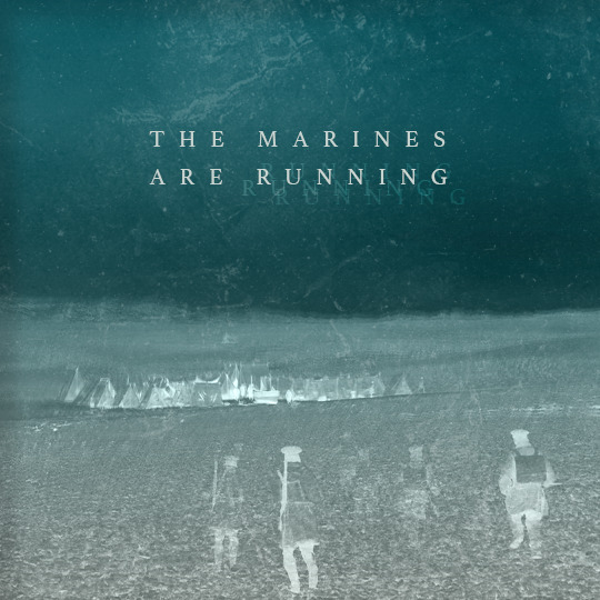
I T ' S I N T H E M U S C L E S
#the terror#theterroredit#the terror amc#amc the terror#james fitzjames#francis crozier#tobias menzies#jared harris#terror camp clear#fitzier#(sort of)#*mine#*edits#100#so this happened because i had coloured in that middle screenshot in great detail#and i didn't really know what to do with it after that#well it turns out i did this#what does it's in the muscles have to do with it? you tell me#i feel like it has something to do with it#and not just that the marines are like the ship's muscles in the tough guy sense... or maybe it is??#it just felt right#the rot is in the muscles#gosh sometimes the terror makes me think deep thoughts
267 notes
·
View notes
Note
Thoughts on character and costume?
I really love how the respective characters have different colour palettes, silhouettes but in particular material/textures to their costuming.
Fang Duobing is a little princess so he gets pale pastels, fancy ornamentation and transparent gauzy fabrics which I find so cute, he’s not just rich he’s *expensive* and *pretty* it’s pretty funny that he matches the actual princess in the red leaves mountain case
DFS gets your wide shoulder bad guy rich deep colours with thick layers and lots of metal detailing but it veers towards grand instead of pretty. Hot topic young DFS is leather and studs lmao. Brocade and fur & shit.
LLH is a linen boi and he almost never has any metal on him, we all know his natural material hair ornament meta etc. Interestingly, he does share some colour palette and fabric overlap with FDB, we se him with his tits out transparent outer layer sometimes. No structure all flowy silhouette
someone on here made a post abt their differing sleeve styles but I can’t find it!
I wanted to gush but also do u have any extra costume thoughts + how they relate to one another? You have a great knack for finding good photos of the show too 😅
Thanks for the ask, @lei-llustrations , and I love your analysis of the outfits! I'm so sorry it took me forever to respond! I had grand plans for a full essay analyzing DFS's costumes, and then I ran out of spoons for doing that. (The short version of the point I was going to prove is that his a-Fei outfits have elements of what seem to be his favorite details from his fancier alliance leader outfits, so it seemed like evidence of LLH trying to make up for making him be in disguise and without his power. I'm thinking of the maroon-red one with studs in the sleeves in particular, but there are echoes of his preferences in the other ones, too.)
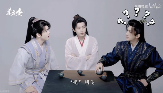
Since I'll never actually respond if I wait to put that meta together, here's a shorter one, with my thoughts on DFS's official Alliance Leader robes (screenshot taken from ep 40, when delivering the wangchuan flower).
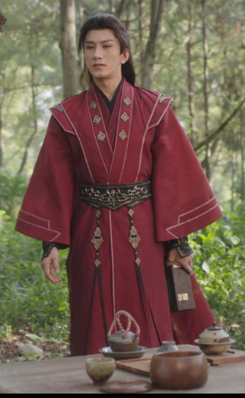
LLH and FDB both call him Di mengzhu in the wangchuan flower scene, because he's clearly dressed in a way that makes this an Official Visit. I find it fascinating that he wears his alliance leader outfit instead of his grey, maroon, and gold outfit that he wears for non-alliance matters (aka. the wedding room outfit, which he also wears for such Xiangyi-related purposes as the reunion duel that doesn't happen and grieving for him in the middle of the night). After all, he's giving LLH a gift to save his life and issuing him a friendly anniversary honeymoon challenge, so you'd think that would call for his dating outfit, not his official garb.
BUT! What if he's using his official Alliance Leader regalia as a way of saying that not only a-Fei/Lao Di, but also Di Mengzhu and the Jinyuan Alliance want him to live? It's more than just essentially creating Peace Treaty version 2.0, and trying to get life back to what could have been if SGD and JLQ hadn't ruined everything: their people at peace, and the two of them meeting for friendly duels rather than death matches. Yes, only LLH and FDB are there to witness it, but by showing up in his Official Capacity, he's also correcting all the narratives about the enmity between himself and Li Xiangyi, and in giving him the flower, he's officially declaring that Di Mengzhu wants Li Lianhua to heal and have his strength and power back more than he wants to gain martial arts power himself.
This is a HUGE deal. DFS formed the Jinyuan Alliance as a way of climbing the ranks of the jianghu, because his goal was to gain strength so he'd never be helpless or forced to do someone's bidding again. And yet, he wears the outfit that symbolizes that striving and his place at the top of it to GIVE AWAY THE FLOWER THAT WOULD CEMENT HIS PLACE AT THE TOP OF THE JIANGHU. He wants Li Lianhua to not just live but also to regain the strength SGD and JLQ stole from him, which would mean that Li Xiangyi would quite possibly defeat him, and he would welcome that, because it's not about self-protection anymore: now, what he wants more than anything else, is for Li Xiangyi/Lianhua to live.
If that's not enough of an emotional gut punch, try this: Di Feisheng told Li Xiangyi at the start of the show that swordsmen shouldn't have weaknesses. Di Feisheng has only really had two "weaknesses" (vulnerabilities might be more accurate): his desiring the wangchuan flower (which led to SGD and JLQ incapacitating him) and Li Lianhua. It feels like a monumental shift to me that, at the end of the show, Di Feisheng hands one weakness to the man who is the other: essentially, he is announcing to the world that nothing is more important to him than Li Lianhua's recovery, and he doesn't care who knows it.
It also feels very pertinent that his official outfit is wedding red, and he's essentially showing up in his fanciest remaining outfit to offer Li Lianhua his heart on a platter priceless magical flower in a box the way someone might show up at the house of their beloved with boxes and boxes of betrothal gifts. Not that DFS explained that or LLH picked up on it, because that would involve better communication skills than either of them had.
#mysterious lotus casebook#mlc meta#lianhua lou#lhl#asks answered#Di Feisheng#Li Lianhua#Fang Duobing#costumes#feihua#dihua
123 notes
·
View notes
Text
The Finest optical illusion Artwork Online: PHOTOS
Most viewers miss the same-headed individuals in the background. what047/Imgur
Listed below are 12 0f the most vexing recorders which have gone viral along with some explanations of how they work.
Kendall Jenner Appears to Be missing a leg.
Where is her leg? InStyle magazine/Instagram
They are all very leggy. So it is odd that one went missing. Kendall leg has been to be viewed. Where’d it go?
It’s under her gown.
Found it! InStyle magazine/Instagram
At some point, the web figured out it. It was under her dress all together! If you look really closely, you may see the horizontal top of her leg again. She’s pointing her knee and twisting her torso forwards to be more prominent in the picture.
That illusion of six girls with five pairs of legs flummoxed the web.
What is happening? jr0d7771/Reddit
But — yet again — a leg was lost. The person sitting at the middle of the couch seemingly has no legs.
What is really happening is a bit more tricky.
That makes much more sense. Jacob Shamsian/INSIDER, jr0d7771/Reddit
You’ll see what’s really happening if you look closer.
The girl in the middle of the sofa does, in fact, possess legs. Her chest’s leaning to the right to her left and her mind. So it is hard to tell that all those legs on the left of the viewer are hers.
The girl most of the way on the left’s bottoms are fairly obvious. She’s wearing black jeans.
So that leaves the individual next in the furthermost. When you look carefully, you’ll see that she’s also wearing black jeans. One of her legs is completely supporting the other girl’s legs. You can view a sliver of the other one from the image. In the event that you correct the lighting of the photo it helps.
There’s something off about this viral picture. Can you see it?
Look carefully…what047/Imgur
This particular image went viral on Imgur, uploaded by a user going by the title of what047. It has the caption “It took me forever to get exactly what was wrong here…”
All the faces in the desktop are the same.
Look at them. what047/Imgur
You may have been attempting to closely at the girls in the foreground. Nothing is off on them.
But in the background, everyone has the identical mind. Someone edited the image so that everybody’s mind was replaced with one belonging to a guy.
The suggestion of the image is a great reminder that the specifics you’re searching for are in the foreground. Sometimes they’re in places that are surprising.
Would these legs seem greasy for you?
They seem shiny! leonardhoespams/Instagram
Later Hunter Culverhouse posted it around 20, this image went viral. It looks like the legs of Culverhouse are coated in acrylic.
It’s really just stripes of white paint.
Nevermind. leonardhoespams/Instagram
Together with the image it is somewhat more easy to tell what’s really happening: stripes of paint make it seem like a warmth of light is coming from the legs of Culverhouse. They’re actually tender.
“[I] had some white paint left in my brush and place random lines in my legs,” Culverhouse composed in an email. “Turned out to be a completely perplexing picture for everyone on the internet.”
Can this dress black and blue or white and gold?
You should be aware of the solution by now. Tumblr
The dress! How can anyone forget the dress? Black and blue? Gold and white? Why does this seem different to everyone?
The first image was published on Tumblr by a girl called Caitlin McNeill, a singer-songwriter from Scotland, afterwards she sent the film to her buddies, who whined on the color.
It’s black and blue. Here’s the science behind it seems different for different individuals.
Yup. Screenshot / Roman Originals
The science of the dress was seen by individuals differently is somewhat complex, and scientists provide explanations for a few of the details. The peer-reviewed Journal of Vision even released several articles relating to this.
Stated clearly, the way that your brain determines color relies on two things: the color of the object you’re seeing and also the color of the light source. The image was overexposed, which means the light in the image overwhelmed the color of the subject. Regions of the dress were in shadow. This suggests that the gown had a tight mild makeup of bluish shadow, so representing yellow light, and the dress itself off, in the store’s poor lighting. Regions of the image also seem to imply that the dress is backlit.
Depending on whether the dress was seen by your brain in shadow or at an immediate light, you’d see the colors differently.
These berries are not red.
There’s no red in this image. Akiyoshi Kitaoka/Twitter
It’s because of a phenomenon called color constancy.
The strawberries seem red anyway. Carson Mell/Twitter
Your brain may believe that they’re red because of a phenomenon called colour. It’s regarding the science supporting The Dress: Your brain examines the color of the light and the color of the object to determine the color presented for you.
But the brain also understands that the object’s color is for determining the color of the object much more useful. So it is trained to dismiss information from the color of the light.
So there is no red from the 22, the color of the light has been manipulated. But your mind acknowledges the objects like berries, and it understands that berries (at least as many folks know them) are red, so it knows that the berries to be red even if the image has no red inside.
“You brain states, ‘the light source which I am seeing these berries below has some blue part to it, so I’m going to reevaluate that mechanically from every pixel,'” Bevil Conway, a neuroscientist at the National Eye Institute, told Motherboard. “When you choose grey pixels and subtract this out gloomy prejudice, you find yourself with reddish”
These shapes are mirror images of each other.
Witchcraft. The Illusion contest/YouTube
Should you see the full video, you can view Sugihara placing the shapes and rotating them — just for completely distinct shapes to appear at the mirror. It’s really cool.
“Ambiguous cylinders” are somewhere between a circle and a square.
There’s an easy and elegant explanation. The Illusion contest/YouTube
Should you pause the video at roughly the 15 minute mark, mid-rotation, you will see the thing’s “authentic” shape.
Ambiguous cylinders, Sugihara writes at a newspaper cited by Motherboard, are somewhere between a square and a circle. In cases like this, the contour also has borders that are top that are wavy. Depending upon your view, your brain adjusts the shape of the image to look like a circle or a square. It is possible to create the identical illusion using much more elaborate shapes which are composed of squares and circles, which is exactly what Sugihara did with the objects.
You’ll find 12 dots in this image. Can you see all of them at one time?
My mind hurts. Perception
This particular illusion comes in an academic paper published in 2000 in the journal Perception by Jacques Ninio and Kent A. Stevens. In case you have access, you’re able to read the newspaper through here.
They can’t be seen by the majority of folks all at one time, although there are 12 circles in the image.
Your peripheral vision sucks.
There they are! Perception
You ought to be in a position to observe. But the ones in your vision pop in and out.
That is because humans simply don’t have very good peripheral vision, as eyesight scientist Derek Arnold clarified to The Verge. For something like that dots against lines — your mind gets the best guess it can to fill in the information. In cases like this, it supposes the dots are not there. The lines that are white in between the grey makes your brain feel the dots are lighter than they are. Thus, it only sees more grey.
“That may counteract the blurry black dot that is really, physically there,” Arnold told The Verge.
What does this look like to you?
A brick wall? Arron Bevin/Facebook
A brick wall, right?
There’s a cigar in there.
Close, but additionally a cigar. Arron Bevin/Facebook
Can it be submerged or not?
Difficult to tell…maskari/Imgur
She seems like she’s underwater because it appears because air bubbles seem to be floating upward and that she’s under light. But she also seems like she’s simply jump into the water.
She’s definitely not submerged.
There are a few clues. maskari/Imgur
For one, you can not be submerged and splashing in the identical moment into water. This makes no sense.
Either overexposure or even a digitally added filter leaves like she’s submerged, the light seem. But she’s not.
These two train trail segments are the identical size.
However they don’t seem like it. INSIDER
Both curves in the track will be the identical dimensions, but one the one in the left appears bigger than the one on the correct once they’re next to each other.
Yes, really. The illusion is known as the Jastrow illusion.
Here’s the way they seem piled on one another. INSIDER
There are a few distinct theories for the way the Jastrow effect works. But essentially, your brain contrasts the 2 sides of their track bits which are adjacent to each other. Instead of comparing the side of one piece it contrasts the side of the left side trail to the left side of the path that is ideal, because those 2 sides are alongside each other.
All these are likely to function as sand dunes.
They don’t seem like hills. Luca Parmitano/Twitter
European Space Agency astronaut Luca Parmitano chose a photo of some sand dunes while flying a few hundred kilometers over a desert in 2013.
“Like an Escher painting, sand dunes seem to reproduce the identical shape indefinitely,” he composed.
It wasn’t seen by A lot of people. The photo looks like a lot of pits, perhaps hills. What is happening?
Flip it over and you’ll see what they really are.
There they are. Luca Parmitano/Twitter
The illusion is easy. Your brain thought the sun was at the 1:00 position, meaning that they had been casting shadows. The sun was casting shadows in the upper-left. By turning the image upside-down, the image is put into a format we’re more used to.
from free stock photos http://www.free-stock-photos.info/the-finest-optical-illusion-artwork-online-photos/
0 notes
Text
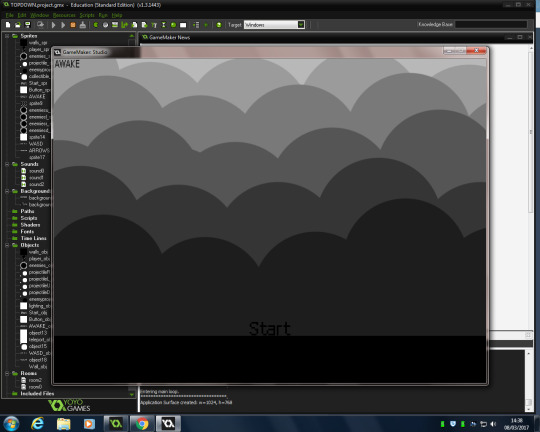
GAME-MAKER:
This is my production diary for my game. These are just some screenshots from the game overall and the processes that I had to go through to reach the end goal, which is in the last screenshot.
In this screenshot you can see the amount of sprites and objects which were created to make the game and all the assets within it.

This is the start screen which I created for the start of my game. This was also essential for my game and also a end screen was meant to be inputted however, I wasn’t able to add this due to the time limit. This could be because I don’t have great time management skills so I could work on this for the FMP and future projects. As well, I had a lot of issues with producing a start screen, for some reason when another room was added it was having conflict with an asset on my character and I wasn’t able to work out why. However, I was able to fix it and allow there to be a start screen at the start of the game. I feel if there wasn’t the players wouldn’t exactly like it because it chucks the player straight in so I’m glad I was able to produce one.
This screenshot is just showing the type of functions which are used within an object. This is the functions which were used for my character as an example to show the ‘behind the scenes’. There are the functions which enable the character to be able to move left, right, up and down. Enables the character to face a certain way when a movement key is pressed. Enables the character to have a light surrounding it so it’s as if he was carrying a flashlight, a flashlight was intended for my original game but unfortunately I wasn’t able to produce my original idea. (I speak more about my original game in another post where I explain the issues throughout the process of producing the game). There is also functions in there which enable the character to shoot in a certain direction and here is where you can also add code and sounds to to when a action is pressed.

In this screenshot, it shows the sprite sheet. A sprite sheet is produced to create an animation within the game. The spire sheet which you can see her is my walking animation, my character was generally small anyway which is why the animation isn’t so clear in the screenshot. However, the process if doing this involved creating a frame by frame animation in Photoshop. So I had to produce the character overall and then remove one leg and save that image and then do the same for the other leg. And then repeat the process so it has the illusion of walking. This took a while for me with my original sprite, since it was only a rough mock up and my animation skills are quite limited. However, I would like to invest more into animation for my FMP. With my new idea, I created a pixel art character and since the art style is really simple and there isn’t too much detail needed for pixel art, all I had to do was remove a leg and then copy the process over and over again until I produced a walking animation that I was happy with.

Besides all the ‘behind the scenes’ screenshots of my game this screenshot is my actual game. Before hand, there was no collectibles and there was only placeholders instead of actual sprites. I forgot to take a screenshot of this to show development, so I need to remember that for the FMP so I’m able to show my process of work and how far I have come. As you can see the main character sprite spawns in the top left hand corner with a yellow glow around him. I did want to have the whole scene to be completely black and then the only object illuminating the scene would be my character but I wasn’t able to do that. I wanted to take some idea from my original idea and not remove that idea completely from my new game. So the sprite idea’s which I had for the original game, the enemy and the collectibles, I brought into my new game. The enemies are small black orbs which follow you around the scene and if they are able to come into contact with you the level will restart and take you back to the ‘Start’ screen. As you can see in the bottom right there is a block which is shaded a different colour, this block is a teleportation block which teleport’s you to the closed area in the middle with the collectibles. I did include a wall which you was able to walk through which the player didn’t know about until he was actually within the room however, due to me having issues with my scene and having to produce it several times I wasn’t able to include this in the final game. I also included instructions in the top right hand corner, so players knew what the controls were. Most of these improvements came from play testing and player’s opinion on my game, So I took a lot of what was said into consideration and tried my best to replicate what they said, overall I was happy with the finished product considering I had a lot of issues throughout the game production.

This is just another screenshot showing that the functions within the game all work. The firing mechanism does destroy the enemies on impact and as well the teleportation block works as well.

Overall, this was the process and the behind the scenes of my game and the production of it. There is another blog post which speaks more in depth about the issues I had with making the game since I had to change from a platformer to top down. However, there are some improvements I wish I made. I wish the game looked more appealing to the eye and as well I wish that I made the game have some narrative/story towards it even if it was a small amount. I should focus on my time management skills and notice how much time I really have for certain tasks. Also I wish I added more to my start screen as well, the background looks nice and suits the game but I feel the start screen is a bit boring and could of had more to it. Buttons and different options would of been a good idea so the player has a little bit more to explore within the menu. I would of also liked to have a time delay or a small introduction screen after you click ‘start’ so it doesn’t chuck the player straight in and you can just adjust to what’s going on before anything happens.
0 notes
Last Seen Blogs