#slp hncgd1
Text
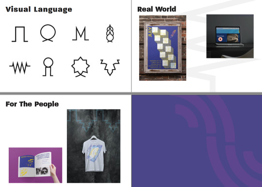
Scaramanga - Visual Language
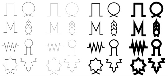
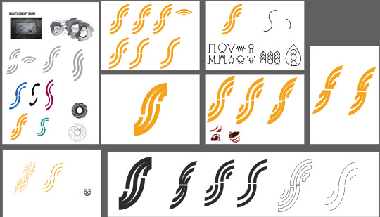
After playing around with symbols for ages (and I mean ages, I had to teach myself how to make pixel art*) I wanted to utilise the VIB Ribbon symbols I had taken inspiration from. It was suggested by my tutor to use them as a visual language across the brand for Scaramanga.
*It turns out the pixelated look was a little too on-the-nose, but it was fun to learn!
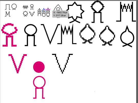
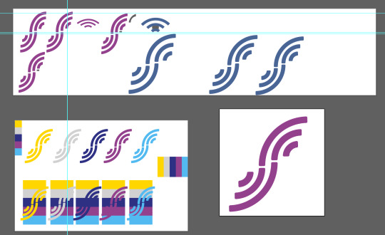
Playing with the shapes was next for me, seeing how they looked in various shades and thicknesses:
Before seeing how I could play around with one or two, using colours from the chosen range:


6 notes
·
View notes
Text
Scaramanga - Mobile
I have to open with a small, unintelligible warble.
The colours are purely to distinguish between pages, which was necessary to solve a disagreement about how burger menus should look. My tutor and I couldn't agree on the specifics of a continuous layout between the opening page and the top right menu on the subpages. I'm being entirely honest, I think we both came out of the experiment thinking we had both won, and that the other person was still wrong.
I liked the idea of a page that moved with you, sections colliding into each other and building so you could always access the various subpages. Then I realised that I had only just started web design, and this was purely an exercise in laying out a rough guideline for a web-presence. But I was dead-set on keeping my pretty colours (sorry, boss)!
The layout here shows that each page will be littered with information, looking back I'm proud of (and surprised at) myself that they aren't as chock-full as I expected. I must have been taking my foot off the gas with regards to filling space, and I was clearly thinking about the use of information, images and layout. Now, I wasn't supposed to be thinking too much about the design aspect, but for a first go - I'm chuffed with this.
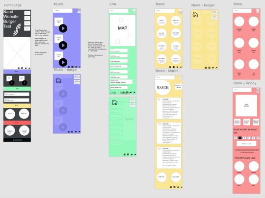
The wireframe allowed me to plan out what kind of information would appear on a page (e.g. for music I wanted album covers and play buttons) without going too heavy into how it would actually all look in the real world. In client-work wire frames are used to give a vague idea of how a website might look without any personality - just the skeleton of how information will be laid out. I worked off my original brand guidelines for the first concept, and then after a bit of beta testing with friends and colleagues, and an overhaul of the brand, I created the second (and final) version:
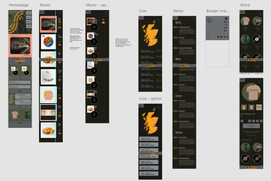
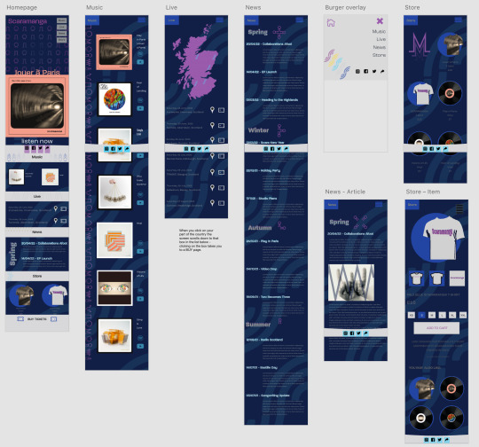
Now that my site is complete, I'm glad I had that frame to work from. Many pages are almost exactly as I'd planned - they followed the scaffolding perfectly (especially the 'Live' and 'Store' pages), but I was able to be flexible enough with my ideas to allow growth, change, and some aspects to be thrown out the window. The pages move with the reader, with access to menus and social media links staying ever present for the user to quickly access other areas of the site.
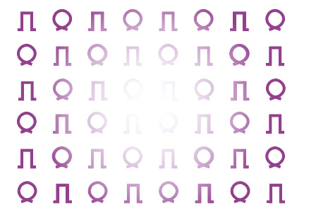
Mostly, I'm proud of my continued use of the visual language. I considered applying meaning to the symbols (having the M shape link to music, the jagged circle link to news), but that would have been too prescriptive. The band give a feeling of ad-hocness when you talk to them, so the feeling of these cool symbols littered around as pleasant background noise felt more fitting than by assigning purpose to each one.
If you really want to see what it's like to visit their website, jump in:
0 notes
Text
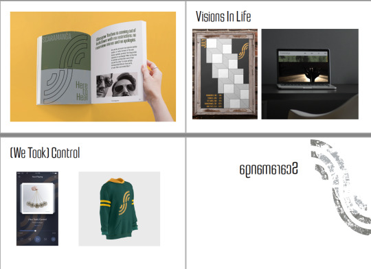
Scaramanga - Brand Guidelines
With all of this in place, I was now able to build a set of brand guidelines that would explain the story of Scaramanga. My first concept was, in hindsight, fairly drab. It told a moody tale of pretentiousness and feigned mystery. It looked like this:
I am afraid of negative space. I try to fill as much of a page as I can. I think it's because I'm quite a skinflint and want to get as much use out of something as I can. However, this is not the end of the toothpaste, I don't need to slice this open and use up every last drop of paper just to show that I've used it - which is what I thought I had to do.
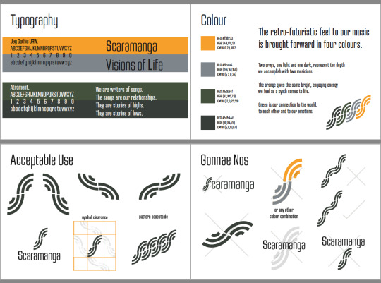
With a more fitting story that linked to a feeling that a electronic duo might want to portray, I was able to bring my colours, language and new outlook together to create something that, if I may be so bold, is more Scaramanga, and less ScaraMarka.
Here, you can see the increased use of white space around my images and text. A strict grid-system is in place to keep everything uniform, the iconography is peppered across the document, giving it a more cohesive feel. The text is small, drawing you in without screaming at you. All in, I feel this layout provides a more comfortable user experience - one that helped significantly when creating the web-presence for the band.
0 notes
Text
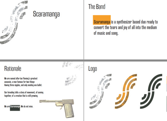
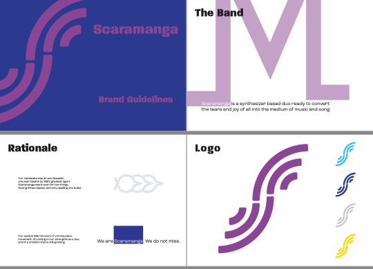
Scaramanga - Logo Crafting
After the development work to create a logo for the band, I had to refine it. In the hunt for finest I went back to my original inspiration for this design, then to my mood boards and conversations with the band. I started to adapt the S mark according to various influences (other band logos, the BBC news opening titles, the original bullet designs, the VIB Ribbon symbols) - but nothing was quite working for me.
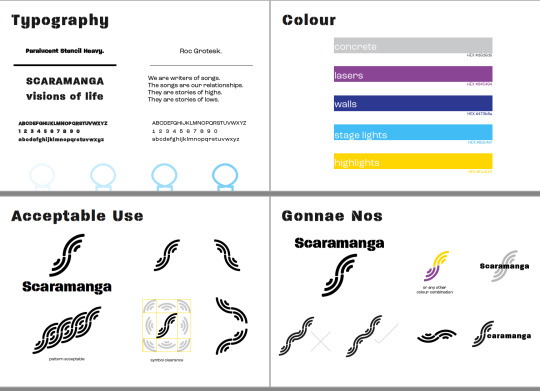
After discussing it with a new friend in the design world, he advised that it was more just a little bit of crafting that I had to apply, not redeveloping the whole idea. A soft curve on the corners, ensuring equal spacing between the lines on it, and a colour story that meant something to the brand. From here, I started to look into as many techno-linked colour schemes as I could find - throwing my S mark onto them to get a feel for how they would look.
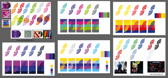
These colours were much brighter than the ones I had been using before, dark oranges and dull greens were replaced with vibrancy and highlights. The bottom centre idea came from a discussion about what a Scaramanga show might be like: concrete walls, lasers bouncing from the stage, the band being lit from behind. Coincidentally a lot of these colours were in an image of The Prodigy that I had already been working with (you can see it to the left of the woollen Keith Flint). Kismet. Possibly.
1 note
·
View note
Last Seen Blogs

wishandpray-blog
The pathetic anthem

fnticcanoncity
Fidelity National Title Insurance Co.


towahime
Tōwa Sōtōkai-Taishō
onlyhotgirls-666
Only Hot Girls :)