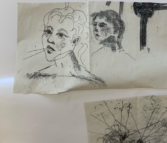
#reverse monoprint
Text
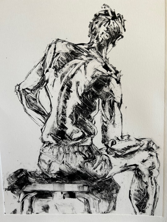
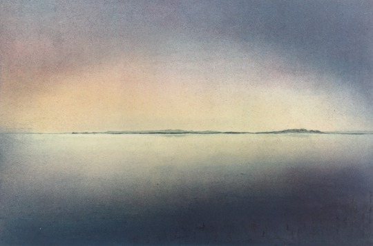
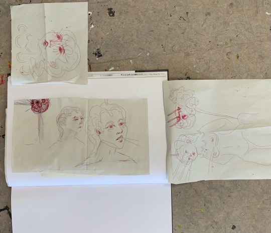
Monoprint from life drawing
This image no longer exists. I printed it, photographed it, then made a small correction with a brush and ink, forgetting that I was looking at an image reversed relative to my original pencil drawing. It was plainly wrong, and impossible to ignore despite its small size. And now I look at this, I cannot for the life of me think why I thought it needed fixing.
20 notes
·
View notes
Text
Tracey Emin

Tracey Emin — AWARE (awarewomenartists.com)
Tracey Emin’s work is emotively charged, at times, an often-uncomfortable truth that you can not hide away from, portrayed through various mediums from painting, textiles to sculpture. There is a sense of immediacy with her work, in that you can almost feel her sitting beside you, telling you about what has just happened in the latest heartbreak, joy and hopes. These works that she produces are not just a bi product of her emotive experience but also indexical, tracing Tracey through every raw sinew that has ever been exposed.
Tracey’s work holds parallels with my latest indexical work, in that I have chosen to use tapestry, textiles and a tent. There are also similarities in the way that we express our emotions through our work, the creative outlet allowing a cathartic response to situations that we would normally find issue with being able to make sense of. Creating imagery through textiles, is symbiotic in its very nature, each thread connecting with the fabric, indexical, the struggles of working with machines, that do not want to cooperate, choosing to sew by hand. There is intimacy in working with textiles and I appreciate Emin’s work, because of this.
“Everyone I have ever slept with” is a blue tent, which has the names of 102 people that she has ever slept with, from 1963 to 1995. This does not imply that every one of these names had a sexual reference, but more of a literal sense, people such as her grandmother, cousins, lost children. The names were appliqued onto the inside of the tent, again, the very tactile nature of fabric on fabric, suggestive of intimacy, the connection. The floor of the tent, has the appliqued words “With myself always myself never forgetting”. The inside of the tent reminds me of the wall in a classroom, at Primary school, bold and strong lettering, on the yellow paper frieze, allowing for the children’s work, their efforts, to be empowered and let them see how important they are. Perhaps it is also a place to hide, retreat within yourself, with only your memories surrounding you, a grotto to the people who had an intimate connection, through your life.
I am intrigued by the juxtaposition of retreating within oneself, to then having these private thoughts and moments, emboldened, this really could be a small portal into her world which has been laid bare and exposed. Emin’s work does expose the areas of her life, which allow for vulnerability to appear raw and uncomfortable to the viewer of the work, so I often wonder if this would leave her any actual hiding place for personal introspection and privacy?

Everyone I have ever slept with (1963-1995)
1995
Tent and embroidery installation
Tracey Emin
The 10 Most Controversial Art Projects of the Last Century (artnet.com)
My installation “My life in the bag of crisps” incorporated both a wigwam made from crisp packets which looked onto the 2.2m x0.8m appliqued, painted and printed frieze. I chose to reverse the frieze, to expose the threads, the actual traces of my life, the connective nerves of what make me. In doing so, the realisation that the reverse images had the simplistic energy that Emin uses in her drawings.

Scorfega
Ink on paper
1997
Tracey Emin
‘Scorfega‘, Tracey Emin, 1997 | Tate
The threads exposed a true fragility, perhaps reflective of the inner self, yet like Emin’s drawings, the very nature of what and who we are is represented as simplicity. The shape and contours, with what appear to be almost scribbles in places, is evocative and suggestive, with the inclusion of hand-written text. There are similarities with Emin’s drawings to that of Egon Schiele’s. The looseness, the intensity and confronting the elements of human nature that most people would look away from, when being faced with the ugly truth. There is power in Emin’s work, using both sides of love, the pain and the passion.
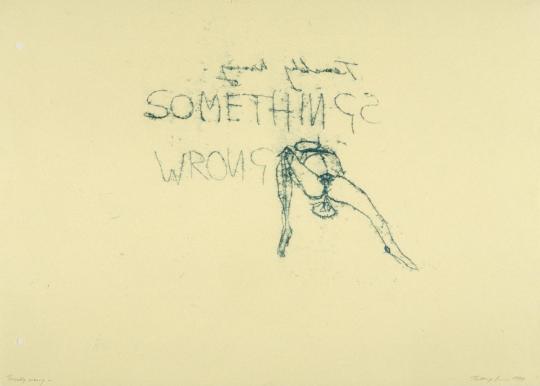
Terribly wrong
Monoprint on paper
1997
Tracey Emin
‘Terribly Wrong‘, Tracey Emin, 1997 | Tate
What I have learnt from looking into Emin’s work and life story so far, is that it is important to be true to yourself, being emotive as an artist is an area that we should not shy away from, the importance of connection is imperative to what makes us human. I think that my work could already be classed as biographical in nature anyway, and I enjoy working with different mediums, but primarily textiles, so in that regard, there will be similarities or inferences with Emin’s work, perhaps something that I have applied to my own practice.
0 notes
Link


In 1944, American Type Founders (ATF) introduced Alpha-Blox, an impressive modular font system of both solid and linear shapes that could be combined to create all manner of typefaces, ornament and pattern in one or two colours. Chris Chandler of Neu Haus Press recreated and re-envisioned this rarely used font in large wood block form by printing on his Vandercook 232P. With the assistance of wheatpasting by Max Collins, they have created billboards as large as 14’ x 20’.
Artist research - Chris Chandler of Neu Haus Press
4 notes
·
View notes
Text
The Year in View
Acrylic paint on collaged paper patchwork with monoprint.
The Year in Review
Reverse
View On WordPress
#abstract#abstraction#acrylic#art#collage#colour#daily painting#Drawing#drawings#glitch#lockdown#mixed media#monoprint#Painting#patchwork#quarantine#stamps
14 notes
·
View notes
Text
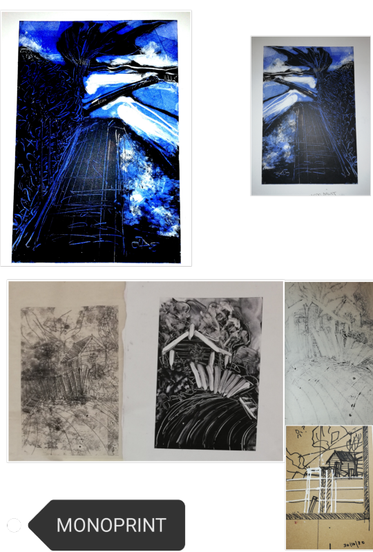
This is work I did in the monoprint studio from some field drawings. I haven't quite got the hang of monoprint yet as it looks deceptively simple but is not! The negative space is going to be a challenge for me with the lino/wood cut. Also the fact that the finished print will be the reverse of how I've seen the landscape. I prefer the work that I did on the newsreel here as its more delicate. Also I'm not getting much power out of my lino cutting tools on the MDF so I might need to use something to burn it off instead. But it's a work in progress and I would like to see it through. 13/11/20
7 notes
·
View notes
Text
Silk Screen Start
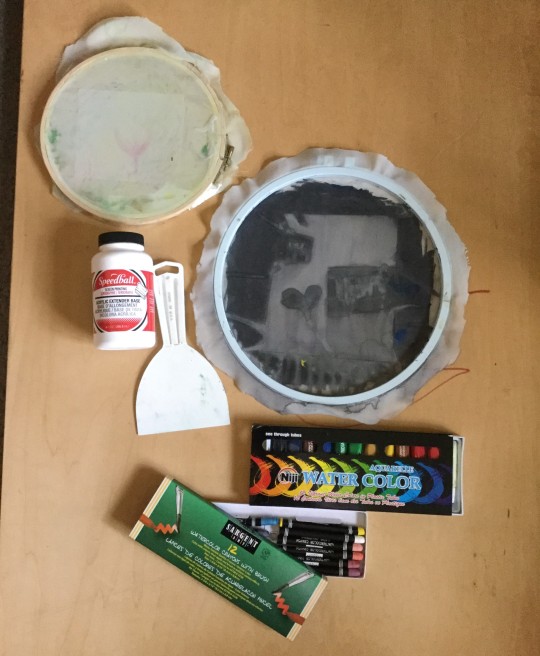
The image above is my silkscreen equipment; the screen with a blue hoop had been used for monoprints but in this image I’ve done the stencil print. I put packing tape on parchment paper and traced shapes with it. Tape peels off that paper like a sticker.
The smaller wood screen was used to add some layers to my monotypes. I will upload additional picture about that soon.
I got my Speedball silkscreen extender, watercolor crayons, and water color tubes from Blick. My white plastic paint scrapper has been really useful in this class; I think this came from the dollar store but didn’t see it last time I was there.

The images above are a few of my stencil prints with tape. The tape is on the back of the screen so I cut the letters out in reverse.
I have some newspaper transparencies and test sheets from my dad when he worked for a newspaper in the 1970s. I traced “the news” from letters in one of the newspaper title transparencies he gave me. The cut effect reminded me of punk ‘zines from the 80s and 90s so I used tape to make graphic shapes. The piece is a visual representation of reacting the news-cycle now and how this whole thing has been happening for a long time.
I like the idea of incorporating things my relatives have worked on into my work; that creates a historical and personal element. My dad spent time working for a newpaper in the past back when the paper was using a Linotype to create metal lines of text for printing. Some other examples I know are my great-grandmother who had been a painter and my great-grandfather had been a photographer.
Silkscreen Tape Experiment:
I put packing tape down on parchment paper leaving some hanging over the edges of the paper to make it easier to peel the tape back off
Since the paper and tape are translucent, I could trace images.
I used scissors and an x-acto knife to cut out shapes.
What I learned
Letters are a great way to see how shapes often have delicate areas; an “E” has small lines that can tear easily in tape and an “A” has a thin line in the middle.
You have to be careful peeling off this tape; little areas might tear off.
You can always layer tape on the screen to correct things or alter the image.
Please remember to cut the final shape out with a bit of tape over the edge of one side so you can peel it off easy; it's really hard to peel the tape off the shape when there is nothing to grab (it’s possible but annoying.)
Here are some of the monoprints I’ve done. I started these before the stencil print, but added some additional layers after that print.

I tried layering to see how it would look and because some of my monoprints had edges with no ink. The more I printed the muddier the prints would get. I haven’t decided if I want to try something else with these prints or move on. Since these are early prints as well, there are sections where I had too much ink and the paper buckled.

1 note
·
View note
Text
Bower Ashton Library AIR (Month One)

Diagrams collected from photography books.
At the end of last semester I was given the news that my proposal had been chosen to be the Bower Ashton Library Artist in Residence.
Up until now I have been responding asemically to texts and song lyrics that have great sentimental meaning so I proposed for the opportunity to explore texts that are completely foreign to me. We are creatures of habit and know when we enter a library roughly what it is we are looking for, or if not, what section of the library to look at. With this in mind I wanted to get lost in the sections of the library that I would never normally dare to venture.
At the risk of over thinking strategies of where to start I began picking books out at random and feeling I was in danger of falling down a rabbit hole of never ending research I decided to focus on three areas of study that I had not explored before. These areas are photography, embroidery and geography. After flicking through different books from these areas I began to pick out drawings and diagrams to use as a starting point. Each of the three subject areas have different visual stimuli to work from, their own unique language specific to them.
Photography had a wealth of diagrams and graphs that explained wave lengths, light refraction and other technical terms I am unfamiliar with. The diagrams I collected were very linear and rigid, except for the wavy lines that featured sporadically. Text appeared quite frequently but was basic in its annotation. All wording was typed, very precise and to the point.

Monoprint on newsprint inspired by graphs found in photography books.

Monoprint on newsprint inspired by graphs found in photography books.
Embroidery was similar in terms of the precise diagrams but they were more square and box-like than the linear photography drawings. The text that accompanied the images were more often than not hand written. Whether this is a reflection of the era from which the books I selected, I am unsure. In contrast to the photography books these books were more of a ‘how-to’ guide rather than an explanation of why. I enjoyed how lengthy some of the handwritten notes were, there was more of a voice in this selection of books.
Diagrams collected from embroidery books.
I found Geography to be the most hand rendered in terms of diagrams and drawings. The books I looked through were of old maps of heaven and earth so the diagrams would obviously have been very dated. That being said they shared some of the same codes as the embroidery books in terms of the hand rendered mark and the sharing of information. These were by far the most heavily annotated of the three areas, and arguably the closest to asemic writing that I have seen in the library thus far. The reverse time-line I have accidentally selected is very telling of the need for words, or lack thereof. The geography diagrams dating back to medieval times, embroidery instructions from the 1960s and photography guides from present day. I understand the research gathered has not been overly expansive, but it is interesting to note what information I have got indicates a lack of the written word.
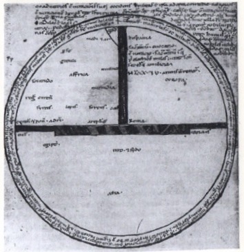
Diagram collected from geography books.
At this stage I don’t think trying to discern a common language between all three areas is the right way forward, but to enjoy the differences between they offer. I have begun to make my own studies inspired by the visual stimuli I have gathered and intend to use this as a basis for investigation. It has been a challenge to emotionally detach myself from the source material, it will be interesting to see what direction my research takes me in seeing as my last works were so powerful due to their emotive leanings whereas the diagrams and drawings collected are very factual, rigid and arguably quite cold.
#practice#artistinresidence#air#artist residency#bookarts#artistsbook#diagram#photography#embroidery#geography#minimalism#abstract expressionism#printmaking#masters#mamdp
2 notes
·
View notes
Photo
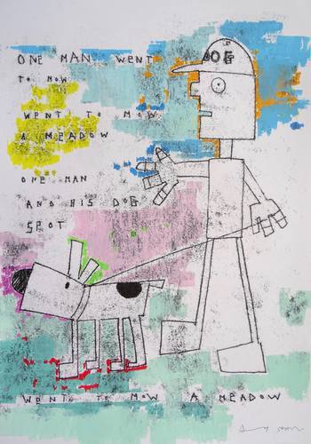
One Man and his Dog Spot went to Mow a Meadow, Andy Shaw
One Man and his Dog Spot went to Mow a Meadow Monoprint, Acrylic and pencil on paper 2017 The reverse side of the paper has the original pencil line image of the work that created the black ink monoprint.
https://www.saatchiart.com/art/Painting-One-Man-and-his-Dog-Spot-went-to-Mow-a-Meadow/877065/3557146/view
3 notes
·
View notes
Photo

Canticum I VE 2/5, Alan Alldredge
A transparent cast monoprint. This piece features a delicate use of gold powders. The piece flashes with almost animated reflections as one walks by. Stretched over a gilded reverse bevel frame.
https://www.saatchiart.com/art/Painting-Canticum-I-VE-2-5/799362/2549587/view
1 note
·
View note
Text
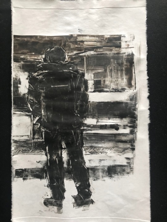

Two takes on a music-loving commuter: monoprint after photo by @halukturgutmenguc
I am too impatient to mess about reversing a drawing before making a plate – immediacy is the point of monoprinting, I reckon. So I draw one image directly onto the transparent plastic plate, accepting the image will be reversed. It usually doesn’t matter, and it shows up your drawing mistakes nicely (a mirror will do the same). Then I often put the first print under a clean plate, and work over it to make a version fixing anything I don’t like - and of course reversing the orientation in the process. There may be several iterations, and the right-way-round version/s may not prove best in the end. In this instance I modified the second drawing in many ways, taking not much more than a hint from the first one.
46 notes
·
View notes
Photo
IT'S THE FINAL COUNTDOWN! (Sorry...) We're counting the days to the close of @easterlyartists Easterly Artists' exhibition #eamaking "Making Our Mark", which ends on Sunday 9 Jan at @ferini_art_gallery the Ferini Gallery, 27 All Saints Road, Pakefield NR33 0JL. The GOOD NEWS is that there are still 3 days left to see work by 23 of East Suffolk's most inspiring artists! This is part of "Eye Spy 1" (mixed media print) by @easterlyartists member @itsclarejohnson Clare Johnson. Clare creates her images in mono before pixellating them: these form a screen print with is printed first with black ink. She explains: “I make one print on thin white paper, which I turn over to draw on the reverse: I then mono print this image (the mono print image has to be backwards). Next, I place a perspex sheet over the drawing, which is stuck onto the back. “Each colour is added separately and placed over the screenprint before passing it through a press, with the colour getting less strong with each print. I change the order of printing between the three and, as things progress, I might add different colours to the three prints, depending on the balance." "Making Our Mark" opening times are Friday-Sunday, 11am-4pm and entry is free. Search #eamaking or visit www.easterly.org.uk/making-our-mark for more details. ------------ #itsclarejohnson #easterlyartists #britishartists #modernartists #visualartwork #suffolkart #suffolkartist #suffolkartists #lowestoftart #feriniartgallery #pakefield #markmakingart #photo #photography #photographer #monoprints #monoprintingart #monoprintmaking #monoprinting #screenprintinglife #screenprinter #screenprinted #originalprint #skyscapes #skyscapeart #skyscapeartist #skylineart #londoneye (at Lowestoft) https://www.instagram.com/p/CYTHXSADHYb/?utm_medium=tumblr
#eamaking#itsclarejohnson#easterlyartists#britishartists#modernartists#visualartwork#suffolkart#suffolkartist#suffolkartists#lowestoftart#feriniartgallery#pakefield#markmakingart#photo#photography#photographer#monoprints#monoprintingart#monoprintmaking#monoprinting#screenprintinglife#screenprinter#screenprinted#originalprint#skyscapes#skyscapeart#skyscapeartist#skylineart#londoneye
0 notes
Photo
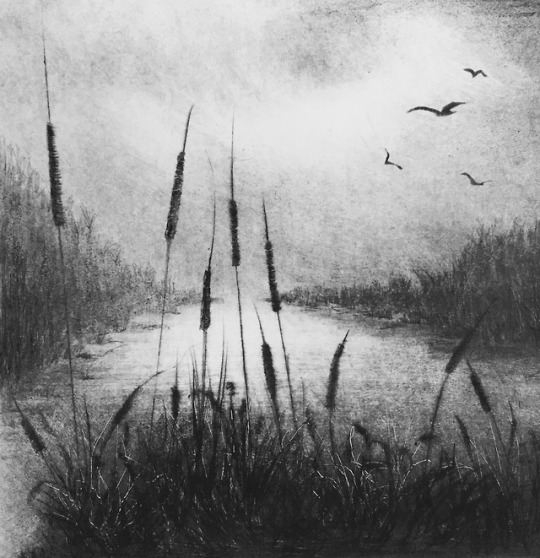
“Reedbeds Evening ll” Unique Drypoint & Monoprint by Angela Brookes
“Having worked with clay for most of my professional life, I now find my printmaking work is foremost in my practice. My interest centres mostly on the natural world. I frequently visit the coasts of Norfolk and Suffolk and am drawn to the vast and unpopulated open spaces and huge skies, so typical of this area. I work ‘en plein air’ in the fields and on the marshes working first in pastel, simply sketching and observing. These drawings are an emotional response to the subject and feed both my printmaking and my imagination. My prints explore the glory and the mystery of the landscape both rural and urban. I enjoy depicting the ever changing effects of light and colour at different times of the day and as the seasons roll through the year. I love the reversal of all the tonal qualities of the landscape after snow has fallen, and the effect of the evening light, in all seasons, has a particular resonance for me.”

“La Luz lV” Unique etching & monoprint
“Spring Tide" Unique Drypoint & monoprint
Greenwich Printmakers has a lovely selection of Angela’s lovely atmospheric prints.
5 notes
·
View notes
Text
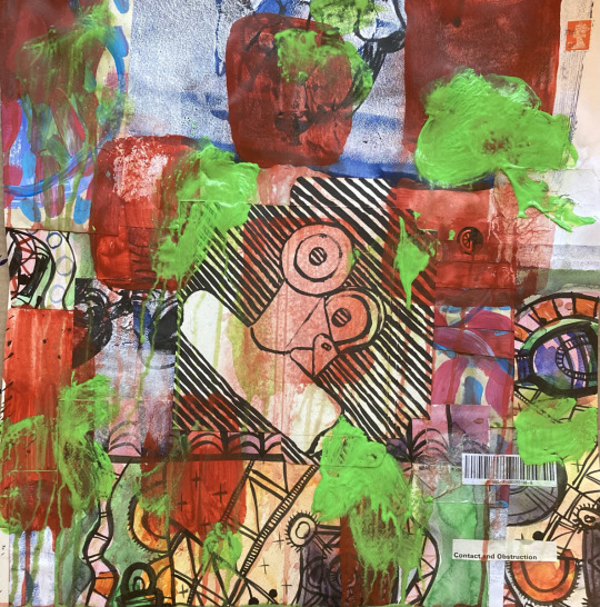
Contact and Obstruction
Acrylic paint on collaged paper patchwork with monoprint and drawing 48cm x48cm
Contact and Obstruction
Reverse
View On WordPress
#abstract#abstraction#acrylic#art#collage#colour#daily painting#Drawing#drawings#glitch#ICQI2021#lockdown#mixed media#monoprint#Painting#pandemic#paperology#patchwork#quarantine#stamps
5 notes
·
View notes
Text
12/10/2021
WORKSHOP: Monoprinting
I learned how to make monographic prints. By rolling ink onto a plate, placing a sheet atop and then drawing on that sheet to pick up the ink below.
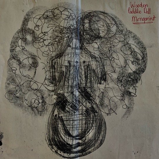
By applying pressure to the sheet, a coat of ink is lifted and transferred to the shape of the imprint.
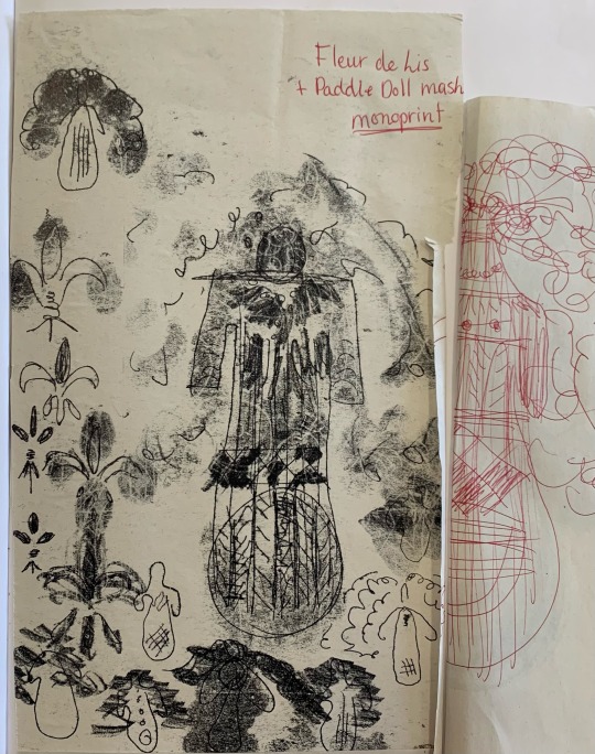

When you take a look at many of my drawings on the reverse side, you find that they are line drawings yet when I peeled back the page I had found rubbings both intentional and not, had added tonality to the piece.
I enjoyed this workshop immensely because it helped visualise my concept, the evolution of the human figurine by allowing me to recreate the same print over and over until it bared no recognition to my initial concept. This is a technique I hope to revisit further down the line in my project.

0 notes
Text
Submissions and Opportunities

‘Eros’ submission for ‘The Future is Queer’ online exhibition - monoprint on paper.
For the last year I have not set myself a brief or project to work towards in terms of a physical body of work, but have opted to use this time to think about how I might make myself known to my audience. Part of my methodology of achieving this has been to apply to opportunities and open calls that place myself in context with other like-minded creatives.
I have become more proactive in the last six months especially at submitting work to a variety of open calls, and fortunately I am beginning to develop a thick skin as rejections are regrettably inevitable. That being said, there have been times where my work has been accepted which is always great for morale.
Publications
Fourteen Poems is a poetry journal that showcases LGBT+ poets, each issue they publish fourteen of the best queer poets three times a year. I submitted the poems that I composed for the ‘anagapesis’ artist’s book to potentially get published in the fourth issue. Though finding my peer group within the visual poetry field is important to me, I would also like to test the waters and see how my written poetry would fair as well. Sadly the application was unsuccessful, but now that my first submission has been sent it might not be so intimidating next time.
Earlier in the academic year I took part in S.J. Fowler’s visual poetry course, ‘Seen as Read’. The correspondence I have had with him since the course has ended has confirmed my inclusion in a publication that collates the work of visual poets from around the globe that also attended Fowler’s poetry courses. Each participant submitted some works and text that highlight how the course impacted their practice. I chose to submit some images of the preliminary writing and finished laser cut typeface that I made in response to the asemic writing week. I have since been told that there will be an event to launch the publication in London that will be attended by all contributing artists. This would be a great opportunity to network with some of these artists and establish connections in a real space, away from the online forums we used to navigate our way through the poetry course.
‘To Call’ magazine is a mimeo-printed visual poetry publication by psw (Petra Schulze-Wollgast), based on the last issue of Tlaloc, 1970. Petra advertised an open call that requested artworks that were influenced by the pandemic. I sent some images from the ‘Exhale’ performance drawing series, made during my daily breathing and drawing ritual that began in lockdown. I have had confirmation from Petra that I will be included in issue number fifteen. This is the submission I have been the most excited about. I feel that my work lends itself to book arts quite fittingly due to its handwritten and autobiographical aesthetic and tone, and so having the opportunity to have a piece sit in a DIY publication alongside other visual poets is very in keeping with who I am as an artist at this present moment.
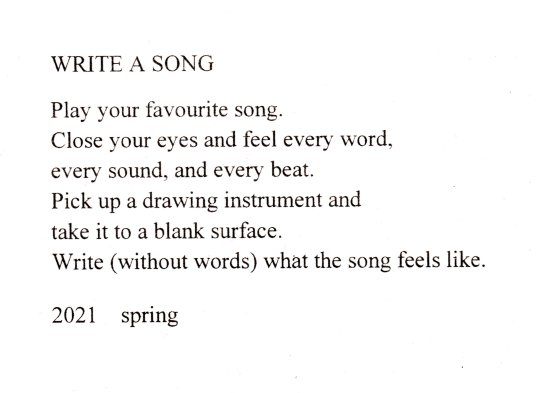
‘Write a song’ submission for ‘Resite’ - offset lithography on paper.
‘Resite’ is an assembling publication by Field Study that offers an element of audience participation. The editions are a nod to the Fluxus tradition of performance-based interactions and the pages are packed with scores, manifestos and documentation.
Since learning about the Fluxus movement from the Block Zero projects we got involved with I have been very aware of how my work is in dialogue with many Fluxus concepts. In lockdown I began to explore the links my practice has with performance and I have understood that these moments of outward reflections of inward feelings are candid happenings, much like those popularised by Fluxus artists in the 1960s.
I printed an edition of forty double-sided lithograph prints that have an event score on one side, instructing the reader how to write a song in the way that I would transcribe one through asemic writing. The text in this print is a direct homage to Yoko Ono’s ‘grapefruit’ manual of scores, even down to the date sign off at the end. The reverse side is a polaroid photograph that documents one of these happenings. These prints will be included in the next Resite assembling book and each contributing artist will be given a copy of the finished publication.
Exhibitions
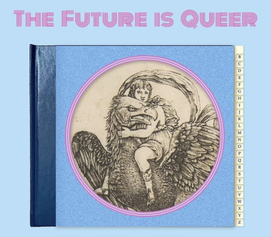
I was delighted to have work selected to show in a digital exhibition entitled ‘The Future is Queer’ - the first time that I have exhibited solely with other queer artists. I have only briefly touched upon this side of my identity in my practice, and so relished the chance to have myself placed under this umbrella for the purpose of this exhibition. I have a lot to say about queer culture, and I feel that now more than ever the world needs people to speak up about the treatment and mistreatment of people from the LGBT+ community. For this reason I see participation in this exhibition as a first step towards telling more honest stories about what it is to be a gay man in contemporary society.
In keeping with this idea I have also submitted works to be exhibited at Bristol Pride this summer. I noticed the advert on social media and am still awaiting a response. The exhibition would be widespread around the city centre as opposed to a singular exhibition. If I have understood it correctly, it sounds to be not too dissimilar from an art trail - where there are multiple venues around the city for people to wander around and discover.
‘Wild Things’ was a call out by Beach Gallery in Orkney, Scotland that I entered just for fun, which from time to time can be a breath of fresh air. The call asked for artworks that focussed on wildlife, and so I submitted a series of three bumblebee monoprints. I was thrilled to learn that my prints are the focal point on the gallery’s website, being the first works you see upon entering the virtual gallery.
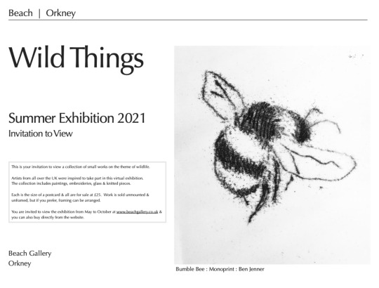
‘Bumble Bee III’ submission for ‘Wild Things’ exhibition in Orkney, Scotland - monoprint on paper.
Residency
A big achievement for me during lockdown was having my application accepted to be an artist in residence at the Museum of Loss and Renewal in Collemacchia, Italy.
I have been extremely fortunate to have been able to spend the last three years developing my practice and honing my interests in visual poetry in an encouraging environment, however I am ready to explore my practice away from an educational institution. There have been moments of anticipated self-doubt as the final weeks of the masters degree are looming. The opportunity to explore my practice in a residency setting would encourage personal growth in the form of self-confidence as well as being able to assert myself as an artist in a creative context.
Furthermore, since returning to my studies I have experienced first hand how important it is to discuss and unpick ideas with a peer group, and so I am keen to collaborate and build relationships with other artists at the residency.
I am eager to continue developing my ideas of discerning a narrative through reading asemic marks, and investigating where we might find narratives. I have proposed that during the residency I would like to place myself in the local community and examine through first hand research how these ideas might translate in a setting where the language spoken is not my mother tongue. How might a language that I don’t understand translate visually? My aim will be to record my findings through drawing and printmaking.
Immersing myself within a village community will provide extensive opportunity to explore a dialogue with new people and hopefully build a body of work that not only reflects these conversations but serves as a common language that is able to be read by all. I must remember to keep the emotional attachment at the heart of my practice and remind myself of the lessons I learnt from my residency at Bower Ashton Library - not to allow my work to become too formulaic and emotionally cold.
#practice#exhibition#publication#contemporary art#contemporary printmaking#asemic#asemic art#asemic writing#visual poetry#vispo#monoprint#bumblebee#printmaking#masters#mamdp
0 notes
Last Seen Blogs
inanetitter
Alex Houstoun


briankernick
Untitled

ds-nighterror
Dreamswap Nighterror Appreciation

peliculasescenas
Frases de Series y Películas