#processbook
Text

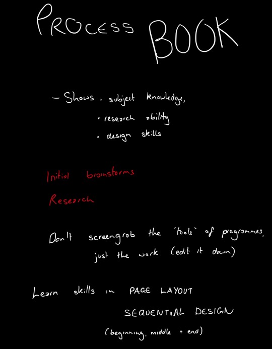
25/04/23 - Process Book Talk
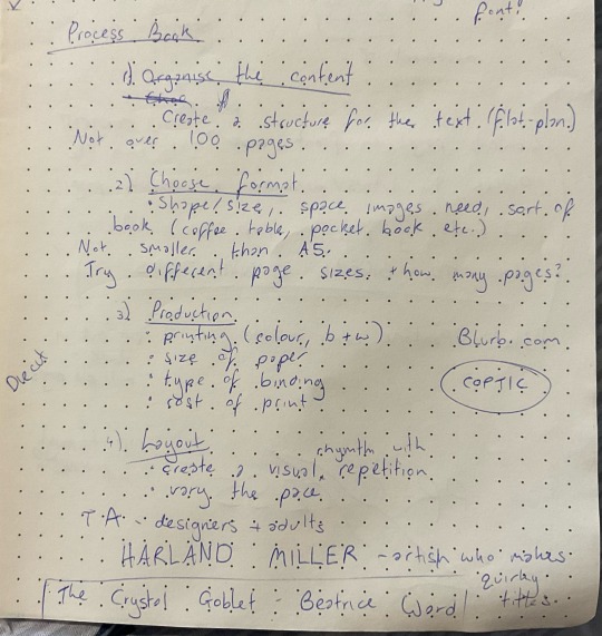
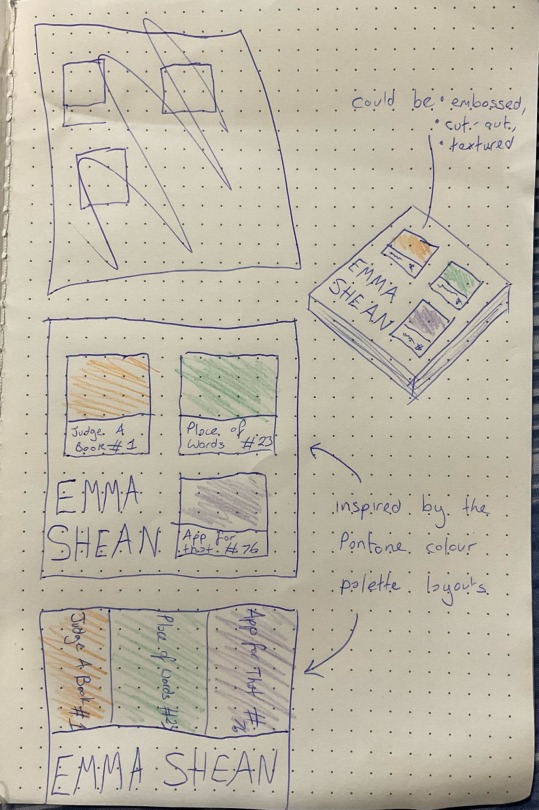
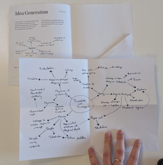
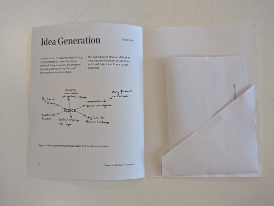
I began thinking of ideas after the talk about how to design our process books for the final term.
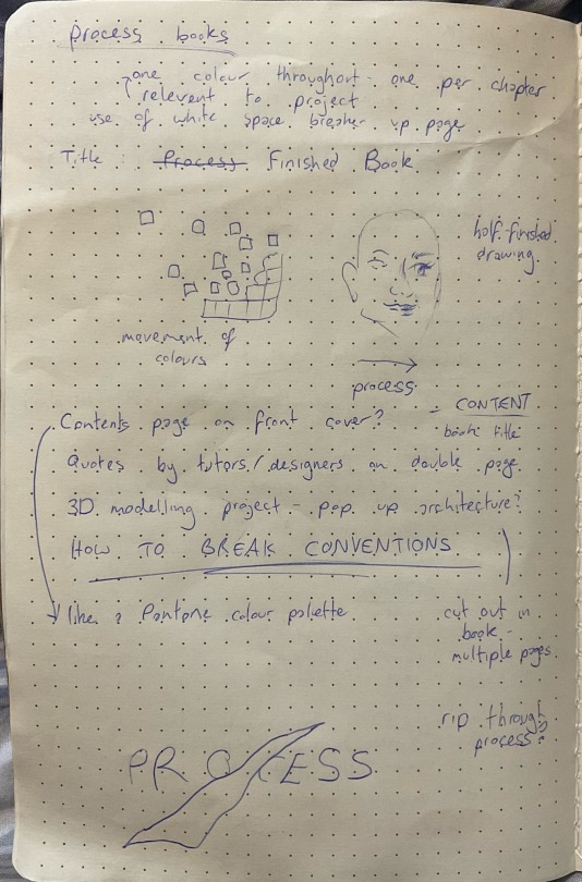
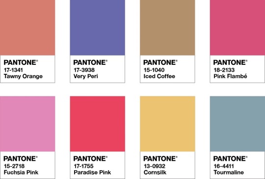
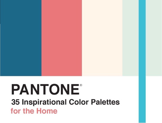
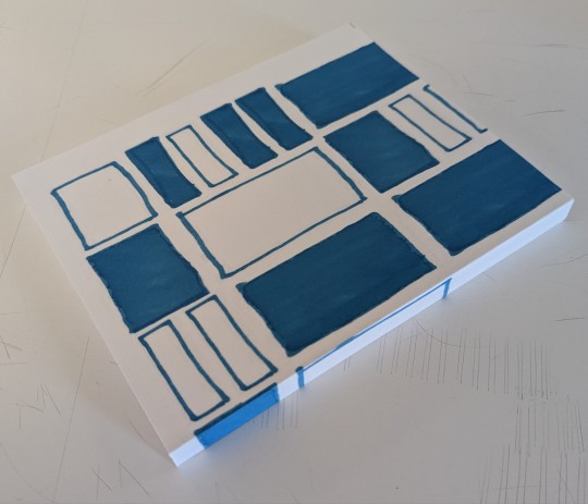
My favourite idea was having the contents on the front page, with a Pantone colour palette layout of the main colours used in each of my projects to distinguish between the chapters and units. I thought this was quite unconventional to have the contents on the front page, and gave it a unique first look. The different colours in each project, for example blue/orange for the ‘Judge a Book’ project, would continue throughout the book chapter and make it easy to see which unit of work the reader is in.
:) from Amy
2 notes
·
View notes
Text

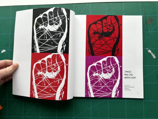
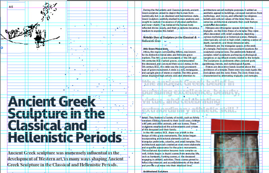
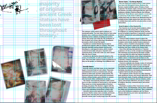
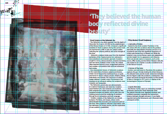
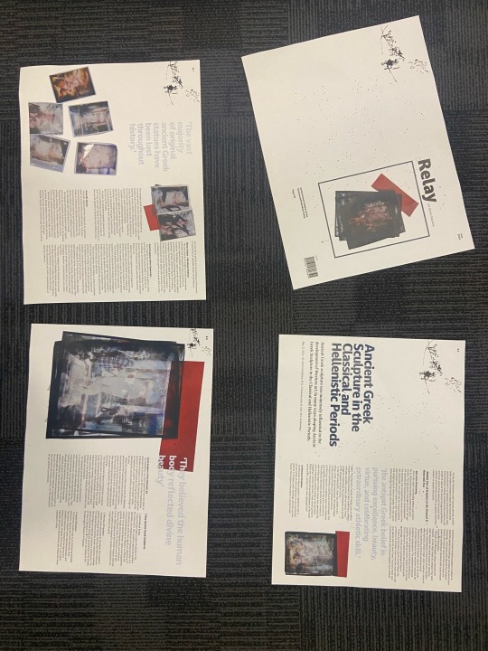
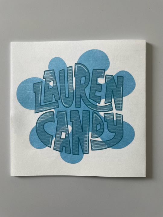
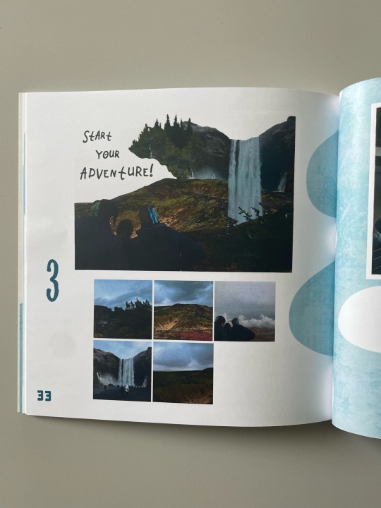
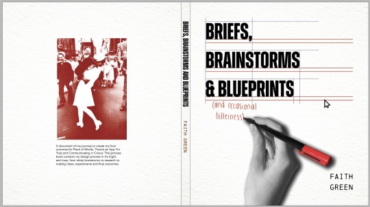
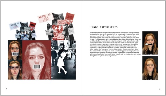
Place of words: Finished magazine spreads. I liked how these turned out and I’m really happy with how the illustrations match seamlessly with the Lino print front cover. Personally, I wasn’t a fan on the front cover and before entering my final feedback tutorial was expecting to have to change it, however it was received very positively so I didn’t make any further changes to it.
0 notes
Text


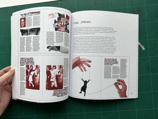


Today I finally bound the final prints of my process book. Overall, I think that the outcome is successful and my images printed well as I assured that I used a CMYK colour scheme for each. I do think that the use of negative space throughout the spreads is effective in making my work stand out. If I were to do this again, the first improvement I would make would be allowing more space for imprecision when designing the spine as when I bound the book it was off centre which resulted in the spine of the book creasing over the text. I would also make sure to triple check spelling and punctuation on every page and also check imagery as on the "Final Spreads' page I selected older versions of my spreads when relinking imagery which I noticed after printing. I would also consider adding more decorative and personalised elements to each page to make the inside of the book more unique. I would have been more likely to do this if I had more time to create the book and didn't leave the majority of it to the last couple weeks, so will be sure to manage my time better when making process books in the future. However, with this being said I do think that it honestly and accurately documents my journey of creating each project and shows how I got from brief ideas to my final designs. Because of this, I do think that m process book successfully fulfils the brief.
0 notes
Text
Final Group Crit
Week 8
Small text adjustments
Change all pull quotes to light blue
I think it looks even better with these small changes. Printed out and cut down, makes it seem even more like a real magazine and professional. I love what I have made this term, and didn't think I would at one point, like anything I made.
0 notes
Text
Process book development
When experimenting with my process book cover, I found that the contents did not resemble a journal as the images were printed on and the text was large.
To fix this I decided to experiment with placing the images as separate inserts, similar to how a personal journal looks.
I found this layout was more linked to the traditional side of my project and made the book look like more of a journal with a modern twist, as the text is not hand written.
0 notes
Text
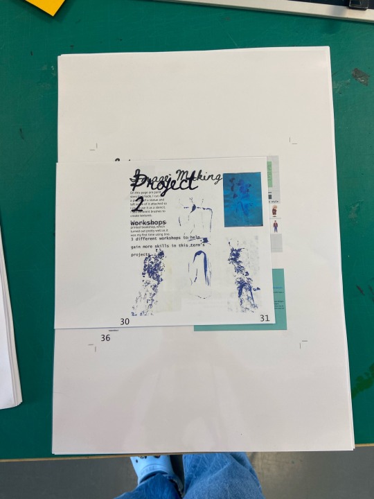
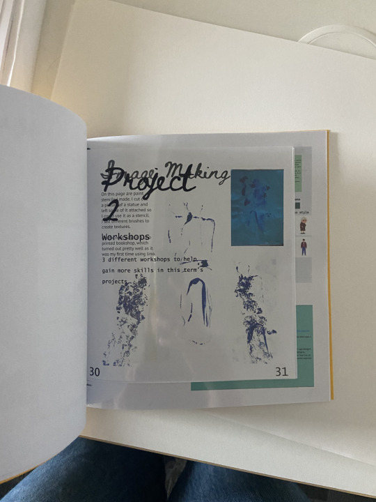
MP - Process Book (Chapters) LO3

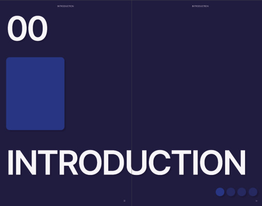
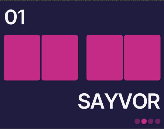

These are chapter pages, there will be brief descriptions of my work in these pages. I stopped creating the layout because I was feeling inspired from the last layout but realized I couldn't get more inspiration and that is what I dislike about editorial design.
Again the inspiration is UX. At the top is the chapter numbers, the middle has vertical rectangles where I will place images relating to the chapter and the chapter heading. Finally, the bottom shows slider buttons as a form of navigation for readers.
0 notes
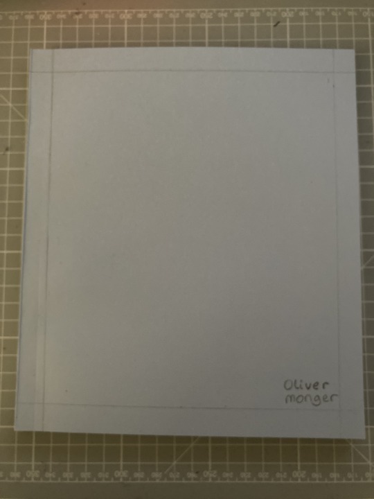
Text
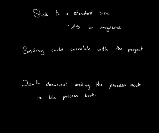
Process Book - Size
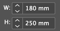
Here is the size that I am sticking to for my process book for this term. I have decided on this size making it smaller than a4.
0 notes

Text
CVL- Process Book 2 (Main Project) Outcome & Reflection
first few pages have a '1' on the top right, this is because I was testing out where to put the page numbers and forgot to delete these once I had finished
type trials by Pangram Pangram citation is 12pt, should be 6pt like the rest of the other figures
front cover- the L glitched and printed weird for some reason
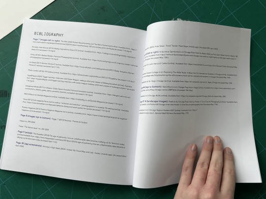
I also completely overlooked the fact that the bibliography/ list of figures isn't included in the back of the book, I have no idea how I missed this but myself and multiple people reviewed this process book once it was bound and none of us caught it until later on- to remedy this I have included the bibliography on Tumblr
0 notes

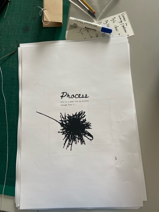
Photo

Process Book
This is my bound process book that I did using the perfect bind.
For the cover I used a baby blue and I drew a grid onto that and added my name to it. I wanted to do more but didn't have the time nor resources to do that at this time, however I do want to make sure that I do it next project as I have ideas in mind.
The binding and printing process went well enough but there's one thing that I need to change for the process book and that is the edit of the text making sure that their are no orphans in my text. It's something that I overlooked this time when creating and that has made me very disappointed as it's an important aspect. I will make sure to perfect it next project.
I feel like there is always going tot be something that goes wrong.
0 notes

Text
Process book: My finished process book. I feel as if I badly mistimed the creation of this and left it very last minute so was quite surprised when I managed to create it, print and bind it in time (with help of Jordy our saviour). I think the end result is quite cool, next year I will definitely put aside more time to focus on this as I could get wayyy more creative with it.
0 notes
Text
Process Book Additions, Edits and Experiments
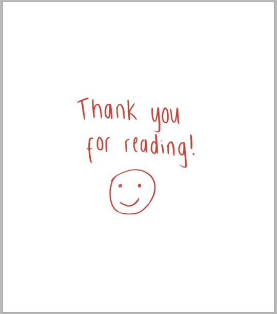
Addition of a contents and bibliography for which I prioritised legibility and function over decoration. I also added a thank you note to the last page using the same red handwriting to the cover to tie it back and give the book a more personal and informal feel.

To experiment with the book cover, I added a faint paper effect to emphasise the handmade feel and link to the "graffitied" effect. However, I felt as though this effect did not fit in with the inside of the book so decided against using it in my final design to make the cover and contents more cohesive.

Edits made to photo placement to make the right composition less left-heavy.

Edits made to move imagery away from the edges of the page to allow imprecisions in trimming.
Edits made to align text and imagery.
Edits made to improve legibility and cohesion of the mind-map.
Edits made to fit imagery onto one page.
0 notes
Text
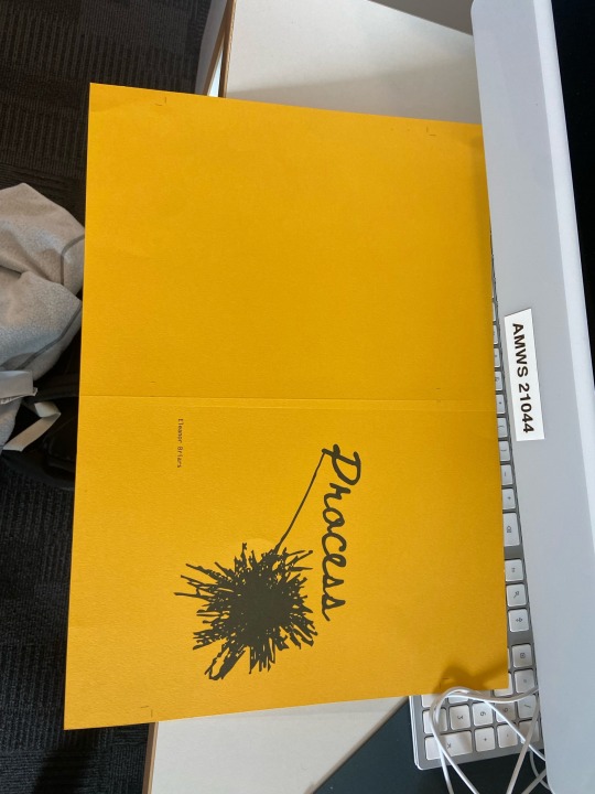
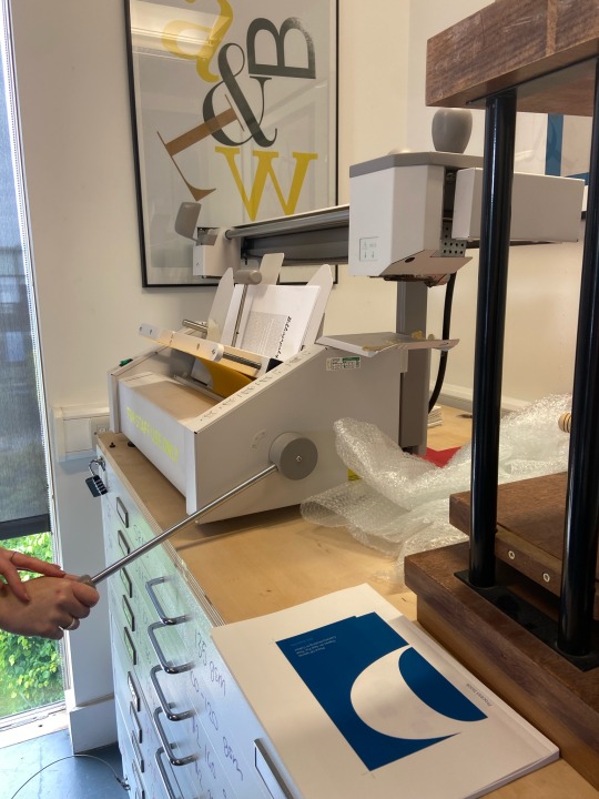
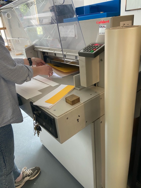
Printing and Binding my Process Book
Week 7
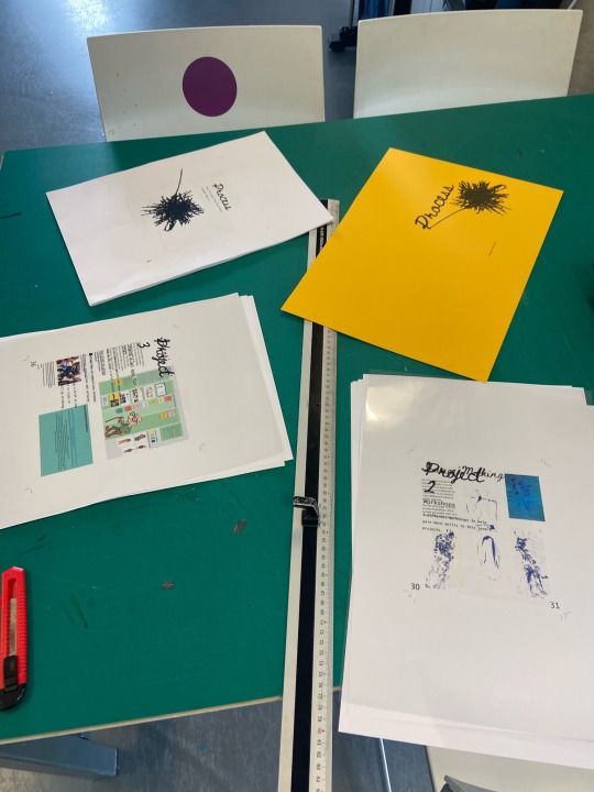
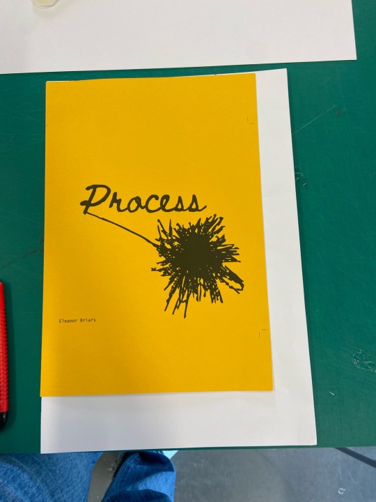
Binding the process book was actually kind of long as I had different types of paper and sizes in the book. There wasn't enough orange/yellow card for the inside pages and it would be too thick for the pages. There also wasn't any orange card like the shade I wanted. The acetate project pages worked really well, and so did the smaller pages, they just had to be cut down before binding.
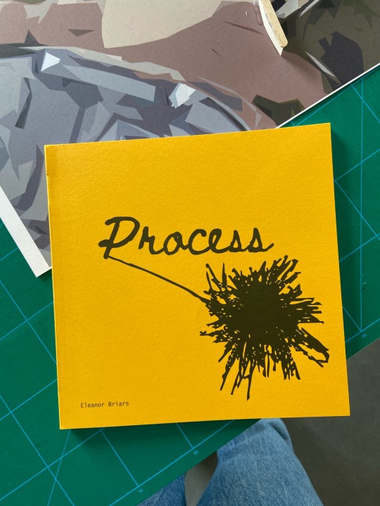
Overall, I think it turned out pretty well. I love how I have different types of paper and size in the book, it makes it more interesting and interactive even. The bright yellow cover looks simple but effective, I don't think it needed much as the illustration says everything about creative processes in general.
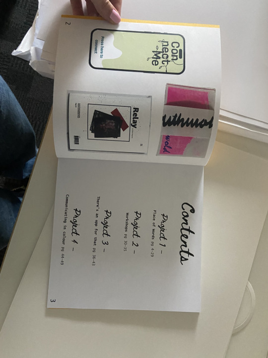
There are a couple things that are annoying, mainly with page numbers, one page doesn't have on and the page numbers on the project pages aren't on the right side. Aside from that, I think I quite like it.
0 notes
Text
Test printing process book cover
To draw attention to the textured paper and handcrafted binding have decided to use a simple cover design. For cover I have decided to use the logo I have created for Craeft, as I like how this links to the project but holds an air of mystery, which will make people feel curious.
Default Settings on large format
First Jordy decided try the default setting on the large printer. I liked how this created a clean print but still allowed the texture to be seen through the ink.
Glossy Paper settings on large format
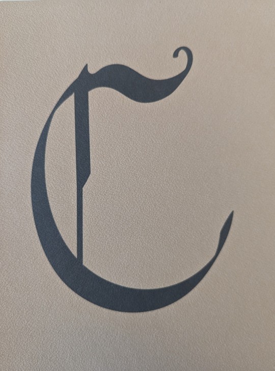
However, we decided to try a different setting to see if more of the texture could be seen. I found the Photo glossy paper did not reveal more of the texture but instead caused the print to appear grey, making the texture less see able.
Standard printer
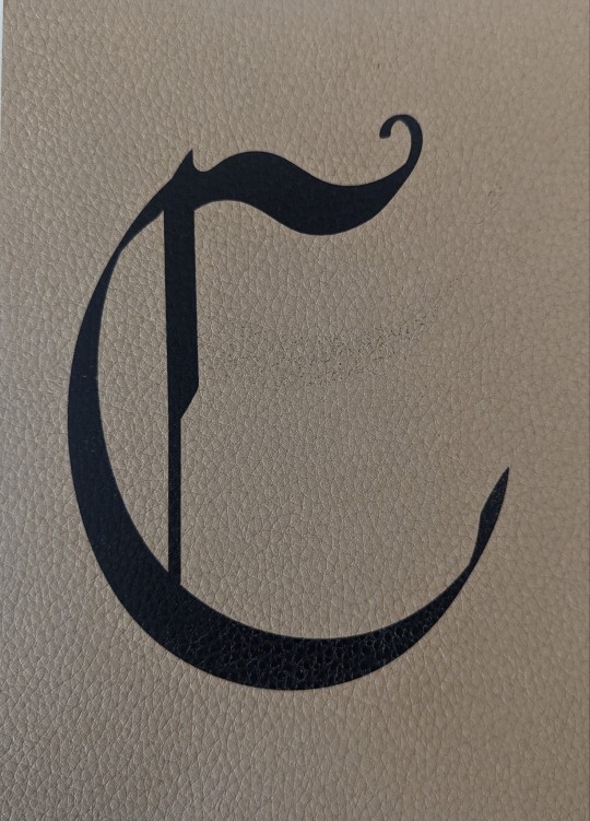
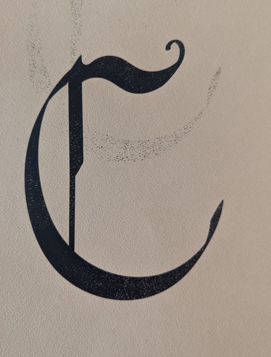
Following this one of the other technicians suggested I try the laser printer as this will make the ink sit on top of the paper instead of sinking in, which could make the texture more noticeable. However, I found the standard printer dragged the ink causing it the print to look untidy and unclear.
Following this I have decided to use the Gmund leather peanut coloured stock using the default settings on the larger format printer, as this creates a crisp print but still allows the texture to be seen more than the Morocco embossed paper.
0 notes
Last Seen Blogs

starlurkerx3
brainrot.

arte-inmortal
🌟 K A R I 🌟

jellybuttmod
Jelly Butt

astralmutt01
Brain Full Of Little Guys

recursive360
𝙍𝙚𝙘𝙪𝙧𝙨𝙞𝙫𝙚