#or wrecking the desktop ui
Text
I guess spending a cumulative 600+ person-years consistently doing pretty much the complete opposite of what people wanted wasn't really a winning strategy.
#look i dont wish ill upon any of the staff#im sure for many of them its heartbreaking#but also i cant help but roll my eyes at some posts in defence of them#you cant save someone who keeps trying to sink their own ship#like i keep thinking#how many of those person-years was tumblr live#how much money did that mess cost them#how much did it add to the upkeep#how much has been spent on breaking the mobile apps#or wrecking the desktop ui#these are all things they chose to spend time and money on#turns out if you insist on trying to sink your own ship#sooner or later you might actually succeed
6 notes
·
View notes
Text
Beta development is iterative.
Pillowfort is in closed beta development.
Some of y’all are expecting a fully baked cake while the icing is still being mixed up.
Beta development is where a wide variety of platform things get worked out, it’s not just UI and databases. It includes minutia like ToS and content moderation. Being a beta user is a collaborative process—not as involved as a beta tester—please provide respectful, polite, constructive criticism and feedback before going on a crusade against a small fandom-lead crowd-sourced project.
Any kind of development process is one of constant iteration. UIs, ToS, features can come and go and evolve from week-to-week, or month-to-month, as resources allow. User feedback is a part of this, and yes, sometimes that feedback is angry (rightfully or not is irrelevant).
Think of how many times a month we get updates from our various mobile, application, credit card, or other life-services with 100 page long updates to ToS. ToS is always evolving, especially in beta development.
Storytime:
Years ago, when I was actively developing for a video-based social media platform, I told my fellow co-founders that someone was going to attempt to post C//P, or at the very least p/o/r/n via the platform eventually, that we would need a moderation system that couldn’t be abused, and we needed to decide on whether or not we would allow adult content on the platform. I also said that this would be a problem with our “let’s show new videos immediately on the main desktop landing page.” But we had a shoe-string budget, less than a handful of people, and bigger things to deal with than fully working those details out.
Within a few weeks after this conversation, one of our developers noticed C//P, posted via our platform. He just happened to be developing late at night (yay global distributed development across time zones) and saw it right away. He immediately quarantined the files, called our CEO in the wee hours of the morning, and went through the process of alerting the FBI (which from out of country isn’t as easy as one may think) AND contacting authorities in Germany from where the C//P, originated. It was graphic and disturbing and traumatic for those who had to “moderate” that situation. In this process we had to change the way new videos appear on the main page. That’s active development.
With respect to fanart, this gets awfully complicated due to different body types and perception of “adulthood” vs “childhood” across cultures. That’s a detail that gets lost in the knee-jerk process of “Oh shit, we need to deal with this now before we get sued, or investigated by authorities, or bad-PR’ed into oblivion.” So you quarantine the content until you can sort it out later. Full stop. Unfortunately that has unintended consequences.
It sucks to have your posts taken down. It sucks that moderation will nearly always be at the risk of user abuse. It sucks that nations and monopolies continuously squeeze the vise on freedom of speech—imposing onerous measures that can wreck a small business or a startup—under the guise of IP protection or targeting C//P and crime.
It sucks for everyone, except of course for antis and purity police who abuse flagging and moderation systems. Have a better idea? Then please engage those ideas without fanning flames or making it appear as if those who are working hard to bring this thing to life don’t care about solving the problem and doing right by their users and in line with the spirit of their intentions.
I’ve got ideas of my own of how to deal with this kind of content moderation, but that’s a write-up for another time after I’ve used PF some more.
#pillowfort#fandom wank#discourse#dont @ me over this#I dont have time to argue#sharing perspectives#apologies if this comes across as rude
70 notes
·
View notes
Text
Worry? Not If You use Dedicated Server The suitable Way!
No matter which operating system the server is working, it may be gracefully shut down by connecting to the server within the Server Supervisor in the game client, and on the Console tab, issuing the quit command. In case your server was installed using the desktop Steam consumer, it needs to be mechanically up to date shortly after the replace is launched. In case your server was installed using the SteamCMD command-line consumer, you'll be able to shut down the server instance after which use the same command you used to install the server to check for and install an update. Griefers can simply wreck your day. Blog about games You can set up the server from your Steam library like you'll install another recreation. The sport loop remains to be basically single threaded though. While I've performed my fair share of deathmatches, I had never really performed through the single player campaign before. Player password protection just isn't enabled by default but a player password may be set via the identical UI.
The FDA's advisory board assembly Friday is set to be followed subsequent week by a gathering of the CDC's immunization advisory committee, which gives suggestions for vaccine use that can result in authorized mandates. We meant extra that the server spawns as much as 26 threads (per work set). For more information, see: Operating as a Service. For more data, see Configuration files. In the event you run that command, you will both get no response (indicating the Dedicated Server isn't running) or a number of numbers (indicating that you have one instance of the Dedicated Server working per number you see). The previous president unleashed a furious response on Saturday, claiming that Staff Clinton's habits would as soon as have merited execution. You might have to change your steam library filters to incorporate tools but aside from that the process does not differ from another recreation. An administrator should create a recreation by means of the in-recreation UI. How do I reset the Administrator password? Your MineCraft server is shipped instantly upon buy. There are many nice multiplayer servers for every type of Pc Minecraft player on the market.
First and foremost, before implementing the reply supplied right here, note that the server is being tuned to be performant with the anticipated player cap of 4. They even have the added characteristic of being able to voice or talk to others. Amongst them, DayZ Standalone is one of its kind, with wonderful voice and text chat features. Opening a $one hundred bottle of wine and a $30 bottle of wine requires the same effort and yet at a fee of 15 per cent, one yields a tip of $15 and the other $4.50. I don’t actually know what was a purpose however after i tried the identical activity a few hours later its worked fairly high-quality. From the same host or one other host on the same LAN (i. If any of this sounds good to you, let’s see how to choose a game server host that fits your needs. There are a couple of different cheaper alternatives that I will spell out for you, if your need is specifically about price, however BlueHost is sweet for a mix of affordability and decent presents in their plans.
Nonetheless, prices in this category are subject to frequent fluctuations and are additionally persistently subject to particular affords and limited offers. Some coupon codes have particular requirements or exceptions. But additionally, it's a must to learn between strains and see if there are any hidden options or details you don’t find out about or that make points. So, now that you realize what a dedicated gaming server is and are nicely acquainted with a few of the amazing features of a devoted game server, it’s increasing demand in the current world market state of affairs might not seem too illogical for you. That is where crypto gaming helps. Adopting a problem-centred method helps students to be taught Geography. If you browse the internet while on a VPN, your laptop will contact the web site via your VPN's encrypted connection. It’s quite easy, all it is advisable do is contact us, we overview and examine the positioning and provides our sincere opinion based mostly on our key areas.
1 note
·
View note
Text
How to speed up your Mac
It is safe to say that you are battling with shoddy handling speed on your Mac? It very well may be baffling when you have work to do and your working framework is slacking. Fortunately, there are a couple of steps you can take to upgrade your Mac's speed, some of which may amaze you.

Boost Your Macbook
Peruse on to discover how you can accelerate your Mac rapidly and effectively, from refreshing your product to clearing reserves. Before you know it, your Mac will be working at maximum velocity once more.
Update your Mac’s software
First of all — ensure MacOS and all applications are current. The most recent security patches are crucial for keeping your Mac running admirably, and Apple is very accepting about streamlining new deliveries for better execution.
Keep in mind, in the event that you have a MacBook, plug it in. The cycle refreshes MacOS and most applications, guaranteeing they exploit the latest security patches and enhancements.
To refresh MacOS, essentially follow these means:
Step 1: Click the Apple icon in the upper left corner, then select About This Mac.
Step 2: Click Software Update to see if there are any new versions of MacOS available.
To update software and apps from the App Store, do the following:
Step 1: Click the Apple icon located in the upper left corner and select App Store on the drop-down menu.
Step 2: Select Updates in the left-hand column and click the Update All button.
Use the Optimize function
Apple presented Optimize Storage in MacOS Sierra that assists clear with separating and improve speed.
Stage 1: Click the Apple symbol situated in the upper left corner and select About This Mac on the drop-down menu.
Stage 2: Click the Storage tab on the accompanying spring up window.
Stage 3: Click the Manage button.
Here you'll discover numerous valuable apparatuses, remembering approaches to store all documents for iCloud and spot mess you can erase. In any case, the most valuable device is Optimize Storage, which permits you to eliminate downloaded TV shows, late connections, etc. Give it a shot in the event that you devour heaps of media on your Mac!
Do a quick malware scan
The entire "Macintoshes don't get infections" guarantee is a legend. While the facts confirm that MacOS has certain security benefits on the grounds that by far most of the malware targets Windows, Macs are as yet inclined to a periodic gatecrasher. Truth be told, when we asked the specialists, they suggested getting an antivirus application. Fortunately, there are huge loads of free alternatives intended to guard you, from nonstop scanners to one-time apparatuses.
In the event that you don't have the foggiest idea of what to pick, Malwarebytes for Mac offers a free one-time check that gets and eliminates the most well-known malware found on the stage. It's additionally speedy at doing as such.
Disable login items
On the off chance that your Mac takes perpetually for sure, you may have such a large number of applications stacking with your framework. Impairing these login things speeds up the boot interaction, yet possibly opens up framework assets and rates up your framework overall.
Stage 1: Click the Apple symbol situated in the upper right corner and select System Preferences on the drop-down menu.
Stage 2: Select Users and Groups in the accompanying window.
Stage 3: Click the Login Items tab.
Here you will see a rundown of applications that heap when your Mac boots. On the off chance that you see applications, you don't require, select them in the rundown and snap the short catch at the lower part of the window.
Reduce transparency
The sprinkle special visualizations of MacOS initially showed up in Yosemite, yet some influence your Mac's general speed, similar to straightforwardness: It's the greatest guilty party. Everything is straightforward now, which is the reason the menu bar pulls tones from your backdrop, in addition to other things. While El Captain truly diminished the effect of these consequences for execution, there's as yet a major exhibition acquire essentially by turning them off, even on the latest update.
Step 1: Click on the Apple icon in the upper left corner and select System Preferences from the drop-down menu.
Step 2: Click on the Accessibility icon in the pop-up window.
Step 3: Select View listed on the left and click the box next to Reduce transparency.
UIs will stop using the transparency effect when disabled and will work much faster too.
Clear your caches
Your Mac gathers a wide range of cruft after some time that devours space on your hard drive. Internet browsers, with their excess of history and huge stores, are acclaimed for this, diminishing their general exhibition. That is the reason you should clear their reserve every once in a while.
Notwithstanding, they're by all accounts,s not the only applications that form reserves and different records over the long haul. This is the reason we suggest you look at CCleaner for Mac.
This free application can at the same time clear out your programs' stores and the reserves your framework gathers over the long haul. Remember that the organization additionally offers a superior variant, however, the free form is above and beyond for most clients.
Uninstall software you don’t use
Opening up space on your boot drive can build execution, especially if your drive is almost full — this is particularly valid for more established Macs without SSDs. A simple method to recapture space is to erase applications you don't utilize. On the off chance that you normally introduce a heap of applications and, disregard them, it's an ideal opportunity to cleanse.
Stage 1: With Finder dynamic, click Go on the menu bar and select Application on the drop-down menu.
Stage 2: Right-click on all undesirable applications and select Move to Trash on the spring up menu.
However, don't simply drag your applications to the Trash symbol — that will give up a lot of garbage you needn't bother with. All things considered, investigate the free application AppCleaner. Drag any application to this window and you can likewise erase every single related record, including stores and setup documents. Or then again, in the event that you like, you can peruse a total rundown of your applications and erase them from that point.
This is the most ideal approach to guarantee an application you don't need isn't giving up anything. You can likewise utilize Activity Monitor to search for programming that is burning-through heaps of RAM.
Find and delete unnecessary files
Applications presumably aren't occupying the greater part of the room on your drive. All things considered, that honor is likely held by your records. In any case, which ones?
The free application Grand Perspective gives you a higher perspective of your documents, with the biggest records appearing as the greatest squares. Investigate this and check whether there are any enormous records you need erased or moved to an outer hard drive for long-haul stockpiling.
Clean up your desktop
Here's a fast tip: If your work area is a jumbled wreck, tidy it up. Your work area is a window like some other, so if it's so overpowering you can't discover records, it's additionally presumably hindering your framework to given it must "draw" everything on the screen. Packing everything into a work area envelope can help on the off chance that you're excessively overpowered to sort everything.
Disable the Dashboard
In case you're running an old variant of MacOS, you can impair the Dashboard. It was fun back in 2005, however, an assortment of gadgets that take up the whole screen simply sums to a superfluous mess in 2020.
Stage 1: Click the Apple symbol situated in the upper left corner and select System Preferences on the drop-down menu.
Stage 2: Select Mission Control in the spring up window.
Stage 3: Select Off on the drop-down menu close to Dashboard to cripple this component.
Note: The Dashboard is consequently crippled in MacOS Mojave. Apple eliminated it totally with the arrival of MacOS Catalina.
Actually close apps
This is Mac 101, yet don't be humiliated on the off chance that you don't have a clue how — heaps of individuals don't. At the point when you click the red "X" circle in the upper left corner, it doesn't close the application, however only conceals the primary window. The actual application actually runs behind the scenes, which is featured by a little spot beneath the application's symbol on the dock.
To appropriately close an application, right-click the symbol and select Quit. Then again, you can close applications utilizing the console easy route Command+Q, which closes down any application.
A decent dependable guideline focuses on shutting applications that aren't being used in light of the fact that the more open applications you have open, the slower your framework will work.
Run OnyX if things are still slow
On the off chance that none of the different ideas have worked up until now, there's something final to attempt. It very well may merit downloading the free OnyX application in case you're alright with power devices. It allows you to improve different parts of your Mac's activity.
Onyx will initially confirm your hard drive, which is helpful in itself. On the off chance that all that looks at on that end, head over to the Scripts segment under the Maintenance tab.
In the Scripts area, power the customary Mac support content to run. At that point go to Rebuilding, where you can constrain MacOS to reconstruct various reserves. That frequently settles log jams. The Cleaning is additionally helpful, yet it handles quite a bit of what CCleaner illustrated above does. When you deal with your presentation, you can explore different avenues regarding the other arrangement apparatuses accessible.
Editorial Selection
How to back up your PC
How to back up your MacBook
How to jailbreak your iPhone or iPod Touch
How to back up your iPhone or iPad throw iCloud and iTunes
How to speed up your Mac
apple, apple silicon, boost mac, boost macbook, boost your macbook, How to speed up your Mac, howitmade, HOWTO, howtodothat, macbook, speed up, speed up your Mac
via exercisesfatburnig.blogspot.com https://ift.tt/38K2nRY
0 notes
Photo

New Post Top 10 Reasons Why You Should Buy iQOO 3!! has been published on https://www.reviewcenter.in/10017/top-10-reasons-why-you-should-buy-iqoo-3/
Top 10 Reasons Why You Should Buy iQOO 3!!
iQOO 3 is a hot topic of discussion right now among the smartphone enthusiasts in India, as it is the first phone to offer 5G connectivity. While 5G is something which is not much relevant in India at present, iQOO 3 is undoubtedly a #MonsterInside phone which should be known for its other features like top-of-the-line specifications, a future-ready device, super-fast charging, an unbeatable camera & the enhancing gaming experience features which will give you an absolute advantage from other gamers!
The price of the phone starts from Rs 36,990 and can be purchased either from Flipkart or iQOO e-Store. I am using this phone for last 15 days and let me tell not a few but top ten reasons why you should buy #iQOO3:
Sɴᴀᴘᴅʀᴀɢᴏɴ 865 – Fᴀꜱᴛᴇꜱᴛ Pʀᴏᴄᴇꜱꜱᴏʀ Eᴠᴇʀ!

iQOO 3 is powered by Qualcomm’s latest and greatest Snapdragon 865 chipset, a 7nm chipset equipped with the latest A77 architecture that offers significantly better performance (with an Antutu score of 6.1L), 25% more when compared with Snapdragon 855 while reducing energy consumption quite a bit, 30% to be precise. And with Adreno 650 GPU onboard, this phone can handle everything without any issues. Be it multitasking or hardcore mobile gaming; it can handle anything without slowing down ever!!
Fastest RAM & Storage Ever!

LPDDR5 RAM
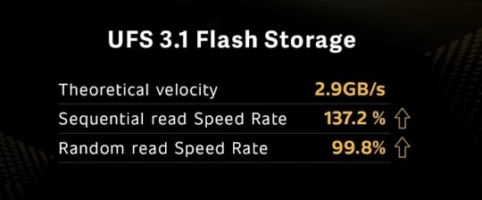
UFS 3.1 Storage
It’s not just the chipset and GPU, which makes iQOO 3 fastest, it’s also the 8GB/12GB of LPDDR5 RAM and 128GB/256GB of UFS 3.1 storage, which contributes to better user experience, especially in multitasking and improving cache speeds. LPDDR5 RAM improves the r/w speed to 5500Mbps, which helps users in faster application retrieval. So even if you may use it for years, it won’t feel outdated. The funny thing here is that this phone outshines my laptop by specifications. Now I probably have a more powerful phone than my laptop.
Device Capability Information from Kine Master
Because of such high-end specs, I was able to easily edit 4K videos on the phone itself using the apps like Kine Master. The inbuilt video editor does a fine job, but for adding effects, a professional editor is required on the go. The faster RAM & Storage, along with the processor, plays a prominent role here for processing of added visualizations on videos while editing and also on rendering of 4K videos.
вeѕт ɢαмιɴɢ eхperιeɴce!
The iQOO 3 comes with two pressure-sensitive buttons on the side of the phone, which the company calls it Monster Touch Buttons. These buttons let users use quick multi-finger operations in the game. The US-Ergo board-certified iQOO 3 that it offers 50% more comfort, better grip, and the overall experience is better than gaming phones.
There is 4D Game Vibration as well, which simulates the recoil when shooting and the vibration of the steering wheel when driving. All these make the gaming experience a bit more realistic and enjoyable for sure.
Also, for the earphone and charger, iQOO has implemented an L-Shaped charging capsule point for the cable so that users can play games while charging and listening to in-game sounds easily without the cords interfering with controls.
Large Battery & Super Fast Charging Tech
The iQOO 3 comes with a massive 4440 mAh battery, which lasts easily good enough for the day. Even if you may actively use it for extended periods, the battery gave me SOT (screen-on-time) of 8 hours at home on Wifi and 7-8 hours SOT on 4G outdoors. The battery backup is the last thing you may ever need to worry about if using iQOO 3.
In terms of charging speeds, iQOO inevitably wrecks everyone with 55W charging. The phone can be charged from 0% to 50% in just around 15 minutes. That is a big deal for many who often forget to charge their phones. In my experience, the phone charged the battery from 0 to 50% in b/w 15-20 minutes, and to 100% in around 50 minutes.
polαr vιew dιѕplαy wιтн 180нz reѕpoɴѕe rαтe


Equipped with a Polar View 6.44-inch full HD Super AMOLED display, the iQOO 3 has a stunning & color-accurate display. The brightness of the screen can go up to 1200nits, which is much better than the latest iPhones. There are no legibility issues, even if you take it in the harshest of sunlight. With HDR 10+ Standard Certification and Rhine Eye Comfort Certification, iQOO 3 ensures an immersive and comfortable experience. It also has the 180Hz Super Touch Response rate, way higher than 120hz standard, a 50% increase in touch scanning. Surely the higher touch response rate can be felt while playing games.
48MP AI qυαd cαмerα wιтн 20х zooм
iQOO 3 Rear Quad Camera Module
The iQOO 3 comes with a quad-camera setup on the back where there is a 48MP Sony IMX582 sensor as a primary camera.
Along with that, there is a 13-megapixel telephoto lens, another 13-megapixel wide-angle camera, and a 2-megapixel depth sensor. Quad-camera setup on smartphones is standard these days. But iQOO has focused on a significant concern raised by many, i.e., improving the wide-angle and telephoto lens.
Rather than going for just an 8-megapixel gimmicky wide-angle lens on many phones, iQOO uses a 13-megapixel lens, which offers higher levels of sharpness. Also, the 13-megapixel telephoto lens provides up to 20X digital zoom so that capturing distant objects in great detail is never an issue. There are quite a few camera features as well that are worthy. There is the Super Anti-shake that uses the EIS algorithm with an ultra-wide-angle lens.
While recording a video, it can perform real-time image stabilization processing by cutting and processing the edges of the screen. The AI Night Mode with upgraded HDR, shorter imaging time, and multi-frame (12-16) noise reduction technology makes sure that photos captured in the night look less noisy and have more details.
нι-ғι & нι-reѕ αυdιo
For audio enthusiasts, iQOO 3 offers the AK4377A Hi-Fi independent chip, which provides the users stereo 32VELVET high-quality audio DAC. Also, the phone has a Hi-Res audio certification, which improves the audio experience by giving a feel of listening to music in a live ambient.
iQOO UI


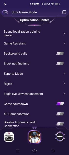
iQOO UI is a feature-rich UI built atop of Android 10. iQOO is a company that takes feedback from users/reviewers seriously and is amending the changes suggested to offer the consumers the best experience possible. iQOO UI includes some unique options for gamers like Monster Mode, which allocates all the resources of the phone to boost the gaming experience. There is a gaming assistant which optimizes your game experience and record your activity to keep track.
It also offers the much-wanted desktop drawer, dark-mode, Always-on-Display (which can be customized with options further) & shortcut center with notifications can be accessed from the top of the screen.
Carbon Fiber Vapour Cooling System

iQOO 3 uses a soaking plate to offer all-round cooling. The liquid-cooling system, combined with superconducting carbon fiber and a temperature equalizing board improves the heat dissipation. Due to this, even while playing very high-end graphic-intensive games, the phone doesn’t heat up quickly. Hence it enhances the gaming experience by avoiding the adverse effects of heating.
iQOO Care

iQOO, being a premium smartphone brand, offers the consumers pick and drop service for any repair issues across the country covering more than 15000+ pin codes. For any on-call assistance, consumers can call iQOO service experts who are available 24*7 over the toll-free number 1800-572-4700.
0 notes
Text
Avoid the mouse trap: Old habits wreck new tech
Don't look now, but your desktop user interface dates back to the Nixon administration. Is it time to upgrade to the next UI?
New technologies revolutionize business. And big shifts like artificial intelligent (AI) virtual assistants and augmented reality seem to have gone from "someday" technologies, to "happening right now."
These technologies are expected to transform business for the better. And I believe they will -- far more than we realize. These new systems come with powerful new user interfaces. There's just one problem: People don't like new interfaces — and cling to the old, inefficient ones.
It's not a theoretical problem. Global business has lost productivity on a galactic scale because of our failure to or inability to switch to the best interface.
To read this article in full or to leave a comment, please click here
via machinistaorguk http://ift.tt/2tX35HM
0 notes
Text
Avoid the mouse trap: Old habits wreck new tech
Don't look now, but your desktop user interface dates back to the Nixon administration. Is it time to upgrade to the next UI?
New technologies revolutionize business. And big shifts like artificial intelligent (AI) virtual assistants and augmented reality seem to have gone from "someday" technologies, to "happening right now."
These technologies are expected to transform business for the better. And I believe they will -- far more than we realize. These new systems come with powerful new user interfaces. There's just one problem: People don't like new interfaces — and cling to the old, inefficient ones.
It's not a theoretical problem. Global business has lost productivity on a galactic scale because of our failure to or inability to switch to the best interface.
To read this article in full or to leave a comment, please click here
from Computerworld http://www.computerworld.com/article/3206584/computer-hardware/avoid-the-mouse-trap-old-habits-wreck-new-tech.html#tk.rss_all
0 notes
Text
Is Windows 8 a wreck or another skyline? The Ars OpenForum says something The Windows 8 Consumer see flashes talks about the eventual fate of the OS.
This week clients got their hands on the Windows 8 Consumer Preview. Promptly, new discussions jumped up in our Windows 8 string, which has been running since September of 2011 in the Ars OpenForum and now has more than 400 posts. With the shopper review surpassing 1 million downloads in 24 hours, there's a ton of enthusiasm for Microsoft's most recent advertising.
In case you're new to the Ars gatherings, the Windows 8 Discussion string is a decent approach to get a feeling of what really matters to the Ars people group. A portion of the remarks will be valuable in the event that you've yet to introduce the review on your machine or tablet for a test drive. A ton of exchange right now is fixated on the update of the graphical UI in Metro. Since motions and touch are a piece of the framework, you can participate in the discussions about what these progressions mean for the working framework. In case you're thinking about relocating to Windows 8 at a later point, perusing these posts may likewise help you settle on your choice.
In case you're a communication architect, engineer or undertaking Windows director, or you utilize Windows for individual utilize, some of these progressions may affect the way you work sooner rather than later.
Feelings on the Consumer Preview are blended, with Ars perusers weighing on whether inheritance highlights (like the Start menu) ought to stay or go. Long-term part Fulgan, supposes it ought to go: "I trust the jury to decide wisely: on a desktop framework, the begin screen is absolutely pointless and should be supplanted by something better (i.e. that works)."
Hambone is not awed by Metro: "Metro is a bet on a dream without bounds no doubt, yet crazy the distance."
As you hop into the talk, recall Semi on's update on the most proficient method to abstain from getting blazed: "No less than one publication seems to befuddle the recognizable proof of issues in the beta with protestations about a last item."
In the mean time, Happysin says the eventual fate of Windows 8 relies on upon equipment: "Windows 8, to function admirably on a portable PC or desktop, will require another era of touchscreen equipment. For anybody that doesn't have a touchscreen (i.e. almost all present equipment), Win8 won't be a solid match, and I will uninhibitedly recommend remaining with Win7."
Care to concur or oppose this idea? Join the discussion. Furthermore, stay tuned for Peter Bright's Sunday include on Windows 8.
0 notes
Text
7 Design Myths That Will Wreck Your Site
When I was a junior designer I made plenty of mistakes. I believed false assumptions mostly because I did not have the experience yet to know better. I still don’t know it all. But, I am always eager to learn new things about design and to see which preconceived notions are accurate or a complete myth. That’s how this post came about. I want to address seven common design myths which I still see influencing design decisions.
Unfortunately, false design myths like these to lead to poorer quality design and poorer experiences for end users. We can avoid this by making smarter design decisions to improve the quality of our designs.
1. The homepage is your most important page
For a long time, people believed the homepage was the most important page. Way back when, it may have been the case when the homepage served as the main directory in getting around to the rest of the pages. It’s no longer the case. The way we browse, and even find web pages, has changed dramatically. Often, visitors will land on a web page from a direct link to a product page, missing the home page altogether. This direct access to other pages is largely due to SEO results or links shared on social media.
Today, home pages serve one main purpose: to get you to the content, whatever it may be. For websites that are constantly filled with new content such as BuzzFeed or Darling Magazine, the home page serves to show the top stories. There are also websites that show off products or services, like Maison Deux. In both of those cases, the user is bound to enter the content specific page because they are not there for the homepage, the directory, they are there to consume information or make purchases. Next, there are services like Mailchimp or InVision where users are interested in using web apps instead. There are plenty of websites out there whose homepage you don’t see as a logged in users, such as Facebook.
Viewing many design gallery sites such as Dribbble, Behance or Awwwards by the sheer number of showings of creative and amazing home pages. There is nothing wrong with having a great looking and well functioning homepage. However, let’s get one thing straight: compared to other pages on a website, a homepage is not as important.
2. Minimalism is the only way to achieve simplicity
Minimalism is a style, while simplicity is about the overall feel and functionality of an application or website. A complicated and extensive design can be made simple. The goal of simplicity isn’t to have the minimal amount of things such as steps, UI elements or interactions.
Steven Sinofsky put it well. He explains that minimalist design decreases the visual surface of a design and its experience, whereas simple design—which he calls frictionless design—decreases the energy required for the experience.
Let’s take for instance the UX of a form with no labels but only placeholder text. We all know this infamous pattern. So although having less visual elements, in this case missing a label, is more minimal the interaction is often confusing for users filling out the input. The interaction is no longer simple. Adding the extra UI element, the label, even providing an example outside of the placeholder, adds to the quantity of UI elements. But, the interaction becomes simpler, easier and more intuitive for the users. That’s a great differentiation between minimalism and simplicity. They are not one and the same.
3. Limit the number of navigational choices
Many people misinterpret George Miller’s theory that the human minds can keep track of 7 (plus or minus 2) bits of information at a time. His theory still holds true but it’s exclusive to the human cognitive condition regarding short term memory. Somehow this theory made its way into web design, specifically to navigation and menus.
Additionally, there is research on limiting the number of choices, which was popularized by Barry Schwartz. Barry Schwartz’s research was referring to choices in product. In his research, Schwartz was referring to jams where the customers had a harder time picking, committing and therefore purchasing a jam if there were a multitude of options. The customers were purchasing jams at a significantly higher rate if they were presented with just a few choices. This can apply to any other product like cars, phones or online subscriptions. They key here is still products.
The job of a navigation is to help a visitor explore what a website has to offer.
Neither of those two pieces of research has anything to do with navigation. The job of a navigation is to help a visitor explore what a website has to offer. Back in 2006, Jared Spool wrote on the topic of link-rich websites which are sites filled with many links and pages. In the article he uses an old version of the Dove website to demonstrate his point, and although the website has changed, the conclusion still stands. Dove’s sitemap was more usable to a visitor than their own homepage’s navigation. The reason for this is that is allowed anyone looking for a specific product to find the necessary product page.
Navigation can be large but still allow the user to browse to the product they are looking for. Good navigation won’t hide the multitude of pages. Instead, it will cluster and group them into similar categories to be findable by a visitor. Now, if the groups and clusters are poorly made that’s also not helpful to the user. The bottom line is, hiding pages from the navigation is not beneficial to the user.
4. Everything must be no more than three clicks away
On computer interactions, the rule is said to be three clicks but this rule has also been extended to mobile devices in the form of two taps. Multiple usability studies prove that this is bogus.
Visitors and users don’t care about the exact amount of clicks or taps. They care about obtaining the information they are looking for, they care about finishing the task they are doing. Additionally, it’s relevant to the user whether clicking through will get them to the desired information. If the user feels they won’t find what they need in their journey, they may leave without clicking just once even though the information might be revealed after a single click. Users will keep on going through as many as 25 clicks, as found by UIE, in order to complete their tasks. The UIE research also states the importance of user satisfaction is also irrelevant to the three click rule.
5. Mobile device users are always on the go and are always distracted
When speaking about mobile apps or responsive websites, both of these points are mentioned. First, mobile device users are presumed to be on the go. Second, they are also presumed to be distracted. Way too often, these two assumptions seem to go hand in hand with one another. Someone who is on the go is bound to be distracted. The fact of the matter is, neither is actually the case.
68% of mobile page views happened at home…mobile interactions such as reading articles or shopping, is mostly done at home
Let’s tackle the first assumption first. A 2012 Google study found out that majority of smartphones were used at home, 60% to be exact. Another study in 2012, this time by InsightsNow on behalf of AOL, found that 68% of mobile page views happened at home. InsightsNow’s study excluded texting, calling and emailing. But, as you can imagine, playing games, browsing Tumblr or Facebook, and any other mobile interactions such as reading articles or shopping, is mostly done at home. Although we should still keep designing for on the go use, it’s not the primary way most of us use our mobile devices now.
Next is the assumption regarding distractions. Distractions are eminent everywhere, albeit it working, watching tv, driving or using a mobile device. That’s just a fact of life. Just because someone is using their smartphone instead of a desktop computer does not make them more distracted. I will point to the same 2012 Google study which found that while using a PC 67% of the time a user is also using another device compared to 57% while using a smartphone.
6. Good usability is good enough without aesthetics
Don Norman devotes a whole book to explain how emotions and design go hand in hand. That’s because while great usability may be a great start and it’s certainly necessary, it still may not actually be good enough. Don Norman’s book centers around emotional connections created through design. Positive emotions can be powerful in helping sell products. There are numerous studies to show that more attractive products appear to perform better than products with poorer designs. Not to mention that first impressions are excessively made through appearances.
More importantly, looks and design are often related to credibility. Stanford University’s Credibility Project proved just that. They presented people with websites to learn about the correlation of credibility. They found the 46% of people based the credibility of a website by its appearance. Emotional responses play a greater role in connecting with people than usability. Emotions are human while usability is technological. Therefore, great visual design and aesthetics is a competitive advantage and a differentiator within a marker. Ultimately aesthetics help enhance usability as mentioned in Don Norman’s book, Emotional Design.
7. Your users will tell you what they want
This one is my favorite. Asking your users for feedback is important. It’s equality important not to take their feedback literally. Noah J. Goldstein wrote:
people’s ability to understand the factors that affect their behavior is surprisingly poor.
And he couldn’t be more right. This type of thinking goes back to days of Henry Ford where he famously said: “If I had asked people what they wanted, they would have said faster horses.” That’s because people are bad at explaining their own behavior patterns, intentions, and behavior predictions. This phenomenon is also known as introspection illusion, in psychology. It’s okay, I’m bad at it too.
Another reason why listening blindly can lead to trouble is that people often speak only about the solution to the problem they might be facing. As a designer, I’m sure you’ve received design feedback such as “make the text bigger” with no explanation as to why. A client or a colleague might have a hard time reading the text with a smaller font or they might feel that the smaller font is less noticeable compared to everything else in the section’s design. The same goes for user feedback. Like I said, it’s important to listen to customers and users. But, it’s more important to get to the bottom of the problem first. Do further research based on user feedback, requests or complaints to figure out what the problem at hand might be, and solve it for that instead of their comments alone.
Conclusion
There are still many more design myths and assumptions out there. These are the seven most common ones I see other designers cling to, especially junior designers or design students. We’ve all been there—I’ve been there. It’s important to realize that these assumptions are baseless and be smart about them moving forward. Hopefully, exposing these seven will help you make better and smarter design choices.
Found
The document has moved here.
Apache Server at www.mightydeals.com Port 80
Source
from Webdesigner Depot http://ift.tt/2niKNdF
from Blogger http://ift.tt/2m6Dy8q
0 notes
Last Seen Blogs

swiftmv
is now @swiftmv

literalinsomniac
Aether

citrusking-blog
[Citrus KING]

v-animal-video
동물영상

shadowpuppetteer
Shadowpuppetteer