#module3
Text
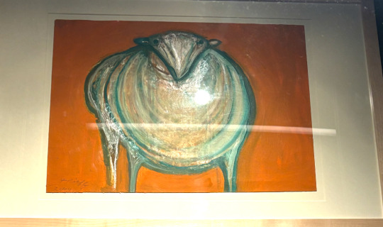


A painting of a sheep or lamp. The sheep has hints of blue/green while the background is orange to emphasize the folds of the animal's fur and make it the main focus of this artwork. While white is the main color of this lamb/sheep, the blue/green undertones within its fur help add depth perception to show not only the thickness of the fur but also help complement the slight orange tones within the sheep and the background.
A painting of 3 birds. This photo uses analogous colors to display both a connection and a distinction between the three birds. The bird in the middle is primarily light green and the other two are majority a darker shade of green to make the viewer focus more on the one in the middle. The outer two birds are displayed in a darker green to not only tone them down but make them a background.
A physical book of A Cat's Cradle. This book uses predominantly cool colors of different shades of blue. I believe that the book uses cool colors to display calmness, as blue is usually associated with that feeling especially lighter shades. These colors are used to trick the reader at first glance, as the actual content of the book is very confusing.
An exhibit from the Broad Art Museum. This piece uses primarily warm colors to make it very chaotic. The exhibit seems all over the place at first, until you read about it. I believe that the designer was hoping to catch the viewer's attention and make them question it, so they can find out more.
A painting of some wrestlers. This piece uses an orange background to contrast the primary color of white as well as the skin color of the wrestlers. The orange color helps empahzise the the actions of the wrestlers rather than the wrestlers themselves.
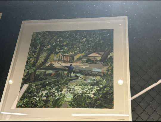
A painting of a man on a raft in a river. This painting displays the gestalt principle of proximity as the man in the painting is painted smaller to make him appear further in the distance.
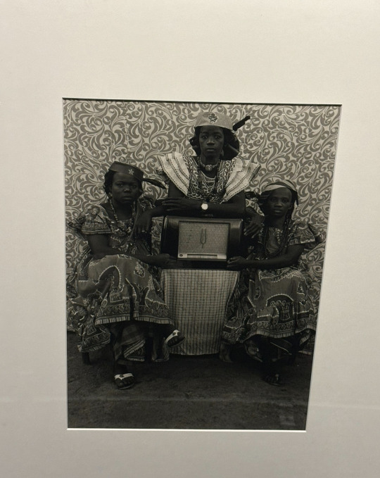
A photo of three women. This painting displays an active figure-ground. The entire picture is in black and white. The shapes within the wall, help parts of the girl's dresses to blend in causing an illusionary effect.
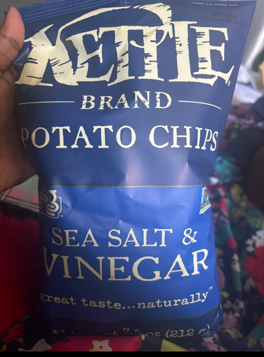
A chip bag. This bag uses a specific font to make it appear to be older than it actually is. The bag uses a font to make viewers believe that the company is older than it actually is, as the font can be compared to other brands that started in the 1800s, but the Kettle Brand only started in 1982.
0 notes
Text
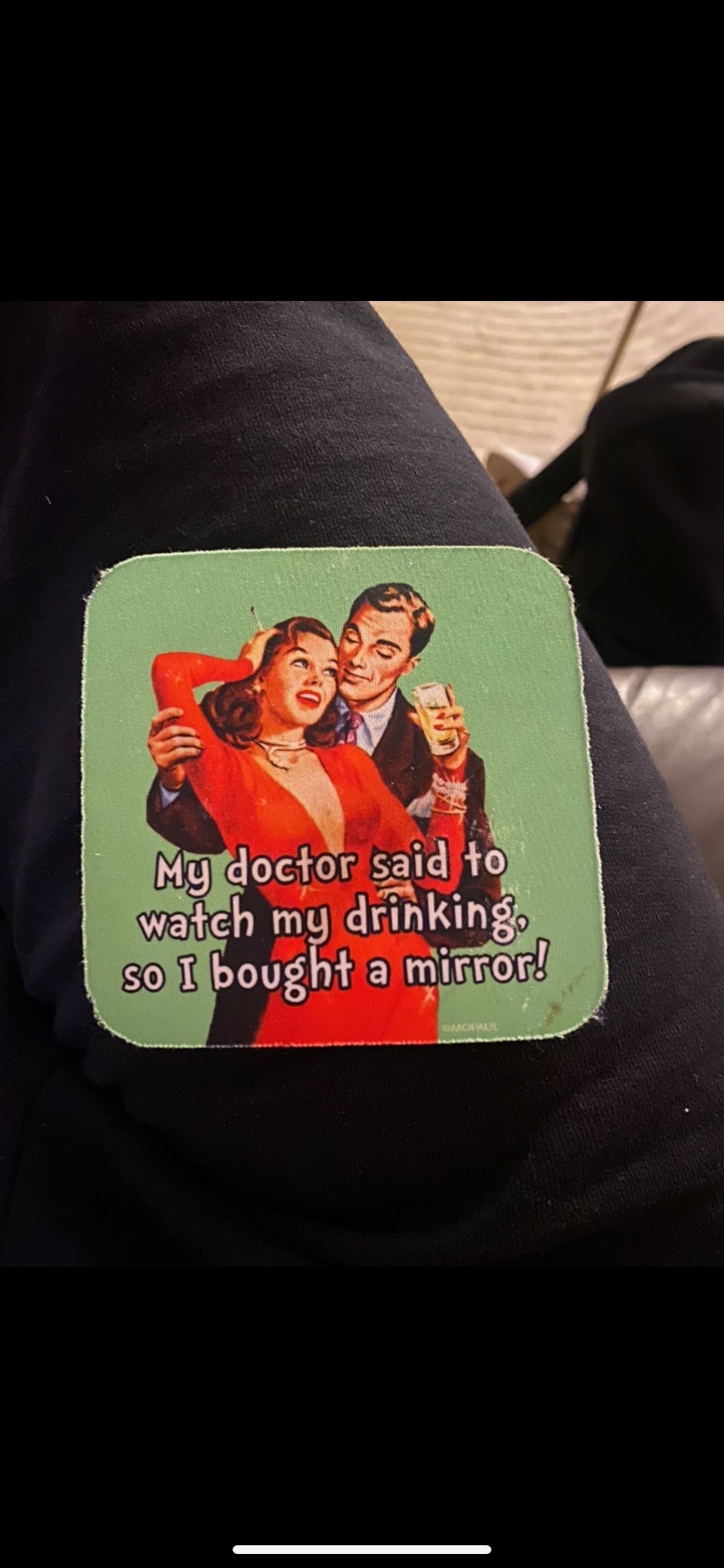
This coaster is using red and green as complementary colors to make the woman the focal point of the piece. Red and green make each other pop, but red is a more striking color than green, which is most likely why she is in a red dress, not vice versa. The color red represents passion, sex, femininity, and power, so it makes sense to have this very feminine woman in red. If her red dress was a “no-brainer” for the artist, then green may have been a “no brainer” as well because red and green are the most compatible, complementary colors each of them have.
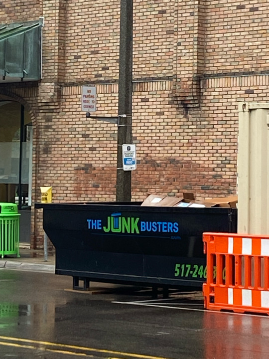
In this company name, blue and green are used to make the name more prominent than black. The bright blue and green easily stand out against the black dumpster, but they are easy on the eyes. Blue and green naturally look effortless together, as they are analogous colors, but they still can stand out from the crowd.
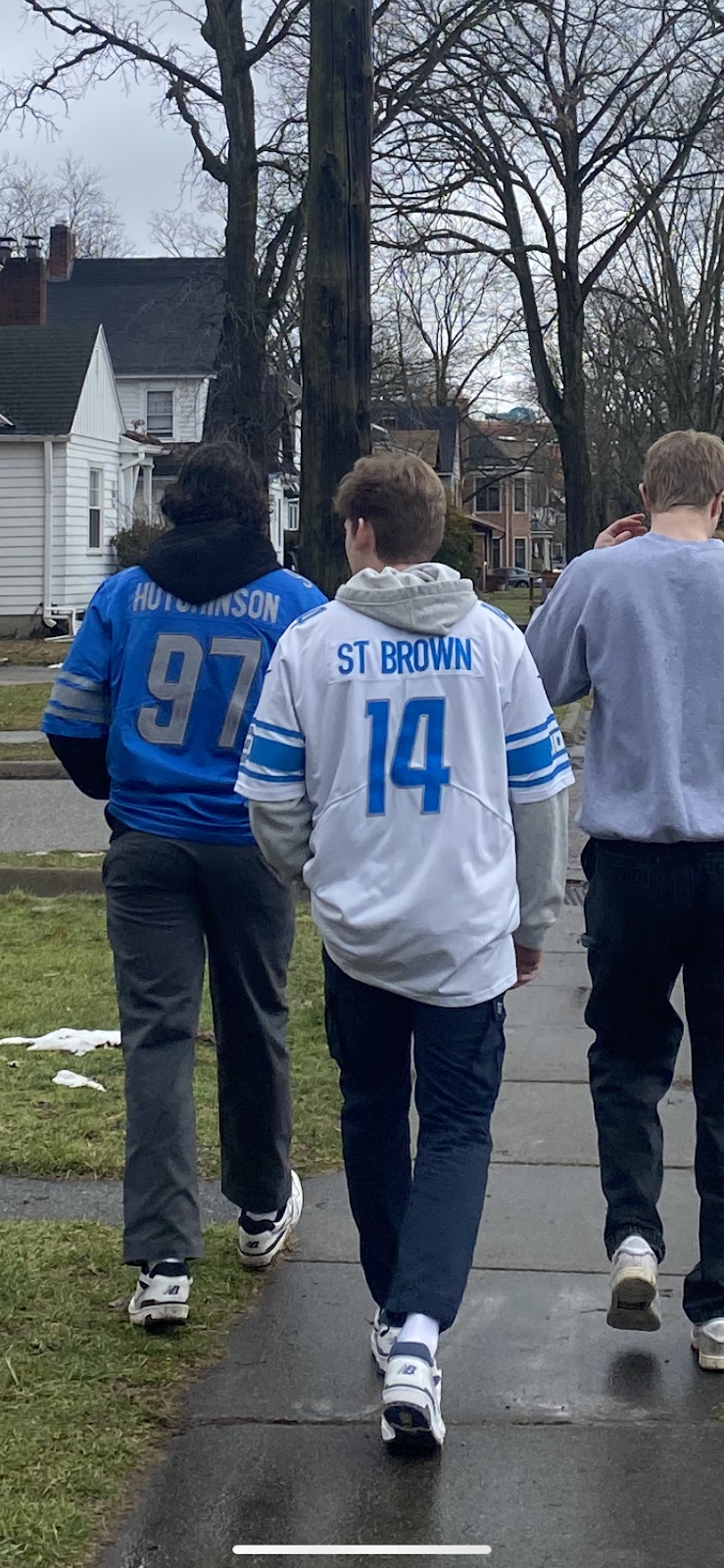
These Detroit Lions jerseys and crewneck all use some shade of the same cool toned blue. Details in the jersey use some shade of the same cool gray hue. This use of cool colors creates a cohesiveness for the Lions community. The city of Detroit has an extremely loyal fan base, and the color blue is often associated with loyalty, consistency, and trustworthiness.
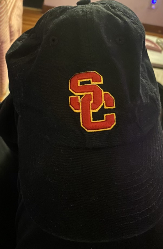
The use of golden yellow used in the University of Southern California’s logo brings a warm essence to the university’s brand, reflecting the hot climate in Southern California and its reputation as the “Golden Coast”. The bright red used in their logos gives the school a powerful, passionate essence to reflect their extreme school spirit and fighting Trojan mascot.
The contrast in complementary colors creates the text on this parking sign stand out. The contrast between the brighter, more saturated red and green against the white background also helps the text stand out for the viewer. Most parking signs use contrast in colors (hues, values, saturation) to stand out and catch the eye.
This hotel sign and logo reads “Motel Caramelo'' with a cursive, decorative “C” graphic below. The sign is a blush pink color, while the word “Motel” is a slightly darker shade. The word “Motel” appears in a simple, capitalized sans font, while the word “Caramelo” uses a flirty, cursive font. The “C” emblem’s curly decorative font and design comes to a full circle, satisfying the eye.

This logo uses the space in the circle behind the unicorn to actually create the unicorn's shape. This white or negative space is actively being used to create the unicorn, while the colorful, striped background helps the white space to stand out and hold its own. The active white space behind the logo circle and company name also allows the fine lined text used to stand out without being too bold or overbearing.
This piece of graphic design uses the Mona Lisa by Leonardo da Vinci to advertise Red Bull energy drinks as a historical product. Red Bull is fairly universally recognized across the globe, so their use of the Mona Lisa, satirically compares their energy drink to one of the most influential art works of human history.
0 notes
Text


1) the two colors chosen are chosen specifically to be evocative of Christmas. The red on the owl in the shirt and hat are representative of Santa’s outfit, the red and green show up on the branch the owl is perched on to make it a holly branch, the line of green diamonds helps balance out the amount of red in the stripe at the top, and the green in that stripe is used to make wreath shapes
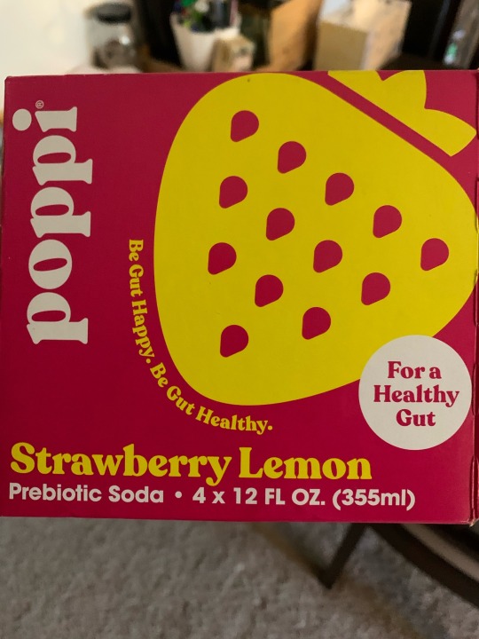
2) the colors chosen are pink and yellow, and they’re used to make connections to the flavor of the drink. The flavor is strawberry lemonade, but because the pink color is the majority of the can the yellow is used to break it up. The yellow makes the shape of a strawberry, with negative space revealing more of the background pink as the seeds. The strawberry ties to the strawberry and the yellow chosen ties it to the lemon part of the flavor
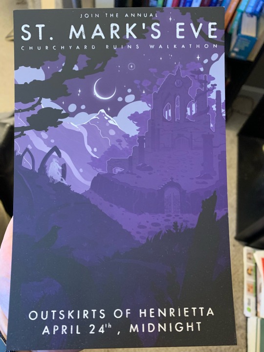
3) three is predominantly cool colors because the designer is going for both a magical feeling and also the purple of the night sky and the way everything gets kind of kind of purple in faint moonlight The object is in the style of an old travel flyer, and the thing it’s advertising is a supernatural rite that takes place after dark
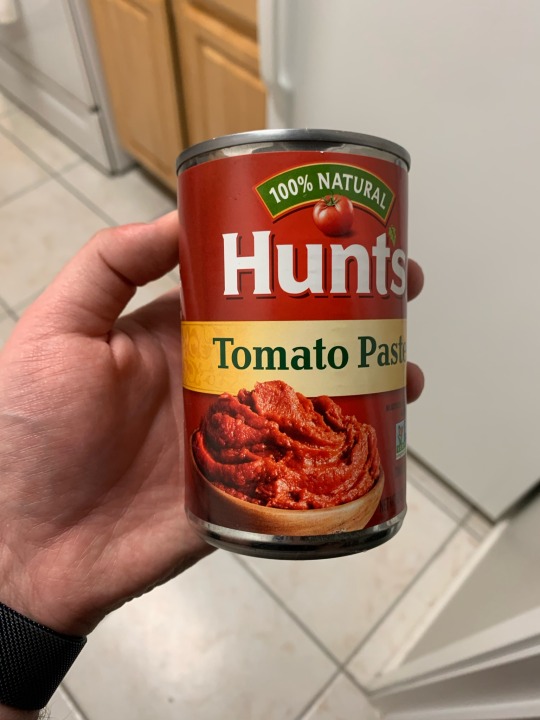
4) this is predominately red because it’s a tomato product, but there’s a subtle use of saturation on the front of that work with the light shining on the image of the paste to help draw the eye there first. It’s hard to tell in the picture but the red darkens as you move further away from the front of the can. It’s easier to see on the yellow band that goes around the can, because the effect is there too.
5) the contrast here is used to indicate that the sun can shine and brighten up any place, because the golden foiled lettering stands out across every other color on the cover. The other colors chosen are classically colors associated with sunrise but also with sadness and depression, to make the sun shining have a double meaning of chasing away the literal darkness but also the mental darkness
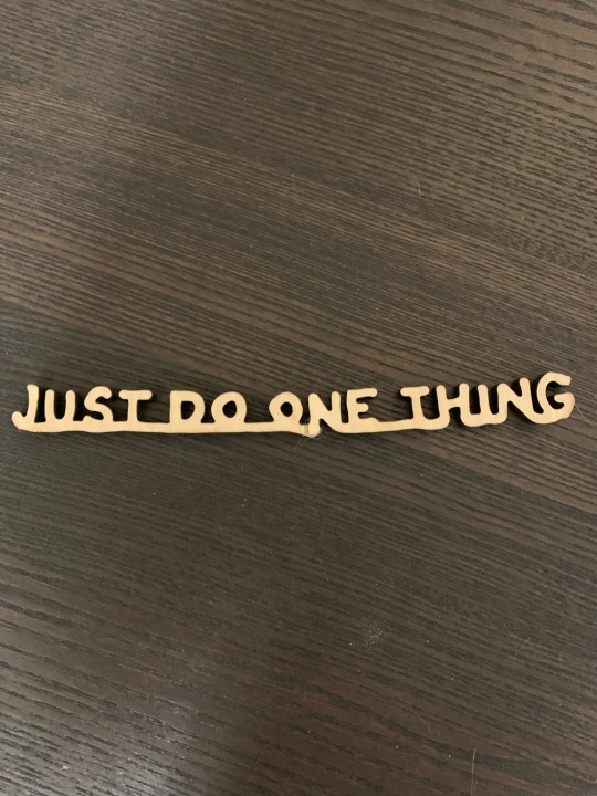
6) when I got this it was originally all one piece but my cats broke it, that’s why it looks weird by the N. The message “just do one thing” connected all together by one line underneath, the words still separated enough to be distinct but all part of the larger whole. It supports the message by having “just do one thing” be all one piece
7) the figure ground relationship here all work to reveal elements of the story without spoiling anything. The foreground is the person, the protagonist of the story, the midground is floating cities, and in the background of everything (on the cover and in the story) the very large sun is depicted
8) this is the board of a game set in Victorian England times, and the style and naming on the map reflects that. It’s a map of the world, but placed such that England is as central as possible, which is in line with how England saw itself back then. Putting England in the middle also helps highlight the distance that must be traveled as you get to the further spots away, which drives home the expeditionary feeling the game creates using the other pieces
0 notes
Text
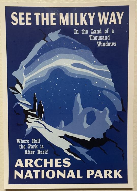


Image #1- The contrasting colors are making both the blue and the orange more prominent by juxtaposing them against one another. Essentially, it acts as a visual cue, drawing the eye towards specific areas or elements within the design, effectively communicating the intended message and enhancing overall visual impact.
Image #2- Analogous colors are often employed in graphic design to create a harmonious and cohesive visual experience. By selecting colors that sit next to each other on the color wheel, designers establish a sense of unity and balance within the composition. These colors work together seamlessly, evoking a feeling of fluidity and interconnectedness.
Image #3- I believe that the cool colors are trying to evoke a sense of calm and tranquility, associated with getting away to a national park. The only color is blue and the different shades and tints are used very effectively.
Image #4- I believe the warm colors are trying to communicate a sense of welcoming and invitation. The poster is trying to get you to come to the community's event and feel welcome. Warm colors elicit a sense of comfort.
Image #5- Graphic design that uses contrast in color to communicate the relative importance of something. The contrasting colors are beige and dark blue, in my opinion they are utilizing the contrasting colors to exaggerate the title of the cologne, promoting it to potential buyers.
Image #6- A graphic design example with the gestalt proximity principle of grouping.
Image #7- A graphic design example with an active figure-ground relationship (Could not find in person)
Image #8- A piece of graphic design that tries to look like something historical in order to communicate something related to that history. Utilizes Andy Warhol's pop art graphic style, that was very influential at the time. Warhol was prominent in the creation of the album. (Serving as the band’s manager, Warhol was the one who linked up The Velvet Underground with Nico and payed for studio time.)
0 notes
Text

Image 1: Today, most pictures were taken at the Broad Art Museum at Michigan State University. Complimentary colors are being shown in the first image. The blue and red really compliment each other in a way that pulls the image together. The first thing you sees the red flooring. Although it is not much of it, it is bright, complimenting the shades of blue on the sweater of the character.
Image 2: This analogous render was created by me. The analogous palette consists of yellow orange, orange and green. The monochromatic buildings bring out the analogous palette because of the different shades. The rendering is very subtle because of the softness of the colors. It is giving you a relaxing background, which makes the trees and buildings stand out.

Image 3: The cool colors shown here are blue and green. I think cool colors were used here to separate the wrestlers from the background. The green is bright, causing you to focus on the main characters in the image, the wrestlers. On the wall of the museum, there were plenty of pieces with bright cool and warm colors so I believe that this also fits the theme of that wall.

Image 4: We see warm colors here, yellow and reddish-orange to be exact. I think these colors represent a connection between the two people in this piece. For some reason, I am picking up intimacy from. a man who is trying to help a woman. The warm colors make the image feel warm. Like you can relate to it. This image was also on the wall with the cool colors.
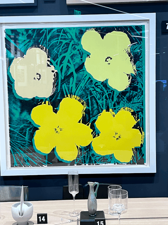
Image 5: The contrast in this painting is strong. The yellow flowers clearly stand out from the black and green background due to the brightness and hue of the two. The flowers stand out, making them the first thing you see. It catches your eye. The point here is to emphasize the flowers.
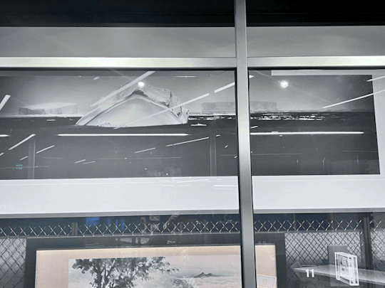
Image 6: At the top of the image is an iceberg standing alone the ocean. There is another iceberg but the long proximity between the two make the stand alone. You are drawn to the iceberg in the front as it is a little difficult to see the other one.
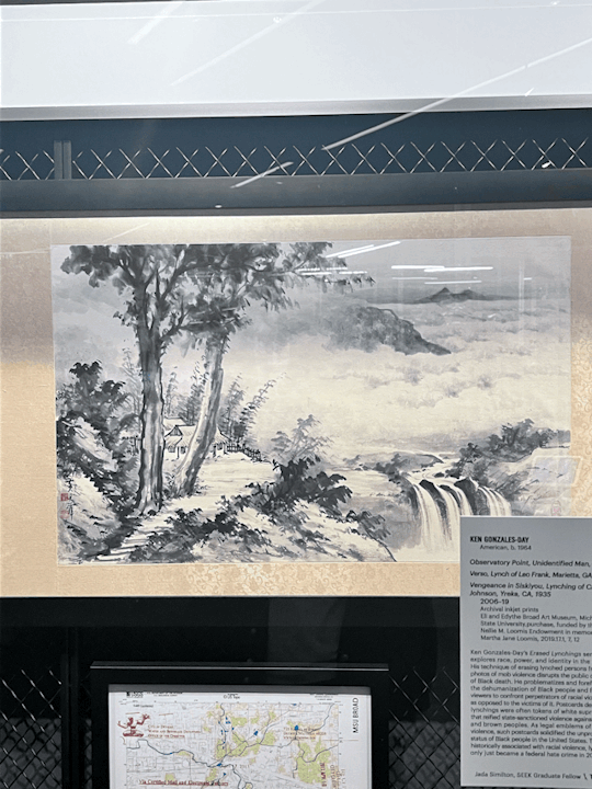
Image 7: This is an image that showcased an active figure ground. It contains white space but the space is an active element-the clouds. It is also acting in the waterfall and the pavement. It separates the elements of the piece and adds realistic features, such as the clouds.
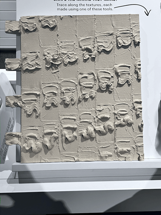
Image 8: This is a historical replica of how a form of art was made. People would pipe the material with a piping bag of some sort and take a thin spatula and design it. Here, the design consists of rhythmic grooves and lines. It also shows proximity between the groups of line and patterns, separating them from each other.
0 notes
Text
Module 3
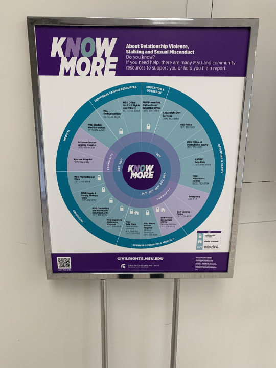
Complementary colors are used here and it's aesthetically pleasing. This in combination with the design of the chart really help draw a reader in to read about a very important topic.

2. Analogous colors are used here to inform the user that this is a sugar free version of an existing product. Our eyes are drawn to analogous colors so using it to convey important information like this is good.
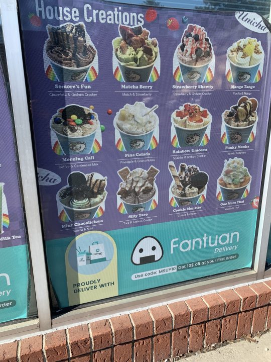
3. Cool colors are used here and it's a great fit because it's an ice cream menu.

4. Folgers uses warm complementary colors. It fits with the product well especially with their rising sun logo.
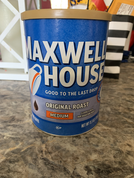
5. Color contrast is used here to highlight the most important things of a product, company name and product type (original roast, medium). This paired with the large bold font make it easy to pick out on a shelf.
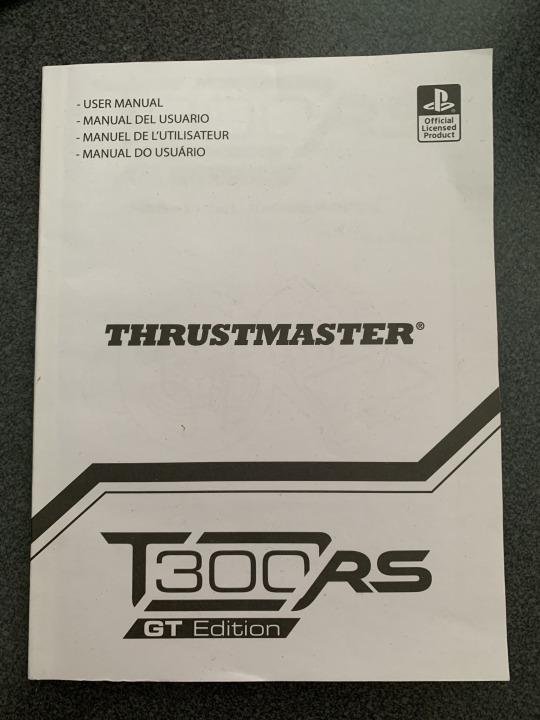

6. This is the front and back of a user manual for a controller I own. I really like the choice to have a continuous line on a book like this.

7. The figure-ground effect is used well here. The literal negative filtered photo creates an interesting visual using blank space.

8. The font used here conveys that this is a relatively old building on campus. Although it was built in the 40's, the font reminds me that we're at a very historic university.
0 notes
Text

1. Complementary Colors: The blue and orange on the tide pod adds a contrast to make the name more visible and smallest details like “clean dissolve” easier to see.

2. Analogous Colors: The colors are used to express the bounty color scheme that is appealing towards the eye.

3. Cool Colors: Extra gum uses and almost all blue package to simulate the cold for their minty flavor.
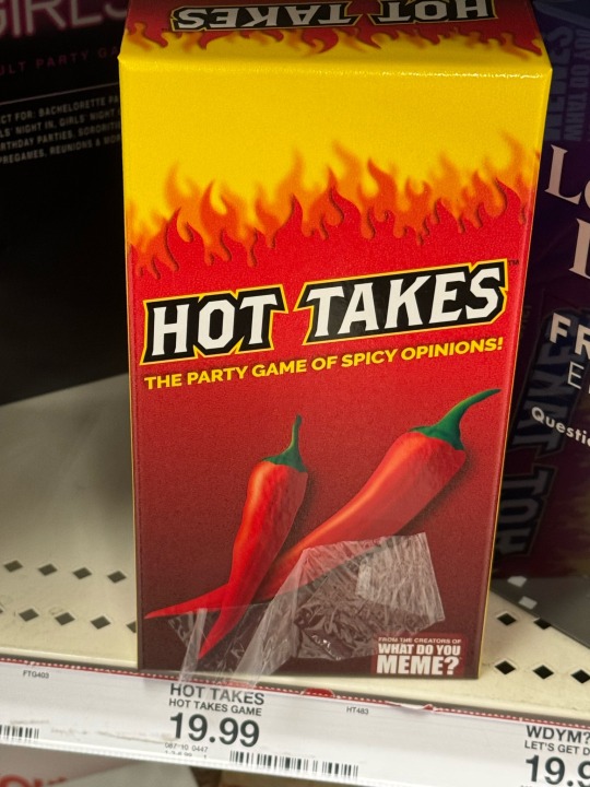
4. Warm Colors: This card game uses warm colors to imitate a spicy/heated environment in which the game is intended to be played as.

5. Contrast: The dollar tree logo has a dark green logo that contrasts well with the white text making it easy to read from a distance.

6. Gestalt Principles: The Arizona can uses continuity with the tree branch going through the logo.
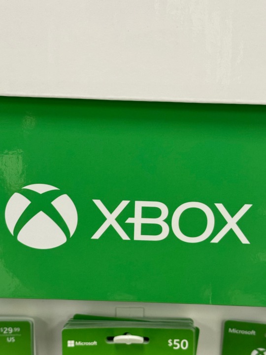
7. Figure-Ground relationship: The Xbox logo can either be looked at as an X or a sphere with an x in it.

8. Historical: Quaker Oats use an old looking design to let you know it is made old fashioned way.
1 note
·
View note
Text
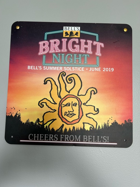

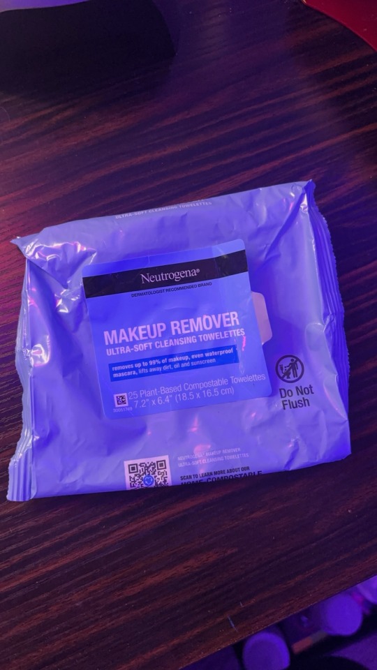
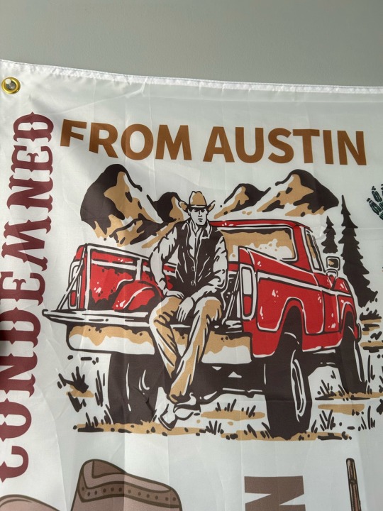
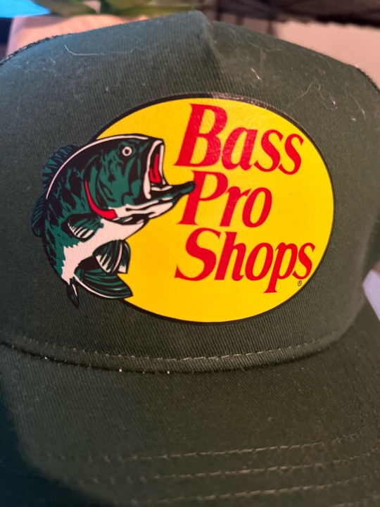

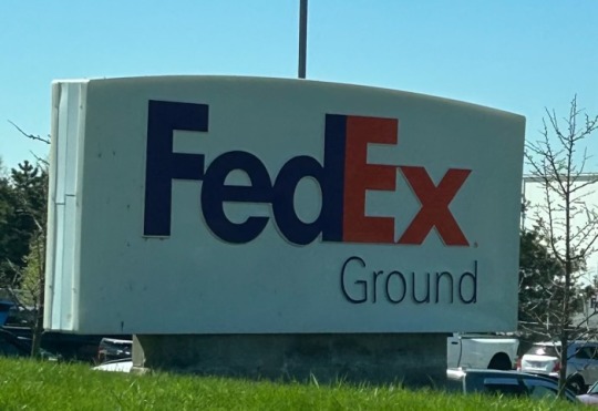

Photo 1: This design uses complementary colors. The contrast in colors on this design are making certain things within the design stand out. What I am being drawn to is the words “BRIGHT” and “NIGHT” The word “BRIGHT” is in red while the word “NIGHT” underneath it and the boarder around the two words are a greenish blue color.
Photo 2: This design uses analogous colors. The colors are being used to make certain things more subtle. For example, most of the colors used in this design are shades of red and orange. These colors are blending in with one another to put less focus on them and more focus on other areas of the design, such as the name of the snack at the top of the box.
Photo 3: This design uses mostly cool colors. This design is using cool colors in order to express the object within. Cool colors often but not always indicate something is cold or wet and i believe that this is what is happening here as well. For example, almost all brands of plastic water bottles have a shade of blue within the design and here this design is used for makeup remover where the towelettes within the packaging are both cold and damp.
Photo 4: This design uses mostly warm colors. It is using warm colors to possibly indicate the setting of the design. The light brown is being used to express certain things that may depict the location because the words “From Austin” and the mountains and ground are all a similar brown color. The red color of the truck is likely being used to indicate the object and make it flow with the rest of the design.
Photo 5: This design uses a contrast in color to communicate the relative importance of something. This design is using a contrast in color to communicate a company logo and what the company is involved with. For example, there is a contrast in hues within this design, being the logo in red and the fish next to it in green. The red is sharing the importance of the logo while the green is sharing the importance of what it stands for.
Photo 6: This design has one of the gestalt principles of grouping, being closure. It shows closure when the lines don’t fill out the trees or outline the oval around it and they are not really there but because of closure our brain is able to fill in what is missing and depict the logo.
Photo 7: This design has an active figure-ground relationship. It is using a figure ground relationship to express both the logo and what it represents. If you look closely you can see the arrow between the “E” and “x”. The arrow in the design most likely refers to the fact that the company ships things to you. If the arrow was made to be more visible, the design of the logo would be very different, fighting with the letters of the logo.
Photo 8: This design tries to look like something historical in order to communicate something related to that history. It has been printed in a grainy texture with black and white ink to replicate an actual sign that it may have been printed during the time period of which the sign is portrayed.
0 notes
Text

Module 3
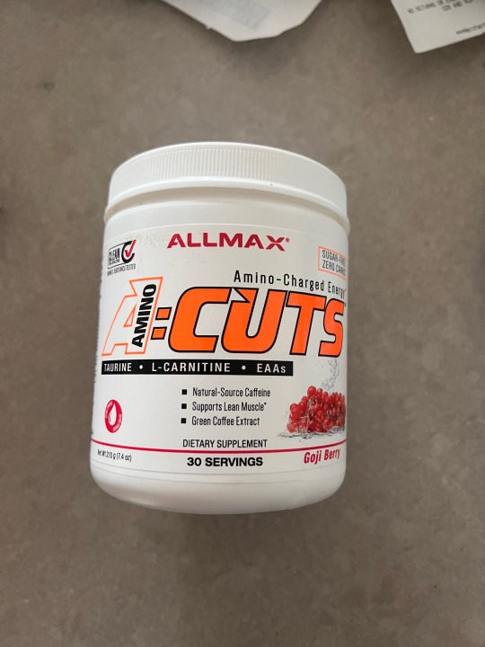
Image 1: Complimentary Colors - This pre-workout packaging shows complementary colors because the bright orange, white, and back complement each other by the orange being the main attraction, and the black and white add small accents to the packaging. It makes the name stand out.
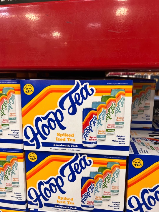
Image 2: Analogous Colors - This packaging and cans show analogous colors because, for each flavor/type, there is a different color separating all 4 flavors. Including the names of the flavors are different colors.
Image 3: Cool Colors - This packaging shows cool colors and how close to transparent it is. Almost like you can look through it but you can’t. All colors are cool and compliment.
Image 4: Warm Colors - I chose Mcdonald's ketchup for these warm colors. You can see there is white, red and yellow. These colors show the tomato in the packaging and express it through color.
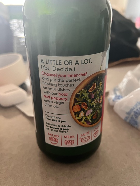
Image 5: Olive Oil - This label shows the foods that are used with the olive oil in red such as salad, steak, saute, soup, and more. This is a way to explain to the user without using words but just changing the color of the text or icon.
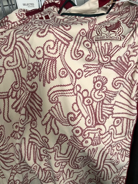
Image 6: This Mexico soccer jersey has different patterns which is unique. They may look the same but the patterns are different. They are rotated as well some of them.
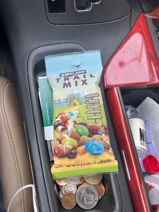
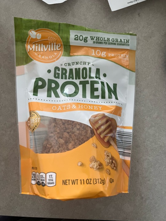
Image 7: This granola protein packaging shows a figure-ground relationship because there is a see-through opening where you can see whatever is in the bag no matter what u put in it.
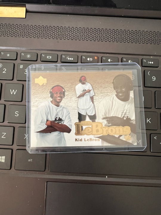
Image 8: Lebron James sports card, this sports card is the “kid Lebron,” as we see they try to replicate the older style by using baggy clothes and the black and white image to make it look older.
0 notes
Text

The complementary colors in this Ruffles chip bag, are the orange and blue colors that together make a contrast. This contrast leads to different things standing out on the packaging such as the orange Ruffles logo on the top of the blue heading of the bag. The two colors also direct the eye from the top down, as you look at the brand name first, then the image, then to the type near the bottom.

2. The analogous colors in this display board is the purple, blue, green, yellow, and orange. The purpose of these colors in this design is to create distinction between the different parts of the design, yet keep some sort of consistency for aesthetic purposes so the design looks cohesive with the topics altogether.
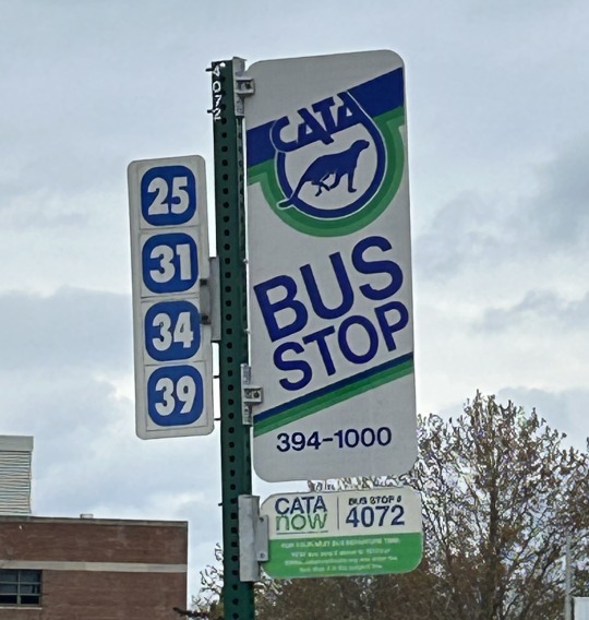
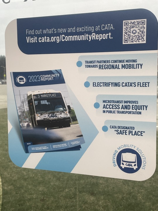
3. The cool colors of the different blues and greens in this CATA bus stop sign, communicate the tone of the brand which gives off a cool and calm vibe when it comes to transportation services. These colors elicit relaxing transportation because you don't have to stress about not having a ride. These colors also help for the readability of the sign and numbers as that is important to communicate to the users.

4. Similar to the previous one, the warm colors of red, orange, and yellow in the Cheetos packaging is meant to communicate the brand tone or aspects of the product. For example, the orange and yellow could be communicating the product as a cheesy or even spicy flavored snack. It communicates the boldness of the brand tone as well.

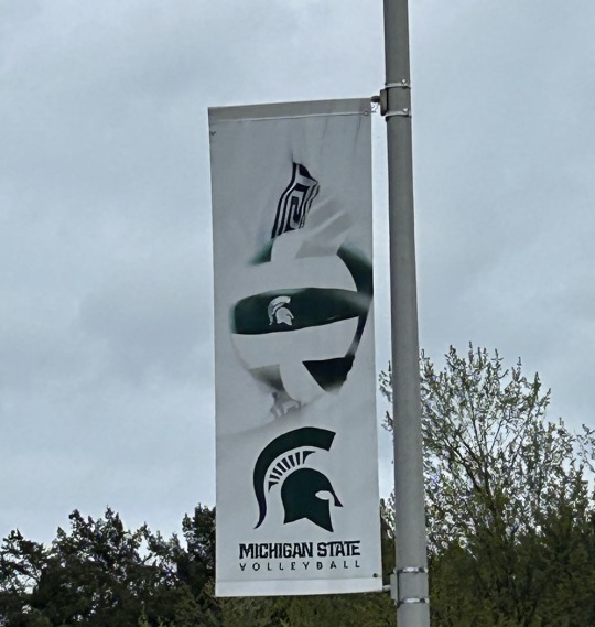
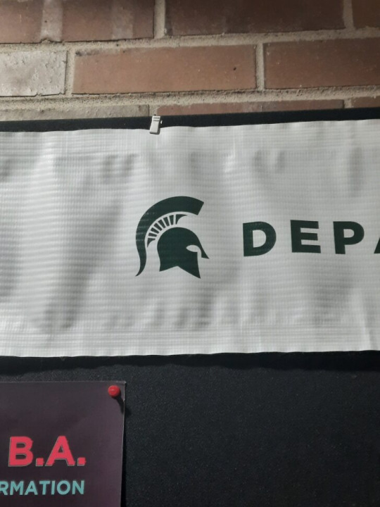
5. Here there is contrast between the letters of text S, A, N, & S (in black) in the word Spartans and the rest of the text (in green). The contrast or colors in the text is trying to further communicate or emphasize the point that this banner is trying to make, that we as Spartans are part of elevating the game. It is a play on words that is enhanced by the contrast of colors in the text.
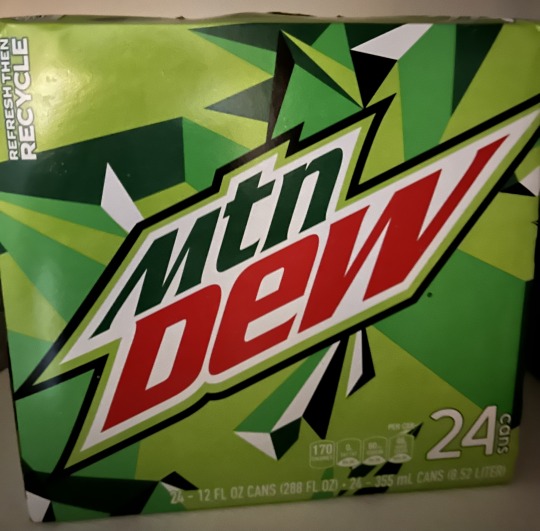
6. Here the Gestalt Principle of Proximity is in play in this Mtn Dew packaging as there are a bunch of different shapes around the logo that make up a grouping even though the shapes are not similar and differ in color and even size. In a way it kind of helps direct the viewers attention to the logo because of the chaos (group of differing shapes in proximity) that surrounds it.
7. In this banner, we can see a figure-ground relationship as the plain white background sort of blends in with the white aspects in of the foreground, which give off the effect as if the figure and ball are coming out of the background. This communicates sleekness in my opinion just based on the overall looks of the design.

8. The colors of the black and white and the red/yellow colors are meant to give the Arnold Palmer Tea drink the look of an old time drink that dates back to the 1960's roughly, approximately when pro golfer Arnold Palmer was in his prime. This communicates that time period as well as the legacy of Arnold Palmer.
0 notes
Text
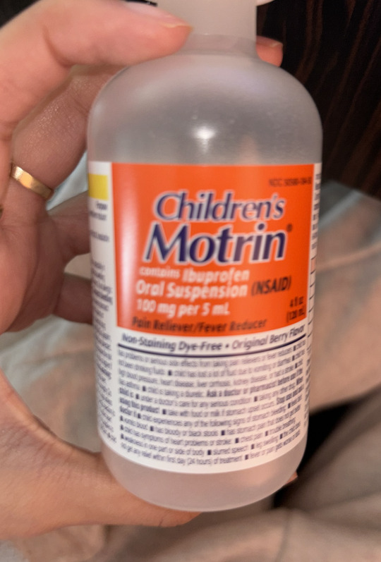
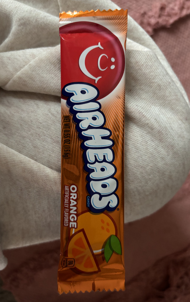
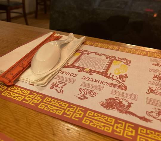
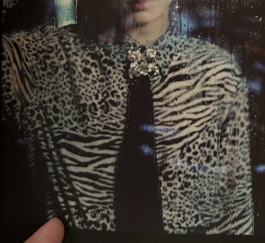
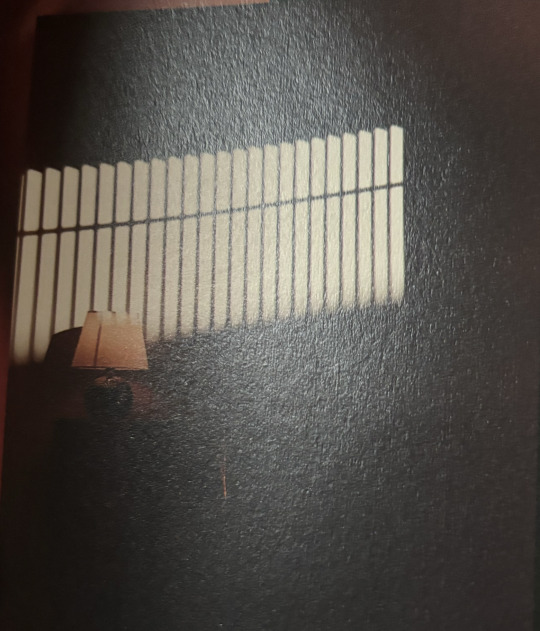

Image 1: This is an image of a children's medicine bottle, the complementary colors that you see are orange and navy blue. The contrast in color allows your attention to be drawn to the label and the name of the medicine.
Image 2: An example of analogous color that I chose to capture was an airhead specifically the orange flavored one. The wrapper of the airhead is mainly made up of orange but the icon airhead head is still popping out in red, they also added in green ro showcase the leaves of the orange.
Image 3: This is an image of the design of an album cover , the design is made up of predominantly cool colors with a deep green as the background colors and a purple to write out the title and edition. The designer is hoping to elicit luck, health and creativity with the use of color in their design.
Image 4: This is a picture of the place mat that is set at a Vietnamese restaurant. The design is predominantly red, orange and yellow which are warm colors. The warm colors are trying to signal a warm environment and the colors are also traditions to Asian cultures. Red is seen as good luck and is used widely in Asian culture with orange or yellow.
Image 5: They used the color read to communicate important information in regards to the product. The color red grabs the attention of a person and makes them read the information. Red is often associated with stop since stop signs and traffic lights use read as stop by this company using red it helps the audience stop and read.
Image 6: The proximity of the different shapes and prints on the shirt allow there to be a unique design within the short. The designer used proximity of dots and lines to create a masterpiece that is unique in every way.
Image 7: The picture of this light is an example of figure-ground relationship because it has a solid black line that runs through all the light and allows the viewer to follow the black light's direction. Without the line in the middle your eyes would not be drawn to the light and lack direction.
Image 8: This is a picture of a flier that I saw at the main library . It gave historical vibes with the neutral colors they chose but also the old fashion looking tickets.
0 notes
Text
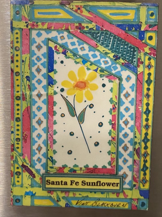
Complementary Colors: Santa Fe Sunflower magnet, featuring a vibrant array of colors that catch your eye against the hues of different blues and greens and yellows.
Analogous Colors: The Four agreements book with the colors blue orange, yellow, green and some hints of other shades and colors.The analogous colors create a cohesive and harmonious design, making it visually appealing and easy on the eyes for the reader.
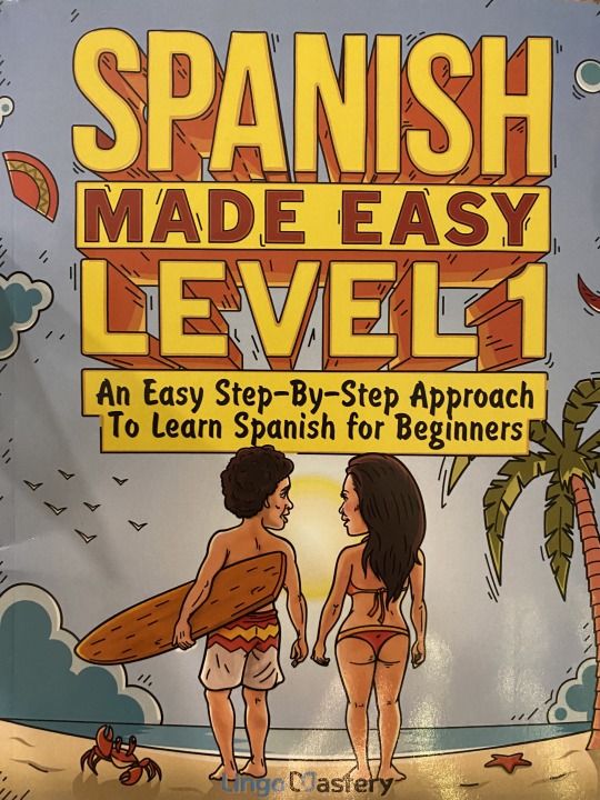
Cool colors : The Spanish learning book with the colors blue and yellow and some hints of other shades and colors. The cool colors convey a sense of calmness and tranquility, creating a serene and inviting atmosphere for the reader to want to engage with the material.
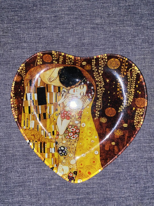
Warm Colors: A decorative plate inspired by the artwork of Gustav Klimt, featuring warm colors like gold, red, and orange. The warm colors evoke feelings of calmness, adding a sense of warmth to the surrounding space.
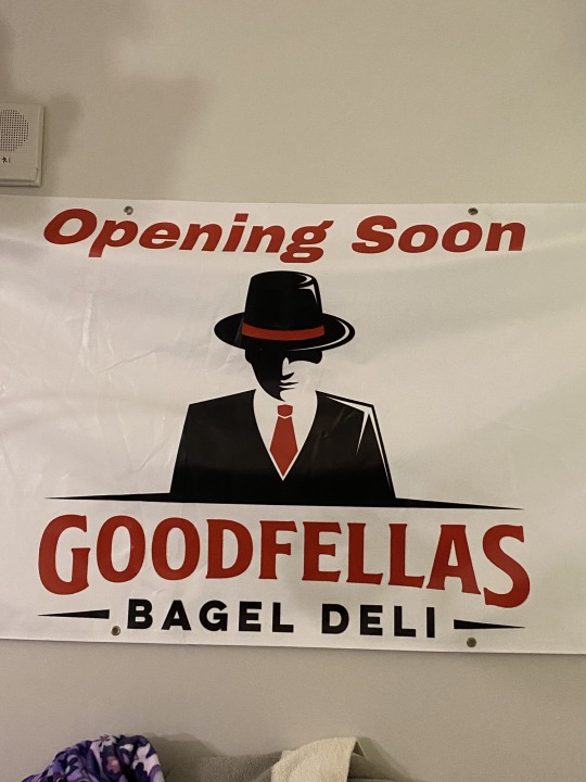
Communicate importance: A large sign for the grand opening of a restaurant called GoodFellas with bold, contrasting colors such as red and white and black. The high contrast and bold typography of the sign instantly grab attention of the viewer, signaling the significance of the event and inviting people to join.
Gestalt: Waffle house Logo: with elements grouped together based on the principle of proximity, with the circle and lines all parallel with each other, even the letters stay "on the line" with the frame.
Active Figure: A magnet featuring an optical illusion design where the foreground and background appear to shift depending on the viewer's perspective. "Canta Y no llores" sing and dont cry in spanish, with playful designs to signify the meaning.
Historical Reference : The image of Handala a cartoon created as symbol of Palestinian resistance. Handala has become a significant symbol in not only the MENA region but also around the world as a symbol of Palestinian resistance against their occupiers.


0 notes
Text
#module3

The use of the orange makes the logo stand out before what it is first. Then my eyes go to the "100% cold pressed..." before going to the shine therapy/gro therapy. The orange contrasts the various hues of green making it the first thing you see.

2. The use of analogous colors uses a gradient from top to bottom to reveal that the aloe plant is the most important thing on the bottle besides the big typography on top. The blue is the first thing you see then the gradient of the light green, and lastly the dark green aloe.
3. The use of cool blue throughout the ad reminds one of the Cata bus because of the use of blue and green strips on the old buses. I just associate this specific blue to the Cata. I feel like the blue makes them feel trustworthy and calm.

4. The way Taco Bell uses warm Reds to depict fires in the background shows how hot this hot sauce will be. Using warm colors will make the viewer think of the spice and the heat that the hot sauce will give to their food.
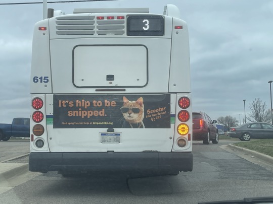
5. The contrast strong saturation and the hue of the "It's hip to be snipped" make the word pop from the black background.

6. This bottle of protein powder uses proximity with the Yakult yogurt bottles faintly in the background.
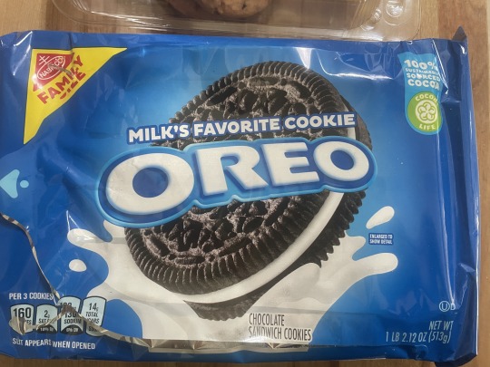
7. I would say the figure would be the word "Oreo" as that's the firs thing that captures your eyes before the big cookie in the background. It is also memorable.
8. The off-white cream color and the use of just red, green, and black make this piece look historical. Also, the drawing of the man dressed in a newspaper suit is stylized in a way you wouldn't see contemporary artists do.
0 notes
Text
Module 3
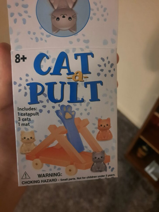
This toy Cat a Pult is a great showcase of complementary colors. By making the words Cat and Pult blue and keeping the letter a yellowish orange, it is able to call attention to the pun in the title. The words cat a pult can also be seen as the word catapult.
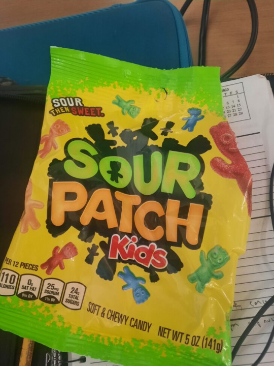
2. This sour patch kids bag is a great example of analogous colors. It uses warmer colors like yellow, orange, and red to bring together the words and background, while still creating contrast with a black outlines and a bright yellow green text.
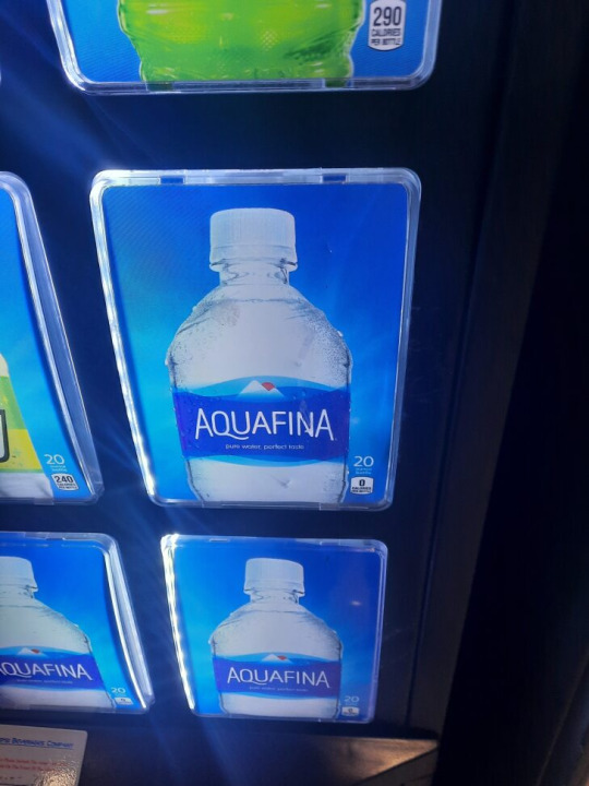
3. This aquafina water bottle on this vending machine heavily uses a cool blue color pallet. To elicit the feeling of cool and refreshing nature of water. Even the background of the vending machine image uses a bright blue to reinforce the same idea of a cold beverage.

4. This hazelnut coffee creamer leans heavy on warmer hues like red, orange, and yellow. This is used to elicit the feeling of a sunrise, which is often associated with a morning coffee.
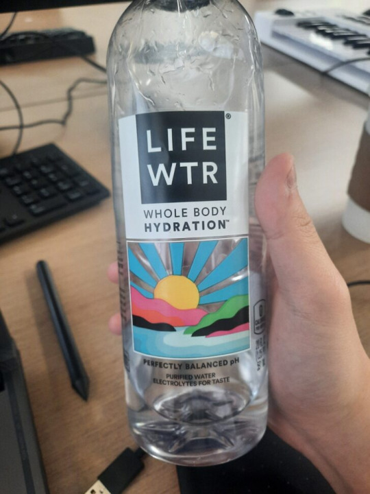
5. This Life water bottle uses contrasting color hues to create an image of a sunset with basic colors. The yellow sun contrasts with the blue water and sky. The black green and pink colors in the mid ground act as different landmasses. By having multiple contrasting colors, it is able to create a sense of depth in the image with rather simple colors and shapes.
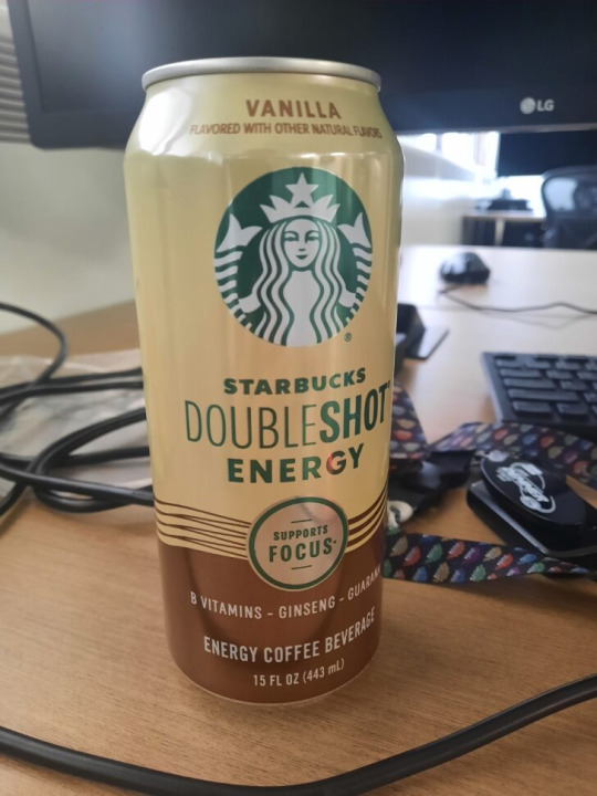
6. This can of Starbuck coffee showcases the gestalt principles of proximity by having brown lines grouped together near the lower end of the can. By having them grouped together in such close proximity, it creates the sense of energetic and fluid waves.
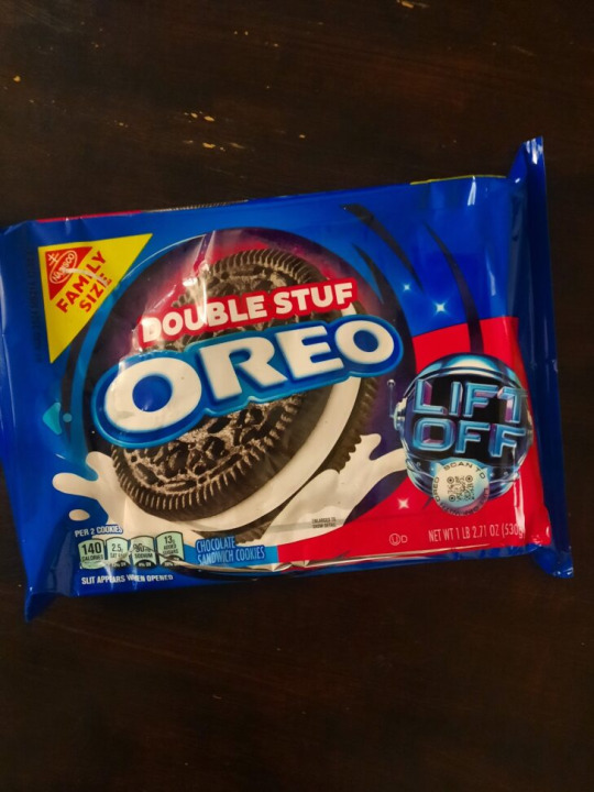
7. This oreo package showcases an active figure ground relationship as the dark blue surrounding color acts as a background. The words “double stuff Oreo” also stand out from the dark oreo cookie and exist in the front ground.
8. One of the best examples of a graphic design that draws upon history is the MSU spartan logo. By using a representation of a spartan helmet as the logo, it creates an association between the strength of spartan warriors and the school itself.
0 notes
Text
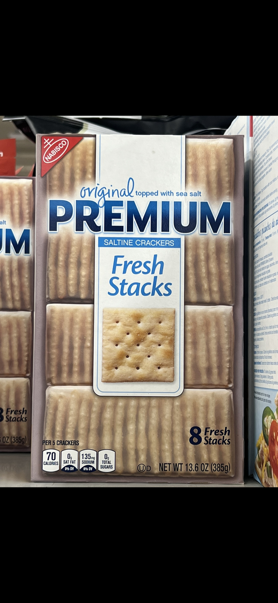
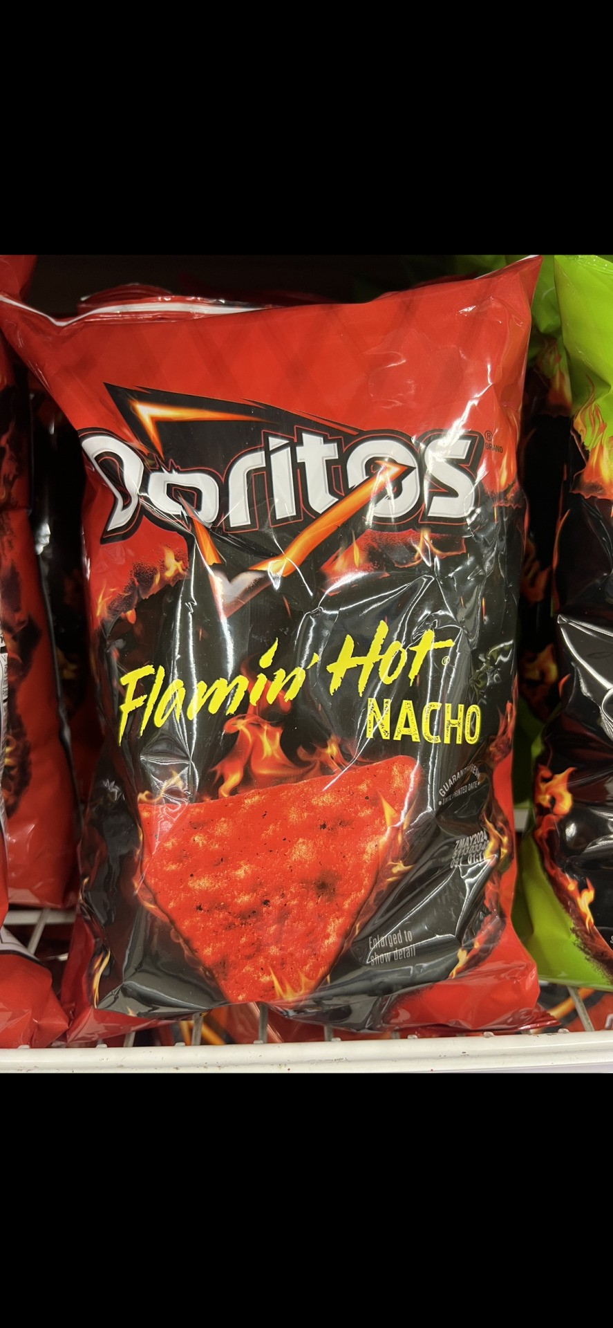
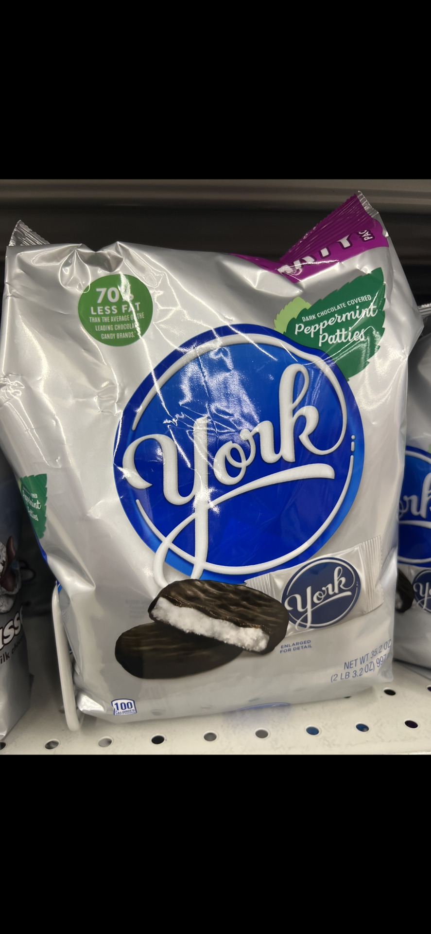
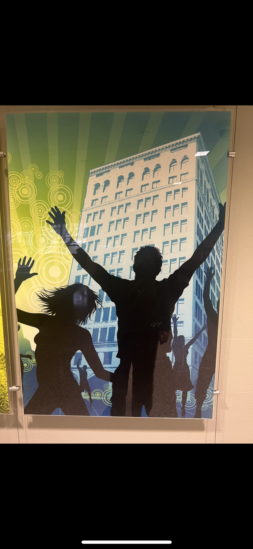
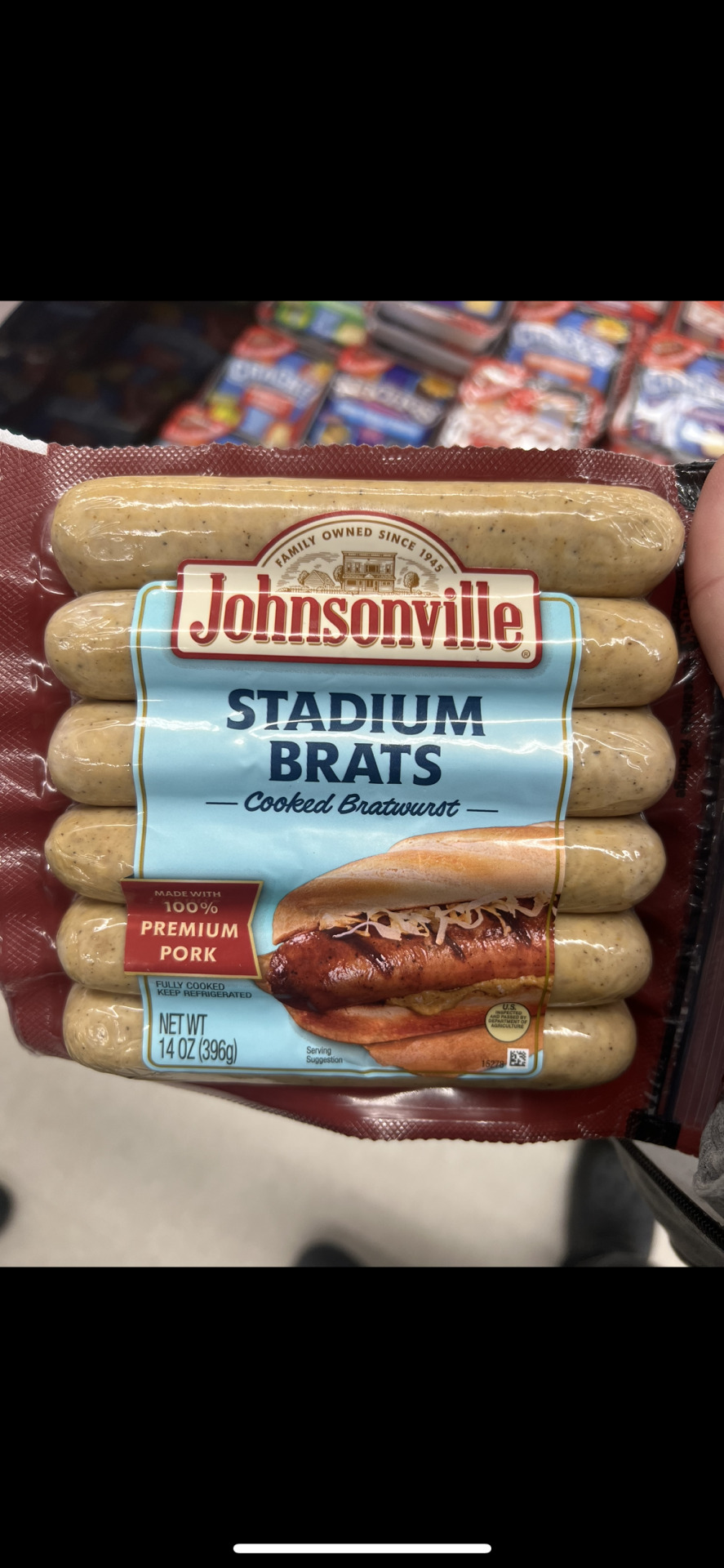
Image one: In this picture, the complementary colors used are Blue and yellow. The message likely attempting to be sent is a cheerful and personable message, which is why the yellow is used alongside a playful font. Also the blue gives a bit of a focal view to the logo of the product to promote the brand.
Image two: In this picture, yellows and reds are used for analogous color contrast. The yellows and reds are used to give the feeling of the desert or a bit more of an old western feel. Yellow and red have famously been used in restaurant and general food settings to promote hunger as well.
Image three: This picture using cool colors is attempting to portray simplicity. A saltine is quite a simple cracker, so using simple packaging is effective as to not seem gimmicky.
Image four: The item in this picture is using warm colors primarily as it is giving the impression of spiciness and fire. It is trying to present itself as containing a lot of heat, possibly excitement as well.
Image five: The image here contrasts blue and pink, two colors quite far away from each other on the color wheel. Through some research into the brand, I found that the goal of the business owner was to rebrand into something energetic and eye catching, which is why they use two heavily contrasted colors for the packaging.
Image six: The principal shown here is the gestalt principle of closure. The 'York' logo is surrounded by a circle that is not quite completed, but the human eye completes the circle. This gives the logo a flow that is quite satisfying to view.
Image seven: The image shown has an active figure-ground relationship as it shows silhouetted figures contrasted against a colorful background. This is done to feature the poses/emotions the figures are presenting that could be lost in a piece that does not have as drastic of a contrast.
Image eight: The image shown utilizes history in its design by showcasing the original building the business started in on the logo. By doing this, it gives the impression the business is quite humble and has not forgot its own roots. This in turn will strengthen customer loyalty as people like to support businesses that seem modest and true to its self.
0 notes
Text
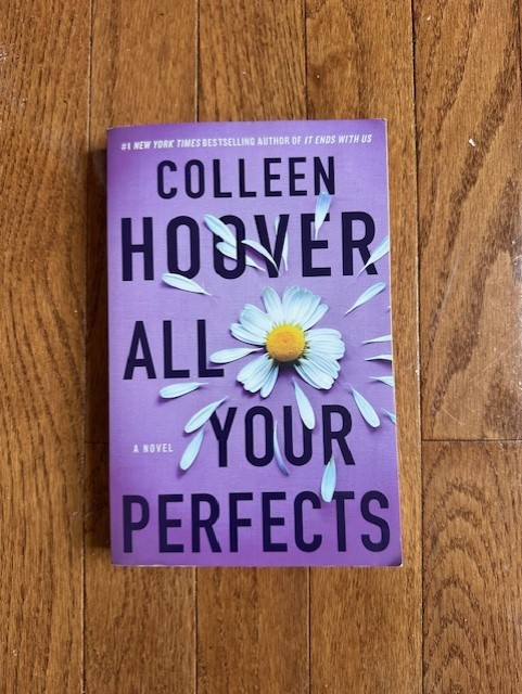


The complimentary colors that are featured on this book cover are violet and yellow, which are opposite each other on the color wheel. The vibrant yellow flower center really stands out amongst the all violet background and immediately draws your eye to it. From there your eye moves outward to the rest of the piece, with the help of the flower petals to lead the eye.
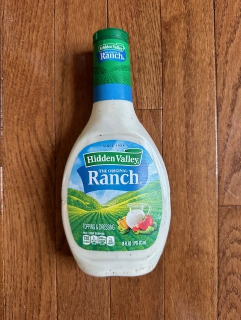
The analogous colors used on the bottle of Hidden Valley Ranch are used to make a visual connection between the product’s branding and a valley where herbs and vegetables may be grown. As we can see, the greens and blues that are used in the logo are also used in the illustration of the valley behind it, creating a sense of harmony and unity. I would predict that the designers goal here is for the consumer to associate the flavors of this product with the freshness and naturalness of the valley.
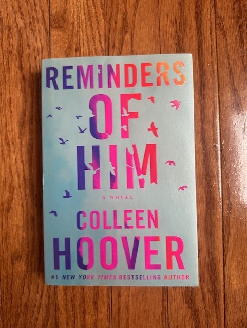
In this case, I think that the cool colors that dominate the majority of this book cover are used to communicate the somber and reflective mood of the novel. This novel is set in post-war Germany, and the different shades of blue used to illustrate the setting in the background help convey the historical atmosphere. The designer ultimately wants you to associate the feelings the cool colors elicit with the themes, setting, and emotions of the book.
I like using Frank's RedHot Buffalo Sauce as an example because the warm colors on its bottle directly communicate the warmth and intensity of the product. By utilizing warm colors, the design effectively conveys the sauce's flavor profile, as these colors are commonly associated with spice and heat. The intentional use of warm hues by the designer encourages consumers to associate the product with the fiery sensation that these colors typically evoke.
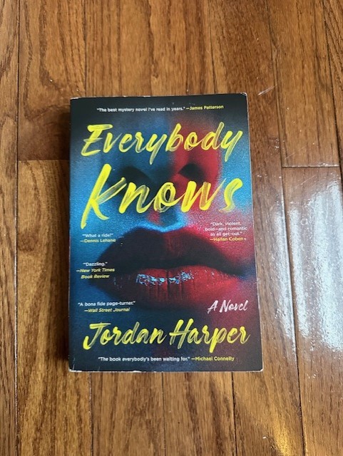
The cover of "Everybody Knows" uses contrast of hues in multiple ways. Firstly, the contrast between the red and blue hues not only suggests police lights but also symbolizes the dual nature of the character depicted on the cover, portraying her internal conflicts and struggles between opposing sides. Additionally, the vibrant yellow typography stands out against the darker background, immediately capturing the viewer's attention and communicating the most important and apparent information to them.
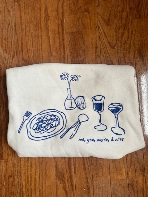
This graphic that is on one of my favorite sweatshirts displays the Gestalt principle of closure. While at first glance it may not be apparent, if you look at the lines that make up the subjects of the design, many of them are incomplete. Our brain fills in the gaps however to create fully formed objects without even thinking twice about it.
This book cover illustrates an active figure-ground relationship using the bird shapes that are cut out of the letters. Depending on what you place your focus on, you will notice something different. If you are focusing on the words you may not notice that the cutout shapes resemble birds, and if you place your focus on the cutouts it is very apparent that they are birds.
This graphic T-shirt showcases a scene of an In-N-Out Burger, likely set in the 1950s era. With its nostalgic ambiance, the design communicates the retro vibe through vintage cars, clothing, and architectural aesthetics. By offering such a T-shirt design in 2024, the brand effectively communicates the rich history and cultural significance of the fast food chain.
0 notes
Last Seen Blogs

orangecountyhomeinspector
Orange County Home Inspection

unrelenting-usurper
Land of Whispers and Glass

risuem
Рисуем картинки

paladin-tauren
By the Light
the-iris-of-goostly
original writing and some other things.