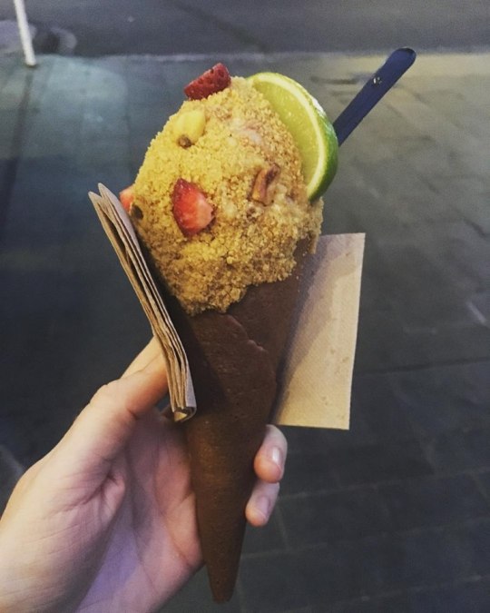
#like there is definitely Flavour it's just not a flavour that is particularly cohesive
Text
due to reasons (buying too many lentils) my roommate and i have way too many lentils. if anyone has any lentil recipes that aren't soup please could u put me on bc i can't eat anymore lentil soup i can't
#currently making a lentil curry abomination#onions garlic chopped tomatoes LENTILS. completely random quantities of garam masala turmeric chili powder and fenugreek leaves#it tastes. like it has spices in it. but not particularly good#like there is definitely Flavour it's just not a flavour that is particularly cohesive#🧃
8 notes
·
View notes
Text
Costume Change - Commentary

Maybe if I just slip this in quietly, nobody will remember how long they’ve been waiting. Right? Right.
@emmypupcake – Mysterious Murders // Rumorborn Ravager
Cohesion: Cohesion is this card’s toughest sell, as the excellent flavour of the front face doesn’t really get delivered on by the back. The use of death triggers and rumor counters creates a really evocative effect, but the back half tries to redefine rumor counters in a way that just doesn’t feel like it comes together.
Complexity: The complexity here is fairly reasonable. The front face doesn’t do anything except transform itself over time, which is probably fine. The back side using rumor counters probably isn’t necessary; this could simply be a 5/4 that puts +1/+1 counters on itself, and you would almost never see a difference mechanically.
Clarity: The play pattern on this is pretty straightforward, which is great. I think the only qualm I’d have is that the tap ability for what is essentially a +1/+1 counter feels strange on a creature this large: normally if you’ve got a big evasive attacker, you’re not going to want to take turns off attacking to grow it slowly instead.
Color: Interestingly, the only ability on the whole card that has a strong color identity is menace, which leaves it in red or black. I think the design is probably most natural in black, though in the type of set it’s likely to appear in seeing it stretched to red makes a lot of sense.
Overall: I think this one does a great job of showing how much flavour small elements like counter names can carry. I’m a big fan of the feeling this card creates.
@fractured-infinity – Tollus, Erratic Reflection // Tollus, Avatar of Change
Cohesion: This is essentially a transformation tribal card, and both sides succeed in playing heavily into that theme. Ironically, this card may push its cohesion too far, as I think it’s reasonable to ask whether a card doing things this similar really wants to be double-faced. Differences obviously exist between the sides, but those differences don’t necessarily feel transformative.
Complexity: This is at best on the far upper end of the complexity I would want to see in a DFC: it has two different copy-except effects that work differently and two different activated abilities that transform other permanents at instant speed. Its biggest saving grace is that it doesn’t transform back, meaning that once you manage to get it transformed, you only have to worry about half the card.
Clarity: This is where the choice not to have a built-in transform ability really hurts, as the card doesn’t convey very well what it’s supposed to be doing. The abilities don’t quite work together the way you’re hoping (while copying another card that can transform will allow you to transform Tollus, the effect that made it a copy initially will still be in place so it won’t actually change anything), but even ignoring that the fact that you have two similar copy effects that work differently (one side retains its name and legendary status, the other doesn’t) is likely to lead to a lot of confusion and misplays.
Color: The only part of the card with an established color identity are the copy effects, which (as written) are unique to blue. Transforming targeted creatures isn’t something we’ve seen a lot of, though I can certainly buy that kind of shape manipulation as blue. The activated ability on the back side is five-color mostly just for Commander, though it’s splashy enough that that’s probably fine.
Overall: Transform ‘tribal’ commander seems like really neat design space to play in.
@grornt – Earthrender Larva // Skyburner Moth
Cohesion: The core of the design seems to be growing the front in order to take advantage of the evasion on the back. Sacrificing a land feels like a pretty big cost to tick up the size of your creature slightly, though the mana ability on the back face tries to help recoup some of that cost. As it is, this design has multiple interesting angles that seem to be pulling it in different directions; I think the design as a whole would benefit from picking one of those angles and really committing to it.
Complexity: This seems appropriately complex for a rare DFC. The abilities are mostly time-limited, and none of them significantly increase board complexity either. The fact that the counters persist from one side to the other is a little easy to overlook, but I imagine that space is too attractive to rule it out altogether, it’s just a point of confusion to be conscious of.
Clarity: While it’s clear the gameplay pattern intended to transform the creature, there’s not a clear throughline between what one side is doing and the other. Leaning in to the point above, I would actually like to see something on the back face refer to counters to help signal to players that those counters do stick around, making it a little clearer what the payoff for the design actually is.
Color: Sacrificing lands to grow is a pretty red thing, and red can produce one-shot mana (even if it’s off-color). Flying is probably the biggest bend here, as red mostly gets flying on either dragons or phoenixes, though enough exceptions exist that I wouldn’t rule it out altogether. It does seem like kind of a strange payoff for a mono-red card though, since flying isn’t particularly red itself.
Overall: Metamorphosis was a good thought for transform space that hasn’t been thoroughly mined yet.
@hypexion – Mazamat the Endless // Mazamat, Undying Cinder
Cohesion: Most planeswalkers are designed to be loosely cohesive value engines, which can make it difficult to create double-faced planeswalkers because they have to balance the demand for a higher level of cohesion with the need to be a general value engine. This one has several abilities that play in similar spaces (milling and recurring cards from graveyards), which feels like it’s intending to be the core mechanical identity for the planeswalker character. With 5/7 of the card’s abilities referencing the graveyard in some way, it feels like it may have leaned in a little too heavily.
Complexity: Planeswalkers are already the most complex card type by default, and this one has seven (!) total abilities on it. What’s more, it flips back and forth between both sides, meaning you have remain aware of what all seven abilities do throughout the game, and with several abilities that are similar but not the same, it feels to me like a recipe for a lot of confusion while playing it. It is both hard to remove and has 3 other graveyard recursion abilities, which sounds like it’s going to lead to a lot of very, very repetitive gameplay.
Clarity: While I’ve touched on these points already, the sheer number of abilities and the similarities between them make it pretty difficult to develop a clear sense of what the card wants to do and how to play it. Even with seven abilities, none of them are an ‘ultimate’, meaning there’s no immediately obvious goal to work toward within the card itself.
Color: You played it relatively safe with colors, and these are all abilities that blue and black can easily do.
Overall: The idea of an undying planeswalker is really cool, I just suspect the final version would wind up looking much more conservative than this one.
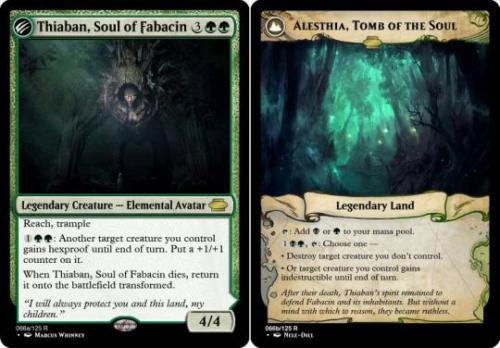
@i-am-the-one-who-wololoes – Thiaban, Soul of Fabacin // Alesthia, Tomb of the Soul
Cohesion: The card has several abilities, but it’s a little difficult to see how they all connect. The hexproof ability is very powerful and is the focus of the front side, somewhat discouraging you from risking the creature in combat to keep the ability; the reverse side has an unrelated protection ability, which is also attached to a removal effect. While I’m confident you had some story in mind while designing it, that story doesn’t really come through in the final version.
Complexity: Repeatable on-board tricks always drive up the complexity of board states, and this card has three different such tricks spread across its two sides. The front side will blank much of your opponents’ removal and make combat difficult, while the back side complicates attacking and blocking on multiple angles. And that’s without even getting into the implications of a land that is a repeatable removal spell, which will lead to a lot of grindy, un-fun matches entirely on its own.
Clarity: While I think the land is probably the more powerful of the two sides (and thus the payoff) it’s not immediately obvious that that’s the case, and the card doesn’t do a very good job of communicating it if that’s how it’s expected to be used. It’s fortunate that the design ensures you generally only need to be aware of one side at a time, but that only does so much when each side requires you to be aware of so much on its own.
Color: All the abilities of the front face are pretty squarely in green, and the back side has black in its activated ability’s cost to cover the creature destruction.
Overall: I’m a little surprised at how many ‘When this dies, return it transformed’ designs we saw. Must be exciting space.
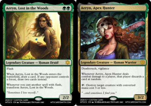
@ignorantturtlegaming – Aeryn, Lost in the Woods // Aeryn, Apex Hunter
Cohesion: This definitely feels more like two cards stapled together than a single holistic card. The front half is a flash-matters creature that cantrips, while the back face cares about none of those things. I suspect you had an idea of what the character you wanted to portray was, and this is a good example of how trying only to be faithful to a character often creates designs that look a little scattered.
Complexity: While the number and type of abilities on this card aren’t problematic, some of the specific design choices create complexity in ways that aren’t beneficial. Adding the ‘opponent’s Forest’ part of the cantrip effect doesn’t do much for the design, and both random discard and creature removal are effects that you generally don’t want to see made repeatable.
Clarity: The front face strongly implies I want to play the card in a flash deck, but the back face offers no real payoff for doing so. It does have the plus sides of the transformation being one-way and the front face being virtual vanilla apart from its transform trigger, meaning it does signal pretty clearly which side you want the card to wind up on.
Color: This is a couple pretty heavy color pie breaks, as green doesn’t have access to the discard or creature destruction abilities on the back face. Like I mentioned in the blog this week, since there’s no black mana required in any of the card’s costs, just the black color indicator is not enough to justify giving the card black abilities.
Overall: Good to know she found her way out, at least.
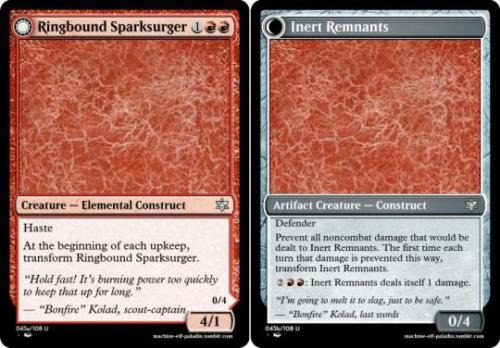
@machine-elf-paladin – Ringbound Sparksurger // Inert Remains
Cohesion: There’s some symmetry between the two sides, one clearly all-in on attacking while the other is clearly all defense. It is a little unclear which deck wants both of these cards, especially since red can generally get a 4/1 attacker for three mana without all the hoops this expects you to jump through.
Complexity: It’s a little strange that this design chooses to transform each upkeep rather than each end step like most one-turn attackers would. Additionally, the damage prevention ability really doesn’t seem like it’s doing much, and the activated ability should absolutely just read “Transform CARDNAME” – there’s no reason to pretend it does anything else.
Clarity: I think the idea behind this card is to use incidental damage to flip it without having to activate it, though it doesn’t communicate that particularly well and the payoff for doing it doesn’t seem all that exciting.
Color: While the damage prevention is a little unusual for red, I don’t think it’s doing anything that it strictly shouldn’t do, just taking advantage of some novel space.
Overall: This is a pretty evocative concept, and I’m a fan of what you were trying to do.

@mardu-lesbian – Bumbling Illusionist // Omnipotent Sorcerer
Cohesion: The two faces of this card don’t really share any elements, relying more on flavour to justify being part of the same DFC. Mechanically they don’t interact in any real way, even having a separate mana cost to make it effectively a modal double-faced card, more than a transforming one.
Complexity: The complexity is pretty reasonable on this pair: the front face is quite simple, and the most complex part of the back face is just turning it back into the front. The cost reduction ability feels like it’ll only occasionally be anything other than one mana, but it’s possible that complexity is justified by the few cases where it’ll do slightly more.
Clarity: I saw some discussion about which face of this card really wanted to be the front, and it’s a worthwhile question. I think if you’re going for the ‘big reveal’ scenario that the concept is referencing, it would probably be correct to put the finale on the back face. This specific design is closer to an MDFC anyway, but most transforming DFCs treat the back face as the payoff for the front, and the ‘man behind the curtain’ was conceptually the payoff for the Great and Powerful Oz.
Color: Drawing a card on a die trigger is interesting in red; every color is allowed to cantrip so it’s not strictly a break, but it’s certainly unusual. Everything else (including the death trigger, indirectly) is gated behind blue mana instead, and they’re all things that make sense for blue to be doing.
Overall: Unless Masquerade does a lot more with transforming than this particular design indicates, it feels like you’d be better off using MDFCs and finding other workarounds (like flickering) for changing between sides.
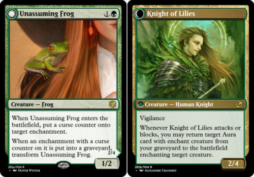
@misterstingyjack – Unassuming Frog // Knight of Lilies
Cohesion: The two effects of this card seem reasonably intertwined, one triggering when you lose an enchantment and the other returning your Auras from the graveyard. Both sides provide a body for your Auras to go on, though neither offers anything that makes them a particularly good Aura target.
Complexity: Neither of the effects here are exceedingly complex, though it feels like it does take advantage of extra room in the text box. I’m not totally convinced that the counter improves the gameplay significantly over simply triggering on any enchantment leaving – they’ll be identical in most cases, and the few cases where they’re not the flexibility is probably welcome. Repeatable recursion is always a red flag, though the worst I’d expect from this is recurring something like Choking Restraints.
Clarity: The throughline on this is pretty clear, and I don’t imagine anyone struggling to figure out how to play the card correctly.
Color: The recursion effect is definitely a strong bend in Green: green returns permanent cards to its hand and can recur lands and occasionally creatures from its graveyard, but there’s not much precedent for doing it with Auras, though that is the kind of bend that hybrid or DFC cards occasionally make. I think returning the Auras to hand might be safer both in terms of balance and in terms of color pie.
Overall: It would be terrible if someone were to figure out that I absolutely adore frogs and started submitting frogs into all of my challenges. Would be a real shame.
@naban-dean-of-irritation – Challenge of the Hunt // Reward of the Hunt
Cohesion: This design has four abilities, none of which quite line up with each other, but are doing similar enough things that they probably belong in the same decks and archetypes. Both sides want you to have creatures that line up well into opposing creatures, and encourage aggression by making blocking difficult. There’s some cute synergy between the Gold token the front face generates and the activated ability on the back face, though it does feel otherwise strange that that ability introduces an artifact matters theme to the design.
Complexity: Most of the abilities are designed well to avoid needlessly complexity, with sorcery-speed and turn-based triggers. The activated fight effect can make combat a little hard to read, though that is gated behind both a transformation and untapped artifacts, so perhaps that confusion is acceptable.
Clarity: This is where having similar-but-not-the-same abilities can cause trouble. Designers have a tendency to look for clever answers, but sometimes it’s cleverest just to repeat yourself: it makes it easier for players to remember, and makes the themes of the design more solid. Rather than splitting your message between forced blocking, ‘stalking’ and fight, I think you’d be better off trimming one or two of those and consolidating the effects around whichever one plays best. Additionally, because these are able to trigger each other explicitly, there’s an implication that they’re better in multiples that the back face doesn’t really deliver on: they count as artifacts for each other, but otherwise the second copy of Reward doesn’t have any relevant abilities at all.
Color: You played it pretty safe with monogreen abilities on a green/colorless card, no problems there.
Overall: This feels like it’s trying to be part of a cycle, or a broader subtheme of a set. That’s pretty hard to pull off with DFCs, but the interesting combination of types and the story it tells definitely feels like they could lead to something.
@nine-effing-hells – A Hero Rises // A Hero Falls
Cohesion: This card has eight different abilities that are operating on a lot of different axes. It somewhat suggests that it wants to be played with a small creature, go-wide strategy (chapter 3 on the front face), but most of the other abilities don’t really reinforce that theme. As cool as it looks, it’s just hard to imagine the deck that wants all the things this card is doing enough to keep it playing on a loop.
Complexity: This card has eight different abilities, which can make it very difficult to keep track of what it’s doing at any given time. At least four of those abilities impact the board directly, making it important to be aware of them constantly. Normal Sagas are a relatively complex permanent type with only three chapters, so designing an eight-chapter Saga was always going to be an extremely ambitious goal.
Clarity: This card has eight different abilities, only half of which are visible at any given time. Perhaps if there were some kind of symmetry to help hint at what the order of the abilities on the other side was, it would be a little easier, but as it is this card will have players flipping it over and checking the reverse every time they need to plan a turn or two in advance.
Color: This card has eight different abilities, which is a lot to cover even with three colors to lean on. Every ability on the back face is a pretty severe bend, and while bending can be expected on this kind of design, it’s something that has to be done carefully. Multiple small bends can add up to a break, and this card features multiple big bends – as well as some good old-fashioned breaks, like the back face’s third chapter (Hurricane hasn’t been in Green in over a decade).
Overall: This card has eight different abilities, y’know? The idea of a double-faced Saga is honestly a really clever idea, but making it work would involve a much more conservative design approach than this one took. In particular, you probably should’ve taken advantage of the fact that multiple chapters of a Saga can share the same effect. Doing so would’ve allowed you to make a design like this with only 4-5 unique effects, which would’ve been much more manageable.
@bluebread-mage – Dovin, Planar Surveyor // Dovin, Reprogrammed
Cohesion: Well, the back face doesn’t do much, so it would be pretty hard not to fit in with it. The two loyalty abilities synergise as the first fills your hand and the second rewards you for keeping it that way. The front face’s transform ability isn’t something you can control (and almost certainly wouldn’t, if you could), and won’t be relevant in the vast majority of games the card is played in.
Complexity: This feels like an example of something that probably doesn’t need a second face: rather than transforming it, you could simply take away the card’s abilities as long as an opponent controls a Dimir creature, and achieve nearly the same result. Neither of the loyalty abilities are all that complicated on their own, though the power level on the potential draw two each turn and the counter-everything emblem are both pretty concerning.
Clarity: You never want this card on its reverse side, what could be clearer than that?
Color: There isn’t much that’s white about this card. The taxing ability arguably could be, but blue is better at it and is already represented. It’s not breaking anything, but they try not to print multicolor cards that could be only one of those colors.
Overall: I definitely applaud your commitment to keeping a character you love around.
@partlycloudy-partlyfuckoff – Surreptitious Shrub // Moldgraf Man-Trap
Cohesion: This design has pretty obvious intentions, swallowing opposing attackers and then digesting them for life and card advantage. Two of the three abilities depend on things you can’t directly control, making it hard to build a dedicated deck for this card, with the only real synergy it allows is the sacrifice in the transform ability.
Complexity: Instant speed transformation can complicate combat, though since it’s something that should only happen once it probably makes for a reasonable on-board trick. I’m not certain the counter on the exiled cards is necessary, as the back face can simply refer to cards exiled with itself (much like Tomb of the Dusk Rose). The upside of letting them digest each other’s food doesn’t seem particularly valuable. I think making the draw/lifegain ability require a tap would help avoid
Clarity: The abilities of the two sides are connected intuitively enough that you won’t need to check back and forth, and it’s easy to see how the card is expecting you to play it. Kudos.
Color: I’m not totally convinced permanent exile effects are a monogreen thing. It’s a pretty significant bend up from deathtouch, and green removal is generally supposed to demand bigger, better creatures. This one at least requires the plant to survive combat, so perhaps that’s enough. I think the card draw and life gain is probably reasonable in Golgari colors – black usually has to bleed for its card draw, so it’s a bit of a bend, but I think the setup covers it.
Overall: I do like what this card is doing overall, and I’d be happy to Seymour like it.
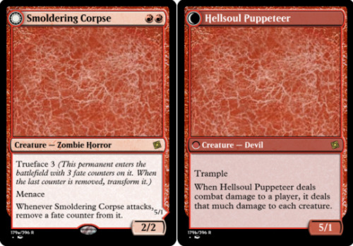
@reaperfromtheabyss – Smoldering Corpse // Hellsoul Puppet
Cohesion: Both sides pretty clearly want to attack, the front with evasion and an attack trigger, and the back with trample and a saboteur ability. This implies a slightly aggressive deck, though the saboteur effect seems like it would punish most traditional aggro builds. It’s a little hard to imagine the archetype that might want a slow-burn Ball Lightning that’s also a board wipe, but maybe it’s out there somewhere.
Complexity: Named counters on creatures are generally a risky proposition: because formats are only allotted one type of counter for creatures, a fate counter format likely wouldn’t have (much) access to +1/+1 (or -1/-1) counters, which is a pretty real cost. The abilities are mostly straightforward, though I think there’s an argument that the damage trigger should sacrifice the creature and then deal damage, as many (especially new) players won’t immediately recognize that that’s what it’s intended to do.
Clarity: Again, the parts of the card largely tell you what the card wants you to do with it. It’s not immediately obvious that the third attack transforms the creature while it’s already attacking, though I suppose for a rare that’s an acceptable play pattern to have to learn. It does put it in the slightly awkward position of occasionally needing to double-check the back side before you attack, especially since the utility of the sides is significantly different.
Color: Red doing what red does, no problems here.
Overall: I’m honestly such a sucker for Ball Lightning variants.
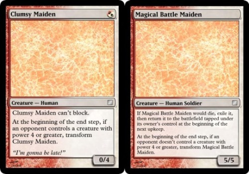
@snugz – Clumsy Maiden // Magical Battle Maiden
Cohesion: A 0/4 that can’t block comes pretty close to doing nothing; as much as I understand that’s the theme, it makes it difficult to determine how cohesive a design is when one side is effectively blank. The trigger conditions are mirrored to send a clear message, but what they’re signaling is something you generally can’t control. All of the abilities on the reverse are just ways to un-transform it, meaning this is essentially just a cheap 5/5 if your opponent has big creatures as well.
Complexity: None of the abilities are exceptionally complex, though perhaps still a bit more than necessary. The replacement effect instead of a dies trigger seems unnecessary, and I can’t immediately determine a reason why the ability taps the creature when it brings it back. Also, the way the stats line up is pretty awkward: if this gets into combat with your opponent’s only 4-power creature, it’ll un-transform at the end of the turn with 4 damage still marked on it, and immediately die. I’m not sure that’s an interaction most players would predict.
Clarity: For what it’s worth, the play pattern is fairly straightforward.
Color: This doesn’t feel exceptionally red or white, though there’s nothing explicitly about it that would keep it from being those colors. Apart from transform conditions and a ‘can’t block’ clause, it’s basically just a vanilla creature anyway.
Overall: I get what you were trying to do and it’s pretty cute, though I’m not totally convinced this card – as designed – really wants to be double-faced, over just a 0/5 that gets +5/+0 as long as an opponent controls a big creature.
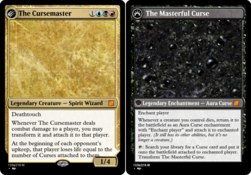
@starch255 – The Cursemaster // The Masterful Curse
Cohesion: Both sides make some mention of Curse cards, so it’s clear what the synergy you’re intending to play into is. The back face also offers some added value for playing creatures, which I suspect is just intended to be more generally useful.
Complexity: Returning creatures as noncreature enchantments is a bit of weirdness that I’m not totally shocked to see, though throwing it onto the same design as an enchantment with a tap ability is asking quite a bit. The fact that the card transforms both ways adds a fair bit of complexity, and one of those abilities is both instant-speed and free – your Curse freely turning back into a Cursemaster in response to enchantment removal is going to ‘get’ a fair few players.
Clarity: The two sides operate on slightly different axes, one rewarding you for playing (and sacrificing) creatures, the other paying you off for having lots of Curses (including those reanimated creatures). It’s not immediately obvious in the abstract which side is better – it may be slightly more obvious on differing board states, but it’s important especially for a card that jumps easily from one face to another to be able to tell when doing so is advantageous.
Color: There’s not a lot that’s obviously blue or red about the whole design. I think it’s intended for commander, where they occasionally add colors just for the sake of color identity, but adding two full colors just for that is probably still a bit much.
Overall: I think a singular card with the enchantment’s death trigger and the creature’s upkeep trigger would be plenty interesting, even with only one face.
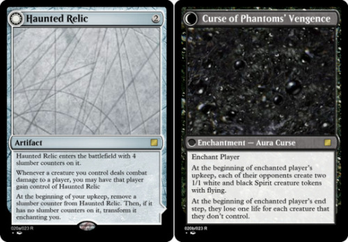
@whuh-oh – Haunted Relic // Curse of Phantom’s Vengeance
Cohesion: The biggest thing this card demands of you as a player is evasive creatures, to guarantee that you’ve got someone to pass the relic off to an opponent. The reverse side gives you a steady supply of evasive creatures – though it gives most of your opponents creatures that can block them as well. I’m not sure whether the end step ability actually encourages you to lean into a go-wide strategy or not; it kills the cursed player really quickly, but doing so turns off your token engine.
Complexity: The hardest part of this to parse is exactly how long it’ll take to pop; if everyone attacks the player immediately after them it goes quickly, but if they’re attacking the player immediately before them it can take much longer. I’d be pretty tempted to move the counter removal effect to the end step, since that guarantees that the player stuck with it will have a chance to attack and pawn it off before it flips and curses them. As it is, this is probably best used by holding onto it for a few turns before slipping it onto an opponent with an unblockable creature.
Clarity: This one sends a pretty clear signal that you don’t want it stuck to you when the timer goes off, so players often aren’t even going to worry about the exact text of the reverse side until it’s face-up – which is good, it keeps it from needing to be checked repeatedly. The one issue I have is that this sends the message of a cool multiplayer card that switches hands a lot, but as soon as it transforms it very quickly just kills the player it got stuck on.
Color: Colorless can do just about anything, though the correct rate for a card like this is pretty difficult to guess at without playtesting – just comparing it to older jinxed cards, this looks significantly above rate. The back face feels black while remaining more or less appropriate for its colorless costs, though making the tokens white didn’t seem particularly necessary.
Overall: I’ve always got such a soft spot for cards that create their own minigames, and this one plays the haunt-potato schtick pretty well.
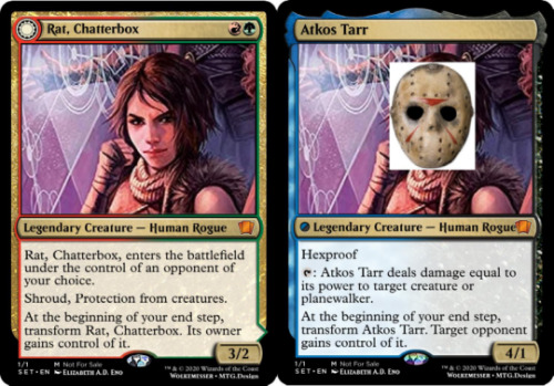
@wolkemesser – Rat, Chatterbox // Aktos Tarr
Cohesion: There have been a few different double-agent cards in the history of Magic, but the idea of putting one on a card that is literally two-faced is actually quite clever. The abilities themselves are a little spread out, with a protection ability on each side, an evasion ability for the opponents, and a remove one for the owner. There isn’t much about the card that conveys precisely what kind of deck or archetype you’d want it in.
Complexity: This card doesn’t offer a lot of space for interaction, with shroud and protection ensuring that most things can’t touch it in the first place. That said, the activated ability on the back face is repeatable removal, which is always a bit of a red flag, though the fact that the card also gives your opponents an unblockable creature that it can’t remove might make that more acceptable. Maybe.
Clarity: The card dictates pretty explicitly how it’s used, and none of its abilities are so hard to track that I can imagine needing to flip the card back and forth to check what it’ll be after transforming. I’m not a huge fan of the dissymmetry between shroud on one side and hexproof on the other, and I’d probably recommend committing to just one, perhaps ‘can’t be the target of spells or abilities its owner doesn’t control.’ The roles of each face are each different enough that this is one of the few cards that transforms both ways and doesn’t lose any clarity points in the process.
Color: Using the blue-green overlap of shroud/hexproof was pretty clever, and the assassin ability is believable in black even though it is thoroughly red. Great job using color overlaps to create a card that feels like both of its color combinations.
Overall: I don’t really know the character, but the card itself feels like it gives a lot of personality.
--
Thanks for participating this week, everyone! I tried to make sure I didn’t skimp on the commentary, since I did make you wait for it. Also tried out aligning my commentary more explicitly with the content from the blog earlier in the week. If you’ve got any feedback on it, feel free to reach out either here or over Discord!
~Mod [ @3smuth ]
8 notes
·
View notes
Text
Tinker Tailor Soldier Spy

The Promised Neverland - Episode 5 Review
So it turns out that one of our titular trio, Ray himself, is our traitor after all. The fifth instalment is less action-packed than the predecessors we have been treated to so far, however it still manages to maintain it’s own tantalising flavour as we are treated to a very disturbing side to Ray - the most being that someone so comfortable with sacrificing his own kin and numbing themselves to shipping them out as stock has been compact into the mind of a child.
In truth, I was almost disappointed with the way the episode was headed. Between the swinging pendulum of the screen cutting between Norman’s determined expression and the back of Ray’s head alongside the ‘uncharacteristic’ reversal of Ray’s demeanour, there was potential to think the series was becoming tedious both by repeating its own tropes a little too often (as if we’re not aware that this is a race against time by now) as well as mirroring the style of villainous behaviour that we’ve recognised from other anime before. What we can suppose we have to thank for not finding the whole interaction between these two overbearing then is the creativity in making Ray seem all the more manic; his behaviour not cohesively matching with what he’s saying, and perhaps the fact that even calm and collected Norman is repeatedly thrown off by what his supposed friend is saying is more than enough to make us feel ill at ease too.
Though this was rather anticipated, we learn that Ray has been Mom’s spy for quite some time - ray not only being aware of the children being shipped out but also having the power to try and work out how much of an advantage he has over Mom before being shipped out himself. You can tell that the animators probably had a lot of fun with making Ray’s expressions as debilitating as possible, taking advantage of his one visible eye and narrow pupils to elevate him to Phantom-of-the-Opera-esque levels of menace. What is particularly evocative about the whole interaction is that, though Norman seems to make sense of Ray’s motives and Ray himself details the fact that everything he’s done has been for the sake of his, and specifically Norman and Emma’s survival, the scene ends with a tangible sense of uncertainty and perhaps more confusion left in the mind of the viewer than when we first entered in - of course, that could be just me. If anything then this heightens the prestige of the anime, for even when the motives and aims of Ray and Norman are painted in black and white (watching these two young friends having to play each other being all the more heart-rendering in its own right) we are still left with an undeniable sensation that there lies an ulterior motive of meaning lurking out of sight. The clash of ideals between Norman and Ray is increasingly engaging to watch, the power dynamic constantly shifting between the two as if we were watching Jackyll and Hyde battle it out on the screen all at the same time.
It is still hard to know entirely then whose side Ray is on or ultimately what is his motive, especially as one of his bargaining chips with Mom has not even been that he expects to survive. Indeed, he merely tells Norman that he asked Mom to put off his shipping date as late as possible, this apparently being so that he can ask ‘rewards’ off of Mom and thereby see how much he can get away with demanding of her. His psyche seems to titillate as much as the pendulum of the clock itself given the switches in expression on his face - one second seeming like he is covering his eyes in cowering pain, the next delivering such a penetrating stare that creates the illusion of him being in complete power. He definitely creates that impression when he leaves Norman given how he leans into putting his hand on the latter’s shoulder and whispering a slight threat in his ear, the effect of this being all the more chilling given how the light goes out of Norman’s eyes and is left visibly shaken after Ray is gone. But we quickly become aware that Ray is still a victim here too, no matter how much he may not act like it himself. We see this in his interaction with Mom and how, though she still wears her poker face of pride with perfection, she voices her observation - and threat - that Ray better not fail to overlook the perceptiveness of his friends again.

The constant transitions not only between the expressions of the characters and their different facades therein then is so dizzying that it’s hard to keep up - but then that’s what makes up half the fun. We are additionally to another tantalising nightmare as Norman dreams of all the orphans - including Emma - seemingly drained and decaying in the tunnel that leads out of the orphanage. Whilst the large jaws (with the tiny head of Mom on top if you noticed) is cinematically scary, what is the most interesting aspect about this sequence is the recurring motif of the flowers that are growing in bunches out of each of the kids. We first notice these flowers not just growing out of Conny’s corpse but it is even a prominant motif in the OP and ED of the anime, yet we are still not completely sure what these flowers of death mean. What we can additionally empathise with then is the fact that Norman is clearly far more afraid about what is going on than he lets on to be, his attempts to maintain his own facade and act as the almost adult of the group making his character all the more engaging.
But of course, the episode additionally makes sure to still leave some room for lightness and comedy given how ray so easily reveals the fact that he has been the snake all along when the boys talk to Emma about the next course of action whilst alone in the forest. Indeed, the snappish transitions between the steadily kookier faces of each kid becomes more hilarious by the second, the hilarity being almost ludicrous given the very real danger of their situation. But then, this is what grants this particular anime it’s charm, and if we couldn’t find our main trio funny and loveable, then we wouldn’t ultimately much care for their welfare and rescue. This moment between the three however also ends up being most prominant as it is perhaps the first time we see Emma make the closest thing to a legitimate threat. Her conversation with Ray seems to hint at more guilt in him than the previous night’s dimly lit and more threatening tit-for-tat with Norman, as what seems to catch both the boys - and us - off guard is how Emma can still possibly still appeal to compassion. In fact, we can almost come to agree with Sister Krone noting Emma’s naivete; the narrative perhaps best being careful as the show progresses as this trait of Emma’s is beginning to take a toll on believability. But what creates more guilt is how her questions to Ray - despite the gravity of what she’s saying - is so direct, and so precise. It’s disturbing to see her so calm, when a few episodes ago her nerves were threaded in knots.
Indeed, what makes her severity towards Ray then all the more unnerving when she realises how he knew about each and every one of their former friends becomign lambs for the slaughter, is that her face is like a micture between fury and fear. Even the action of her taking his hands is quite poignant, as this again evokes the significance of manipulation through touch in this show; thereby showing that even Emma is being forced to prematurely manipulate and mature. She tells him never to do anything like this again. The question then is her expression pitying, or - given how nothing is perhaps more dangerous than one who knows no ends to love - another level of predatory?

Tanika Lane
1 note
·
View note
Text
Week 8: in which we get rained on a lot and drop into NZ for the weekend
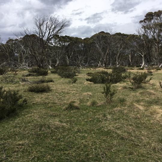
The week started...pretty grey and cold. We had a day to explore Alpine National Park, which thankfully has a lot of its big views visible from the car because it wasn’t very inspiring to get out of it. What all the tourism brochures neglected to mention about Alpine National Park (and in fact all of the Snowy Mountains region) is that there was a huge forest fire in 2003. This is part of the ecosystem etc, but it leaves a lot of Mountain Ash corpses sticking up, bleached white, above the brush. That plus the thick, grey cloud diminished the beauty of the view somewhat.

This was also the only time we’ve been at significant altitude in Australia. This meant snow (moderately exciting) but also high winds, which meant getting out even briefly at the viewpoints was somewhat unpleasant.

Since it was not actively raining when we reached the top, we decided to go on a walk from the weirdly named town of Dinner Plain. The walk was also fairly weirdly named; A Room with A View. The first thing we viewed was an enormous black snake, that was waiting patiently to cross the path in front of us. This was a bit surprising as there were patches of snow still around in the mountains and my limited understanding of snake biology is that they don’t like the cold. This one seemed pretty happy though. We think it was a red-bellied black snake, which is venomous, but only in a probably lifetime of miserable health complications after an ITU stay, rather than an instant death way like most Australian snakes.
The path was also really badly signed so we were quite pleased to find the eventual view point. The views were pretty good and from there we realised that we had done the circular walk the wrong way (there were actually arrows on trees but you could only see them from the other side). Did make it easier to find our way back though.

Our Airbnb had a tin roof and Marcel casually commented it would be nice to have heavy rain because he liked the sound of it. He probably regretted that statement, and I definitely did, when it teemed with rain overnight. The sound on the sloping tin roof, a few feet above our head, was not dissimilar I imagine to being stuck inside a coffee grinder. Not much sleep was had.
Alpine National Park is continuous with Kosciuszko National Park, which is just over the border in New South Wales. We had booked a night there, so headed out into the relentless rain the next morning.
Now Marcel was feeling rather guilty still about his corvid murder of the week before, and saw an opportunity to redeem himself. The rain had brought out a number of eastern long-necked turtles into the road, and every time we saw one Marcel would stop the car, turn around, drive back, get out in the pouring rain and move the turtle. He was feeling pretty good about this...until he drove over a magpie that decided to pay zero attention to the oncoming car.
I have always been keen on visiting the Snowy Mountains as they are home of the silver brumby in the Silver Brumby books I loved in my childhood. Unfortunately so thick was the mist and the heavy rain that we didn’t see much of it.


Weirdly though when we descended into our town for the night, East Jindabyne, the sun appeared. We decided to try a little walk in a low area of the park called Sawpit Creek.
It was beautifully sunny and there were lots of adorable wallabies around.


Feeling optimistic about the weather we decided to head back into the park...only to find if we went even a small distance up in altitude, the thick clouds and rain began again.
We abandoned it and headed to our airbnb for the night. A proper storm came on so we could watch lightening across the lake. That and the sad face of the random cat that appeared by our screen door. Now I know cats in Australia are terrible invasive predators...but this one was super cute. So we let it inside and fed it cheese.

The next day we had hoped the weather would be better locally so we could explore the mountains. It was not. Never mind we thought, we are driving to the coast where there are some beautiful beaches, the weather must be better there so we will just enjoy them for the day. The forecast for there was also teeming rain.
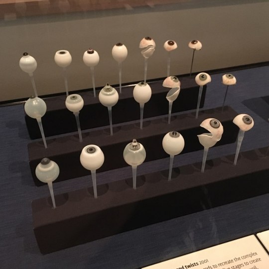
So in utter desperation for something to do to fill the rainy day...we headed for Canberra. Now Canberra is not the world’s most exciting capital. The National Museum there is pretty decent though. We ignored the opportunity to pay to see the visiting exhibit featuring “treasures of the British Museum” and instead went to the free galleries. Which whilst not particularly cohesive on the history of Australia featured cool things like a mummified Tasmanian Tiger head, a collection of glass eyes and spear heads made from wine bottles. It passed the afternoon well.


Fortunately the next day dawned gorgeous. After a week of pretty much solid rain it was blue skies and sunshine all around. Unfortunately we only had one hour to look at the best of the local beaches in Jervis Bay (we picked Hyams) before we had to head to Sydney.

After a run in with an annoying question talking parking warden, we finally made our way to Esther’s flat, dumped what must have been an alarming amount of stuff at hers and dropped our filthy car back at the airport (sorry Hertz).
We then headed back into town. Earlier in the day I’d been talking with Marcel about how Australia was fine for a visit but I didn’t like the population’s right-leaning stance and casual racism. He said he didn’t think they were that racist. As we walked by the harbour bridge through the botanical gardens, we found ourselves calling the police as a man screamed racist abuse at non-white tourists, spat in their faces and hit one of them. No joy there in being right. Also the police were extremely tardy on bothering to turn up despite the fact that area of town must have had a lot. Despite this we enjoyed a lovely dinner with Esther before heading back out to the airport for a night in an airport hotel.
The reasoning for this was that whilst we were in this part of the world we might as well “pop” to New Zealand. It is a 3 hour flight from Sydney to Auckland, but that is a lot fewer hours than it is from London and it is a lot cheaper.
So on Friday we headed off to New Zealand. After the customary lengthily grilling at the flight counter about onward flights (really tempted to ask how often people, with hand luggage only, who are citizens of a rainy island with so-so social benefits, illegally emigrate to other rainy islands with so-so social benefits) we headed off.
We arrived to find… it starting to rain. Luckily it held off for a bit that evening so that we could go to a night market and stuff ourselves full of weird food including bubble waffles with our hosts Anita and Pete.

The next morning it woke up...beautifully sunny. Which was unsettling as this is NZ and it likes to rain on us in NZ. I did however remember that New Zealand sun= basically like shoving your body into fire and slathered myself with factor 50 before heading out. We meandered in the warm sun down to a market for breakfast, on to a chapel on top of a hill (never realised before how hilly Auckland is. Too hilly is my brief conclusion) and then after meeting up with Kate, we wandered slowly along the sea front, stopping for drinks, before we got to a Breton galette place about 10km down the shore.


After stuffing ourselves, we waddled slowly back home. To find that no matter how thickly you slather on the suncream, NZ sun finds some way to chargrill you, and my forehead and patches around my neckline were pretty much maroon.
The next day we’d planned to go to a place called Piha beach. The weather forecast suggest it would be cloudy but wouldn’t rain there until the mid-afternoon. We had brunch. The sky gloomed ominously. We headed to the beach. It started to spit cold rain into our faces pretty much the second we arrived. I would have thought this was our standard NZ curse, but this was the second time the exact same thing had happened to Anita, so I think she was our Jonah of that trip.

When we got back to Auckland, Marcel and I decided to head over to Devonport, a little village suburb of Auckland that you can get to by ferry. We confirmed our suspicions that Anita was definitely the jinxed one when we enjoyed lovely sunshine all afternoon whilst a dark cloud glowered over Auckland.


In the evening, reunited, we headed out for Mexican, and then to an ice cream store called Giapo that did weird flavours. Now I thought you’d just go in and order your weird ice cream. But no. Instead you are admitted in your pair/group/alone to stand around a small table, whilst a server brings out a selection of their favourite ice creams for you to try and discusses each one. I imagine it similar to being at a wine tasting, only more socially awkward as none of us were expecting it and weren’t really sure how to praise ice cream in an appropriate manner. I did ended up going for one of the ones our server had introduced but I hadn’t thought of, guacemole with strawberries. The ice cream was delicious. The corn nacho crumb that it was coated in I was less keen on.
We ended up finishing the night (and the week) watching The Meg, a gloriously terrible Jason Statham shark movie, whilst all shouting at the screen. Hilarious fun and reminded me of long-ago weekends down in Dorset.
Ways I thought I might die in Australia this week: fairly minimal as the rain prevented us leaving the car much. Perhaps just an apoplexy of wrath from the rain refusing to shut up as it banged down on our tin roof earlier this week. Oh and falling off a steep mountain pass in our car. And getting bitten by a surprisingly cold-tolerant snake.
0 notes
Text
Pinky’s Ca Phe
It's like stepping onto the set of Miss Saigon, a walk back in time to an American G.I. bar in Vietnam during the war. I can't say I have any personal experience with the experience in 1970 Vietnam but Pinky's Ca Phe, hidden in a small house in Little Italy is certainly what I would expect if someone asked me to describe one.
Something between a speakeasy and a diner, all with a vintage twist, Leemo Han has created a truly unique dining venue in what is sometimes considered a saturated restaurant scene, especially if you are tired of the same old phở shops and bánh mì joints that are ubiquitous across the city now.
Like many of the restaurants that take unique, themed risks in Toronto, Pinky's is not the first attempt of owner Han as he has plenty of experience with snack bars. He currently also operates Japanese-style izakaya Hanmoto and Korean tapas-like OddSeoul, both of which—like Pinky's—cater to the cocktail and late-night snacking crowd. At Pinky's, there is a definite Vietnamese slant to the menu but don't be surprised to see a little Thai influence as well as the dishes are the chef's own modern takes on diner fare from 70s Vietnam. So, if you'd like to be transported back in time, this hipster snack bar can check all the boxes for vintage vibe, cocktails, small plates, good music, and a look at Vietnam as perhaps you've never experienced, it's worth a trip to Little Italy.
Atmosphere & Decor
One word? Shiny! Complimented by old hardwood floors, bare brick walls, and vintage snackbar signs, everything is shiny and glowing with the sort of fluorescent lightning that is more common in old Hong Kong gangster movies and dive bars rather than the upscale eateries of Toronto. The entire area is covered in tinsel that reflects what little brightness is given off by the coloured lights, and is further adorned with old American and Vietnamese flags, as well as prints of old Saigon. Like many of these throwback speakeasies and diners, it's reminiscent of an era that is only familiar to some of us through movies or stories.
The music is a blend of popular oldies from the 60s, 70s, and 80s which are familiar enough to sing a few bars but not so much that the bar is going to launch into a Broadway chorus a la Miss Saigon. It fits the feel of the venue and the only thing this place would require to truly be an authentic replication of those scenes in film is a thick haze of cigarette smoke—which is thankfully absent here. Lighting is quite low with a golden glow of yellow. Out front is much better lit section and a patio outside is open in summer months.
Menu Range
As Pinky's is essentially a snackbar, the menu is limited to 13 choices of Vietnamese inspiration. However, if you're looking for the Vietnamese food you're familiar with elsewhere in the city, you may be in for a surprise. Absent from the menu are any of the take-out classics like spring rolls or eat-in big bowl soup favourites such as phở. Everything on the menu is a twist with a flair for something a little more upscale than the usual fare such as Han's take on butter beef or french dip. Sure, you'll see words like vermicelli, bánh mì, wings, and phở but each of these is taken up a level.
There's no clear definition between appetizers and entrees, mostly as it seems everything is generally the same size. At the top of the small menu is mango papaya salad with grilled squid for $15 and it's the only salad on the entire menu, followed by bánh xeo broccoli for $7 which is not actually the French-influenced crepe dish of the same name but rather a plate of battered broccoli. Then it's back to $16 for the ever-popular Tiger's Milk ceviche with tuna, scallop and surf clams. The latter half of the page consists of sticky wings or eggplant claypot for $10 each, and marrow beef for $16. It's worth noting that the marrow beef offering is a version of butter beef and quite possibly the most Instagrammed dish on the menu. Clearly, Toronto still isn't over the marrow-served-on-the-bone craze. And it's not for naught as it is indeed a good-looking plate of food.
If you're looking for something a little more pedestrian or familiar, the second page of the menu might be more appealing. Lemongrass chicken bánh mì could be the perfect choice, especially for the low $8 price tag or the So Fly! Rice which is fried rice with the added bonus of deep-fried soft-shell crab for $17. At $15, mushroom vermicelli is one of three vegetarian offerings on the menu and is exactly what the name implies. The take on french dip here is called phở beef dip for a very reasonable $10, but you won't find any rice noodles in this dish.
Down near the bottom of the menu are the charred chicken legs, beef curry claypot, and the "lucky" strip for $18, $16, and $25 respectively. Chicken legs are grilled over charcoal and the striploin is smoked or seared with phở butter and served alongside Viet chimichurri.
Following up is a small dessert offering of two dishes: the Vietnamese tres leches and purple yam smash at a very modest $8 and $10 but continue with the cohesive theme of the restaurant.
As this is authentically South-East Asian cuisine, it's very important to understand that most if not all the dishes likely include ingredients that many Western eaters may be allergic to such as shrimp (paste), fish sauce, shellfish, and nuts, especially peanuts. The servers will generally ask about allergies when ordering and it's important to check with the server if you have one of these common allergies. They are accommodating.
Appetizers
As previously mentioned, this snackbar doesn't divide itself into traditional apps and mains but instead has everything together with moderately-sized portions and mid-range prices across the board. After all, this place is about casual bites and tasty strong drinks, not complicated sit-down fine dining.
It was hard to make a decision about how best to start out the meal but being a huge fan of Thai green papaya salad and grilled squid, it seemed impossible to pass up the dish at the top of the menu that combined both of these things. It came fairly quickly in a looming tower of greens and reds on top of mango, papaya, and bean sprouts with a surprising amount of charred squid. Unless you order a specifically squid dish such as calamari, it's not all that common to be given so much at once. What a pleasant surprise! The best part of the squid was not only that it was cooked absolutely perfectly with a thick char on it (exactly the way I like it), but that it included both body and tentacles. It was crispy on the ends and a good bite without being too chewy. It actually reminded me more of various octopus dishes I've had in Toronto rather than squid in how it was cooked. Excellent.
The fruits and vegetables were all grated and mixed well, with various herbs like cilantro and Thai basil seemingly used more as a garnish than an ingredient. The heat wasn't particularly strong but came on eventually. This contributed partly to my opinion on the salad. As I'm quite familiar with the Thai version, I wondered if maybe I was too blinkered by what I'm used to a papaya salad tasting like instead of this new Vietnamese-style papaya salad. I miss the sharp and strong contrast of cilantro and Thai basil with the hot red chillis, and there seemed to being something more overpowering, possibly the ginger? Vietnamese mint was missing, lime juice was also lacking and the peanuts included where candied beer nuts, which I found a bit strange but not unappetizing. Nước chấm sauce was there but I could have had more and the delicious salty brine of fish sauce seemed to be tampered down for some reason. There were quite a few scallions mixed in but again, I'm not sure where I was losing their flavour but something else seemed to be overpowering most of the dish. It was not by any means a bad papaya salad but it was not exactly what I was expecting, and that is probably a good thing.
Entrees
For the "entree", I wondered about going the trendy way of the marrow beef, the tempting crab and fried rice, or something more unfamiliar. There are enough opinions of the marrow beef on every review of Pinky's and I wasn't sure if an entire bowl of fried rice to myself was exactly what I wanted despite my never-ending love of crab so I opted for what I didn't realize was basically a roast beef sandwich with broth dip. That may be my mistake for not thinking carefully enough since the words "dip" and "phở" were enough to catch my attention! Although, in my defense, there is no mention of bread on the menu.
It was a small pot of dark phở broth and cilantro with a sandwich based on french dip, which itself is an American invention. The bread here was not the fluffy and soft Vietnamese roll with a hard crust that is present at bánh mì shops but instead stays very close to traditional American french dip which uses a much harder baguette-style bread. I tasted no asiago cheese, nor much hoisin sauce but the trendy sriracha sauce that is omnipresent in all Asian restaurants in North America was definitely here as well. The broth itself was hot and quite delicious and paired exceptionally well with the beef. It managed to soften the slightly difficult hard bread. With the addition of lime juice, it really helped the broth's flavour to pop.
The contents of the sandwich were tasty and as I'm used to ordering rare beef for my phở, this tasted mostly like well-cooked phở beef, just on bread instead of with rice noodles in soup. On the whole, it was just a roast beef sandwich. That may sound dismissive but there is something to be said about a well-made, tasty comfort-type food. I can imagine an American soldier in a bar in Saigon (before it became Ho Chi Minh City) soaking up the familiar food and being incredibly grateful for it. So, for a restaurant that mimics such a place, it makes sense to include some dishes like this which hark back to meals its patrons would have indulged in as well.
Combined with the good prices, it has to be said that the plates are the perfect size for one person and anyone wanting a quick bite would not go amiss here. In fact, As I was sitting at the bar enjoying my meal, someone came in, ordered the ceviche and a pint, and was out again before I'd even started dessert so it is a place to stop in briefly and have a snack as well. Next to them were two friends who shared the marrow beef, beef curry claypot, and fried rice and they couldn't stop raving about what a good choice the curry pot was. So, whatever you choose off the menu, it seems to be a hit.
Dessert
There are only two options on the menu for those with a sweet tooth but both are well-priced. Tres leche cakes have never been a particular favourite of mine but perhaps the ones here are excellent. I was told by the bartender that the yam smash is the better of the desserts and I can't say I question that considering how tasty it was! Not only that, but it was massive. Three huge scoops of coconut milk ice-cream on top of a mashed purple yam with beer nuts, toasted coconut, and fresh lime. The ice-cream was obviously homemade and that is a good thing and the flavours were smooth and complimentary, especially with the squeezed lime on top. When taken with the tasted coconut and beer nuts, the crunch with the delicate ice-cream and grilled yam all brought out the best parts of each ingredient. By the time I was done with the salad and sandwich, it was impossible to finish all 3 scoops by myself but the yam went down really well. This is a dessert best shared between people if everyone has already had a meal but it wouldn't be a bad idea to just order this dessert for a snack if you're after something sweet.
Drink Options
The cocktail list here is where to look for a good drink to accompany your snack. It's small and each drink caters to a different taste but all of them maintain the feel of a Vietnamese dive bar taken up a notch. Whether it's lemon or lime, there will be a sour punch to each cocktail that harks back to subtropical Asian locales. All except the Pink Lady are at a reasonable $13 with the former being just one little loonie more. The Pink Lady with the housemade raspberry syrup seemed to be a particular favourite of patrons at the bar with one commenting that it is the best cocktail she'd had in quite some time. The Mango Popper includes a jalapeno-infused vodka which is done in-house as well.
I chose to try the Saigon Rock as a fan of gin, passionfruit, and lime. I had no idea what orgeat was, but that's all the more exciting in a cocktail. I know now that it's a sweet, almond-based syrup with orange or rosewater and also that I'm not much of a fan, as it turns out. The cocktail itself was nicely balanced and used fresh lime juice and if perhaps the orgeat had been absent, I would have enjoyed it more. I felt there was just a hint of that store-bought lime cordial in the drink even though I knew from watching the bartender that they used their own squeezed lime and lemon juices so it was just niggling on my tongue. It seems like it was the orgeat syrup causing that. Otherwise, it was a refreshing drink and if you enjoy almonds or amaretto (or Mai Tais which also use it) you'd likely enjoy the cocktail more than I did.
As it's based around expat Saigon bars, Pinky's has a full cocktail selection and a very good, enthusiastic bartender so beyond their signature offerings, they can probably whip up whatever you have on your mind. Bar rail drinks are an easy $7 a pop.
The other unique offering on the drinks menu are the $14 Foco Loco cocktails which you may recognise from Pinky's Instagram as being the juice cans on top of ice. In fact, they are either rum or vodka on the rocks with juice poured over top and served with the tin. It comes in 5 flavours: mango, coconut, passionfruit, guava, and lychee.
There's also the Hua-Hua Iced Tea which is a similar alcohol mix as a Long Island Iced Tea but with a Vietnamese tea blend instead of Coca Cola. It's made for two or four people.
Of course, a bar isn't complete without beer and Pinky's has 3 brews on tap including Sapporo (Japan), Laguintas IPA (USA) and 8 Man EPA (Canada) all for $8 a pint. They also a have small selection of beer by the can for $6-7, and tall boys for $7. Three Ontario ciders, two from Revel and one from West Avenue, round out the list, ranging from #13 to $24. There are also a few wines on offer by the 5oz glass or bottle: two whites and two reds, as well as a sparkling cava. Bottles are either $50 or $55, and glasses are only $11 or $12 a glass.
Service
Even showing up at around 6:30 PM, the restaurant was half-full and as a single, it's bar seating only. I quickly found a free spot and the bartender was prompt with water and asking if I had any questions about the drinks. Of course, I ordered after a quick glance over the cocktail list and from that point on, I still had no complaints about attentiveness despite she was often running hostess, bar, and taking guests orders all at once. As the place quickly filled up, even on an icky spring evening, servers and bar were on point. Food came quickly enough for the demand of the place and I was never left with an empty water glass or looking at my watch. All the food arrived hot and ready to eat, except the dessert obviously which must have just been dished up as the ice-cream hadn't even had the chance to begin melting yet.
The bartender was friendly, conversational, and skilful and overall, everyone seemed to be in good moods and happy to be there.
Feeling Afterwards
As I wandered out through the old house, I felt incredibly full. Had I forced down the entire dessert perhaps I would have felt a bit ill but as it stood all the flavours still remained pleasantly on my tongue with no hint of disappointment. The place was totally packed and stepping onto the darkened Toronto street was not jarring since, despite its small size, the restaurant itself never felt stuffy or overfull even with every seat filled.
Walking down the pathway, I met a young man who looked to be a backpacker who asked if it was a restaurant and I told him it was. He said, "I never would have found this!" and proceeded to go straight in. And that's how Pinky's works: it's word of mouth mainly as there is no signage and looks more like someone's old house is having a warm house party in the front room. So, if you're ever wandering down Clinton or across College, make sure to take a peek around the corner and keep your eyes peeled for a white house which otherwise is indistinguishable from its neighbours apart from the patio out front. This is definitely a place to come for a filling dinner, for a quick snack, for dessert, or even just for a flavoursome drink. Be prepared to be surrounded by vintage vibes, oldies, and crowds of young people who know a good deal when they see one.
VL00KV
from News And Tip About Real Estate https://jamiesarner.com/toronto-restaurant-reviews/pinkys-ca-phe/
0 notes
Last Seen Blogs

fallikfirik
22

welcome2humanity
Welcome 2 Humanity

frankkin
Untitled

cupcakesfamily-blog
Tortas tematicas

unladyboss
THE BEAR: Time Out Of Joint and Ceres mythology.