#koriyue.txt
Text
i have something i would like to share with the class (and ESPECIALLY @monocaelia) :

#koriyue.txt#do i tag this as#genshin impact#LMAO?#my bias towards male leads with dark hair and bright eyes is . ruining me#RUININGME#arhf ARF BARKJ BSKJBRKAB AKBRKABR#didi if you're reading this i was making your white haired childe and i accidentally inverted the colour#and i just . watched . stared . GLANCED . respectfully#I WAS DISRESPECTED INSIDE MY OWN HOME#get him ! AWAY FROM ME#white hair childe: 🥰💌🥺👼🏻#black hair childe: 💥🔪👹#childe: i can be your angle or your devil <3
217 notes
·
View notes
Text

q. what programs do you use to make graphics?
a. i use adobe photoshop, illustrator, and the occasional after effects when creating motion graphics!
q. can i request [insert fandom] graphics?
a. here is a list of fandoms i am currently interested in! if you don’t see it on the list, i probably haven’t heard of it! (you can still request it though… rope me into the fandom… :>)
q. can you make a tutorial on [insert graphic here]?
a. as much as i would love to, tutorials take me a lot of time to do (since i’m essentially re-creating the same graphic again)… however! you can always ask me for editing tips / advice on specific elements in my graphics! ** please link the specific graphic you want me to cover!

ps. please don't take any of my designs or resources without credit! i make these to help fellow graphic designers and i try very hard to come up with new ideas! thank you <3
🎐 — last updated july 31, 2021!
4 notes
·
View notes
Text
i'm so weak i saw this picture of kazuha and burst into tears

#koriyue.txt#he's so!!!!! SO!!!!!!!#tinie#HE'S SO TINIE!!!!#BABIE!!!!!!!#BABY!!!!!!! HE'S MY!!!!!!!!! BABY!!!!!#breathes#B A B Y#littol babie sipping his littol juice🥺#i cant see my eyes aer filled with tears#UUUUUUUUUUuuuuuUUUUU
62 notes
·
View notes
Text
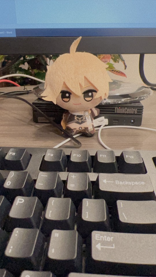

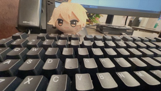
take your aether to work day!
EVERYONE SAY HELLO TO AETHER! TELL HIM HE'S DOING A GREAT JOB OR ELSE >:((
#koriyue.txt#aefer cham explores the world!#this is my new aether nui tag hehe :>#this is his tumblr account now#he's so!!!! SO!!!!! ks;odfekfkf 🥺🥺#he's working very hard!!! grinding!!!#he just sits on my desk and looks pretty im so sad#my only motivation for work#I WANT TO PINCH HIMIFKEFKR;G#i took these during break please don't come for me#my babie the light of my life the babiest#so sickening that he sits here and just :>#STOP IT!!!!!!!!!!!!#grgGRGRGR
51 notes
·
View notes
Text
WHAT'RE SOME SONG TITLES THAT 5WIRL WOULD HAVE ON THEIR ALBUM WEE WOO WEE WOO PLEASE SEND SUGGESTIONS !!
#koriyue.txt#can i tag this as#genshin impact#5wirl#need some funky ideas to slap onto the album art ahauhuahaa#i have! the album name ready :)c wehehe
32 notes
·
View notes
Text
okay if i manage to pull both heizou and kazuha today i will post the 5wirl album in the morning :>
25 notes
·
View notes
Text
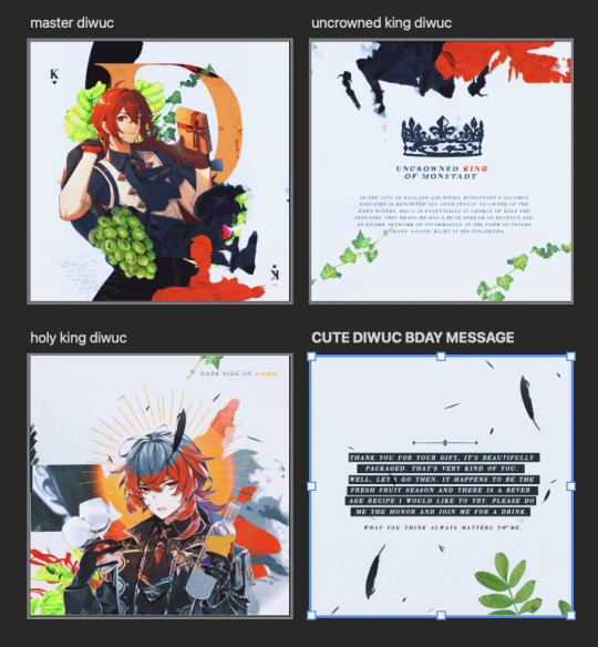
diluc birthday 2022 gfx (process work)

since i had so much fun making my diluc birthday 2022 edit (and jumped through numerous hoops to finalize the design,,,) i wanted to share the process!
this is not a tutorial! i will not be going over how i made every graphic. instead, this post shows all of my jumbled thoughts and decisions when putting everything together!
details under the cut! (initial thoughts / rough brainstorming + inspiration / final layout / colours / motifs / concluding thoughts)
cw: tons of rambling! i attached a couple of images too! no moving images or flashing.
i. initial thoughts
let's be honest every thought i had going into this was about diluc and how FINE he looked in his birthday art,,
a majority of my edits are 800 x 1000, and this one was originally going to be 800 x 1000 too. but! i have a bad habit of overfilling smaller documents and not using negative space properly. so, i tried to use an 800 x 800 document for this edit instead!
choosing to work with a square base instead of a rectangular base meant i had to use the smaller space more effectively.
ii. rough brainstorming + inspiration
initially, i was aiming to do an editorial style of graphic where diluc was meant to be presented as a model in vogue (or any high-fashion magazine). some of the inspiration i had:
i was going to focus mainly on typography and experiment with different editorial layouts!

i knew i wanted a combination of text and images in this post (which is why i played around with two boards at once). i really wanted to keep this monochrome and use one red (sampled from diluc's hair) as an emphasis colour.
but then i thought... wait.. diluc looks SO GOOD in his art.. why would i relegate him to the background????? and make it black and white?? fool behaviour,, so! i scratched everything and started from the very beginning! but now i wanted to focus on diluc's figure and his character instead!
so... now what? i was so ready to give up— i had spent the first two hours going back and forth between different layouts and different monochrome colourings and to lose all the progress was just. defeating, really. :<
iii. final layout
after mourning the loss of my model!diluc dreams, i wanted to create an edit in a style that i was more comfortable with. usually i create vectors or lineart in my edits, but this time, i wanted to go back to my roots and experiment with textures! before being on tumblr, i made numerous edits that looked like this:
(i was still, and continue to be a bts fan haha)
i really, really enjoy this style of editing and i really missed it when i started creating for genshin! but it's hard to mix real-life elements with 2D characters, which is why i tried to stray from it... but i always had so much fun making these that i was like,,, hey,,, why not???
so! using my past self as inspiration, i began gathering images and making elements to create a diluc-piece that focused on layering textures + manipulating them!
iv. colours
okay. preface: i really fricking love using colours. i don't know what i was thinking when i tried to make this entire thing black and white, but i was wrong!
i sampled a bunch of colours from diluc's birthday art and came up with something like this:

buuut it looks a little bit... flat? so i took the green from the background and added that to the palette too! this really helped the red pop, since they're complimentary colours. after i finished making the edit, i went back and altered some of the colours to make them pop out!

v. motifs
my favourite, favourite part that i can talk about for ages!!!!! here's where i obsessively read up on diluc and brainstormed the things i wanted to symbolize in my edit! some stuff i included / took into consideration:
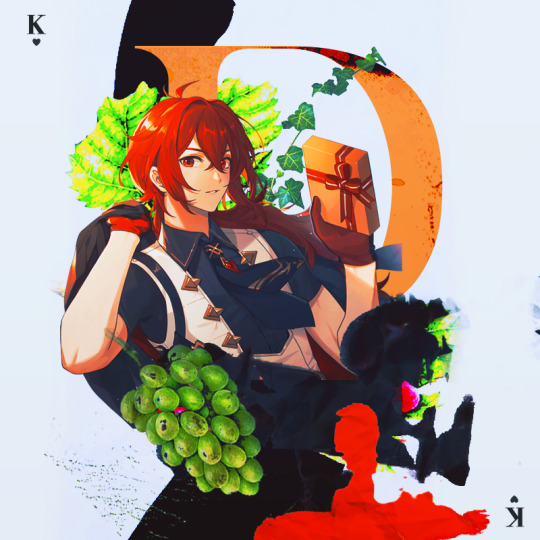
grapes + vines. hints at his status as a wine tycoon. also symbolizes fertility, wealth, inner transformation. similar to the process of fruit becoming wine, diluc has grown to become a respected man.
the king of hearts. i emphasized diluc's title as the uncrowned king of monstadt by directly referencing him as a king. the king of hearts symbolizes honesty and is often regarded as a kind-hearted man. so... diluc.
splatters. it's not blood! diluc is alive and well!!! the red is supposed to mimic spilled wine (a play on the saying "no use crying over spilled milk) but... legal.
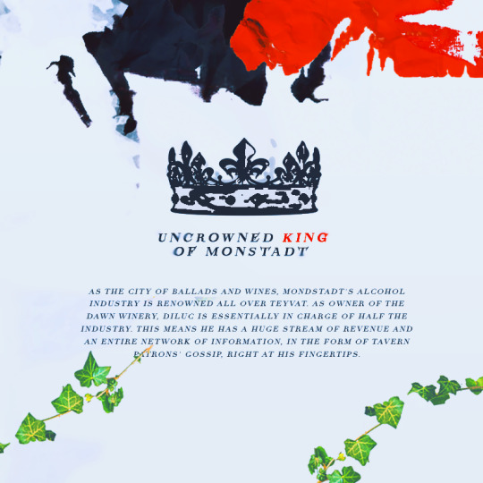
a crown. another reference to the uncrowned king title. diluc deserves a crown and i will personally place it on his head.

the sun. references his title the dark side of dawn. bright, scorching, unrelenting—a very diluc symbol.
the golden halo. symbolizes royalty and glory. can i highlight his status anymore in this edit?
black feathers. a reference to his title the darknight hero. black feathers also symbolize protection and are considered good omens. it's kinda like a silent thank you to diluc for always protecting monstadt!
golden wine. shh, it's apple juice! but also.. diluc as king midas who has the power to turn anything into gold. references his wealth and his adeptness as a businessman. i think there's also a beer called liquid gold... funny!
some stuff i didn't end up using:
burnt paper. i was going to make it look like one of the pictures were burnt. for the obvious: diluc's a pyro character, duh. but (on a sadder note) the burning of bridges and the past as nothing but a pile of ashes. bonus points: i was going to burn a picture of diluc and kaeya haha. in the end, i didn't do it b/c it looked out of place.
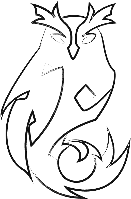
an owl. references his constellation. okay it's supposed to be a "night bird" but. owl. whoo! i made it and tried my best to fit it somewhere, but it made everything too crowded... so it had to be scrapped from the final design.
vi. concluding thoughts.
honestly, i really do love this edit. it came out a lot better than what i had in mind initially... haha... i'm proud of how it looks, and it was really fun to make! i haven't had this much fun making something since my long kazuha & tomo edit... rip.
i think i'll continue sprinkling in this style of editing more often since i really enjoy doing it! it really reminds me of myself from the past it's kinda.. bittersweet, i guess? to still prefer my old editing style after everything that i've created? shrugs.
anyway! if you read through this entire thing, thank you for reading! i really enjoyed laying out all of my ideas and showing my (messy) thought process throughout the whole thing. i would love to make more of these in the future and babble on and on about editing,,, sighs dreamily,,
#koriyue.txt#*gfx process#*tut#this post is so.... long...#gr grrr... if anyone wants to learn about my process + what goes on inside my head!! :DD#the bounce back of the century honestly#rip my owl vector :< /whoos but sadly/#i wuv you for reading this! and for <3 supporting my silly little edits haha#THIS ENTIRE THING IS 1K WORDS SKF;SFJ;S I AM SO SORRY
37 notes
·
View notes
Text
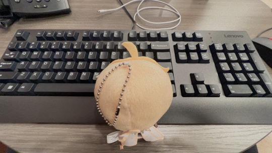
claw machine date with aether!! >:))

#koriyue.txt#aefer cham explores the world!#AND HIS NEW FRIEND MOOMIN!! :DD#i also won . a massive chonky totoro :>#A SUCCESSFUL DAY!!! :DDD#a girl recognized aether and started talking to me about genshin :)))
20 notes
·
View notes
Text
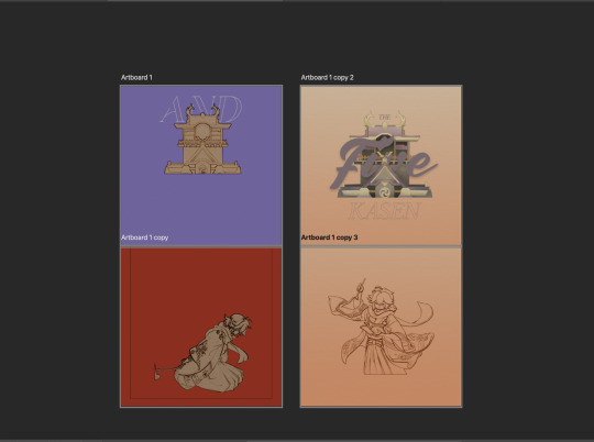
the five kasen graphic — process work

hiya!! welcome to another (unnecessarily long and convoluted) breakdown of my latest graphic: the five kasen :>
details under the cut! (initial thoughts + inspiration / rough outline / brainstorming / scrapped designs + concepts / motifs + colours / concluding thoughts)
INITIAL THOUGHTS & INSPIRATION !
this little brainworm began wiggling as soon as i finished playing through the irodori festival,,, seeing all the characters together and interacting made me so happy,, and the story of the five kasen was so interesting that i had to make something for it.
but i had to sit on my hands for a couple of weeks and just. wait patiently. b/c there were no HD images of the darn tapestry, which meant i had to wait for hoyoverse to release it. and! there were still no official pictures of scaramouche i could use... so i was a sitting duck for a long time.
my plan going into this was simple: retell the story of the five kasen. this concept is similar to my kazuha post a couple of months ago, and since i had so much fun doing that, i knew i had to do it again!
ALSO! a huge, ginormous part of me wanting to make this graphic is because i saw the picture of kazuha smiling with the little blushies on his face and i just :( i had to do it :( he was too cute :( i love everyone equally
again, i wanted to experiment with textures and layering to create this. i wanted to use brighter colours and really make the entire thing pop!
overall, this project ended up being 1,328 layers in total and took me around three weeks to complete!
ROUGH OUTLINE !
whenever i retell a story, i always use the original dialogue and script from genshin. usually, i transcribed the story teaser released by mihoyo and begin to edit some of the lines. oftentimes, it's me choosing to scrap a majority of the audio until i'm left with a couple of outstanding lines that become the guiding structure for my graphic. here's what all of my rough planning looked like:
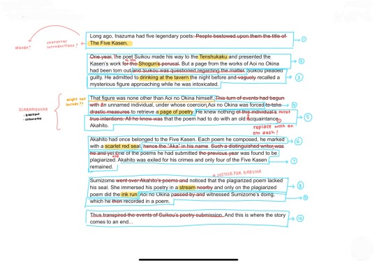
i cross out all of the unwanted text in red.
i use the yellow highlight to emphasize words that may be accompanied by imagery.
every blue box was a potential line that got its own image.
pink is for additional ideas that i may have.
as you can probably tell, a lot of the dialogue i left in the rough outline didn't make it to the final design. i wanted to use imagery to tell the story, and implemented a lot of the text into different motifs! for example, the line "[Suikou] admitted to drinking at the tavern the night before" was kept in the final design. however, i chose to remove "the night before" and implicitly showed that by including a dark background and a moon in that image!
BRAINSTORMING !
i went into this thinking that i would replicate traditional Japanese scriptures and woodblock prints. faded colours, cream coloured paper to mimic old scrolls, running ink, grunge, nature symbolism.
a customary pinterest board of some inspiration!
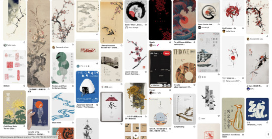
even though i was so dead-set on recreating the style of japanese paintings and calligraphy, i found it really hard to convey my ideas. i thought the colours looked too washed out, or the subject matter too difficult to work with.
so, despite all of this, i decided to rework my original idea and stick to a brighter background, and allow myself to step outside of the style. it took me a week of floundering back-and-forth between this decision before coming to it (grr,,,)
SCRAPPED DESIGNS & CONCEPTS !
hoo boy! the most frustrating (but also most interesting) section of this! i decided to keep all of my scrapped designs to show how one idea might change or stay the same throughout the process!
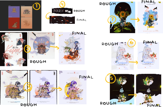
ONE:
tried to use an orange / taupe base for the design and it was too overpowering for a lot of colours. tried to remedy it by making the backgrounds bright n' vibrant, but it made designing layouts way too hard!
TWO:
i absolutely HATED the original design. i really thought i came up with something great with the petals and the border.... yeah it didn't really work out... it looked too crowded, and there were too many awkward spaces. i liked the petals though! in the second design, i tried using a square canvas again + tried again with the painting motif (for albedo <3) but... i thought the tenshukaku building NEEDED to be with the next line of dialogue.
sidenote: i finished this image first, but ended up remaking the entire thing after the entire thing was done. i was so... frustrated with this design too because i honestly had no idea how to fix it. i sat and stared at my laptop for hours trying to fix it because i really liked the font i used for the title...
THREE:
HATED THIS ONE TOO!!!! it looked way too dull!! what's the colour palette?? i tried to make it messy, but it looked.. too messy?? does that make any sense?? i had the hardest time reworking this one b/c i couldn't grasp what colours i wanted to use
FOUR:
first one looked too... clunky? basic? shrugs. i remade it to look like blackout poetry instead!
FIVE:
gr GR GRGGR THE BLUE! OH GOSH! the light blue didn't sit well with me at all! the liquid is supposed to be sake (which, FYI kitty, isn't blue but okay!). the little wave also looked weird too—i wanted venti to kinda surf on the wave but it wasn't meant to be :<
SIX:
nothing too drastic! i already had a ton of trouble designing the first one, so i just made it more vibrant!
SEVEN:
.... i. i really thought i had a good idea for the first design. it was supposed to be a cool pop-art design with a vibrant blue background, and scaramouche's silhouette in the back! but! it was way too crowded, and i couldn't fit the text anywhere :( i was kinda disappointed b/c i spent hours making that scaramouche silhouette and i couldn't slot it anywhere :,)
motifs !
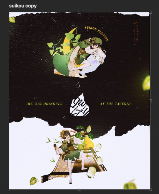
venti (suikou) "green light"
to represent his name, green glow and lanterns were used
his section is the only section that has a black background. this, paired with the moon, emphasizes that this entire story begins in the dark of night. venti's confession is the light that exposes any hidden secrets hidden within the dark.
the darkness in this section also directly references, "he was drinking at the tavern the entire night."
pears represent abundance and sustenance. i thought it was fitting, since venti seemed to be having a blast at the tavern!
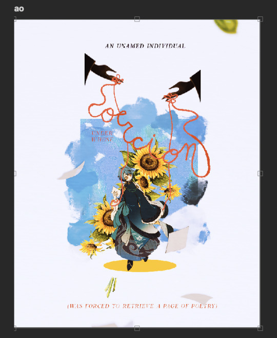
xinqiu (aoi no okina) "elder of sunflower"
sunflowers! to represent his name! the yellow was also a lovely contrast against the shades of blue!
the puppet strings around him indicate his role within the story: a liason that was coerced. there is a mastermind behind this story and it doesn't seem to be xinqiu...?

kaedehara kazuha (akahito) "scarlet man"
the little blue bird on his scarf is him! (my personal headcanon) is that his poetry is like music! it sings and comes to life. it's bright and lively, like a little bird! is this canon? technically... no. but i can dream.
the ribbons are used to symbolize his initial status as a poet. he was celebrated and his words were treated like gifts (neatly tied together with a bow).
however, the ribbons that once showed his status became the very chains that tied him up. glory is only given to those that deserve it.
the red flowers—higanbana—are also called "flowers of death". they symbolize akahito's death as a poet, and his exile from the five kasen.
and lastly (my favourite motif!) are the black feathers! they are meant to represent feathers from the fallen black swan—akahito. this motif comes from the movie black swan, where it is said that "a dancer dies twice—once when they stop dancing. and this first death is more painful." a part of akahito died the day he was accused of plagiarism.
(i cried making this and i cry thinking about akahito and how painful it must have felt during his exile)
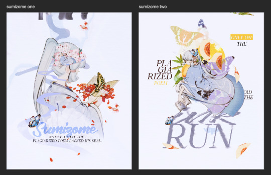
kamisato ayaka (sumizome) "ink-dyed"
the stream directly reflects her actions as she begins to dip the plagiarized poems in water.
the cherry blossoms symbolize renewal and new life. by proving that akahito did not plagiarize, she breathes life back into his art
it is believed that butterflies also symbolize death and rebirth. she witnessed both the death and rebirth of akahito.
the peach, oftentimes associated with momotarou, is known to ward off evil. the fruit also symbolizes feminity! sumizome is as smart and strong as she is beautiful <3
the smudges and ripples also represent her name and her actions within this story.
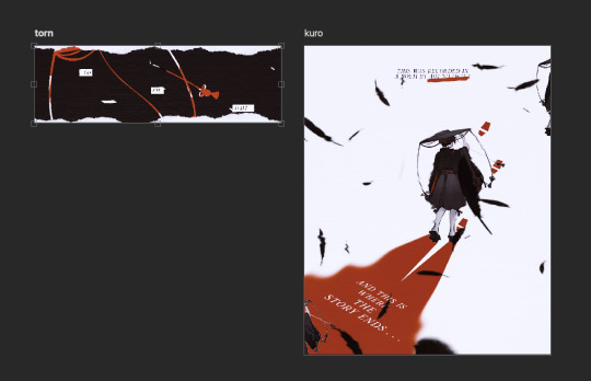
scaramouche (kuronushi) "black lord"
the red ribbons / string seen in his section tie together the entire graphic! throughout the piece, you can see red ribbons (the puppet strings, the "torn out" graphic, akahito's exile)—the events of the story are all the result of kuronushi's actions! he is the one who frames akahito and changes his red ribbons to red rope. he's the puppetmaster who got away.
the black feathers come back in his section to highlight his participation in plucking off akahito's feathers. he clips the wings of (once) flighty birds until they are grounded and caged.
CONCLUDING THOUGHTS !
this piece is my little problem child. we had a lot (and i repeat: a lot) of issues along the way and i almost considered scrapping it entirely. i spent days grieving about the design and disliking many of the ideas i would come up with. but! i'm very happy with how everything turned out! whoo!
hopefully i was able to do this story justice, haha :> i really enjoyed playing around with different motifs and trying to mix the genshin art style and my own!
ps. please don't tell me that my scrapped designs are better than my final ones LOL i will burst into tears! thank you!
#koriyue.txt#*gfx process#*tut#wa wa wa WAAA IT'S HERE!!!!#cradles this to my chest <3#my blood sweat and tears....#RIP MY SCARAOUCHE SILHOUETTE PRESS F :(((#also sad that i couldn't stick in an albedo easter egg anywhere :((( i'm sorry calx i wuv you#me: i love kazuha! also me: and what if i make his about DEATH
34 notes
·
View notes
Text
??!?? THE FATUI HARBINGERS???? [rest]
#koriyue.txt#the first day i get wifi back and they punch me in the gut OKAY?#im calm . im calm im .#BITING MY FISTS KSHDSKGLDJ CSA DHD#if bad why hot#PANTALONE#????#ARLECCHINO???!????&?$?$??#IL DOTTORE#childe .#hLePSPFISLFS#🧍♀️🧍♀️🧍♀️#it’s over it’s actually over
18 notes
·
View notes
Text
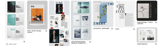
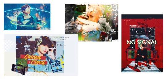
how it started vs. how it's going

#no <3#koriyue.txt#🤡 the first draft#why. why does it look like that#how did this happen#was really trying to mimic magazine layouts / b&w colouring with diluc#and then my brain just said#jazz hands look at my rough drafts! :>#sighs dreamily... i would love to post write ups of my thinking / editing process for some of these edits... if anyone is interested...#THE FIRST ONE ISN'T EVEN CENTRED LMAODSOKF#this is 99% of the stuff i make actually
37 notes
·
View notes
Text
i already miss the irodori festival :<
#NOOOOOOOOOOO HOW COULD YOU#koriyue.txt#ehehe another wip!!!!#do i know where i'm going with it??? nope#i showed my friend kazuha and she went#and honestly SAME#this is my coping mechanism
24 notes
·
View notes
Text
am i allowed to.... post some cute kazuha scenarios i wrote... based on my experience at the tulip festival.....?
20 notes
·
View notes
Text
hihihi might fool around and design a 5wirl album :)c
#koriyue.txt#o boy o boy#the idol!au runs deep in my bones#now that i have one (1) pic of heizou maybe i can make it happen nyahsyahyaaa
9 notes
·
View notes
Text
heading to an anime con with my friend and both of us made bingo sheets for potential cosplays we’ll spot :)c
mine:

hers:

#koriyue.txt#weHEHEHEHE#the xiao is for me#i want to see a xiao cosplayer and ask them to hold my hand#may the best man win >:))))
7 notes
·
View notes
Text
pov you watch me speed run the chasm for spare primos with tears in my eyes b/c mistsplitter leaves in a week
11 notes
·
View notes
Last Seen Blogs
suitalist-blog
SuitalistArts

smithlawfirm
Smith Law Firm
lpggasbottles
LPG Gas Bottles UK
dying-beautiful
skinny is so hard