#i really did not need to buy more manifesto albums but it was worth it bc i pulled a super cute jake pc and jay selfie pc
Text

someone take the enhypen albums out of target this isn’t a joke anymore 😭
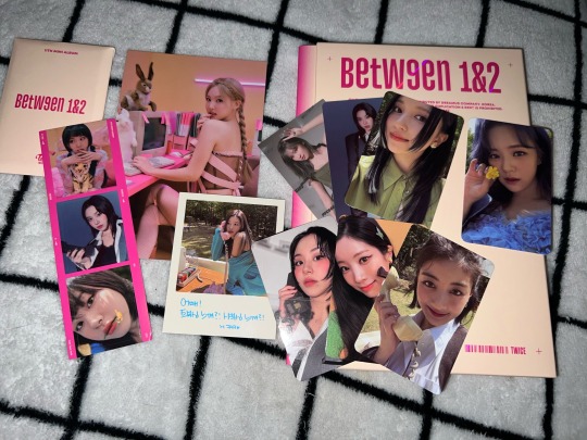
#i really did not need to buy more manifesto albums but it was worth it bc i pulled a super cute jake pc and jay selfie pc#both of which i’ve been wanting so bad 😭#(the jake is going straight to my phone case 🫶)#and both the niki and the heeseung pc i didnt have so 🫶#i bought these mainly bc i thought they would complete my second set of albums (bc i have a spending problem when my ults are in target)#but when i was putting the pcs in my binder i realized i never bought a second normal d version (mainly bc i don’t love the concept)#but not having it fills up three pages perfectly 👀#which is very satisfying but as i said i have a spending problem when my ults are in target so i might buy it bc i’m crazy 🤡#also got a between 1&2 album bc it was the last one and i don’t own any twice albums (other than nayeon’s solo)#and the three outside cards (mina jeongyeon and jihyo) are so pretty 😭#both the twice album and the d engene version were a little beat up but i didn’t really care tbh#anyways these were surviving fall quarter/early birthday presents to myself 🫶#also i’m too lazy to watermark these so pls don’t steal them to scam people 🫶#enhypen#twice#album pulls#cay.txt
1 note
·
View note
Text
Episode 114 : Enter The Midnight
"...we fighting back - sorry Martin."
- Erick Sermon
This month marks twenty-five years (!) since the release of two monumental albums - "Midnight Marauders" by A Tribe Called Quest, and the Wu-Tang Clan's "Enter The Wu-Tang (36 Chambers)". I still remember going to buy each of these albums which have had a huge influence on me over the years, and I thought that this episode would be a good time to feature them both. We have a mix of original tracks, alternate versions, covers, and original samples, alongside plenty of other tunes to keep your head bobbing!
There are still a few tickets left for Schoolly D and DJ Code Money on December 15th in Manchester - but you might want to be quick!
The Mouse Outfit are playing an Xmas special at Band on the Wall on December 18th - a few advance tickets left for that one too.
See Children of Zeus on tour!
Twitter : @airadam13
Playlist/Notes
Minnie Riperton : Inside My Love
An excerpt of a soul classic from one of our departed greats. Minnie Riperton was well capable of singing well into the whistle register, and demonstrates that to spectacular effect at the end of this track from the essential "Adventures In Paradise" album, which I first encountered as part of "Lyrics To Go"...
A Tribe Called Quest : Lyrics To Go
This sample use was absolute genius. When I first heard this as a teenager I didn't have a clue that the high tone running through the whole track was actually a singer and not a keyboard, and it still stuns you the same way twenty-five years after release. Perfect production, together with Q-Tip and Phife (RIP) on the mic, make this album cut from "Midnight Marauders" every inch of a classic.
Funky DL : Midnight
London's Funky DL first came to popular notice as an MC, but clearly also has major skills as a producer, arranger, and keyboardist! His "Marauding At Midnight" album is a tribute to "Midnight Marauders", with instrumental versions of every track played with no sampled breaks/loops - just instrumentation, as well as backing vocals. "Midnight" was one of my low-key favourites on the original LP, so it's great to hear his take on it here. I couldn't resist the opportunity to cut a few samples over the top :)
Wu-Tang Clan : Clan In Da Front
On my first listen to "Enter The Wu-Tang", this was the track that made me know for sure that the album was a classic. The Wu members regularly battled to see who would get to be on any particular RZA beat, and you can hear for yourself how undeniable GZA was on this one - one of only two tracks on the album to feature just one MC.
The ARE : Clap Ya Hands
The "Manipulated Marauders" project is much older when I look at the release date (2007) than it feels, but still gets solid play from me on a regular basis. The ARE tears up the classic Bob James "Nautilus" sample amongst others to bring some freshness to the familiarity of the Tribe "Clap Ya Hands" track from "Midnight Marauders".
Rockwilder ft. Erick Sermon, Method Man, and Redman : Clutch Reloaded
I missed the original version of this track, but this remix is absolute fire! This might be the most aggro I've ever heard Erick Sermon, and I can't be the only one struck by the combination of "bunch a n****s walking down the block like it's Selma" and the lyric that gave us this month's epigraph. Following Erick, the match made in blunt smoke, Meth & Red, continues the lyrical assault, and Rockwilder's beat is a banger that reminds you of a classic sample atomised. A must-purchase!
Ice Cube : Arrest The President
The man who brought us "I Wanna Kill Sam" back in the 90s is back to burn and has absolutely no problem going in on Mango Mussolini! Atlanta's Shawn Ski provides a stomping, horn-laden beat while Cube calls out Agent Orange for being an asset of Russian intelligence, and his general devilish behaviour. This tune definitely puts you on notice for the upcoming "Everythang's Corrupt" album.
[DJ Quik] Nate Dogg ft. Eve : Get Up (Instrumental)
One of those singles I somehow picked up a couple of a while back and still barely play! The first single from Nate Dogg's third album, it's not crazy but does have that Quik flavour and the beat a good bridge between the bombast of the Cube track and something a little more subdued...
Public Enemy : See Something, Say Something
I was looking for something funky in this spot and this fit the bill perfectly. Chuck D is from the right kind of era to know what to do with a groove like this, and has the experience and intelligence to drop wisdom all over it. Gary G-Wiz is on production on this lyrically clever flip of the Department of Homeland Security slogan, an overlooked track from "How Do You Sell Soul To A Soulless People Who Lost Their Soul?"
El Michels Affair : C.R.E.A.M
Much harder to mix with than I thought, but that's often the case with live bands - tempos are much more likely to shift within the track than with electronically sequenced music! Anyway, this is just one of the many great Wu instrumental cover versions from El Michels Affair, who gave us this tribute to the 36 Chambers classic on "Enter The 37th Chamber". It's always interesting when a band is sampled by a Hip-Hop producer as part of a composition, and then another band interprets that new version.
A Tribe Called Quest & Busta Rhymes : God Lives Through
The original "God Lives Through" included the voice of Busta via a sample from Tribe's own "Oh My God" on the same album, but he wasn't actually on the track. As he says, he always wanted to rhyme on it and here he gets his chance! This version is from the Q-Tip and Busta mixtape "The Abstract and the Dragon", and here I've just gone with the Busta verse and then Phife's - which is the same as the original, hopefully you own it by now :)
Black Milk ft. Fat Ray and Elzhi : Sound Of The City
Detroit time! Black Milk covers the low end lovely with well-engineered kicks and bass driving this track along. The title track to his first solo LP is a worth headliner, and I always laugh at the shade thrown at Mike Jones at the end of the second verse!
Hall & Oates : Method Of Modern Love
A new one to me, but after reading recently that this was the song that inspired the hook to "Method Man", I took a listen and thought I'd play a snippet here. You hear the first eight bars looped up for a couple of minutes, then we let it go so you can hear the introduction of the chorus - then stop the track and merge into...
Wu-Tang Clan : Method Man (Home Grown Version)
...the tune that drew from it! This isn't even the version from "Enter The Wu-Tang", but an alternate version that was on the 12", and is even more raw and lo-fi than anything on the album. It sounds like it was recorded in a basement and probably was, and I'd bet that this was the original, later re-done for the LP. For the turntablist heads, this is the version Mista Sinista used for his killer juggle - solved a mystery for me!
Cypress Hill : How I Could Just Kill A Man
Classic Cypress! Back in the pre-internet days, some New Yorkers thought this crew were locals from the Cypress Hills housing project, but in fact they were from all the way over in Los Angeles. The first album is still my favourite after all these years, and this track was fierce - a hit without even an attempt to soften up for the radio. DJ Muggs layers up legendary breaks for the beat and even has a few bars on the mic at the start of the second verse, while B-Real spits memorable bars on the kill-or-be-killed lifestyle, and Sen Dog jumps in for the hook. Early 90s heat.
Slum Village (ft. Young RJ) : Nitro
Detroit in the mix again, with the 2009/10 lineup in full effect, along with family member Young RJ on the boards and rhyming as well. The beat actually has a lot of RZA feel to it, and I could easily have imagined this on one of the early Wu albums. No slacking on the mic either, everyone represents and make this a tune worth tracking down - I got it on the "Villa Manifesto" LP, but it's not on all versions so look out for that when buying.
Inspectah Deck : R.E.C. Room
I'd forgotten that it wasn't until six years after the release of "Enter The Wu-Tang" that we finally got a solo album from Inspectah Deck, but "Uncontrolled Substance" did eventually arrive - maybe it needed that incredible verse from the start of "Triumph" to create the momentum! I believe this was the lead single, a tribute to the rec room parties from the Wu's youthful days, with a characteristically Wu-Tang beat courtesy of True Master, who cooked up some great tracks over the years.
[DJ Premier] Gang Starr : Just To Get A Rep (Instrumental)
One of those tunes everyone either knows or really should! I think the 12" will have an instrumental on it, but this is taken from a white label instrumental version of the whole "Step In The Arena" LP.
Air Adam : 13th Chamber
I wondered if this was worth including, but if not now, then when? I recorded this maybe 10-15 years ago, and while some of the plain movie samples were just layered over the top from my DVD collection, everything else comes from the turntables! The bassline is a plain tone being modified with the 33/45 button and pitch slider, the drumming is all done with scratches, and then the kung-fu samples that were available on battle tool vinyl (no Serato back then!) were scratched over the top. This was my tribute to/version of Wu's "Wu-Tang : 7th Chamber - Part 2" from the first album, derived from a battle routine I once developed, and was on my "Sleight of Hand" mixtape - a few of you might still have it!
Please remember to support the artists you like! The purpose of putting the podcast out and providing the full tracklist is to try and give some light, so do use the songs on each episode as a starting point to search out more material. If you have Spotify in your country it's a great way to explore, but otherwise there's always Youtube and the like. Seeing your favourite artists live is the best way to put money in their pockets, and buy the vinyl/CDs/downloads of the stuff you like the most!
Check out this episode!
0 notes
Text
How to design a contemporary book cover
The fine art of book cover design is a tricky one to master. Consider: when the graphics on the packaging of Heinz baked beans are changed, or the typography is modified on the wrappers for Kit Kats, the alterations are barely noticeable to the untrained eye. The design of household brands is tampered with as little as possible.
26 books every graphic designer should read
An even more stringent, no-tampering rule is applied to album covers. No record label would dare think about changing the covers of Sgt Pepper’s Lonely Hearts Club Band, The Dark Side of the Moon or Nevermind.
It appears that the packaging design of baked beans, chocolate bars and pop music is treated with more reverence than the jackets of literary fiction.
Literature is universally accepted as high art, which might lead us to think that the covers of literary classics are free from the need for frequent stylistic updates. Not so. It is common practice amongst publishers to update the covers of the classics almost constantly, in much the same way that Nike updates its trainers.
One of Suzanne Dean’s collaborations with Julian Barnes (left); David Pearson’s 1984 cover (right)
Book cover design challenges
Sinem Erkas has been designing book jackets for eight years, and her typographic covers for F. Scott Fitzgerald’s novels are a lesson in putting a fresh spin on a classic text.
“At the time, Fitzgerald’s stories were out of copyright, so loads of publishers were republishing his books, and I imagined many of them would end up as pastiches. I wanted to avoid that, so instead took the opportunity to draw inspiration from beautiful Art Deco typography and the Jazz Age, but making my own custom typefaces that felt contemporary and hinted at Art Deco rather than looking like they were from the 1920s. There was no budget for finishes, so we decided to stick to a monotone colour palette and uncoated stock.”
The challenge of designing a new take on a ubiquitous text is good news for designers. And even if designing a cover for a new edition of On the Road may not be as financially rewarding as tweaking the Kit Kat logotype, I know which I’d rather do.
F. Scott Fitzgerald series By Sinem Erkas
Designing book covers is in one way like designing album covers: most people do it for love rather than reward. I spoke to some book cover designers to find out more about working in the field.
Why be a book cover designer?
David Pearson is one of the UK’s leading book jacket designers. He studied at Central Saint Martins, and after a period working as a text designer at Penguin, he now runs his own studio. “My inclination to overthink, fuss and fiddle could only be accommodated by the relatively slow-moving nature of publishing,” he says. “Working within constraints – be they because of brief or budget – also seems to speak to my nature.”
Pearson’s career in publishing began while he was at university. “I was fortunate to be asked by my tutor, Phil Baines, to lay out a Phaidon book. Part of the job was to present our ongoing work to the great Alan Fletcher – at that time, creative director of Phaidon – for his feedback.”
Later, during his time setting the type for the interiors of Penguin books, Pearson was to discover that he was working in what he describes as, “a nice, sedate job.” There was room to focus on the detail and lose yourself in the book. Plus: “Nobody really had an opinion on your work, unless you did it wrong.” But this all changed when Pearson began to design book covers.
Jamie Keenan’s typographic illustration for this Franz Kafka cover (left); David Pearson’s design of The Communist Manifesto (right)
In contemporary publishing, the cover is subjected to the same intense scrutiny as any consumer product. It’s also the case that many authors care deeply about the covers of their books. In his acceptance speech on receiving the 2011 Man Booker Prize for his book, The Sense of an Ending, the novelist Julian Barnes paid generous tribute to the book’s cover designer, Suzanne Dean.
He said: “Those of you who’ve seen my book – whatever you may think of its contents – will probably agree that it is a beautiful object. And if the physical book, as we’ve come to call it, is to resist the challenge of the e-book, it has to look like something worth buying and worth keeping.”
Not only must a book cover attract attention by reflecting the content, it must do this online, in bookshops and as an e-book. It must also satisfy the demands of publisher, author and designer – not to mention the book buyer. This is quite a lot to demand of a few square centimetres of card.
Next page: Do you need to read the book to design a great cover?
To read or not to read?
Erkas stumbled into cover design after a “frustrating job as a junior designer working in corporate branding”. Does she always read the book before designing the cover? “Ideally I would read the whole book, if the deadline lets me,” she says. “What I sometimes like to do is read the book only halfway, or three quarters of the way through, before I start sketching some ideas, and then I’ll finish reading it before I complete my first round of roughs.”
For Pearson, reading the text first is desirable, but not always possible. “Ideally, you would read the book – key themes and ideas present themselves so readily that way – but it’s important to remember that the book isn’t always written by the time a designer is summoned,” he explains.
“Often we receive only the vague promise of a book, with design work regularly taking place even before a title is settled on, which is one of the disadvantages of the cover having to be produced so far in advance. In this instance, I would look to speak to the book’s editor or, better still, the author, to try and build a sense of the book’s tone and temper.”
Éditions Zulma By David Pearson
The covers for Éditions Zulma presented Pearson with a particular problem. “It’s important to point out that I’m not a French speaker, and as a result I have to lean on some incredibly visually literate editors who convey the essence of the books to me,” he says.
“This process [of discussing books] plugs everyone into the design process and makes us feel collectively responsible for the outcome. It also ensures that I don’t shoulder all of the blame when the books fail to sell!” Pearson adds that the French book market is less visually aggressive than in the UK, which allows him to create more quietly suggestive covers.
When designing a cover for a fiction title, Faber & Faber in-house designer Eleanor Crow, insists that reading the text is always essential. “I would find it impossible to get the tone of the writing, and a sense of the readership, without it,” she claims. “Also, small details and less obvious, but still significant, strands in the novel might lend themselves to a cover.”
Jim Stoddart at Penguin Press also advocates a close reading of the text. But he adds a caveat. “With new books, the ideal set-up is to be given a finished manuscript 12 months before publication, which allows three months to read, digest, come up with ideas, create visuals, get approval for one chosen route, and complete final artwork.
However, it would also be wrong to design a cover that only makes sense once you’ve read the book. The people we are aiming to appeal to are those that haven’t read the book, that may be browsing in a bookshop and literally know nothing about the book – you may have only two or three seconds to grab their interest before their eyes drift to the next book.”
Next page: Design considerations for shelf appeal and online thumbnail
Books as merchandise
As with any commercial project, the merchandising of books is paramount. Although bookshops were widely tipped to be on the way to oblivion a few years ago, they are making a comeback, and regardless, book covers are designed to have shelf appeal, even if the ‘shelf’ is a page on Amazon.
For Pearson, being aware of related titles is becoming ever more important, since books are often grouped this way in bookshops. “Knowing what you are siding with – or indeed kicking against – can really help get the design process moving,” he says.
“Time-honoured classics are invariably sat alongside alternative editions of the very same book. This can present some exciting possibilities, since your own edition can do something the others are not prepared to, making them look plain by comparison.” You can even remove key content from your own design since it will be ‘filled in’ by those around it, Pearson adds.
Everyone is keen for something visually arresting, rather than giving away every last plot detail on the cover
David Pearson
While many designers complain about the restrictions imposed by retail conventions, Crow strikes a more upbeat note. “It’s quite liberating now,” she notes, “as there has been a great deal more press coverage for book covers than in the past. Everyone is keen for something visually arresting, rather than giving away every last plot detail on the cover.”
This means that covers can be more reductive, and smarter, than in the recent past, Crow continues. “Retailers are keen for things that will look striking in the window, as well as be legible in a tiny thumbnail online.”
Penguin Modern Classics By Jim Stoddart
In developing an update of the Penguin Modern Classics series, Stoddart and his team worked through 100 book covers, a job that involved new picture research as well as new imagery. “I’ve really enjoyed consolidating the covers for John Updike’s Rabbit series by reviving iconic Penguin covers,” he says.
“In fact, the 1960s Rabbit, Run cover featured an illustration by Milton Glaser, which we’ve put back on the cover. We also asked Milton Glaser (now aged 88) to do a fresh illustration for the last in the Rabbit series, which he was kind enough to do for us, completing the circle 57 years later,” he explains.
Next page: Creative media ideas for book shelf appeal
Illustration, typography or photography?
Looking at current book designs, it’s hard not to conclude that illustration is enjoying a fertile period. Coralie Bickford-Smith is widely celebrated for her illustrated covers, which use naturalistic patterns and motifs.
When asked whether she thinks her work is representative of a preference amongst book buyers for illustrated covers, she says, “It is more likely a trend that is coming from the number of illustrated covers coming out of the publishing houses that end up adorning the bookshops, rather than the book buyers making a deliberate aesthetic choice.” Bickforth-Smith adds that the use of photography and illustration on book covers seem to go in cycles of popularity.
Although she has previously used photography in her cover designs, Bickford-Smith isn’t keen on doing so. “A shoot is usually over in a day, and the results are final, bar some great Photoshop work,” she says.
“I like to work slower than that. I like time to consider the idea. I need to stare at rough work a lot. I really think it’s a personal thing. Also, given how I’m obsessed with pattern, right now illustration is a perfect way for me to express those ideas visually.”
The Fox and the Star, written and illustrated by Coralie Bickford-Smith, who also designed Penguin’s Clothbound Classics series
For Pearson, the choice is easy: “I cannot illustrate covers – I have to rope in others to do that – and I’m terrified of photography – cropping other people’s art to fit a cover shape makes me feel sick. That leaves typography, and I tend to lean on it for everything. Using lettering in place of representational imagery can also help to activate reader interpretation – I think we enjoy working for answers.”
Pearson adds that typography also presents a lovely challenge for a designer – to sum up an entire book using such limited graphic means.
“I think typographic covers are great for being timeless, not revealing too much, and they work particularly well if the title is just brilliant,” says Erkas. “Illustrated covers are great for capturing feelings that photography can’t. And photographic covers are great for showing something real, but can also be dreamy, abstract and illustrative.”
Books online and e-Books
Just as record cover designers had to adjust to the loss of the 12-inch square album cover, replaced by the reduced canvas of the CD, book jacket designers are learning to adapt to the e-book format. But what is the role of a cover in publishing e-books?
In Pearson’s opinion, “beyond working as a thumbnail at the point of sale in the online shop”, there is no role for a cover in electronic format. “When the e-book is purchased and installed, there seems no good reason for a cover image at all, especially if it takes up more memory than the book itself,” he argues.
Crow takes a similarly stringent line. “I have never read an e-book. I read manuscripts on an iPad, but a paperback isn’t much heavier than an e-book reader, and I prefer real pages. Our covers are used to sell e-books online in any case. It would be less interesting to buy a book from a list of titles without some visual trigger to hint at the contents,” she says.
An Eleanor Crow’s cover design for Faber & Faber (left); Design by Emily Mahon, art director at Doubleday (right)
For Stoddart, the need for a book to have an online presence is factored into his thinking from the start. “One recent project I’ve been very excited about is an update to the Penguin Modern Classics series, initiated with a casual discussion about whether we could make [the series] more visible as online thumbnails.”
“This is a contentious issue – many people will argue that more and more books are bought online and their visibility at a small size is fundamental. Yet books listed on websites are usually accompanied by text, a reiteration of title and author, and a bucket of metadata.”
To find a solution, Stoddart turned to colour. “A recent update of the Modern Classics template uses Penguin ‘eau-de-nil’ – a muted light turquoise which has evolved from other parts of Penguin’s history. This eau-de-nil is a beautiful colour that works well in the flesh and online. I’ve moved it onto the spines (which were an all too crisp white) and the back covers, and have used it as a brand note on the front cover titling.”
It’s flashes of creativity like this that keep the field exciting. “If all bookshops ended up having to stock books with giant titles and images, the world may as well be over,” Stoddart concludes.
This article originally appeared in Computer Arts magazine issue 270. Buy it here.
Related articles:
How to design the perfect book cover
10 great uses of type on book covers
How to design a book cover in InDesign
This post comes from the RSS feed of CreativeBlog, you can find more here!
The post How to design a contemporary book cover appeared first on Brenda Gilliam.
from Brenda Gilliam https://brendagilliam.com/how-to-design-a-contemporary-book-cover/
0 notes
Last Seen Blogs

smile4friendz
‼ I POST SMILING FRIENDS SPOILERS ‼

nerdmain
L E A D E R

wareeee
Wareee🌸

n-sync
*NSYNC

michellex00
Untitled