#i just keep sketching until I find that shape that makes the lightbulb in my head spark up !
Note
Do you have any tips for figuring out your silhouette and shape language? Is there someone you take inspiration from, or is it just intuitive?
Find asymmetry where you can - Keep one side of your shape simple, and the other complex. Negative space is your friend. Don't settle on your first sketch. Keep pushing your shapes until they excite you.
#I had a very no nonsense figure drawing teacher in my first term of school#I remember one time he was doing a demo for us (drawing a figure) and suddenly he went#'this shape makes me excited'#and I still think about that today#because it was the first time someone had put it into words#the feeling I get when I find a shape that is inexplicably pleasing#it is so exciting !#so to answer - yes I guess it is very intuitive for me#i just keep sketching until I find that shape that makes the lightbulb in my head spark up !#trashtalk#anonymous
170 notes
·
View notes
Text
when we stood on the skyline (there was no turning back)
AO3
Sora is born into a world where your heart has wings.
Unique to the person, tuned to their soul, the wing-shaped embodiment of your being sprouts from your back in a shimmer of lights.
Sora loved his Mom’s wings, a pale brown with white undersides that appear in a spiral of green. They were super soft, and she’d use them to shield him from the rain or even the sun on particularly hot days. Sometimes, she’d give him her dropped feathers to play with. He’d carry them around in his pockets to pull out while waiting in line at the store, carefully separating and smoothing out the barbs.
He couldn’t wait for his wings to come in. One evening he spent hours focused, trying to replicate the bright flash he’d seen others use to pull out their wings. For all his efforts he got nothing, not even the barest burst of sparks like Riku sometimes showed when he got excited.
“A person’s wings aren’t quite strong enough to spread on their own,” Sora’s mother consoled him later as she tucked him into bed, “We all need a little bit of help, the wind beneath our wings to hold us up. That’s what your Flight is for.”
“Like you, and Uncle Dylas, and Auntie Emi?” Sora asked.
“That’s right. And once we bonded, that's when I manifested my wings.”
Uncle Dylas lived three houses down in a house that was smaller, but had a giant tree and a truly spectacular tree-house out back that he and Riku played in after Uncle picked them up from school. He made perfect cookies, taught them all the card games there were, and sometimes snuck them dessert before dinner.
Auntie Emi didn’t really have a home, at least that Sora had seen, or maybe her home was their home, or maybe Uncle Dylas’s, whichever she preferred on any given day. He couldn’t figure anything else out since that’s the only place he’d ever seen her sleep.
She also left a lot, though she’d always make it home in time for the big holidays and Mom and Uncle Dylas’s birthday every year. Mom said she had a big job that took her all over the world, and Auntie did bring home really cool gifts whenever she came back every few months. Once she even got him a pocketknife with a big, bold pattern – which was so cool because not even Riku had gotten a knife yet – but Mom took it away and said he could have it back in a couple years.
All of that to say that Mom and Uncle and Auntie were pretty much the coolest people ever, and always seemed to know what each other was thinking, and got to be around each other basically whenever they wanted. If that’s what being part of a Flight was like, then that seemed pretty cool. He’d certainly like to see Riku whenever he wanted.
More than anything, though, Sora just really wanted his wings.
“When will I get my Flight?” he whined.
“Give it time,” his mother laughed, “You’ll meet plenty of people, and when you’re older you’ll find the right ones.”
“Of course we’ll be in a Flight together,” Riku said when Sora brought it up, “Who else is going to make sure you’re okay?”
“Hey! Who says I won’t be looking after you?”
“Anyways,” Riku continued over his protests, louder than before, “We’ll just have to find our third, and then we’ll bond.”
“Yeah! But, Mom says it can take a long time to find your people. She didn’t meet Uncle and Auntie until she was twenty.”
The two grimaced at each other, because that was forever to wait.
“You’ve got a point,” Riku said, “And we already know pretty much everyone on the island. It’s not like we can take just anyone. We’ll have to wait until we can go over to the big island ourselves, at least.”
“Yeah. What do you think they’ll be like?” Sora mused, and their conversation turned to guessing at all the qualities of their future partner.
Their answer came in the dark of the night, in the form of a falling star.
Kairi entered their life between one day and the next, blown in with the tides.
It’s Tidus that introduced her to them, helping her off the boat and onto the beaches of their play-island. She was quiet, watching everyone with foggy eyes and hovering on the edge of their games. She answered Selphie’s questions and smiled faintly at the boys’ competitions and flinched if you approached too fast.
Sora thought she was nice. Riku, he could tell, pretty much wrote her off by the time the second week was over.
It was during the third week, as they were arguing over how to retrieve the ball Sora and Selpie had gotten wedged up between a hut and a particularly large branch, that things changed.
Riku was insisting he could retrieve it himself. He had recently managed to pull out his ghost-wings, glowing spectral shadows of the wings he’d someday have. Like all ghost wings, they could only be pulled out for a few seconds at a time, but he decreed they could give him enough of a boost to help out. He was explaining how he could shimmy up the corner, one side on the hut and one on the cliff, when Kairi cut in.
“Don’t be silly, all you’re going to do is break your neck.”
They all turned to her in surprise to find her frowning up at Riku with her hands propped on her hips. She seemed to waver for a second and then –
Sora watched as a light seemed to flicker on behind her eyes, like a new lightbulb slipping into place, chasing away all the fog keeping her trapped. Rather than giving in, she tilted her chin up and firmed her stance.
“Alright then,” Riku scoffed, “How would you do it?”
Ten minutes later Kairi stood smugly over her spoils as Riku eyed her with grudging respect. From that day on, everything was different.
Kairi fit between Riku and Sora in a way Tidus and Wakka and Selphie never quite managed.
Riku liked that she could keep up when they ran races and got Sora to stop napping. He said she’s cooler than Sora ever was, and smarter too. Sora figured she must be, because Riku listened to her when she told him his plans to supply food for their raft by building in a mini mushroom shed were stupid.
(Later, Sora thanked her profusely for this, because no matter what Riku said mushrooms were slimy and gross, and if he had to live off them he’d die. Kairi giggled and told him he’s also very silly, but she still supported him on the mushroom front, so that’s okay.)
Sora liked being around Kairi because she was warm. She was bright, too, not quite like the sun, but in a way that said everything’s going to be alright, and you never had to be scared of the dark because the light would still be there, even then.
“Like if the sun was a nightlight,” Sora explained to Riku.
“What,” said Riku, from where he’d been drawing raft plans in the sand. After a moment he rolled his eyes, dismissing the remark as more of Sora’s nonsense, and went back to his sketch.
“She is pretty cool, though,” Riku agreed later, “Maybe - maybe she could be our third.”
It didn’t take long for the three of them to agree that they definitely wanted to be a Flight together. When Sora got home, he immediately asked him Mom how they could make it happen.
“Ceremony?” his Mom questioned, turning away from the papers in front of her.
“Like, if you get married there’s a ceremony, right?” Sora asked, “So what about when you become a Flight?”
“Oh! Oh, well, no, there’s nothing like that. A reception later, sometimes, but no ceremony. Why do you ask?”
“We’ve decided we’re gonna be a Flight together – me, and Riku, and Kairi. Now we’ve just gotta make it happen!”
“Oh,” she blinked down at him, spinning in her chair to face him, “Well, like I said, there’s no ceremony. It’s just something that… happens, when you’re ready. Besides, no one bonds at your age. You need time to grow up and find the right people.”
“But why wouldn’t it be Riku and Kairi?” Sora pouted up at her, “They’re my best friends! I’ll never find anyone better than them.”
“It’s not quite that simple, I’m afraid. I met a lot of people I thought were the right ones before I met your Aunt and Uncle.”
“Well, how did you know they were right, then?”
“I suppose it’s like how I knew I was going to marry your father,” his Mom mused, “Only… more. You turn and look one day and realize this is it for you.”
“But I know I want them now, so we should be bonding, right?”
“Perhaps ‘know’ isn’t quite the right word,” she corrected thoughtfully, “It’s more like ‘understanding’. You understand how they’re already a part of you, and the act of understanding makes it real, and suddenly they can’t not be a part of you anymore.”
“What? They become a part of you, but they’re already a part of you? I don’t get it,” Sora grumbles, pouting down at his plate.
“You’ll understand when you’re older.”
#kh#kingdom hearts#sora#riku#kairi#fanfiction#wingfic#wrap your wings AU#Yza writes a thing#I've been working on this for months#so excited to finally begin posting
1 note
·
View note
Photo
Planning
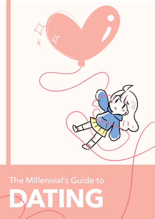
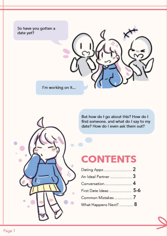
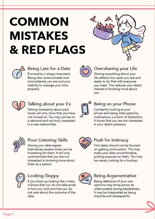
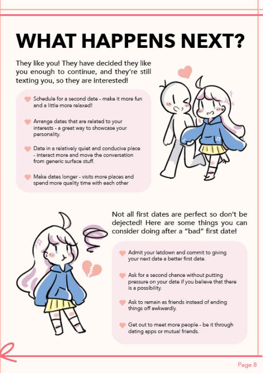
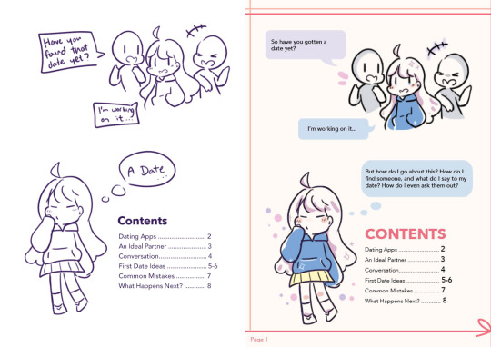
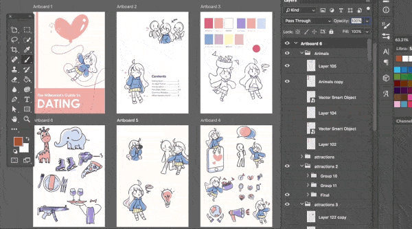
Our group initially planned on creating a guide about dating for Millennials in Singapore. We first came up with the overall content and sketched the layouts of our assigned pages. I was tasked with the Cover, a Comic as the Premise and Content Page.
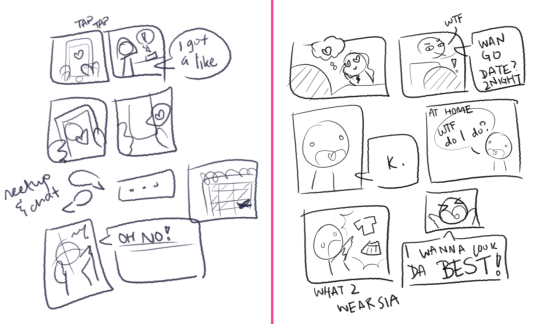
I first came up with 2 comic strip drafts and explained the story to the group to get feedback. They liked the story on the left, which depicts a main character finding a date through a dating app. This established the art style that we were going to use as a cute, cartoon-ish style. Then, I proceeded to draw out the more concrete draft, with a proper layout and text:

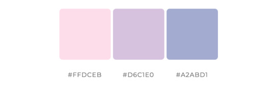
Next, I worked with my group to come up with a general colour scheme. We knew we wanted to use soft colours, and the initial palette was based on pastel pink, purple and blue.
After Feedback 1:
The first feedback was that the comic may be too time-consuming to do. Hence, I decided to scrap it for a much shorter premise for the book. I felt that was enough to introduce our main character, as well as convey our idea of a said main character wanting to find a date.
Our e-book underwent some restructuring in terms of content and flow of pages. We brainstormed and researched for content together to determine the final content flow. We decided to combine the content page with the “comic” so that pages 5-6 could remain a spread of a map. Hence, I came up with a second draft of the content page:

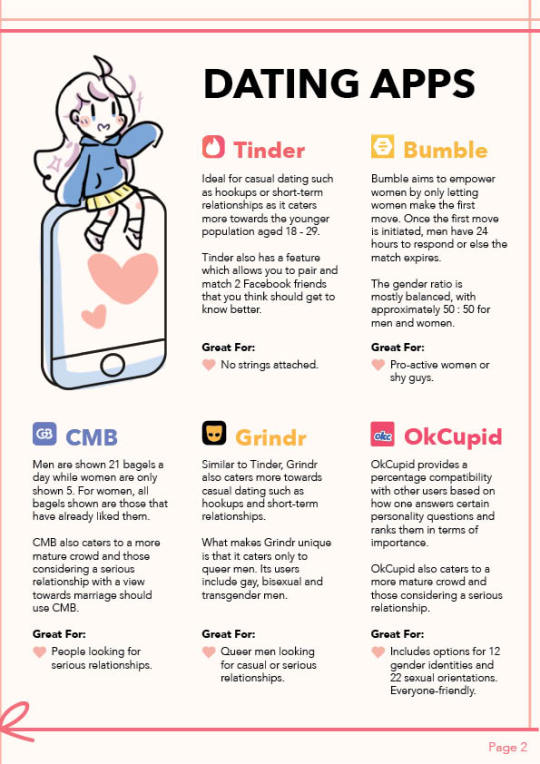
I next worked on character designs. I got inspiration from Pinterest for the stylistic direction of our e-book. I especially liked the style that utilises minimal colours, with cute, hand-drawn, cartoon-ish characters and objects.
My initial idea was to make the main character androgynous, as seen in the first comic sketch. However, I noticed that classmates were more likely to see the character as a girl and suggest adding a male character as a counterpart in their initial feedback. With these references and feedback, I proposed the main character (coloured):

Whilst creating the cover page, I felt that the colour of the girl’s hoodie did not stand out because the cover had a lot of pink and white elements. So I chose a darker shade of blue instead. I also did up the graphics for the content page:
Art Direction and Graphics
With my pages settled, I begin my role of maintaining the art direction of the e-book. I compiled a list of graphics of the girl that my members needed for their pages so that I may start to draw them. I also devised a way to keep the style of icons as similar as possible. Because there are many people working on the design, having everyone submit their own completed graphics would have been rather disastrous for the art style. Since most of the group enjoyed creating flat icons, I proposed that they sent me the vectors of their icons and I would add colour to them.
I did this by importing the vectors (without fill) from Illustrator to Photoshop and colouring on a layer beneath the vector outlines. We decided to standardise a basic black stroke for our icons. By standardising the colour palette to just 3 colours and applying colours in a stylised manner, I managed to achieve a style that worked coherently despite different people handling the outlines. The colours chosen were analogous colours that complemented each other and of different tonal values to ensure that the coloured icons did not look too flat.

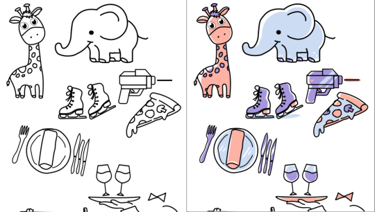
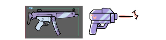
We encountered the problem of different art styles when one particular line work stood out more than the others. It did not really follow the cutesy style we had going. To solve this, I worked with the groupmate to select some references from Google and redid the graphic in a more suitable style:

Compiling the e-book
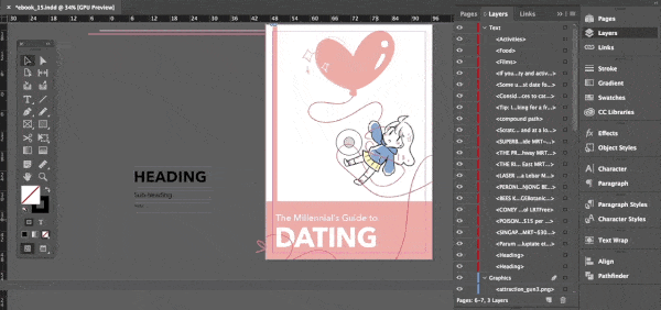
Whilst the rest of the group were working on their pages, I set up the InDesign document to be used and inserted completed graphics first. I created a border made of red-pink lines and a ribbon and included page numbers and a Snow background in the Master page. I also set up character and paragraph styles to standardise the text in the e-book.

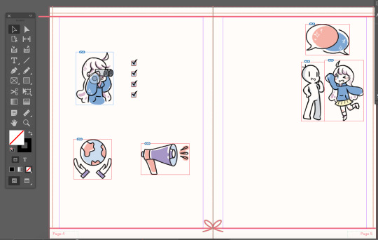

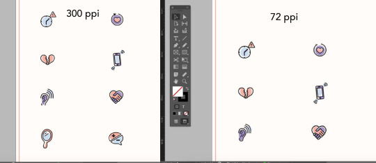
After my group members transferred their Illustrator files to me, I coloured and exported the icons in .PNG as it preserves transparency. Most of the graphics were done in 72ppi as the e-book was not meant to be printed, and that resolution was good enough for web-browsing. However, I found that some icons lose a lot of quality when exported and recoloured them in 300ppi instead. (It is a bit difficult to tell from the image below, try this link instead)
Our group met up on Zoom to work on the e-book together. Since only one person could work on the file at a time, I shared my screen with the group and started compiling all the content. Everyone chipped in by giving feedback on where edits should be made to improve the design. For example, the content on page 3 was divided into 2 sections but did not have a clear-cut distinction between the sections. Some groupmates pointed this out and I added a pink divider to solve it. This was a team effort.
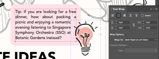
I utilised the text wrap function of InDesign to subtly give text boxes a more interesting look. Since the initial idea was to have a lightbulb overlap a text box, I decided to wrap the text around the lightbulb’s bounding box.
After exporting the e-book to .pdf, I opened it on my macbook preview and found that the colour had changed slightly. I did a bit of research and learnt that different software rendered colours differently. I then tried to open it on the Google Chrome browser and the colours looked correct. Remembering that our e-book was to be viewed on both laptops and mobile, I opened the file on the Google Chrome browser on my iPhone, and it seems the colour looked different as well. The page was more yellowish and the pink was duller. This could be due to the settings for my device’s screen. Therefore, I concluded that the e-book should be viewed on the browser of a laptop or desktop.

After Feedback 2:
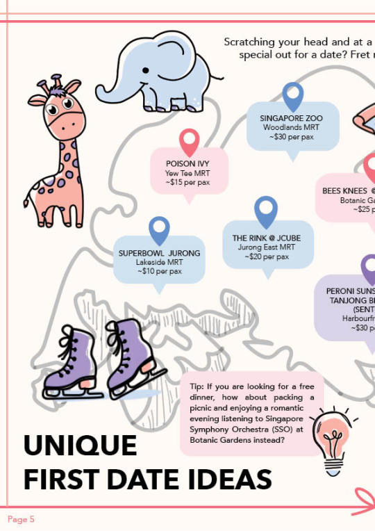
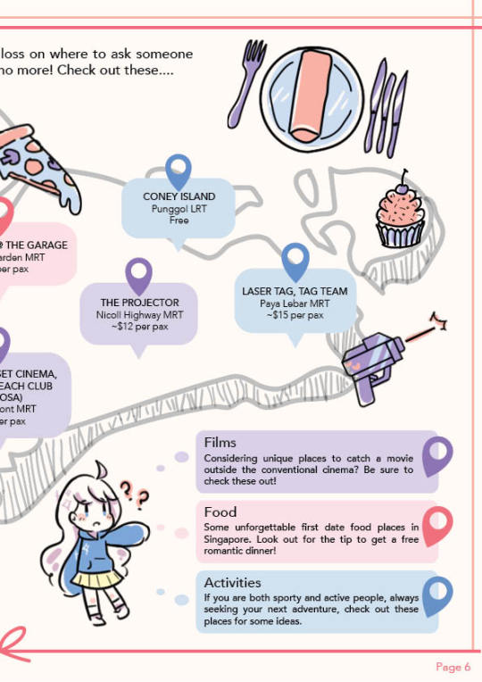
One main feedback we got concerned the map page. The outline of the map appeared to be too light and difficult to notice, and the legend looked too much like the bubbles accompanying the geotags.
To fix this, I worked with my groupmate to come up with a few edits to the design of the map. We removed the waiter graphic and shifted the legend down. We also added more content to explain the 3 different categories we had. Finally, we changed the colours of the corresponding geotags on the map to further emphasize that they belonged to their respective categories.

Another feedback we got was the inconsistent spacing between the heart-shaped bullet points and the text beside it, which I promptly fixed.
Challenges
One of the biggest challenges I faced was collaborating on the style for the e-book. Up until now, most of my design works have been solo projects which gave me full control over the design. However, with groupmates, we have to adapt to each other’s styles and sometimes that involves sacrificing our own preferences.
To make things easier, I proposed the workflow and a simple style that I felt was both appealing and easy enough to work with given our project constraints (deadline, inability to have physical meetings, lack of software for some members). I was lucky to be in a very helpful and accommodating group, though keeping the style consistent was a rather persistent problem we faced. Since I was in charge of compiling most of the pages and graphics, it was extremely time-consuming.
Another problem we faced was broken links when passing the InDesign documents around. We did minimal transferring of files. When we did, we found that links sometimes got broken. To fix this, I suggested using InDesign’s package function and explained to the group why links broke and how to fix them. We zipped the packaged folders before sending them to other groupmates. Since I am working on an earlier version of Indesign, I learnt that I should use the .idml files to open the document instead.
Design Document
I helped out with the Design and Layout, Production, and Reflection sections of the design document. Since I handled most of the InDesign and compiled graphics, I helped to add the more technical parts of the design document. I also explained the design principles our group used in our e-book.
Workspaces
Better quality gifs can be found here: ID | PSD
4 notes
·
View notes
Text
Before & After: Grace and Julia’s Pink Living Room Makeover
New Post has been published on https://craftsguideto.com/awesome/before-after-grace-and-julias-pink-living-room-makeover/
Before & After: Grace and Julia’s Pink Living Room Makeover
One of the things I’ve always wanted to do is have a totally pink room. Like top to bottom, all pink, all day. And it wasn’t until this year that I decided it was time to give it a try. Pink is a tricky color. Like yellows and purples, it genuinely alters depending on the time of day, sunlight, and undertones of the paint. But with Julia’s encouragement, I decided it was time to lighten up our deep green living room and go for a complete and total makeover. Thankfully, with some help from the team at Lulu& Georgia ~ ATAGEND( and a TON of DIY help from Julia, more on that below ), we were able to turn our room from a dark space in need of a little energy and life into a sunny, colorful room that builds both Julia and I smile every hour we walk in. So, let’s start the tour! xo, Grace
“After” photos by Kelly Merchant
The difference between our room then and now knocks my socks off. The power of a totally different paint color to transform a room should never be underestimated. We went through so many pink paint policy options and objective up combining our two favorite colors (Literally! In a giant plastic bucket !) to create this warm, saturated pink. See our testing below :P TAGEND
The objective result was us combining Benjamin Moore’s “Teacup Rose” and “Sunlit Coral” to create a color that, in the daylight, is the most heavenly and warming tint of pink. At night it veers a little into Miami Beach territory, we are therefore altered our lightbulbs to cooler styles to help tone that down a bit. I’m so happy with the seem, and even happier we decided to go monochrome with it — we painted the doors, trim, and heating units, too, so they are able to all blend in. It’s a seem( not in pink, necessarily) that we are presented in a lot of older the house and have always wanted to try in here.
What genuinely brought this room to life were two major pieces: an unbelievable L-shaped sofa and this gorgeous striped rug. Both pieces are from Lulu& Georgia and they are much more modern than I’ve ever gone for at home — and I love it. I’ve always run for traditional rolled-arm sofas, but this clean, modern style( called the Chareslton LAF, similar models here) feels so much lighter. And yes, I know puppies+ a illumination coloured sofa= stains and mess, but we got used to that a very long time ago. I basically invest in Nature’s Miracle spray in bulk and have learned to embrace a perfectly imperfect( and often dirty) sofa as a part of living with animals we love to pieces.
The rug that brings this space together is the Nurae Rug in Rust from Lulu& Georgia ~ ATAGEND. I’ve been gravitating toward a pink/ochre/rust color palette for a while, so getting to bring these colours together in this space was so exciting. Hope is fully in love with the new beige sheepskin, too. She is the queen of a comfy sleep spot.( Julia made our simple coffee table from a leftover piece of IKEA butcher block we had from our old Brooklyn apartment years ago ).
These colorful pillows from Lulu& Georgia ~ ATAGEND were such a nice bit of coloring for the sofa, but I also want to talk about the DIY aspects of this project, too. Like the artwork above! Julia made the wooden sculpture on the wall, while I decided to frame some of my favorite collected bits of Japanese indigo fabric( all in affordable frames from IKEA ). In addition to the sketches of Hope and Winky that friends induced, you can also find one of the prints we induce ourselves! More on those below…
When we talked about decorating the walls in this room, we knew we wanted to keep things personal. I didn’t want to buy anything “just to fill a space, ” so we decided to go DIY and got a block printing kit from Michaels and made our own simple artwork for the walls. Ours are the black and brick-colored publishes. I got a little frustrated at first, but Julia persevered and we discovered our groove and aimed up with a handful of beautiful, large pieces we could frame and feel proud of. Among the mixture are a huge hand-tied knot we found at an artist market a few years ago, watercolours of the americans and the pets by Alessandra Olanow, and a stack of photo albums( one for each pet and one dedicated to our late friend, Georgine) that we cherish.
Speaking of DIY, one of the most important one undertakings in this room was a huge behind-the-sofa table that Julia and I built together (seen above ). It’s made from plywood and a whole lot of elbow grease. It took us about two days to get all the cuts right (there’s not a single straight-out or un-bowed wall in this room ), but I’m so proud of the clean, streamlined piece we made and how useful it is for drinks and snacks we want to keep away from the pets while we’re eating and watching TV.( Although Hope has now taken to sleeping on one side of the table because she misses being right up against the window. Dogs .)
Speaking of artwork, we moved our dog portrait by our friend Sasha Israel to our entryway and used this great space to celebrate an incredible print by Lily and Hopie from Blockshop Textiles ~ ATAGEND. It was so much better fun getting to know Lily and Hopie during their photoshoot for In the Company of Women and it means so much better to have artwork that is connected to people we know and love. The publish is meant to be hung vertically, but we tip-off it sideways while working on the anchors and fell in love with this horizontal orientation and ran for it.
I also decided the old hardware store handles on our built-in credenza needed an upgrade, so I bought some inexpensive raw leather online and induced new manages utilizing brass fuckings and a hole puncher. Voila! Easy DIY makeover.
This little corner of our living room has always been a bit dark and hodge-podgey, so we decided to bring a little extra light to it with this pennant Cydney Mirror from Lulu& Georgia ~ ATAGEND. It’s nice to see some of our DIY artwork reflected back at us.( I still want to strip both sides of this doorway down to the original wood, but that’s a project for another day.)
This corner makes me laugh every time I look at it. Mainly because I asked for feedback online about what to do with it( because I was feeling frustrated and confused about how to make it more functional) and despite so many great ideas, we still haven’t committed to anything because nothing has felt 100% right yet. And while I love a fully “finished” makeover, I don’t like adding things merely to fill a space. So for now, this corner has a cozy sheepskin chair and plenty of room for Winky( our puppy) to hide all of her tennis balls. One day I think it would be nice to add a textured wall hanging, or maybe even a mobile, but for right now I’m running to let this space breathe and merely be empty for a bit.
Thanks for joining us on our living room makeover tour! And thank you to Lulu& Georgia for our new living room decor! xo, Grace
Sourcing :P TAGEND
From Lulu& Georgia: Charleston LAF Sectional, Nurae Rug in Rug, Beige Sheepskin fling, throw pillows, sheepskin chair and mirror.
Sconces: Brooklyn Bulb Co.
Walnut Lamp: Amish stimulate turned walnut lamp from Canvas Home (circa 2010)
Artwork: Our living room features a mixture of DIY artwork we stimulated with a Speedball publish kit, as well as pieces by Blockshop Textiles, Veronica Corzo-Duchardt, Carson Ellis, Alessandra Olanow, and a poster from a 1968 Andy Warhol show in Stockholm. Most of our frames are from IKEA.
DIY Projects by Julia: Julia made our coffee table from hairpin legs and leftover butcher block counter from our old Brooklyn apartment. She made the behind-the-sofa table employing plywood, she also made the wooden sculpture hanging on the wall from scrap pieces in her woodshop.
Paint: An equal concoction of Benjamin Moore’s “Teacup Rose” and “Sunlit Coral” in eggshell finish. Thanks to our community on Instagram for all the voting and suggestions!
Read more: designsponge.com
0 notes
Last Seen Blogs
a-really-bad-decision
there is absolutely no consistency

nyoomiie
many thoughts

melvmusic
Mel V/ MIA
k1phogwild
kip, notorious rat man 🐁

organized-pandemonium
Roy's Cosplay/Reference blog