#honestly these could be our next mobile headers ??????
Text
Reactions (Bit 13)
Bit 1 | Bit 2 | Bit 3a | Bit 3b | Bit 4 | Bit 5 | Bit 6a | Bit 6b | Bit 6c | Bit 7 | Bit 8a | Bit 8b | Bit 9 | Bit 10 | Bit 11a | Bit 11b | Bit 12a | Bit 12b | Bit 13

We’re getting there ever so slowly. We have some herding of brothers to get through first.
For @soniabigcheese who started this one :D
-o-o-o-
From that point onwards, it was all about family.
Virgil threw himself into looking after his brothers with the same vigour he looked after his ‘bird the five days previous.
There was guilt, so much guilt. He had put himself over his brothers, ignored them even and hid away nursing his own wounds.
Gordon yelled at him about it, but Virgil was focussed on Scott. He had never seen his big brother so down. It was almost as if his fire had been extinguished.
John refused to leave orbit, determined to deploy as much energy and equipment he could into fixing this mess. Virgil let him be. For now. He had plans to later climb up into orbit himself to check on his space brother. He had no doubt the astronaut was running himself into the ground.
Alan was recovering and for lack of a better description, reminded Virgil of a pissed off terrier. Angry as all hell and willing to take on the neighbourhood great dane.
There were words.
Emotional words.
Alan continued to snarl.
But his little brother was now mobile and buzzing around the house in a hover chair. Grandma was keeping an eye on him.
Grandma was keeping an eye on all of them.
Virgil got one hell of a talking to about looking after himself and received chicken soup as punishment. At least he thought it was chicken soup. The cucumber was confusing.
Kayo was simply gone. On the other side of the planet, most likely. Virgil didn’t know exactly where. The few times she contacted the Island, he grilled her on her health status and was ignored for the most part.
Virgil worried.
About all of them.
It hit Scott the hardest. The commander saw it simply. He saw it as failure.
This was their father’s dream and somehow it had all crashed and burned. Virgil regretted his absence in those first days more and more. If he had been there to support Scott...
But he wasn’t.
He cursed himself in every language he knew.
Gordon was almost as much a concern as Scott. The aquanaut was fuming. No sorrow, no fear, just anger. He spent most of his time in contact with various people and Virgil had the urge to ask John to monitor his fish brother’s communications in case he was planning a world coup of some kind.
But as the days wore on the picture of exactly what was happening did become clearer.
The scathing media continued. Jack reported in almost daily, apparently his entire practice had been mobilised across several attack fronts. They were winning several, but the battle appeared to be a long one.
One of the worst moments was when a hurricane hit the Bahamas and Florida. IR was refused deployment, no matter what angle John tried. The astronaut directed calls to emergency services as best he could, even called in a few Tracy favours from the Jacksonville plant of Tracy Industries, their machinery switching to emergency supplies and relief production to help the people in the beleaguered cities to the south, but even that received a rebuttal. The head of GDF communications cut into IR frequencies and demanded Thunderbird Five cease interference.
Virgil had never heard John so angry.
Scott was as cold as the Arctic. “Do as they ask.”
“Scott-“
“Do as they ask!” Blue eyes like ice, Scott’s expression was stone.
So, theoretically, Five stood down.
Virgil was on the elevator within the half hour.
Eos pummelled him with questions all the way through the stratosphere and into space. John had stopped answering apparently, so she was looking for another Tracy to help.
Virgil stepped onto a silent Five.
“Where is he, Eos?”
“Communications hub. I honestly don’t understand, Virgil. Why would they do this? John is trying to help.”
Virgil’s lips thinned as he strode to the airlock that separated the gravity ring from the central hub. John had to know he was there, yet, there was no greeting, no acknowledgement.
Virgil drifted through the lock to find that Five had most certainly not shut down.
His brother floated in a sea of information. Aunt Val’s picture cruised past. Another document with the GDF logo at the top darted over Virgil’s head as his brother threw it across the room.
“Eos, I need the results from breach fifty-nine.”
“Not until you rest.” Eos’ voice was determined. “And now I have Virgil to help me look after you.”
Turquoise flickered in the engineer’s direction. “Virgil.” It was a greeting and a dare all rolled into one.
“What are you doing, John?”
His astronaut brother wove code with one hand while reaching for a document with the word ‘classified’ stamped across its header. “Exactly what you suspect I’m doing, no doubt.”
“John, I thought we had an agreement.”
“You thought you did. I’m only doing what needs to be done.” The coding hand finished something off and with a swipe sent it on its way.
It was replaced with a scroll of information, rapidly accumulating in a simulated pile.
John smiled thinly at it before turning to face his brother.
“What do you want, Virgil?”
If Virgil had been in a gravity affected situation, he would have taken a step back. As it was, he hadn’t gotten his space legs quite yet and was reduced to a half-strangled gasp.
John was ever so pale, his eyes little more than caverns, his usually perfect hair looked limp and straggly, hanging down over his face.
“Have you slept at all?!”
“I’m doing what needs to be done.” His brother returned to juggling information.
A beat and an incoming comm flashed up. “Johnny, Brandy says the orders have come down. The launch is set for next week. We should tell Scott.”
Virgil blinked.
A swipe of his hand and John answered. “No need, Gordon. You’ve just told Virgil.” A pause. “And don’t call me ‘Johnny’.”
The aquanaut startled as, no doubt, Virgil’s image appeared in his office alongside John. “Oh.” A shrug. “Hey, Virg. Whatcha doin’ up there?”
“What are you doing, Gordon?”
“What needs to be done.”
“And what exactly is that?”
“Saving International Rescue. After all, ‘saving’ is what we do, isn’t it, Virgil? We don’t sit on the side-lines while people die.” The aquanaut poked at something out of transmission range. “Johnny, you gonna brief our big brother or let him dob us into Scott and tackle both explosions at once?”
“Gordon…” John’s voice spoke of exhaustion. “I will handle this.”
“FAB. Sending you Brandy’s report.” Another document flashed up, this one with the WASP logo at the top.
Hell.
Gordon’s hologram held his stare for a moment before blinking out.
“John?” Virgil put every bit of big brother he had into the name. He wasn’t Scott, but he hoped he was enough.
The astronaut sighed.
“General Strom has commissioned a new rescue force for the GDF.” John waved a hand and an array of aircraft and equipment appeared, floating in the recycled air. “They’ve called it ‘World Rescue’ and on the surface it appears legitimate. Brains is even impressed with some of the technology.”
Brains? Brains was in on this as well?
Virgil eyed the largest ship in the list. It was no Thunderbird Two, but it appeared formidable. “They don’t have our technology.”
John frowned. “No, they don’t…yet.”
Virgil mirrored his brother’s expression. “What?”
Another sigh and John flicked through a series of documents. “Lady Amelia traced the source of the equipment to a project initiated about the same time we lost Dad. It appears that even then, these people had their eyes on us.”
“But why? Running a rescue organisation is not a money-making exercise. We both know that from experience.”
“It is if you are the only one.”
“But-“
A hand caught his shoulder and Virgil’s eyes widened. John was definitely tired if he was reaching out. “Even if they don’t charge for the service, the GDF will gain popularity. Our popularity, Virgil. We have a huge fan following. You know this.”
“But that is just for fun!”
“Virgil, popularity is the key. That list of our weaknesses is also a list of our strengths. The GDF’s popularity has been inversely proportional to ours. We’re stealing their thunder, literally. This has led to budget cuts and a drop in recruitment. They’ve lost money because of us.”
Virgil blinked.
“They want it back.” As Virgil continued to stare, John swallowed. “But that is only part of the equation.” John let go of Virgil’s shoulder. “The call for expressions of interest is a farce. They have a launch planned for the first fleet next week.”
“Next week?”
“To capitalise on our negative press. The world is calling for a replacement service and they are answering.”
“We’re being replaced.”
“By Jim Lucas and Robotics Industries. Eos has found connections between Lucas and Wainwright. Lucas went to college with her. Strond is the only part of this equation we haven’t been able to fully clarify. His is the position responsible for the project funding. Lady Amelia is working on it.” John’s shoulders dropped.
“You need sleep.”
“Virgil, this is important. Aunt Val is in the firing line because of us.” A frustrated sound. “Because of me.”
Virgil drew in a breath. He knew that their Aunt had turned a blind eye for them on several occasions, particularly where John’s fingers had poked into certain pies that perhaps they shouldn’t have. But John only did that to save lives. Aunt Val knew that. She was their support within the GDF and she took that position seriously.
Even Virgil knew enough to know that was why she had been removed from the picture.
Scott had been in contact. Had thrown Jack at her. Tracy money was doing its best to dig her out of the hole they had dug for her.
“She wouldn’t want you killing yourself over this.” Virgil kicked off the wall gently and caught his brother by his arm. “C’mon, John.”
“Virgil, get off me.” John wriggled in his grip.
The holographic display suddenly shut off, leaving the hub a bleak grey. “You’re not doing any more work, John. I have Five under control. Attend to your bodily needs.”
John pushed him away and Virgil let him. A turquoise glare hit him between the eyes.
“I can look after myself.” He glanced at the camera beside the airlock. “Just let me be. Both of you.”
“I tried that and look what happened.” The AI was defiant.
“Eos, turn the hub back on.”
“No.”
“Eos!”
“No! Listen to your brother, if you won’t listen to me. You need sleep and food. Your vitals are a mess.”
Virgil set himself. John could be as stubborn as the rest of them, and as slippery as an eel. “It can wait, John. You either sleep up here, or I drag you downstairs and you can deal with Scott.” Who was just as bad, but John didn’t need to know that.
“Virgil-“
“No, John. Food, then sleep. If Scott isn’t enough of a threat, I have a direct line to Grandma. Don’t think for one second that twenty-two thousand kilometres is enough to keep her out of your hair.”
Turquoise lit on fire. “Fine.”
Virgil wrapped an arm around his brother. “And after we will look at what we can do.”
John just grunted at him.
Virgil drew him closer and led him from the hub.
-o-o-o-
Next
#thunderbirds are go#thunderbirds#thunderbirds fanfiction#Virgil Tracy#John Tracy#nuttys fandomversary
53 notes
·
View notes
Text
I, a campaign manager
so in addition to being a CTO, a CS major, and a dorm vice president, i was also a campaign manager for 2 weeks (the exact campaign that I was managing is not entirely difficult to figure out if you really want to know, especially if you click on the links BUT i will be trying to not mention it specifically here lol). You might be wondering - (1) why and (2) how did you end up becoming a campaign manager..... you're not even a poli sci/gov/humanities/literally anything vaguely related to this major??
You're correct, yes, how did this happen? Well that's a great place to start this story:
How in the world this happened
Friends drag you into stuff. This happens to be the same friend that dragged me to New York, and then was 20% of the reason I got dragged into the negotiation class, and then was maybe 15% of the reason i got dragged into nonprofit activities? In terms of providing unique opportunities in my life, she definitely takes the cake. So one day, she says "I'm running for this position," and me and the squad says "we gotchu." What does that mean? Clearly wasn't sure in the beginning, but we were texting campaign strategies and slogans and tiktok ideas in the chat for fun. None of us had any real responsibilities, especially since the actual candidates were still weighing the playing field and figuring out their platform.
I also was a course 6, so I guess there was some expectation that I would make the website, even though I didn't actually code the website from scratch.
but anyways, it was actual campaign time.
CAMPAIGN SZN
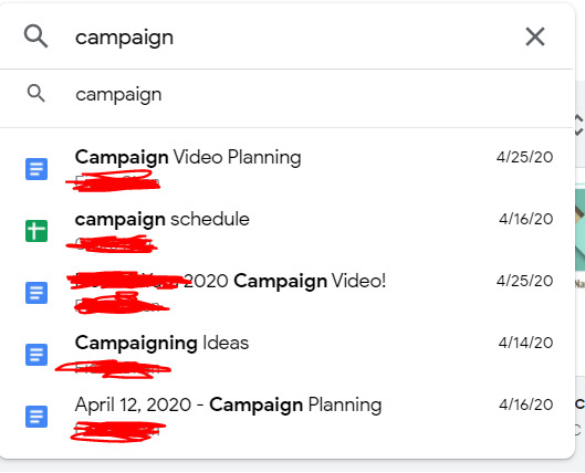
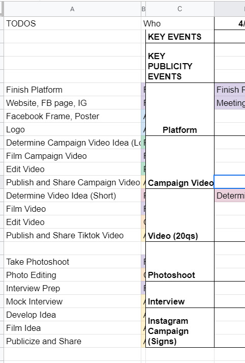
After they figured out the campaign platform, it was game on for the campaign materials. We spent a lot of time on artwork, we photoshopped pictures from a photo shoot, we came up with campaign motto ideas, we brainstormed strategies for officially announcing the campaign. We had an actual campaign meeting to talk over things in mid-April where I met like six different people, friends from both candidates on this ticket, who were supporting this effort. We had a google drive AND a Dropbox. Look at this:
Despite this seemingly organized effort, it was not that organized because this publicity team didn't actually actively do anything for like a week. Many reasons for this: one being it was actually the semester, and it was also CPW weekend. Unfortunately for me, that weekend was literally hell for me, because I was managing this site for our nonprofit, CPW events (so like five zoom calls on a Saturday), classes (because those are still happening), and then the campaign thing finally started, about a week before voting opened. In the form, of a website.
So the tl;dr is I developed an entire Squarespace website in one night. Yes, one night. I had to model it from I think the website from a Harvard campaign site, which took me like three or four hours on a Saturday night, which is a very fast time in my opinion to learn how to use Squarespace. I also bought a domain and figured out how to connect it to Squarespace at like 1 in the morning, which was the first domain I ever bought in my life!

(It expires in a month. I am absolutely going to let it die.)
Also, if anyone from squarespace is reading this for some reason, yall made a really solid product. I actually was very happy with my experience. You all should use it, I am 100% not sponsored by them at all, but honestly it was a very good experience. If you need to develop a website in four hours and don't have a lot of webdev experience, definitely consider it. You can even see website clicks and user analytics, it's actually really put together.
The next day we spend a lot of time going through website changes and artwork changes. It's bad. We had so many discussions about color palettes and the advantages of a 3 column vs 4 column layout. Yes. I'm serious. I'm starting to go crazy.
If anyone's interested, I would say that our website definitely was better than the other campaign's website. Like objectively. Like both campaigns were great, but the website? well. Here's the link (archived because I only paid for 1 month of squarespace :D) The amount of detail that went into it is actually incredible, the amount of spacing, i even had to custom CSS the header image so that mobile headers would show up correctly.
THE CAMPAIGN VIDEO
so sometime during this week, I had this thought about making a really good campaign video. I was very inspired by some of these Google ads that started with a Google search bar. (Yes, I am aware that I am that much of a Google simp.) To be honest, rewatching this ad, I really definitely just copied this entire ad lol, it's ok we don't have to talk about that.
That Wednesday, we coincidentally talked about what makes campaign videos successful. We talked about how Trump's incendiary imagery helped stoke the flames and how it was really effective in getting people to vote, and eventually helped him beat Clinton in the presidential election. So I went and took that and grabbed news clips and campus videos and overlayed that in the video, and it went from like a solid 6 to an 8 immediately, in my honest, unbiased opinion. You can see what I mean in the video itself: [link].
We also had to put together quite a few interviews about what they wanted from the school and were looking for in their candidates, which took a million years of coordination, but we somehow got it done in three days, and everything was put together in a flurry of a weekend, unending changes and small fixes for sixteen hours straight. I could not even tell you how much I learned about premiere pro and how to use layer masks and everything. I even composed the music for the first fifteen seconds of it. Literally, composed, it.
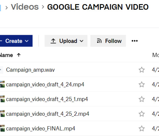
And so on a Sunday afternoon FINALLY right before voting, the video drops. I'm sitting in my backyard absorbing the sun because I hadn't left my computer for 48 hours straight.
It gets like 1000 views or impressions or something in like two days, which is incredible for me, since I'm not a professional by any standards, but I am considering being a professional campaign manager at this point. By the way, we're also managing an Instagram page, a Facebook page, a tiktok page, a website, our individual social media pages, and we're trying to synchronize this video drop and all of our publicity efforts across every single one of these channels. It's chaotic at best.
VOTING SZN
So it's voting week, where we give everyone an entire week to vote. Across the week, it's mostly a waiting game, we make a few more tiktoks and funny videos that we publicize to get out the vote more. The last day, we're thinking about it, and we know the final vote's gonna be close, so we message every. single. person. in our Facebook friends list. I think I singlehandedly convinced like twenty people to vote (and hopefully vote for our ticket).
There's a lot of drama about different stuff. I won't really talk about it because I think it got really messy, but this week and entire couple weeks was a lot to get through honestly. As a reminder, I'm also working on my senior thesis and my nonprofit website work is peaking at this point, so everything is very, very bad and none of us have slept in a while. Also it's the pandemic.
Finally, the results come out. We lost by like 20 votes or something, out of 1500 or so total votes casted or something like that. It's one of the highest voter turnouts in school history or something, I don't quite remember. After that, we're so emotionally drained from this whole thing that we just don't talk about it for a while and that's that.
If the ticket won, I wonder how it would've turned out. I feel like things would've continued to be busy, and maybe that's not a great thing. So maybe everything happened for a reason. I don't know, but those three weeks were quite interesting, quite fun, quite odd. I'm putting those videos in my personal portfolio and am putting Adobe Premiere Pro and Squarespace on my resume and moving on.
Anyways, thought I'd just share! i haven't posted in a while, and this was definitely one of my #weird #odd stories from my time at MIT, which is quite reminiscent of #weird #odd at MIT in general.
1 note
·
View note
Text
Mobile About
Yeah, there’s a decent bit here, but this is info to help YOU know what to expect from ME. Please, take the time, just once, to read over this. I’m a bit wordy for the sake of clarity and leaving as few unanswered questions as possible.
My Rules and About may seem strict, but I am honestly very chill and happy to chat.
► Mun is of age, so are nearly all Muses. I am 26, and nearly all of my humanoid muses are of age, though I DO have child-verses for several of them. I specify humanoid because I will not ship or smut animal or creature muses that are not capable of giving proper informed consent.
►NO MINORS. I WILL NOT WRITE WITH ANY MUN UNDER 18. PERIOD.
►RP stats
I go by either Kitty or Moon on tumblr, though I prefer Kitty.
You'll probably never find out my IRL name.
I have a Discord but it is for mutuals only. Please IM me for it
I have been RPing for over a decade in various forms
►I am Selective- I only RP with Mutuals(I say selective, but I follow people back left and right so please don’t be intimidated)
-I am selective for my own sanity, as I am a fairly nervous and generally private person. I have to FEEL the ship/story/roleplay in general to be able to write it well. If I cannot write something well I don’t want to write it at all.
►I am Multi-verse and Multi-ship. Nobody is cheating on anyone. I will “connect” verses(threads) with each other if its discussed and WANTED by the other Mun, but this is rare and I have to be comfortable with the Mun to do so.
►Speed may Vary - If I am really feeling a thread, I might reply in MINUTES
But I may also take days, sometimes several weeks to reply to a thread. It depends on interest, muse, availability, and general life things.
It is not impossible that a reply can take over a month, or that I can lose interest in a thread because I've been unable to write a reply for so long. If this happens, I will tell you, and I will likely feel like shit as I apologize profusely. But I can't force something that isn't there.
I spend more time writing than most any other hobby, but RP is, and will always be, just that. A HOBBY. If you are expecting me to consider myself obligated to you in any way, don't follow me.
►VERY IMPORTANT:
Regardless of what is going on in my life, @theirvoices is my IRL best friend and I will ALWAYS prioritize replies with them. I may be entirely inactive at times with all other mutuals, but writing with them. PLEASE do not take this personally. I could be sitting in my closet having an anxiety attack and writing with my best friend to take my mind off of it. PLEASE do not make assumptions that I am ignoring you. They are my RP wife and my best friend and will ALWAYS be a priority, even when my activity on other threads is very slow. If that is a problem, I recommend not following me.
►I Drop Ask-Threads- If a thread was started with an ask, I WILL eventually drop it, likely with no warning, unless we plot out and make a defined storyline for it. This is because I recieve new asks and sentence memes EVERY. DAY. and it is beyond unrealistic to keep all of them.
If you want to KEEP an ask-thread, tell me.
►Following
-I will not follow you if you do not have at least semi-detailed Rules, About, and Bio pages. I also will expect to be able to find examples of your writing on your page without scrolling for ten minutes.
-I need to know that our writing and posting styles will mesh.
-I need to be comfortable writing with you.
-I need to know that you are of age.
-I need to know enough about your character to write with them.
-I need to know that your expectations of other muses mesh with what I do/don't do.
-If I am following you, it is because I feel your muse(s) and mine may have some chemistry or potential for a story.
-IF I AM NOT FOLLOWING YOU, IT MAY BE BECAUSE I DO NOT KNOW THE MUSE YOU PLAY (example: I am not even remotely up to speed on any of the CW shows like the Flash, and have yet to see the Kingsman movies)
-PLEASE don't take it personally if I am not following back. There may be a multitude of reasons. For example, it can take me a long time to read over your blog properly. I don't follow without extensively checking out a person's blog.
-Additionally, IF I CANNOT READ YOUR BLOG I WILL NOT FOLLOW YOU. I have bad eyesight, and if you use tiny ass font or similar colors so that I can't read your blog even after zooming in until your theme is unusable, I will NOT follow you.
►Unfollowing- I will unfollow/not follow you if:
-If you do not tag your posts, I will unfollow you. I will not apologize.
-You send hate to people. Constructive criticism is one thing, but being a dick is unnecessary and I wont even say anything about this, I'll simply block you.
-You ignore my rules. Depending on the rule, I may warn you, I may simply unfollow, or I may block you. Respect people's rules. We are all here to write and enjoy ourselves, and respecting each other is an important part of that.
-You pressure me. An occasional nudge is fine but if you pressure me to reply i will drop the thread and unfollow. I've got enough IRL anxiety, I’m not here for more.
- You don't cut your posts. Seriously, there are several options, for desktop or mobile. I don't want to scroll for ten years to get to the next post. I'm not a major stickler for this, but be reasonable with your post length
► When I unfollow you for breaking my rules, I will:
Immediately drop all threads/delete all drafts and asks between us.
-Softblock you, so that you unfollow ME as well. This is to help ensure you do not presume we are still writing partners.
-Ignore any correspondence you attempt, including Asks, IMs, comments on my posts, etc. Excepting certain circumstances.
-If you repeatedly try to interact with me despite this, I will block you on all known blogs.
►Tagging
Personal posts are also tagged: #Kitty whines, OR #Kitty rambles
Smut/nudity/sexual imagery is tagged as #{{ NSFW }} OR just #nsfw . I try to use both.
if sexual acts are insinuated but not SHOWN, I use the tag #{{ nsfw-ish }}
-I sometimes forget to tag. Please remind me if you like, but be aware that this blog IS NSFW-THEMED and NSFW things, including smut, gore, character death, violence, torture, and a variety of other things will occur.
That’s not to say I won’t respect your triggers, because I will, I simply need to know if you need something tagged.
In general, NSFW smut, Death, Rape, and Torture are always tagged. Beyond that, I dont tag blood or gore or injuries, because they are rampant in my threads. Please use your own discretion to decide if this is a blog you should be following, because I DO NOT want you to be uncomfortable or threatened by myself or my content, but I also will not change how I RP.
-potentially triggering content will be tagged: {{ tw: tag }}
example: {{ tw: non-con }}, {{ tw: Torture }}, etc.
►Icons
I am 100% okay with icon-less RP. You do NOT have to have icons or special formatting to RP with me ♥
- I use GIFs and Icons in MOST of my replies. Usually sized 100 pixels, I do occasionally go up to 150 pixels for gif icons. I have bad eyesight, and therefore need GIFs I use to be at least 150. If this bothers you, I can refrain from using GIFs in my RP with you. Please let me know.
-I RARELY, and ONLY with certain people will use larger GIFs or stills for specific scenes. I won’t do this without asking, but it does occur on my blog.
-I generally edit all of my own GIFs, unless otherwise stated in tags or a character's bio. If you want to use an image I edited, PLEASE check with me, and if you find that I have improperly credited/forgotten to credit someone please let me know.
Icon Credit
Almost all still 100x100 icons images that do NOT have a PSD come from the Hollow Artists, either at the Hollow Art website, or on their tumblr page, thehollowedartists.tumblr.com
My icon PSD with the crescent moon in the corner was made by @phasiiingxshadow, as was my Harley Quinn PSD.
200x110 icons with the moon in the bottom right corner were made by Snow: @writteninthestcrs
I have also used PSDs from the pack HERE for headers and graphics, and have used other free PSDs from @darkrpsd in some of my iconing ( check them out and see if you can support them!)
3 notes
·
View notes
Text
a read more on the asse v psg game but i apologize to the mobile users innit
anyway im actually a bit mad at all these psg players who said after the as saint-etienne game “we did well to get a draw in the end” bc like.....i mean you’re absolutely right but ??? thats not good enough? if psg are “dominating” ligue 1 then at least dominate it properly lmao but the way they played on friday was atrocious and we could’ve very well lost that game 2-0 or 2-1 if we still count the own goal. like on paper psg should be beating asse 3-0 like we did at home but a football game isn’t played on paper, it’s played on the pitch and those players were shocking that first half to the point i didnt even bother with the 2nd half bc it was doing my head in to have watched us completely unravel like that in the space of 45 mins and play the worst half of football i’ve seen us play all season. conceding a goal and then giving away a penalty AND THEN a red card like what is this ligue 3 or sunday league or??? we got 4 yellows in the 1st half like bye ????
i genuinely think it would have been better for us to have lost that game bc then these players would be going into the monaco game with something to prove and something to fight for and with a chip on their shoulder....now i think they’re too comfortable (as usual tbh) having got a draw and not lost.
if it were an away game i’d genuinely put my money on us losing but since we’re at home we'll probably scrape a win but tbh i wouldn’t be surprised with a draw with how unbothered they seemed about us DRAWING with saint-etienne.....not drawing with monaco or lyon or loserseille but SAINT-ETIENNE who are in last for the race for a europa league spot like,.......can we have some pride? puhleaze
anyway all respect to saint-etienne for that game bc they played a good ass game of football and exposed our weak mentality AGAIN and were genuinely unlucky not to beat us
bit of respect to areola and mbappé - areola saved a penalty and their goal....i mean not much he did wrong with that it was a fucking mess. mbappé did have a rough game, as has been the case whenever we put him down the middle as a striker, but he guessed the right way cabello was taking the penalty lmao even if perhaps areola hadn’t seen it or paid attention and he provided the assist for the own goal with his header so.....
and presnel...........dios mio what a terrible match. but to his credit, when he got his second yellow and red, it looked like he hadn’t known he had received the first yellow, which i had been confused about too because we saw layvin get a yellow for dissent (?) after the penalty call but my stream at least didn’t say anything about presnel getting a yellow nor show it so. i think if he had known he was on a yellow already he might have not gone into that challenge like he did knowing he could get a red. but thats semantics bc he really did have a poor game. im hating the thought of thiago retiring more and more and liking the thought of having a marquinhos/kimpembe pairing of centerbacks in defence less and less as we see it lmao
i need nasser to hurry up on funding a cure for old age or some sort of immortality fuckin potion so thiago can play for us forever honestly i cant even comprehend what we’re going to do when he leaves......rip us. might get europa league but we could win that at least saksdnsdkd
let me not talk about cavani and his miss bc imma hurt his feelins so
also there are players who played in that game that don’t start that i think today did ZERO ZIP NADA to prove why they SHOULD star. like pastore......adios, you were tryna leave both transfer windows so like please get gone now, you complain about game time but you got given it and were awful. meunier.... usually i like him and prefer him as our 1st choice right back but holyyyyy shit was he poor as well like....he offers a lot going forward but.....his first job is to defend and his defending for their goal was SHIIIIIT. kurzawa was boring and even diarra i cant say had a good game it was ok at best. honestly everyone played pretty poorly but some players were very clearly at least trying while others (notably pastore) were not. at least thats what i got from the first half....maybe they improved in the 2nd half idk but i mean damage was done asse were already 1-0 up feeling confident lmao
anyway tldr is we SUCKED, were genuinely lucky to get a draw and i wont be surprised if we lose to monaco next weekend
#psg#this is another episode of 'i need to write down these thoughts to properly process them and then throw them out'#this is all instagrams fault for showing me posts from 3 days ago honestly#who asked#anyway sometimes i see read more on mobile and sometimes i dont so im confused whether they do work or not#so im sorry if they dont and you had to scroll past this entire dumb rant my bad yall
1 note
·
View note
Text
Reviewing Popular SEO Page Speed Tools I Recommend WebPageTest 💪

Fast web page render times are key for SEO success. Google has stated over and over that speed is important.
Fast render times are even more important now that most online activity is on a mobile device. This means slower, less reliable network connectivity and slower CPUs.
Surveys continue to show more consumers expect pages to load faster on mobile devices than desktops.
Why is speed so important?
No one likes to wait.
Studies show anxiety levels rise when a person must wait on a web page to render. If it takes too long they will find another answer or solution to their question.
Google calls this bounce rate and a bad bounce rate negatively affects your ability to rank.
What does it mean to load fast and how can you measure your page speed to make sure your site performs well.
Since these tools score our pages I decided to score them back!
Let's see how they do and what tool I recommend you use over all other tools...
Love2Dev Tool Score - D-
This is a popular tool with online marketers, but honestly it is bad, really bad.
The report looks nice and all, but they don't measure much that offers real value. That is unless your server is really, really bad.
You can enter a URL in their free online tool. They let you select from a few locations around the world to see how long it takes your content to reach the client.
And that is the clue, the time it takes your bytes to reach the client computer.
Pingdom only measures time to first byte, which in the scope of page speed accounts for 5% or less of your performance metrics.
It gives this site a score of 86% because of the Google Analytics and other tracking pixel requests. Those all come from external domains and do not have cache headers applied.
Otherwise I would score 100.
They give you a nicely formatted network waterfall. And as you can see from my profile, even including the favicon request my page's assets reach the browser in about 500ms.
My advice is to skip this tool, there are better, free options.
GTMetrix is another popular tool for search engine optimizers. This is another free tool, and like Pingdom it leaves a lot on the table.
The tool does offer a little more insight, but not much.
GTMetrix does run a basic audit of best practices on the page, which is nice. These are all good performance best practices, most I classify as low hanging fruit.
If you score bad in the PageSpeed items then you most likely have a configuration issue with your server or deployment process. It might also be your site's theme, so look in all these areas to improve.
The next tab is a bad sign in my opinion, YSlow.
Don't get me wrong YSlow was great, in its time. But the project has been deprecated for a few years as technology has progressed.
YSlow was created by a team at Yahoo, yeah that company we have all forgotten, as a FireFox plugin you could use to evaluate your page's performance.
They were based on research lead by Steve Souder's team back in the 2007 time frame.
Since then HTTP/2 and other changes to the web have happened, which make some of the YSlow recommendations obsolete.
For example, domain sharding, you should not shard anymore, but use HTTP/2. You should also use smaller files so you can control caching at a granular level.
Like Pingdom the tool really just measures how long it takes your page's resources to reach the browser.
Google Page Speed Insights
Love2Dev Tool Score - C+
This is the last of the popular SEO go to tools. It makes sense this one is offered by the Google search team, so it has to be good, right?
Compared to Pingdom and GTMetrix the Google Page Speed tool is much better. It does not bother with basic time to first byte, but focuses more effort on the rendering cycle, which is the key to good page speed.
The Page Speed tool recently went through an overhaul where it now runs its test using Lighthouse, which I will cover later.
The real value is the Lab Data section. Here you will see:
The real measurement that matters is Time to Interactive, the time when the page is fully interactive. This means when the page has completely loaded all assets, rendered and finished executing JavaScript.
And that my friends is how you measure real page speed, not how lond it takes the server to respond.
All the time up to the point the browser's UI thread is busy loading and rendering page assets.
Google Web.Dev
Love2Dev Tool Score - B-
While the Google Page Speed Insights tool recently migrated to using Lighthouse, they went one step farther by launching Web.Dev.
Like the page speed test, Web.Dev runs Lighthouse over your page. You get a very similar set of data, just more of it.
As a bonus you can view the actual Lighthouse report.
You do not have control over where the test is run. It is run from a Google server, somewhere in the cloud.
Speaking of Lighthouse...
Love2Dev Tool Score - B+
A while back the Chrome team started working on a site auditing tool, with a focus on page speed.
After a few iterations, including a deprecated Chrome extension, Lighthouse was born.
There are two ways you can run Lighthouse, from your browser and using the Node CLI.
To run Lighthouse from your Chrome browser open the developer tools (F12). Go to the 'Audits' tab.
You will be greeted with the ability to select which audits you want to run and the conditions the tests will execute.
I select all audits, because why not get everything!
Its free after all.
For conditions I like to select 'simulated fast 3G' and mobile. This should execute your page in a more harsh environment. This will reveal where you have issues more than if you run using your desktop and high-speed connection.
For the record, never test using high end equipment, like your developer's machine.
The Lighthouse report is rather detailed. It also gives you a nice filmstrip view of your page loading. This allows you to see what the page looks like to the consumer over time.
Running from the developer tools is very convenient, but I also mentioned the node CLI (command line interface).
This is great because your devops team and developers can integrate it in the site's build and deploy processes.
The tool exercises the page and creates a report in JSON format. You can then use the report data to verify the page is within your allowed performance budget.
SEOs will probably chuckle at the SEO audits because they are so high level. But look at the report this way, it is just another eyeball on those basic tasks, which your developer most likely overlooked.
Also, all these performance tools offer valuable SEO analysis because they are measuring and checking for many technical SEO requirements that most developers and non-technical folks overlook or do not know about.
Finally, the best page speed testing tool, WebPageTest.org!
If you really want to know how well your site and pages load you will use this test because it offers the most thorough coverage.
And it is FREE!
You can visit the site's home page, enter your url, select where the test should run and what browser or device should be used.
I like using the real phones in the Dulles data center to run my tests because they use a real cellular connection and real phones.
Public instances of WebPageTest are available from data centers all over the world. Because this site is popular in India, I often run tests from the Mumbai instance as well.
Honestly, I don't have the space here to dive into all the data collected by the tool. I focus mostly on the initial scorecard in the top right corner of the report, the times in the table just below the scorecard and the waterfall.
I have been using WebPageTest so much over the years I can glance at these three visuals and just know the basic health of the web page.
Like the Google Page Speed and Lighthouse you get the time to first interactive score as well as the full time it takes for everything, including the content being loaded by the service worker, to fully load.
For the record you want a 3 second or less time to first interactive, even on mobile. Many will say 5 seconds or less, but I have higher expectations.
Why?
Because if you achieve 3 seconds in a known environment then you should be faster than 5 seconds even in the worst environment.
You can also capture the Lighthouse report within the tool, which in my opinion make running Google Page Speed and Web.Dev a bit weak😊💪.
By default, the tool loads a page twice, this gives it the ability to check for properly cached URLs. You can adjust this and run it more times if you like.
You also get a filmstrip view. But even better you can also watch a video of your page rendering!
If you want to get more fancy or stand up you own WebPageTest instance you can. There is an API you can exercise to automate your tests.
WebPageTest is an open source project, which means you can clone it and stand it up in your data center. You can also clone an Amazon EC2 instance or use a container.
Don't worry if you don't understand what I am talking about, your developers and devops folks will.
If you have not guessed by now, WebPageTest is the tool I recommend always using to verify your site's page speed.
It has everything you want. It is regularly updated. It is easy to use and produces reams of data.
You can automate and stand up your own private instances if you want.
Finally, it is FREE!!!!
Monitor Page Speed Over Time
Performance is never a one and done effort. It requires investment over time. Tiny tweaks can have a big impact in either direction.
Sometimes different factors can affect a single measurement. Maybe a router was overloaded, which temporarily increased the network latency. Maybe a high CPU process was running on the client machine creating a longer time to first interaction. Maybe a third party dependency's server was down or unavailable, which created a delay.
This is why I typically do not rely on a single test, but run multiple passes and over time. I look for a consistent pattern to determine the real page speed.
But this can be tedious if you do it by hand. You cannot always remember to run a test every day or even for a large set of URLs. This is why an automated tracking tool or service can be a game changer.
This is what SpeedMonitor.io does for you. Just enter a URL, then some contact information and your first report is off and running!
You can add additional URLs and even track competing URLs. Over time you can see trends and patterns emerging.
If you are actively making tweaks to pages or the entire site you can see how your changes affect the
There are four key metrics, which just happen to map to 4 of the most important metrics in my opinion:
The data is collected from Google Page Speed Insights. Again the best thing is your tests will be run automatically each night for you. Plus since it is the Google Page Speed Insight tool you are getting data Google thinks is important.
Here's the best thing...
It is free!!!
So other than time needed to configure your URLs to monitor there is no financial commitment.
The service is new, so expect improvements and new features over time.
Wrapping it Up
Ok, these are the four most popular page speed testing tools. As you can tell I don't really care for Pingdom or GTMetrix and love Lighthouse and WebPageTest.
If you are an SEO, web developer or business owner you should make Lighthouse and WebPageTest part of your workflow.
If you have pages that are not scoring well, these tools will quickly show you where you are failing so you can take action to improve not only your search ranking, but your ability to engage customers and even make your staff more productive.
This content was originally published here.
0 notes
Note
I AM VERY BAD AT RECOMMENDATIONS but if you like girlbands pls listen to little mix they are a blessing (mainly their albums glory days and salute) or if you don't like them listen to stay by sede ft alessia cara or symphony by clean bandit ft zara larsson bc i'm currently OBSESSED with them
you just gave me three recommendations !!! how is that bad, my love ?!?!? I love Zara Larsson and I adore Stay by Sede ft Alessia Cara !! I haven’t listened to Little Mix so I may just have to check them out!!! thank you so so so much for entering!!
url: F E Y R E aka my lord and savior !! honestly, this is a killer url and it’s close to canon so we could be like close to canon buddies with our urls, yeah? be the feyre to my rhysahd? (yes, I know I put an ‘h’ instead of an ‘n’ I was trying to be clever...get it?? no?? wow I’m such a fool lmao)
icon: this icon is so so pretty ! (honestly link me to the page where you got it, yeah?) but seriously the composition is super nice and you can clearly tell it’s a person (sometimes these kind of icons are either too small or too big and it just throws it off, but this one is amazing!)
theme: truth be told, I had this theme for a g r e a t while and I still love it so freaking much! It’s just the right amount of simple, but it’s still so interesting and ugh I love LOVE the sidebar! also the built in updates tab??! ALSO YOUR BLOG TITLE AND DESCRIPTION (feyre anyone?!?!) anyway, it’s amazing!
updates tab: I kind of addressed this above, but I love it! super simple, straight forward, and BUILT INTO THE CODING! thank the LORD for that, amirite?!
mobile theme: 100% beautiful! I love the color of th background so much because it’s so...original! no one has the color of background (or anyone that I know!) and I love the glittery header
overall: if we are being honest, you have quickly become one of my favorite blogs on here! I follow quite a lot of people, but I notice you often and I really love your content! so LETS BE FRIENDS because you seem cool and also your EDITS?! crazy!
do I follow: not yet | (+) follow | forever and always
want one?!
5 notes
·
View notes
Text
The Best Single Page WordPress Themes for Business | Templified
New Post has been published on https://templified.com/the-best-single-page-wordpress-themes-for-business/
The Best Single Page WordPress Themes for Business
Here’s a new collection of single page themes for amazing business websites. They’re great for all kinds of businesses, app promotions, general brick and mortar businesses. You get the deal. Let’s dig in!
Verko, One Page WordPress Applications Theme
This theme is called Verko, it’s a one-page WordPress theme that’s great for app launches, software promotion or anything else that only requires one page to tell the entire story of what it is your website is all about. At times, themes are little too intricate and detailed, not all websites truly require a multi-page theme, that’s where like Virgo comes in. This is a WordPress theme that focuses on marketing your products and services, it’s got landing page templates and it really helps you encourage all users to take the next step to contacting your business. That’s what a call to action is all about. You can use a photo or video to achieve this, Verko is suitable for just about any type of business or creative agency that wants Maximum Impact in delivering their message to potential customers. The steam was created with a minimalist, modern design, it offers masterful slider presentation and visual composer to help ensure incredible flexibility and a great user experience.
If you’ve been searching for a one page theme and you’ve come across this particular page, well, that’s good, I guess? But maybe this theme isn’t exactly what you want? If Verko isn’t doing it for you, then you may want to look at our full one page WordPress theme collection. That’s a great place to find exactly what you want to find. The whole collection is full of amazing stuff, it’s got a wide range of themes, each one of them has a little bit different set of features or a different style. The whole collection is full of fantastic themes that can work for any sort of one page theme website. So, anyway, hopefully, you can find what you want if the Verko theme isn’t right for you.
Demo More Information Get Hosting
LightOne, Clean, Modern One Page Parallax WordPress Theme
LightOne is a clean and bright WordPress creative theme that uses one page design, smooth parallax scrolling and big, bold images to get it’s point across.
LightOne is a well-designed one page Parallax WordPress theme that is great for digital creative companies that want to establish a great-looking website or rebrand an old, dated site. By using the power of visual composer and bootstrap, this user-friendly WordPress theme allows you to really wow your clients, and establish new business at the same time.
Let’s have a look at the great looking at home page style of the LightOne WordPress template.
You may wonder if the themes name is a reference to the light and bright, airy and minimal style of this template, or whether or not it’s referring to the lightweight code.
In fact, it’s both.
This 100% GPL license WordPress theme loads up fast, looks great on every device tested and it’s an amazing and modern website for advertising agencies, corporate Pages, creative companies, digital agencies, Freelancers and more. With a built-in blog, you can beat the bushes to attract new traffic, which is always something that creative companies need to do. You’ll certainly be providing a great looking theme that gives a great first impression to all of your visitors. If you want to showcase your creative work in a unique and fun manner, light one could be the solution you’ve been looking for.
If you’d like to see a more extensive selection of one page themes, why not have a look at our collection? We have assembled quite a group of single page templates, each one of them better than the last. That’s not to say we put the best one last, you might find that the first one is the best. I could keep going on and on and flattering about which one page theme is better than the other, but honestly, that’s all about your personal taste and the needs of your company. Anyway, I will be back with more one page templates soon, so see you later.
Demo More Information Get Hosting
SCRN, One Page Parallax WordPress Theme
SCRN is a one-page, responsive portfolio theme that is ready for any sort of work. No matter what you want to promote, this mobile-friendly theme has the minimalist one page design, along with unattractive blog, that you may have been looking for. It even supports videos in portfolio sections, something that not all one page themes seem to offer some of the main features of this theme include the responsive design, and advanced theme options panel for quick customization of your sight, plenty of different visual composer blocks for adding content and helping you to move things around, and sticky navigation. That is all important when building a one-page website.
What is it that makes one page WordPress themes so popular? Well, when it comes to the various layouts that are available to you, one page themes are a little bit more simple and easy to navigate. That doesn’t mean that your website is going to be simplistic or generic. Far from it, you can have all the dynamic look and feel that a multi-page theme offers, but using just one page.
If your website is specifically usually focused, perhaps a creative agency or a digital agency, you’re going to love one page themes for building a great-looking portfolio for your content. In addition, you can use the custom post managers to help you develop any type of custom posts with ease. However, that’s not what one page themes are bad. The Collection that we have built of WordPress one page themes, it’s a great way to find multiple different layouts that provide a great starting point for building your website.
Ensuring that your site has the proper layout is critical to the success of your website. If you have settled on a one page design for your site, but you want to add or change things in the future, many of the themes in our collection offer multi-page options down the road. He’s multi-purpose themes are a great way to ensure continuing flexibility and to make it so that you don’t have to completely start over from scratch if you decide to change the look of your sight.
Throughout our entire collection, you’ll find multiple different themes that offer both one page and multi-page styles, I think that we have found most of the best themes, but there are plenty more out there and more coming around every day. We are committed to adding more fantastic games all the time, with your help, we can achieve that. If you know of a fantastic one page WordPress theme, we would love to hear about it in the comments. We will try our best to ensure that we add all of the highest quality themes that there are to offer.
Demo More Information Get Hosting
Swenson, Full Featured Bootstrap One Page Theme
With Swenson, you’re getting a wonderful, soft almost ephemeral WordPress theme that still packs a bunch that belies it’s innocent and lovely design features. Installation is simple and set up requires no knowledge of code or web page development. This template’s construction, assembled with CSS3 and HTML5 combined with the popular Bootstrap 3 framework, allows for layout alternatives that are truly unique and fluid. The resultant websites display on any size screen and that use Swenson are entirely receptive. Both one page and multiple page websites can be built with ease.
That’s the blog demo, standard version. We’ve gathered up a ton more personal blog themes if that’s what you’ve come here for.
Now, despite the fact that Swenson is simple and user friendly, that does not mean it lacks in features, although Swenson is simple to work with. The parallax scrolling design that is popular offers easy navigation up and down the page. Entire customization of headers enables you to take control of website visitors’ first impressions. The premium Visual Composer plug in lets you drag various blocks of widgets, content or elements into place. Slideshows and other dynamic demonstrations with eye catching animations and transitions can be assembled using the Revolution Slider plugin. All of these features and more can be deployed or customized in the Redux alternatives panel.
That’s the rundown for Swenson and I think you’ll love what you see, should this be the theme you choose for your next website.
Demo Get Hosting
Honshi, WordPress Business Theme for One Page Websites
Simple and Clean, whether you want your website to offer a single page style or a multi-page book, Honshi is a themed well worth considering. This theme offers plenty of features that are similar to a lot of other creative agency or minimalist portfolio sites, one click installation to get your demo data up and running quickly, helping you achieve a solid base looked customized.
There’s also a powerful page builder that lets you do just about anything you want in terms of creating layouts for your posts and pages. In addition to that, Honshi gives you powerful admin panel that helps you create edits to the way out and look at your side, all without having to know anything about coding. There is an impressive documentation included and fantastic support as well.
This is a smooth and Sleek theme that was inspired by Nature. That’s a really neat thing, I think that as a one-page theme, that intuitive design and familiar style is going to really set it apart from the rest. Also, considering how flexible this theme is, it really doesn’t matter what type of site you are attempting to create, you will be left with a stunning and beautiful web page, no matter what the subject matter.
If you’re searching for even more options for building the best one page WordPress theme that you possibly can, you’re going to want to have a look at our full collection of themes. Businesses and websites that don’t have a gigantic amount of content, sometimes a one-page name is all you need. You can create a very interactive user experience that delivers your content first and foremost.
Our collection of one page themes for WordPress is great for self-hosted WordPress websites that want to seem that really delivers on content presentation, without the necessity to have multiple Pages involved. Some are great for portfolios or photography websites, others for businesses. Most of them are incredible multi-purpose themes that include one click demo import and all of them, of course, I have a single page option. All you’ll need to do is replace your content and get started quickly. There’s more to live than multi-page themes, you know what I mean? I think one page themes like this one are trending for a reason. People don’t have the time to wade through tons of pages, especially if the information is clearly presented in a professional and stylish way. That’s what this collection is all about, so check it out for more great themes.
Oh yes, many of them also offer WooCommerce support, allowing you to set up a shop quickly and efficiently. We’ve gathered up nothing but the most beautiful one page themes that can be easily adapted to suit your needs. Many of the themes also include multi-page options, although that’s probably not why you’re here if you are looking for a one-page theme. Still, it’s always nice to have flexibility going forward if you should decide to add more pages to your website.
DemoMore Information Get Hosting
0 notes
Text
The 8 Biggest Graphic Design Trends That Will Dominate 2019 [Infographic]
https://120profit.com/?p=2266&utm_source=SocialAutoPoster&utm_medium=Social&utm_campaign=Tumblr
Last year was all about taking risks in graphic design. But most of the graphic design trends I predicted last year have become mainstream. With brands like Apple, Google and other tech giants embracing bold and unique designs trends. So you’re going to need to take it up an extra notch, or three, to be seen and heard in 2019. That means more vivid colors palettes, bold fonts, and futuristic patterns. Luckily, this guide will help you stay ahead of the curve. Without further ado, here are the biggest graphic design trends for 2019: CREATE THIS TEMPLATE Click here to jump back to the biggest graphic design trends in 2018 Or click here to jump back to the biggest graphic design trends in 2017 1. Pops of Vivid Colors You may have noticed the world of design feels a little more colorful lately. You would be right. Splashes of electric yellows, bright corals and vivid blues are replacing the reserved colors of the past. More brands and designers are adding vivid colors to their palettes for 2019 and beyond. I love it–more color is always a plus in my books! If you aren’t familiar, vivid colors include lighter hues that are intense or attention-grabbing. Kinda like the blues, pinks, and reds in the example below: Source Or literally any of the colors used in this beautiful annual report: Source I believe that this shift towards more vivid colors is a continuation of the rejection of bland minimalism of the early 2010’s. Also, as brands proceed to fight for our attention, they must take bigger design risks. Last year was dominated by bold colors, this year very vivid and bright will reign supreme. After one of the largest trendsetting companies, Apple, added vivid colors to their designs a few weeks ago, I expect these colors to continue their takeover. As you can see, they used a bunch of vivid color palettes to announce the new iPad Pro…and it was a hit! We have already seen vivid colors start making their way into other Apple graphics as well: But I think this year these vivid colors will become part of their core creative and brand strategy. Plus these colors just look amazing on their, and other brands, ultra HD device screens. And once Apple does something, many brands will follow. Spotify is another big brand that is usually ahead of the most popular trends, and this year is no different. Bright, vivid colors have made their way into their marketing material: And on their wildly popular app: We saw Spotify embrace gradients, bold colors, and flat design before it was fashionable, and I see bright colors taking the same path. I do think it’s important to note that you don’t have to only use vivid colors. In fact, mixing those color with stronger or flatter colors will help you stand as well. Check out how well the colors come together in the presentation template below: CREATE THIS TEMPLATE It’s like the two trendy color palettes of the past few years teamed up to create something very unique. 2. Strong Typographic Focal Points Over the past few years, we have seen bold fonts and typefaces become the norm. From Adidas using it across all of their marketing: Source To Samsung, which illustrates nicely the move to more vivid colors this year as well: Source This bold font makes it easy to read the text on social media feeds and on mobile devices. As well as instantly projecting strength, innovation, and individuality. However, as you can see in all of these examples, the bold font is often the supporting partner to the other design elements. But this year the bold font will become the main focal point in a lot of graphics. Especially if your graphic only has a few seconds to grab the reader’s attention. Like with a poster, social media graphic or flyer. In these poster examples from the CTA18 conference you can see how powerful a bold font can be: Each of the font-heavy posters stands out like a beacon, compared to the other futuristic-looking posters. Even if you knew nothing about the conference or company it would pique your interest. This bold font was used throughout the rest of their conference material and it helps project a daring and confident message. All of this was achieved with a single bold font, and no supporting images. Another great example of using bold font comes from Nike at the Public School New York Streetball Classic: Source This bold font just screams strength. It’s extremely fitting for an athletic display. Plus those posters will definitely stand out on the busy streets of NYC. If you’re looking for something a little more colorful, check out the bold font used on this design project from CalArts: Source It dominates the graphics but fits extremely well with the vivid color palette. Could you imagine a minimalistic font having the same effect? I think not! This example is begging you to read more. It could even catch your eye from across a crowded room. I do think it’s important to point out that I’m not advocating only using text-heavy graphics. There should be some other interesting elements included, like in this gradient-filled festival flyer: Source This modern sales poster: CREATE THIS TEMPLATE Or this brilliant flamingo adorned hiring poster example: Source The main header and font of each example definitely grab your attention, but the other elements could be what catch your eye first. So don’t forget to include some of these interesting elements, even if you want the text to be your central focal point! The harmony between all of those elements could really make or break your designs in 2019. 3. Futuristic Influences Are Mainstream I guess since we are technically living in the future that so many 80’s films predicted, it’s time for our designs to reflect that. This means a lot of futuristic patterns, colors and ideas are about to dominate the design world for the next few years. We do have most of the futuristic devices they predicted in our pocket each day. So you might as well take advantage of that tech with your design work! I believe that this approach will help brands create unique content that will stand above the noise on social media. The visual rebrand of BBCTWO this year is a solid example of a large brand embracing this idea: Source They could have taken the boring route that so many brands take and just refresh their typeface or logo. But they have let the futuristic patterns, textures, and colors define their branding across all of their content. Additionally, I don’t think it’s a coincidence that the rise of vivid colors matches up almost perfectly with the explosion of futuristic influences. They both have been used recently to stand out from the noise created by other brands. When futuristic designs and vivid colors are used together, they can create something really cool. For example, these album covers from the europe.collective project looks like they were ripped from a futuristic record store: Source Honestly, these are works of art and are likely to stick in someone’s mind a lot longer than some of the other album covers I have seen. Plus these futuristic examples will look amazing on your iPhone, Android or Mac screen. Or on the side of a building, like with this innovative event poster example: Source With futuristic designs, you can take a lot of risks and let your creativity run wild. Let’s break down some of the common elements of these futuristic designs: Bright color palettes: CREATE THIS TEMPLATE Gradients and other color transitions: Source Abstract patterns: Source “Glitches”: Source Holographic and reflective elements: Source Geometric influences: Source …and more! But since we don’t know what the future holds, there’s no right way to do it! So get out there and create something that looks like it was ripped straight out of your favorite science fiction movie. 4. Light and Dark Color Schemes You may have noticed that some of the largest companies are adding light and dark modes to their apps. Or embracing light and dark color schemes across different devices and avenues. This includes Apple recently adding Dark Mode for all of their Macs: Facebook just added a dark mode to its Messanger platform: But they are about a year behind Twitter, who integrated that feature all the way back in 2017: You may be asking why I’m highlighting these companies now. I do like talking about tech companies but that’s not the reason. Instead, I wanted to point out that the biggest brands in the world of tech are embracing this dual colored design trend. So it’s pretty easy to see the graphic design world wholeheartedly adopting it this year. These apps use different modes to make the apps more useful for the user depending on the situation. You can use this same flexible technique in your design work to instantly adapt to many mediums or screens. In fact, one of my favorite flyer examples uses a light and dark color scheme. Each fits the subject matter and event extremely well: Source Like I said above this dual color scheme makes the poster a lot more flexible. If you need to hang it up on a dark wall, the white colored poster is perfect. But it also won’t stand out if you need to place a poster on a blank office wall, which is where the black color scheme saves the day. In these beautiful poster examples, the designer used a duotone blue and white as the main color influences. But it has the same effect as the flyers above. Source With this kind of technique, you’re not putting all your eggs into one basket. Saving you from a ton of wasted time and effort. The light one could catch the eye of some people, but the dark one could do the same thing for another group. The change between light and dark graphics can be quite subtle. For example, in these graphics they only really change the borders from light to darker colors: Source It may seem like a lot of work to create multiple versions of your design but with the Venngage Brand Kit, you can switch between color palettes with a single click. You can also import your brand colors, fonts and logos into your Brand Kit. Then you can automatically apply them directly to your designs or templates. Like so: DESIGN SOMETHING You already have a battle-tested palette of colors that your audience recognizes. So why not use them! 5. Complex Gradients and Duotones Gradients are one of my favorite things to add to any design project to give it a little more depth. Plus, like some of the other rising graphic design trends, they look incredible on mobile devices. Last year I predicted that gradients would begin to take over the world. Especially after seeing large companies embrace it, like Microsoft: And the payment giant, Stripe: Even the designers over at Apple Music: With their vivid colors and futuristic patterns, they feel right at home with some of the other graphic design trends of 2019. However, I think this is the year the gradient grows up and is used in more ways than just a simple background. Just like any new trend, people are going to find unique ways to use it as time progresses. For example, take a look at how Fast Company uses gradients as color filters across their content: Source This simple overlay can instantly upgrade even the blandest stock photo. Also, this visual strategy can become part of their brand, making it easier for readers to spot their content. Overall it’s a simple way to differentiate from the competition that even the most novice designers can emulate. After seeing the rise of gradients last year, we added the gradient backgrounds to Venngage. Apply them to your designs in a single click: DESIGN SOMETHING If you’re looking for something a little more complex, check out these examples from the Adobe 99U Conference: Source In these examples, the gradients are the main focal point and dominate the graphics. In the past, they would have of being pushed to the background and only played a secondary role to another element. This approach takes a little more skill to master, but definitely will stand out: And if gradients were used to advertise, say, a conference on the future of design, I think it’s safe to say they are here to stay. If you want to blow readers out of the water, take note of these slides from the Ringling College Motion Design conference: Source These slides are literally called “Future Proof” and feel like they were pulled straight from an episode of Star Trek or Blade Runner. I could honestly look at them all day, or make them the background of my laptop. Actually, maybe I will! Duotones are another design tactic that fits extremely well with the other design trends. Most graphics that use duotones feel very futuristic and colorful, almost by definition. In the simplest terms, duotones are images that replace the whites and blacks in a photo with two colors. Like how the graphics designers at TQ used a blue for the dark parts, and a pink for the lighter ones: Source I like duotones because you can make almost any image match your company branding. And as you probably know, keeping things consistent is extremely important in the design world. Duotones aren’t as popular as they once were a few years ago. But they still can be used to create some interesting graphics, like these blog headers from The Health Diaries: Source Additionally, like gradients, they really pop when used on a white background, social media or a mobile phone. 6. New “Colorful Minimalism” I think it’s pretty common misconception that minimalist design only used black text and white backgrounds. Or another combination of the two. But minimalism is actually about paring down design to only the necessary components. It’s seen as the rejection of complicated and cluttered ideas. Many people have interpreted that as using only muted and neutral color palettes. Especially after the main tech giants used it for about a decade in their marketing. Source A lot of the graphic design trends I have witnessed over the past few years have been a reaction to that kind of minimalism. From the explosion of hand-drawn graphics, bold color schemes, and abstract patterns. Each of those trends is the opposite of what minimalism is at its core. Despite that, this year, some of those more complex graphic design trends are going to mix with traditional minimalism to create a new type of minimalism. One that is dominated by color and creativity, instead of blandness and conformity. For example, take a look at this product poster series from Nike: Source Each poster is traditionally minimalist, with not a lot of flair or unneeded elements. And without the vibrant gradients, it’s just another boring poster. But this simple color addition makes it very eye-catching, without abandoning the main tenets of minimalism. It masterfully walks the fine line between too dull and too complex. You can also take some of the ideas we have outlined in this article and integrate them into your minimalist projects. Things like a bold font, futuristic elements or a simple gradient can really upgrade your simple designs: Source Just be sure that they don’t dominate the graphic, and instead are used in a supporting role to other elements. These logo examples from Aula Visual are a perfect illustration of that idea: Source In each of the graphics, both a futuristic pattern and color are used to up add a little something extra to the brand mark. Without those elements, I think this would just be another boring logo. The same thing can be said about these graphics for Black[Foundry]: Source It honestly looks like they were able to combine almost all of the graphic design trends we have talked about so far with the minimalist ideals. We’ve got a bold font dominating a few graphics, a gradient peeking through and even a futuristic pattern making an appearance. Now if you don’t want to go the color gradient route, you can still inject some color into your designs. In this presentation template example, they use only three colors to build an interesting visual: CREATE THIS TEMPLATE The slides use exactly the same layout throughout the whole presentation, only swapping the colors on each. This minimalist approach keeps the presentation cohesive and eye-catching, all without being too complex. The designer used exactly what they needed to get their points across, no more and no less. And at its core, that’s what minimalism is all about. 7. Dynamic and Complicated Hand-Drawn Illustrations Custom or hand-drawn illustrations are an excellent way to make your visual content stand out. And stand above all the other brands that take the easy way out. That’s because no other brand is going to be able to exactly replicate these visuals. Competitors can copy your color scheme, your social media strategy and the stock photos you use. Plus, in the quest for a strong brand, unique content such as this is extremely valuable. That’s why I believe that hand-drawn graphics and illustration will continue to be a graphic design trend this year. However, like some of the other graphic design trends we saw roll over to this year, things are about to get a bit more complicated. Last year you could get away with using simple flat doodles, like the examples from MailChimp below: Source This year that’s not going to cut it! Because everyone else picked up on the simple sketch trend, it’s not unique anymore. Like I said above, you’re going to have to take it to the next level with your hand-drawn illustrations and visuals. Mailchimp, among others, has risen to this challenge and blown the doors off of it with their custom illustrations. Source These illustrations were added to literally every page of their website, and all social media accounts. And I kinda love it. Additionally, they used these custom illustrations to help inspire their customers to be themselves and embrace simplicity…as well as reject the overly polished company image that they see online every day. Their designers have always been known to take big risks, and this one seems to have paid off. It was talked about by every designer and marketer for weeks after the rebrand was unveiled. The project management masters over at Asana took a similar approach this year. Last year used the simple doodles and sketches throughout their marketing graphics. But this year they invested in some more dynamic illustrations across their social media accounts: Source I like that these illustrations look like they were all created by the same designer, which is very difficult sometimes. Especially when they have a whole team of designers working on one project. This method makes each share or email from them look like it came from a single voice, that their readers can easily recognize. In this noisy world that we all live in, that can be a huge benefit. Also, it’s nice to see them using some very vivid colors in their designs! At Venngage we got the memo as well when we created this fun Halloween infographic: VIEW THE FULL INFOGRAPHIC One of our designers created each of the illustrations from scratch, and it makes me smile each time. There are a ton of similar Halloween infographics in the world, but ours is incredibly remarkable because of the custom illustrations. To conclude, if you’re looking for a little more inspiration to create your own illustrated masterpieces, I would check out these examples from The New Yorker: Source And the perennial innovators over at Slack: Source They actually were one of the first companies that I noticed creating these works of art. And they have been creating amazing illustrations for their content ever since! 8. Authentic and Genuine Stock Photos As you have probably noticed many brands are creating some very creative designs to seem more genuine. Or to make them feel more authentic, instead of a faceless corporation. This push into the more real and genuine will be seen in the type of stock photos they use this year as well. I feel that a lot of stock photos have become too professional, polished and vague. In their quest to reach as many people as possible, these photographers choose a safe subject. Overly edited photos are also out this year, readers really want more genuine and authentic looking photos of people. The viewer should be able to see themselves reflected in the photo. These new stock photos look like they were taken with someone’s personal camera or phone. Kinda like the examples of people below: Source These examples honestly look like they were taken by a bunch of friends hanging out, not by a professional. The same thing can be said about these photos as well! In each of these free stock photos, the colors look real and not like it was overly edited: Almost like something you would see in your Instagram feed from your cousin that travels too much. And I was able to find those examples relatively easy, so it baffles me when brands all use the same generic photo. Those ultra-generic pictures that might relate to the content should be avoided this year. Like this example, which has been used by almost every tech company at least once: As a reader, this photo tells me nothing about your content because it’s so general! Instead, shoot for photos that help you tell a visual story and add to the narrative. Instead of just filling an open space on your blog or social media feed! For instance, compared to the example above, these photos would work much better in a tech-focused blog article: Like I said previously, these photos depict a real scene that you could put yourself into. And they feel like they were snapped in the moment. Not meticulously planned like some of the examples below: Ugh, that fist bump photo makes me cringe a little bit. Now in my experience, the laziest content creators love the generic and overtly planned stock photos. Ones that took them a few seconds to find, and have already been used by millions of people. I hate those kinds of stock photos. I mean, if you can’t take the time to create or find a better stock image, why should I take my time to read it? I think many of you will agree with that statement. So in 2019 don’t be one of those creators, instead strive to be more weird, unique and genuine with your visuals! And best of all, you can find these great examples and millions of more stock photos for FREE on Venngage now: DESIGN SOMETHING NOW Want to learn how you can incorporate stock photos seamlessly into your designs? Read our step-by-step design guide. Now that you have seen what will dominate graphic design trends in 2019, why don’t you take a look at the trends that were popular in 2018! The biggest graphic design trends for 2018: GET THIS INFOGRAPHIC TEMPLATE 1. Multiple brand color schemes Traditionally, companies have a few colors that they use across all of their branding and design work. This helps people recognize them out in the world, on social media and other places online. But I think this design “tradition” is going to be completely upended as brands look for more ways to stand out in 2018 and beyond. In fact, companies rebranding with a plethora of colors schemes is one of the first graphic design trends that I see really taking off. Spotify started doing this a few years ago in all facets of their design but they were one of only a few. Now they have such a strong visual brand that I know something came from Spotify almost instantly. Dropbox also decided to completely ditch their old color palette in 2017 to help update their brand and reach. Usually, a rebranding effort updates the font or graphic of a company logo, but this one was completely different. Instead of changing their logo design, which everyone already knew, they added a ton of new official brand colors to use with it. They built this new branding to show that great things can happen when diverse minds work together. And I hate to say it because some people were not big fans, but I kinda love the rebrand. They already had a logo that everyone knew, but now they have a ton of new ways to use it. When you are a massive company like Dropbox that needs to appeal to almost every industry, this kind of flexibility is ideal. I also think that this change really reflects their growth as a company from a free place to store your school paper, to something that connects the creatives of the world. Just take a look at how they evolved their social media presence from last year: To this year with the rebrand: It’s almost like night and day. Who would have thought that breaking design conventions would have allowed for so much creative freedom? However, I do think that this kind of rebrand can only work with a company that is as big and recognizable as Dropbox. Or eBay, which actually rebranded a few months before Dropbox. In their rebrand, eBay also decided to add a ton of new colors, while keeping their recognizable logo: If we want to compare the two rebrands, I think that eBay would win. That isn’t because I was not impressed by Dropbox’s efforts, I just think that it fits eBay’s core business and products better. Plus, they are using the rebrand across all parts of their platform. It’s a good idea to consider multiple brand color schemes if you want to create a perfect E-commerce website. The designers at eBay have used the color upgrade to unify millions of products across their site. Take a look at the examples below: They may not all share the same colors, but they have the same feel. Even though it’s a mix of pastels and bold colors, the site still looks incredibly clean. Additionally, they have found a way to inject color into a place that is usually boring and bland: the background. This subtle boost of color makes almost everything they share on social media stand out from the rest. Are you seriously going to be able to scroll past this pastel mixer? I think not. If you need help picking your picking new colors, read out in-depth guide to picking color schemes. 2. Color gradients are making a comeback Whenever I think of color transitions and gradients, I can’t help but remember the bad word art from Microsoft Word over the past 20ish years. As kids, we thought this was the best way to make your report on dinosaurs look professional. And I think that we were on to something back then. Because in 2018 color gradients will be literally everywhere, from websites to Twitter headers, and even presentations. Instagram, always ahead of the curve, has used it in their branding and logos for the past few years, actually: Now the rest of the world is starting to catch up. One of the best examples I have seen of gradients being used comes from Mixpanel, an analytics company. As you can see below, they have adopted a gradient as the main background of their site: This is a common way for sites to keep a simple background, and add a few flourishes. Otherwise, you’re stuck with a pretty boring single-colored background. What I haven’t seen much of is gradients being used in every piece of visual content, like Mixpanel did: This wholehearted adoption of color gradients gives the company a lot of creative freedom, without straying too far from their brand. Because in this case, multiple color gradients is their branding. The graphs and charts are by far my favorite use of color gradients. It adds that little something extra and helps them stand out from the noise. These principles are similar to website design must-haves. A few other large tech brands are bringing gradients back into their designs. Like Stripe: Polaroid, with a more subtle gradient: And even Skype: But my favorite way to use a gradient is by overlaying it on an image or creating a duotone. Kinda like what The Next Web did below: It adds so much extra power to the image. All this with a simple gradient, a design trick the internet loves to hate. But as we’ve seen in these examples, they are a great way to add a little bit of eye-catching color to your design. Plus, they can help improve any image or stock photo. 3. Better branded social media images Last year I talked a little bit about using more authentic photos in all parts of your design and marketing strategies. This year, I really want you to focus on extending that trend to your social shares as well. Readers and consumers use social media to distract themselves from what is happening in their life. They don’t want to see a tenuously relevant stock photo that you picked in two seconds for the sake of having an image. That shows readers that the person who produced the content didn’t care enough about their work to find an impactful image. If the person who created the content doesn’t care, why should you? For example, if you were scrolling through your Twitter feed, would you click on the tweet that used this image? Or this one from Cubeit? Now, technically either would work for the same tweet, but the one from Cubeit is the clear winner. By a mile. How do I know this? Because that image made me stop in my furious scrolling tracks and want to read the article. I must sound like a broken record by now because of how often I talk about not using bad stock images in your design work. But I also believe that this is one of the easiest ways for your brand to stand out on social media. The image will be the first thing the readers are going to see on social media, and maybe then they’ll read the text. Your content could be great but it will never get the chance because you picked a bad featured image. Even something as simple as what Quuu did below looks a hundred times better than a stock image of a computer: One of my favorite examples of this trend comes from Moz: They attach a face to almost all of their tweets. Instead of a generic stock photo, you see a friendly and luminizing face, from the person who wrote the article, shining back at you. They also use Rand Fishkin, in as many images as they can. This is not only a great branding play, it also humanizes the company as a whole. When I think of Moz now, I don’t think of a faceless company–I think of an innovative person. 4. Unconventional colors everywhere As we have seen so far, 2018 is the year of taking risks in your design. One of the best places to start taking risks is in the colors that you use. That doesn’t mean that you need completely rethink your brand’s color palettes, like some of the brands I’ve mentioned already. Instead, be ready to inject some more risky colors in your design projects this year. Bold colors are the most common driving force that we have seen behind each of the design trends this year. I wouldn’t call any of the following colors traditional in any sense of the word: Sticking to the traditional corporate blue palette isn’t going to cut it this year. Also, if you noticed, minimalism and neutral color schemes are on its way out. Instead, I recommend going a little off the rails with the colors you pick–within reason. Find a few colors that you can call your “unofficial brand colors” and use them across all your projects. This way, you can do something new and exciting but still stay close to your core values in other places. A great example of using bold color comes from the sports world, in Bleacher Report. They are in an extremely competitive space, fighting with thousands of sports writers for your eyeballs. But they consistently use bold, bright colors in their designs to differentiate their content from those others. Because they do it so well, you can quickly spot a Bleacher Report article or Tweet out in the world. Another example is Fast Company, who have taken to using more non-traditional colors in their magazine cover designs to entice readers. Like Bleacher Report, they’re also using bright and bold colors to stand out in a very competitive space: print journalism. With each issue, they are fighting with thousands of competitors to get the attention readers. And that isn’t an easy task. Even online they’re using color to add something extra to their design work. With the simple addition an interesting color–or five–they made each graphic much more captivating. Now, I hate to bring Spotify up again, but they have effectively been disrupting the space for the past few years. You can definitely see this in their color usage lately as well: I have talked a few times before about being to spot something from Spotify just from their non traditional color usage. Especially in their most recent Wrapped experience, which shows your listening habits for the past year: For a few weeks after they launched this promotion, I was even able to spot other people’s lists, just based on the colors they used. If that isn’t an effective use of color, I don’t know what is. 5. Bold & handwritten fonts dominate What makes you a good graphic designer? Another way to add some eye-catching features to your designs is to use some bold or handwritten fonts. This is another trend that seems to come from the design world, moving away from boring minimalism as a whole. Bold and handwritten fonts are going to stand out against the simple or overused fonts that your competitors are using. And they will help your content jump off the screen on social media–whether it’s infographics for your blog, Facebook ads, or motivational quotes on your social media. Kinda like my alma mater, the University of Arkansas, does below: They are definitely fans of bold fonts, however what they are not fans of is winning apparently. Now, instead of looking at more examples who only use bold or handwritten fonts, I thought it would be interesting to find ones that effortlessly use both. A great example comes from the shoe giant, Adidas. They may actually be my new favorite company in 2018. I mean have you seen those NMDs and Ultraboosts?! Across their site, they use bold fonts in their graphics or text, which looks great: And when you jump over on social media, bold handwritten fonts take over: But neither feels out of the ordinary for a brand like Adidas. Everything they create and share feels natural because they have created such a strong visual brand over the past few years. I believe that this adoption of ultra bold and handwritten fonts coincided with their plan to become a more fashion-forward brand. That choice has helped really sell the mystique of these new type of shoes they are creating. Another incredible example of using both bold and handwritten fonts together comes from Adobe: With this Digital Marketing Report, they are able to seamlessly blend together both bold and handwritten fonts, in addition to using some awesome gradients, GIFs and unique colors. In fact, Adobe seems to be embodying all of the graphic design trends I’ve mentioned so far. If the leader in design is using them, I think they’re a safe bet. 6. More custom illustrations Over the past year or so I have seen designers move away from cookie-cutter graphics to more custom icons and illustrations. And I could not be happier. This movement started to take form last year with the rise of hand-drawn illustrations and icons. But these illustrations and icons will become even more unique in 2018, as brands look to differentiate themselves even more. I mean, look at how Strikingly has used the illustrations to make their blog headers look amazing: No one else is going to be able to replicate that, especially with a stock image. So instead of using a boring photo, I would recommend creating some custom graphics. Like Discord has done below: As a tech company that caters to gamers and techies, those icons fit them perfectly. I mean just take a look at their homepage: That is a well thought out brand! Also, I believe that this trend is another rejection of the overly clean and somewhat boring design “rules” that dominated the past decade. Now, instead of following those rules, designers are making their own. If you need help there are also many free online graphic design courses available. There’s also Microawesome, a design service aimed towards providing short-term design work at low costs. You can clearly see this with the rise of custom illustrations and icons being used across the spectrum. From the simple hand-drawn icons that MailChimp uses: To the one-of-a-kind illustrated images in InVision blog posts: And all the places in between, like in this year-end report from First Round Capital: If you are looking for something that looks a little more like art, I would check out the examples from Slack below: These are incredibly interesting designs to look at, and they will stand out from the riff-raff of social media. This also fits their almost laid back “making work better” vibe that they use in all of their marketing and product materials. Additionally, when someone takes this much time and effort to create a featured image, you know the content is going to be good. They are able to use the image to make a first impression with their audience almost instantly. That’s why I’m pushing for more graphics like this in 2018 and beyond! People are looking for more authenticity in all parts of their digital life and this is a great way to appeal to that. Instead of using a bad stock image, use an awesome illustration or icon. 7. Better GIFs, less reactions One of my favorite things to come out of the internet–maybe ever–are GIFs. I use them on a daily basis to communicate with my friends and coworkers. They are perfect little ways to show how you are feeling. For me, it’s usually this one: They are also used by your favorite hip brand to show they are still cool. Using reaction GIFs and such are great to send on Slack or Tweet to your friends. But in 2018 your GIF usage as a brand or company needs to be taken to the next level. Most people would also recognize a GIF as the reaction ones we are all so fond of. But they can be used for so much more. Like as infographics that actually add to your share or article in a meaningful way. One of the best examples of using GIFs in this manner comes from the sports world, actually. My hometown Kansas City Chiefs are big users of GIFs on game days and it truly adds to the experience. Now, I usually don’t have time to watch a whole game, but I love that I can quickly scroll through my Twitter feed and get an update. Those updates stick out more than a simple text update would. They may not be the most breathtaking GIFs but they help people keep track of what is going on. It helps foster a conversation with their audience and that should be one of your goals when using GIFs this year. Don’t just slap a reaction GIF on a share or article, because someone will laugh and move on with their day. Another way to use GIFs this year is to replace your featured images and blog headers. Like in this one from Axios about nuclear tax credits: That will definitely grab someone’s attention, no matter the platform. But just because I’m recommending that you upgrade your GIFs, doesn’t mean they all have to be bland or serious. They can still have that element of silliness that GIFs are known for. To see what I’m talking about, check out this GIF from Muz.li: And here is another similar one from UX Planet: It’s simple, well designed and relatable. Plus, it will stand out from all the other static images in someone’s feed. If you can create and share GIFs that marry those three ideas together nicely, you will be set in 2018. 8. Cinemagraphs are gaining more traction After talking about GIFs, it’s time to talk about their more refined cousins: cinemagraphs. Cinemagraphs are basically GIFs or videos that have been completely frozen, except for a tiny area of subtle movement. Here is one of my favorite examples: I’m guessing you have more experience with GIFs. But cinemagraphs are going to continue to gain ground in 2018. Especially with more design and tech-focused companies in the world. Like my friend’s podcast, the Pitch, which has a large audience of tech and startup aficionados: The subtle changes in the stars may not seem like much, but they definitely add a little something that people will stop and take a look at. Cinemagraphs are less obtuse than a GIF or a video, and can still be used in all parts of your marketing or design work. Because of that somewhat subtle movement, I believe that they are more eye-catching than a video or static image. Plus they can be little works of art that bring customers to your post or share. Design that fights back The driving force behind this year’s graphic design trends is the rebellion of designers against the plain, white color schemes and sparse aesthetics that the titans in the tech industry have pushed for the past few years. Now we will see designer take a whole new approach. It will be intense, innovative and beautiful. I mean, look at this year’s explosion of colors! As we have seen in previous years, most of the innovating will be done by the top tech companies. They are the ones that have the bandwidth, money and talent to test a bunch of ideas to see what works best. But that doesn’t mean that you can’t implement some of these in your design. Remember, 2018 is all about taking risks! I hope these tips will guide you in taking on some new design challenges and getting ahead of your competitors. Check out last year’s graphic design trends below. The biggest graphic design trends of 2017 GET THIS INFOGRAPHIC TEMPLATE 1. Louder and brighter colors Over the past few years, many tech leaders used muted, safe and easy to digest colors. This was in an attempt to create a very clean and controlled design scheme. It was almost an attempt to show people that the sleek, functional future they have seen in science fiction movies was already here. But now that everyone and their mom have seen this design style work for Apple, the copycats have killed the power it once held. Now, in 2017, there will be a shift away from neutral colors like whites, grays and black, to bolder and brighter colors. Some companies are already doing it and have been for a while, like the music wizards over at Spotify. In fact, they are already leading the pack, using bold colors mixed with professionally edited photos to create in-your-face designs. This kind of color usage has become part of their brand, which means that their images are instantly recognizable. And when you are fighting for real estate on social feeds, powerful branding like this will help you win 2017. Just because many companies will be ditching their boring color schemes in 2017 doesn’t mean there needs to be a color revolution in your company. Some companies will be adding just a bit of color, and it will make all the difference. Using bold color accents will also help many brands cling to their minimalist roots. By infusing bright colors with traditional neutral backgrounds, companies can give their branding a fresh new look without straying too far from what made them great. For example, we already saw this type of redesign from Instagram a few months ago. This simple redesign helped bring them into a whole new era and unified all of the different apps under one color. And just like with Spotify, this type of bold color usage is recognizable across the web. A large driving force behind the trend of bold and bright color usage in design comes from Google’s Material Design. Their design language focuses on flat, organized, and intuitive design. They use “unexpected and vibrant” colors, as well as fonts and images that are as functional as they are pleasing to the eye. Actually, a lot of the things that will be trending in 2017 are influenced by the adoption of the Material Design principles. We took their advice when designing this graphic to promote a new ebook. It has been an insanely popular featured image! If you need some great examples of color palettes that fit this bold scheme, check out this article that helps you choose the best colors for your designs. Don’t be afraid to use colors that contrast starkly against one another. GET MY INFOGRAPHIC TEMPLATE 2. Bold typography In 2017, bold typography will also fight against the ever-dwindling attention spans of readers, and the saturation of content. Big and daring fonts will be used to grab the eye. One of my favorite examples of this would have to be Wired. They use a mix of fonts to emphasize individual titles and establish a hierarchy of information on the page. Just take a look at some of the examples from their homepage below: A great example of using in-your-face fonts to grab the reader’s attention on social media comes from HubSpot. They make sure the text is front and center, with the graphic used as support: HubSpot know that the time we allocate to digest a tweet is nearing zero each year. They combine concise, punchy copy with bold fonts to capture your attention. Additionally, the shift to mobile and extremely high definition screens will also increase the need for bold fonts. Obviously, more and more people will be using their phones to get content, and the way that content is presented will need to keep up. Buffer uses strong headers in the body of their articles, not just at the beginning, to give them a backbone and make it easier to read across different devices. I would recommend using this approach to help people navigate long reads, no matter the screen size. We also took a similar approach, when creating this infographic template. Mixing bold font choices with interesting colors to create an eye-catching graphic: GET MY TEMPLATE 3. Google Fonts I have been using Google Fonts for a while now because they are so versatile. If I need to design one thing online and then add it to my slide deck, I am confident the fonts will work together. And they play nice with about every website you build. Oh, and did I mention most of these 810 different fonts are free to use? Yeah, people like free. And they like things that are insanely easy to use. Like this example that uses a mix of a few popular Google Fonts: GET MY INFOGRAPHIC TEMPLATE Some of our most popular fonts on Venngage are bold Google Fonts, like Roboto from above or Open Sans. 4. Authentic photos As the amount of content created each year continues to increase, the need for quality images has increased as well. And to maximize the shelf life of some of these images, the creators have had to make them as generic as possible. The only problem is that the best generic images get overused by everyone. If you have been active in tech or marketing scene lately I am guessing you have seen the following image: It has been used in landing pages on, blog headers, and even some Instagram posts. To be fair, I even used it for one of the sites I was building a few years ago. But because of the popularity of this image and other stock images like it, the authenticity has plummeted. The need for clean and perfect images in everything has only exasperated the problem as well. As reader seeing this image for the hundredth time, I would think that the writer or creator does not care about making their work original. So why should I read it? That is why you need to start using authentic images that represent your brand. Stop using the most popular images and start making some of your own. I am guessing everyone on your team has a camera phone in their pocket. Why aren’t you using them? Snap a few photos of your product, office or some fun pictures of your logo and use those instead. Or if someone on your team is a budding photographer, give them a day or two to shoot some images that you can use for a year! For example, we took a picture of some of our employees for our new website and could not be happier. By doing this, we added the human element back to our images, that so many of these stock photos are missing. 5. Hand-drawn graphics and icons The need for more authentic images will also influence icons and graphics. Recently we have seen brands embrace this wholeheartedly as they look to differentiate themselves from the pack. This will also add a personal or fun element back into your design or content work. And this can’t be done with off-the-shelf icons or graphics. Many may see this trend as childish or unprofessional, but it will definitely help you stand out online. Like many of the graphic design trends in 2017, this is a push back on the clean and almost clinical nature of design in recent years. For example, Dropbox has adopted the use of hand-drawn illustrations in everything they do. It has become part of their brand now and is easily recognizable. Plus, it puts the user at ease, appeals to the child in all of us, and makes the product seem more accessible. This is especially helpful if you are a large tech company like Dropbox. Another great example of hand-drawn icon comes from Casper, a mattress company. They use illustrations on almost all of their landing pages Like this interesting one below: MailChimp also got into the spirit and used hand-drawn illustrations in their 2016 annual report! And finally, for one more GREAT example, we look to Moz. They use illustrations in their blog headers, like this one: We also have introduced more hand-drawn illustrations in Venngage as well. I am particularly a fan of some of the ones below: GET MY ICONS And our love for hand-drawn icons sometimes makes its way into other projects as well: 6. Minimalism that goes back to its roots If you were to describe what minimalism was to a stranger, you would probably talk about a lack adornment in design, with a focus on functionality. You would probably also think of a neutral color palette of blacks, grays, and whites. It seems that the true spirit of minimalism–pared down, functional design elements–has been lost and, instead, replaced with boring black and white color schemes. I suspect this was done to make up for the lack of processing power and screen size on mobile devices. In 2017, that will all change. This is the year that minimalism, hopefully, gets its groove back. And that involves using a lot more color. Mobile devices are now just as powerful as computers and some even have better screens. One of my favorite minimalist-influenced designs would have to be Medium’s logo. They were able to include a bunch of different colors but still create a very minimalist logo. Another logo redesign that influenced minimalism with color happened a few years ago with Google, who happens to be a catalyst for many of these new graphic design trends. They shaved a little bit off their typeface but also debuted a whole new “G” logo, which I am still a fan of. Everything about that screamed minimalist but there was not one mention of it in the press because true minimalism has been lost to the general public. Because it did not look like it was created before color was invented and only used one shape, it was not a minimalist logo. Instead, it was more colorful and popped off the page–but it was still a minimalist logo. And following that redesign, like so many things before, people followed Google’s lead. We have even started emulating a more minimalist style with our featured images for blogs. The simple design clearly communicates the message of the graphic. 7. Useful GIFs Everyone (well, almost everyone) loves GIFs. They are the perfect little conversation helper that expresses emotion when text won’t do the trick. Plus, they do not require any special software to run, usually have a small file size, and can be embedded just about anywhere. So they are better than videos and images, in most cases when loading time or data usage needs to be minimized. And I think that versatility is what will make them even better and more useful in 2017. One of my favorite ways to use GIFs is as featured images for your blog posts or article. Instead of using boring stock images, invest a few minutes of your time in creating a GIF like the one below: It does not have to be a work of art, but it definitely will draw attention to your post when shared on social media. One of the best examples of using a GIF as a blog header is this post on The Next Web 8. Duotones Duotones are simply the combining of two colors on an image, usually using very bright or contrasting colors. They require a bit of design work but it is most definitely worth it. Only a skilled designer can really create an amazing duotone. It is honestly past my skill level but that does not mean you should not include it in your 2017 design plans! Spotify was one of the first to really push this type of design into all parts of their branding, and many other brands have followed their lead since. Like below: They have been able to use this approach to color to stand out in not only the streaming space but music in general. And you can use it in the same way for your industry! This bold use of contrasting color will also bring some originality into your design. And hopefully make it pop on the white backgrounds of the many social media sites. If you need some help getting your graphic design skills up to par, I recommend these articles: The Ultimate Guide to Designing Epic Social Media Graphics How to Make an Infographic in 5 Steps (function(d, s, id) { var js, fjs = d.getElementsByTagName(s)[0]; if (d.getElementById(id)) return; js = d.createElement(s); js.id = id; js.src = "http://connect.facebook.net/en_US/sdk.js#xfbml=1&version=v2.0"; fjs.parentNode.insertBefore(js, fjs); }(document, 'script', 'facebook-jssdk')); 120profit.com - https://120profit.com/?p=2266&utm_source=SocialAutoPoster&utm_medium=Social&utm_campaign=Tumblr
0 notes
Video
youtube
CHURCH OF THE CITY
Hi everybody, Tyler Rominger here from Ministry Designs. I’m here to do another church website review.
Today we're going to be talking about Church of the City. Church of the City is a church in Nashville. It's a relatively new church. They're doing some phenomenal things down there. Darren Whitehead was a pastor on staff at Willow Creek Church in Chicagoland area and a couple of years ago he went down and planted in Nashville and they've seen some explosive growth over the course of the last couple of years. And so, because of the things that they're doing, I wanted to take a look at their website and see how they are communicating that. So we'll go ahead and jump right in.
You can see on their home page, it's actually pretty simple. This is literally the only thing that their homepage consists of. I like the background image, but there's not a lot of information there. So from a personal standpoint, because the majority of people are looking at websites on their mobile device now, I like to see a little bit more information on the homepage. That doesn't mean that this is bad or wrong it's just a personal preference. The data would suggest that when you have less information on your homepage, obviously you're forcing people to click more, which means people are less likely to stay on your website. And so if you have more information on your homepage it gives them that ability to scroll that we've all become so accustomed to.
Let me just dive into the site a little bit. Again, the overall design is clean, it's brief; the navigation is pretty short up here. But they do have a footer navigation which again, limits the ability for people to find what they're looking for. The reason that is, is because we're creatures of habit. We know to look in the header for what it is that we're looking for in a website. That doesn't again mean that that's a bad thing, it just means that it's unusual to see that.
So we'll go ahead—and they obviously want us to “Learn More” or to take a look at the “Messages”. So I have had the privilege of meeting Darren a few years back. I was a youth pastor prior to starting Ministry Designs and Darren was a part of our youth camp that I was facilitating. And so I got the chance to meet him a little bit. He gave a message at that camp and it was phenomenal so I have no doubt that the sermons are wonderful, so we're going to go ahead and skip that. We want to “Learn More” about the church because that's really why we're here. Looks like they've got a Vision Sunday coming up. They educate you on how to park; they give you directions. They're doing some hurricane relief response. This is a great feature here, “Frequently Asked Questions”. So a lot of times you don't see “Frequently Asked Questions” on a church website but I love that they've put that here.
So again, if I wanted to click through the individual campuses—we'll go to the Franklin campus because I think that's their primary campus—it gives you some more information: what's happening, some updated events and those kind of things. Let's check out the KidCity here. Lot of white space … (I’m New—let’s see if it takes me back—oh it takes me back to a different page) … so I'm clicking through this website in real time with you, and just my initial knee-jerk response to this, is honestly it's a little bit confusing to navigate as I'm clicking through the website and kind of analyzing it for the first time. If I'm a parent with children, or if I'm maybe a first-time visitor to the church, I'm not going to know exactly what to look for, or where to look for it, and so I may abandon this website, just because of the difficulty to navigate.
I love that they have the Vision Sunday video right here—that's also helpful. They tell us what to expect in the “I'm New” section … “Who We Are”. We've got some good information here—the “Vision and Values”—people actually do look at that information, so it's good to have.
With that said, I want to go ahead and jump over into some of the technical aspects. So if we look at the site speed from Google—the mobile site speed—it looks like it needs a little bit of work. 72 is by far not the worst I've seen; it's also not the best that I've seen. Their desktop however, it's pretty good. And I think that that's because of the limited amount of content on the home page so there's not really a lot to optimize there.
So this is a tool that was produced by HubSpot, and basically what it is, is it's an overall website grader. And it kind of audits things like performance, mobile responsiveness, the SEO of the site, like the on-page optimization of the site, and the website security. So it says “This site is ok”, which I can understand why, and we'll jump into a little bit more of that when we get down to the SEO section. The performance is pretty good, like we already saw thanks to Google. A couple of things that they could increase there. Notice that the page speed is really good. We don't ever want to see that load speed higher than about four seconds. If they can get that down between two and three seconds they'd be in a better spot. Mobile-friendly: they get a 30 out of 30 so that's phenomenal.
So their SEO grade is a little bit lacking. I've actually noticed that with a lot of churches that I review their website on, that I think there's just a general lack of search engine optimization, and people don't necessarily understand the value of having your website rank higher in the search engines. So a real simple thing that they could do is just add a sitemap. You know, there are free sitemap generators that they can generate the sitemap and then submit that to their google webmaster tools. And what it does, is it gives Google a more clear picture of the layout of their website and helps Google then index the pages more effectively, therefore then ranking the site a little bit higher.
They have no headers on their website so they need H1 tags/H2 tags. An H1 tag would be the primary goal of the site. You could have a couple of H2 tags which would maybe … So an example of an H1 tag would be: “City Church—Nashville” and then an H2 tag could be some subcategories inside of that website. They have no header tags in that home page so it's hurting their SEO grade. The security is a big thing, again, there's no SSL certificate on this site, just like Scottsdale Bible. They for some reason have not added an SSL certificate, but this will also help their overall SEO grade. Because Google has now publicly come out and said that if a site has an SSL certificate it's going to be viewed more securely in the search engines, therefore ranking higher. Because Google wants to produce the most quality and secure results possible. So if I had to make a recommendation I would say, “Add some header tags and add an SSL certificate.”
So to that point, there are some things that they could do again a little bit better in their SEO. You can tell that they've probably recently given it some attention because their site traffic has just jumped astronomically in the last year. But there are some things that they're missing, right?
So if I did a search for churches in Nashville and I view the results on that, they're not even on the first page. So I'm all the way down here to result number 14, which would be the fourth result on the second page. And this has a pretty high search volume. So it looks like the search volume for this particular term is 720 organic searches a month in Google. And so, I think that if they added an SSL certificate and they put some header tags, were strategic about their page linking, created some Nashville-specific content and added it to their website, their SEO ranking would increase pretty dramatically, which would then ultimately help them leverage the search volume that's happening in their specific city on any given month.
So just a quick recap: we'll go back to the home page of Church of the City. I love the initial presentation—it's clean, it's concise, it's modern—but once I dive into the navigation, I struggle a little bit to follow the path of the site. It's not very logically organized. I know that churches—larger churches—struggle with this but there are more effective ways to lay out your site. So if I could make a recommendation it would be to add the SSL and maybe clarify some of the navigation.
I hope this review was beneficial to you. Again, my name is Tyler Rominger. I'm from Ministry Designs. We'd love the opportunity to take a look at your church website and do a review. Thank you, I hope you’re having a great day, and we'll look forward to seeing you at the next video. Make sure that you subscribe in the link below.
Links:
YouTube: https://www.youtube.com/watch?v=g1OwBHEXa0I
Ministry Designs Website: https://ministrywebsitedesigns.com/church-of-the-city
0 notes
Text
New Post has been published on Cloudlight
New Post has been published on https://cloudlight.biz/google-search-on-mobile-now-lets-you-easily/
Google Search on mobile now lets you easily
Google Search is including a new characteristic these days so as to easily manual you in the direction of activities nearby if you use it on your smartphone. The new events functionality is available within the US at first, through the Google app for Android and iOS, in addition to the Google Search cellular internet site.
You can search for matters which includes
“jazz concert events”, “art events”, and you will get a unique listing filled with at-a-look details about the approaching activities. You get additional options if you tap More events, and when you discover something you want simply faucet on that and you will be able to at once purchase tickets for it.
It’s additionally feasible to look up things arising on particular dates, the use of filters together with “today”, “the next day”, or “next week”. If you want to go the opposite path and feature everything thrown at you, simply search for “occasions near me” and you will be proven all the one-of-a-kind alternatives.
As always with new Google functions, it’s unclear when or if you may see this outside of the USA.
How Is Google Search Changing Us?
Typing in Google and searching for stuff has never been less difficult. Have you ever questioned how it’s far changing us? Read on for insights.
For instance, we want to look up the meaning of a word or locate synonyms of that phrase. We can discover the answer within the be counted off a few clicks. In the antique days, while the net became not there, we had to show over the pages of a dictionary and find the phrase we had been attempting to find matching the primary few alphabets.
A seek on Google, for this matter, virtually has made this less difficult. We are too reluctant and lazy these days to consult a strong dictionary when Google is so available.
We also can discover information applicable to research within the niche we are interested in.
We can locate new websites and bookmark them for destiny references. All those statistics may be retrieved on Google clicks.
However, no longer all records on the web corresponding to a Google seek may be 100% applicable and correct. We might also if so need to buy books and seek advice from them. So for brief runs, it’s miles okay and we can take it. But if we’re writing a thesis, research paper, article or report, that is wherein strong books come into the picture.
Not all of the searches on Google supply the answer we are seeking out. Sometimes we fall into a loop, constantly clicking and wasting our time when the data can be rightly determined in catalogs or at the library of our office.
Free boards are available on the internet and a Google seek on those can rightly allow us to discover them. I suppose it is good to seek advice from the boards for the statistics you need badly. This may be associated with programming issues or other topics for that count number. If they are popular, you get appropriate answers to your issues from professionals or specialists in the one’s boards.
Fiction eBooks are available in reachable as nicely on many loose sites.
Instead of spending cash on fictions, you may just download excellent fiction eBooks from the websites and those websites you could locate on Googling.
The benefits of a Google seek have made our lives lots less complicated, less difficult and cozier by means of letting us get admission to the specified statistics at a quick tempo. But for long term commitments which, I actually have explained before, Google searches certainly waste our time without giving us the data we want and if so, it’s far extra dependable for us to seek advice from a library.
Rosina S Khan has authored this newsletter, highlighting how Google searches are converting us and whether or not they may be the proper tools in the long run.
Search Engine Optimization: A Must Online Marketing Method Website Owners
Some site visitors will visit your web page, because you accurately listed it to your enterprise card, or brought it to your email signature, however majority of your visitors will come from search engines like google.
If you want human beings to discover your personal home web page after they search for your call, and for whatever cause your web page isn’t always displaying up within the outcomes of the most famous search engines, then at worst you may be a little much less well-known and a bit greater disillusioned.
But, it’s far lots more extreme if you are accountable for maximizing the range
Of potential customers who go to your agency’s website so that they should purchase gadgets online out of your employer’s catalog. If for some cause the engines like google are displaying your competition’ sites ahead of your enterprise’s, then it is able to mean the difference between your organization making or losing cash, and your being promoted to a nook workplace or demoted to an avenue nook.
The extremely good reputation of search engines like google among Internet users is the number one motive why commercial corporations – especially the ones whose sales is usually or completely derived from on-line income – are inclined to invest huge assets in first-class tuning their websites to get the quality ratings within seeking engine listings. This exercise, and now career, of “search engine optimization” (search engine marketing), is a vital element of online marketing.
How Search Engine Works
There are masses of things which might be involved when search engines like google rank websites in an organic search. Amazingly sufficient, they are able to examine billions of pieces of facts in as speedy as 0.Five seconds! The moves you are taking to optimize your site may have a right away impact for your search engine optimization rating. Components along with H1 tags, the words used to your internet site meta description, content and keyword density, permalinks, and one-way links are a number of many things that you may leverage to enhance your ranking.
H1 Tags: These are the larger headers you operate to title your content.
For example, the H1 for this article would be the title, ‘The Basics of Search Engine Optimization’. This article page may also floor at the Google search results while someone searches for keywords which are a gift inside the H1 tag like ‘search engine marketing’ and Basics of SEO’. Make certain your H1 tags are applicable to the keywords you need to be displaying up for.
Keyword Density: This is a number of instances that the keyword your target market is looking for appearing on your internet site. Make certain to say your key phrases, no longer simplest to your H1 tags, however also within the body of your content. While you need to encompass your key phrases frequently, don’t over saturate your content. Remember, Google can even recall the usage of synonymous key phrases.
First, develop a list of all of the phrases that you could consider that humans would possibly use to locate your website – succinct terms that exceptional describe your commercial enterprise. Then home that listing right down to the two dozen maximum probable terms. If you have got difficulty developing a listing of key phrases, then test Wordtracker, that is designed that will help you optimize your keyword listing. At this time, they offer a loose trial.
Is Mobile Car Valeting Service a Good Option After the Holidays?
So the holidays are over and you’re now considering whether or not to have your automobile cleaned by using a cellular car valeting enterprise. That is honestly a wise idea, in particular, if your car has persevered the elements to this point and you may need to use even greater after the holidays.
Many humans query the usefulness of cellular automobile valeting services after the holidays, however, the fact of the problem is that the time is simply as right as any to ebook a carrier. Although you could sense such as you ought to rely upon your conventional vehicle wash to easy your vehicle, there are a few arguments pointing closer to hiring a valeting service:
You get it carried out at your house – no one loves to leave their home
Especially whilst it’s miles best to get the automobile cleaned. Who knows how bloodless it is out of doors and what nation the roads are in. There might be snow and ice and the forecast might not be promising. To avoid this hassle altogether, you could without a doubt have your automobile cleaned at your house because that is what cellular vehicle valeting is all about. It is a massive gain, which you could take gain of immediately after the holidays.
You can awareness on different obligations
Because you don’t have to waste time getting the car to the automobile wash, you may clearly get different paintings performed. This includes taking a while to rest after the hectic Christmas and New Year Eve’s occasions and possibly getting something finished in your private home. After all, in case you held a party there, it might be sensible to attention your effort on handling the mess as opposed to losing a while and strength on automobile cleaning.
You can advantage from unique gives – it is not a secret that many organizations offer their services at discounted fee at once after the vacations. If you are looking to store money and nevertheless get the activity completed, then now is the satisfactory time to ebook one. Of path, you should not be concerned that the provider you are furnished could be of negative high-quality, as many agencies are serious and could now not compromise their work.
0 notes
Text
The Best Single Page WordPress Themes for Business | Templified
New Post has been published on https://templified.com/the-best-single-page-wordpress-themes-for-business/
The Best Single Page WordPress Themes for Business
Here’s a new collection of single page themes for amazing business websites. They’re great for all kinds of businesses, app promotions, general brick and mortar businesses. You get the deal. Let’s dig in!
Verko, One Page WordPress Applications Theme
This theme is called Verko, it’s a one-page WordPress theme that’s great for app launches, software promotion or anything else that only requires one page to tell the entire story of what it is your website is all about. At times, themes are little too intricate and detailed, not all websites truly require a multi-page theme, that’s where like Virgo comes in. This is a WordPress theme that focuses on marketing your products and services, it’s got landing page templates and it really helps you encourage all users to take the next step to contacting your business. That’s what a call to action is all about. You can use a photo or video to achieve this, Verko is suitable for just about any type of business or creative agency that wants Maximum Impact in delivering their message to potential customers. The steam was created with a minimalist, modern design, it offers masterful slider presentation and visual composer to help ensure incredible flexibility and a great user experience.
If you’ve been searching for a one page theme and you’ve come across this particular page, well, that’s good, I guess? But maybe this theme isn’t exactly what you want? If Verko isn’t doing it for you, then you may want to look at our full one page WordPress theme collection. That’s a great place to find exactly what you want to find. The whole collection is full of amazing stuff, it’s got a wide range of themes, each one of them has a little bit different set of features or a different style. The whole collection is full of fantastic themes that can work for any sort of one page theme website. So, anyway, hopefully, you can find what you want if the Verko theme isn’t right for you.
Demo More Information Get Hosting
LightOne, Clean, Modern One Page Parallax WordPress Theme
LightOne is a clean and bright WordPress creative theme that uses one page design, smooth parallax scrolling and big, bold images to get it’s point across.
LightOne is a well-designed one page Parallax WordPress theme that is great for digital creative companies that want to establish a great-looking website or rebrand an old, dated site. By using the power of visual composer and bootstrap, this user-friendly WordPress theme allows you to really wow your clients, and establish new business at the same time.
Let’s have a look at the great looking at home page style of the LightOne WordPress template.
You may wonder if the themes name is a reference to the light and bright, airy and minimal style of this template, or whether or not it’s referring to the lightweight code.
In fact, it’s both.
This 100% GPL license WordPress theme loads up fast, looks great on every device tested and it’s an amazing and modern website for advertising agencies, corporate Pages, creative companies, digital agencies, Freelancers and more. With a built-in blog, you can beat the bushes to attract new traffic, which is always something that creative companies need to do. You’ll certainly be providing a great looking theme that gives a great first impression to all of your visitors. If you want to showcase your creative work in a unique and fun manner, light one could be the solution you’ve been looking for.
If you’d like to see a more extensive selection of one page themes, why not have a look at our collection? We have assembled quite a group of single page templates, each one of them better than the last. That’s not to say we put the best one last, you might find that the first one is the best. I could keep going on and on and flattering about which one page theme is better than the other, but honestly, that’s all about your personal taste and the needs of your company. Anyway, I will be back with more one page templates soon, so see you later.
Demo More Information Get Hosting
SCRN, One Page Parallax WordPress Theme
SCRN is a one-page, responsive portfolio theme that is ready for any sort of work. No matter what you want to promote, this mobile-friendly theme has the minimalist one page design, along with unattractive blog, that you may have been looking for. It even supports videos in portfolio sections, something that not all one page themes seem to offer some of the main features of this theme include the responsive design, and advanced theme options panel for quick customization of your sight, plenty of different visual composer blocks for adding content and helping you to move things around, and sticky navigation. That is all important when building a one-page website.
What is it that makes one page WordPress themes so popular? Well, when it comes to the various layouts that are available to you, one page themes are a little bit more simple and easy to navigate. That doesn’t mean that your website is going to be simplistic or generic. Far from it, you can have all the dynamic look and feel that a multi-page theme offers, but using just one page.
If your website is specifically usually focused, perhaps a creative agency or a digital agency, you’re going to love one page themes for building a great-looking portfolio for your content. In addition, you can use the custom post managers to help you develop any type of custom posts with ease. However, that’s not what one page themes are bad. The Collection that we have built of WordPress one page themes, it’s a great way to find multiple different layouts that provide a great starting point for building your website.
Ensuring that your site has the proper layout is critical to the success of your website. If you have settled on a one page design for your site, but you want to add or change things in the future, many of the themes in our collection offer multi-page options down the road. He’s multi-purpose themes are a great way to ensure continuing flexibility and to make it so that you don’t have to completely start over from scratch if you decide to change the look of your sight.
Throughout our entire collection, you’ll find multiple different themes that offer both one page and multi-page styles, I think that we have found most of the best themes, but there are plenty more out there and more coming around every day. We are committed to adding more fantastic games all the time, with your help, we can achieve that. If you know of a fantastic one page WordPress theme, we would love to hear about it in the comments. We will try our best to ensure that we add all of the highest quality themes that there are to offer.
Demo More Information Get Hosting
Swenson, Full Featured Bootstrap One Page Theme
With Swenson, you’re getting a wonderful, soft almost ephemeral WordPress theme that still packs a bunch that belies it’s innocent and lovely design features. Installation is simple and set up requires no knowledge of code or web page development. This template’s construction, assembled with CSS3 and HTML5 combined with the popular Bootstrap 3 framework, allows for layout alternatives that are truly unique and fluid. The resultant websites display on any size screen and that use Swenson are entirely receptive. Both one page and multiple page websites can be built with ease.
That’s the blog demo, standard version. We’ve gathered up a ton more personal blog themes if that’s what you’ve come here for.
Now, despite the fact that Swenson is simple and user friendly, that does not mean it lacks in features, although Swenson is simple to work with. The parallax scrolling design that is popular offers easy navigation up and down the page. Entire customization of headers enables you to take control of website visitors’ first impressions. The premium Visual Composer plug in lets you drag various blocks of widgets, content or elements into place. Slideshows and other dynamic demonstrations with eye catching animations and transitions can be assembled using the Revolution Slider plugin. All of these features and more can be deployed or customized in the Redux alternatives panel.
That’s the rundown for Swenson and I think you’ll love what you see, should this be the theme you choose for your next website.
Demo Get Hosting
Honshi, WordPress Business Theme for One Page Websites
Simple and Clean, whether you want your website to offer a single page style or a multi-page book, Honshi is a themed well worth considering. This theme offers plenty of features that are similar to a lot of other creative agency or minimalist portfolio sites, one click installation to get your demo data up and running quickly, helping you achieve a solid base looked customized.
There’s also a powerful page builder that lets you do just about anything you want in terms of creating layouts for your posts and pages. In addition to that, Honshi gives you powerful admin panel that helps you create edits to the way out and look at your side, all without having to know anything about coding. There is an impressive documentation included and fantastic support as well.
This is a smooth and Sleek theme that was inspired by Nature. That’s a really neat thing, I think that as a one-page theme, that intuitive design and familiar style is going to really set it apart from the rest. Also, considering how flexible this theme is, it really doesn’t matter what type of site you are attempting to create, you will be left with a stunning and beautiful web page, no matter what the subject matter.
If you’re searching for even more options for building the best one page WordPress theme that you possibly can, you’re going to want to have a look at our full collection of themes. Businesses and websites that don’t have a gigantic amount of content, sometimes a one-page name is all you need. You can create a very interactive user experience that delivers your content first and foremost.
Our collection of one page themes for WordPress is great for self-hosted WordPress websites that want to seem that really delivers on content presentation, without the necessity to have multiple Pages involved. Some are great for portfolios or photography websites, others for businesses. Most of them are incredible multi-purpose themes that include one click demo import and all of them, of course, I have a single page option. All you’ll need to do is replace your content and get started quickly. There’s more to live than multi-page themes, you know what I mean? I think one page themes like this one are trending for a reason. People don’t have the time to wade through tons of pages, especially if the information is clearly presented in a professional and stylish way. That’s what this collection is all about, so check it out for more great themes.
Oh yes, many of them also offer WooCommerce support, allowing you to set up a shop quickly and efficiently. We’ve gathered up nothing but the most beautiful one page themes that can be easily adapted to suit your needs. Many of the themes also include multi-page options, although that’s probably not why you’re here if you are looking for a one-page theme. Still, it’s always nice to have flexibility going forward if you should decide to add more pages to your website.
DemoMore Information Get Hosting
0 notes
Text
New Post has been published on Cloudlight
New Post has been published on https://cloudlight.biz/real-estate-seo-7-ways-to-boost-traffic-and-leads/
Real estate SEO: 7 ways to boost traffic and leads
When it involves actual estate, the competition is countless.
As the proliferation of online actual property marketers and services keeps, it’s becoming more difficult for established and skilled businesses to get the recognition they deserve.
Since the internet is the first area most homebuyers and dealers look, it’s vital for relatively active actual property marketers to set up a robust on-line presence and seem a number of the pinnacle few effects of an internet seek.
Fortunately, you could growth your internet site traffic and leads by imposing these easy suggestions and hints for enhancing search engine marketing.
1. Use nearby key phrases
As an actual estate agent, you’re probably promoting homes in a selected region. Most people searching for shopping for or selling a residence consist of their vicinity in internet search queries, this means that you ought to be specifying the region to your key phrases. This is critical for online publicity.
Check for famous search terms with equipment together with WordStream, and implement key phrases used by citizens for your vicinity.
Keep in thoughts that keyword stuffing is terrible for search engine marketing; you can reveal your use of these words and terms with this keyword density checker. Utilize all areas of SEO.
It’s important to keep in mind that search engine optimization is set tons more than keywords; metadata, keyword density, hyperlinks and back links, HTML supply codes, and headers are all key elements of effective search engine marketing.
While it may appear tough to hold up to these elements, there are approaches to get around the intimidation of dealing with this facet of content creation. Those who aren’t as skilled with search engine optimization may do this loose optimization tool, which analyzes your web page in order that will help you broaden powerful search engine marketing.
3. Quality is imperative
Using search engine marketing to increase your website traffic will best get you to this point if you’re now not creating well-written content material. The key is to write portions which can be high exceptional and authentic, and it’s very clean to rent an editor or proofreader to help with that.
Connect with an editor from EssayRoo or Boom Essays to ensure your website doesn’t get demoted due to spelling or grammatical errors determined by means of seek engine crawlers.
The Life Cycle of an Estate
Some estate life cycles flip up very quickly, in order that few years or even months separate the initial building and the very last section. In different cases, an estate may additionally remain for numerous centuries in a single stage of its life cycle. It is not possible to signify the common period for an estate life cycle to complete its revolution, however, within the case of regular home buildings of traditional creation, a time period of 60-100 years is traditional. There are symptoms of, but, that with the expanded tempo of technological development, this period will have a tendency to be shortened.
In the middle of our older cities
There are many examples of states which have exceeded via a chain of life cycles, and successive homes were erected and later replaced, but greater, not unusual is the estate that’s now in some ranges of its first cycle. A building reaches entire obsolescence or dies both while it is physically exhausted or whilst it’s miles no longer economically worthwhile to preserve it in use. In practice, the latter is normally the figuring out thing because the pace of physical obsolescence may be managed by using maintenance and enhancements, provided the economic incentive to carry the price is the gift. A unique case is that of a constructing of the awesome historic hobby which may be preserved as a dwelling fossil lengthy after it’d had been anticipated to perish.
While it isn’t always viable to describe in detail the sample of a property’s lifestyles cycle, it is easy enough to suggest the primary stages experienced through most states that skip from preliminary development to renewal and to explain the predominant estate management issues relevant to every degree as follows
1) The pre-improvement level.
2) The newly developed degree.
Three) The middle life level.
4) The antique age stage.
Five) The general obsolescence stage.
PPC Tips That SEO Firms Rely On
Search engine optimization (Search Engine Optimization) possibly one of the maximum daunting three letters or words that any organization proprietor will flinch when they pay attention. What is so horrifying about search engine marketing? Search engine optimization Firms will tell you that search engine optimization is some of the distinct advertising strategies which might be used to help organizations boom their ranking in search consequences. They will even let you know that it’s far an ongoing marketing campaign and that you have to continuously paintings at it, which is why business owners outsource their SEO as they honestly don’t have the time.
PPC or pay in keeping with click marketing is a very
Effective online advertising tool that once blended with the right key phrases can help a business enterprise growth their emblem visibility and acquire on-line fulfillment in the end. PPC must be done nicely and by means of a professional, who constantly video display units the performance of the ads, amending the budget to focus on the ones which are achieving the outcomes. The gain to PPC is that you handiest pay when an ability purchaser clicks on the hyperlink and is directed to your internet site. So you pay for outcomes, that is cost effective and exceedingly worthwhile in the long run, supplying an excellent go back on funding.
The first and very essential issue to consider on the subject of PPC advertising and marketing is to get your timing proper.
Timing is imperative to the success of your ads. You can pick out while they’re to be had so that you can tailor your advertisements primarily based on your specific customer base. If you promote products which might be used in particular carrying occasions, ensure you run your advertisements specializing in those products while it’s far sports season. Simple timing techniques can make a giant distinction to the fulfillment of your advert marketing campaign.
Next, you need to make certain which you have ok keyword cowl. You cannot stuff your key phrases into each advert, so run numerous advertisements, specializing in particular keywords which you recognize are in demand. Monitoring the ads will help you identify which keywords are acting and which ones you should be converting to usually reach your audience always.
The top SEO firms will advocate that you make certain that your adverts are mobile friendly,
Together with your website. With the Google algorithm in the area to award groups that have to grow to be cellular pleasant, you need to make certain that the whole lot you do online is cellular friendly, so you are not best seen in desirable standing with the SERPs, but you will revel in attracting greater customers. Bear in mind that greater humans are using cellular gadgets while attempting to find services and products, so it is imperative that your paintings with this target audience ensure your own success ultimately.
Monitor your PPC advertisements on a regular foundation. Constant monitoring allows you to pick out which advertisements are performing and which of them aren’t. Use this data to help you manipulate your marketing finances, focusing extra money at the top appearing adverts and the use of less of the budget at the below performers. This is also a possibility to exchange advertisements that are not working, cognizance on one of a kind keywords and then see how they do shifting ahead.
A Natural Way to Boost Energy
Feeling worn-out out and gradual at some point of the day is not a laugh. It can bring about now not getting sufficient carried out and reduce how alert you’re It can slow down productiveness and increase the risk of mistakes. A natural manner to boost your energy is to buy bee pollen. It is a better alternative than ingesting caffeine and strength liquids.
Circulation
One cause someone could have low power each day is their move isn’t always what it should be. This need to be a problem as it is able to growth the threat of diverse health troubles which includes blood clots. Poor circulate can be the result of a fitness problem together with diabetes, it is able to be genetically linked, and it is able to be a part of the natural aging process.
When you buy bee pollen and use it each day, you could enhance your flow. This gets the blood flowing and to be able to help to boost each your temper and your electricity level. There is set forty% protein in a good fine product, and this is going to be something your body can use as fuel. This will come up with a lift without overstimulating you.
Vitamin B Complex
When you buy bee pollen, you furthermore may get extra Vitamin B Complex. This is proven to help with fighting fatigue. It can also help to enhance your stamina and staying power. As a result, you will have enough power to get you through the day. You can push yourself with the workout routines and you can experience social activities in place of sitting domestic on the sofa due to being too tired.
Respiratory Ailments
Breathing troubles including bronchial asthma can be worse due to allergens. There are plenty of respiratory illnesses that can be capable of enhancing with the everyday use of this product. It can help to give you the enhance you need to get your body feeling higher. When you sense better, you may be extra active than earlier than.
0 notes
Last Seen Blogs

segiryth
Segiryth Art

itty-bitty-sunshine
Ray of Sunshine


tyronesmith
Tyrone Smith

sarlija
Sarlija༆⚰️