#gotta balance out the roundness... add nuance...
Text

a couple of Scribbles for the darling lad
#im not doodling him enough. i need to get back on that good ol wally brainrot#shaking him around like a dog w a chew toy As Usual#these are the only two presentable scribbles from a batch of Wally Expression Exploration#the others came out weird or just. bad.#hes still kinda tough to draw! hes very Specific!#hes got a strange shape to him. i love it but. its difficult#scribble salad#welcome home#wally darling#gotta balance out the roundness... add nuance...
838 notes
·
View notes
Text
Crusher Elaborations #1: Thoughts on the Aesthetic of Sonic’s World
If someone came up to me and asked “Which do you prefer, Classic Sonic or Modern Sonic?”, my answer would start off with “Well, technically Classic Sonic because...”, and then I'd get cut off by the other person immediately lecturing me on why I'm wrong and why I'm the worst kind of fan imaginable. Should they finish their rant, I would then explain to them in the midst of them basking in their flock of easy Twitter likes that I didn't necessarily mean it in the way they predicted.
If we were talking about the games, the characters, or the character design, I'd be fairly neutral, since I like both halves equally for the most part. In fact, when it comes to characters, Modern might actually have the edge believe it or not, since the sheer number of characters introduced from SA1 onwards naturally means a lot of my favourites were introduced from that point on, such as Tikal, Rouge, Gamma, Omega, Blaze... But then again, Classic introduced Eggman and Tails, and the Hard-Boiled Heavies are technically Classic as well despite being relatively new...
Anyway, the point is, I'm not talking about any of that today. I'm talking about the world that Sonic and his multicolored chums live in. Or rather, the aesthetic of it.
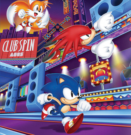
NOTE: This is purely about the game universe. While I do have my thoughts on Sonic’s world as presented in other continuities, that won’t be the focus here.
If you're familiar with my blog, you'll know that as a general rule of thumb, I much prefer colorful and creative worlds in my Sonic universe, and that rings true for my reasoning here. And I know what you're gonna say: “But Crusher, isn't there plenty of that in the Modern games as well?” Yes, there is, and I appreciate them very much. But this is why I feel the need to make a post of this sort to begin with, because I'm NOT saying “Classic cool, Modern boring” and calling it a day. There's a little more nuance to my tastes here.
When I say I prefer the Classic aesthetic for Sonic's world, I don't mean it in the literal sense of disregarding everything about the Modern aesthetic. Let's put it like this: when you're asked to paint a picture of these two sides of Sonic's universe in your head, a specific image will likely come to mind. When you think of Classic, you'll probably think of Green Hill first and foremost, whereas with Modern, you'll probably think of something like City Escape or Rooftop Run before anything else. In other words, when you think Modern Sonic, you're probably imagining the more realistic kind of locations first. And between the two mental images that come to mind, I personally prefer the Classic image. Shock, horror.
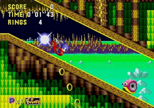
I wish I could swim in a sea that’s probably radioactive.
Now keep in mind, I'm not saying that City Escape, Rooftop Run, and all similar environments in the series look bad, because they don't. Unless they're painted with the '06 brush, they generally look fine, and the locations in Unleashed in particular are undeniably beautiful from an graphical standpoint. The problem is that although I can picture this as a world that Sonic could be in, I can't necessarily picture it as Sonic's world specifically. Because when it comes to the more realistic environments, I feel there's not much of an attempt to let it branch out as its own thing.
I know that might seem harsh, especially for Unleashed, since the real world angle was the deliberate theme of that game. And Sonic taking cues from real places is a fine concept, there's no issue there. I'm not gonna complain if there's a France Zone with an Eiffel Tower in the background. In fact, Sandopolis Act 1 has one of my favourite aesthetics in a Classic zone (mainly because the background is really pleasant to look at), and that zone is essentially Egypt Zone. But if you're making a Real World Zone, there needs to be more to it than that, otherwise you don't truly get a Sonic interpretation of our world... you instead have our world as it is with Sonic characters awkwardly stapled on.
When I look at City Escape, it may not be completely unfitting for Sonic (the posters and billboards in particular are actually a really nice touch), but when I look at it, I don't see Sonic's interpretation of San Francisco. I see San Francisco with Sonic shoved in. When they morph these places to Sonic's liking, they'll add rings, loops... and that's it. They rarely take the concept any further, which is a huge shame, particularly in the case of Rooftop Run, where I otherwise do like its visuals a lot, but it just doesn't go far enough with the concept for my liking.
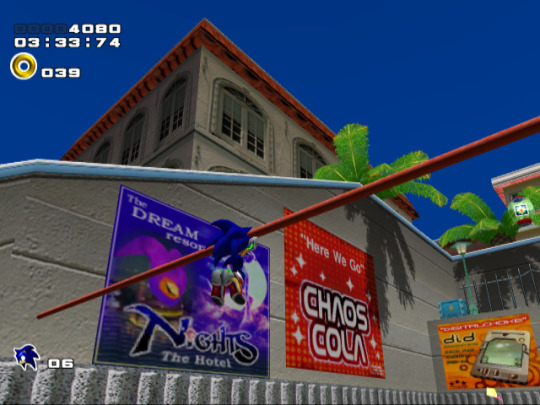
At least you get to murder car owners, and give G.U.N. a legitimate reason to arrest you.
So which Modern games do I feel did the best job at making Sonic's world... er, Sonic's world? Well the truth is, most of them actually do a decent job in this area, regardless of the level design quality or the game’s quality period. SA2 has Pumpkin Hill, Eggman's Pyramid Base, and... SOME levels aboard the A.R.K (mainly the “outside” ones, like Final Rush). Shadow the Hedgehog, a game that reveled in how brown and gritty it was, still had highlights like Circus Park and Digital Circuit. Even '06 of all games had Aquatic Base, which was pretty cool from a conceptual standpoint. And although Unleashed as a whole might be a touch too vanilla in the creativity scale, it still had the glorious Eggmanland at the very end. But if I had to say which of the Modern installments did the best job overall...
- For starters, I'm gonna give a shoutout to SA1, because even though it was the first Modern game, and thus it was technically responsible for the more focused angle of realism in Sonic's world in the first place, it didn't take it quite as far as later games would, and although it may not be a perfect 1-to-1 representation of the world we saw in the Classic games, it does well enough with what it brings to the table that I can still accept it without any issue at all. Some of that has to do with the fact that you still have wilder areas like Windy Valley and Red Mountain to balance things out, but even with the other half, the game's use of colour is enough for it to go a long way, oddly enough. Take the At Dawn section of Speed Highway for instance:

From innocent times, when the radar wasn’t a piece of shit.
Technically, it's really not that different to the urban environments you see in SA2 or Unleashed. But something about the sleepy morning approach gives it a subtle, almost dream-like edge to it that I really dig, and despite it being pretty similar to the likes of City Escape, somehow I have an easier time buying into the idea of this place being part of the same world as zones like Sky Sanctuary.
And seeing how I already mentioned Red Mountain, let me compare it to Flame Core:
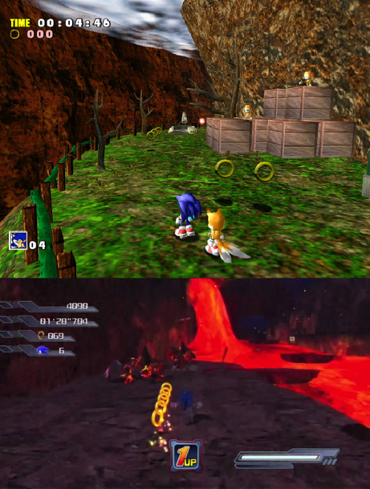
Yes, I know bringing '06 into this discussion at all is inherently and hilariously unfair, but let's put aside the game that Flame Core comes from for a moment. Aside from maybe the purple crystal caves indoors (and that's assuming you can even see where the fuck you're going in there), Flame Core is pretty boring to look at as far as Sonic levels go. Red Mountain is vastly more interesting, even though it's basically the exact same concept, and a lot of that has to do with - you guessed it - colour. Sure, it's day time, that's one thing, but you'll also notice that for a lava/mountain stage, it surprisingly has a few grassier sections, sort of like Hill Top in that regard. A little bit of green among the brown and red, and a great contrast to the volcanic nightmare you'll experience when you head inside.
Now this might seem like a fairly minor detail... and yeah, it is, but the thing that SA1 does so well is that it combines so many of those small details to make a complete, well-rounded package. This is why SA1 meshes well with the Classic style despite not being an exact replica, because just as the Classics excelled at, it wasn't afraid to use colour in interesting ways. It understood that a fire level could have more than just red and orange, in the same way that a grassy level could have more than just green and blue.
But of course, as I mentioned, SA1 is not an exception. There are other Modern games that did a great job on the whole...
- Heroes is an obvious answer, since it's translation of Genesis-style environments to 3D is probably one of the most recurring praises the game receives, and rightly so. Not much to say here, except that Hang Castle is still cool as hell.
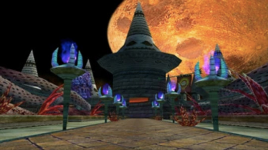
And plenty of opportunity to admire the not-broken-in-half moon.
- Colours is another obvious one, though something of an ironic one given that the premise of the game involved going to other worlds, and those worlds were all converted against their will by Eggman. Yet, they did an equally superb job at creating fun, unique locales, and Aquarium Park in particular remains a favourite of mine.

Gotta love that red/blue contrast.
- The Riders series has a more futuristic bend compared to the rest of the series, but even when it's not all high-tech, it's got some pretty cool environments of its own, and I feel they even do well at mixing the real world side of things on top of that. Gigan Rocks comes to mind, as does Aquatic Capital.
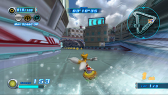
Reminds me of when Perfect Chaos peacefully protested against Station Square.
- Regardless of my thoughts on the game itself, Secret Rings had some undeniable winners in this depertment. You tell me with a straight face that Night Palace doesn't look amazing.
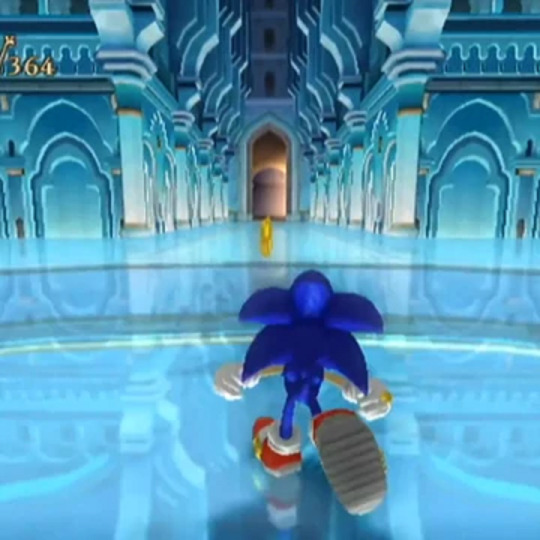
A wonderful palace for a domestic abuser.
- And lastly, they might have had an early advantage since they're already 2D, but the Advance trilogy and Rush duology deserve a mention. They had some fantastic ideas for zones, like Planet Sonata Music Plant, and they did great with the colours as well. Hell, throughout these five games, the sky was practically every shade of the rainbow at one point or another.
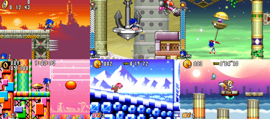
Oh look, another completely whole moon.
Also, quick shoutout to another minor detail akin to the grassy sections of Red Mountain: these pink tunnel sections in Ice Mountain. No elaborate point to make here, just another perfect example of how much I adore these games' use of colour and contrast.

Seriously, I could go on for hours about good contrast.
Although I do bring up these small details for another reason, and in turn, another layer to my more nuanced take on Sonic aesthetics. By this point, we get the basic jist: Crusher likey when Sonic levels unique and pretty. But this can - and has - lead to a couple of misconceptions, so I'd like to address those and then laugh at them.
“So you want Sonic's world to be exactly like Mario?”
A common complaint that Lost World received was that it was too much like Mario, in more ways than one, and part of this was to do with the game's visual style. The zones may have been upbeat, but they often consisted of a bunch of things floating in the air and not much else, ala 2D Mario. While I didn't outright hate it, it’s definitely not what I have in mind for Sonic.

Of course, all complaints about being too much like Mario suddenly turn into praise when Eggette gets brought up...
And why is that? Because yes, I like my Sonic locations to be fun and lively... but I also want them to be firmly established within the context of this universe. The Lost World approach is fine with Special Stages and the sort, but outside of that... well, Studiopolis is a perfect example of what I'm talking about:
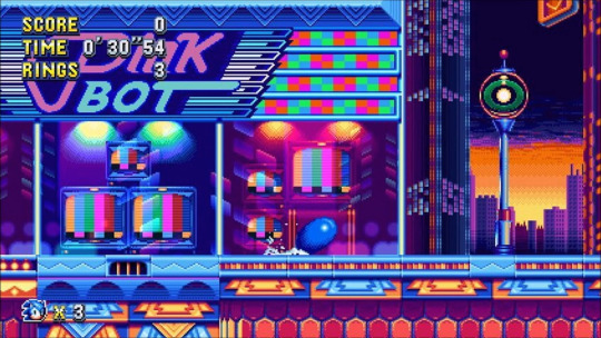
On one hand, it's very unique when compared to other cities in this franchise, and it's full of quirkiness, great use of colour, and all that good stuff I've went on about. But at the same time, it's grounded just enough so that it still feels like an actual city that the people of Sonic's world could feasibly live in, rather than a basic and empty video game level with a tacked on city background. Studiopolis may be a level from a video game, but you can totally believe it's a fully fleshed out place from its own perspective.
Naturally, this praise also rings true with the Modern games I listed earlier, and is yet another reason for why I approve of their settings.
“So you think Sonic can't have darker locations?”
It might be easy to take my compliments at face value, and assume that I'm immediately opposed to a zone that's not brightly colored. This is... very obviously false, as even the Classic games have their share of less-than-cheery areas, such as Scrap Brain and the Bad Futures in Sonic CD.
However, when you're making a grittier location in Sonic's world, regardless of the context, it still needs to be interesting. The problem with a lot of them in Modern installments is that they're boring. Crisis City is a generic city on fire. Westopolis is a generic city with aliens firing lasers from above. The prison levels in SA2 - and the indoor ARK levels not named Cannon's Core - are just grey hallways for the most part. That shit isn't exciting, and it doesn't get my mind speculating. It just makes me want to move on.

Let the eggsperts take care of this.
By contrast, Eggmanland is a prime example of how to do it right. Eggmanland is a magnificent theme park as envisioned by the good doctor, but it's also, at its core, a giant metal hellscape fueled by the energy of a dark entity, and it only gets more ominous the further you go through it or try to before you give up because it’s too fucking long and you died at the end. So it sets the mood to be sure, but it's still visually compelling to look at, and interesting to think about.
And since Eggman is apparently the only one who can show us how it's done, here's a shoutout to Titanic Monarch as well:

Like Heavy King, but Heavier and Kingier.
When comparing the final zones in Sonic games, I especially love this zone's visual approach, because it manages to be dark and colorful at the same time, and in a strangly organic way. It's got a spooky atmosphere, with a moody moonlight backdrop to match, and the titular robot is foreboding as hell as you climb up it and traverse through it... all the while having red floors, green and yellow wires, blue and pink buildings, and stained glass windows of Eggman and the Heavies for you to marvel at. So even putting aside the unique scenario of climbing up and then through a Kaiju-sized mech, the mood of the zone alone manages to be extremely memorable.
So what have we learned from all this? Aside from the fact that I’m way too interested in this subject? We now know that when I say I prefer the Classic “style” over Modern when it comes to the way that Sonic's world is presented:
- I don't mean that literally.
- There are certain qualities that although both of them possess, they tend to be more immediately associated with Classic in the collective consciousness, even within the fandom.
- The environments that I love the most in Modern games are often the ones that would also fit perfectly in the Classic style.
So whenever I express the basic nature of this opinion in the future... just imagine a small asterisk at the end of my sentence.
54 notes
·
View notes