#definitely wanted a slight 80s poster vibe with this. oh well.
Text
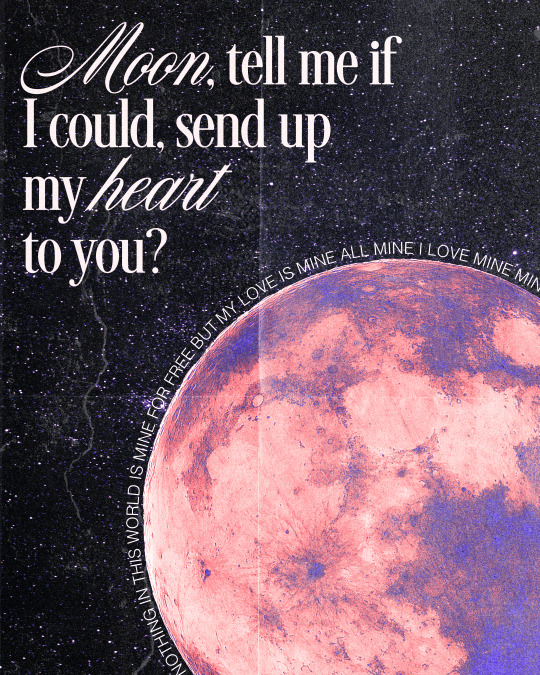
my baby here on earth, showed me what my heart was worth, so, when I die, which I must do, could it shine down here with you?
#mistki#the land is inhospitable and so are we#graphic design#art#lyric art#mitski art#my love mine all mine#originally had a coffee stain circling the moon to reference heaven but the gradient map muddied it and i liked the gradient to much to let#it go.#definitely wanted a slight 80s poster vibe with this. oh well.
839 notes
·
View notes
Photo





Design inspiration/ mood board
Library of Things branding, Kind Studio. [source]
When I initially sketched out my logo, I immediately knew the look and feel I wanted to have for the realised digital version. I imagined bold, clear lines and type, combined simply with blocks of flat colour (where relevant).
This branding by Kind Studio for the Library of Things (a place where you can borrow a multitude of items instead of buying), was something I came across after I’d digitized my logo and begun experimenting with colours, and which seemed to do exactly that. I knew that this was the sort of visual style I wanted to work in and develop for my festival, and I also liked the idea of using black and white to enhance a chosen colour palette/ combination, similar to the way that they have done.
I think that this style is appropriate for my audience as it’s clean and distinctive but at the same time doesn’t carry any particular notions with it because of it’s almost neutral appearance- leaving the audience to appreciate and take in the design around them at the festival with an open mind.
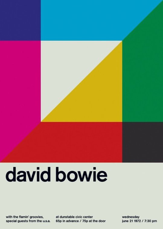
Swissted project, Mike Joyce. [sources 1, 2, 3, 4]
I was first introduced to the Swissted poster project by Mike Joyce, at college. Described as a series reimagining/ redesigning ‘vintage punk, hardcore, new wave, and indie rock show flyers into International Typographic Style posters’, it puts a fresh spin on a very classic style. [source]
What I love about this series is again the simplicity. Repeating shapes, playing with size, transparency, overlaying/ offsetting and colour, these minimalist posters can’t help but catch your eye. I want to draw influence from these characteristics to help form my own visual identity, and combining both line and shape is something I feel would fit in very well with the look I’m going for. The Swiss style also makes use of a grid, and I also intend to draw inspiration from that, as well as it’s arrangement of type- flush left or right.
The focus with pieces of work in this style often seems to be on clarity, straightforwardness, and order; the clear presentation and communication of information, therefore I think it’s a good style to try to emulate or draw inspiration from for my festival.
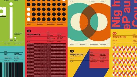
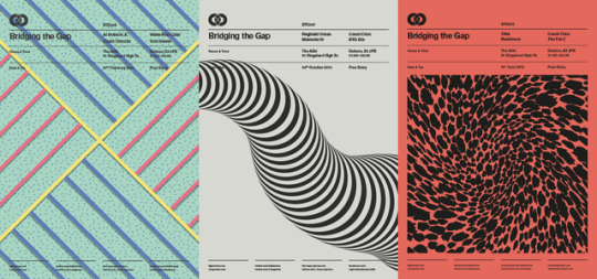
Bridging the Gap series, Ross Gunter. [sources 1, 2]
Bridging the Gap is another poster series I looked at around the same time as Swissted. The series similarly takes influence from the clean Swiss style, but also works with finer lines and in some instances, a more up to date colour palette- as well more exploring patterns, along with simple shape compositions/ arrangements. Looking at it has made me consider more about creating patterns myself/ repeating elements.
Memphis inspired showroom collection, Toth for InterfaceFlor. [source] [other sources 1, 2, 3]
Another bit of feedback whilst showing a few different tutors my colour palettte options ‘brainstorm’, was that some of the combinations reminded them of Memphis furniture, which in itself was quite strange and playful (and used bold colours and shapes). Memphis inspired graphic design is something I quite like-as someone fond of 80s design, and the way shapes and patterns are used in these, is something I think will help me in creating my own designs, as often times the elements can be quite simple, just arranged well.
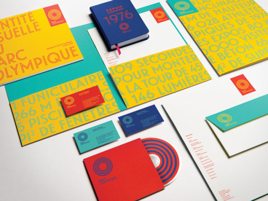
Parc Olympique branding, lg2boutique. [source]
One of the tutors also suggested that I should pick about four colour pairs for my options (refine them), and showed me this Parc Olympique branding as an example of an identity that works similarly. Limiting it to four makes the selection process easier and also allows me to see what might work together collectively.
What I like about this brand identity is the fact that they’ve managed to make it work with so little in the way of elements, which in fact makes it more effective. The rings from the logo are carried through to the outlined text as well as used standalone, and that’s essentially all there is. Text sometimes rotates around their circular logo such as in a vertical position, or is even used as shape(s) in the compositions.
A comment by the same tutor was that ‘if you’re clever enough, you can get everything you need for your graphic elements from your logo. You have the framework, just break it down, use what’s already there.’ From that alone, I can consider shapes such as squares, rectangles, diamonds, triangles, circles, crosses (intersects), as well as just lines for things to use as my graphic elements. I think that this is a good place to start and will soon start my development.
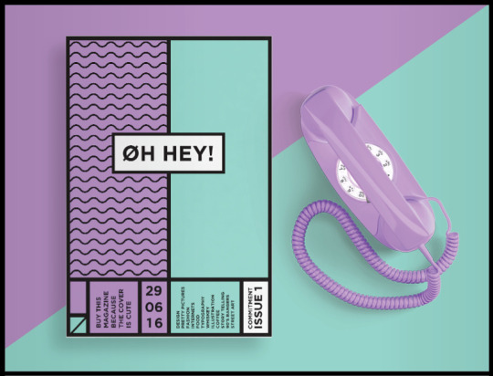
Oh Hey! magazine by Shanti Sparrow [source]
This is another example of design that I really liked and came across whilst browsing Pinterest. A word I can’t help but use to describe this, is ‘clean’ because everything about it is just crisp and really well done to me. I like the slight introduction of pattern to the design in that singular panel on the cover, and this has given me the idea of actually showing lines and divisions of a grid in my designs, as well as working with the guides of one. Another thing that I also like is that the designer has used both horizontal and vertical text. It’s definitely something worth considering and would make a design more interesting. I also get a slight Memphis vibe from this because of it’s boldness and simplicity.
1 note
·
View note