#dashboarddesign
Text
0 notes
Text
A Step-by-Step Guide to Create Dynamic Animated Graphs in Tableau
1.Connect to the Sample Superstore data in Tableau to load the dataset
2.Choose the "Sub-Category" field and place it into the Columns card.
3. Drag the "Sales" field and drop it into the Rows card.
4.Take the "Order Date" field and place it into the Filter card.
5. Drag the "Sub-Category" field and drop it into the Color option in the Marks card.
6. Select "Show History" to enable historical data.
Follow us for more insider tips and if you're ready to dive into the world of Tableau, enroll in our upcoming batches. 🚀 Contact us at +91 8288040281 or visit the link in bio for further details. 📈
#CACMSInstitute#TableauTutorial#DataVisualization#AnalyticsTips#TableauMastery#TechSkills#DataScience#DashboardDesign#VisualizeData#TechInnovation#TableauMagic#DataAnalytics#LearnTableau#GraphDesign#TableauTricks#DataStorytelling#BIExcellence#TableauExperts#DataVizCommunity#AnalyticsPro#TableauForBeginners
0 notes
Text

Empower Your Analytics: Best Power BI Courses for Success
Elevate your data game with the best Power BI courses. Uncover the secrets of dynamic data visualization and analytics. Master the art of business intelligence with top-notch courses, empowering your career journey.
0 notes
Text
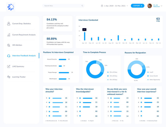
Human Resources - Interview Feedback Analysis Dashboard
0 notes
Text

youtube
#Dashboard Ninja: Powerful data visualization & business intelligence for Odoo by ksolves.#ksolves#OdooIntegration#BusinessAnalytics#DataInsights#DashboardDesign#CustomizableDashboards#RealTimeMetrics#DataReporting#ksolvesOdooApps#DataVisualizationTools#BIandAnalytics#BusinessPerformance#KPIVisualization#ksolvesSolutions#DashboardWidgets#Youtube
0 notes
Photo
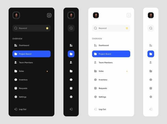
Today, we're on side panels #mobileapp #productdesign #uiuxdesign #uidesign #frontenddesign #appdesign #uidesign #uiux #uxdesign #UserExperience #userinterface #webdesign #uiinspiration #webdesign #dashboard #dashboarddesign #sidepanels https://www.instagram.com/p/ClLHa65Kll_/?igshid=NGJjMDIxMWI=
#mobileapp#productdesign#uiuxdesign#uidesign#frontenddesign#appdesign#uiux#uxdesign#userexperience#userinterface#webdesign#uiinspiration#dashboard#dashboarddesign#sidepanels
1 note
·
View note
Text
Dashboard Usability
I found a really interesting paper on the development of a dashboard for an emergency room in Seoul. The researchers designed the dashboard iteratively (over several rounds) then tested its usability. The paper is:
A Real-Time Autonomous Dashboard for the Emergency Department: 5-Year Case Study
By: Junsang Yoo, Kwang Yul Jung, Taerim Kim, Taerim Lee, Sung Yeon Hwang, Hee Yoon, Tae Gun Shin, Min Seob Sim, Ik Joon Jo, Hansol Paeng, Jong Soo Choi, Won Chul Cha
https://mhealth.jmir.org/2018/11/e10666
There were 2 subprojects: a dashboard for providers and a dashboard for patients and families. The dashboards fell under a Happiness project at the institution (called "Happinovation" - Happy innovation) that sought to enhance patient and provider happiness through process and hardware innovations.
There were three dashboard principles: (1) Anytime, Anywhere, at a Glance, (2) Minimal Interruption to Workflow, and (3) Protect Patient Privacy. And, there were three design principles: (1) Geographical Layout, (2) Patient-Level Alert, and (3) Real-Time Summary Data.
The researchers used the System Usability Scale (SUS) to obtain and measure participants' views on the usability of the dashboard. The SUS score was a high 67.6 points.
There was a lot of data to include in the dashboards so they were a little crowded/busy. I personally felt that they were too dark, but the dark color made the numbers pop (more visible).
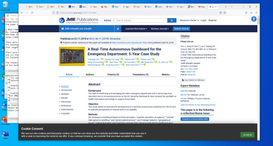
(Paper on designing a dashboard for an emergency room)
0 notes
Video
Dashboard Design & Development Services | Data Visualization Company | Techknomatic Services
A well-designed dashboard provides actionable and valuable information at a glance, assisting you in comprehending, analyzing, and presenting critical findings.
At Techknomatic we have highly skilled and experienced professionals who will give you best-in-class digital analytics and dashboard designs to impress and influence people.
Click the link below to know about our Dashboard Design Services:
https://techknomatic.com/services/das...
Quick Links:
Website: www.techknomatic.com
Facebook: https://www.facebook.com/techknomatic...
Instagram: https://www.instagram.com/techknomati...
LinkedIn: https://www.linkedin.com/company/tech...
Twitter: https://twitter.com/techknomatic
#DataAnalyticsCompany #DashboardDesignServices #DataVisualizationCompany #TKS #TechknomaticServices
0 notes
Text
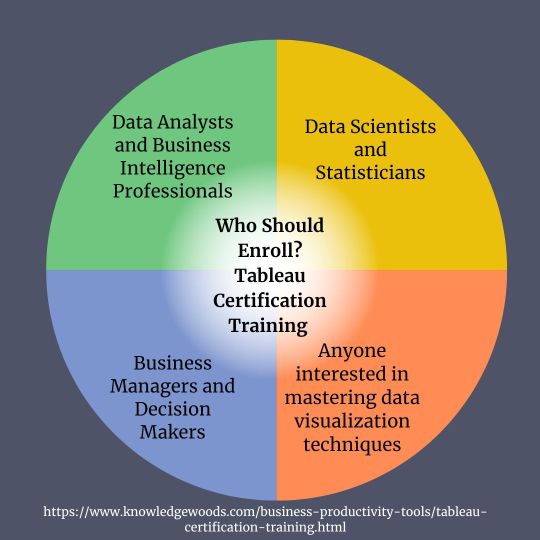
Getting the Hang of Data Visualization: A Handbook for Tableau Certification Training
The capacity to efficiently analyze and interpret data is a highly sought-after skill in today's data-driven society. Tableau is one of the most robust and approachable data visualization tools available. There are several more programs as well. Tableau Course powerful capabilities and straightforward interface enable users to build interactive and insightful visuals that facilitate well-informed decision-making.
Tableau Certification Training Courses provide an organized and thorough learning route for people who want to improve their knowledge of Tableau and certify their abilities. From the fundamentals of data visualization to sophisticated methods for building intricate dashboards and reports, these courses cover it all. Additionally, they help candidates get ready for Tableau certification tests, which are accepted as credentials in the data analytics industry.
Comprehending Tableau Certification
Tableau provides a variety of certification tests to accommodate varying degrees of experience, such as:
Tableau Desktop Specialist: This entry-level certification attests to a person's fundamental understanding of Tableau Desktop and fundamental ideas in data visualization.
Tableau Desktop Certified Associate: This certification shows competence in connecting to and preparing data, doing simple calculations, and generating interactive dashboards. It is intended for those with a deeper understanding of Tableau Desktop.
Tableau Desktop Certified Professional: This certification evaluates advanced abilities in data visualization, analysis, and dashboard creation and is aimed for seasoned Tableau users. A number of practical exercises are included in each certification test, which assesses practical skills as opposed to academic knowledge. Professionals can stand out on the job market and establish their credibility as knowledgeable data analysts and visualization specialists by obtaining a Tableau certification.
Tableau Certification Training Courses' Advantages
There are many advantages to taking a Tableau Certification Training Course, such as:
Organized Learning Path: These classes, which cover the fundamental ideas and abilities needed to pass certification tests, are created by Tableau specialists to offer an organized learning path.
Practical Experience: Working with real-world data sets and finishing activities that mimic exam tasks gives participants practical experience.
Expert Guidance: Throughout the course, knowledgeable teachers offer advice and support, sharing best practices and ideas for efficient data analysis and visualization.
Exam Preparation: Tableau Certification Training Courses are designed especially to get students ready for certification tests and make sure they are competent to handle test difficulties.
Networking Opportunities: Participants have the opportunity to connect with peers who share similar interests and career goals, fostering collaboration and knowledge sharing.
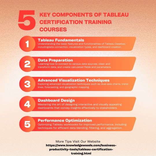
Key Components of Tableau Certification Training Courses
Tableau Certification Training Courses typically cover the following key components:
Tableau Fundamentals: Understanding the basic features and functionalities of Tableau Desktop, including data connection, visualization types, and dashboard creation.
Data Preparation: Learning how to connect to various data sources, clean and transform data, and create calculated fields and parameters.

Advanced Visualization Techniques: Exploring advanced visualization techniques such as dual-axis charts, trend lines, forecasting, and geographic mapping.
Dashboard Design: Mastering the art of designing interactive and visually appealing dashboards that convey insights effectively to stakeholders.
Performance Optimization: Optimizing Tableau workbooks for improved performance, including techniques for efficient data blending, filtering, and aggregation.
Conclusion
Tableau Certification Training Courses offer a structured and effective pathway for individuals to enhance their Tableau skills and obtain industry-recognized certifications. Whether you're a novice looking to enter the field of data analytics or an experienced professional seeking to validate your expertise, these courses provide the knowledge, skills, and confidence needed to succeed in the competitive landscape of data visualization. By mastering Tableau through certification training, you'll not only expand your career opportunities but also contribute to the advancement of data-driven decision-making in organizations across various industries. So why wait? Take the first step towards becoming a Tableau expert and unlock a world of possibilities in the realm of data visualization and analytics.
0 notes
Photo
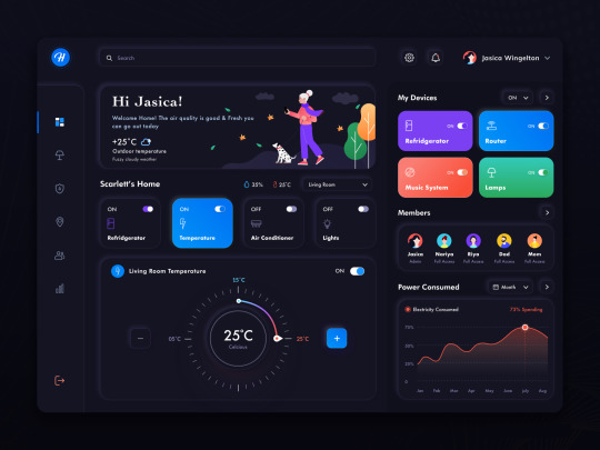
Free Smart home dashboard
Free Download 👉 http://uistore.org
2 notes
·
View notes
Text
Power bi online training with 100 % Placement Assistance

Secure your future with the Best #PowerBI Course in SR Nagar, Hyderabad at Learn giants!
Attend a Free Demo
Power BI empowers organizations to turn raw data into meaningful insights through interactive and visually compelling reports and dashboards. With its user-friendly interface, robust data connectivity, and advanced analytics capabilities, Power BI is a game-changer for businesses seeking data-driven decision-making.
Key Features:
Data Visualization: Transform data into visually appealing charts, graphs, and tables for easy interpretation.
Real-Time Analytics: Access and analyze data in real-time, enabling timely decision-making.
Interactive Dashboards: Create dynamic and interactive dashboards that provide a comprehensive overview of business performance.
Data Connectivity: Connect to a variety of data sources, both on-premises and in the cloud, ensuring comprehensive data integration.
Natural Language Queries: Use natural language queries to interact with data and gain insights without the need for complex queries.
Collaboration: Share reports and dashboards with stakeholders, fostering collaboration and informed discussions.
Security: Implement robust security measures to ensure that data is accessed and shared securely.
Hashtags:
#PowerBI
#DataVisualization
#BusinessIntelligence
#Analytics
#DataDriven
#BusinessAnalytics
#DashboardDesign
#MicrosoftBI
#LearnGiantsAcademy
#learngiants
#rajeshyepuri
Address: 🌐visit our website: www.learngiants.com for more information.
facebook :.https://www.facebook.com/
instagram:https://www.instagram.com/learn_giants/
CONTACT US:9032444875
📍 Location:#8-3-214/22/S, South India bank Building, 3rd Floor, Near Harsha mess, SR Nagar, Hyderabad-500038
#PowerBI#DataVisualization#BusinessIntelligence#DataAnalytics#DataInsights#Dashboard#BIReporting#MicrosoftPowerBI#DataDrivenDecisions#PowerBIDesktop#PowerBIService#PowerBICommunity#DataModeling#Analytics#DataStorytelling
1 note
·
View note
Text
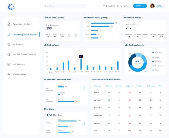
Human Resources - Current Requirement Analysis Dashboard
0 notes
Text
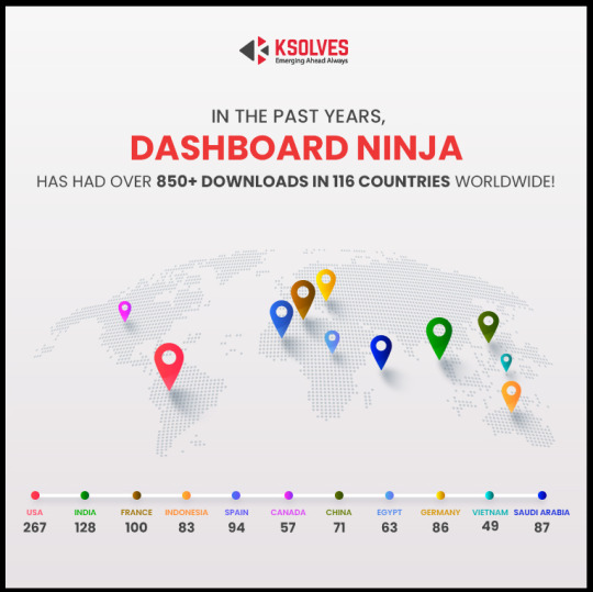
Odoo Top Rated App Dashboard Ninja
#Odoo #KSDashboardNinja #OdooApps #BusinessIntelligence #DataVisualization #DashboardBuilder #Reporting #Analytics #KPIs #BusinessDashboard #DataAnalysis #PerformanceMetrics #EnterpriseManagement #DataInsights #CustomDashboards
#Dashboard Ninja: Powerful data visualization & business intelligence for Odoo by ksolves.#ksolves#OdooIntegration#BusinessAnalytics#DataInsights#DashboardDesign#CustomizableDashboards#RealTimeMetrics#DataReporting#ksolvesOdooApps#DataVisualizationTools#BIandAnalytics#BusinessPerformance#KPIVisualization#ksolvesSolutions#DashboardWidgets
0 notes
Text
Empowering Your Business Insights with Power BI: Unveiling the Magic of Data Visualization
In today's data-driven world, extracting actionable insights from vast troves of information is key to staying ahead of the curve. This is where Power BI shines. A robust business intelligence tool developed by Microsoft, Power BI empowers organizations to harness the power of data through intuitive visualization and analysis. In this blog, we'll explore the importance and myriad uses of Power BI, shedding light on how it can revolutionize the way businesses understand and leverage their data.
The Importance of Power BI:
1. Data-driven Decision Making: Power BI enables businesses to make informed decisions by transforming raw data into meaningful insights. By visualizing data trends, patterns, and correlations, decision-makers can gain valuable perspectives to drive strategic initiatives.
2. Real-time Analytics: In today's fast-paced business environment, timely insights are paramount. Power BI offers real-time analytics capabilities, allowing users to monitor key metrics and KPIs as they evolve, facilitating agile decision-making and proactive problem-solving.
3. Accessibility and Ease of Use: Power BI's intuitive interface and user-friendly features make it accessible to users across all levels of technical proficiency. With drag-and-drop functionality and customizable dashboards, users can quickly create compelling visualizations without extensive training or coding expertise.
4. Integration with Microsoft Ecosystem: As part of the Microsoft ecosystem, Power BI seamlessly integrates with other Microsoft tools and platforms, such as Excel, SharePoint, and Dynamics 365. This interoperability enhances collaboration, data connectivity, and productivity across the organization.
Key Uses of Power BI:
1. Data Visualization: Power BI enables dynamic and interactive data visualization, allowing users to create compelling charts, graphs, maps, and dashboards that convey complex information in a digestible format.
2. Business Performance Monitoring: With Power BI, businesses can monitor key performance indicators (KPIs) in real-time, tracking progress towards organizational goals and identifying areas for improvement.
3. Predictive Analytics: Power BI offers advanced analytics capabilities, including predictive modelling and machine learning integration. By leveraging historical data and algorithms, businesses can forecast trends, anticipate customer behaviour, and make data-driven predictions.
4. Report Generation and Sharing: Power BI facilitates seamless report generation and sharing across teams and departments. Whether it's scheduled email reports, embedded dashboards, or interactive presentations, Power BI makes it easy to disseminate insights and foster collaboration.
5. Data Exploration and Analysis: Power BI provides robust data exploration and analysis tools, empowering users to delve deep into their data, uncover hidden insights, and answer complex business questions on the fly.
#PowerBI #DataVisualization #Analytics #BusinessIntelligence #DataAnalytics #BIReporting #DashboardDesign #DataInsights #DataDrivenDecisions #PowerQuery #PowerPivot #DataModeling #DataAnalysis #PowerBIPro #DataStorytelling #VisualAnalytics #BIConsulting #DataManagement #PowerBITip #BIPlatform
1 note
·
View note
Text
Are you ready to revolutionize your dashboard experience?
Introducing Thememakker's LUNO admin template, the ultimate solution for modern and stylish dashboards!
With LUNO Mega Bundle, you gain access to company support, 10+ layouts, 500+ HTML pages, and much more.
Explore the incredible features of LUNO Admin Template, such as dynamic font settings, LTR and RTL support, and easy template customization.
With 10+ business niche concepts, LUNO will meet all your business requirements. It's time to take your projects to the next level.
For a seamless experience, get all HTML, CSS, SCSS, and JS files, along with a starter kit.
Choose the license that suits you best, whether it's the Regular License ($18) or the Extended License ($999).
Our dedicated support team is here to assist you.
Contact us anytime via live chat or email at [email protected].
Don't miss out on the dashboard revolution. Embrace LUNO Admin Template and elevate your digital journey today!
#LUNOAdminTemplate#DashboardRevolution#StylishDashboards#LUNOMegaBundle#WebDevelopment#BusinessNiche#HTMLTemplates#DashboardDesign#DigitalJourney#Thememakker
URL: https://www.wrraptheme.com/templates/luno/marketing/
For more details visit https://www.Thememakker.com/
Thememakker Infotech LLP
B-906/907, Titanium Heights,
Corporate Rd, Prahlad Nagar,
Ahmedabad (India) – 380015
Call: 7573830505
Email: [email protected]
Follow Us,
https://www.linkedin.com/company/thememakker/
0 notes
Last Seen Blogs

muse-of-meme
local boi has adhd, more at 11

thatkeeleyhawesblog
"I'm a dirty burger kind of lady"

theoppositeoftwizzlers
✨moby mobius✨

melancholicpills
Remington Leith ❤️

akavir89
Bellies are some hot stuff