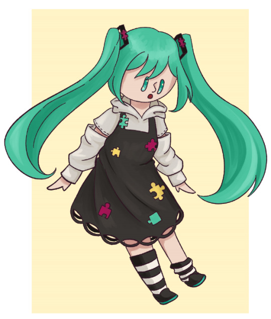
#cmyk yellow ep
Photo
CMYK June Day 2
Dolphin (I Found You)
#please listen to cmyk by circus-p#vocaloid#megurine luka#vocacmyk#cmyk yellow ep#cmyk yellow#not ec
16 notes
·
View notes
Text


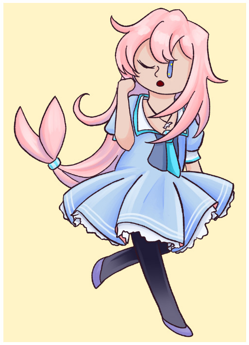
The four EP album covers I did for Circus P's album CMYK! ft the album mascot that I also designed :3
Speedpaints: Yellow, Magenta, Cyan, Key
#circus p#vocaloid#CMYK#ibblescribbles#2022#hey did you notice#did you notice their hands form their respective letters#I’m so genius for that I’m so genius
109 notes
·
View notes
Text
Grundlagen der Drucktechnik: Welche Farbräume und Dateiformate eignen sich für den Druck?
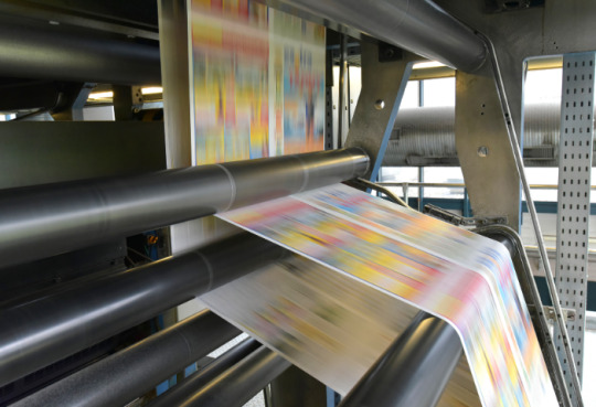
Du hast also ein fantastisches Design erstellt und möchtest es auf Papier zum Leben erwecken. Aber Moment mal! Bevor du deinen Finger auf den Druckknopf legst, gibt es ein paar grundlegende Dinge zu beachten. In diesem Blogartikel werde ich dir die ins und outs der Drucktechnik erklären – von Farbräumen bis hin zu Dateiformaten. Also schnall dich an und lass uns eintauchen!
Drucktechnik - Wo Magie auf Papier trifft
Drucktechnik ist die Kunst, digitale Designs in physische Werke zu verwandeln. Es ist der Moment, in dem Pixel auf Papier treffen und ein beeindruckendes visuelles Erlebnis entsteht. Aber damit diese Magie passiert, müssen wir einige Dinge berücksichtigen. Farbräume und Dateiformate sind die Schlüssel zu einem erfolgreichen Druck.
Farbräume - Das Spiel der Farben
Farbräume sind wie der Farbkasten eines Künstlers. Sie definieren den Bereich der Farben, die in einem bestimmten Medium dargestellt werden können. Im Druck gibt es zwei gängige Farbräume: CMYK und RGB.
CMYK - Vier Buchstaben, unendliche Möglichkeiten
CMYK steht für Cyan, Magenta, Yellow (Gelb) und Key (Schwarz). Diese vier Farben werden beim Drucken verwendet, um eine breite Palette von Farben zu erzeugen. Jede Farbe wird durch das Mischen der entsprechenden Tinten auf dem Papier erzeugt. CMYK eignet sich hervorragend für den Druck, da es ein breites Spektrum an Farben darstellen kann. Es ist der Standardfarbraum für den professionellen Druck.
RGB - Wenn das Licht den Ton angibt
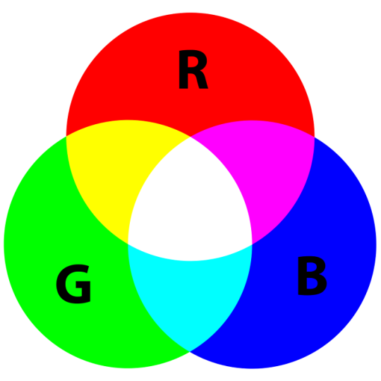
RGB steht für Rot, Grün und Blau. Dieser Farbraum basiert auf der Kombination von Lichtfarben. RGB wird hauptsächlich für digitale Medien verwendet, da Bildschirme und elektronische Geräte Licht emittieren. Es ist wichtig zu beachten, dass RGB-Farben möglicherweise anders aussehen, wenn sie gedruckt werden, da Drucker die Farben in CMYK umwandeln müssen. Wenn du also ein Design für den Druck erstellst, verwende idealerweise den CMYK-Farbraum, um ein genaueres Ergebnis zu erzielen.
Dateiformate - Die Sprache der Drucker
Dateiformate sind die Sprache, die Drucker verstehen. Sie sind der Schlüssel, um deine Designs in ein Format zu bringen, das für den Druck geeignet ist. Hier sind einige gängige Dateiformate, die du für den Druck verwenden kannst:
PDF - Das unverwüstliche Format
PDF steht für Portable Document Format. Es ist ein vielseitiges und stabiles Dateiformat, das für den Druck sehr gut geeignet ist. PDFs bewahren die Formatierung, Schriftarten und Bilder deines Designs genau so, wie du sie erstellt hast. Sie sind plattformübergreifend kompatibel und können von den meisten Druckereien problemlos verarbeitet werden. Wenn du sicherstellen möchtest, dass dein Design genauso gedruckt wird, wie du es entworfen hast, ist das PDF-Format eine sichere Wahl.
TIFF - Das verlustfreie Format
TIFF steht für Tagged Image File Format. Es ist ein verlustfreies Dateiformat, das eine hohe Qualität der Bilder und Grafiken beibehält. TIFF-Dateien können große Dateigrößen haben, sind aber ideal, wenn du Bilder in hoher Auflösung für den Druck benötigst. Sie bieten eine ausgezeichnete Farbgenauigkeit und werden häufig in der professionellen Druckindustrie verwendet.
EPS - Das Vektorformat
EPS steht für Encapsulated PostScript. Es ist ein Vektorformat, das sich besonders gut für den Druck eignet. Vektorgrafiken verwenden mathematische Formeln, um Grafiken zu erstellen, und bieten eine unbegrenzte Skalierbarkeit. EPS-Dateien sind ideal für Logos, Illustrationen und andere grafische Elemente, die gestochen scharf gedruckt werden sollen.
JPEG - Das platzsparende Format
JPEG steht für Joint Photographic Experts Group. Es ist ein komprimiertes Dateiformat, das häufig für digitale Fotos verwendet wird. JPEG-Dateien sind platzsparend und eignen sich gut für den Druck von Fotos, bei denen eine hohe Detailtreue nicht unbedingt erforderlich ist. Allerdings sollte die Komprimierung nicht zu hoch sein, um Qualitätsverluste zu vermeiden.
Die richtige Wahl treffen
Jetzt weißt du also, welche Farbräume und Dateiformate für den Druck geeignet sind. Aber wie triffst du die richtige Wahl? Hier sind ein paar Tipps, die dir helfen können:
- Überprüfe die Anforderungen der Druckerei: Jede Druckerei hat möglicherweise spezifische Anforderungen in Bezug auf Farbräume und Dateiformate. Stelle sicher, dass du diese Anforderungen kennst und dein Design entsprechend anpasst.
- Arbeite im CMYK-Farbraum: Wenn du ein Design für den Druck erstellst, arbeite idealerweise von Anfang an im CMYK-Farbraum. Dadurch kannst du sicherstellen, dass die Farben genauer gedruckt werden.
- Speichere eine Kopie im richtigen Dateiformat: Wenn du dein Design abschließt, speichere eine Kopie in dem für den Druck geeigneten Dateiformat. Überprüfe dabei die Komprimierungseinstellungen, um die Qualität zu erhalten.
- Verwende hochwertige Bilder: Achte darauf, hochauflösende Bilder zu verwenden, insbesondere wenn du sie in gedruckter Form anzeigen möchtest. Niedrig aufgelöste Bilder können zu Pixelbildung und unscharfen Druckergebnissen führen.
Indem du diese Tipps befolgst und die richtigen Farbräume und Dateiformate für den Druck verwendest, kannst du sicherstellen, dass deine Designs in ihrer vollen Pracht auf dem Papier erscheinen.
Drucke deine Kreativität aus
Die Welt des Drucks bietet unendliche Möglichkeiten, deine Kreativität auszudrücken. Indem du die Grundlagen der Drucktechnik verstehst und die richtigen Farbräume und Dateiformate wählst, kannst du sicherstellen, dass deine Designs im Druck genauso beeindruckend aussehen wie auf dem Bildschirm. Denn let's face it, es gibt etwas Magisches daran, ein physisches Werk in den Händen zu halten, sei es ein Poster, eine Broschüre oder eine Einladungskarte.
Ein guter Druck ist wie ein Kunstwerk. Die Wahl der richtigen Farbräume und Dateiformate ist dabei entscheidend, um die Farbgenauigkeit und Qualität deiner Designs zu gewährleisten. Es ist wie das Mischen von Farben auf einer Palette – du musst die richtigen Töne wählen, um das gewünschte Ergebnis zu erzielen.
Aber hey, das bedeutet nicht, dass du deine Kreativität einschränken musst! Im Gegenteil, die richtige Beherrschung der Drucktechnik ermöglicht es dir, deine Designs noch besser zum Ausdruck zu bringen. Du kannst mit verschiedenen Farbnuancen und Texturen experimentieren, um ein einzigartiges und ansprechendes Druckwerk zu schaffen.
Und vergiss nicht den Wow-Faktor, den ein gut gestalteter Druck haben kann. Es ist wie der Moment, wenn ein Zaubertrick enthüllt wird und das Publikum staunend zurückbleibt. Ein gut gedrucktes Design kann Menschen beeindrucken, Emotionen wecken und deine Botschaft effektiv vermitteln. Es ist eine Form der visuellen Kommunikation, die ihre eigene Sprache spricht.
Also, wenn du das nächste Mal ein Design für den Druck erstellst, denke daran, dass die Wahl der richtigen Farbräume und Dateiformate einen großen Einfluss auf das Endergebnis hat. Behalte den CMYK-Farbraum im Auge, um präzise Farben zu erzielen, und wähle das geeignete Dateiformat, um die Qualität deiner Bilder und Grafiken zu erhalten. Und vor allem: Lass deine Kreativität fließen und bringe deine Designs zum Leben!
Drucktechnik ist wie eine Zauberkunst, bei der du die Kontrolle über die Farben, Texturen und Qualität hast. Also, schnapp dir deine Ideen, setz dich vor den Drucker und lass die Magie geschehen! Deine Designs verdienen es, auf Papier zum Leben zu erwachen und die Welt zu verzaubern.
Read the full article
1 note
·
View note
Text
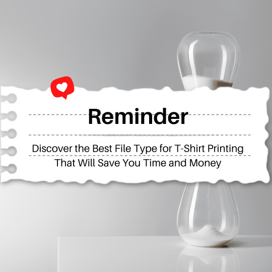
Discover the Best File Type for T-Shirt Printing That Will Save You Time and Money
T-shirt printing is a popular method of promoting a brand or sharing a message. It is an effective way of showcasing creativity while expressing individuality. With the advancement in technology, it is now possible to print any design or image on a t-shirt. However, choosing the right file type is essential for the success of any printing project. In this blog, we will discover the best file type for t-shirt printing that will save you time and money.
The best file type for t-shirt printing is a vector file. Vector files are graphics that are created using mathematical equations rather than pixels. They are designed to be infinitely scalable, meaning they can be enlarged or reduced without losing their quality or resolution. This makes them perfect for printing on a t-shirt because they will maintain their sharpness and clarity, even when resized.
The most common vector file formats are AI, EPS, and PDF. These formats can be created using software like Adobe Illustrator, CorelDRAW, or Inkscape. They are the preferred file types for most t-shirt printers because they allow for easy editing and manipulation of the design.
Vector files are also very efficient in terms of file size. They are usually smaller than raster images, which are made up of pixels. This means that vector files take up less storage space and are quicker to load. This can save you time and money in the long run, as smaller file sizes mean faster printing times and lower storage costs.
In contrast, raster images are made up of tiny pixels, and their quality depends on the resolution. High-resolution images may look great on a computer screen, but they may not print well on a t-shirt. This is because the resolution required for printing is much higher than what is needed for viewing on a screen. Raster images also tend to be larger in file size, which can slow down the printing process and cost more to store.
The most common raster file types are JPEG, PNG, and TIFF. While they may be suitable for some printing projects, they are not recommended for t-shirt printing. If you must use a raster image for your design, it is important to make sure that it is at least 300 DPI (dots per inch) and saved in the CMYK color space.
In addition to choosing the right file type, it is also essential to prepare your design correctly. This includes ensuring that the design is the correct size and resolution, and that the colors are optimized for printing. T-shirt printers often use the CMYK color space, which stands for cyan, magenta, yellow, and black. It is essential to convert your design to CMYK before printing to ensure that the colors are accurate.
In conclusion, choosing the right file type is essential for the success of any t-shirt printing project. Vector files, such as AI, EPS, and PDF, are the best file types for t-shirt printing as they maintain their quality and clarity when resized, are smaller in file size, and can be easily edited. Raster images, such as JPEG, PNG, and TIFF, should be avoided as they may not print well on a t-shirt and can be larger in file size. By choosing the right file type and preparing your design correctly, you can save time and money and ensure that your t-shirt printing project is a success.
Read the full article
1 note
·
View note
Text
Vector vs Raster - What Is The Basic Difference and Which One Choose for Your Artwork
If you are a photographer or designer, you probably know what you are dealing with. For the others who are just starting, it can be a little bit overwhelming – raster, vector, bitmap, pixel. I’m expecting that everybody knows .jpeg, .jpg, but what about .svg? What is the difference between .png and .jpeg? Well, if don’t know about .jpeg, probably you have never downloaded a wallpaper then but do not worry, everyone has to start somewhere, someday!
What is actually the difference between vector and raster?
Which formats are used for each of them?
For which projects I should use vector or raster?
For a digital artist, it is very important to understand the difference between vector and pixel art. Each of them has special software and needs, each of them is used for different purpose. Also, every single file format is giving you different options. Today we will look at the basics of these to get a better understanding.
Raster (bitmap, pixel)
Raster images are often called bitmaps. They consist of millions of tiny little squares which we call pixels. Pixel stands for “picture element”. It’s the smallest physical element of a digital display device. It’s pretty easy to recognize it by yourself. Try to open any photo you have and zoom in. Closer you look, more blurry the image becomes and in the end you will be able to see the little pixels. Bitmaps are created with pixel-based programs, captured with a camera or scanner. Usually, almost every drawing/painting app is raster oriented. Creating such artwork is pretty similar to traditional painting or drawing. You have many brushes to choose from, you can blend colors easily to soften the transition, you can apply many filters, gradients, undefined lines and shapes, and complex composition.
Raster format is resolution specific – that means that the photo you just took is displayed in one specific resolution. If you will try to resize the picture, bigger without changing the number of pixels, it will get blurry and not nice to look at anymore. Scaling down its not such a big problem, but the smaller version could be less crisp or softer than the original. There is a possibility to change the number of pixels but the pixels will be added randomly, rarely producing a good outcome.
We have two main names using raster images. PPI and DPI. They are both describing the resolution or clarity of an image, but they are not the same thing.
PPI (pixel per inch) means how many pixels will fit into one inch. A 72 PPI image will have 72 pixels per inch. PPI describes the number of pixels for the digital screen. PPI can be modified with photo/painting editing software.
DPI (dots per inch) means how many dots per inch my printer will print on the paper. Printers are not printing little squares. So how do they do it with raster images? They reproduce the image by spitting out tiny dots consisting of a mix of colors – Cyan, Magenta, Yellow, and Key (black) per the pixel of your image. DPI is set by the printer itself and cannot be manipulated.
That’s why we as digital artists can work with two different color schemes CMYK and RGB. Today we are not going so deep into this, so just put it simply – CMYK is for printing method, RGB is for electronic displays – monitors, phones, tablets etc.
Almost all the pictures you will find on the websites are raster images (even though they could be vector images before). Photographs and pictures in books or magazines are usually also pixel images, but these images are saved with very high resolution what is making them very big files in the end.
Formats of raster images
.jpg, .jpeg, .gif, .png, .tiff or .tif, .psd (Photoshop)
Popular programs used with raster images
Adobe Photoshop, Procreate, Affinity Designer (pixel persona), AutoDesk, Corel and many others
In which hobbies or jobs I can use pixel graphic
Photography, digital painting
Vector
Total opposite from pixel images, vector images are created with a mathematical formula that’s defining lines, curves and primitive shapes like polygons, circles, and rectangles known as paths. Vector graphics have to be created in software that is designed to create lines includes node position, locations, lengths, and curves. Because vector graphics are composed of geometrical primitives, it is very best to use it for more structured images like logos, line art, illustrations with flat, uniform colors, letterheads, and fonts.
Vector images are more flexible and versatile. You can scale them down, up easily and perfectly. They have also no resolution restriction and therefore they are not depended on the output device. And because vector images don’t have to handle millions of tiny pixels, these files are usually smaller than their raster sibling. You can easily recognize vector by looking at the edges, doesn’t matter how much you scale, they will always stay crystal clear and smooth.
One of the biggest disadvantages is the compatibility. They are often saved as native files from the programs they have been created in. Like Adobe Illustrator and their native .ai file. If I will use Affinity Designer to open .ai file, good, I will succeed. But if I will save a file with Affinity, I will not be able to open it with Illustrator. Another disadvantage is the limitation of effects. Vector will be never as a natural painting. It is just not possible. The best to print vector is PDF or EPS, which are producing the sharpest result.
THEREFORE MANY ARTISTS ARE COMBINING THESE TWO TOGETHER AS WELL.
Formats of vector images
.ai, .ait, .art, .svg, .pdf, .eps and many more
Popular programs used with vector vector graphics
Adobe Illustrator, Affinity Designer, Corel Draw, Sketch, Inkscape etc.,
In which hobbies or jobs I can use pixel graphic
Graphic designer, illustrator, printing publications design and others
Conclusion vector vs raster
It all depends on your project. Vectors are best for logos and illustrations. Raster images are classic for digital photography and are very often used for all graphic once they have been published digitally. If you want to repaint Mona Lisa on your iPad, you will not use vector unless you would like to look it as Picasso style Mona Lisa.
Raster images should be used if you require high lever detail (photos) and you don’t care much about by enlarging the image by a great amount. On the other hand vector you will use on images what requires tiny details and might be resized in the future.
1 note
·
View note
Text
How to Prepare Your File for Large Format Printing
HERE ARE 5 TIPS TO PREPARE YOUR FILE FOR QUALITY LARGE FORMAT PRINTING!
The large format printing requires taking some precautions critical for a quality print. Low quality printer and forgetting between taking the picture and calibrating the printer can impact your entire print. So to gain in quality and productivity, it is necessary that your files are prepared correctly. So here are some basic tips to save your time and money!
THE FORMAT
Leave 3 to 5 mm between the edge of your document and your content (text, image, logo, etc.). Anticipate the position of the eyelets and any fittings.
THE RESOLUTION
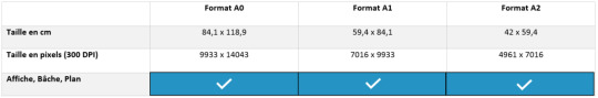
Whether you want to print a working document, a plan, a work of art or a photograph, the resolution is essential: a number of pixels large enough to work on the image without loss. For prints up to A0 format it is recommended to have a resolution of 300 dpi (pixels per inch). Below that the image quality will be poor, above this the file will be heavy and the processing slow without any quality gain.
For very large format prints , the optimum resolution will be between 120 and 150 dpi. You should also consider the type of media used and the distance at which the media will be viewed.
THE COLOUR
It is preferable to use only CMYK colors (Cyan, Magenta, Yellow, Black) for better color reproduction. RGB colors are to be avoided. It is often difficult to get the precise color you want. In particular, because several factors influence the rendering of your print:
Your computer screen: all screens do not have the same calibration and this one can change according to the age and its use during the day. This is why from one screen to another a color will be different and in printing also.
Print Media : If you're printing on tarpaulin, tape, vinyl, or just paper, the color may also vary. The quality of the support can also interfere with the color rendering.
The type of ink: you may also get different shades of color on your prints depending on whether your ink is eco-solvent or UV-curable. Even if today their system faithfully reproduces the colors there will always be a slight variation.
The print heads:
As you use your plotter, the print heads wear out. The rendering will therefore not be equivalent between a new head and a used head.
This is why in printing you can get close to a color, but it is difficult to achieve perfect precision and reproduction.
For black the important thing is that C, M and J are equal to or above 25 each. Otherwise your black that appears on the screen will be gray when printed.
example: CMYK = 50/50/50/100
THE FILE TYPE
For the best quality, use files in TIFF, EPS or JPG formats. The source files .psd or .ai are the most reliable.
THE BAT
The printing of a test image, called the proof, validates the final image before the final printing. You can also give rigidity to your print (laminating, laminating, etc.).
You have therefore understood for a successful large format printing several parameters must be taken into account and those stated above are only an exhaustive list.
0 notes
Text
Which file format does your logo need to be in?
As a businessman, you should do all you can to make your logo eye-catching and memorable as your logo is the cornerstone in your brand identity. And if you want a professional logo design, you need to know about the different file formats you can get your logo in.
There are two main categories of logo design files – Vector and Raster – and both are intended for a different purpose. So, knowing what files you are sending and why is very important for you. Here is a brief guide that will help you get some logo design inspiration.
Vector files
Vector files can be scaled without compromising with quality as they are built up from mathematically precise points. It is going to keep looking sharp, whether it is billboard size or a stamp size. It is perfect for high quality or large scale printing purposes. For example; exhibition stands, vehicle printing, pens, brochures, etc. Also, these files are provided in CMYK (Cyan, Magenta, Yellow, and Black) color mode. These colors are used to make up the colors in a full printed page. PDF, EPS, AI and SVG files are the most popular vector files.
AI: Adobe Illustrator
The AI file is an editable, transparent and scalable working file. You can only view this format with the Adobe software until it is saved with PDF compatibility. AI is becoming more viable as a logo format and it is perfect for printing purposes.
PDF: Portable Document Format
Vector format and transparency are making PDF logos more popular. Also, you can view PDF universally on any computer with Adobe Acrobat. It is great for print or web digital. Also, you can open and modify this format in the same way an AI file can.
EPS: Encapsulated PostScript
When it comes to choosing the logo file format for print, EPS plays a vital role. It is scalable, editable and transparent but only if you have the right software. If you use PNG and EPS files, you can do anything you want to do with your brand’s logo.
SVG: Scalable Vector Graphic
SVG is an XML-based vector image format and is perfect for animation. You can use this graphic format for current web development demands of performance, scalability, accessibility, and interactivity.
Raster Files
Raster files are made of small squares called pixels. They are provided in RGB (Red, Green, and Blue) colors. They have a file extension of.JPEG or.PNG.
JPG/JPEG: Joint Photographic Experts Group
JPG/JPEG is the best file format for websites, everyday printing, Microsoft Office programs, etc. It is debatably the most commonly used image file format. It offers very good compression without overly degrading the image. This means the size of the image is very small, so it will be able to load quickly.
PNG: Portable Network Graphics
PNG is a file that is used for website, email or any computer programs. One of the best things about this file is that it holds a transparent background. Also, it doesn’t lose quality during editing.
Hope you have now understood which file format you should use for your logo design. Designing a logo with a correct file format is a very daunting task. When you hire professionals for reliable logo design services, you will get a beautiful and valuable logo at the end.
0 notes
Text
3.1 AVAILABLE NOW!
Our new EP 3.1 is now available! Continue the journey from where 3 left off with Imperfect Black, and start in the void that is Absolute Black.
Grab the digital copy or CD at store.seims.net - and absolutely, it’s on all streaming platforms.
From our press release:
Sydney's instrumental math-rock band SEIMS is set to release their EP '3.1', a follow-up to 2017's math-rock masterpiece '3', on March 29th. In anticipation the band will be dropping their first single, 'Translucence', on Friday March 1st which will give fans their first taste of the luminance-inspired EP. '3.1' will see its release into the world on Friday March 29. All pre-order information can be found at www.seims.net.
3.1 is a continuation of the concept album of "3" in the way that the third album explored the CMYK relationship, summing Cyan, Magenta and Yellow, where 3.1 focuses on luminance and the relationship of light within the colour spectrum. Imperfect Black closes 3 - and Absolute Black picks up right where it left off with it’s immediate drop and wall of sound, shifting through various modes, until the subtle key and tempo changes in the outro - starting the luminance journey.
Front man and multi instrumentalist Simeon Bartholomew spoke about the thought process behind the new single. "Translucence is all about the passage between" he said. "[It begins] lost and struggling to find its way out of the absolute black, until we find our feet towards the big middle section of that song - then leading into pure Clarity - the 7/4 banger that’s all about seeing this one motif through right to end - almost heading 'towards the light' with that giant mess it finishes on."
To compliment Translucence, the track will drop with its gorgeous music video. The band paired up with contemporary dancer Angela Hamilton, known for her award-winning Opus, to choreograph and dance to the music following the translucence journey from the first song on the EP, Absolute Black, to the final track, Clarity.
0 notes
Text
logo design services company
https://www.kooldesignmaker.com/logo-designA great logo can help a business project a positive image while a bad
logo can bring a negative impression about a company. For many
companies, a logo is the only identifiable mark a potential customer may
ever see, so it needs to be memorable, descriptive and easily
recognizable. If a logo is the company spokesman, how much is it really
worth?
Shoddy logo plans are everywhere throughout the Internet - logo outlines under $150! logo design services company
$99 logo outlines, $75 logo plans, $49 logo outlines and even lower!
You will effectively locate an extensive variety of costs for logo outline on the
Web. Be cautious of shoddy logo configuration offers, a few originators might be
utilizing cut workmanship. A logo outline that incorporates a sovereignty free bit of clasp craftsmanship
can't be copyrighted. That same bit of clasp craftsmanship could be utilized on
many other logo outlines. An originators portfolio ought to be shown
what's more, there ought to be a wide assortment of logo tests. At $49 each, do all
of the logos appear to be identical? Do the greater part of them have piece lettering
what's more, a swoosh?
Some logo creators charge one level expense for a logo without any inquiries
inquired. Will you envision Coca-Cola buying a logo plan for $99?
What an arrangement! Or, then again what about Bob's trap shop paying $750 for a logo.
There goes the financial plan! All organizations are not equivalent in size, spending plan and
use. All outlines are not equivalent. Does a swoosh take a similar sum
of time and exertion as making a point by point bike?
The perplexity doesn't stop there. Some logo architects charge
extra expenses for additional hues, additional adjustments and additional
preparatory plans. You need to get your number cruncher out just to figure the
last cost of your logo. Do you truly know what you are paying for?
What amount is a logo outline truly worth? Ask Coca-Cola, Polo, Nike,
The Hard Rock Cafe, Hallmark or whatever other organization that depends on their logo design services company
logo as their main representative. Not each organization is as expansive as
these however every organization ought to have a logo that is anything but difficult to distinguish and
remains for the respectability of that business.
A logo configuration is more profitable to an organization than a solitary spot
outline. A representation is ordinarily utilized once or utilized for a restricted
battle, while a logo is utilized for quite a long time and is put on business
cards, letterheads, envelopes, sites, vehicles, structures and
items. Do you see the distinction in incentive to an organization? A logo has
more incentive than simply the hours spent on making it. It turns into the
organizations personality.With that said, shouldn't a logo be worth more than just the time involved
in creating it? Professional graphic design rates average anywhere from
$30 to $75 per hour. If you see a logo design priced at $125 and that
designer charges $50 per hour for design work, do you assume that
they spent 2.5 hours on your logo? That price would include the time
spent to contact you, the research done on your company and
competition, the preliminary ideas, the changes, the finalizing of the
logo, the file prep for each different format, sending the logo, billing and
allowing you to have all rights to the design. So how much time was
actually spent creating your logo?
My conclusion is that a logo is much more valuable to a company than a
standard illustration so the price should reflect the added value. Many
professional graphic designers would be hard pressed to create a top
notch illustration for under $150 let alone a creative, well designed logo.
So beware of logos priced under $150, you may get what you pay for.
There's even more confusion about logo pricing. Some designers base
their logo rates on several of these factors:
Logo Modifications - You could get charged for each time you want a
change or modification to your logo. If a logo designer asks the right
questions, does the research and stays in close communication with the
client there should be no need for major changes during the creation of
a logo design. Be a good communicator and explain to the logo
designer exactly what you want your logo to be saying about your
business. As a designer, you should get signed approval for each
modification showing that the client was in agreement at the time.
Extra Colors - Printers charge more for extra colors. If a logo designer
charges more for a two color logo than they do for a three color logo, get
a detailed explanation as to why. It only takes the click of a mouse to
add an extra color. In today's world there is very little need for color
separations so there should be no need for a designer to charge by the
color.
Preliminary Designs - A few choices is good, to many choices is overkill.
A logo designer should be able to decide for you the correct amount of
preliminary designs it will require to create your perfect logo. Be leary of
eight, ten and more initial designs. How much time could actually be
spent on each design? If you don't like your first two or three designs
you can easily request two or three more.
If you are on a committee or a board, I assure you that you do not want to
present ten logos to ten different people. You may never get down to a
winning design.
logo design services company
On the other hand, if you need an additional presentation of logos due
to a complete change in direction on the companies part, there should
be an extra fee. An example would be asking for a yellow duck logo
design and changing your mind to a red dog design once the logos are
presented to you.
Adding a personality program to your logo is a honest to goodness cost. Outlining
the business card, letterhead and envelope designs are regularly a
higher evaluated bundle. You ought to get camera prepared records for each
outline.
There is a standard reference for evaluating visual communication and corporate
character ventures. It is Pricing and Ethical Guidelines, distributed by the
Visual Artists Guild. Any logo planner can buy the book. A
proficient visual fashioner would have an intense time supporting a
family and a studio outlining the majority of their logos underneath $200.
I'm not composing this to give correct costs for a logo outline in light of the fact that each
logo architects conditions are distinctive. Beginner logo architects
charge significantly less to get their feet wet, however gradually increment their rates as
they pick up understanding and innovativeness.
The standard logo configuration rates depend on two noteworthy segments,
organization size and application or conveyance measure. The dominant part of logo
outlines made over the Internet are made for little organizations and
people with constrained application and conveyance employments. Fortune 500
organizations regularly pay significantly higher logo configuration rates and utilize
publicizing offices.My conclusion is that the value of a logo should be based on a few
important criteria:
1. Experience of the logo designer
2. Size & budget of the company using the logo
3. Scope and usage of the logo
4. Difficulty of the design
An individual or small company with small to average uses should be
prepared to pay anywhere from $300 to $1500 for a top quality, logo design services company
logo design.
What's included with your logo? The worst part of paying for a cheap
logo is finding out that you were not sent the correct file formats for
printing and web. You will then have to pay another graphic designer or
printer to create the correct files. Be aware of what file types you will be
needing and ask your logo designer what file types are included in their
price.
The most common file types needed are AI (Illustrator) and EPS for most
professional print jobs. These are vector format files. These files should
be in a CMYK color format. Vector art allows you to reduce or enlarge a
design to ANY size without losing detail or clarity.
For home use and some print jobs you will need TIFF and BMP files.
These are pixel files and should have a DPI (dots per inch) of at least
300 dpi. 600-1200 dpi is best for professional printing. These type of
files lose their detail when enlarged but can be reduced.
The last file types you will need would be JPEG and GIF. These are
pixel files and are used for web design. They should be in a RGB color
format. Be aware that not all colors translate well on the Internet,
especially GIF files. Ask if the logo designer used web safe colors. You
should receive crisp 72 dpi files for the Internet. A GIF file should be
transparent if you do not want a white box around it when displayed on
your page.
Be sure and ask your logo designer about your logo colors. Ask them for
the Pantone PMS color numbers for each color. You will need this
information each time your logo is printed. This insures that you get the
exact same colors with every printer that you use.
Will you get your files over the Internet or will you receive a CD? Try to
get a CD, it is much easier to take that to your local printer. Ask your
designer how long they keep your logo on file in case you lose your
versions later down the road.
You should also receive all rights (copyrights) to your logo. logo design services company Since a logo
is a companies identity you will need to own all rights to get a trademark.
Ask for this in writing if you have any doubts.
Ask for the background on the logo designer you choose, you should at
the very least know their name. Do they have a degree? How long have
they designed logos? Is this their profession or a hobby? Where is there
portfolio? Can you contact their other clients? Can you speak to them
directly? With the amount of software available today and the invention
of the Internet, any sixteen year old kid can start his own logo design
company.
In closing let me say that the information above is a personal opinion
and is taken from years of searching logo design web sites and reading
books on graphic design. The prices and information I have explained
here only pertain to the work of graphic designers, not advertising
agencies. An advertising agency handles logo design on a larger scale
and incorporates an entire corporate identity service. Their logo design
rates are many times higher than a graphic designers. logo design services company
8 notes
·
View notes
Text
63 Web Design Terms Every Marketer Should Know
When you're new to marketing, especially on a small team, you might have to do a lot of things at a moment's notice. And when it comes to things like blogging and social media, sure, you've got this. But soon enough, you're being pulled onto design projects. One day you're mocking up an infographic; the next, you're designing an ebook. You feel woefully unprepared -- and that design vocabulary? It can feel like a foreign language.
Sound familiar?

We've been there -- and we know we're not the only marketers who have, at some point, needed to become fluent in this vocabulary. So we decided to share a larger glossary, to help us all step up our game a bit. By no means is this the be-all-end-all of design terminology, so feel free to add your definitions in the comments as well. Here's what we have, organized alphabetically.
The Ultimate Web Design Terms Glossary
A / B / C / D / E / F / G / H / J / K / L / M / N / O / P / R / S / T / V / W / X / Z
A
1) Alignment
The positioning of the elements in your design (e.g. text, images, etc.). These elements can be aligned to both the page and to each other. For example, this paragraph of text is aligned to the left margin, whereas the lines depicted in the image below are aligned to the right.

Source: Pixabay
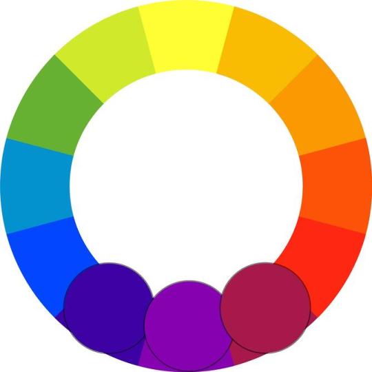
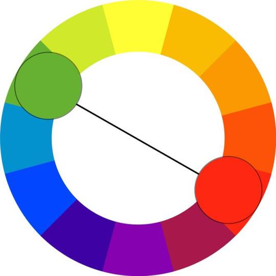
2) Analogous Colors
Colors that appear adjacent to each other on a color wheel.
Source: nopira
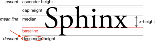
3) Ascender
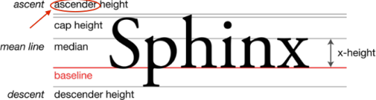
A linear extension of a letter that appears above the midline -- also see baseline, cap height, descender, and extender.
Source: Max Naylor
B
4) Baseline
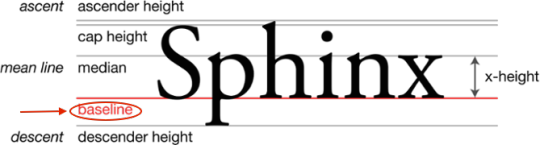
The even, invisible line on which all letters of a typeface sit -- also see ascender, cap height, descender, extender, and midline.
Source: Max Naylor
C
5) Cap Height
The distance between the baseline and the top of uppercase letters -- also see ascender, descender, extender, and midline.

Source: Max Naylor
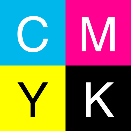
6) CMYK Color Model
Stands for cyan, magenta, yellow, and black. This set of colors is used in print design because of the way paper absorbs light.
Source: Capsoul
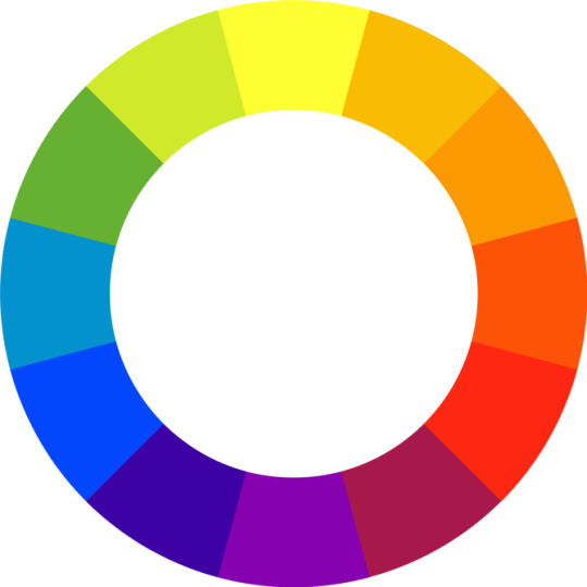
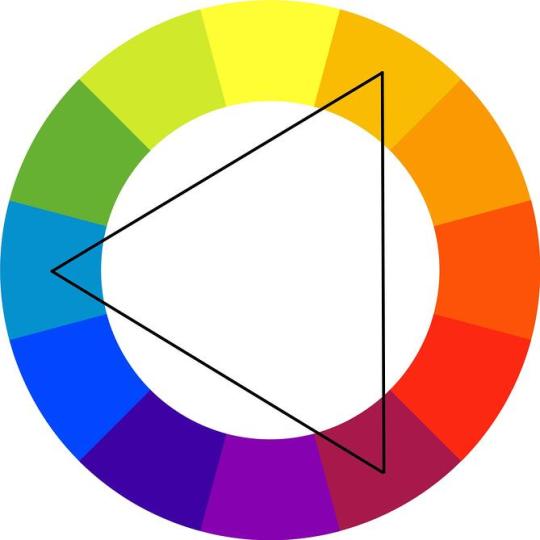
7) Color Wheel
A circle of colors that shows relationships between primary, secondary, and tertiary colors.
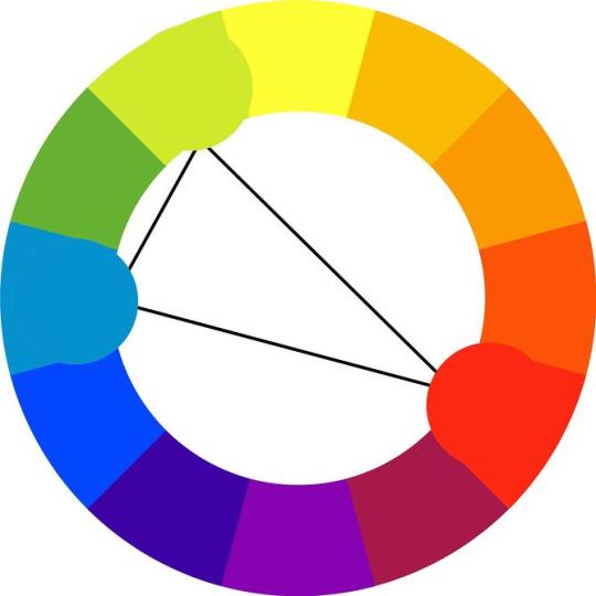
Source: nopira
8) Color Schemes
The combination of two or more colors from the color wheel -- also known as color harmonies.
9) Complementary Colors
Colors that are directly opposite of each other on the color wheel.
Source: nopira
10) Compression
Reducing a file size by eliminating excess data. Particularly helpful when emailing or saving large image files. See more on lossy and lossless compression.
11) Contrast
The accentuation of differences between colors, shapes, spacing, or any other design element.
Source: Pixabay
12) Crop
When outer parts of an image are removed to reframe the subject matter, or to resize the image's aspect ratio.
13) CSS
A piece of code that is used to designate the look and feel of a website, separate from the actual content of a web page.
D
14) Descender
An extender on a letter, appearing below the baseline -- also see ascender, cap height, and midline.
Source: Max Naylor
15) Dots per Inch (DPI)
Similar to the pixel for the web, dots are the smallest unit of measurement when printing digital images. The number of DPIs refer to the resolution of a printed digital object -- the higher the DPI, the higher the resolution.
16) Drop Shadow
A visual effect that displays a graphic as if it had a shadow behind it.
Source: Tizio
E
17) EPS
A file format used for vector images that contain both text and graphics.
18) Extender
The part of a letter that extends above the x-height or below the baseline -- also see ascender, cap height, descender, and midline.
F
19) Feathering
A design technique used to smooth out edges of a feature.
20) Font
A typeface in one specific style and size. An example would include Times New Roman Semi Bold in size 14.
G
21) GIF
An image file format that's best used for small image files with few colors and designs, or animated images. Below is an example of an animated GIF image:

Source: Manuel Almagro Rivas
22) Gradient
A design technique in which one color or portion of an image appears to fade into another.

Source: Public Domain Pictures
23) Grid
A purely hypothetical map of vertical and horizontal lines that helps align images and text within a document.
H
24) HEX Code
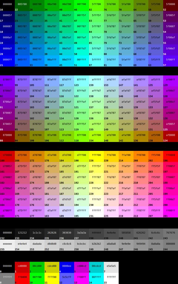
A code used in HTML and CSS to designate a specific color, often appearing after the pound sign (#). Below is a chart of HEX color codes:
Source: bmdavll
25) HTML
The computer language used to display content like text, images, and links on the web.
26) Hue
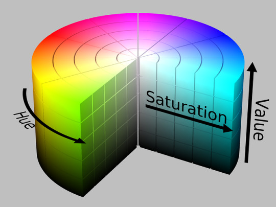
What most people think of as "color" -- red, orange, yellow, etc.
J
27) JPEG
An image file type that uses lossy or lossless compression, with little perception in a loss of quality. This type of file is best used for photographs and realistic paintings where there are smooth transitions between colors.
K
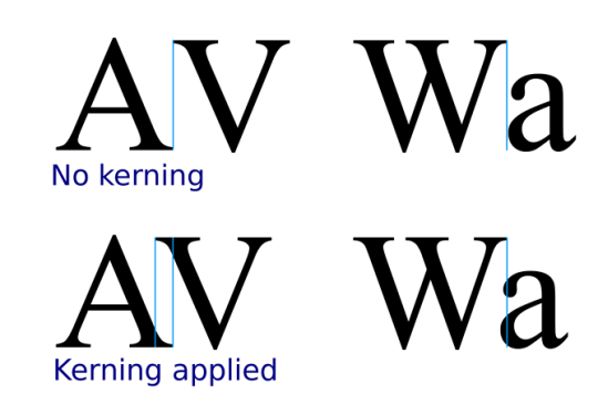
28) Kerning
The space between individual letters.
Source: Sherbyte
L
29) Leading
The space between lines of type.
30) Lossy
A form of data compression where detail is deleted as the file size is decreased. A usual lossy compression method is JPEG.
31) Lossless
As opposed to lossy compression, this format allows the image's detail to be restored.
M
32) Midline
The distance from the baseline to the top of most lowercase letters, including “e,” “g,” and the curve of “h." Also know as the "median," as depicted below. See ascender, cap height, and descender.

Source: Max Naylor
N
33) Negative Space
The empty space surrounding a design, whether a webpage or single image -- also see white space.

Source: Public Domain Pictures
O
34) Open Type Fonts
The current standard in font formats. It contains both the screen and printer versions in a single file, and is compatible for both Windows and Mac. The file extension is .otf.
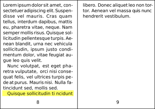
35) Orphan
An opening line in a paragraph that appears alone at the bottom of a page. An orphan can also be a word or very short line that appears by itself at the end of a paragraph.
Source: Maat
P
36) Pantone
A color-matching system developed by the Pantone company. Largely used in print design, and used to match printed colors to those that appear on the screen during the digital phase of design.
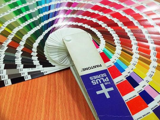
Source: Pixabay
37) PDF
A file format best used to represent documents and presentations.
38) Pixel
The smallest element of an image on a computer.
39) Pixels per Inch (PPI)
Another measure of image resolution, according to how many pixels are present within a given section of the image.
40) PNG
An image file format that's best used when the image has large areas of uniform color, or a transparent background (unlike JPEG).
R
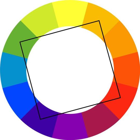
41) Rectangular (or Tetradic) Colors
Four colors that are two pairs of complementary colors.
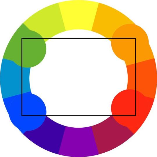
Source: nopira
42) Resolution
A way of measuring the sharpness and level of detail in an image. A higher resolution usually indicates a larger file size, representing the amount of data -- like pixels or dots -- within the image.
43) RGB Color Model
An acronym standing for the colors red, green, and blue. The RGB color model is used for web design, because monitors transmit light in these colors.
Source: Mike Horvath
S
44) Saturation
How bright or intense a color is.
Source: SharkD
45) Serif
A small line attached to the end of a stroke in some fonts. "Sans serif" refers to fonts that don't have this line.

Source: GJo
46) Shade
How much black is mixed in with the hue.
47) Split-Complementary Colors
Colors that consist of a base color, plus the two colors that lie next to its complementary color.
Source: nopira
48) Square Colors
On the color wheel, four colors are spaced evenly from each other.
Source: nopira
49) Stem
The primary vertical stroke in a letter. It’s used in the letter “B” and the diagonal line of “V.”
50) Strokes
The lines that make up a letter in a typeface.
T
51) Tail
The descending stroke in a letter that’s often decorative -- for example, in the letter “Q.”
52) Terminal
The end of a stroke that doesn’t include a serif.
53) Tint
How much white is mixed in with the hue.
54) Triadic Colors
Color scheme in which three colors located at 120 degrees from each other on the color wheel are combined. It's often considered the best color scheme.
Source: nopira
55) Typeface
A design collection of characters, including letters, numbers, and punctuations. Examples include Times New Roman, Helvetica, and Arial.
V
56) Vector Image
Instead of using pixels to represent images, vectors use lines and shapes. Because they do not rely on pixels, enlarged vector images still maintain image clarity and quality.
57) Visual Hierarchy
A design principle that visually orders and emphasizes different parts of your content’s message by using colors, sizes, and layouts.
W
58) Watermark
An easy-to-see marker placed over the top of photos on the web and in print. It is used to identify the owner of an image and prevent visual content theft.
59) Weight
In typefaces, the thickness of the stroke’s width. Some examples include demibold, light, and bold.
60) White Space
The blank space surrounding an object in design -- also see negative space.

Source: Pexels
61) Widow
The section of text at the end of a paragraph that spills over into the following column or page.
Source: Maat
X
62) X-height
In a letter, the distance between the midline and baseline -- also see ascender, cap height, descender, and extender.
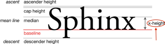
Source: Max Naylor
Z
63) ZIP file
A file format that compresses several files and combines them into a single folder. Compressed files do not lose any data to become smaller, and are easily restored by unzipping the ZIP file.
What other web design terms would you add to the list? Let us know in the comments.
Editor's Note: This post was originally published in July 2013 and has been updated for accuracy and comprehensiveness.

from HubSpot Marketing Blog https://blog.hubspot.com/marketing/non-designers-web-design-glossary
0 notes
Text
10 lý do bạn nên học illustrator
Đối với bất cứ nhà thiết kế đồ họa nào cũng đều nên biết kết hợp nhiều phần mềm đồ họa khác nhau để tạo nên những tác phẩm hiệu quả cao. Đa số mọi người khi nghe đến "thiết kế đồ họa" là nghĩ ngay đến Adobe Photoshop. Còn bạn thì sao? Bạn đã bao giờ thử với các phần mềm khác như Adobe Illustrator chưa? Ở bài viết trước, Mình đã giới thiệu đến các bạn 10 lý do bạn nên học Adobe Photoshop, bây giờ mình sẽ giới thiệu đến các bạn 10 lý do bạn nên học Adobe Illustrator, một chương trình cũng hay không kém Adobe Photoshop.
Adobe Illustrator là một phần mềm đồ họa khá phổ biến, nó chủ yếu thao tác trên các đồ họa vector, cho phép bạn tạo và chỉnh sửa các vector chứ không phải ảnh bitmap như Photoshop. Do đó, với Adobe Illustrator bạn có thể tạo một file kích thước nhỏ nhưng in với một kích thước to hơn gấp nhiều lần mà không gặp vấn đề gì cả.
Adobe Illustrator là một chương trình linh hoạt có khả năng cung cấp các tác phẩm cuối cùng chất lượng khá cao. Với khả năng tạo và chỉnh sửa các đối tượng dễ dàng, Illustrator thực sự phù hợp cho các nhà thiết kế đồ họa. Riêng bản thân mình cũng có niềm đam mê về Illustrator cao hơn Photoshop. Hiện cũng còn rất nhiều điều tốt về Illustrator, nhưng mình nghĩ những lợi ích dưới đây cũng có thể đáp ứng được như cầu sử dụng của các bạn.
1 . Bạn có thể tự do thể hiện ý tưởng
Với Adobe Illustrator, bạn có thể hoàn toàn tự do thể hiện ý tưởng của mình bằng bất cứ cách nào bạn muốn, cho dù bạn có thể sẽ phải bắt đầu từ con số 0, thì nó cũng dễ dàng hơn cho bạn. Nếu bạn biết vẽ tay, những bản sketch của bạn trên giấy sau khi được xử lý lại bằng Adobe Illustrator thì tuyệt vời. Bạn thật sự có cơ hội tạo ra bất cứ điều gì bạn muốn bằng các công cụ của Illustrator.
2 . Bạn có thể tạo logo
Trong tất cả các tác phẩm được tạo bằng Adobe Illustrator, thì logo là cái được đặt lên hàng đầu. Chỉ với text và công cụ Pen Tool, hay các công cụ tạo Shape cơ bản khác, bạn có thể dễ dàng tạo ra được nhiều hình dáng khác nhau cho logo của bạn, và nó cũng dễ dàng để đặt lên bất cứ một background nào mà bạn muốn. Mọi thứ trở nên thật linh hoạt. Bạn cũng có thể lựa chọn bất kỳ màu sắc nào mà bạn cho là thích hợp với logo của mình.
3 . Bạn có thể vẽ tất cả các đối tượng
Các bản vẽ và các đối tượng có thể trở nên thực tế hơn với Adobe Illustrator. Ngoài các công cụ tạo Shape cơ bản, bạn còn có công cụ Gradient hay Gradient Mesh, với các điểm lưới và điểm màu, giúp cho tác phẩm của bạn nhìn thực tế hơn. Những công cụ này có thể giúp tạo ra một bề mặt thật mịn và màu sắc hòa đều với nhau. Bạn cũng có thể nhấn mạnh một số điểm hay đối tượng trên bản vẽ của mình. Điều này có thể sẽ gây ngạc nhiên và ấn tượng tốt với khách hàng hơn.
4 . Bạn có thể vẽ hoạt hình
Những nhân vật hoạt hình có thể được sử dụng như một biểu tượng cho thương hiệu, cho truyện tranh hay bất cứ mục đích nào có thể thực hiện được với Illustrator. Bạn chỉ cần tạo ra đó bằng công cụ Pen, sử dụng màu sắc sinh động, hay đơn giản là thêm những cái bóng với công cụ Gradient. Nó cũng thật tiện lợi để chỉnh sửa hay thay đổi màu sắc bất cứ lúc nào bạn muốn.
5 . Bạn có thể vẽ các icons
Với hệ thống Grid System tuyệt vời của Adobe Illustrator, bạn có thể dễ dàng tạo ra các icons với nhiều hình dạng khác nhau. Bạn chỉ đơn giản là sử dụng những shape cơ bản như hình vuông, hình tròn, v.v... Nó rất dễ dàng để bố trí và sắp xếp trên hệ thống lưới của Illustrator, giúp bạn tạo ra những icons đẹp cho thiết kế của mình.
6 . Bạn có thể vẽ bản đồ
Bản đồ là rất quan trọng để xác định vị trí của mình hay tìm hướng đi đến một nơi nào đó. Nó rất quan trọng và hữu ích đối với khách du lịch và những người khác, những người cần được trợ giúp để xác định đúng hướng. Bạn có thể vẽ bản đồ với công cụ Line và Pen của Adobe Illustrator để tạo ra các đường đi, các shape của mọi điểm nào đó. Lúc đầu, nếu bạn chưa quen sử dụng Pen Tool thì có lẽ nó cũng hơi khó khăn với bạn, nhưng nếu bạn luyện tập và sử dụng lâu dài sẽ thấy nó thật sự tiện ích, bạn có thể dễ dàng chỉnh sửa và rút ra bất cứ điều gì bạn muốn từ bản đồ.
7 . Bạn có thể vẽ biểu đồ
Biểu đồ thường được dùng trên các báo đài, tạp chí, trang web, sách vở, nhằm hiển thị các số liệu thống kê về một vấn đề nào đó. Bạn cũng có thể dễ dàng tạo ra nó với Adobe Illustrator đơn giản bằng cách nhập dữ liệu và các con số. Bên cạnh đó, bạn cũng có thể trang trí cho nó bằng một vài icons, shape hay màu sắc phong phú. Bạn chắc chắn sẽ dễ dàng tạo ra biểu đồ và đồ thị của bạn bằng chương trình này.
8 . Bạn có thể thay đổi kích cỡ tác phẩm tùy ý
Vì bạn đang làm việc với các đồ họa vector, nên bạn có thể thay đổi kích thước của nó tùy ý mà không ảnh hưởng đến chất lượng. Nó sẽ không bị bóp méo, không bị bể, và các chi tiết vẫn được đảm bảo hiển thị rõ ràng. Bạn có thể hoàn toàn yên tâm về độ phân giải và chất lượng của nó.
9 . Bạn có thể in ấn với các màu riêng biệt
Như các bạn đã biết, trong in ấn, người ta thường sử dụng hệ màu CMYK, đó là sự kết hợp của 4 màu : Cian, Magenta, Yellow và Black. Adobe Illustrator làm việc cực kỳ tốt với hệ màu này, Bạn sẽ không có bất cứ rắc rối nào với vấn đề in ấn của Illustrator. Thậm chí bạn còn có thể tách riêng 4 màu ra để in từng màu riêng biệt (hỗ trợ cho chế bản khi in lụa). Illustrator là một phần mềm tuyệt vời nếu công việc của bạn chú trọng đến in ấn.
10 . Bạn có thể lưu các file EPS
Một ưu điểm khác của Adobe Illustrator là khả năng lưu lại các file với đuôi file là EPS. Với file EPS, bạn sẽ có các tác phẩm in ra sắc nét, điều này có thể đảm bảo cho các logo hay những tác phẩm chi tiết như brochure, poster. Bạn nên save các file của bạn lại thành EPS trước khi đưa cho khâu in ấn, để có thể đảm bảo chất lượng cho tác phẩm ở mức cao nhất
Adobe Illustrator có thể được sử dụng cho bất cứ mục đích nào của thiết kế đồ họa. Nó chắc chắn sẽ mang lại cho bạn sự tự do để thể hiện sáng tạo thông qua các tác phẩm nghệ thuật khác nhau. Vì thế, bạn đã sử dụng Adobe Illustrator chưa? Tại sao bạn không thử dùng nó bây giờ để khám phá sự thú vị tuyệt vời của nó?
Học Công nghệ thông tin ở Tây Nguyên
0 notes
Photo
CMYK June Day 1
Puzzle
You know what? Why shouldn’t I be posting these here. Nothing to do with ec but it’s still vocal synths so it counts. Enjoy this month of me being annoying by telling you to listen to this album.
12 notes
·
View notes
Text
What is the best file format for printing with quality?
Best File Format for Printing If We Need Quality?
Design best file formats for printing companies?
We are all aware there are thousands of different graphic file formats for design files all across different computer and software brands, but with the pass of the years, it has been clear on which are the most used file formats and which ones printing companies prefer as for the design file.
youtube
Keeping it simple, among all thousands of file formats, printing companies ask the customer to convert their graphic design to “.JPG” as the highest compression (less amount of storage) and highest quality (Will distort the image a lot less than other file formats). Also, remember to convert your art to CMYK for long run offset printing or RGB for color copies. Both are going to be explained further in the article.
What File Formats Are Accepted Appart From “.JPG” For Printing
At 55printing.com we accept all file formats available in the world and we then convert it to our more convenient file formats for printing, then we send a graphical proof via email to the customer totally free of charge even before you place the order with us.
To request a free proof for your design, please visit the “Free design proof” request form section here: 55printing.com/free-design-digital-proof-before-printing-order.html
Top 10 File Format for Design Printing
JPG = used interchangeably with JPG. JPEG stands for Joint Photographic Experts Group, who created the standard. JPG files have 2 sub-formats, JPG/Exif (often used in digital cameras and photographic equipment), andJPG/JFIF (often used on the World Wide Web).
PNG = (pronounced ping as in ping-pong; for Portable Network Graphics) is a file format for image compression. In time, is expected to replace the Graphics Interchange Format (GIF) that is widely used in today’s Internet.
PDF = PDF is also an abbreviation for the Netware Printer Definition File. PDF (Portable Document Format) is a file format that has captured all the elements of a printed document as an electronic image that you can view, navigate, print, or forward to someone else.
DOC = In computing, DOC or doc is a filename extension for word processing documents. Most commonly in the proprietary Microsoft Word Binary File Format. Historically, the extension was used for documentation in plain text, particularly of programs or computer hardware on a wide range of operating systems.
TIFF = Tagged Image File Format (TIFF) is a variable-resolution bitmapped image format developed by Aldus (now part of Adobe) in 1986. TIFF is very common for transporting color or gray-scale images into page layout applications but is less suited to delivering web content.
Less Used Files Format for Printing
BMP = The BMP file format, also known as bitmap image file or device-independent bitmap (DIB) file format or simply a bitmap, is a raster graphics image file format used to store bitmap digital images, independently of the display device (such as a graphics adapter)
SVG = Scalable Vector Graphics (SVG) is an XML-based vector image format for two-dimensional graphics with support for interactivity and animation. The SVG specification is an open standard developed by the World Wide Web Consortium (W3C) since 1999. SVG images and their behaviors are defined in XML text files.
PPTX and PPT = A file with the PPTX file extension is a Microsoft PowerPoint Open XML Presentation file. These files are used to store slide show presentations.
EPS (Encapsulated PostScript) = Encapsulated Postscript Vector graphics (Adobe Illustrator) EPS is a file extension for a graphics file format used in vector-based images in Adobe Illustrator. The initials EPS stands for Encapsulated PostScript. AnEPS file can contain text as well as graphics.
CDR (CorelDRAW) = A CDR file is a vector graphics file that stores a digital image encoded and compressed to be opened and manipulated by a vector editing software program. Files saved with the CDR extension are designated for use with CorelDRAW products as well as other Corel applications.
CMYK vs RGB Basics
All Scanners, digital lens cameras, and monitors for computers and smartphones use red, green and blue (RGB) light to display color.
Commercial printing presses print with cyan, magenta, yellow and black (CMYK) ink. Also often called as the process printing, instead of the displayed RGB light, and therefore produce a different range of colors and tones.
In what printing case to use CMYK or RGB for the Design File?
The difference is simple, but it is always a good idea and strongly recommended to ask your printer on which file format they want the design file to be on. The main purpose of this color change option, if for you. As the customer to have a better idea on what is the final look of your art, beforehand.
If you built the design in RGB mode and then change it to CMYK, you will right away notice it takes a pale and denoted color tone change as you might take into note this is a totally different way to build up colors. Many mistakes can be avoided by switching to the correct file format on time before sending it to printing.
youtube
CMYK for Printing in Bulk
If you are printing more than 1,000 units like business cards, flyers, postcards or brochures. Keep them to maintain low costs to the customer. Printing companies use the most reliable and better quality printing technique called offset printing. In this printing technique, different plates are pre-perforated for each color layer, then during the printing. The ink goes thru these little wholes onto the paper.
This allows a wider range of tones and printing perfection for your art if designed correctly. Nowadays, offset printing (CMYK) is the top most popular printing method used by printing industries all over the world. So for the designer, its a must to know about this little trick.
RGB for Printing in Little Quantities
When you are just concerned on printing a little number of copies like a few postcards to send to friends. Maybe a few pictures to print for the album or even a few flyers to hand out to local customers. The odds that you will find yourself printing these on a regular copier machine are very high. Getting cheap color copies for regular daily activity is really easy and there are many local print shops with these machines all over the place.
The ink or toner used for color copies machines is in the same color format. As the screen on your smartphone or even your computer screen. Making it a lot easier for you to see a better idea on what the final product will look like after printing.
Resources:
Google.com
55printing.com
kb.iu.edu/d/afjn
Reference code: Chimi-Printing-006
The post What is the best file format for printing with quality? appeared first on Cheap 55 Printing.
Published First on https://cheap55printing.com/
What is the best file format for printing with quality? posted first on https://cheap55printing.com/
0 notes
Text
What is the best file format for printing with quality?
Best File Format for Printing If We Need Quality?
Design best file formats for printing companies?
We are all aware there are thousands of different graphic file formats for design files all across different computer and software brands, but with the pass of the years, it has been clear on which are the most used file formats and which ones printing companies prefer as for the design file.
youtube
Keeping it simple, among all thousands of file formats, printing companies ask the customer to convert their graphic design to “.JPG” as the highest compression (less amount of storage) and highest quality (Will distort the image a lot less than other file formats). Also, remember to convert your art to CMYK for long run offset printing or RGB for color copies. Both are going to be explained further in the article.
What File Formats Are Accepted Appart From “.JPG” For Printing
At 55printing.com we accept all file formats available in the world and we then convert it to our more convenient file formats for printing, then we send a graphical proof via email to the customer totally free of charge even before you place the order with us.
To request a free proof for your design, please visit the “Free design proof” request form section here: 55printing.com/free-design-digital-proof-before-printing-order.html
Top 10 File Format for Design Printing
JPG = used interchangeably with JPG. JPEG stands for Joint Photographic Experts Group, who created the standard. JPG files have 2 sub-formats, JPG/Exif (often used in digital cameras and photographic equipment), andJPG/JFIF (often used on the World Wide Web).
PNG = (pronounced ping as in ping-pong; for Portable Network Graphics) is a file format for image compression. In time, is expected to replace the Graphics Interchange Format (GIF) that is widely used in today’s Internet.
PDF = PDF is also an abbreviation for the Netware Printer Definition File. PDF (Portable Document Format) is a file format that has captured all the elements of a printed document as an electronic image that you can view, navigate, print, or forward to someone else.
DOC = In computing, DOC or doc is a filename extension for word processing documents. Most commonly in the proprietary Microsoft Word Binary File Format. Historically, the extension was used for documentation in plain text, particularly of programs or computer hardware on a wide range of operating systems.
TIFF = Tagged Image File Format (TIFF) is a variable-resolution bitmapped image format developed by Aldus (now part of Adobe) in 1986. TIFF is very common for transporting color or gray-scale images into page layout applications but is less suited to delivering web content.
Less Used Files Format for Printing
BMP = The BMP file format, also known as bitmap image file or device-independent bitmap (DIB) file format or simply a bitmap, is a raster graphics image file format used to store bitmap digital images, independently of the display device (such as a graphics adapter)
SVG = Scalable Vector Graphics (SVG) is an XML-based vector image format for two-dimensional graphics with support for interactivity and animation. The SVG specification is an open standard developed by the World Wide Web Consortium (W3C) since 1999. SVG images and their behaviors are defined in XML text files.
PPTX and PPT = A file with the PPTX file extension is a Microsoft PowerPoint Open XML Presentation file. These files are used to store slide show presentations.
EPS (Encapsulated PostScript) = Encapsulated Postscript Vector graphics (Adobe Illustrator) EPS is a file extension for a graphics file format used in vector-based images in Adobe Illustrator. The initials EPS stands for Encapsulated PostScript. AnEPS file can contain text as well as graphics.
CDR (CorelDRAW) = A CDR file is a vector graphics file that stores a digital image encoded and compressed to be opened and manipulated by a vector editing software program. Files saved with the CDR extension are designated for use with CorelDRAW products as well as other Corel applications.
CMYK vs RGB Basics
All Scanners, digital lens cameras, and monitors for computers and smartphones use red, green and blue (RGB) light to display color.
Commercial printing presses print with cyan, magenta, yellow and black (CMYK) ink. Also often called as the process printing, instead of the displayed RGB light, and therefore produce a different range of colors and tones.
In what printing case to use CMYK or RGB for the Design File?
The difference is simple, but it is always a good idea and strongly recommended to ask your printer on which file format they want the design file to be on. The main purpose of this color change option, if for you. As the customer to have a better idea on what is the final look of your art, beforehand.
If you built the design in RGB mode and then change it to CMYK, you will right away notice it takes a pale and denoted color tone change as you might take into note this is a totally different way to build up colors. Many mistakes can be avoided by switching to the correct file format on time before sending it to printing.
youtube
CMYK for Printing in Bulk
If you are printing more than 1,000 units like business cards, flyers, postcards or brochures. Keep them to maintain low costs to the customer. Printing companies use the most reliable and better quality printing technique called offset printing. In this printing technique, different plates are pre-perforated for each color layer, then during the printing. The ink goes thru these little wholes onto the paper.
This allows a wider range of tones and printing perfection for your art if designed correctly. Nowadays, offset printing (CMYK) is the top most popular printing method used by printing industries all over the world. So for the designer, its a must to know about this little trick.
RGB for Printing in Little Quantities
When you are just concerned on printing a little number of copies like a few postcards to send to friends. Maybe a few pictures to print for the album or even a few flyers to hand out to local customers. The odds that you will find yourself printing these on a regular copier machine are very high. Getting cheap color copies for regular daily activity is really easy and there are many local print shops with these machines all over the place.
The ink or toner used for color copies machines is in the same color format. As the screen on your smartphone or even your computer screen. Making it a lot easier for you to see a better idea on what the final product will look like after printing.
Resources:
Google.com
55printing.com
kb.iu.edu/d/afjn
Reference code: Chimi-Printing-006
The post What is the best file format for printing with quality? appeared first on Cheap 55 Printing.
Source: https://cheap55printing.com/
What is the best file format for printing with quality? published first on https://cheap55printing.com/
0 notes
Text
Best File Format For Printing Cheap & High Quality
Select Best File Format For Printing | Guidelines to Get Optimum Picture Quality in Print
Selecting the best file format for printing is no easy task if you don’t have the information required. The difference between digital pictures and printed pictures is massive. What you can see in the digital screens is different from the printed version of the same picture. This means you cannot expect the same picture quality on paper as you see it on screen. But is it possible to get the print quality somewhere close to the digital pictures? Yes, it is! Thanks to modern printers. The advanced printers and high-quality papers can give you quality like never before.
Back from the days of black and white printing, today you can find prints in any color. True colors and authentic combinations make the color copies more realistic. However, it is not always the printer or ink quality responsible for creating a good color copy. You need to keep a check of the actual picture quality too. To get a good picture, the picture itself needs to be of good resolution.
How to get a good picture quality?
A good quality picture is instantly attractive for its clarity. It is easy for people to comprehend the meaning of the picture. The advancement in technology has given birth to so many different gadgets. The digital camera is one such. When you know that you need a printout of a particular picture, make sure to use a digital camera with great picture resolution.
With the help of a digital camera, lens, and other photography gear, you can easily get a good photograph. The picture quality greatly determines the print quality. When you are taking the photograph make sure to adjust the camera settings. It is very important to get the camera settings right.
most popular file formats in general not only for printing
Picture resolution
This is applicable for both still images and graphic designs. If you are creating a picture mostly with graphic designs, the resolution is important. Depending on the size of color copy you are planning to print, determine the resolution first. For example, a big sized postcard or flyer will need a picture with good resolution. Hence while designing, you should choose a layout with a bigger resolution.
For pictures captured with a digital camera, you can understand the picture resolution when you open the image in your computer. Once you get the full-size image you can see the image get pixelated with enlargement. Every image will indeed get pixelated with the increase in size. But a picture with good resolution will give maximum clarity until the end. Therefore, when you are choosing a digital camera read the specifications carefully.
Importance of Pre and Post Production
Printing a quality image will require some effort in the pre-production process. The first step is to capture a subject that is clear and understandable. This is followed by capturing the picture in the correct frame. Once you have the right picture in hand go to the post-production process. This is where you start with editing the picture to get the correct margins and size. For this, you can use software like Photoshop or Lightroom. You need to be skilled to carry out this task well. Once you are done with the pre and post-production process, check the resolution once again. You can then proceed with the printing.
Here are the guidelines that can help you get a good image printed perfectly. Try these to ensure highest quality printouts.
Check for the file size
These days you can find memory cards with a lot of space. Previously the short storage amounts in SD cards were a cause of concern. But now you can store pictures with bigger file size and retain it in the best quality. Most experts recommend using RAW files instead of JPEG. The problem with JPEG is that it makes the images compressed. It is good for storing more data but not ideal to retain all information captured by the camera sensor. The data is also not recoverable. This will affect the post-production process too.
Importance of Megapixels
The importance of megapixels cannot be ignored. When you are getting the picture printed, megapixels do matter. A pixelated image will give a horrible output. The megapixel will also determine the picture clarity. It is important to consider the measurement of the picture you are planning to print. To determine how large you can print the picture, check the image file and look for the dimensions.
Professional software like Photoshop will tell you the image size easily. But once you come to know about the image dimensions, you can easily estimate the megapixels for the image. Avoid enlarging a picture when you find it getting pixelated. For example, if you want to print a large size picture, you need to take the original picture with a camera that has a good number of megapixels.
Go for a better lens
It is important to choose the right type of lens for your camera. It is because the lens is responsible for getting the focus right. If the picture is not focused properly, it will be blurred and unclear. Sometimes you may not get a second opportunity to click the right shot. Hence, you can still save money on the camera body. But choose to invest in better lens quality.
Best File Formats for Design printing
The file format plays an important role in determining picture quality. Here are the top 10 best file formats to use.
JPG
This is also known as JPEG which is short for Joint Photographic Experts Group. The file format was created by the group itself. There are two sub-formats. The first is JPG/Exif that is generally used by digital cameras. This format is also used in other photographic equipment. The other is JPG/JFIF, which is common to the Internet.
PNG
Short for Portable Network Graphics, it’s a format used for image compression. It is expected that this will end up replacing the Graphics Interchange Format with time. GIF is a popular choice on the Internet these days.
PDF
Commonly, PDF is short for Portable Document Format. This format contains all elements of any print document captured as a digital image. This allows the document or image to be viewed, printed or sent easily.
DOC
DOC is the common filename extension for documents made by word processors. This is most commonly used by Microsoft Word. Previously this extension was a popular choice used for documentation in the plain text format.
TIFF
Short for Tagged Image File Format, this is a format for a bitmapped image with variable-resolution. It was developed in 1986. This is commonly used for converting images for applications involving page layout. However, this file format is not suitable for web content.
BMP
Also called bitmap image, BMP happens to be a device independent format. It is meant for raster graphics and is capable of storing bitmap digital images irrespective of the display device used.
SVG
Short for Scalable Vector Graphics, this is a format for vector images based on XML. This is meant for 2D graphics while getting the support animation and interactivity. This specification is available as open standard since 1999 and it was developed by the W3C.
PPT and PPTX
These file extensions are used by Microsoft PowerPoint. These files are used for storing the slide show presentations.
EPS
Short for Encapsulated Postscript Vector, this is for graphics. It is used by Adobe Illustrator for storing images based on vector graphics.
CDR
This extension is used by CorelDraw as a vector graphics extension. It stores digital images in a compressed and encoded manner allowing them to be easily used by software capable of editing vectors.
The Common Color Standards
The common color standards used in printing images are RGB and CMYK. RGM stands for Red, Green, and Blue while CMYK stands for Cyan, Magenta, Yellow and black. These are two are categorized based on primary and secondary colors respectively. And when you combine colors from each of these two sets, you get a new color or the color you want to use.
When you use RGB for preparing a design and then change it later to CMYK, you can notice the change easily. You can notice a pale change in tone. Hence, when you are designing an image it is important to choose the right color set. The file format and colors play an important role in determining image quality. Choosing the correct file format and resolution can save you from many unwanted mistakes. This way you can get the perfect image with optimum print quality.
Resources to find out on Best File Format to Print:
cheap55
cheap chimi printing
kb.iu.edu/d/afjn
Google
https://en.wikipedia.org/wiki/List_of_file_formats
The post Best File Format For Printing Cheap & High Quality appeared first on Cheap Printing Deals.
via Tumblr Best File Format For Printing Cheap & High Quality
Best File Format For Printing Cheap & High Quality published first on https://www.55printing.com
0 notes
Text
Best File Format For Printing Cheap & High Quality
Select Best File Format For Printing | Guidelines to Get Optimum Picture Quality in Print
Selecting the best file format for printing is no easy task if you don’t have the information required. The difference between digital pictures and printed pictures is massive. What you can see in the digital screens is different from the printed version of the same picture. This means you cannot expect the same picture quality on paper as you see it on screen. But is it possible to get the print quality somewhere close to the digital pictures? Yes, it is! Thanks to modern printers. The advanced printers and high-quality papers can give you quality like never before.
Back from the days of black and white printing, today you can find prints in any color. True colors and authentic combinations make the color copies more realistic. However, it is not always the printer or ink quality responsible for creating a good color copy. You need to keep a check of the actual picture quality too. To get a good picture, the picture itself needs to be of good resolution.
How to get a good picture quality?
A good quality picture is instantly attractive for its clarity. It is easy for people to comprehend the meaning of the picture. The advancement in technology has given birth to so many different gadgets. The digital camera is one such. When you know that you need a printout of a particular picture, make sure to use a digital camera with great picture resolution.
With the help of a digital camera, lens, and other photography gear, you can easily get a good photograph. The picture quality greatly determines the print quality. When you are taking the photograph make sure to adjust the camera settings. It is very important to get the camera settings right.
most popular file formats in general not only for printing
Picture resolution
This is applicable for both still images and graphic designs. If you are creating a picture mostly with graphic designs, the resolution is important. Depending on the size of color copy you are planning to print, determine the resolution first. For example, a big sized postcard or flyer will need a picture with good resolution. Hence while designing, you should choose a layout with a bigger resolution.
For pictures captured with a digital camera, you can understand the picture resolution when you open the image in your computer. Once you get the full-size image you can see the image get pixelated with enlargement. Every image will indeed get pixelated with the increase in size. But a picture with good resolution will give maximum clarity until the end. Therefore, when you are choosing a digital camera read the specifications carefully.
Importance of Pre and Post Production
Printing a quality image will require some effort in the pre-production process. The first step is to capture a subject that is clear and understandable. This is followed by capturing the picture in the correct frame. Once you have the right picture in hand go to the post-production process. This is where you start with editing the picture to get the correct margins and size. For this, you can use software like Photoshop or Lightroom. You need to be skilled to carry out this task well. Once you are done with the pre and post-production process, check the resolution once again. You can then proceed with the printing.
Here are the guidelines that can help you get a good image printed perfectly. Try these to ensure highest quality printouts.
Check for the file size
These days you can find memory cards with a lot of space. Previously the short storage amounts in SD cards were a cause of concern. But now you can store pictures with bigger file size and retain it in the best quality. Most experts recommend using RAW files instead of JPEG. The problem with JPEG is that it makes the images compressed. It is good for storing more data but not ideal to retain all information captured by the camera sensor. The data is also not recoverable. This will affect the post-production process too.
Importance of Megapixels
The importance of megapixels cannot be ignored. When you are getting the picture printed, megapixels do matter. A pixelated image will give a horrible output. The megapixel will also determine the picture clarity. It is important to consider the measurement of the picture you are planning to print. To determine how large you can print the picture, check the image file and look for the dimensions.
Professional software like Photoshop will tell you the image size easily. But once you come to know about the image dimensions, you can easily estimate the megapixels for the image. Avoid enlarging a picture when you find it getting pixelated. For example, if you want to print a large size picture, you need to take the original picture with a camera that has a good number of megapixels.
Go for a better lens
It is important to choose the right type of lens for your camera. It is because the lens is responsible for getting the focus right. If the picture is not focused properly, it will be blurred and unclear. Sometimes you may not get a second opportunity to click the right shot. Hence, you can still save money on the camera body. But choose to invest in better lens quality.
youtube
Best File Formats for Design printing
The file format plays an important role in determining picture quality. Here are the top 10 best file formats to use.
JPG
This is also known as JPEG which is short for Joint Photographic Experts Group. The file format was created by the group itself. There are two sub-formats. The first is JPG/Exif that is generally used by digital cameras. This format is also used in other photographic equipment. The other is JPG/JFIF, which is common to the Internet.
PNG
Short for Portable Network Graphics, it’s a format used for image compression. It is expected that this will end up replacing the Graphics Interchange Format with time. GIF is a popular choice on the Internet these days.
PDF
Commonly, PDF is short for Portable Document Format. This format contains all elements of any print document captured as a digital image. This allows the document or image to be viewed, printed or sent easily.
DOC
DOC is the common filename extension for documents made by word processors. This is most commonly used by Microsoft Word. Previously this extension was a popular choice used for documentation in the plain text format.
TIFF
Short for Tagged Image File Format, this is a format for a bitmapped image with variable-resolution. It was developed in 1986. This is commonly used for converting images for applications involving page layout. However, this file format is not suitable for web content.
BMP
Also called bitmap image, BMP happens to be a device independent format. It is meant for raster graphics and is capable of storing bitmap digital images irrespective of the display device used.
SVG
Short for Scalable Vector Graphics, this is a format for vector images based on XML. This is meant for 2D graphics while getting the support animation and interactivity. This specification is available as open standard since 1999 and it was developed by the W3C.
PPT and PPTX
These file extensions are used by Microsoft PowerPoint. These files are used for storing the slide show presentations.
EPS
Short for Encapsulated Postscript Vector, this is for graphics. It is used by Adobe Illustrator for storing images based on vector graphics.
CDR
This extension is used by CorelDraw as a vector graphics extension. It stores digital images in a compressed and encoded manner allowing them to be easily used by software capable of editing vectors.
The Common Color Standards
The common color standards used in printing images are RGB and CMYK. RGM stands for Red, Green, and Blue while CMYK stands for Cyan, Magenta, Yellow and black. These are two are categorized based on primary and secondary colors respectively. And when you combine colors from each of these two sets, you get a new color or the color you want to use.
When you use RGB for preparing a design and then change it later to CMYK, you can notice the change easily. You can notice a pale change in tone. Hence, when you are designing an image it is important to choose the right color set. The file format and colors play an important role in determining image quality. Choosing the correct file format and resolution can save you from many unwanted mistakes. This way you can get the perfect image with optimum print quality.
Resources to find out on Best File Format to Print:
cheap55
cheap chimi printing
kb.iu.edu/d/afjn
Google
https://en.wikipedia.org/wiki/List_of_file_formats
The post Best File Format For Printing Cheap & High Quality appeared first on Cheap Printing Deals.
Best File Format For Printing Cheap & High Quality posted first on https://www.55printing.com
0 notes
Last Seen Blogs

imbogwitch
yaya

jinanjaehonnam-blog
동구 돌싱 49살 오피 짬뽕 연상
nudnickel
Cass :)

mostly-funnytwittertweets
previously funnytwittertweets

rinoflava-blog
Flavanapoli