#chromo's sketches
Text
orson and dr seimell :3

plus timelapse:
#g/t community#g/t#g/t art#giant/tiny#sfw g/t#chromo's sketches#g/t sfw#g/t sketch#chromoc: orson#chromoc: dr. seimell
242 notes
·
View notes
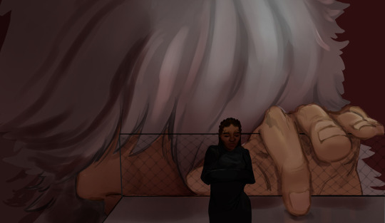
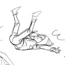
Text

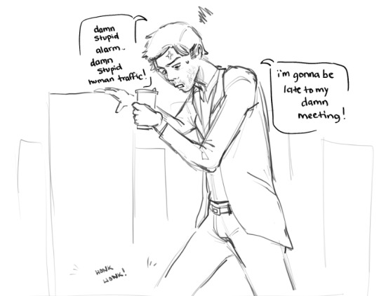
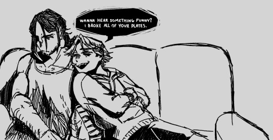
You hate me so much, don't you? Why don't you just shoot me, then?

Remy (c) bittersweet-fl0wer
Chromos (c) me: c'mon, love. make this easy for the both of us and tell me you hate me
#meaty art#meaty OCs#meaty market#whump#whump art#whump oc#injury#blood#angst#suicide#suicidal whumpee#masochist whumpee#insufferable bastards#remy#chromos#C&C AU#i should really finish this sketch someday because it actually has so much potential
7 notes
·
View notes
Text
sometimes i wish ace lived just thinking about how different the fandom would be...
#i wouldn't have to gamble with my emotions every time i go in his tag lmao#and if he had a definitive post-ts timeline#i bet there would be so much great fanart#like just the scrap of that one 'canon' aged up sketch of him inspired so many riffs...........#we could've had!!!! so much!!!!#like im watching the WCI arc right now#imagine if there were as much ace art as there is wci!sanji art#i need to lie down#hi my name is chromo
0 notes
Photo
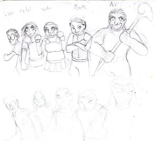


I am being encouraged to post more of my sketches more often.
For my Controlers story I eventually decided the big bad needed more than shadow clones and his big sister so I gave him a team of minibosses.
So for reference, Controlers is about a bunch of kids from a world where everyone can control an element, they get trapped in our world by the bad guy, Volkan III and these are his some of his disciples who I haven't properly named yet.
So These were my various attempts at creating them and giving them iconic. Nearly all come to me fully formed.
#Controlers#character design#sketches#traditional art#drawings#Chromo Tinner#Sylphia#Pao-Len#original characters#Artists on Tumblr
4 notes
·
View notes
Photo
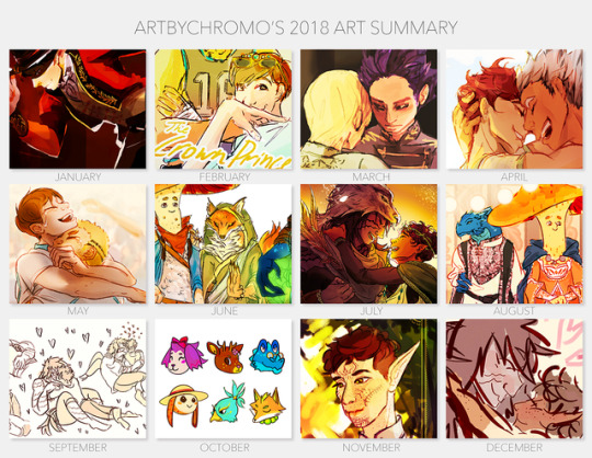
:’)) things got busy from september to november... but I had a few pieces I was real happy about this year!
thank you for sticking around!!
#could have used rilas for june thru december tbh#but....... some were real sketch-like i suppose#hi my name is chromo
7 notes
·
View notes
Text
I’m having such a crisis over the way this commission turned out... in a bad way......
#everything looks perfect except for this one part that’s like#inexplicably different from the preview sketch they sent for me to give feedback on#but the part that’s different is... a characters face#which is like#a sticking point I feel like#but also like they’re done with the piece and#with this media I don’t think they can make the changes I want.....#I sort of just want the exchange to be over#waaaaahhhhhh#hi my name is chromo#update: decided it couldn't hurt to ask if they could make the changes i want#it seems like it might work out...#but... i still kind of want to take a crack at doing this in my style anyway
0 notes
Note
HEY WAIT- GENE? WHAT- WHO IS THIS BADASS SWEETHEART? I GUESS IT'S YOUR OC, I LOVE HER, CAN I LEARN MORE PLEASE? 🥺💕 waiting i'm gonna read anything i can with her-
Art by: @senka-mesecine
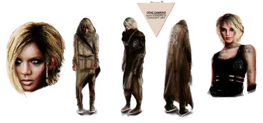
@onl-you I’m glad you asked! Gene is my Death Stranding OC. I came up with her around the time I was conceptualizing my fanfic Sky of Atoms. I’ll give you all ze facts you want, and if you have more questions you’re always welcome to hit me up with more.
Name: Gene Chromos Dawkins
Occupation: Porter for BRISK Harpy--an independent delivery company that primarily works with folks West of the UCA. Has a co-partnership with Bridges.
Age: Late 20s or 30s--I’ve left her age and appearances up to interpretation for readers. I have my own version of how I see her, but I love giving creative freedom to readers to build up the character themselves.
Life Story: Gene was born to parents Linne’ (lynn-ay) and Robert Dawkins in Middle Knot City. Gene’s parents were scientists. Lenne’ focused on botany and plant applications while Robert studied DOOMs, but eventually resorted to working on botany projects with Linne’.
Gene had a good upbringing as a child. She would help her parents out with their plant projects and was taught biology and other sciences, but as she grew older, Gene became different from her parents in both personality and interests. Gene was more into physical work and never stayed in one place for too long. Growing up in a colony, Gene wanted to see the world even with the BTs and other dangers. Being an explorer was her dream job.
As soon as Gene discovered what porters were and found out they got to go outside and see everything, she made it her life goal to become one. During her youth, Gene trained hard physically so she could get her foot in the door to the porter industry. She studied up too on requirements, what sorts of dangers she’d have to look out for, and tests to get a certification.
Gene butted heads with her mother, who wanted Gene to grow up and have a career in a science field because it was a guarantee to have a good life post-Death Stranding. Her father Robert was indecisive, wanting to encourage Gene’s diversity and interests but he too thought Gene would be safer going into a career similar to his and his wife’s.
When Gene had the financial means and hit the requirements, she applied to BRISK Harpy out West. Upon being hired, Gene had a falling out with both her parents. The result ended in a brutal argument where neither party wanted to speak to each other. Sadly, after some time, Homo Demens had obliterated Middle Knot. Robert and Linne’ Dawkins were among the casualties. The loss hurt Gene significantly, and for a while, she felt lost on what to do with her life; thinking of her own mortality, her parent’s lives, and what she truly wanted.
Gene finds out through the grapevine at work about a new UCA project called the Pioneer Program. The program which is part of the Far North Expedition selects strong porters to go up into the region that was once Canada. Upon arrival, they are to catalog if there any survivors and how much the environment has changed after the Death Stranding. It was hoped that after a couple of years, the Chiral Network and UCA can expand up North. Gene decided to make this her goal, figuring it was a compromise between her dreams of being an explorer and doing the science research her parents loved.
In the present and before Sky of Atoms starts, Gene is working on saving up her finances to get a Pioneer Pass to go up North and join the Expedition.
If you want to read up on what happens to Gene and how she gets involved with Higgs, you can read Sky of Atoms here.
Then there is the story Death Stranding: Rewind which is an alternative take on how Gene meets Higgs (based on Higgs saying in SOA how he wishes they could have met in better circumstances)--and the plot of this fic follows Higgs when he was a porter and leads into how he got ensnared into joining Amelie.
Random facts!
I came up with Gene’s name based on, genetics, chromosomes, and Richard Dawkins.
The term gene was introduced by Danish botanist, plant physiologist, and geneticist Wilhelm Johannsen in 1909. This ties in with Gene’s parents being botanists and studying plants.
Linne’--Gene’s mother, was named after Carl Linnaeus. He a Swedish botanist, zoologist, and physician who formalized binomial nomenclature, the modern system of naming organisms.
I originally wasn’t going to have Gene and Higgs end up together in Sky of Atoms, but it kind of evolved on its own.
Gene knows how to draw in good detail because her folks had her sketch and diagram plants as a kid.
Despite being brought up by scientists, Gene doesn’t know too much about anything in the subject. She only held onto key things that would help out in survival situations for when she’d become a porter. Example: learning about wild plants that help heal, cure headaches etc. from her mother.
Gene is quite physically strong, but prefers to outsmart her opponents versus brawl it out, but she’s not afraid to get her hands dirty.
Gene has killed before on the job, and doesn’t like doing it. She especially has a tough time too when it comes to kids.
Gene is indifferent towards kids. She likes them, enjoys their personalities, but being a parent isn’t her goal in life.
Gene can be a bit of a smart ass. It has either helped her out of situations or made them worse.
Below the belt (lolz) is my artwork of Gene.

DS: Rewind appearance in later chapters
Concept Art I did of her


#gene chromos dawkins#gene dawkins#death stranding oc#death stranding#death stranding fandom#thank you for asking about her hon#hope this helps#love ya!#onl-you
17 notes
·
View notes
Text
My name is Nick Stewart and I’m from Rochester, Kent, England. Much of my working life has been spent in service to London’s advertising agencies and design studios as well as a part time tutor at the University for the Creative Arts. I am currently the creative lead at Stewart2, a branding and design team.
Robert Oster Inks
Sheaffer Black And Bleach
My art journey began early. As the offspring of a father in the armed services it was the norm ‘back in the day’ to be sent away to school to offset the disruption of relocation every 2 years. In the boarding communities I found myself, it was important to play to your strengths in order to survive. Art happened to be something I excelled at and since the age of eight have developed it as a skill for both career and personal practice.
Robert Oster Inks
Parker Quink And Bleach
J. Herbin Inks
Four years ago, I was in an extremely frustrating and anxious place. The creative driven analogue industry that I love and cherish finally morphed into the digital behemoth it was destined to become. Now led by programmers and account managers utilising keywords, templates and digital visual content. I desperately needed to find something analogue to satisfy my inner creative cravings and that’s where the fountain pen ink art project began.
Mild bleach on Parker Quink black background
I had already been introduced to an abstract use for Parker Quink Ink and bleach mainly for lettering and design while at Brighton University, where I was tutored by the renowned calligrapher Miriam Stribley. So, this seemed like an opportunity to revisit those investigations from thirty years ago and take them further into uncharted territories.
Mild bleach on Waterman ink backgrounds
For the uninitiated, fountain pen inks are made up of dyes that when introduced to a wetted paper surface, the colours that make up those dyes are released from solution, so although you are dealing with one colour it appears that you could be using several. This chromatic process is totally unique to fountain pen inks with the stunning visual outcomes very much serendipity led. Add to that a touch of alchemy (bleach), and the art goes to a whole new level with stunning neon gold effects, textures and new colours created!
So, first off, I got hold of ink samples from all over the world to swatch test. And the potential for fountain pen ink use, aside from handwriting, was jaw dropping. I uploaded my swatch cards, ink reviews and fountain pen ink art to a dedicated website and shared them to social media and discussion forums that I thought may gain some attention. And what quickly became apparent, is that there is a big international audience out there who are eager to know more and to learn how to use their fountain inks in their own art.
Nick Stewart Randall ink
I found that each fountain pen ink is unique. Some inks are just one trick ponies while others reveal a whole range of unexpected behaviours, colours, reactions and creative possibilities. To-date I have swatch tested over 1,800 individual inks and discovered some real delights, all of which, once recognised, will be of great value to creatives in all fields of art practice.
Troublemaker Abalone and Petrichor inks
Left: Noodler’s Rome Burning and Walnut Brown inks. Right: Krishna Graphite ink
For readers of this forum who are into sketching and watercolour painting, you can achieve some easy and stunning watercolour effects by simply letting the chromatography just do its thing. In the illustrations shown above, the ‘chromo’ skies and foregrounds created themselves with the details added afterwards with a dip pen. For enthusiasts of art journaling and sketching, this simple and natural process allows for a seamless visual and medium continuity between image and handwritten word.
youtube
For the travelling artist, illustrator and journal keeper, using a limited palette of four fountain pen inks similar to cyan, magenta, yellow and black, will easily mix and blend together to give all the colours needed to create great art with the addition of those unique chromatic effects and reactions to bleach included – all from the one medium.
Nick Stewart Berber Blue, Desert Rose, Dune Yellow and Twilight Black inks (4 colour mix)
Nick Stewart Berber Blue, Desert Rose, Dune Yellow and Twilight Black inks (4 colour mix)
What is also of interest is that all ink ranges are made differently. Each ink maker has their own and recipes and processes. So, one range of inks may suit a particular subject matter better than another.
Various standard, sheening and shimmer inks
But it doesn’t stop there. Fountain pen sheening and shimmer inks can also be used for art and to stunning effects when used for painting, calligraphy and illustration. And for creatives who like working light into dark, using bleach into an ink background is not only unique to this medium but visually impactive too.
Cult Pens Robert and Maureen inks with mild bleach
I hope that this ‘snapshot’ of my investigations shows that a lot of unique, exciting and diverse art can be created using fountain pen ink. However, as with anything that ‘looks good’, there is scrutiny and rightly so. There are 2 main areas of negative discussion – the effect of bleach on paper and the history of ink dyes being prone to fading. These are real issues but are certainly not terminal. Some inks are fugitive. Not all!
I create my art on good quality paper and protect it with a matte UV resistant spray. This works very well, and the good news is that ink creators are starting to add UV inhibitors into their products. Thick bleach will destroy paper. I don’t use concentrated bleach I use a very mild solution with water and as I’m using heavy paper the damage is invisible.
Mild bleach on Parker Quink ink black background
And the future? Well, the last four years has been a real pleasure. Not only has fountain pen ink art satisfied my analogue creative needs, but I think I’ve actually found a unique niche where my art is developing into a recognisable style of its own and that’s fundamental for any artist. I have also made hundreds of new friends: painters, illustrators, calligraphers, writers, ink makers, pen makers, paper manufacturers and others who are just curious, all wanting to find out what’s going on.
Diamine Teal ink
I have delivered numerous fountain pen ink art workshops, sharing the processes and techniques and for the many who can’t attend a workshop I have produced an online tutorial course – details on my website.
My real hopes are that I can help share and promote this unique medium as a bonafide art material and genre. As technology slowly erodes the use for handwriting, this reimagined purpose will hopefully see fountain pen ink appreciated for new creative alternatives. Why not give it a try?
If you’d like to find out more, there are links below. Thank you.
Nick Stewart
Website
Instagram
Twitter
Facebook
YouTube
GUEST ARTIST: "The Magic of Fountain Pen Ink Art" by Nick Stewart - #doodlewash #ink #fountainpens #sketchingstuff #painting My name is Nick Stewart and I’m from Rochester, Kent, England. Much of my working life has been spent in service to London’s advertising agencies and design studios as well as a part time tutor at the University for the Creative Arts.
#1798 Anniversary Ink#art#artist#featured#Fountain Pen#Fountain Pen Ink#ink#Inktober#J. Herbin#painting#Parker#pen and ink#penandink#UK
1 note
·
View note
Photo

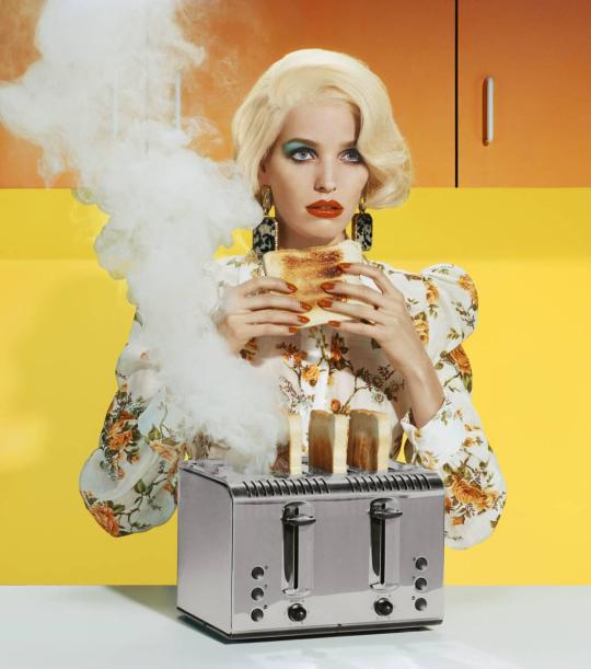
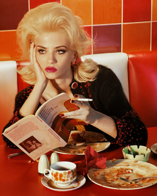
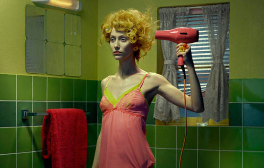
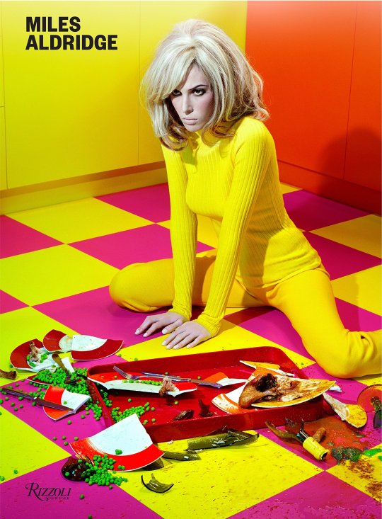
Miles Aldridge
Miles Aldridge rose to prominence in the mid-nineties with his arresting, highly stylised photographs with references to film noir, art history and pop culture. An acclaimed colourist, he renders elaborate mise-en-scènes in a palette of vibrant acidic hues. These glamorous, frequently eroticised images probe society’s idealised notions of domestic bliss where sinister undercurrents swirl beneath a flawless surface. Aldridge has worked prolifically for more than twenty-five years, and today he remains one of the few photographers still shooting predominately on film. His creative output encompasses large-scale c-type prints, Polaroids, screenprints, photogravures and drawings.
Born in London in 1964, the son of famed art director and illustrator Alan Aldridge, his interest in photography began at an early age when he was given a Nikon F camera by his father. He went on to study graphic design at Central Saint Martins, graduating with a BA in 1987. Aldridge initially worked as an illustrator and music video director, before turning his attention to photography. In 1996 he began working with Franca Sozzani, the legendary editor-in-chief of Vogue Italia, and their boundary-pushing collaboration would continue for twenty years. In addition to the many international editions of Vogue, Aldridge’s images have featured regularly in prestigious titles including Harper’s Bazaar, Numéro, W, The New York Times Magazine and The New Yorker.
Aldridge develops each new photographic narrative by rendering his initial thoughts in ink or pencil sketches with washes of watercolour and pastel. These drawings and storyboards are an essential early stage in his creative process. He believes that ‘fiction and theatricality can be more truthful than documenting reality’ and translates his sketches into meticulously arranged compositions to create images reminiscent of film stills: frames snatched from a broader story. Aldridge notes that many of his favourite moments in cinema are, as he describes, ‘closeups of a woman’s face thinking’, and he shares Hitchcock’s ability to create powerful moments of suspense, turning viewers into voyeurs. In Aldridge’s Chromo Thriller (2012) there is a palpable resonance with David Lynch’s neo-noir mystery Blue Velvet, where immaculate façades hide darkly strange stories. As one author has noted: ‘Aldridge’s female protagonists recall the glamour and splendour of Isabella Rossellini’s character whilst at the same time remaining suggestive of something more sinister.’
https://milesaldridge.com/about/
0 notes
Photo

So this piece I used my favorite #prismacolor premier color pencils on #strathmore smooth bristol board paper. Everytime I watch instructional videos they always say to start out with a light layer and burnish in the end. It never seems to work like that for me. I guess im heavy handed or something. I always end up putting a thick coat of my lightest color. Then build it up from there. I tryied it a few times without the 1st thick coat and it just didnt seem to work out for me. Maybe I need more practice. I still never tried faber caster Polly chromo pencils. Which do you prefer? Prismacolor or Faber caster? #family #babies #sorryforyourloss #followme #commisionsopen #artistforhire #sketch #color_sketch #likeness #nailedit #artoftheday #artissoulful (at Waterbury, Connecticut) https://www.instagram.com/p/CESE3BIhY3i/?igshid=szox99vsxmim
#prismacolor#strathmore#family#babies#sorryforyourloss#followme#commisionsopen#artistforhire#sketch#color_sketch#likeness#nailedit#artoftheday#artissoulful
0 notes
Text
British Library digitised image from page 72 of "Sketches of Japanese Manners and Customs ... Illustrated by native drawings, reproduced in fac-simile by means of chromo-lithography"

Image taken from:
Title: "Sketches of Japanese Manners and Customs ... Illustrated by native drawings, reproduced in fac-simile by means of chromo-lithography"
Author(s): Silver, Jacob Mortimer Wier [person]
British Library shelfmark: "Digital Store 10057.f.16"
Page: 72 (scanned page number - not necessarily the actual page number in the publication)
Place of publication: London (England)
Date of publication: 1867
Type of resource: Monograph
Language(s): English
Explore this item in the British Library’s catalogue:
003385220 (physical copy) and 014829563 (digitised copy)
(numbers are British Library identifiers)
Other links related to this image:
- View this image as a scanned publication on the British Library’s online viewer (you can download the image, selected pages or the whole book)
- Order a higher quality scanned version of this image from the British Library
Other links related to this publication:
- View all the illustrations found in this publication
- View all the illustrations in publications from the same year (1867)
- Download the Optical Character Recognised (OCR) derived text for this publication as JavaScript Object Notation (JSON)
- Explore and experiment with the British Library’s digital collections
The British Library community is able to flourish online thanks to freely available resources such as this.
You can help support our mission to continue making our collection accessible to everyone, for research, inspiration and enjoyment, by donating on the British Library supporter webpage here.
Thank you for supporting the British Library.
from BLPromptBot https://ift.tt/2zT2hZM
0 notes
Text
consider: g/t businessmen


hehehehehehe
157 notes
·
View notes
Text
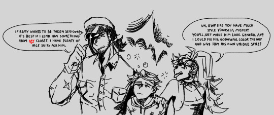
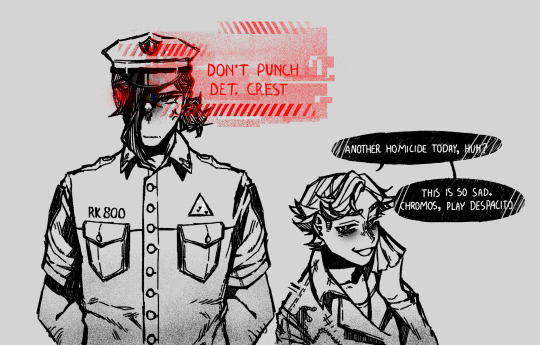
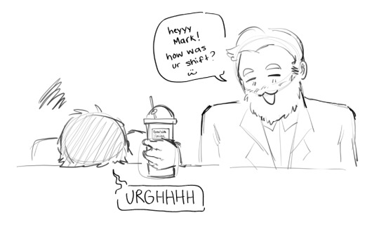
Reposting my favorite Insufferable Bastards sketches onto this account because :3cc I love them and they're awful.

Remy (c) bittersweet-fl0wer
Chromos, Rena (c) me: don't worry guys remy's just trying to make Chromos laugh. i mean, he can't laugh if he's busy being pissed off, no?
#meaty market#meaty OCs#meaty art#insufferable bastards#remy#chromos#rena#combining these all into one post because i don't want to post each one individually
4 notes
·
View notes
Text
drawing tanaka/hinata again and dang does it feel good, feel organic
#i just realized if i rotate my sketch a bit i can fit in them HOLDING HANDS HECK YEAH#chromo hits a touchdown#well we'll see#looking at it again... hmmm
2 notes
·
View notes
Photo

Another SCC work ;3
this time sketch was by awesome Thalsa <3
I did just basing and coloring this
coloring is based on winter wish chromo.
-Bara
3 notes
·
View notes
Text
Sprint 9


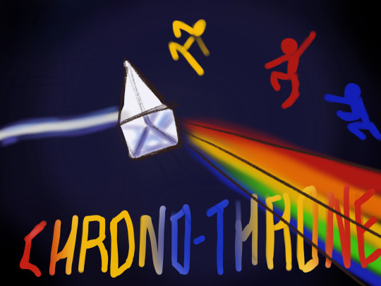

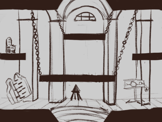

As a team we landed on a new name and scraped our working title (Ligthshow): Chromo- Throne! I Had a lot of fun finding cool fonts and messing with them in Photoshop. Even though I think they look cool, I am worried about the legibility and if it hurts the viewer’s eyes. I did not make the fonts, I used DaFont.com; which is great for free use. I also doodled some start screen ideas. I also sketched some ideas or the background for our medieval stage so that it is not just a blank background. Lastly, I modeled out some possible thrones for the chromo-throne. As a team I believe that we are starting to get into Phase 2: Proving. I feel as though we have been iterating and landed on a concept that works and that we enjoy. I also made a few rough animations this week. I do not know how to export them to show as gifs. I’m worried that not having a lot of animation experience will hinder the team and our game. I guess it’s better to have some rough animation than none at all...right?
0 notes
Last Seen Blogs
wittebanes
seething seas and puppet strings
room25-morgue-street
arassume's artblog

jbille66-blog
Sans titre
skelet0npuke
post-modern poser

vv3spa
kinshifting very hard